Creative Musing
March 2017
__
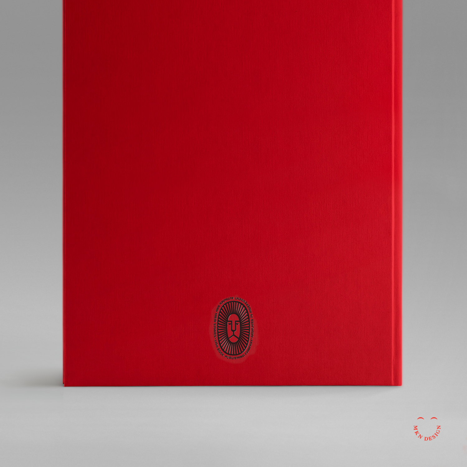
Lion Book Publishing Co.
Dedicated to independent authors and their stories. The typeface utilized around the mark is ATF Franklin Gothic by American Type Founders Collection.
Creative Musing
March 2017
__
Lion Book Publishing Co.
Dedicated to independent authors and their stories. The typeface utilized around the mark is ATF Franklin Gothic by American Type Founders Collection.
Creative Musing
March 2017
__
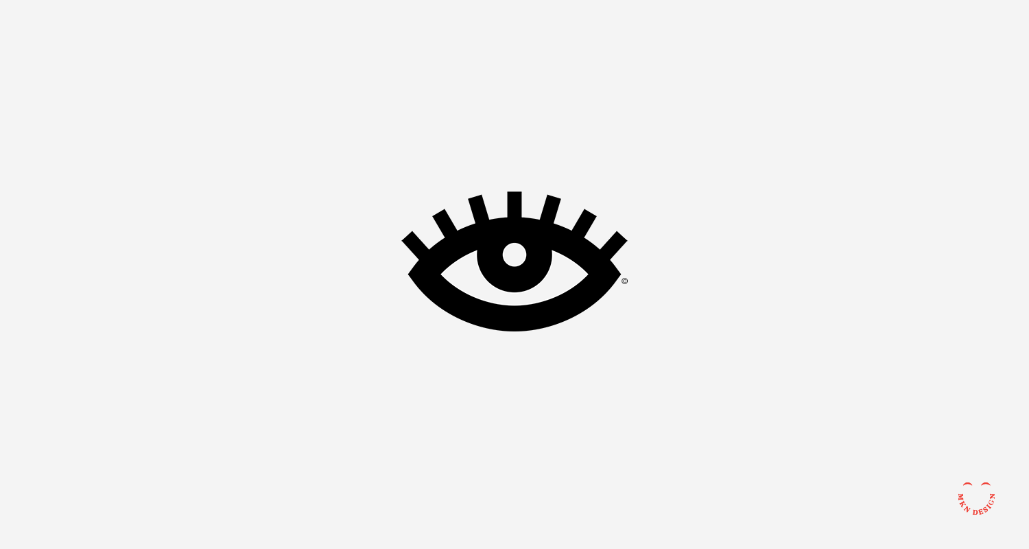
Uneasy Eye
Simple little illustration and animated gif to give it life.
Creative Musing
March 2017
__
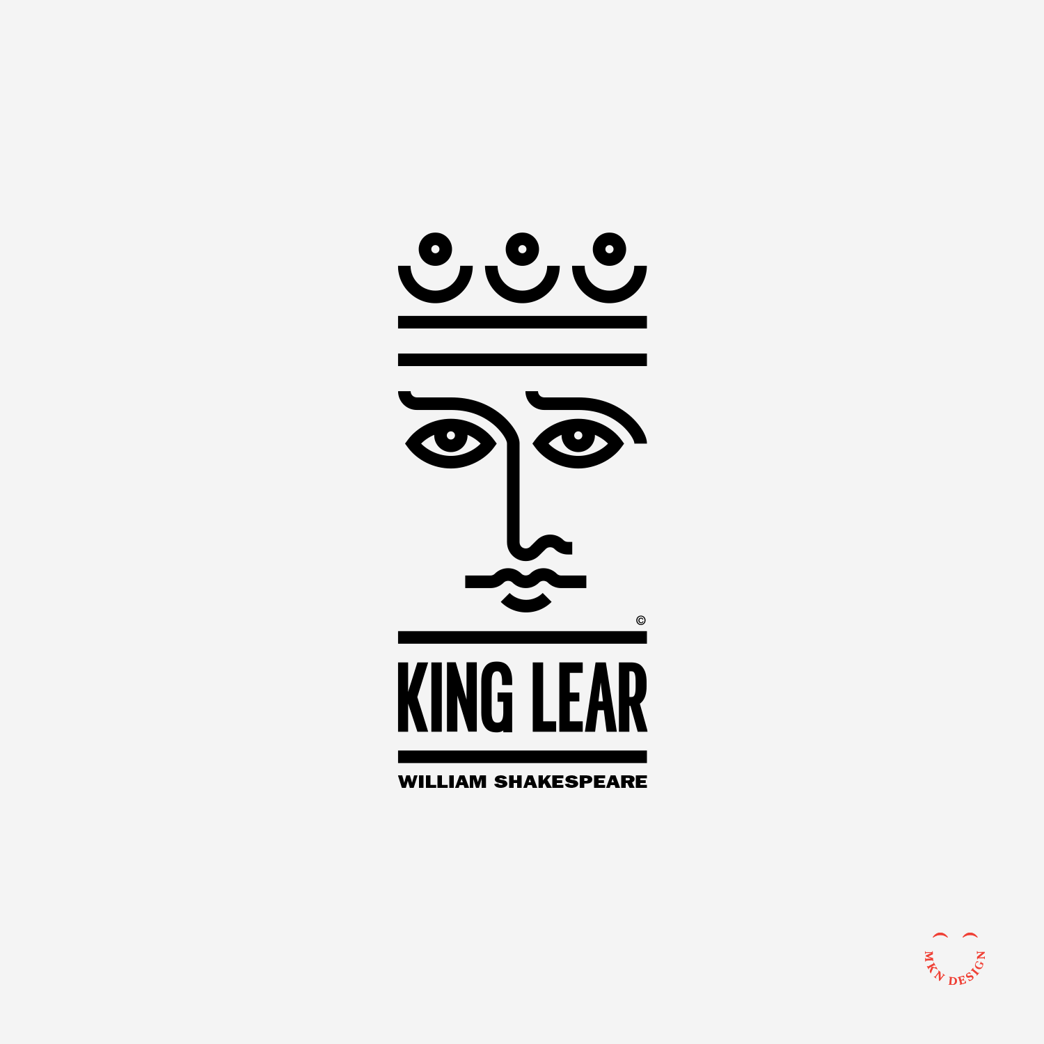
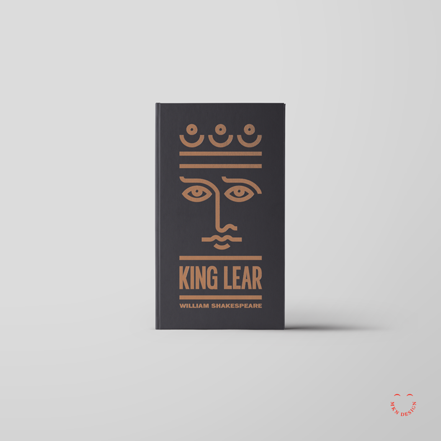
King Lear
Simple lines to create this portrait of King Lear for a book jacket. The typeface used on this book jacket is ITC Franklin Gothic LT Pro designed by URW Type Foundry.
Article
February 2017
__
Panel Discussion & Portfolio Review
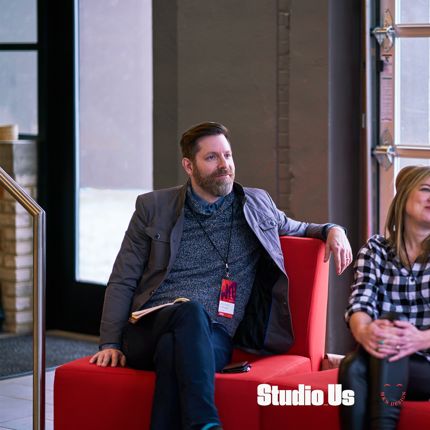
Over the weekend, I dedicated my morning to attending "WIP it into Shape," a panel discussion and portfolio review tailored for design students in West Michigan. The event provided an invaluable platform for emerging talents in the design field. Panelists included: Emily Boyd, Sarah Brockett, and Carlos Estrada. This day was organized by AIGA West Michigan, curated by Studio_Us, and graciously hosted and sponsored by Atomic Object.
Note
Program design and photography by two kind and talented humans, Bree and Ross Tanner from Studio_Us.
Creative Musing
February 2017
__
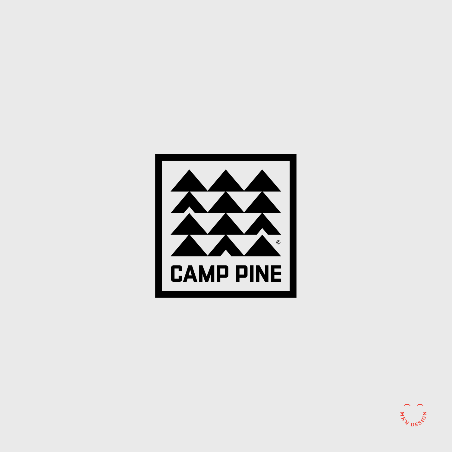
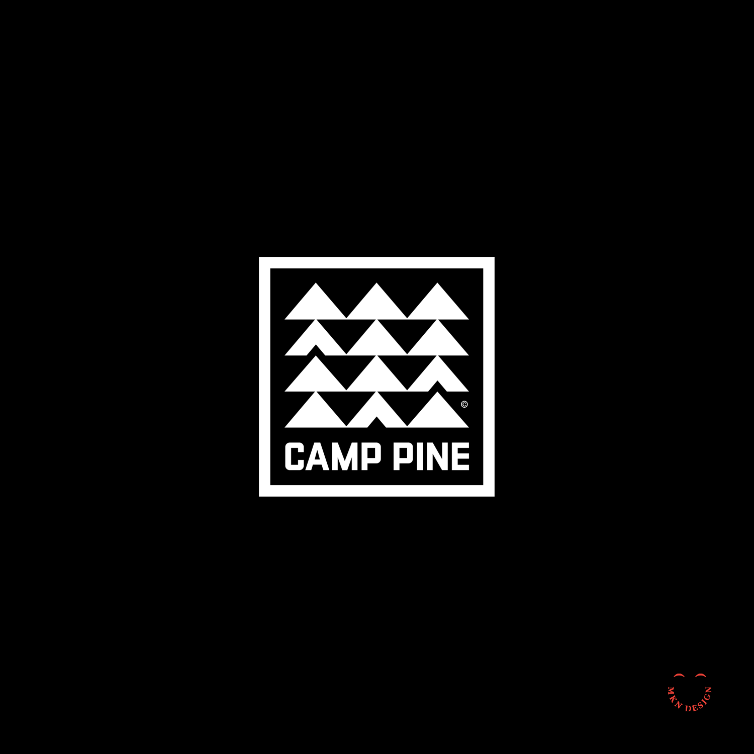
Camp Pine
A square, retro mid-century logo with repetitive modern aesthetics. The typeface was custom designed to fit a campy feel.

Client Project
February 2017
__
House Books
The utilization of a simple line of a roof serves to exemplify the name for House Books. The incorporation of a angled line above the House Books typeface serves as a distinctive marker for the brand's name. The chosen typeface is a customized slab serif that was widened to enhance its presence. I paired the mark with the typeface URW Bodoni Wide designed by Giambattista Bodoni from URW Type Foundry.
Brand Identity
+ Creative Direction
+ Qualitative Research
+ Concept Development
+ Sketching & Ideation
+ Illustration
Client Project
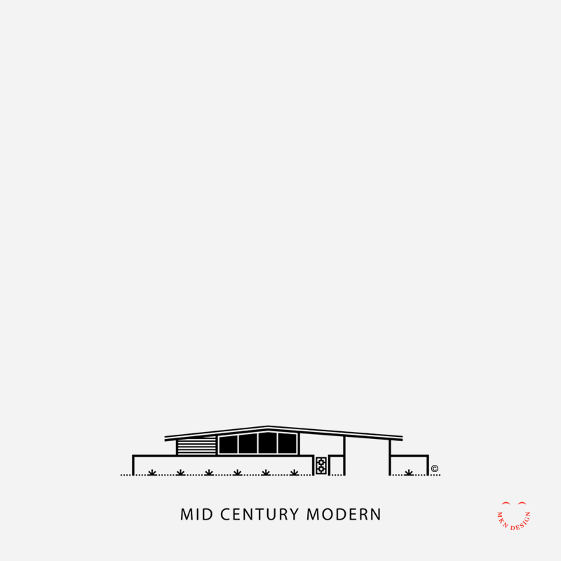
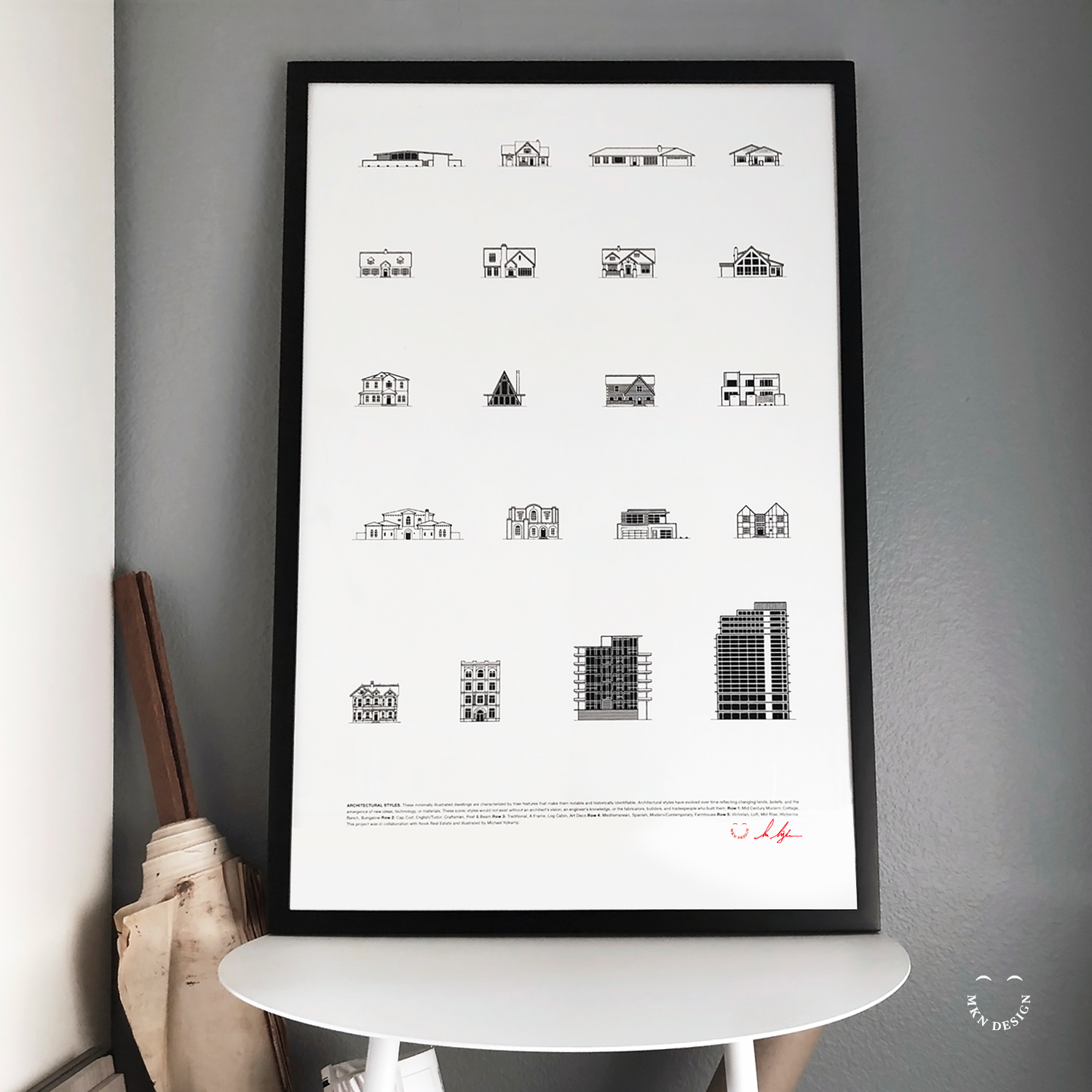
January 2017
Employing my minimalist illustrative approach, I visually captured 20 distinct architectural styles. These illustrations were subsequently compiled into a poster, presenting a comprehensive showcase of the diverse spectrum of architectural designs found in Newport Beach, California.
Illustration & Graphic Design
+ Creative Direction
+ Research
+ Sketching & Ideation
+ Graphic Design
+ Iconography
This poster is available for purchase in my shop.


Article + Product
January 2017
__
Skate, Surf, & Art
Monsa Publications requested permission to feature my illustrated skateboard deck graphic, "Urban Totem," in their book titled "Skate, Surf, and Art." This graphic, originally created for a fundraiser aimed at constructing a new skatepark.
Buy this Book
Skate, Surf, & Art is available for purchase on Monsa Publications website.


Creative Musing
January 2017
__
America's National Parks
Utilizing the emblem shape of the National Park Service and drawing inspiration from the natural elements of our parks—land, water, and sky. Above are two illustrative styles, left badge features gradient colors and right badge feature flat colors. The emblems typeface is Rockwell Nova Condensed designed by Monotype.

Creative Musing
January 2017
__
Canada Goose
Bold fills with negative space accents and a Canadian maple leaf.

Creative Musing + Article
December 2016
__
Modern x Dwell
The simple line and halftone pattern illustration is a reflection of the contemporary esthetics created for the Modern x Dwell collection. This collaboration between Dwell and Target has produced a thoughtful collection of well-designed modern pieces. Most pieces represented in my illustration are the outdoor patio collection.

Creative Musing
December 2016
__
Fish King
A simple line illustration mark paired with my own custom typeface.

Client Project
December 2016
__
Michigan Wheel Marine
Combination badge and flag mark designed for a boat manufacturer that didn’t make the cut. The logo’s mark is paired with the typeface Poppins designed by Jonny Pinhorn and Ninad Kale, from Google.
+Brand Identity
+ Creative Direction
+ Project Management
+ Qualitative Research
+ Concept Development
+ Sketching & Ideation
+ Illustration
Client Project
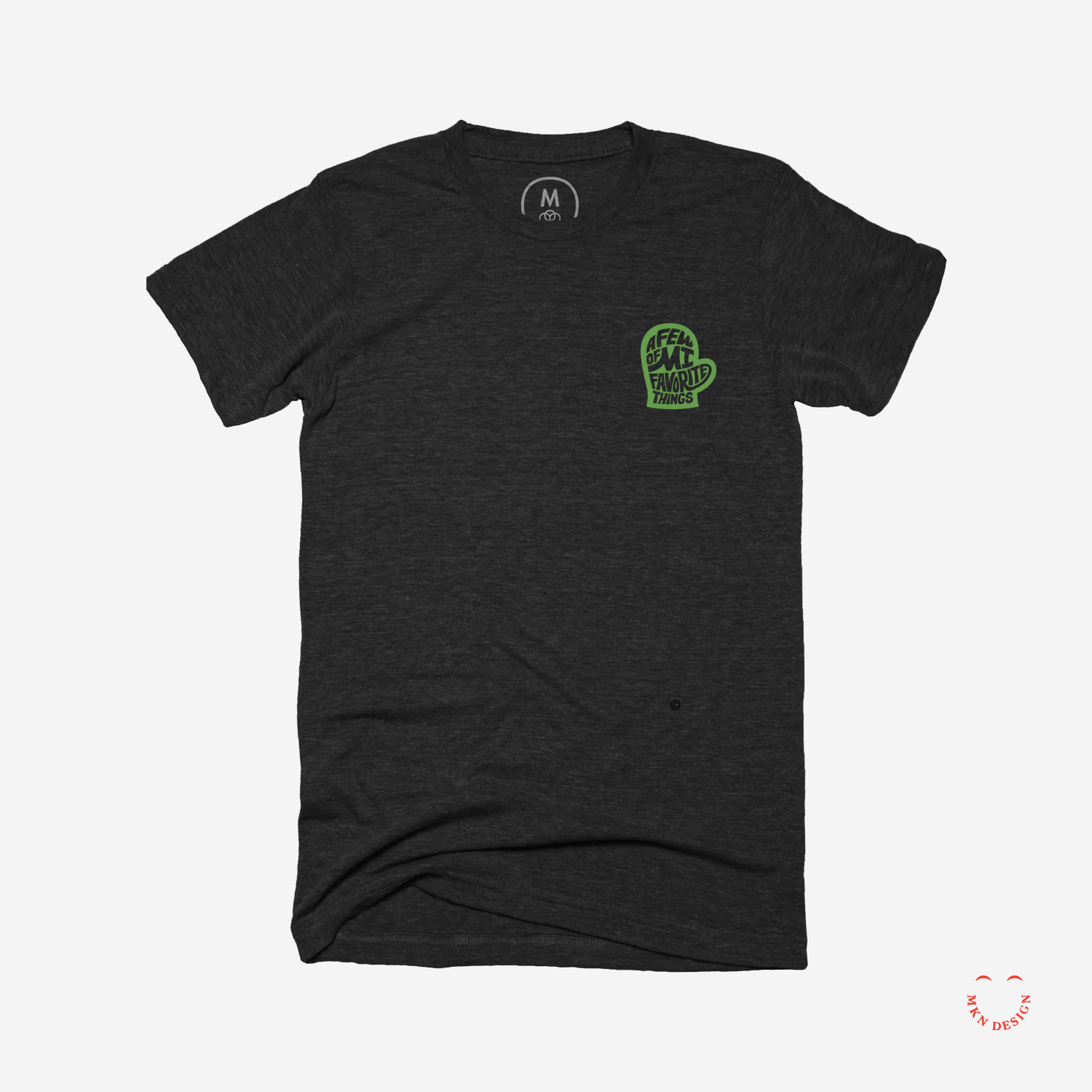
December 2016
—
Mitten State
A few of MI (my) favorite things. A mark with custom hand type created by my wife and I for a our children’s school auction—auctioning authentic Michigan paraphernalia. The letterforms in this mark have been custom-designed to fit snugly into the mitten.
+ Brand Identity
+ Creative Direction
+ Project Management
+ Qualitative Research
+ Concept Development
+ Sketching & Ideation
+ Illustration

Client Project
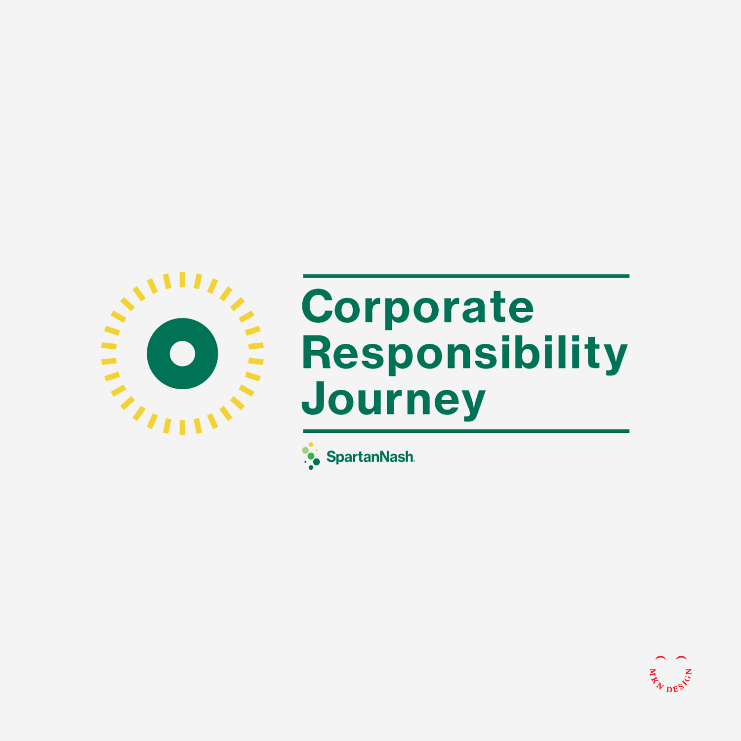
November 2016
Using a guided design approach, I explored SpartanNash's key environmental impact areas of Social and Environmental Responsibilities, delving into each segment to narrate their entire sustainable journey. Through the strategic use of storytelling, we intricately wove together their core values, showcased their diverse capabilities, highlighted community engagement efforts, and underscored their unwavering commitment to environmental responsibility. This narrative was brought to life through a blend of design elements, compelling visuals, and informative infographics, culminating in a comprehensive sustainability report.
Brochure Design & Layout
+ Creative Direction
+ Project Management
+ Qualitative Research
+ Concept Development
+ Sketching & Ideation
+ Graphic Design & Layout
+ Photography Art Direction
+ Infographics
+ Illustration

Article + Product
December 2016
__
Dwell Feature
Thank you Dwell for promoting my work in this month’s issue of Dwell Magazine and on dwell.com It’s nice to be noticed ☺️
What the Dwell blurb reads, “Design With an Eye for Fine Lines. Michigan-based graphic designer and illustrator Michael Nykamp takes minimalist approach to creating portraits and logos for a variety of clients, including AIGA West Michigan, Herman Miller, and musician Truman Cage. We also love his crisp drawings of midcentury classics, such as Jens Risom’s A-Frame house. Follow his collaborations, posters and personal explorations like this geometric lion at dwell.”
Additional Content
View my work on Dwell.
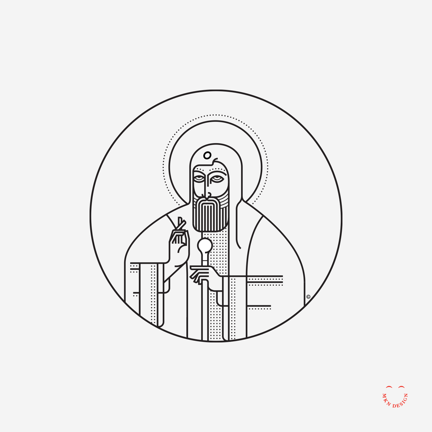
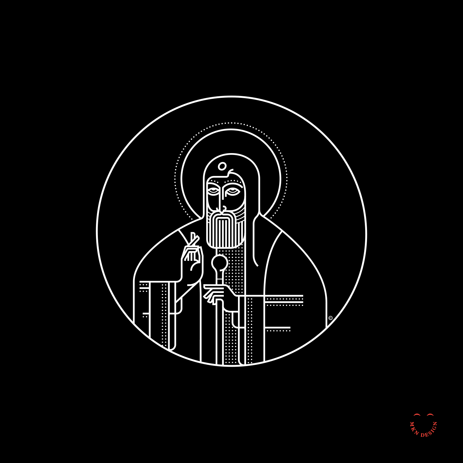
Creative Musing
November 2016
__
Saint Tikhon
Simple line and dots illustration of an Orthodox Priest in his vestments and staff.

Creative Musing
October 2016
__
The Careful Gardener
An older gentleman recently told me, “Every relationship has a gardener and a flower.” Typically women are gardeners.

Creative Musing
September 2016
__
The Death Of Peace
Illustration inspired by the quote from Jason Donahue, “I see humans, but no humanity”.
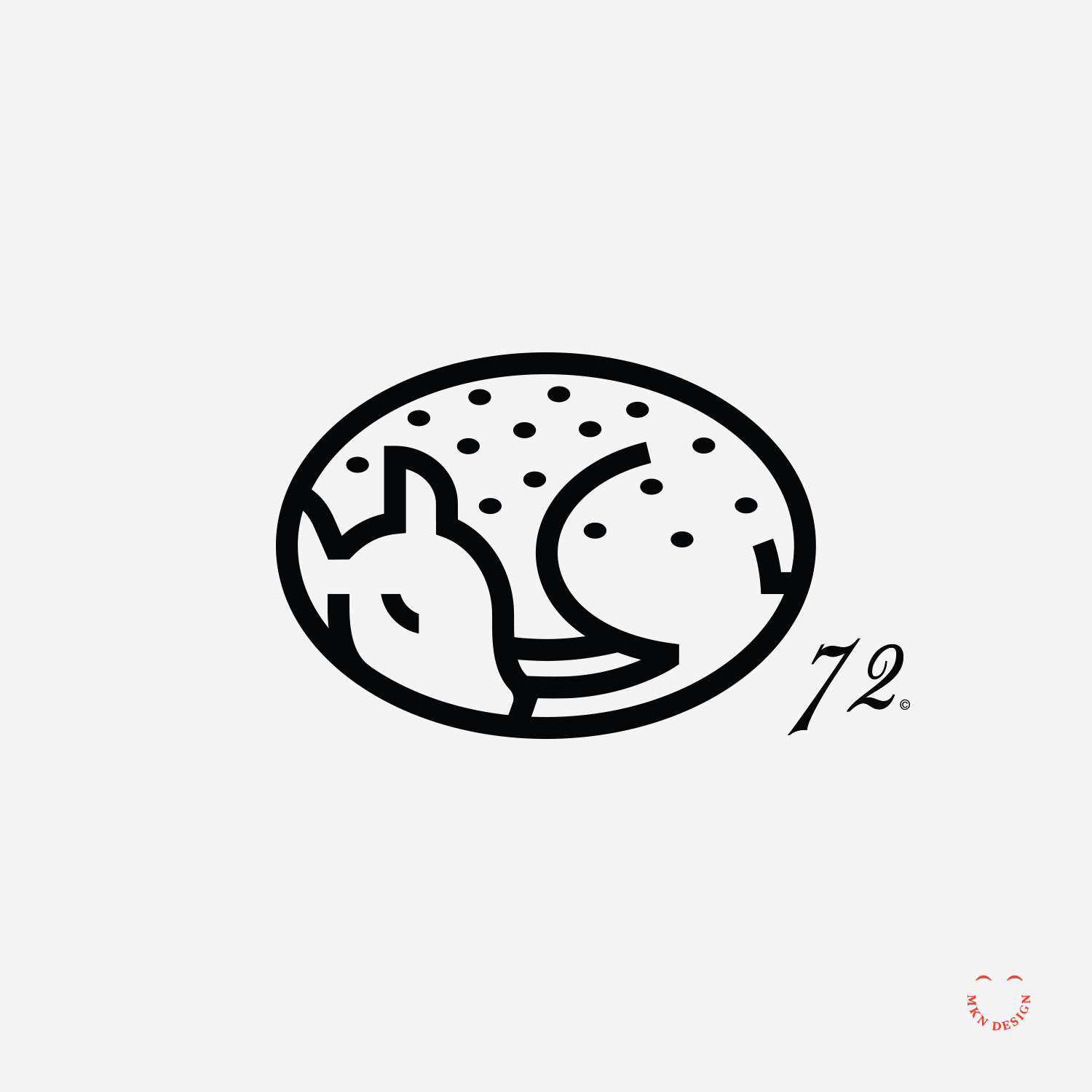
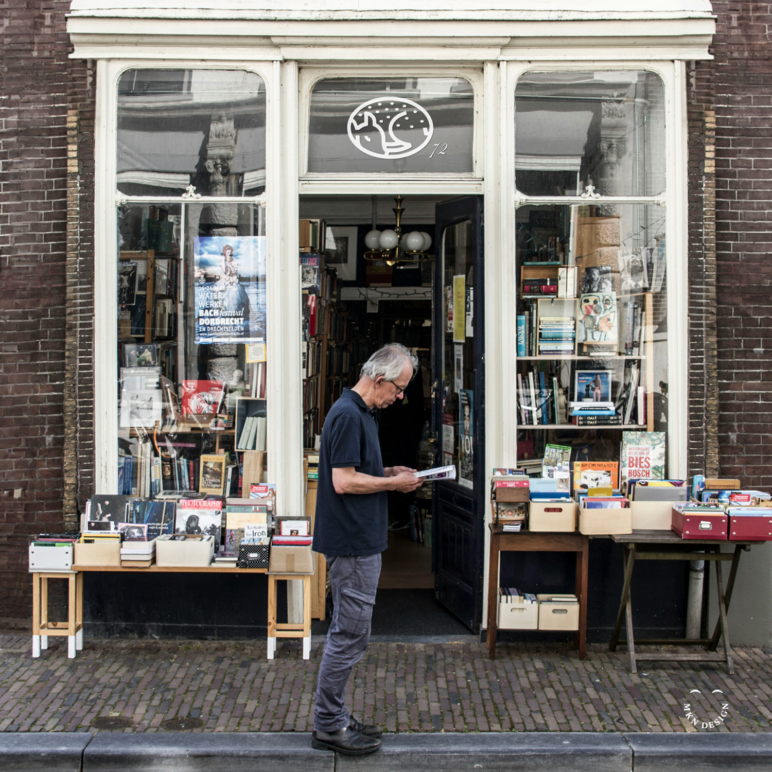
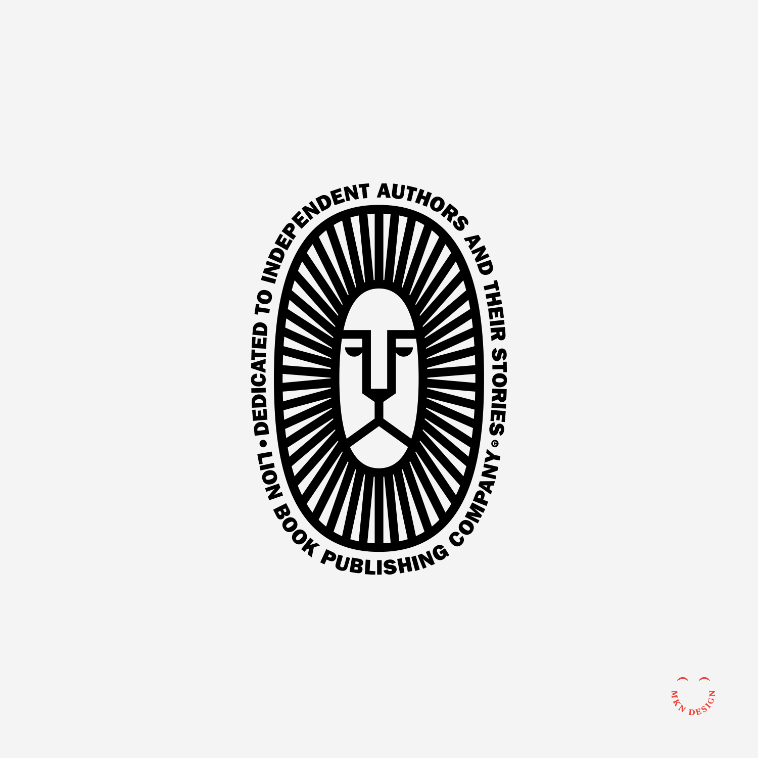
Client Project
September 2016
__
Sleeping Fawn
Created this a few years ago as potential mark for a book publishing company.
+ Brand Identity
+ Creative Direction
+ Qualitative Research
+ Concept Development
+ Sketching & Ideation
+ Illustration
michael@mkn-design.com
1 616 915 1941
Good design is complexity presented simply
MKN Design LLC © 2024
133 Somerset Drive NE
West Michigan