Herman Miller – Planning Guide System Design


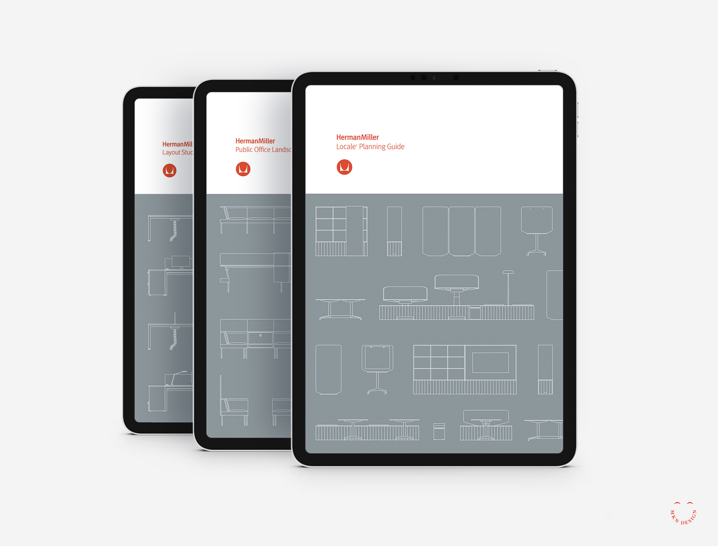
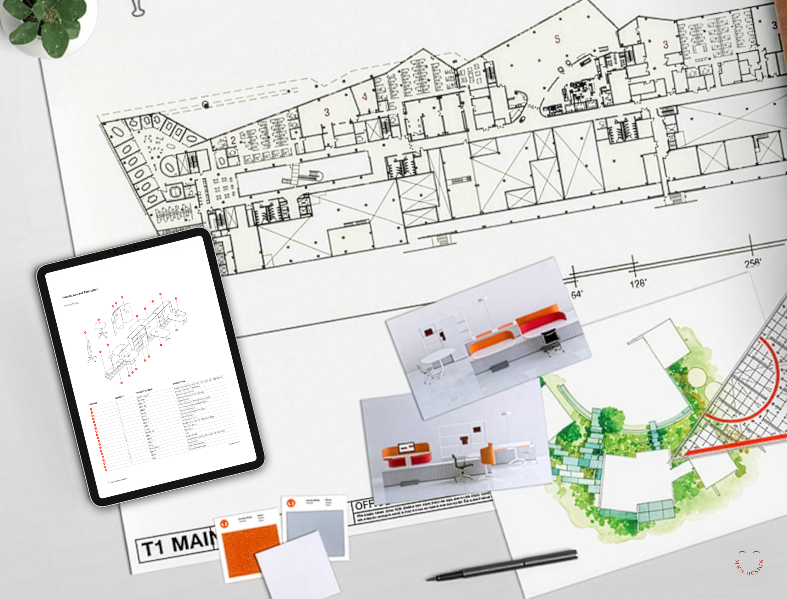
↓ Locale Planning Guide
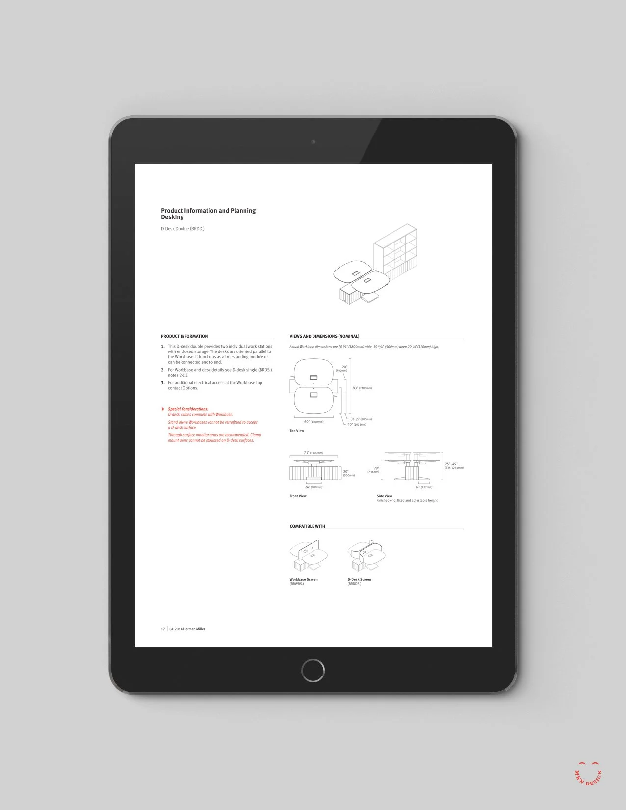
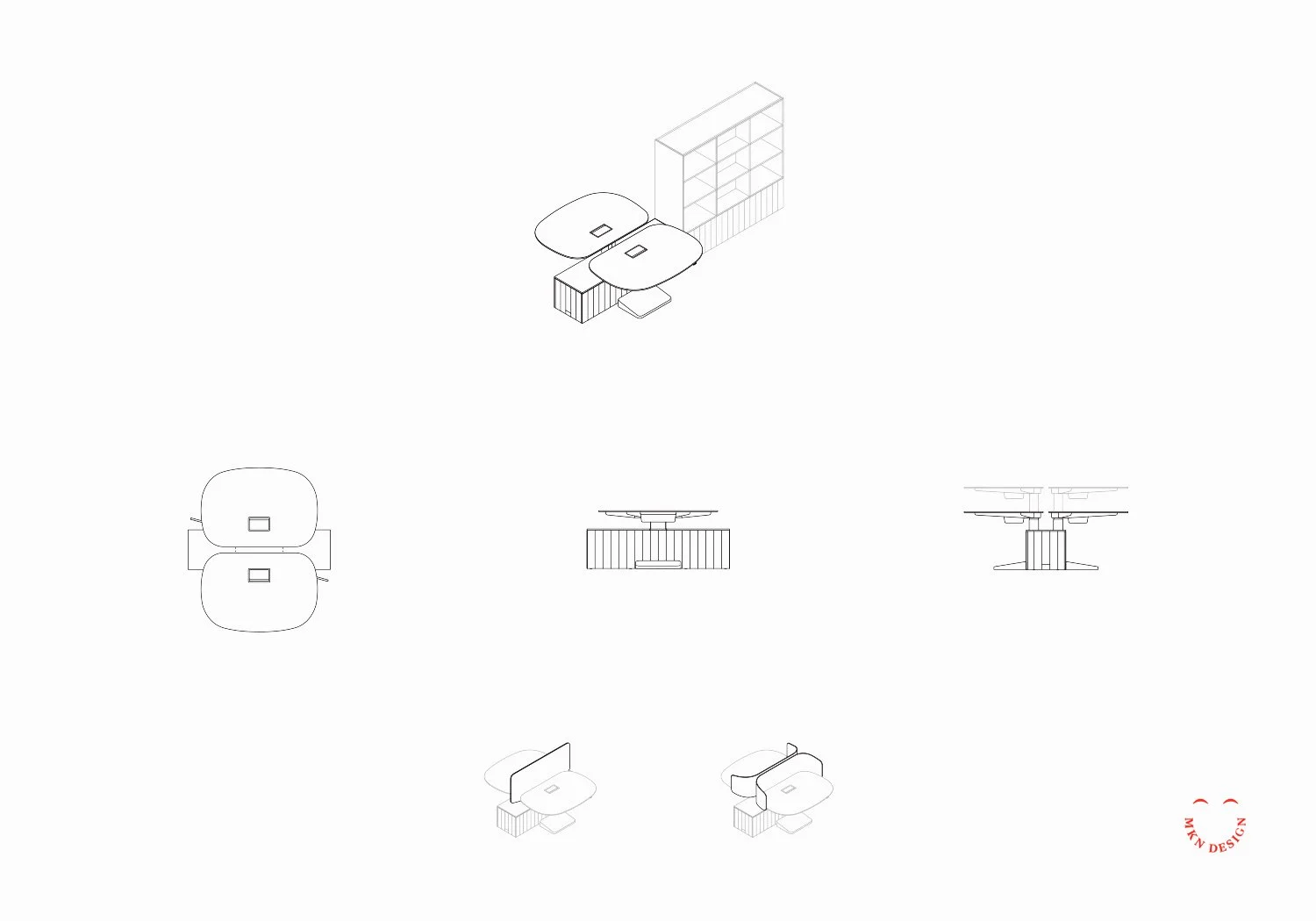
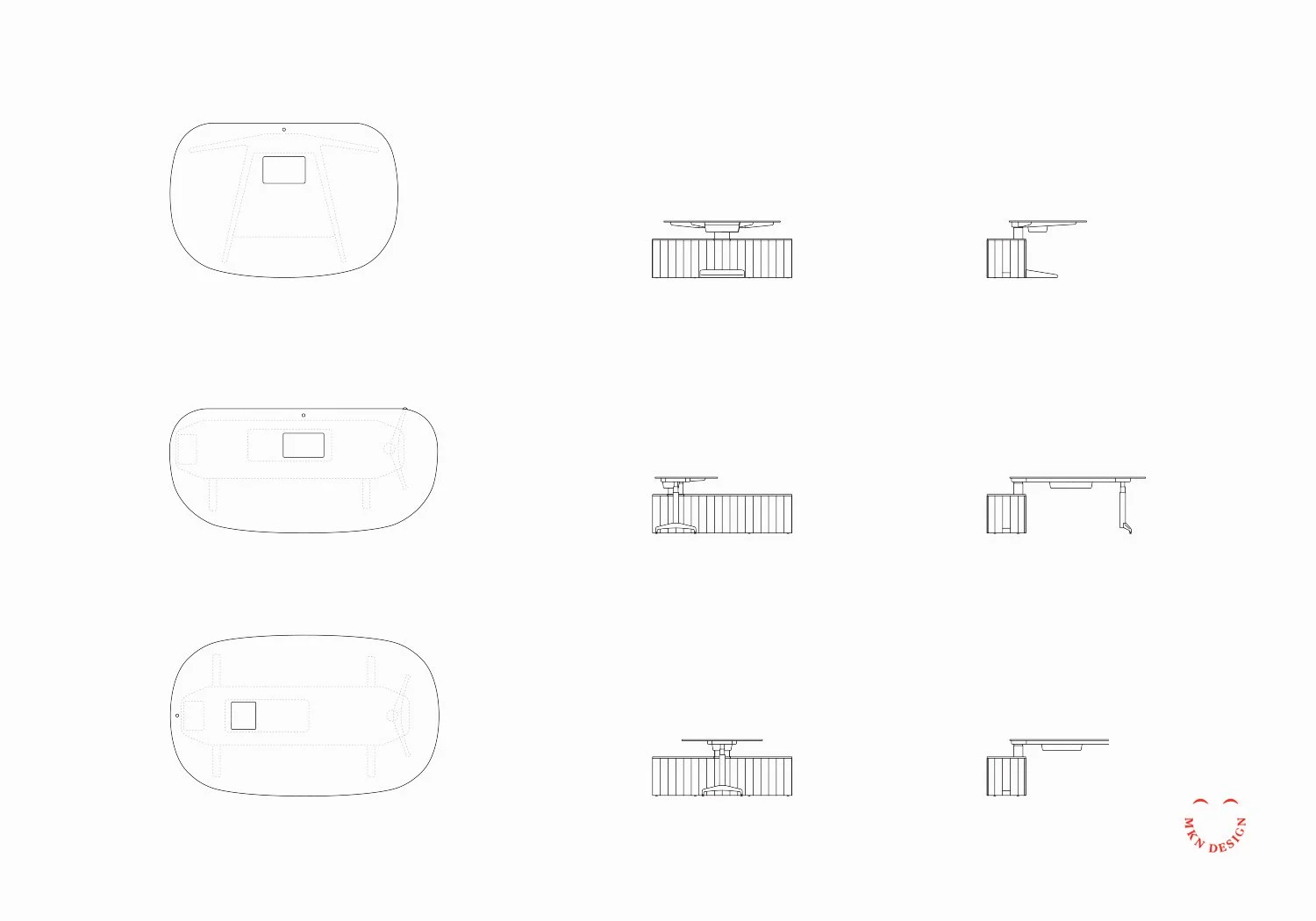
Several layouts from the Locale product planning guide.


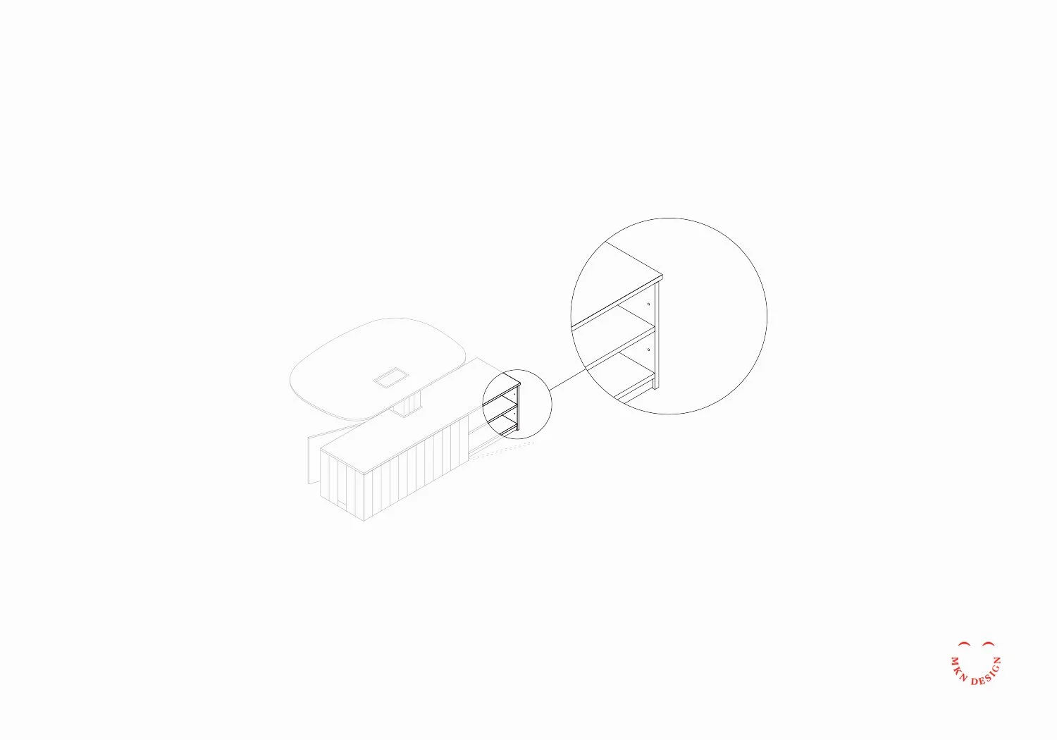
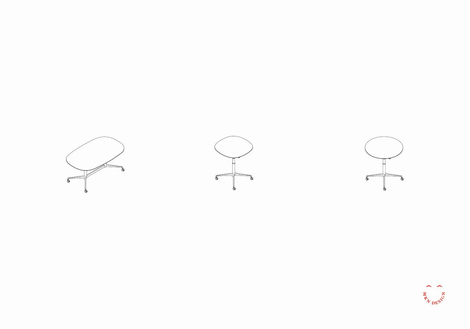
↓ Locale Isometric Illustrations
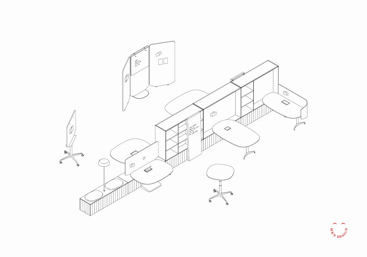
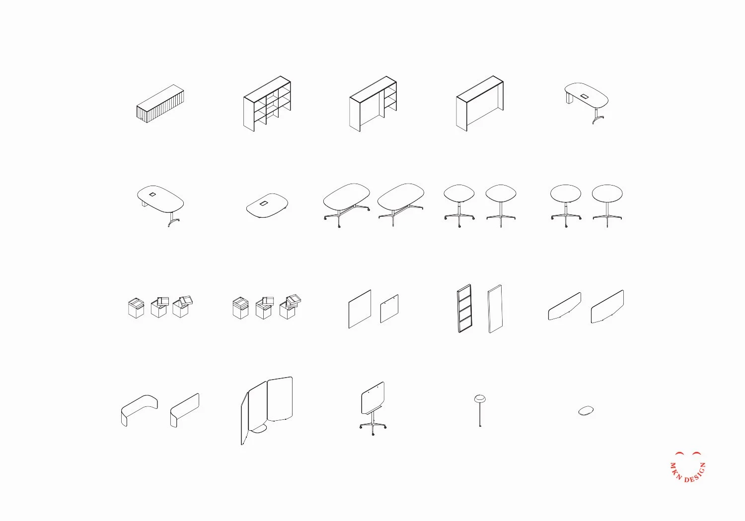
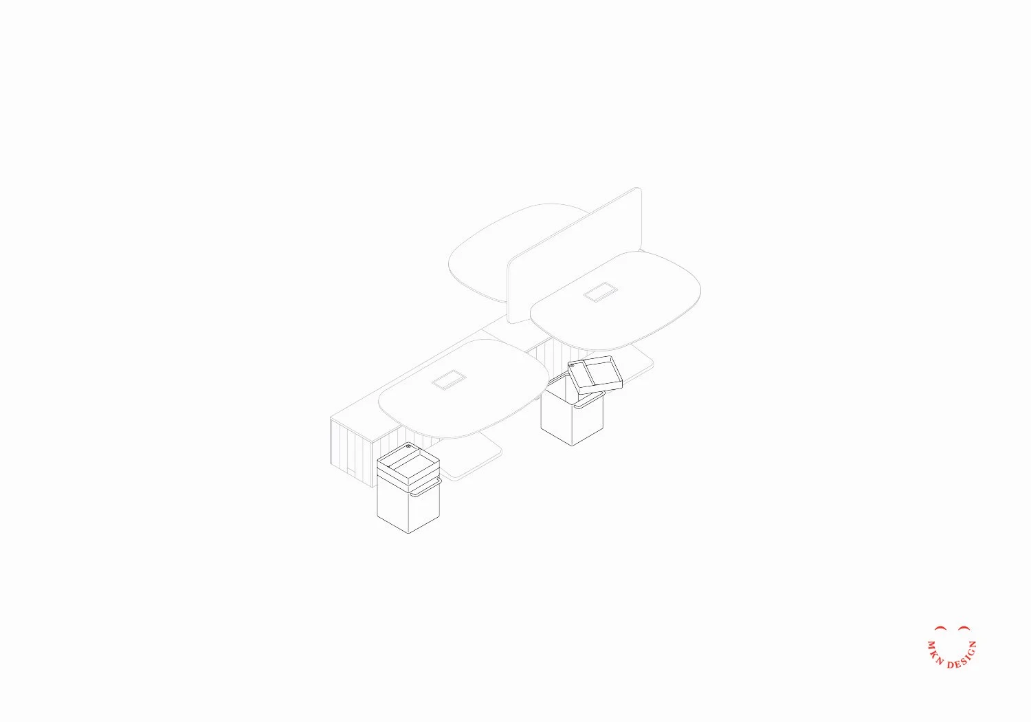
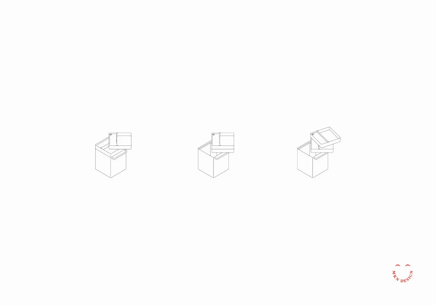
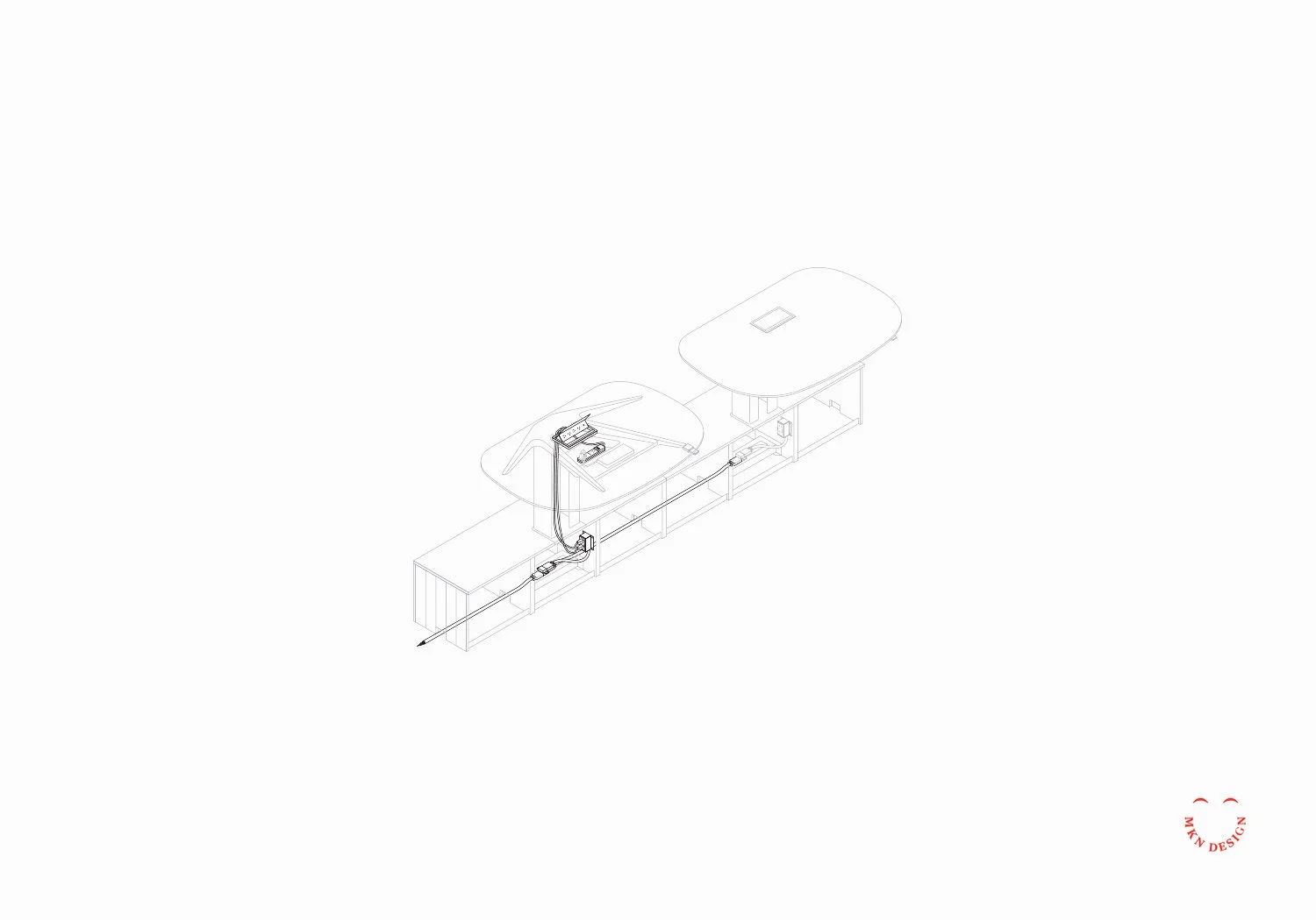
A selection of isometric illustrations from the Locale Planning Guide.

Client Work


Herman Miller – Planning Guide System Design
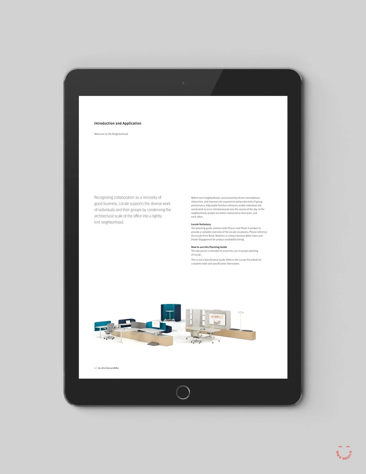
To support Herman Miller’s vision for an accessible and scalable planning resource, we were brought in to redesign their product planning guides from the ground up.

Informed by focused research, UX insights, creative exploration, and stakeholder input, the work moved into development. Over the next two years, I worked with three product development teams to define requirements, understand their product lines, create a flexible framework, and design layout concepts paired with a refined isometric illustration style.

Each planning guide required custom product illustrations paired with copy and callouts, all maintained consistently across the system. Categories such as storage, desking, screens, displays, tables, and accessories were represented with multiple illustration types—including product views, detail views, planning views, and electrical diagrams—complete with callouts and dimensions. Across each guide, over 300 isometric and plan view components were created to ensure comprehensive and consistent representation.

The redesigned framework refreshed MillerKnoll’s planning guides, enhanced search functionality, and introduced a clearer, more intuitive layout. The final implementation delivered a user-friendly, easily navigable, and scalable guide, accessible across electronic devices, with the added ability to download and print PDFs.

“Michael’s collaboration, creativity, and design expertise elevated the planning guides, creating a user-friendly system with clear layouts, comprehensive visuals, and a flexible framework that works across product lines.”

Marketing Manager
MillerKnoll


Remarker – Brand Identity


Client Work


Remarker – Brand Identity
Collaborating with Sung Yi via Carambito I assisted with developing a logo and defining the aesthetic of his notebook. Through thorough research, it became evident that the logo needed to embody both the notebook’s simple sophistication and resonate with its intended audience. The outcome was a logo that conveyed individuality and simplicity. The logos freehand script mimicked a fluid motion of pen meeting paper. Crafted to be comfortably handheld, this product provides effortless access to personalized index cards that perfectly align with users’ needs.

Crafted to securely hold index cards, with future adaptability to accommodate cell phones. Users can choose from a variety of custom-designed index card options to suit their needs, including Blank, Dot Grid, Line Grid, Isometric Grid, Idea Card, Lined, Time Tracker, Task List, Hourly Task List, and Storyboard.

Notebook Dimensions:
• Closed Notebook: 5¼" x 3⅞"
• Open Notebook: 5¼" x 7¾"


Herman Miller – Iconography Design System


Client Work


Herman Miller – Iconography Design System
Led the Workplace Knowledge Team at Herman Miller (presently MillerKnoll) in the development and design of an iconography system pivotal in delineating crucial research methodologies within their workflow. These icons were not only instrumental in establishing definitive research practices but also needed to adhered to Herman Miller's strict brand guidelines.


Sustainable Research Group – Brand Identity


Client Work


Sustainable Research Group – Brand Identity
Following a decade of expansion, SRG’s logo no longer aligned with the organization’s aspirations. Collaborating closely with the leadership I gathered key insights informing what the brand could be. Based on these insights, a fresh trajectory emerged—one aimed at broadening expertise, enlarging the customer base, and refining market focus. The bold new approach reflects an innovative impression of sustainability and boasts confidence, strength, and leadership. The rebrand extended to stationery brand standard guidelines.


HON, Brand Collateral Design System


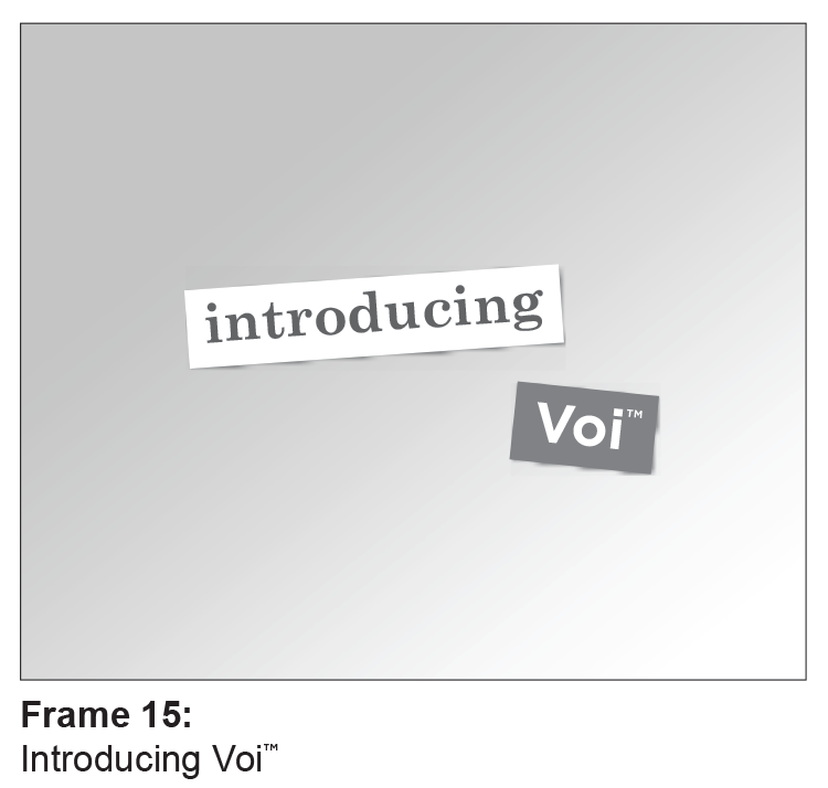
↑ Storyboard Sequence
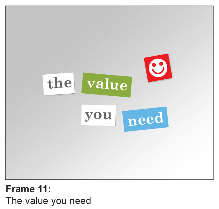
Voi Promotional Video, Magnetic Poetry

↑ Product Wordplay
Playing with two HON products names, Boda and Jetty. Work smarter with Yoda, conquer tasks with Yetti.

FYI, these didn’t make the cut.

Client Work


HON, Brand Collateral Design System
During my time at Peopledesign, I contributed as a designer to the development of creative materials for HON. My role encompassed a wide range of responsibilities, from conceptualizing social media campaigns and creating storyboards to planning and art directing photoshoots, as well as overseeing the print production of HON’s extensive product catalog. Every project was a collaborative effort, carefully crafted to align with the unique needs of HON and support their sales team effectively.


Atmosphere – Air Purifier Model


Client Work


Atmosphere – Air Purifier Model
We collaborated with Alticore on developing marketing collateral for their Atmosphere Air Purifier. Partnered with the Atmosphere marketing team to create a realistic 3D model that supported: Illustrative imagery for product collateral and Animated visualization showcasing the air purification process. The 3D model was crafted in 3D Studio Max and rendered using V-Ray, while the animation was produced in Adobe After Effects.


Turnstone – Brand Identity & Design System Collateral


Client Project


Turnstone  Brand Identity & Design System Collateral
Following a series of internal shifts, Turnstone found their brand outdated and disconnected from their customer base. A relevant change was needed to resonate with the emerging demands of smaller businesses and startups. Equally important was to show that their products could grow with them and still have the quality and longevity as other furniture brands in the industry. I was a member of the design team responsible for creating a revitalized brand and integrating the new brand across various communication channels, including advertising, product catalogs, brochures, and website improvements.


CAT Footwear


Client Work


CAT Footwear
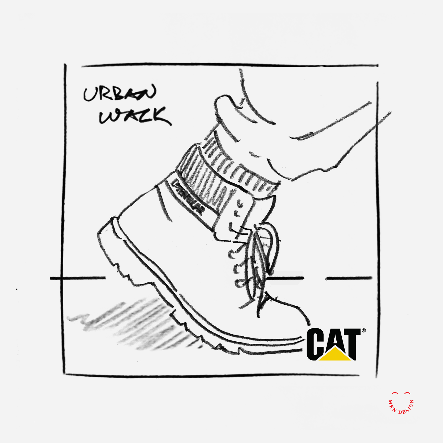
While employed at Designvox I helped create the photography concept direction for Cat Footwear. Cat Footwear is a renowned brand recognized for its rugged and durable footwear designs, built to withstand tough environments and provide exceptional comfort and protection. With a legacy rooted in craftsmanship and innovation, Cat Footwear continues to be a go-to choice for individuals seeking reliable footwear for work and leisure alike.

The selected photography approach showcased consumers wearing CAT's footwear, focusing specifically on their CAT boots as they engaged in various activities within diverse environments. This concept resonated with our clients, aligned with consumers, and fit the demographics without being overtly masculine or feminine. 

This project faced a distinctive challenge, CAT footwear had been successfully manufacturing high-quality construction boots for 20 years, primarily catering to masculine construction workers. However, new customer demographics emerged, as women and teenagers began to purchase their rugged boots. Armed with this information, I produced some of the photography concept directions.