St. Joseph City Hall


Client Work


St. Joseph City Hall
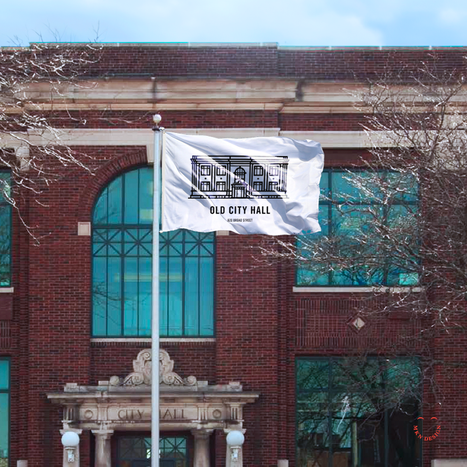
Thesis is a design agency nestled in St. Joseph, Michigan, their process is embodied in their name and distinctive approach. Collaborating with a diverse clientele spanning from startups to Fortune 100, they craft innovative solutions tailored to each client's needs. Among their clients was Old City Hall, the very building that housed their business. Thesis approached me to lend a hand with their branding endeavor.

I was asked to develop a minimalist illustration of the Old City Hall. The subsequent work was completed by Thesis and integrated into comprehensive branding system and wayfinding signage for the building.


Nook Real Estate


Client Work


Nook Real Estate
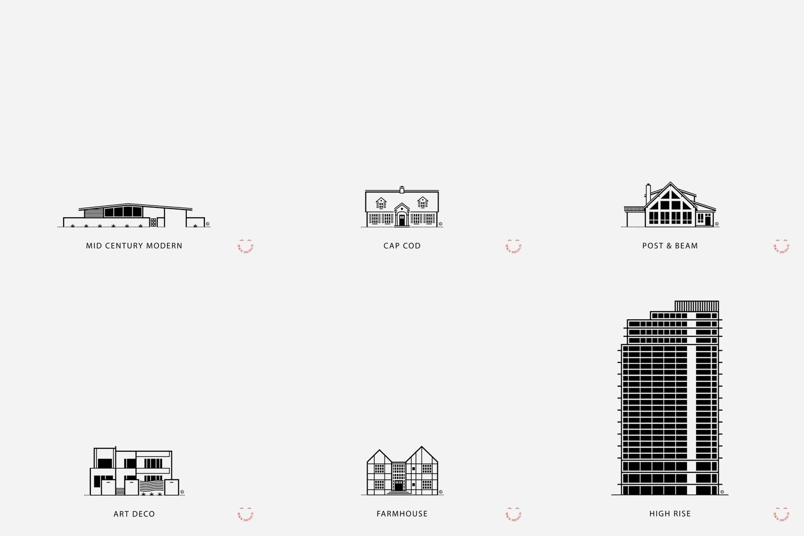
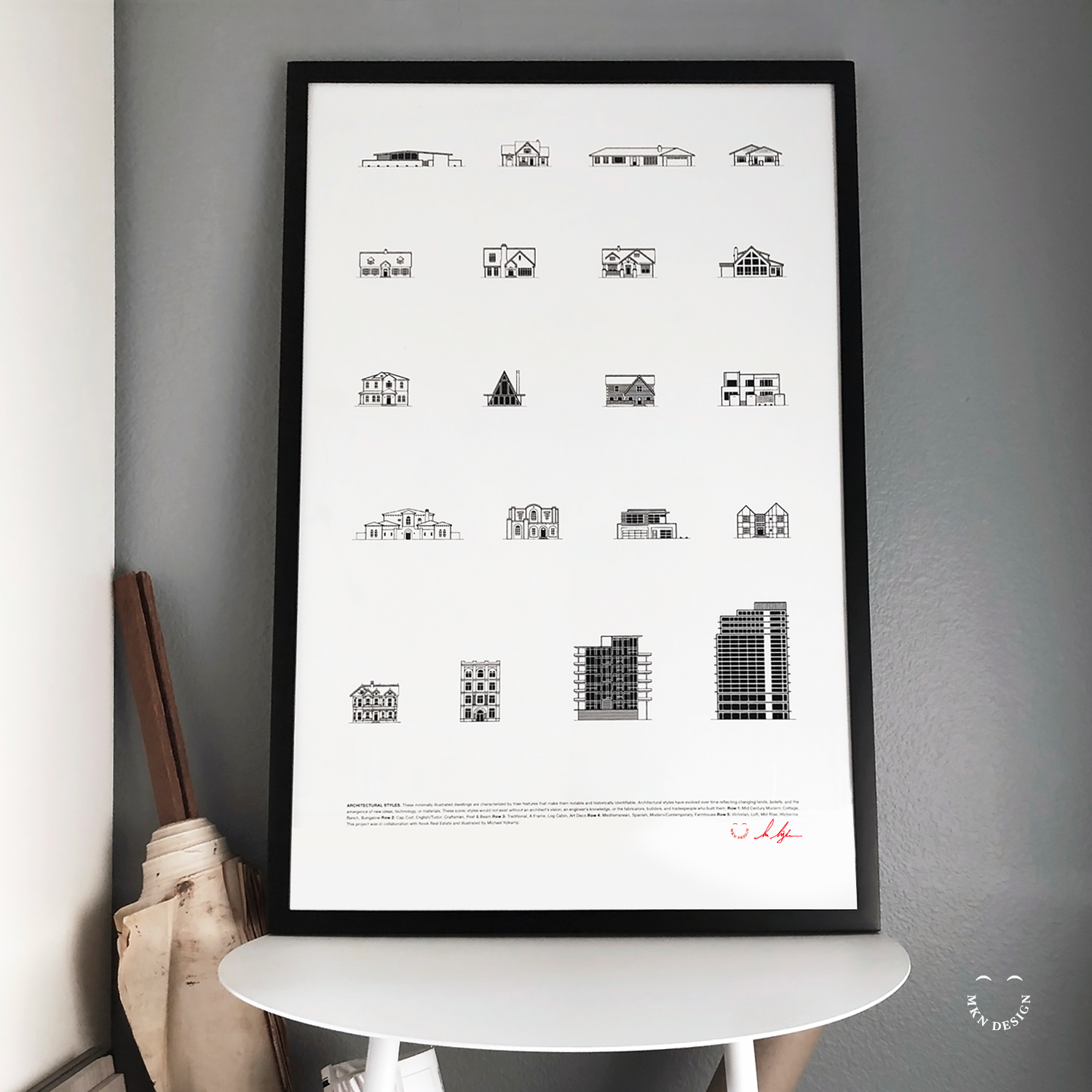
Nook Real Estate, nestled in the heart of Newport Beach, California, epitomizes modernity in the realm of real estate. With a team of astute industry leaders, they specialize in handpicking lifestyle properties that captivate discerning buyers. I've was hired by Nook to craft simple illustrations showcasing the diverse architectural styles of California, enriching their marketing arsenal with visual allure.

Employing my minimalist illustrative approach, I visually captured 20 distinct architectural styles. These illustrations were subsequently compiled into a poster, presenting a comprehensive showcase of the diverse spectrum of architectural designs found in Newport Beach, California.


SpartanNash – Corporate Responsibility Report


Client Work


SpartanNash – Corporate Responsibility Report
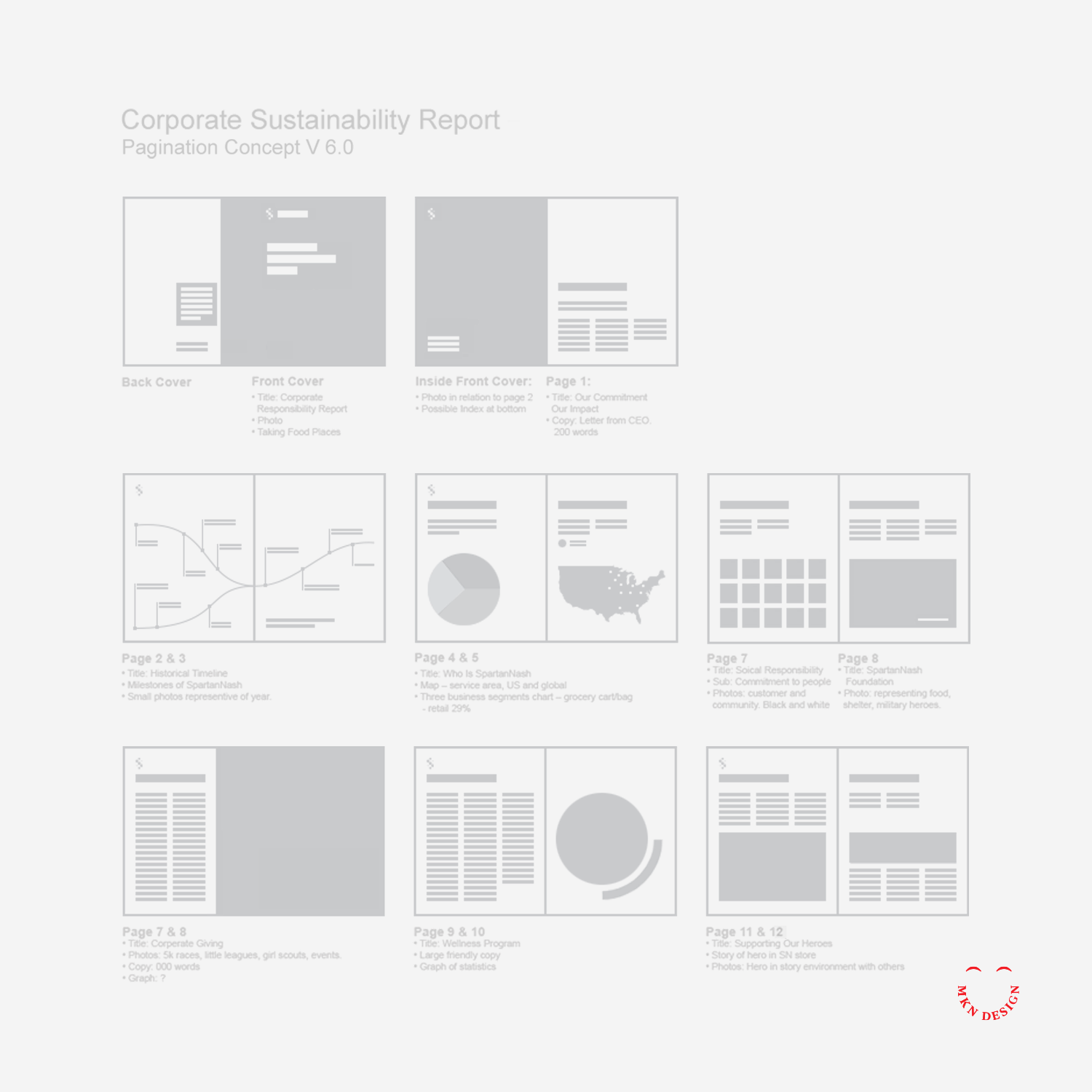
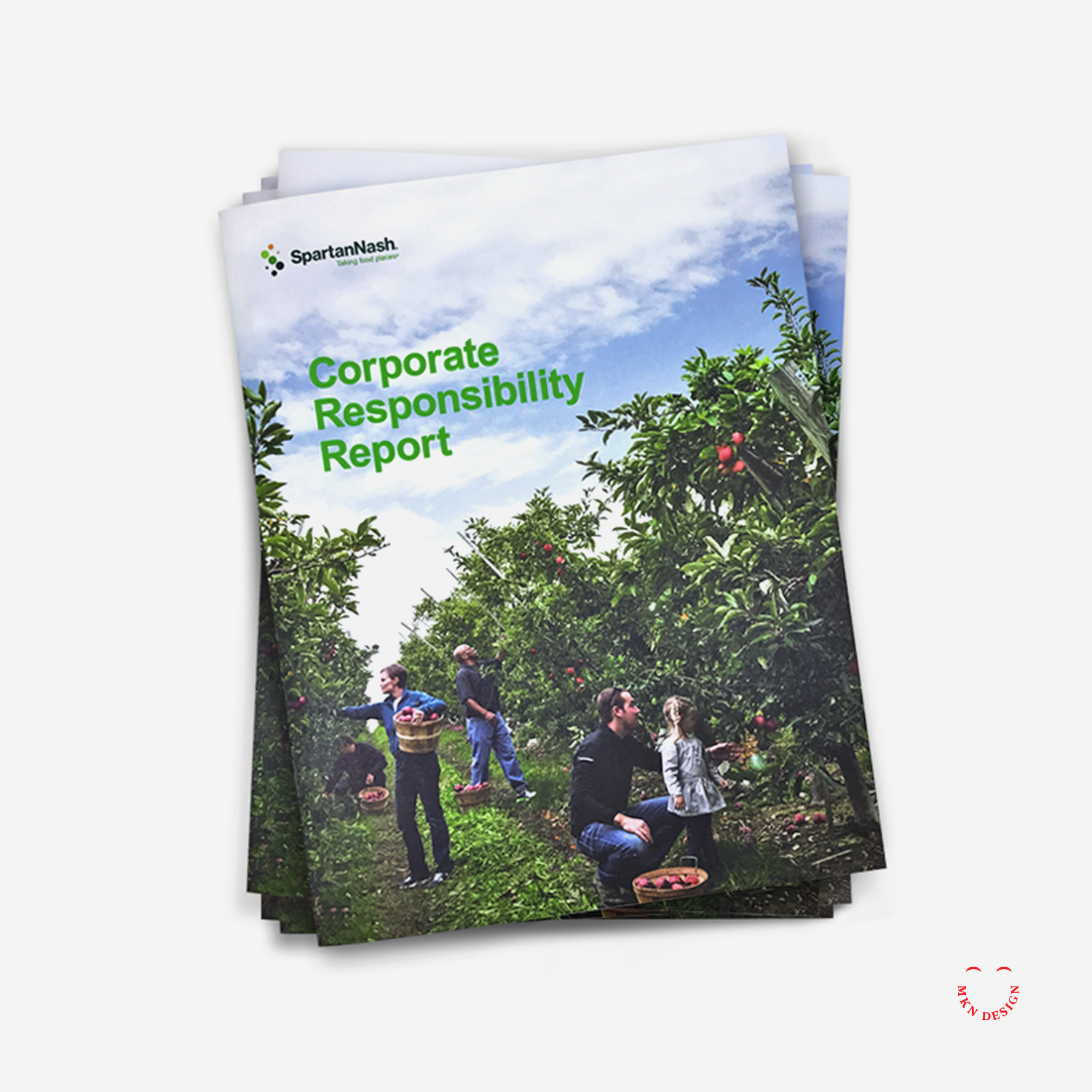
Headquartered in Michigan, SpartanNash is the largest food distributor in the U.S., serving independent grocers, military commissaries, and corporate-owned retail stores across 44 states. With a responsibility to communicate their impact at scale, we partnered with their marketing team to direct, develop, and design a 36-page corporate responsibility brochure.

Serving as design director, I led the process to the development and design of the report, highlighting SpartanNash’s core values, diverse capabilities, community engagement, and commitment to environmental responsibility through a strategic combination of copy, visuals, design, and infographics.

Following a guided design process, I reviewed and analyzed SpartanNash’s areas of social and environmental responsibility, shaping each section to tell the story of their sustainable journey. By integrating storytelling with design, we connected their core values, capabilities, and community efforts into a cohesive narrative.

The final brochure brought SpartanNash’s story to life, combining compelling visuals, informative infographics, and clear, engaging design to communicate their achievements and initiatives. Serving as both a visually engaging and practical reference, it reinforced the company’s commitment to sustainability, community, and corporate responsibility, resulting in a comprehensive and impactful sustainability report.


Religion & Liberty – Rebrand & Magazine System Design


Nonprofit Client Project


Religion & Liberty – Rebrand & Magazine System Design
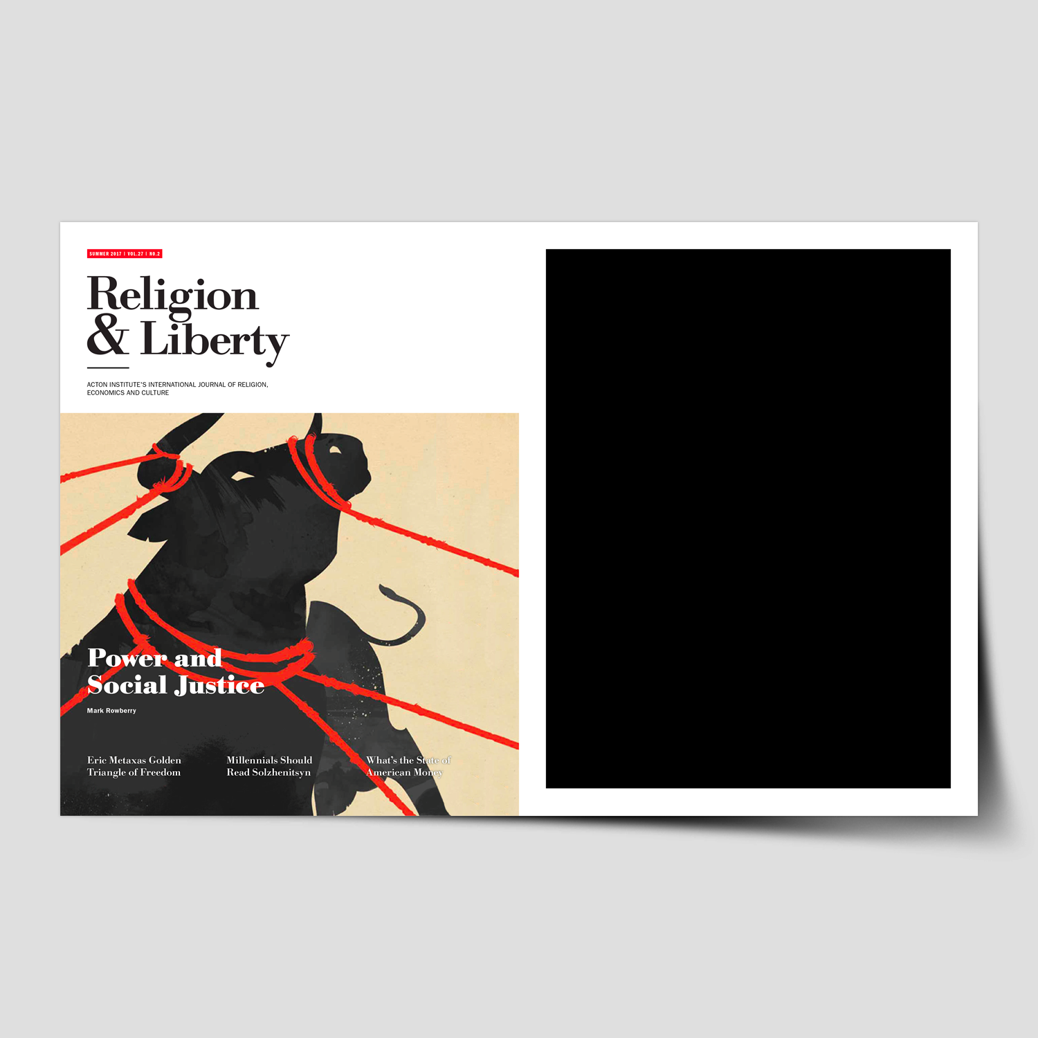
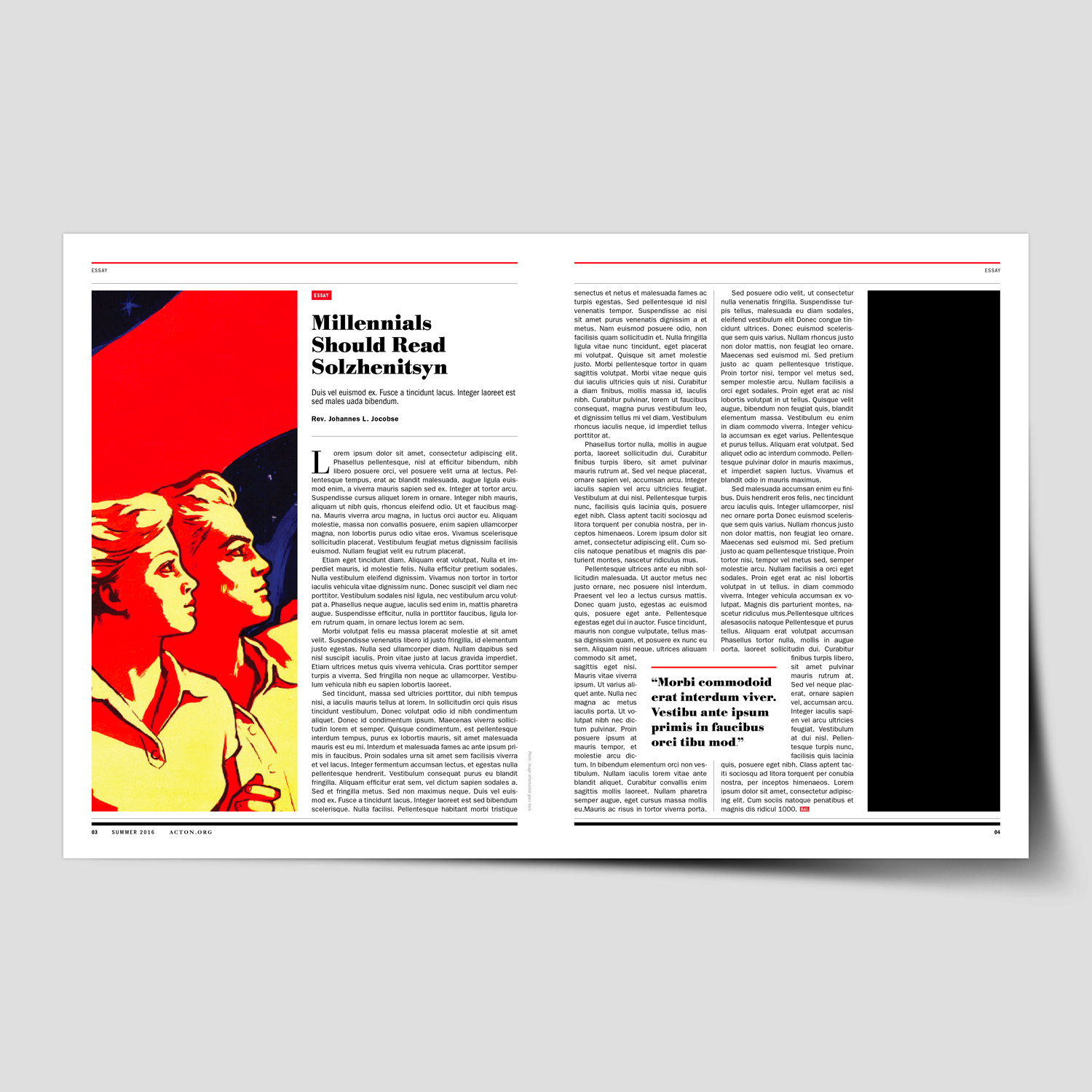
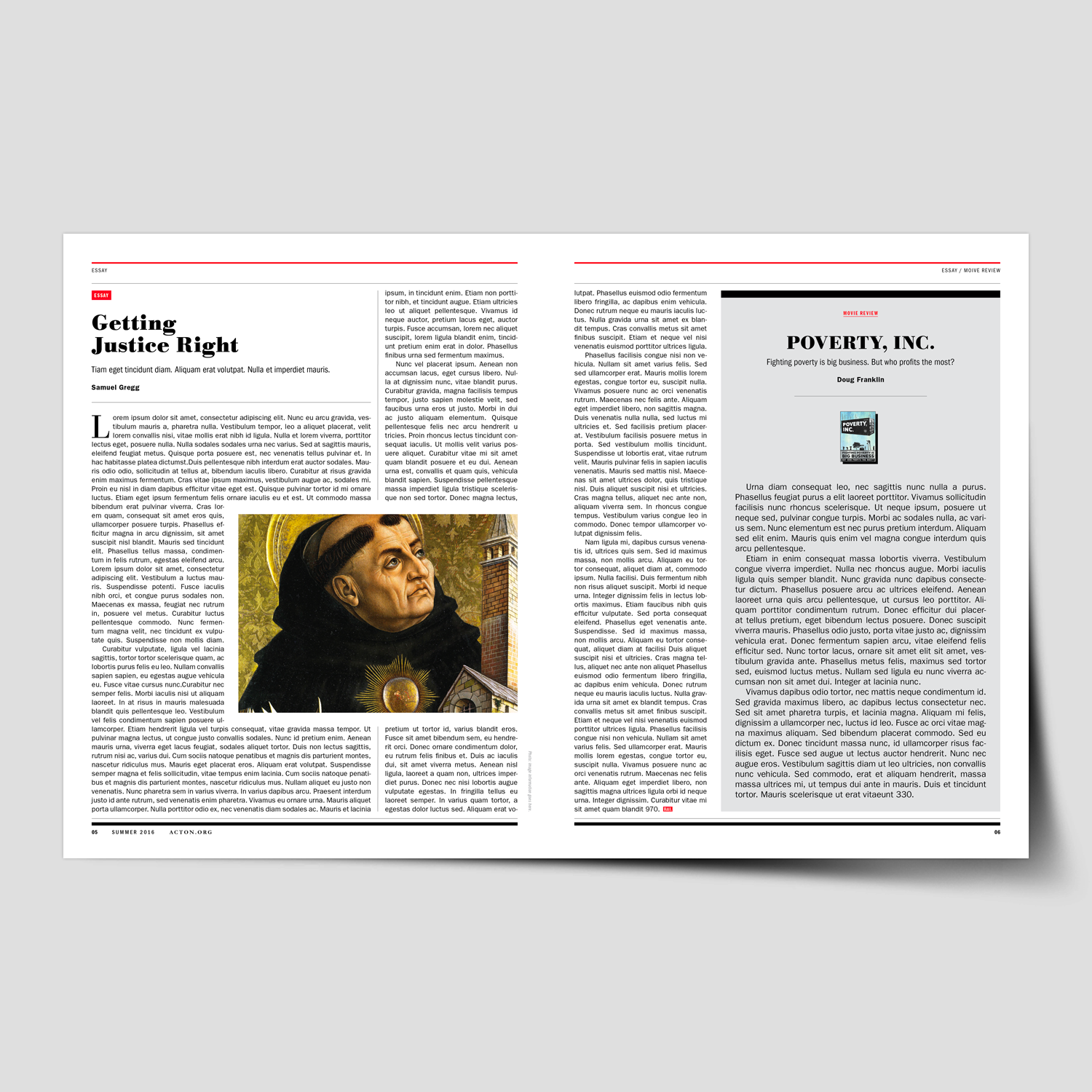
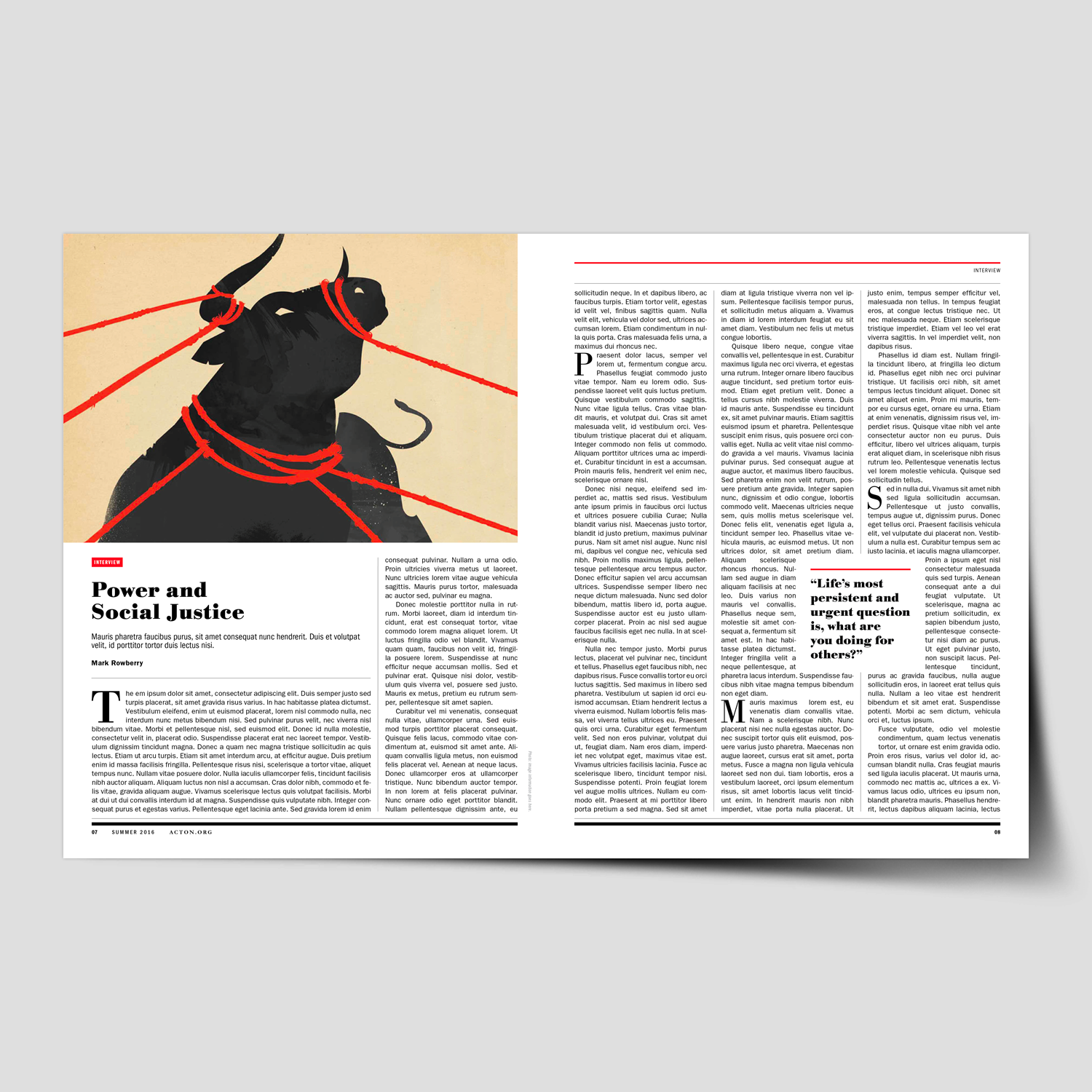
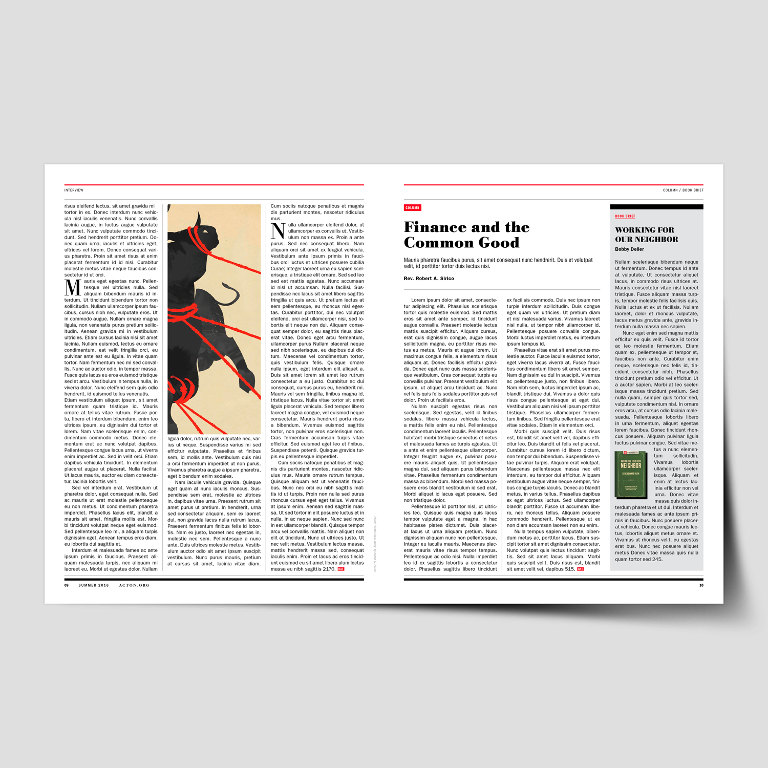
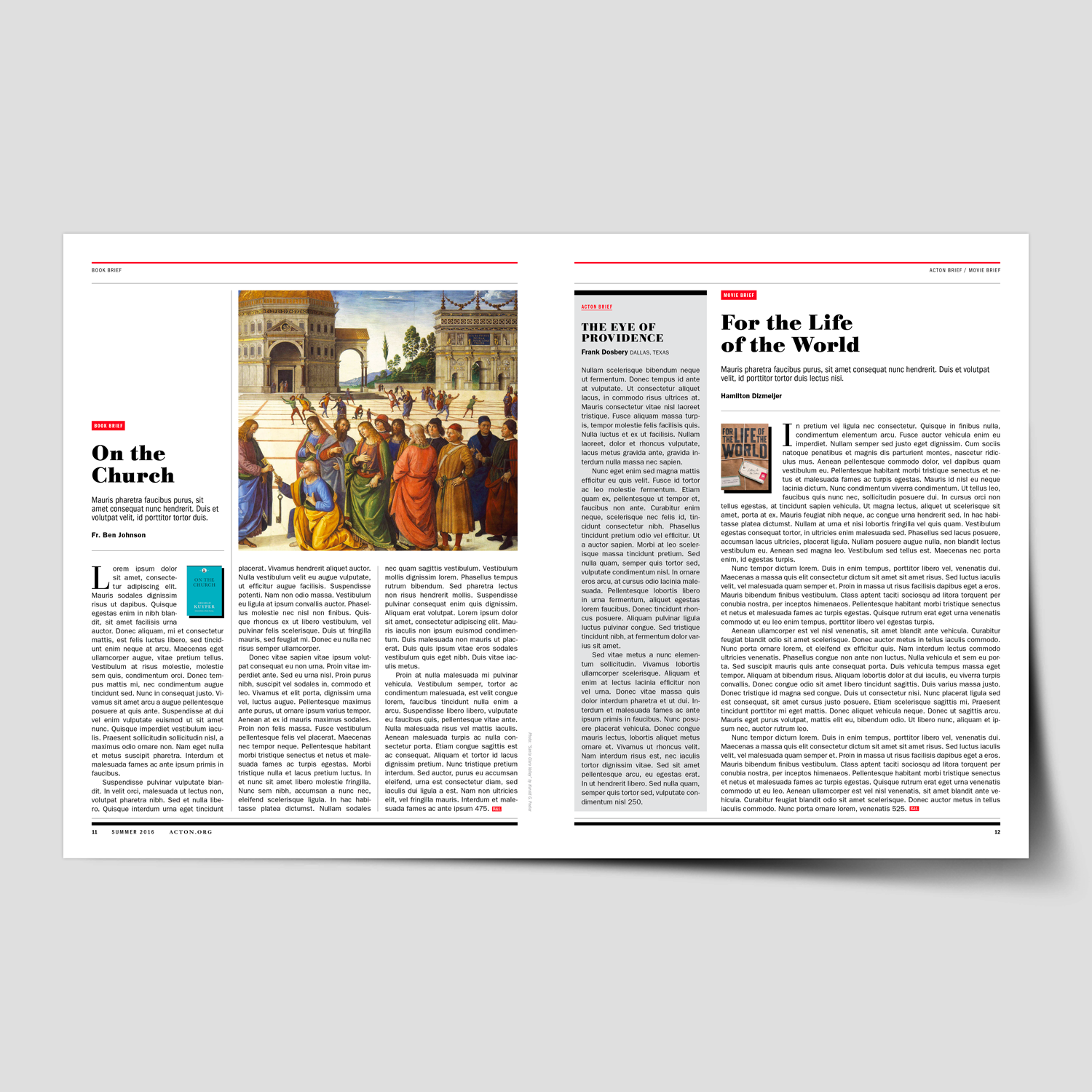
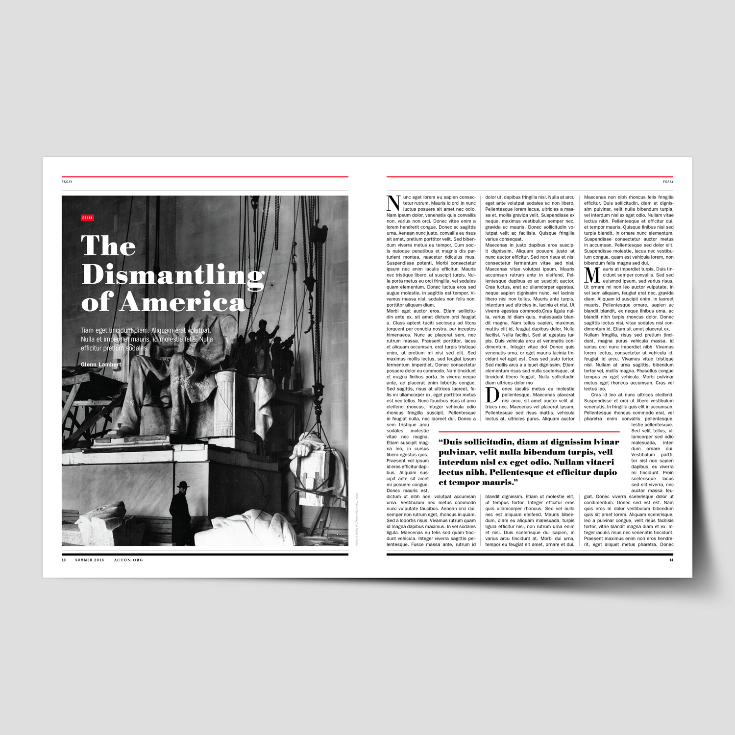
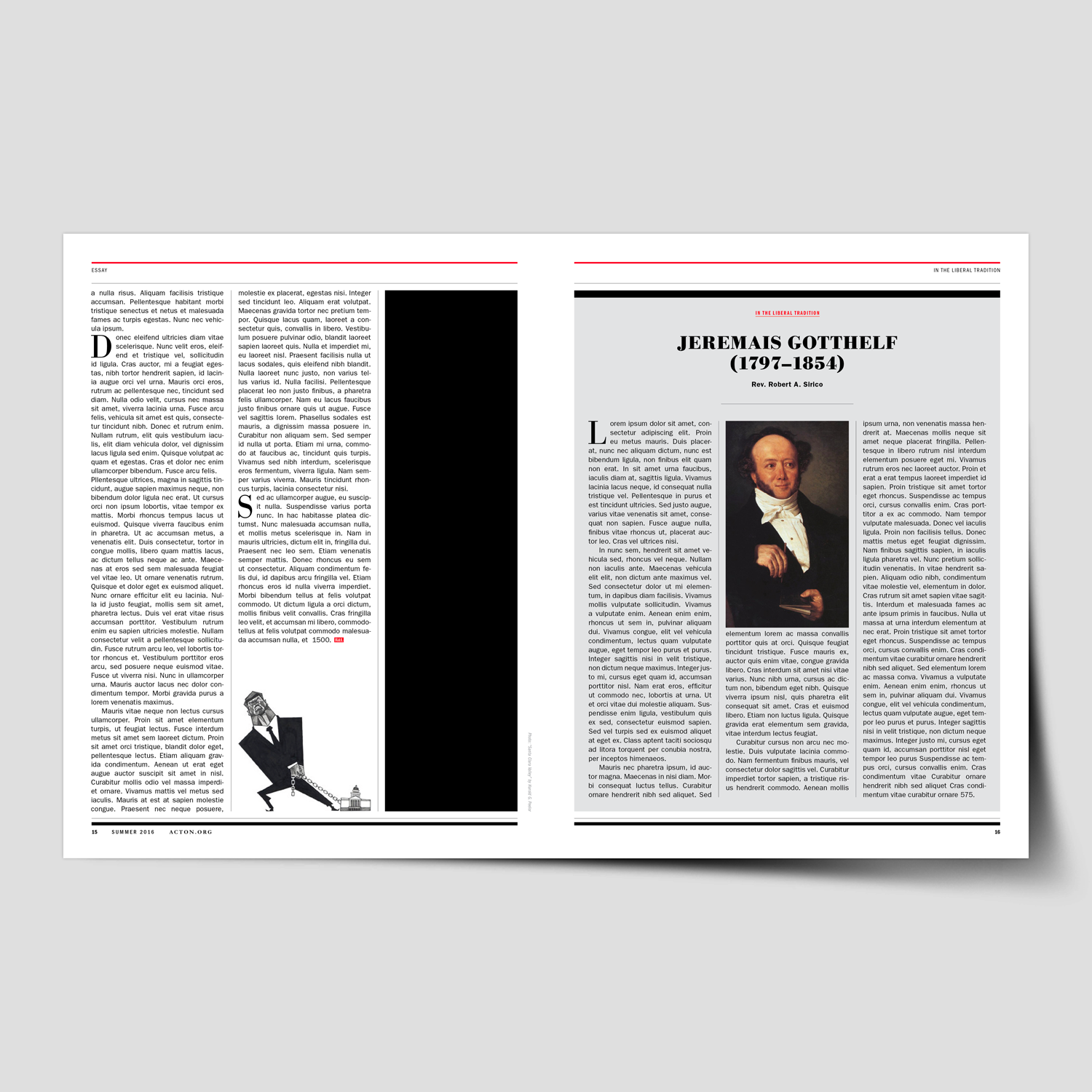
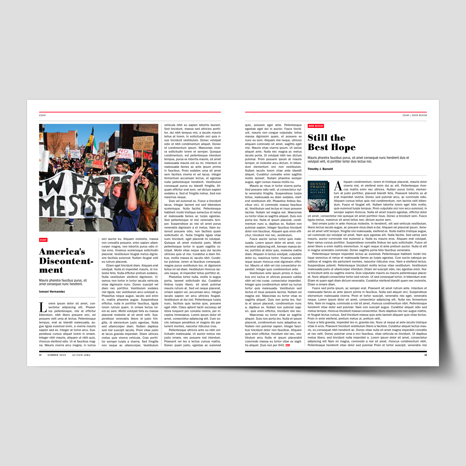
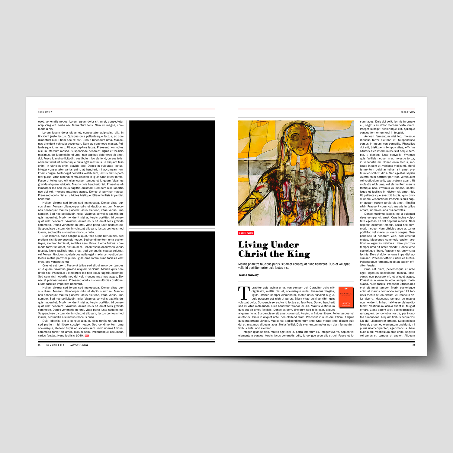
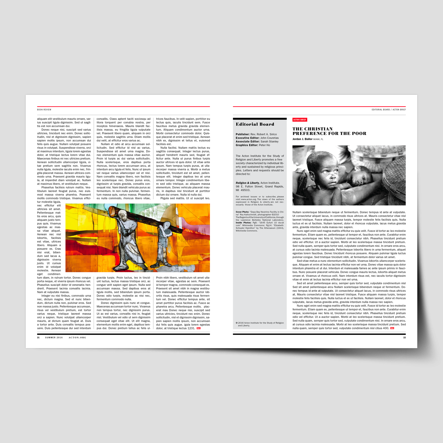
We helped Religion & Liberty magazine rebrand and develop a comprehensive system design for the Acton Institute’s quarterly publication. This six-month initiative focused on modernizing the magazine while establishing a flexible and cohesive framework to guide future issues.

This project began with a full evaluation of the magazine’s existing structure, visual language, and editorial needs. Through extensive planning, research, and collaboration with Acton’s editorial team, we identified opportunities to improve clarity, storytelling, and brand alignment while creating a system flexible enough to support a wide range of content.

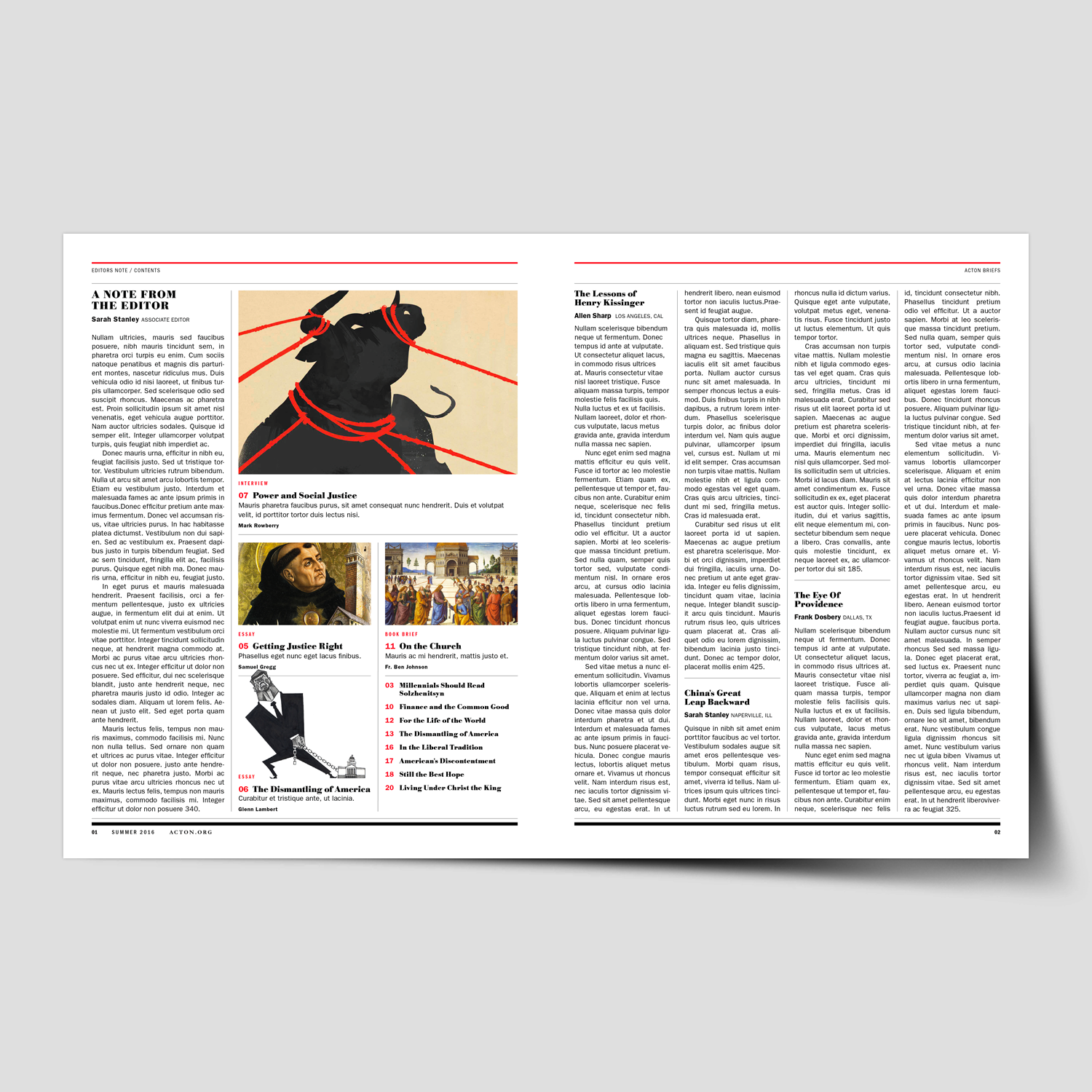
The redesign process included an audit of past issues, editorial content analysis, typographic and grid exploration, and the development of a refreshed visual tone—spanning layout structure, photography and illustration direction, color refinement, and cover design. The result was a comprehensive editorial system built around forty distinct layout templates.

To support long-term consistency, a detailed design and layout toolkit was created, equipping the internal team with clear guidelines for typography, spacing, imagery, recurring features, and decision-making. The outcome delivered a magazine that feels contemporary, readable, and distinctly aligned with the Religion & Liberty vision—while significantly improving workflow efficiency for their editorial staff.


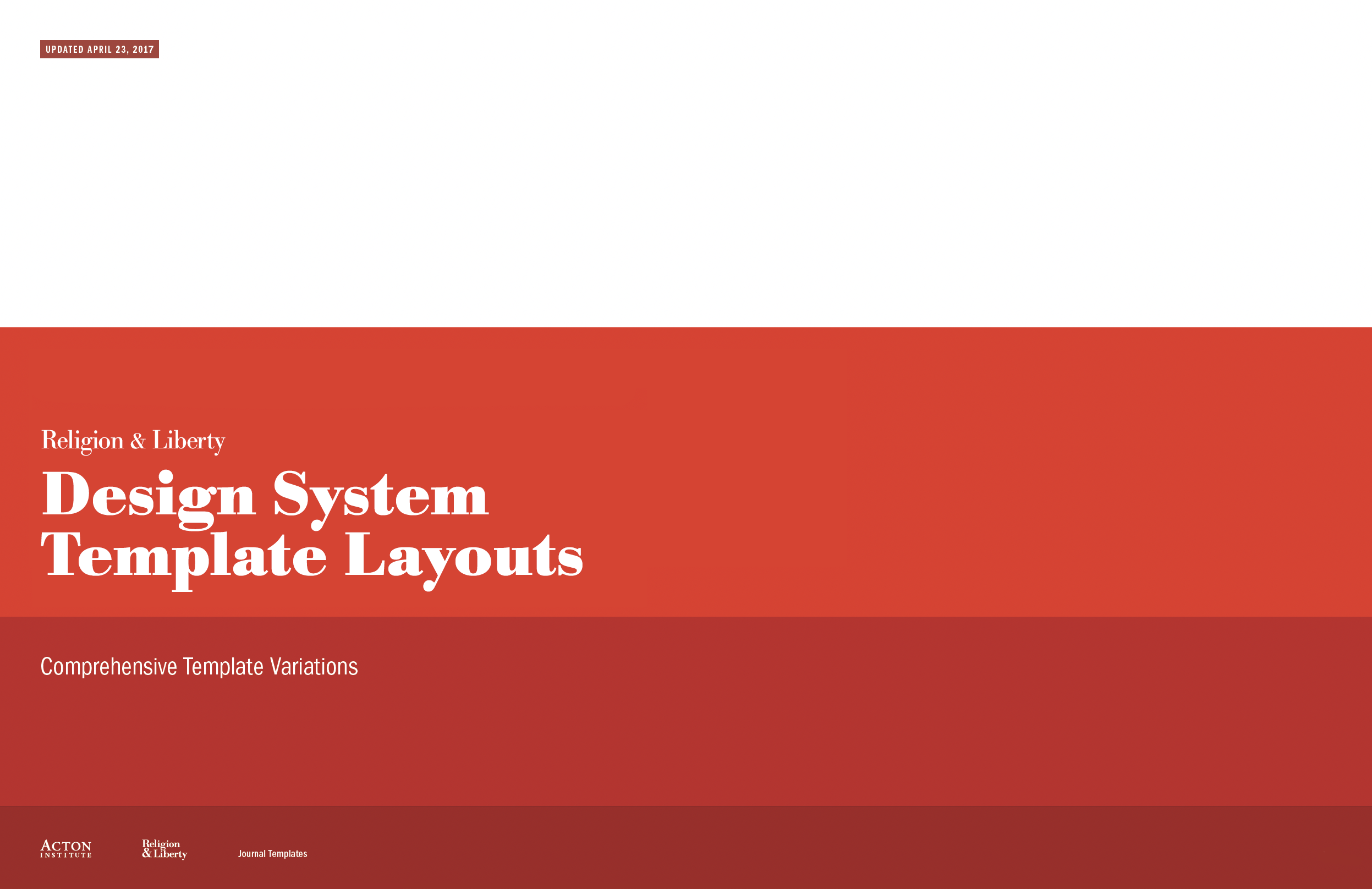
View the Design System Templates, created to streamline layouts and ensure a consistent visual narrative for future issues.

“It’s rare to come across someone as talented and easy to work with as Michael. We hired Michael to redesign one of our most important publications, Religion & Liberty. The project was incredibly difficult from the start as we didn’t have a clear picture of what we were looking for. Michael was extremely patient and methodical, working closely with us, so we could come up with a concrete plan of execution together. He took special care to understand the needs of the organization as well as the readers, so the final product would be ideal for all audiences. He created a polished publication that holds its own against mainstream magazines.”

Sarah Stanley
Managing Editor, Acton Institute


Herman Miller Threads – Portrait Illustrations


Client Work


Herman Miller Threads – Portrait Illustrations
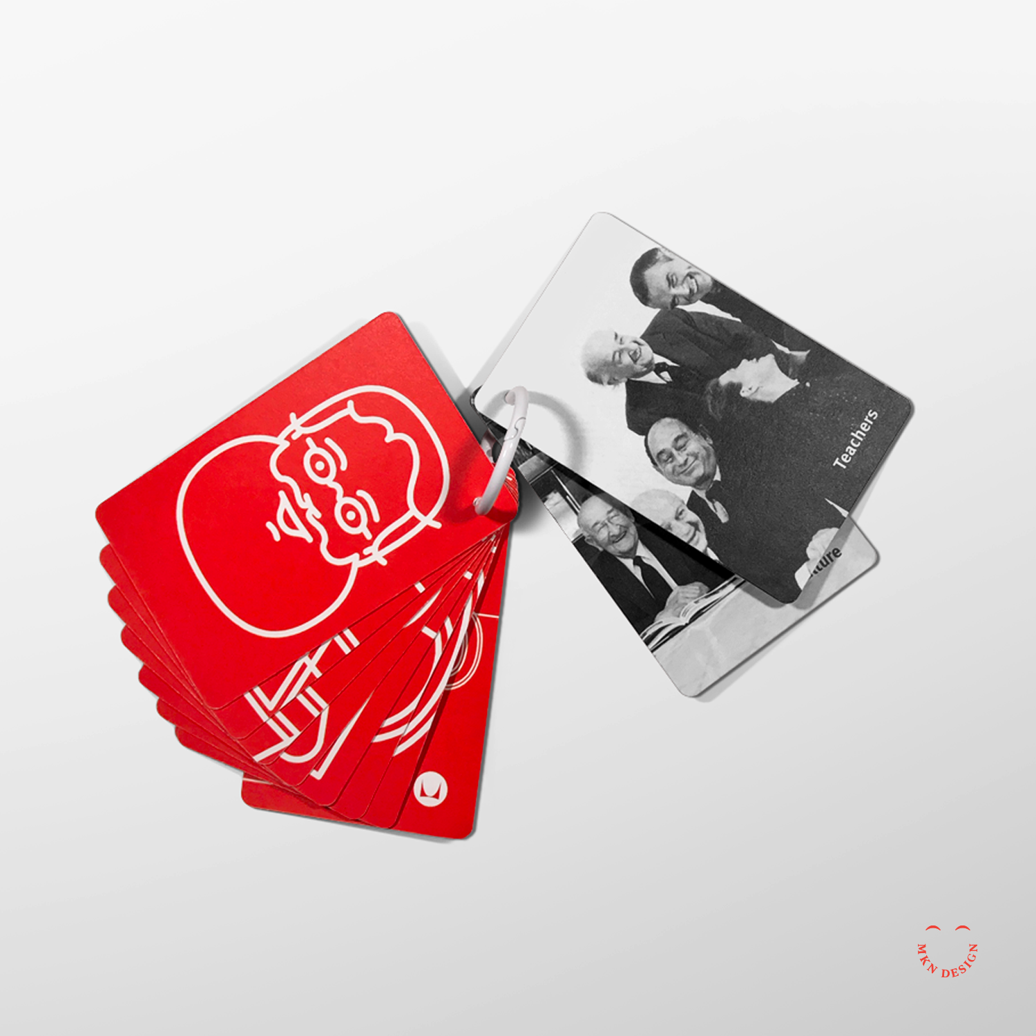
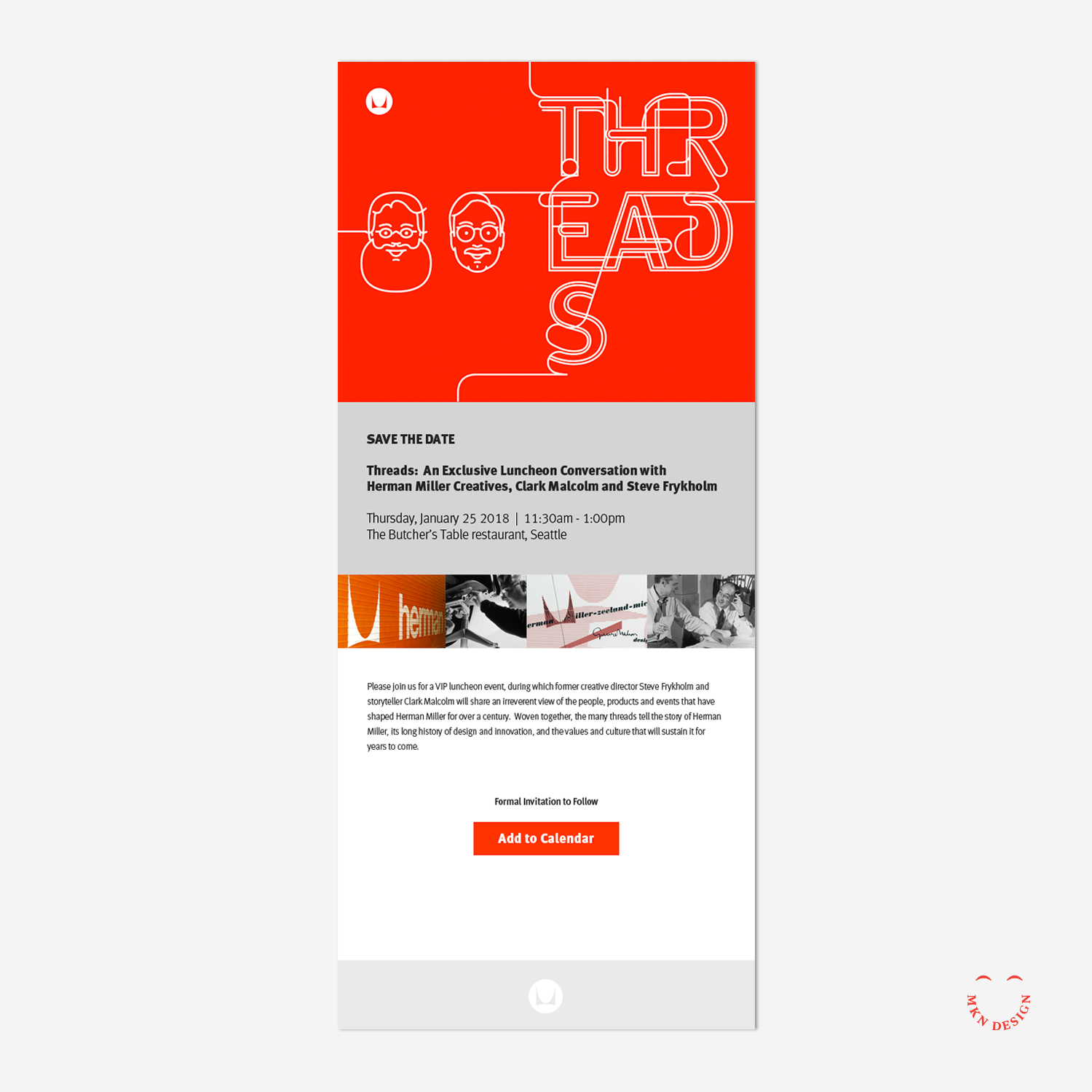
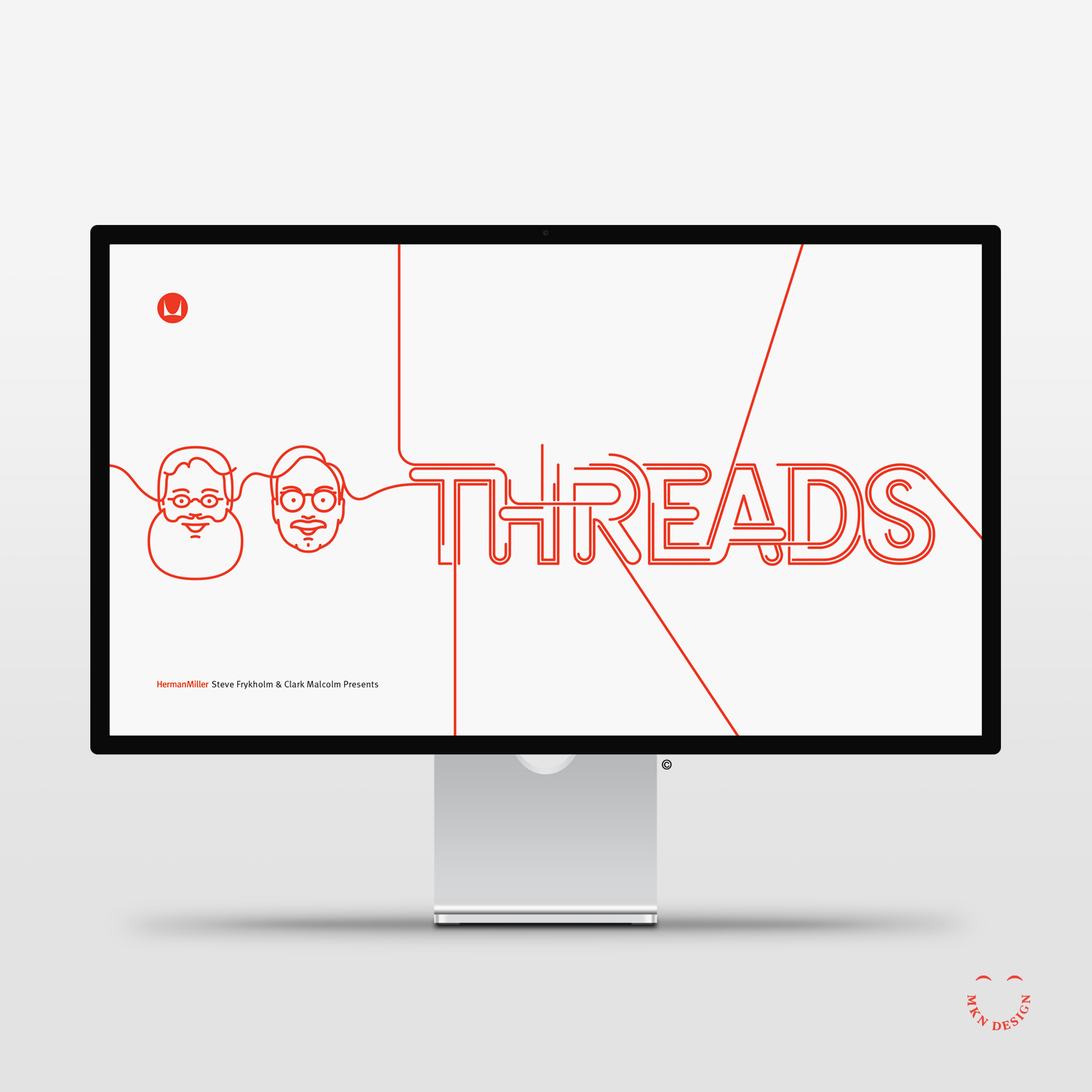
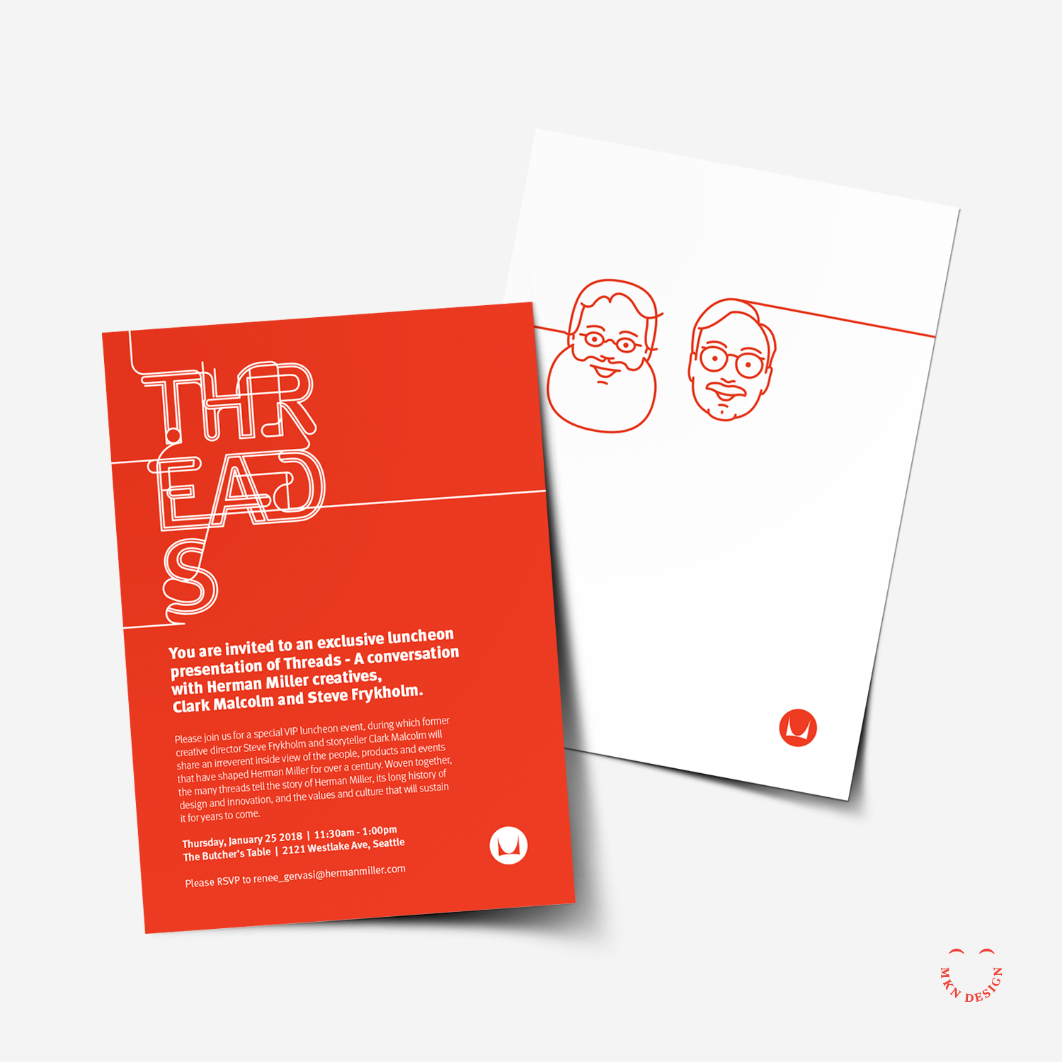
At the heart of the furniture manufacturer's legacy lies its iconic pieces and the visionary designers behind them, such as Alexander Girard, and Ray and Charles Eames. "Threads" is a presentation and conversation lead by former graphic designer Steve Frykholm and writer Clark Malcolm. They weave Herman Miller's rich history of design innovation, its embrace of new ideas and talents through captivating narratives that shaped Herman Miller's 111-year journey. Because of my illustrative portrait line style, I was commissioned to create illustrations tailored to complement the theme of "threads."

Because of my former work in simple line portraits and having already completed a portrait of Steve, I was approached to create a portrait of Clark. These portraits were seamlessly woven into promotional and presentation materials, tailored to complement the theme of "Threads."


Merchandise Mart – Architectural Illustration


Client Work


Merchandise Mart – Architectural Illustration

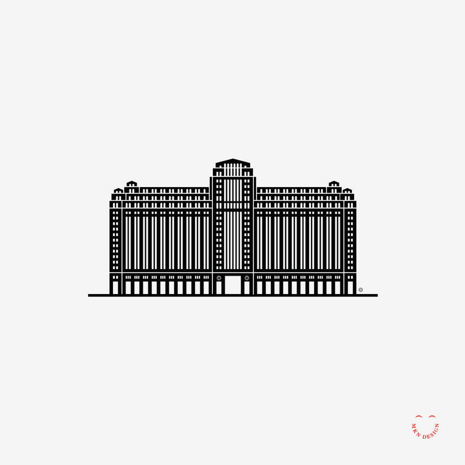
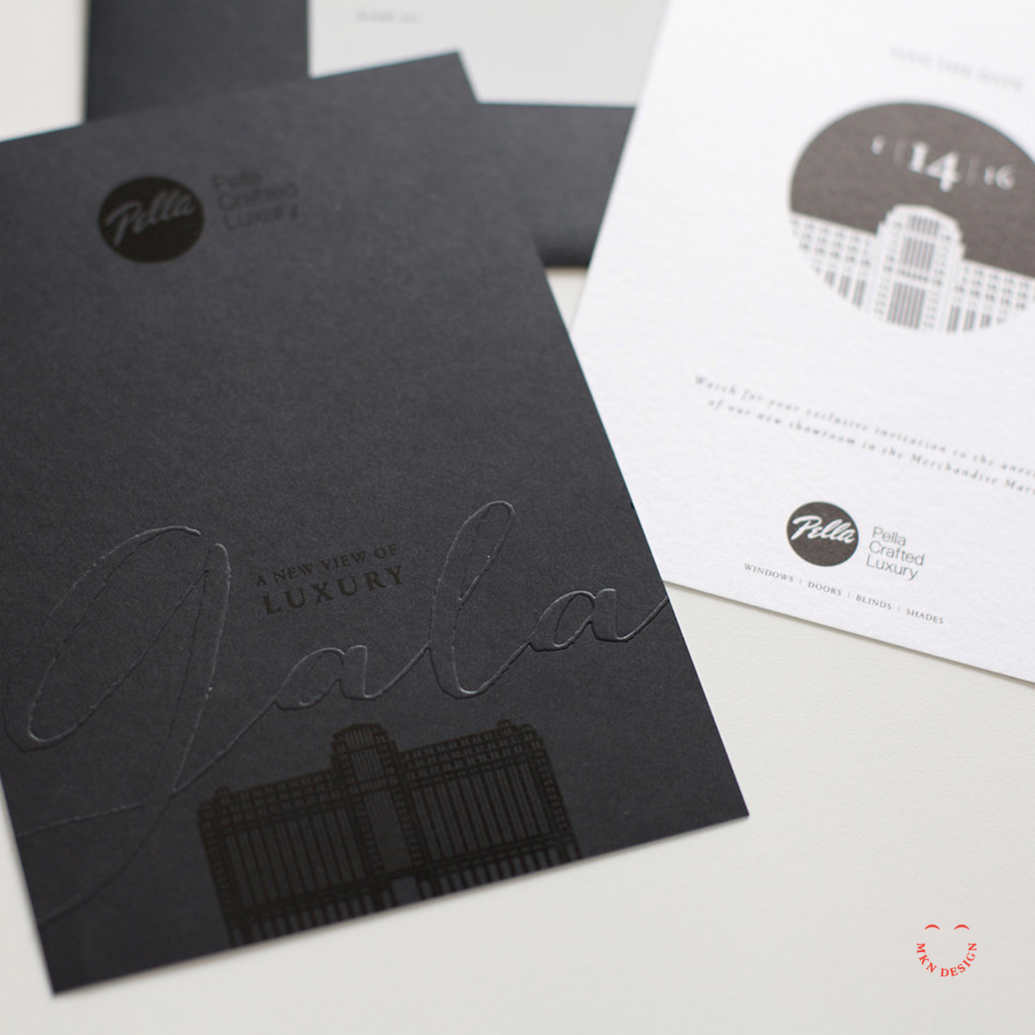
I was approached by The Integer Group to license the minimalist Merchandise Mart illustration I created several years prior. The iconic illustration was used for promotional and invitation materials for the grand opening of Pella Windows' new store front, Pella Crafted Luxury in Chicago, Illinois.


Good To The Bone


Nonprofit Client Project


Good to the Bone

Invited by AIGA, West Michigan to design a fun graphic for Design For Good participants. I came up with this quirky illustration, Good to the Bone. The Design For Good is a three-day event for dedicated to helping non-profits in creating design assets that align with their business and mission.


Steelcase – Showroom Illustrations


Client Work


Steelcase – Showroom Illustrations
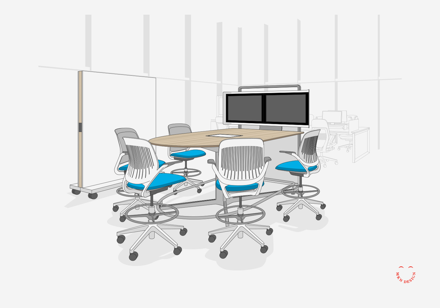
We produced a series of 23 environment illustrations for Steelcase’s showroom in Los Angeles. Each illustration originated from an interior scene within the showroom and was divided into three distinct layers to emphasize its significance within the space. These layers were comprised of the primary products rendered in full color, the background environment delineated with gray lines, and the showroom's architectural framework presented in gray.


Case Study No.8 – Architectural Illustration


Client Work


Case Study No.8 – 
Architectural Illustration
Thesis is a small and experianced design agency nestled in St. Joseph, Michigan, their process is embodied in their name and distinctive approach. Thesis approached me with a request to acquire a license for the Eames House illustration I had created several years ago.

Thesis utilized the Eames House illustration I created by having it letterpressed and using it as a gift for their clients.


E-Spring – Infographic Illustration


Client Work


E-Spring – Infographic Illustration
Collaborated with the Amway eSpring and Detergent Design to develop a collection of illustrative materials. These visuals were designed to assist the sales team to effectively communicate the water journey—from water sources to household water taps. Furthermore, the illustration was repurposed into a video articulating the significance of eSpring’s pivotal role at the end of the water journey. This project received an AAF Addy award.


CANUX Conference Portraits


Client Project


CANUX Conference Portraits
CANUX is an annual design, UX, and technology conference held in Canada’s historic capital, Ottawa, featuring engaging speakers from around the globe. I was commissioned to create portraits for the keynote speakers in both 2014 and 2015. Notable speakers included Aaron Draplin of DDC, Abby Covert of the IA Institute, and Louis Rosenfeld of Rosenfeld Media. The portrait style has evolved over time, building on techniques developed in an earlier project called Facebook Friends. This progression and my approach to simplifying the illustrative style were highlighted in an article written for the conference, which also explores my creative background.


CanUX Conference


Article


CanUX Conference
This article was originally published on October 2014 by CanUX which provided a background about myself and the process creating the speaker avatars.


Meet Michael Nÿkamp
Michael is an designer and illustrator born and raised in Ontario Canada, his only complaint (politely filed, of course) is that there are never enough pencils in the office.

The product of a tiny hamlet in Southern Ontario, called Nelles Corners, Michael is Dutch by blood but as Canadian as they come. One of seven children, Michael spent his days frolicking through the wide open spaces of the family farm. That’s right, Michael was not only one of seven, he frolicked; deal with it.  When he wasn’t out and about in nature, he could usually be found holed up in the house watching his favorite shows “The Friendly Giant” and “Simon in the Land of Chalk Drawings.”

Michael loved to draw and create from a very young age and couldn’t understand why something artistic wasn’t incorporated into every class in school. He just knew math and science would be so much better with a little drawing or painting mixed in. He carried this certainty and love through grade school and high school and settled into Illustration, and New Media Design at Sheridan College.

After working in Toronto for several years, Michael met a beautiful Michigander and left his homeland for West Michigan. He worked at several design firms in Grand Rapids before going out on his own, “I was exhausted from trying to play the political game and do the design work” Nÿkamp says.

Michael has combined his experience, direction, design, and illustration to create mkn design. Michael regularly works with companies of all shapes and sizes, be they profit or non-profit, e.g., Herman Miller, Steelcase, Thesis:, and Hospice of Michigan. His design and illustration work has been recognized and awarded by Communication Arts and he was recently a finalist for his interpretation of the American Flag on behalf of The University of Baltimore, AIGA Baltimore and AIGA Blue Ridge.

Perhaps because of his Canadian roots or his general pleasantness, Michael is genuinely excited about being a part of his community and creating spaces for other designers and illustrators to connect. He’s a member of the AIGA and IxDA. And as if that isn’t enough camaraderie, Michael is also a member of Citizen Project and a founder of The Illustration League. When he’s not helping with one of these organizations, you might find him volunteering at or attending an event like Design for Good or Midwest UX. Michael is either the world’s most giving individual or too Canadian to say “no” to anyone. He’s not sure which either.

Process and Projects
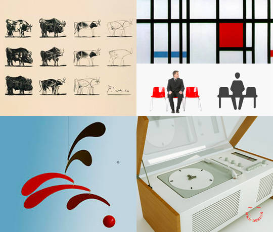
Michael was always drawn to detailed organization and the idea of simplification; “All the blue legos went in one place and the red in another,” Nÿkamp chuckles, “And I still do that with my sons, Emmett and Landon. Throughout my life and education, mentors and teachers showed me that design was a process of simplification we use to create clear and informed pieces through avenues of distillation.” Nÿkamp began seeking out others who exemplified these design ideals and became influenced by works of Picasso, Piet Mondrian, Alexander Calder, Dieter Rams, and Stefan Dziallas. “These people all strive for simplicity and balance in their work and as I began to recognize and understand that, I began to emulate it in my own illustrations and design,” says Nÿkamp.
↑ Left to Right: Pablo Picasso, ‘Bull, plate 1 – 11’;  Piet Mondrian, ‘Composition with Red Blue and Yellow’;  Stefan Dziallas, iconwerk;  Alexandar Calder, ‘Mobile’; Dieter Rams; ‘SK4 Record Player’


“Good designers use this process all the time,” Nÿkamp points out. “Most designers strive to create a solution that is easy and pleasurable. I think about it every time I use my iPhone. The change from iOS6 to iOS 7 and 8 was a real design revolution. The simplicity of it is perfect. Windows 8 utilizes similar principles for their tile interface and it’s pleasant to use. So, whether we’re illustrators or UX designers, I think we’re all trying to recreate a simple, beautiful experience.”
This dedication to balance and simplicity can be seen and felt in Nÿkamp’s Iconified Project. “I started creating these iconified faces as a fun, self-initiated project using my friends from Facebook. Looking at profile photos, group shots, and selfies, I had a ton of material to help me create each individual. I find it difficult to illustrate people I don’t know so I tend to like a lot of background info. Whether it’s Einstein or my best friend, I’m trying to distill their essence into one image and that requires seeing them in a lot of different situations. Nobody is just one thing.”

↑  Art board of mkn design’s iconified process of Einstein’s face

The simplicity of his images belie the time and attention Nÿkamp puts into all of his work. As UX designers, you know you’re always striving to use less and accomplish more; Nÿkamp’s images do just that. Using only a few curves, lines, and dots, he distills the tale of each individual into one, single icon. They say less is more. Well, we think we’d like more of Nÿkamp’s particular brand of less.

↑ Some of MKN Design’s iconified faces, from left to right: Brandon Satterlee of The Forest; Lotta Nieminen; Mallory Bartz of Mutually Human; Steve Frykholm of Herman Miller


This article was written by Mallory Bartz, a writer, performer, and creator. She has strong likes, dislikes, feelings, and emotions about things; especially things that are important to her; but, don’t worry, she is in no way weird.  She currently resides in New York and is a student at the Maggie Flanigan Studio Inc.


Nemschoff Healthcare


Client Work


Nemschoff Healthcare
Collaborated with Nemschoff, the healthcare devision of Herman Miller (now MillerKnoll) to develop healthcare environmental illustrations for their Chicago showroom. Each illustration was designed to convey a visual narrative of how different healthcare environments supported both patients and hospital staff. Moreover, these illustrations were crafted to mirror the layout of their showroom at the Merchandise Mart in Chicago, serving as an informative and insightful guide for visitors to understand each application. 


Midwest UX – Conference Experience Design


Nonprofit Client Work


Midwest UX – Conference Experience Design
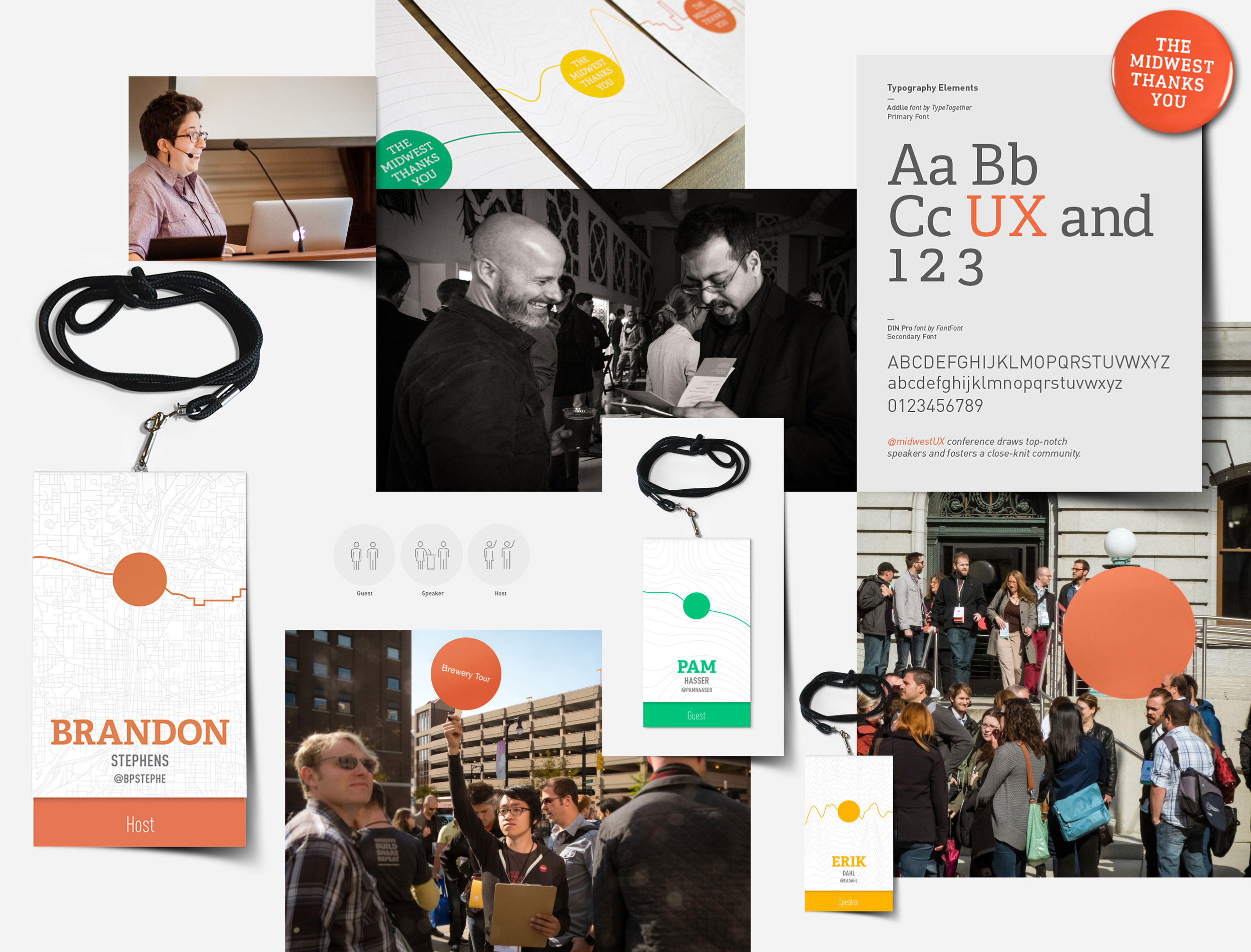
As the Creative Lead and a creative team we partnered with Midwest UX to craft the creative vision for their three-day conference in Grand Rapids. Leading the creative team in the development and design of key visuals, environmental graphics, and digital touchpoints, we created a cohesive experience that reflected the theme of “Place” and highlighted the city’s culture and character.

Guided by the theme, I directed the overarching visual identity that shaped every aspect of the attendee experience. I oversaw the development of key visuals and their application across a comprehensive range of assets, including badges, wayfinding systems, environmental graphics, videos, website design, apparel, and social media content. By defining the conference’s visual language through clear assets and guidelines, I ensured the brand was applied consistently across all touchpoints, creating a cohesive, intuitive, and immersive experience for more than 500 participants for workshops, talks, and keynotes.

Beyond execution, we had the opportunity to showcase what Grand Rapids has to offer, integrating local culture, gastronomy, and context into the conference experience. I collaborated closely with the Midwest UX board, conference board, sponsors, and vendors to ensure alignment between design, logistics, and user experience, balancing creative vision with practical considerations. The resulting design system strengthened the conference brand, enhanced participant engagement, and left a lasting impression on both attendees and the broader UX community.