
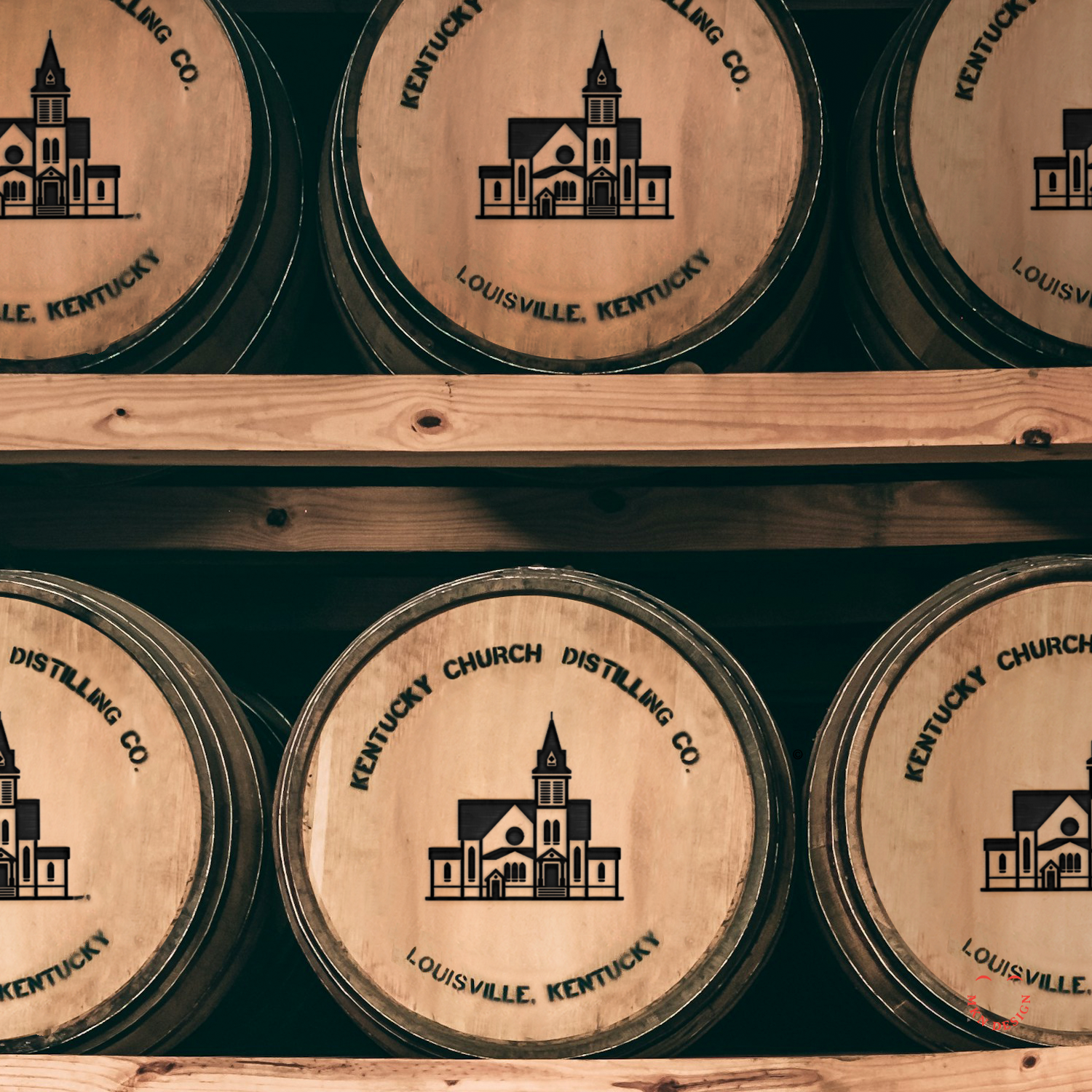
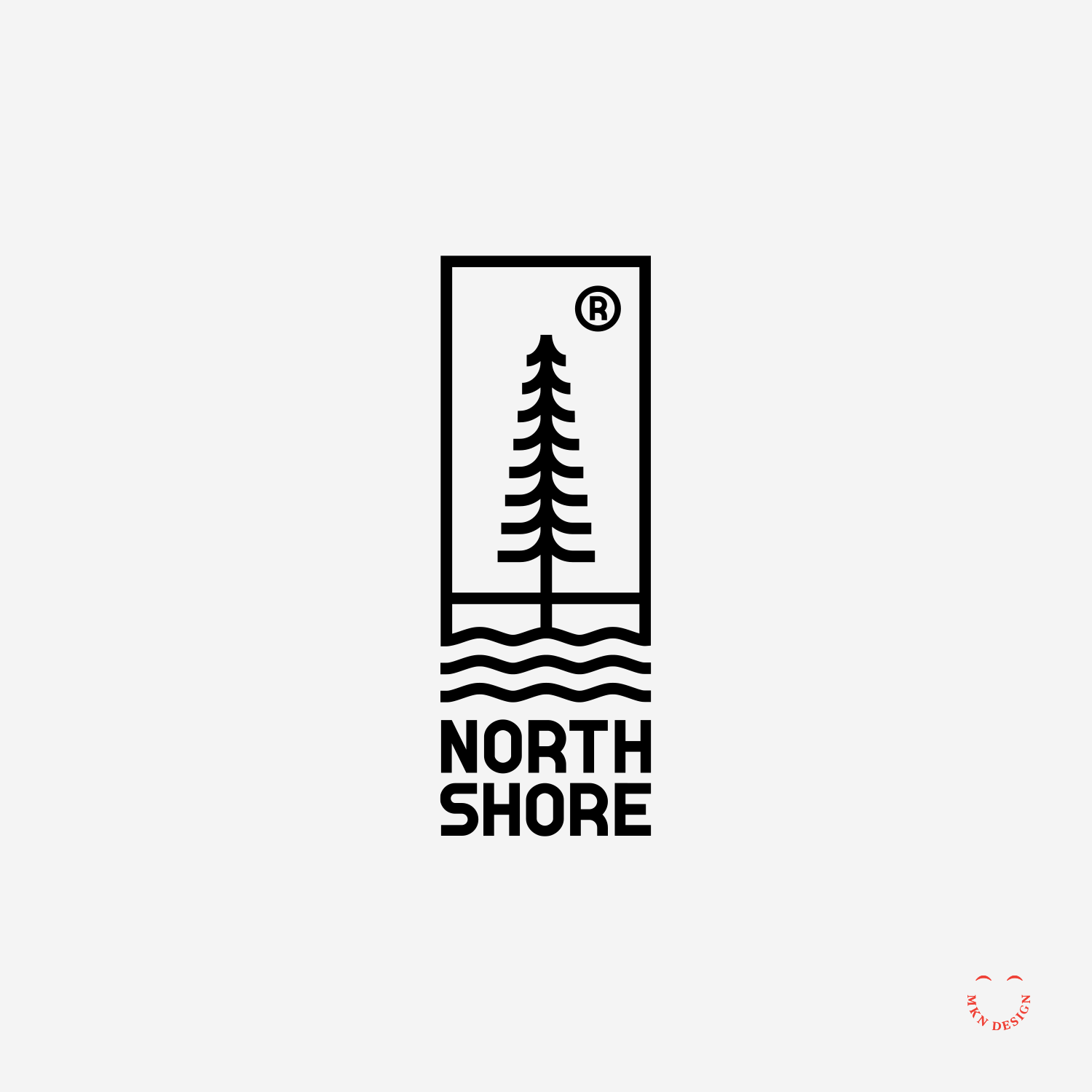
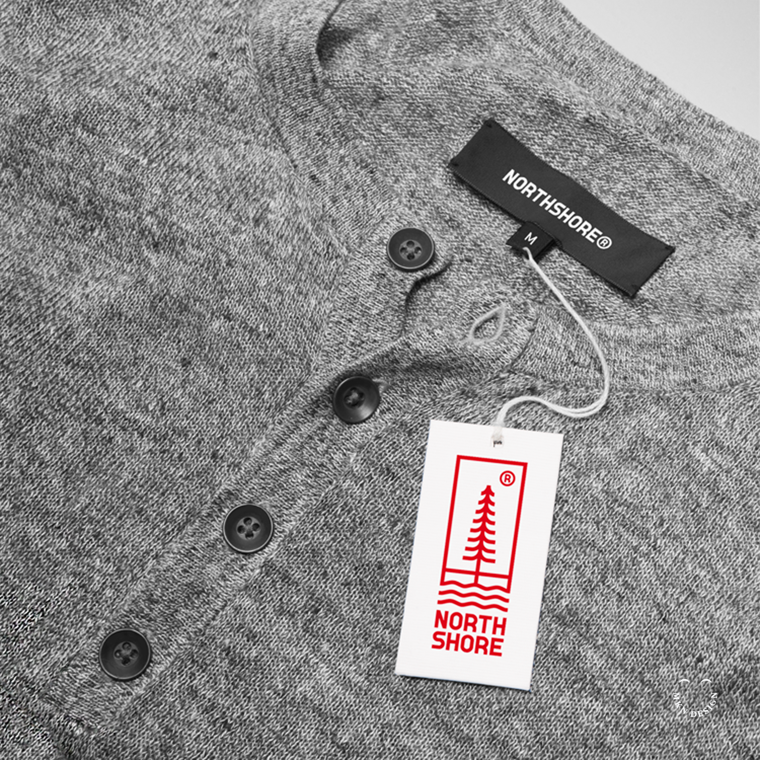
Independent Work
Independent Work

Independent Work
Client Work
Boon & Caro Sheridan
+ Architectural Illustration
+ Sketching & Ideation
MKN Design Team:
+ Michael Nÿkamp, Illustrator
Stakeholders:
+ Boon Sheridan
+ Caro Sheridan

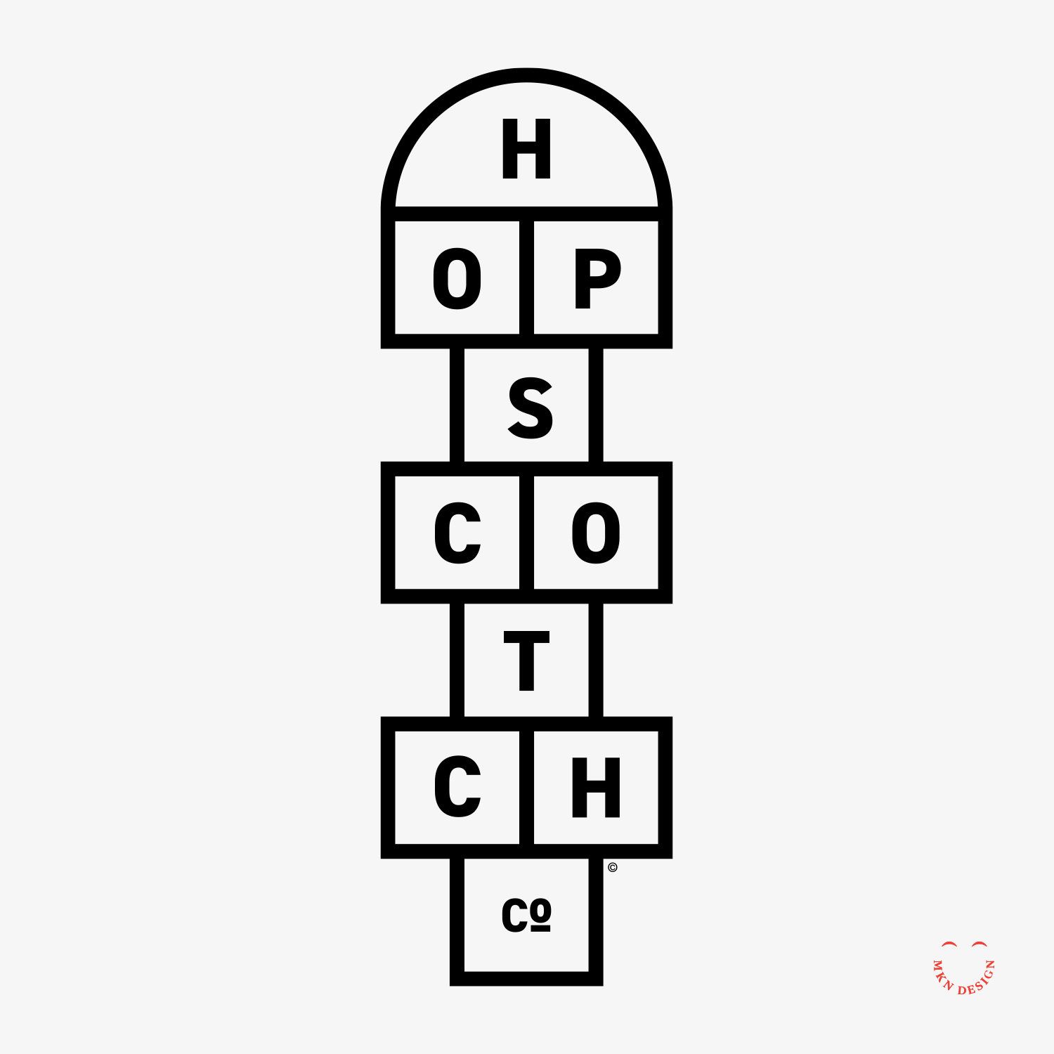
Independent Work
For nearly two centuries, wooden building blocks have been a common presence in children's playrooms (and for the adults who join in), enriching their playtime experiences. In the 1800s, German education pioneer Friedrich Fröbel crafted wooden block set, laying the groundwork for his innovative approach to early childhood education.
Fröbel, renowned for inventing "Kindergarten," revolutionized the field and his educational concept remains influential today.
Independent Work
Independent Work

Client Work
This endeavor required a strategic approach, including the use of personas, iterative wire-framing, and meticulous design iterations to craft a compelling and user-centric digital journey for patients.
The application catered to both new and returning patients of Spectrum Health facilities, offering features such as iPad-based check-in for hospital and doctor appointments, seamless access to medical records, and entertainment options.
Spectrum Health via Mutually Human
Health Care Facilities & Services
+ Concept Development
+ Design Direction
+ Illustration Storytelling
+ Qualitative Research
+ User Experience
+ Sketching & Ideation
MKN Design Team:
+ Michael Nÿkamp, Visual Storytelling & UX/UI
Mutually Human Stakeholders:
+ Ross Hunter, Software Craftsman
+ Mark Van Holstyn, Founder and CTO
Independent Work
Independent Work

Independent Work
Independent Work

Independent Work

Independent Work

Independent Work
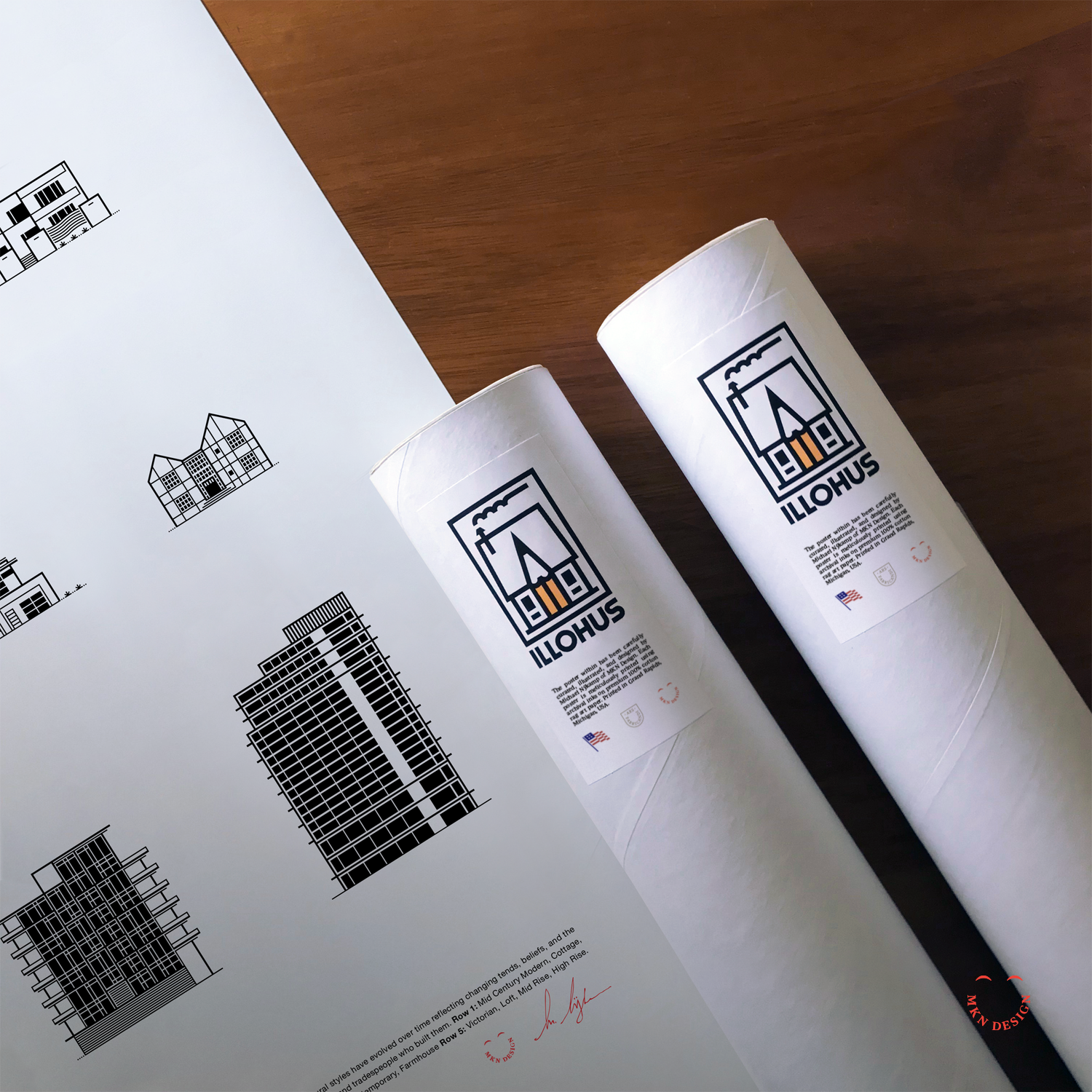
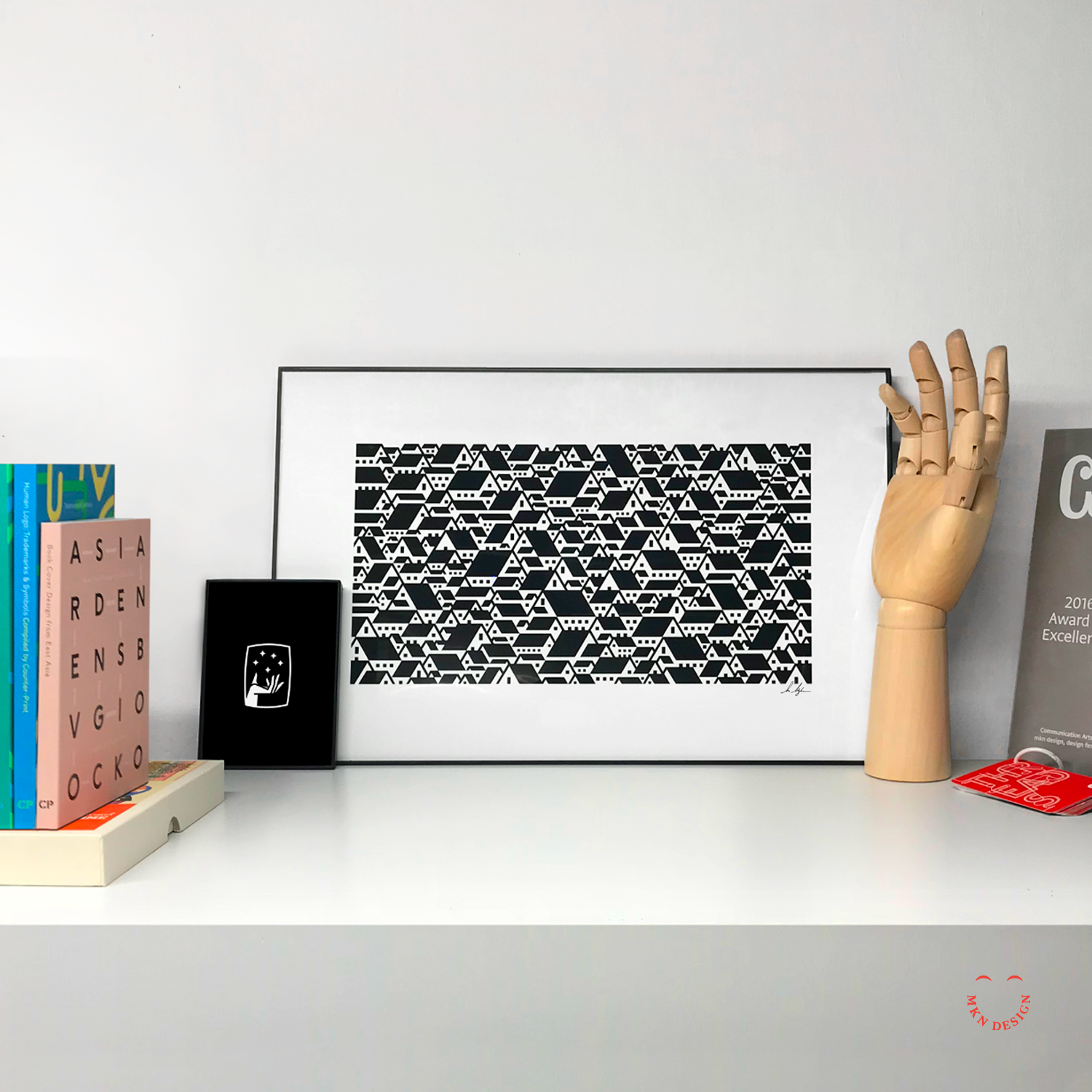
Product
I opened up a small shop on my website to sell posters and digital products. Peruse all the products available in my shop.

Independent Work


Independent Work
Client Work
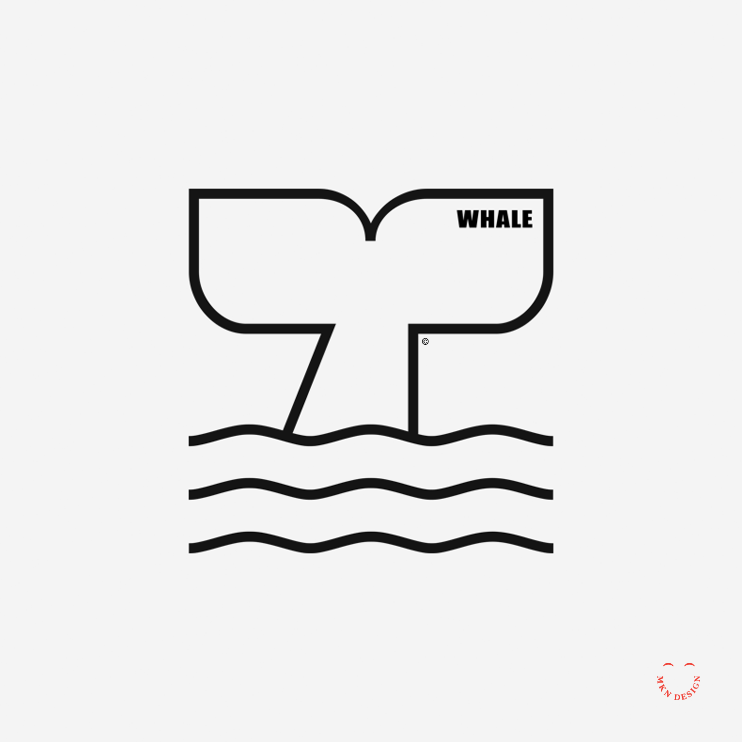
Fultonwood Type Foundry
Independent Typography Studio
+ Graphic Design
+ Illustration
MKN Design Team:
+ Michael Nÿkamp, Design Director
Peopledesign Stakeholder:
+ Zac Freeland, Founder & Type Designer
This poster is available for purchase in my shop.


Client Work
Panda & Rainbows
Independent Creative Collaborative
+ Brand Advisor
+ Concept Development
+ Creative Assets
+ Design Direction
+ Qualitative Research
+ Visual Identity
The five members of this independent group where made up of designers, illustrators, web developers and game developers. The members of this independent group where:
+ Kurt Devlaeminck, Designer & Illustrator
+ Michael Nÿkamp, Designer & Illustrator
+ Celeste Pretzel Ritsema, Web Designer
+ Todd Ritsema, Creative Digital Experience Designer

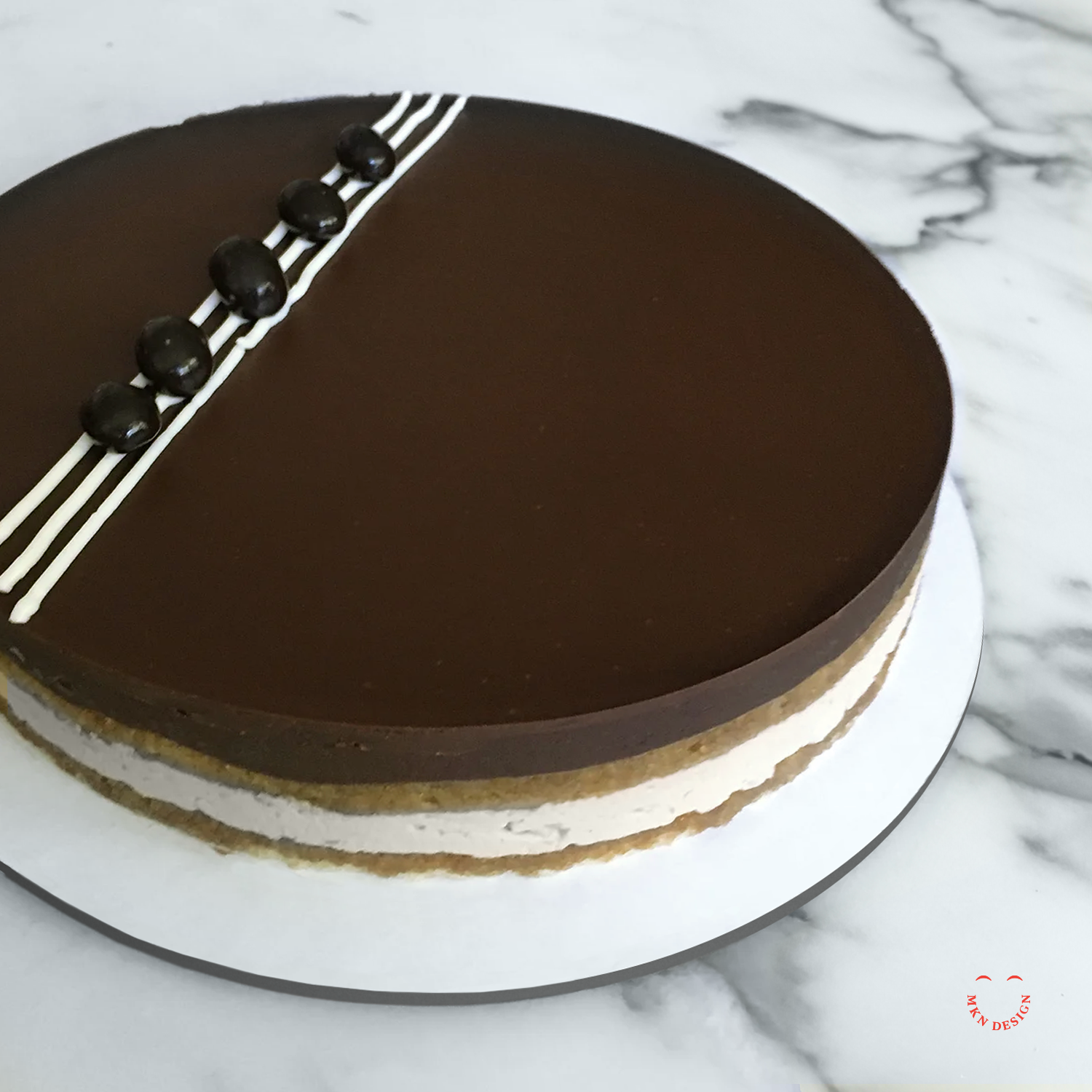

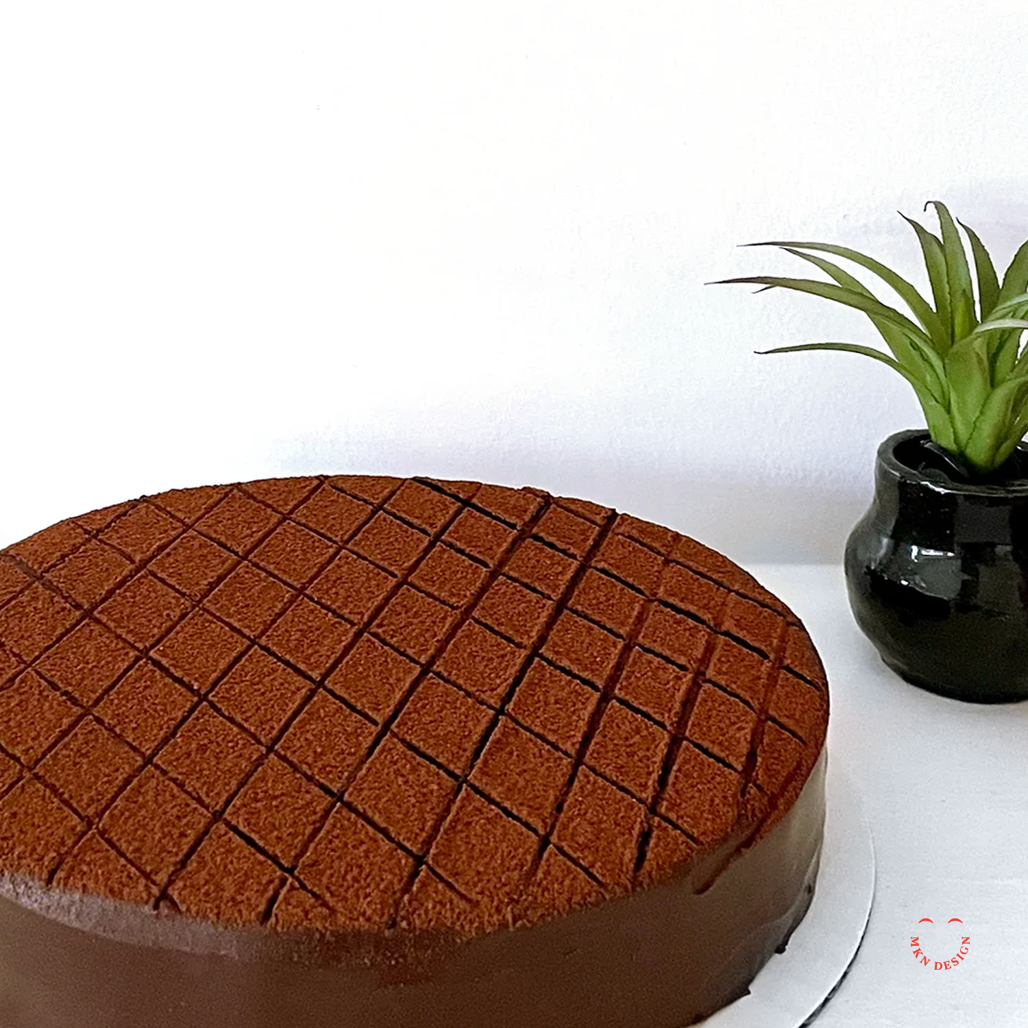


Client Work
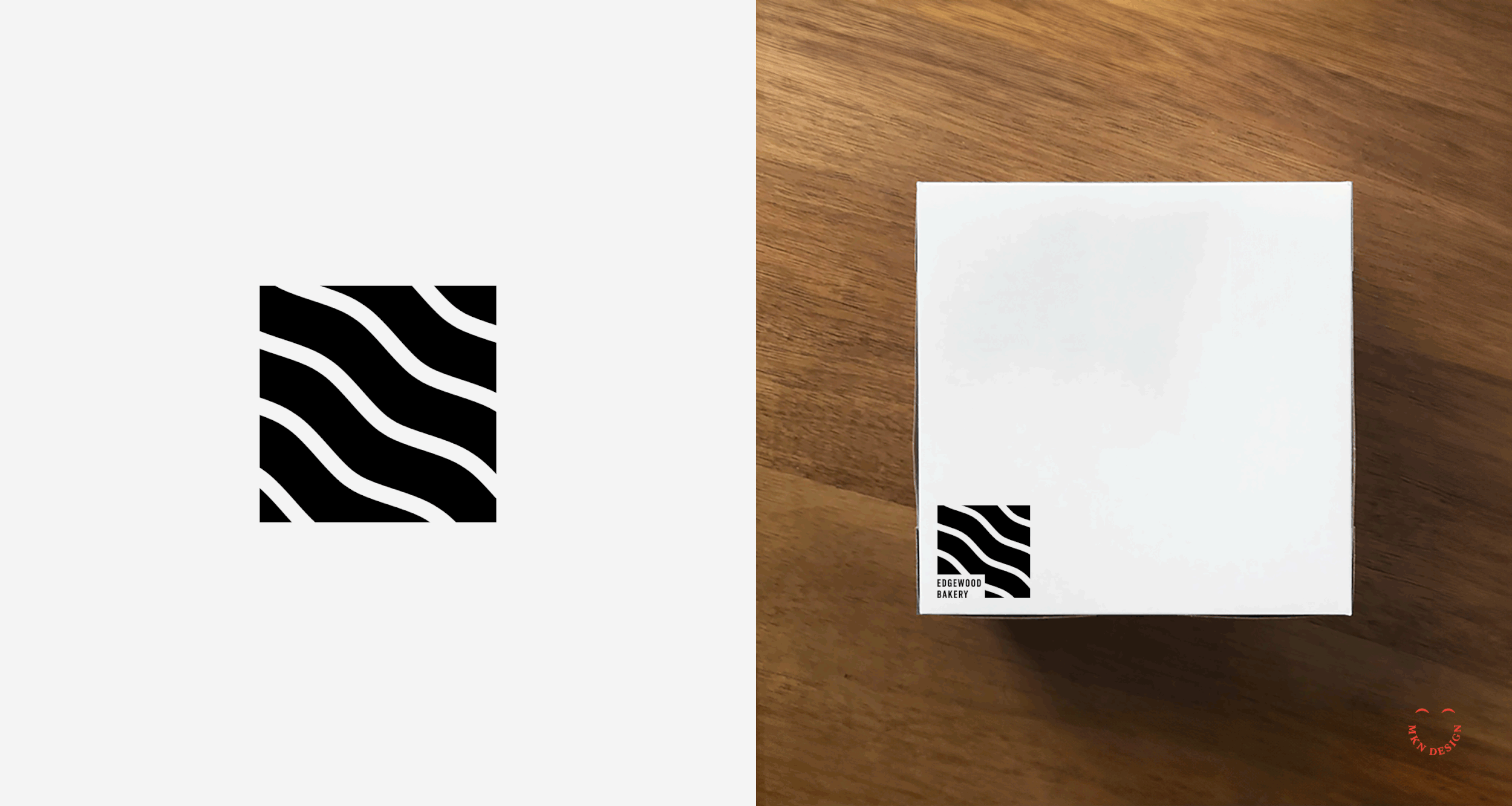
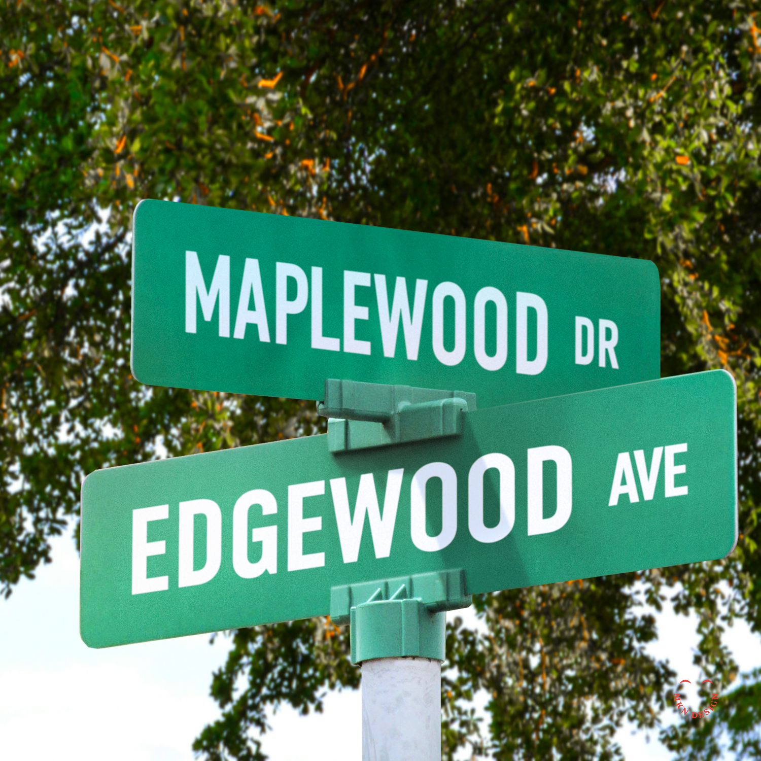
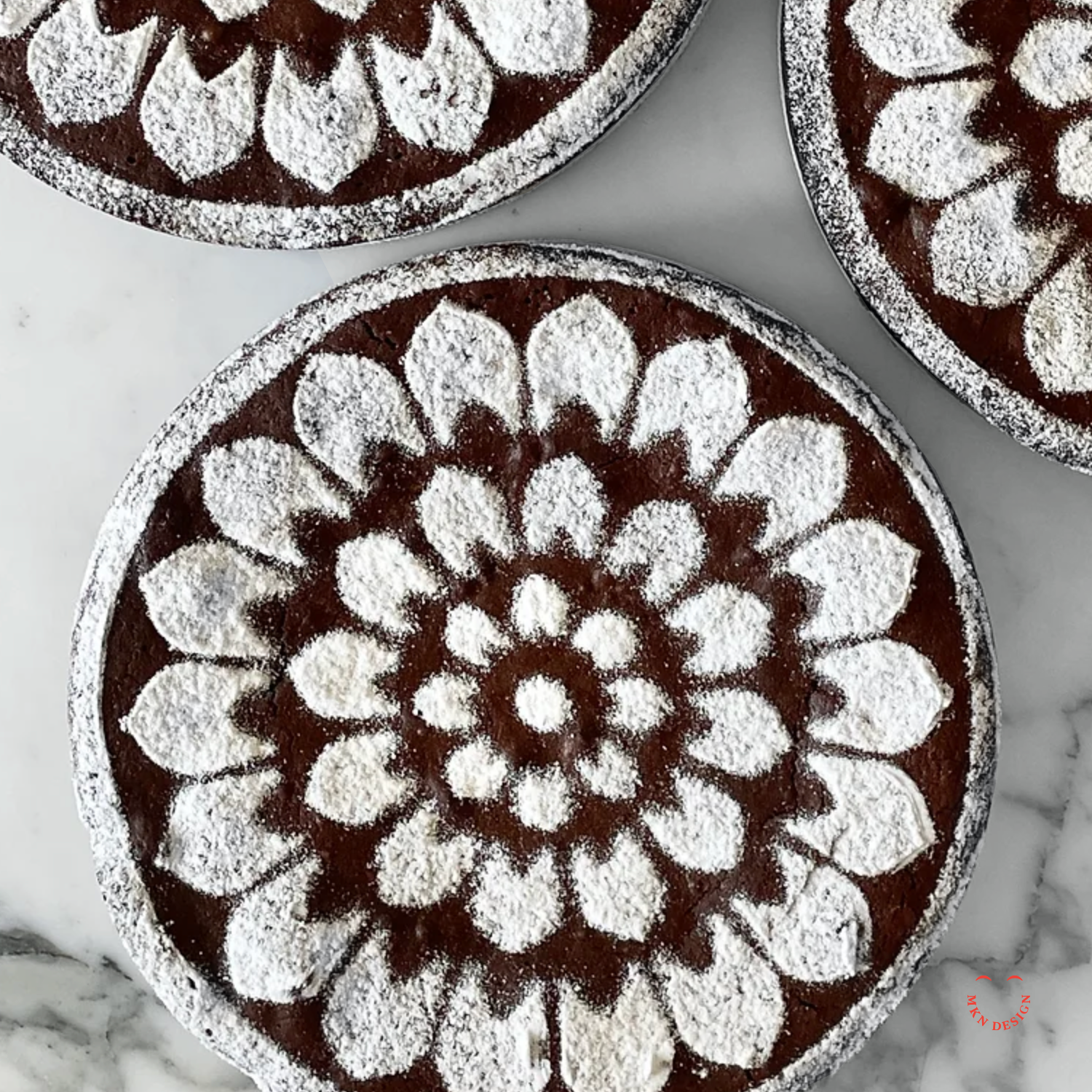
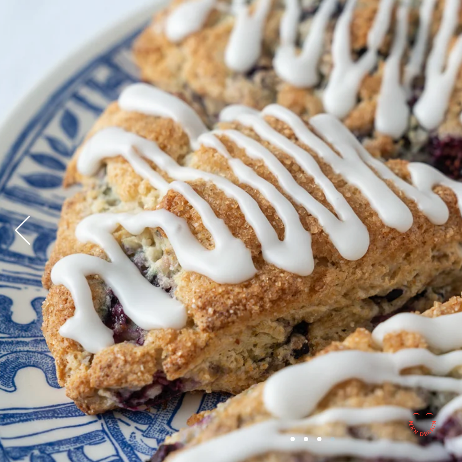
Edgewood Bakery
European Specialty Bakery
+ Brand Advisor
+ Concept Development
+ Creative Assets
+ Design Direction
+ Qualitative Research
+ Visual Identity
MKN Design Team:
+ Michael Nÿkamp, Design Director
+ Otto Selles, Photography
Edgewood Bakery Stakeholders:
+ Rita Selles, CEO & Baker
MKN Design, LLC
michael@mkn-design.com
1 616 915 1941
Good design is complexity presented simply
MKN Design LLC © 2025
Originally from Ontario, Canada, and currently based in West Michigan, Michael Nÿkamp is dedicated to helping businesses develop and refine creative strategies into clear, impactful solutions that captivate and engage.