Collected Works
These pages serve as a repository of MKN Design Studio’s articles, client projects, independent work, and products.

Careful, it’s a rabbit hole.


Use the search to find projects by type, or the dropdown to explore by group.


Action Surge!

Product


Action Surge!
I’m not done yet! Not familiar with this term? Well, let me enlighten you. It’s a D&D reference where a fighter pushes themselves beyond their limits to do twice as much in one turn… because clearly, we needed even more ways to drag out combat ; )

Action Surge typeface is Kaneda Gothic designed by Ryoichi Tsunekawa from Dharma Type.


Zero-One & Ninety-Nine


Product


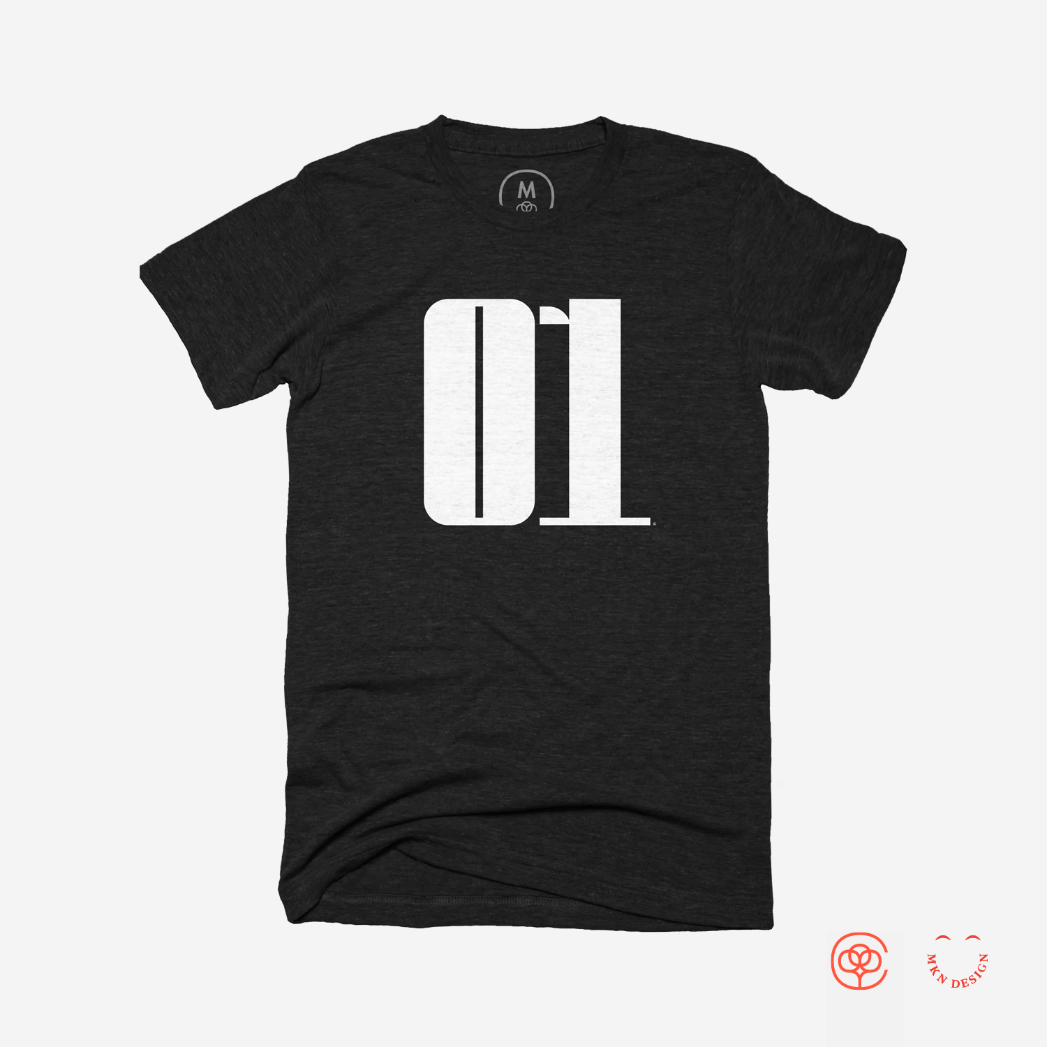
Zero-One & Ninety-Nine
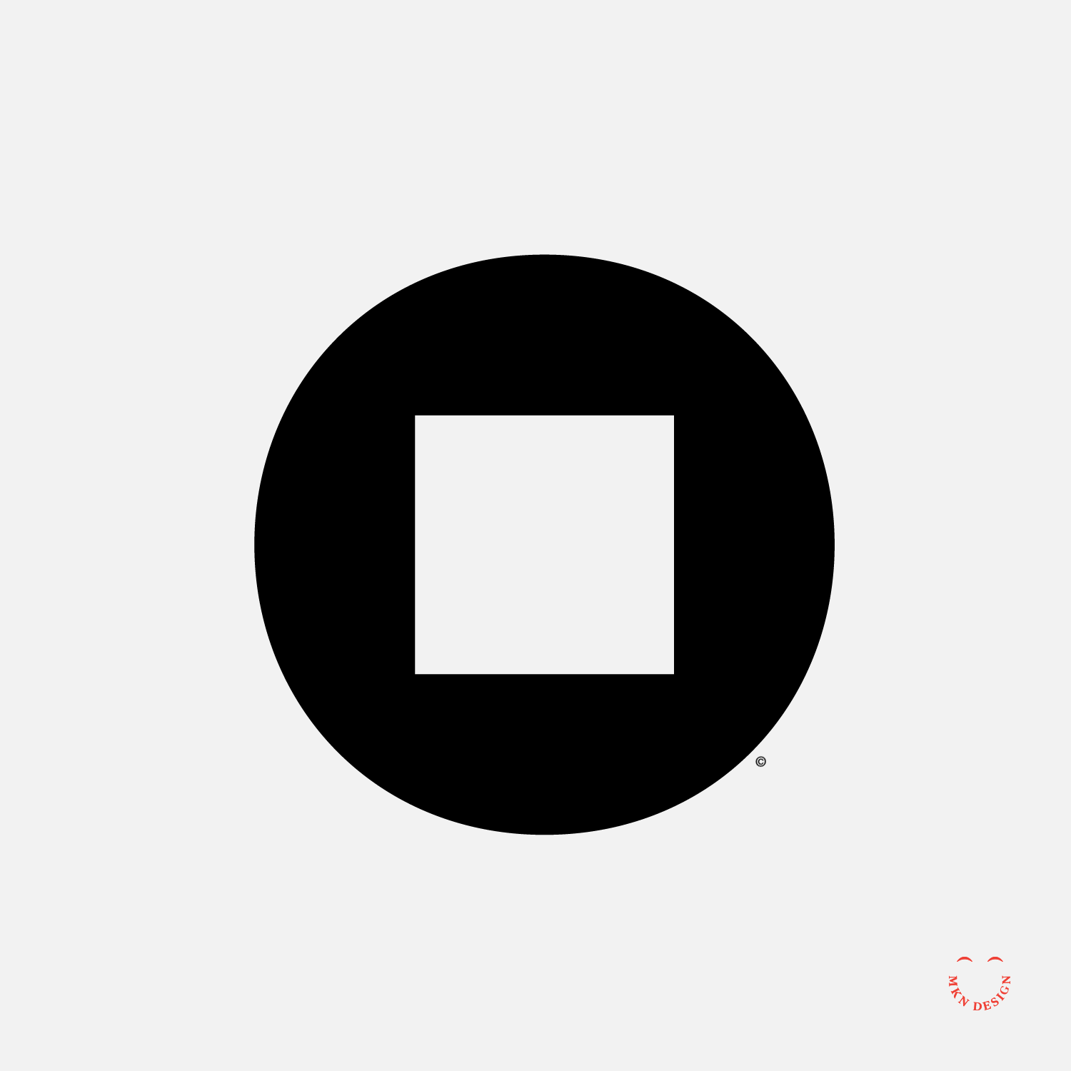
These numbers were my favorites growing up. Zero/One (or 10) is from the Dodge Charger that Bo and Luke drove on, Dukes of Hazzard. Ninety-nine of course came from my favorite hockey player, Wayne Gretzky who played for the Edmonton Oilers from 1979–1988.


Super Phat


Product


Super Phat
A design exploration to find a typeface that embodies “Super Phat”. I believe I choose right. The typeface I used is Sutturah designed by Octavio Pardo from Rosetta Type Foundry.


Skull & Bones


Product


Skull & Bones
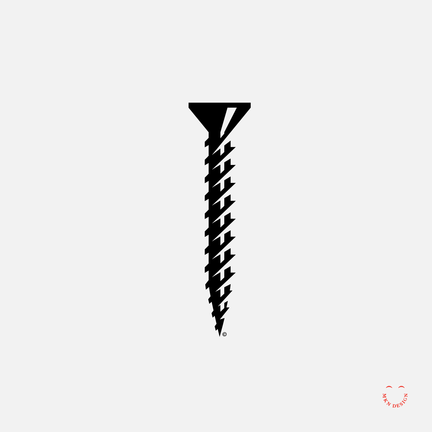
For a limited time some of the icons I created for Halloween will be available on graphic tees at Cotton Bureau. I’ve paired the icons with the typeface Metalista designed by Tomáš Brousil from Suitcase Type Foundry.


Notcha Tacos


Product


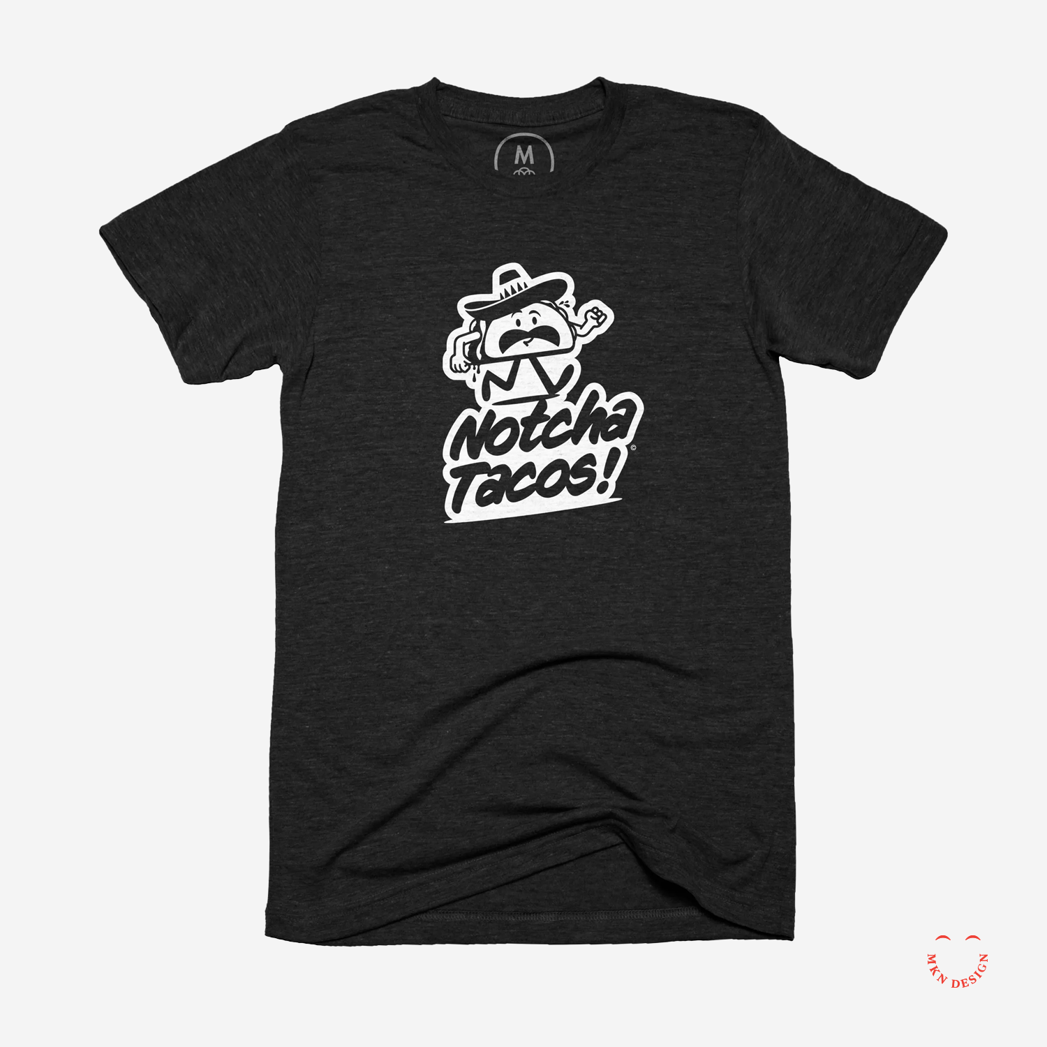
Notcha Tacos
Pronounced, Not-Cha-Tacos. Utilizing some past work I illustrated this fun tacos restaurant logo. The mark is paired with the typeface, CC Sign Language designed by John Roshell and Richard Starkings from Comicraft.
 

Sum


Product


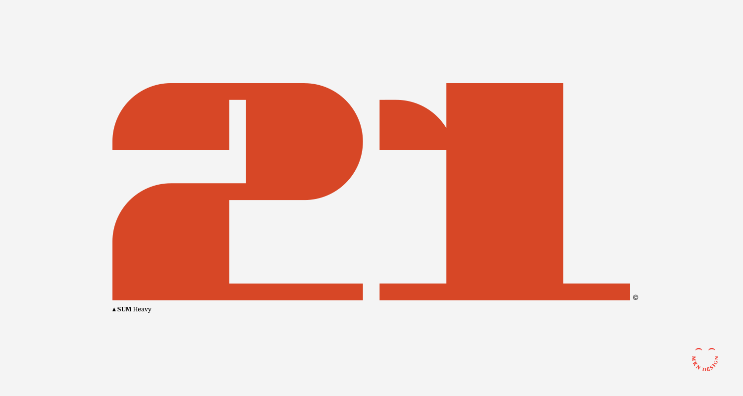
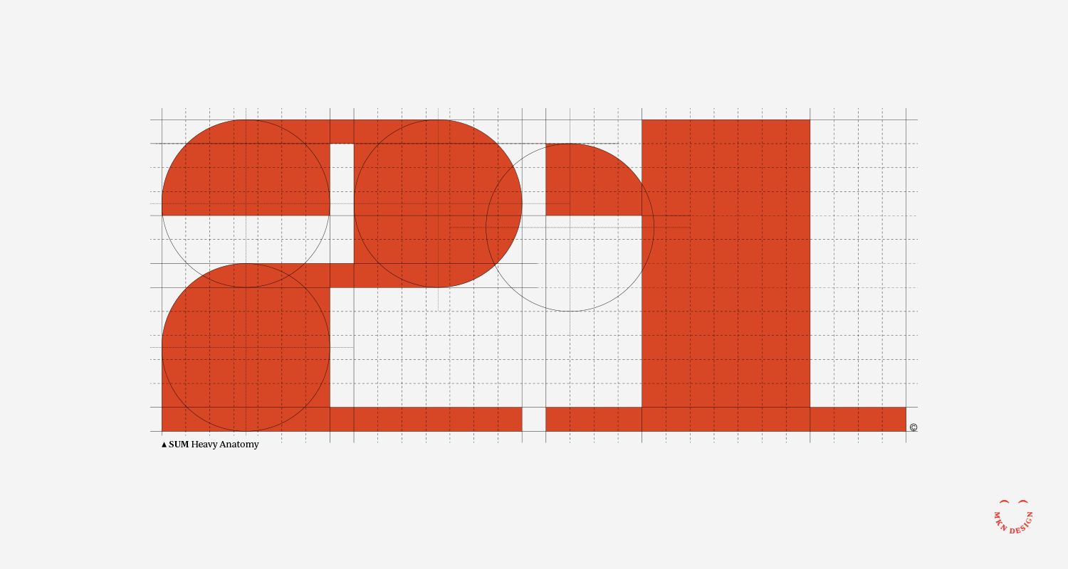
Sum
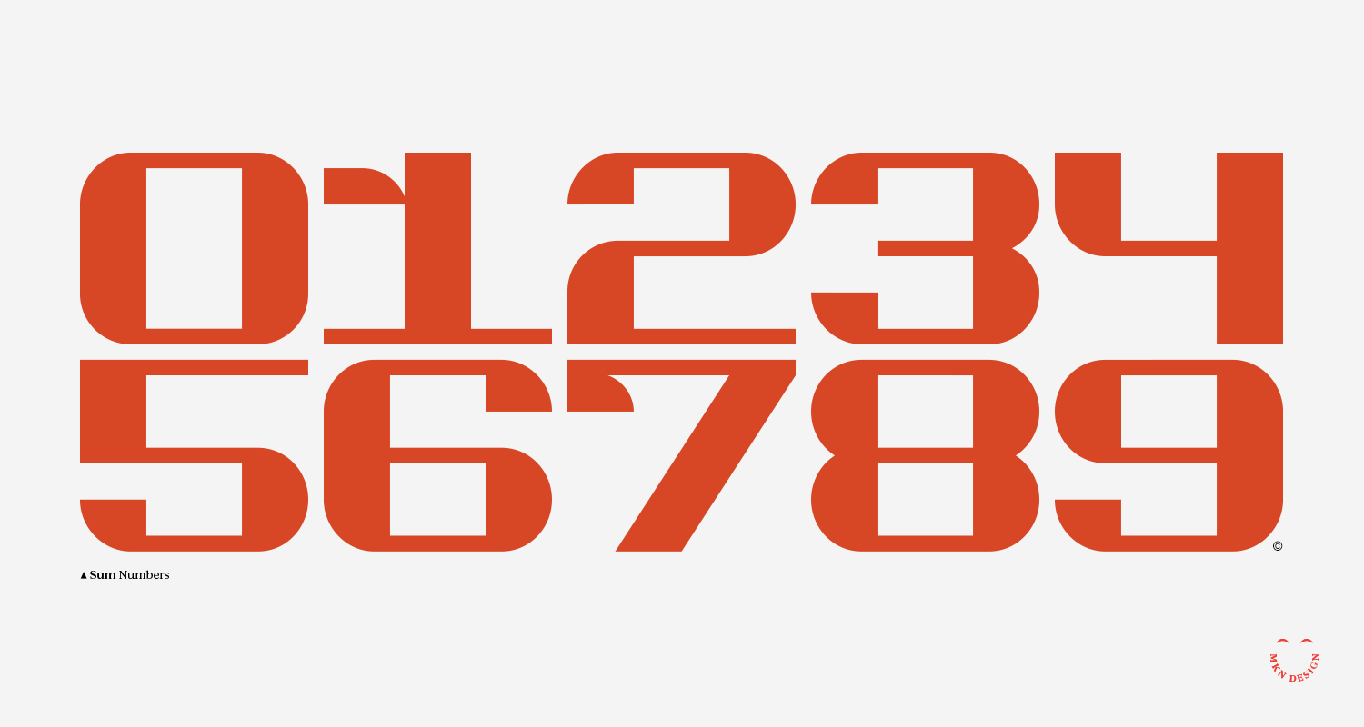
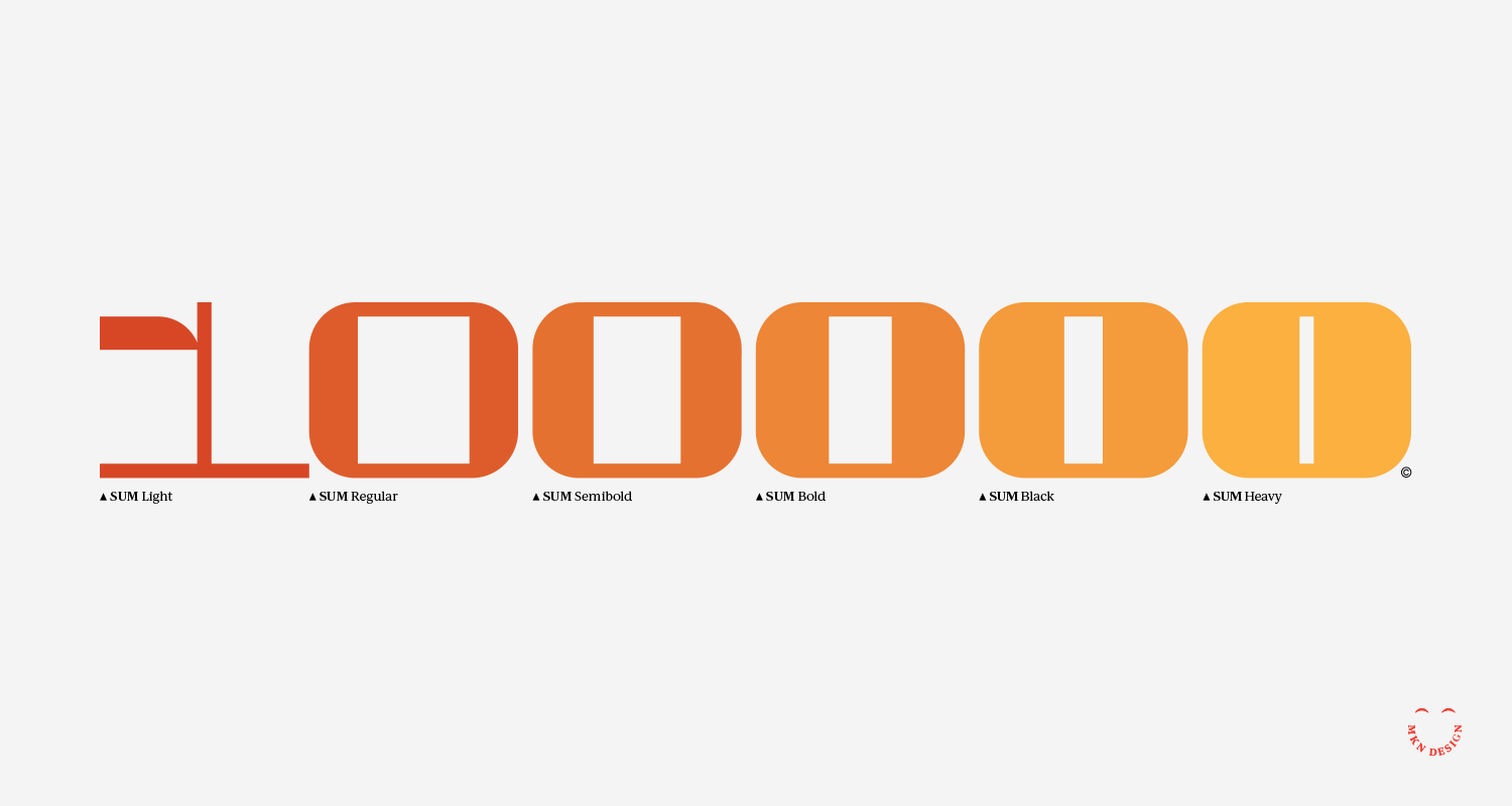
While I am not a professional type designer, I have a passion for creating custom typefaces. I just finished this display numerical typeface, called Sum. This font comprises six sizes: Light, Regular, Semibold, Bold, Black, and Heavy. Engaging in studies like this is beneficial for graphic designers., as it enables them to comprehend the intricacies of typeface formation. This knowledge is particularly valuable when crafting a bespoke typeface for a brand.


Kindly


Independent Work


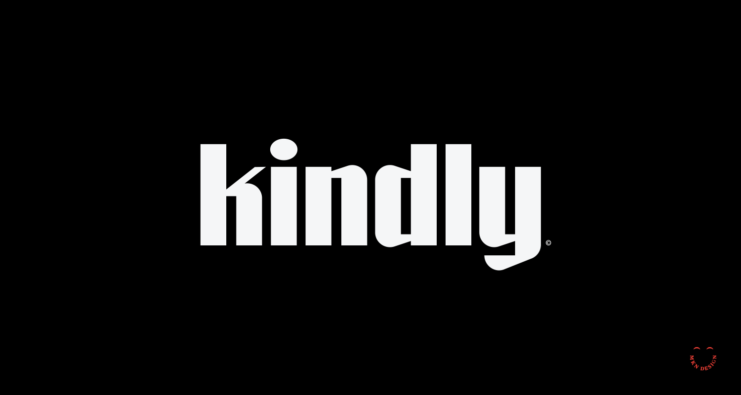
Kindly
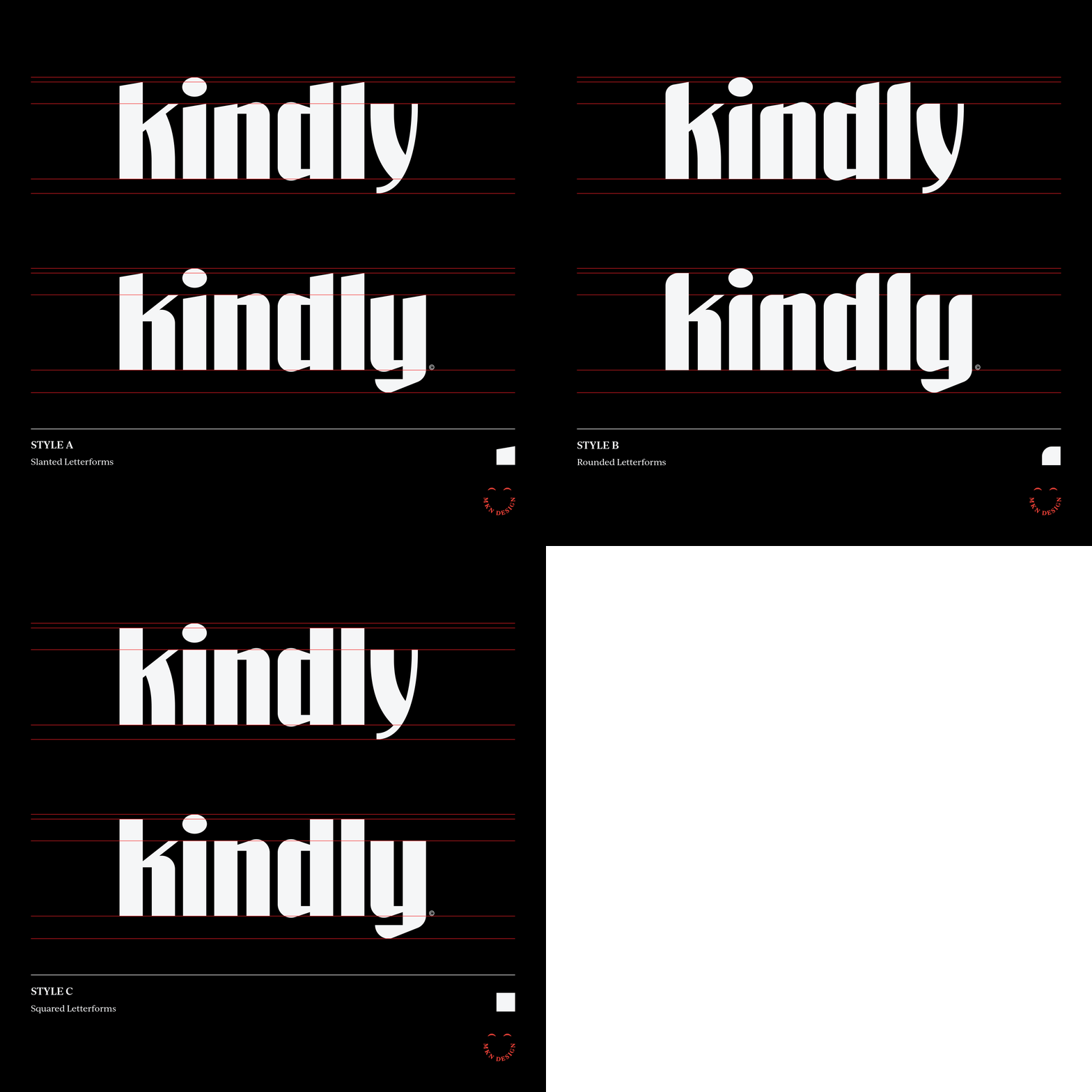
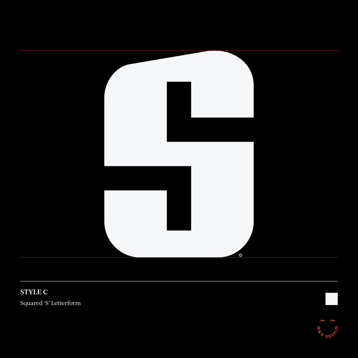
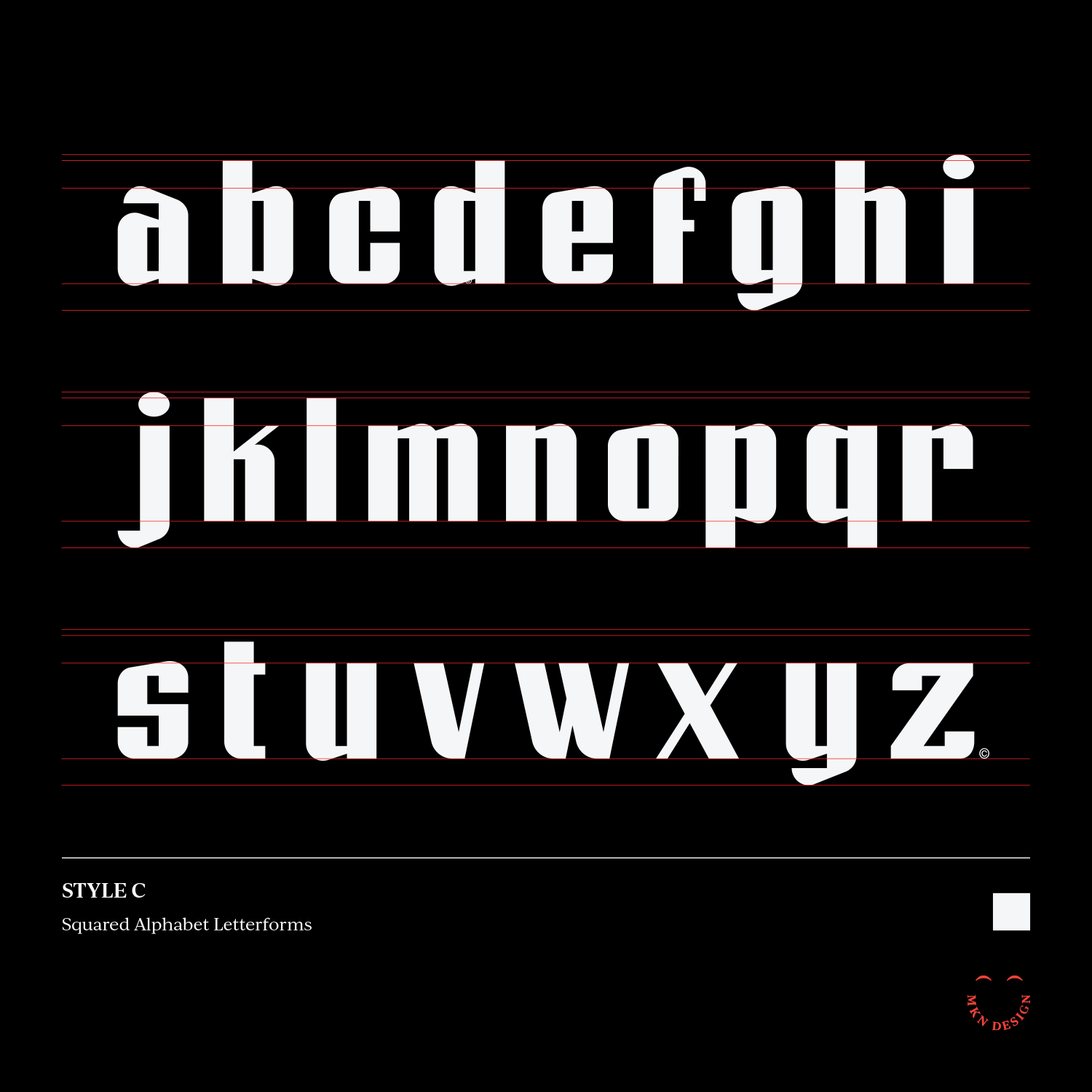
The aim of this type design exercise was to capture the essence of the name, kindly. I’m not a type designer and crafting this lowercase typeface was challenging. Nonetheless, I'm always eager to tackle new challenges.


Hello


Independent Work


Hello
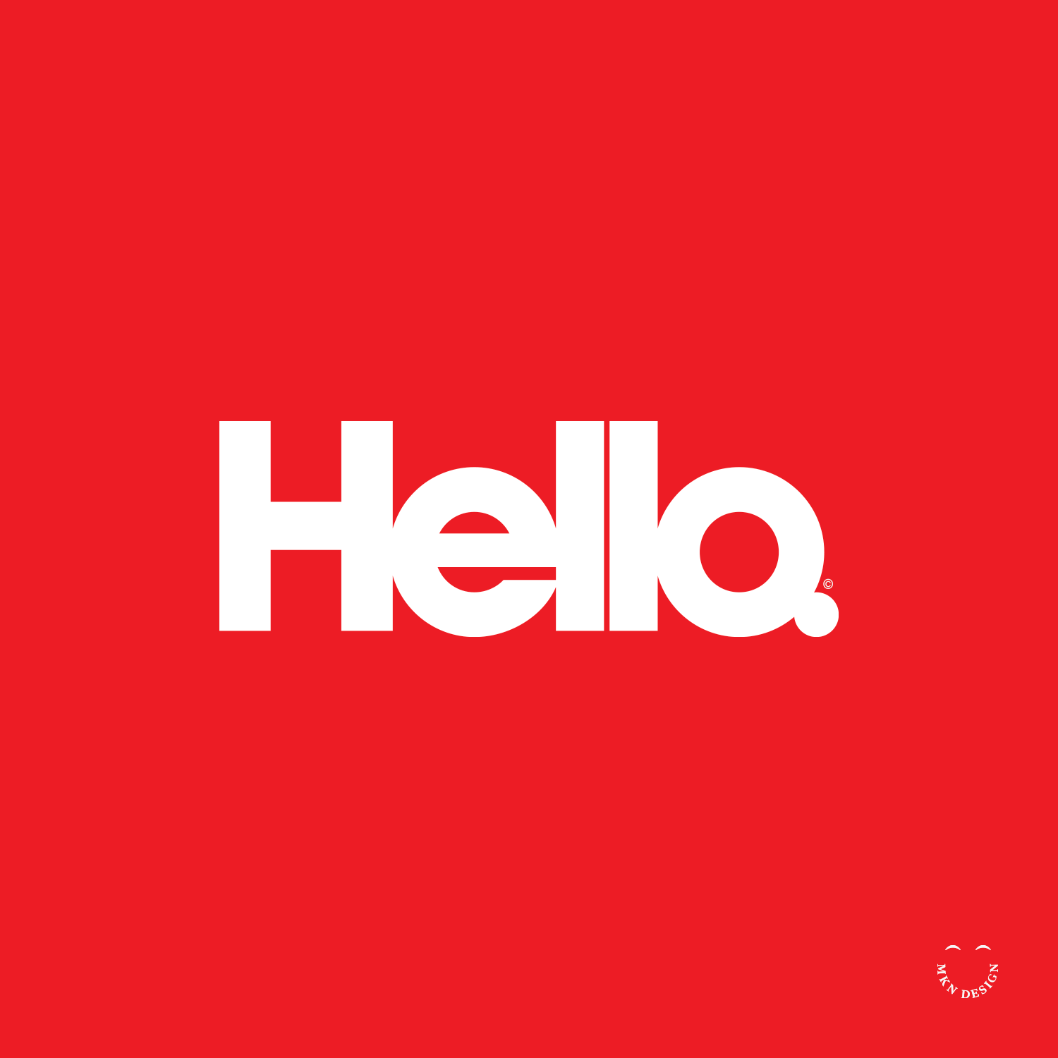
A very cramped hello wordmark featuring a custom typeface designed by me.


Dark Side of the Moon


Product


Dark Side of the Moon
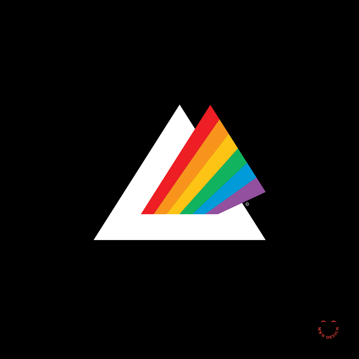
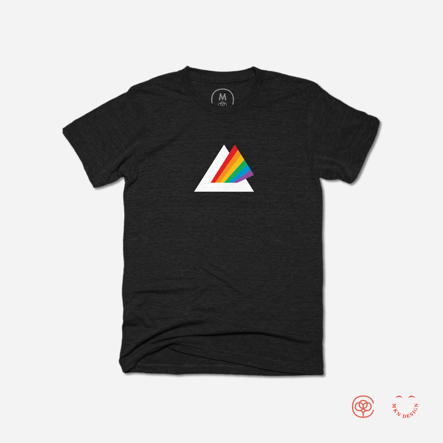
A modern take on Pick Floyd’s, Dark Side of the Moon album cover.


Kudo


Independent Work


Kudo
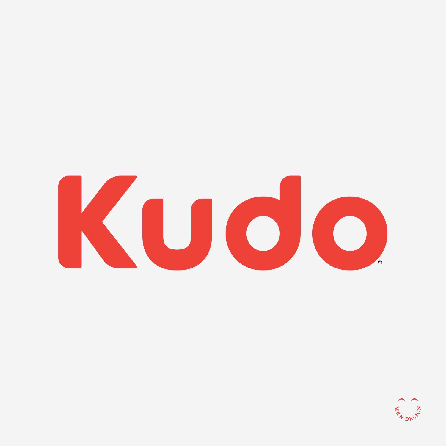
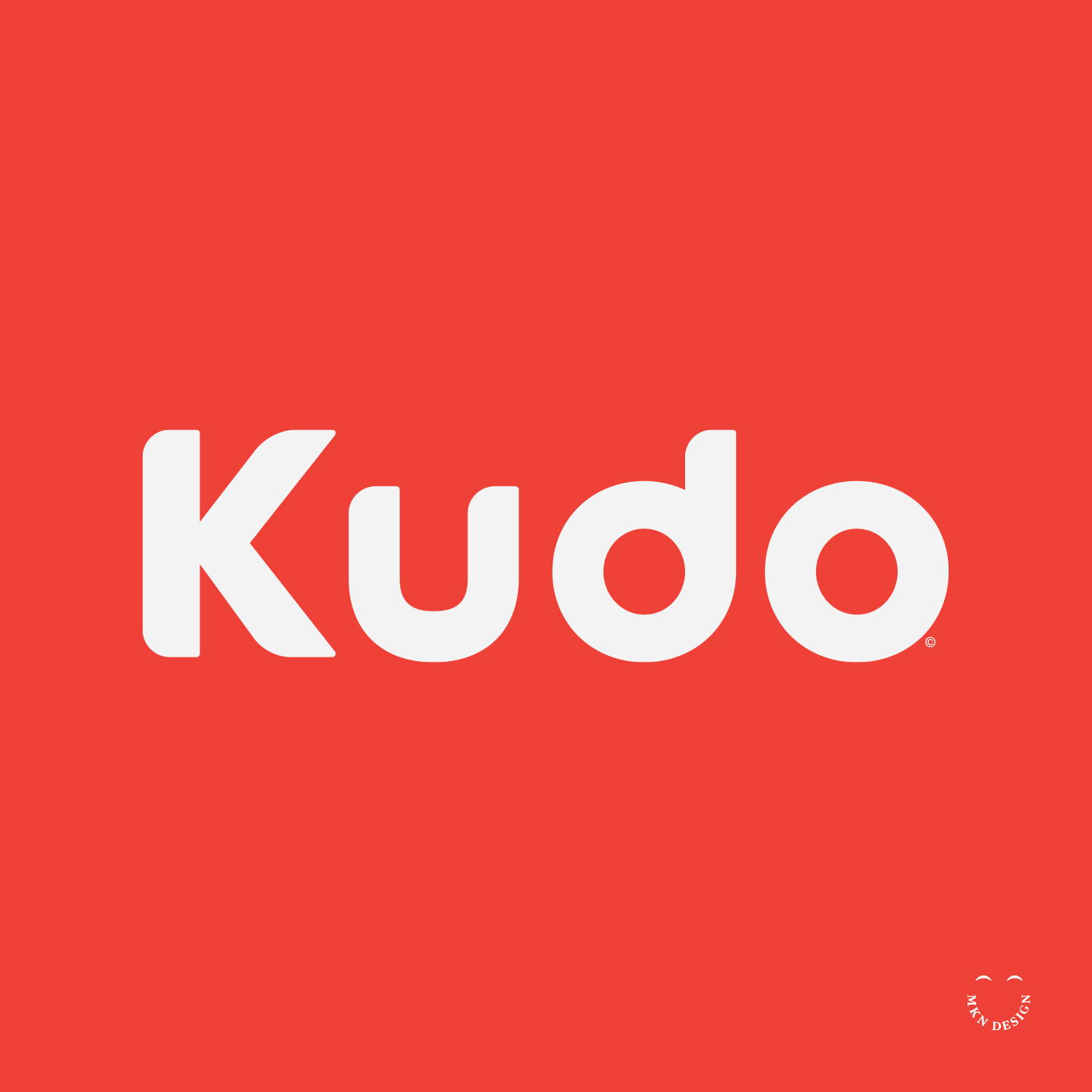
A hand-lettered wordmark study on the word Kudo, meaning praise and honor received for an achievement. This is a custom made typeface.


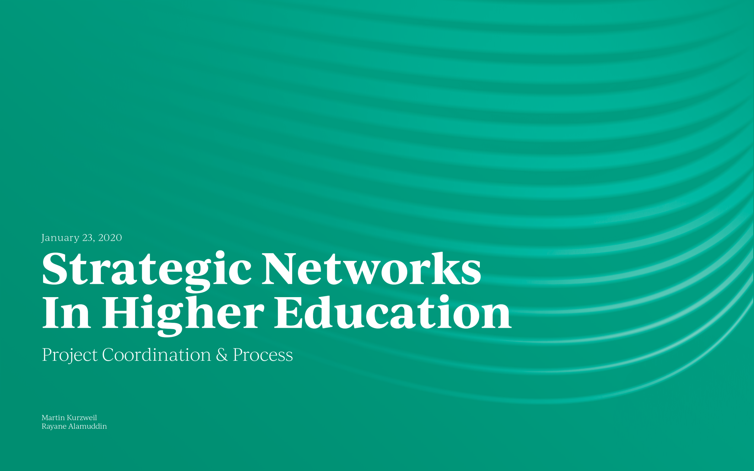
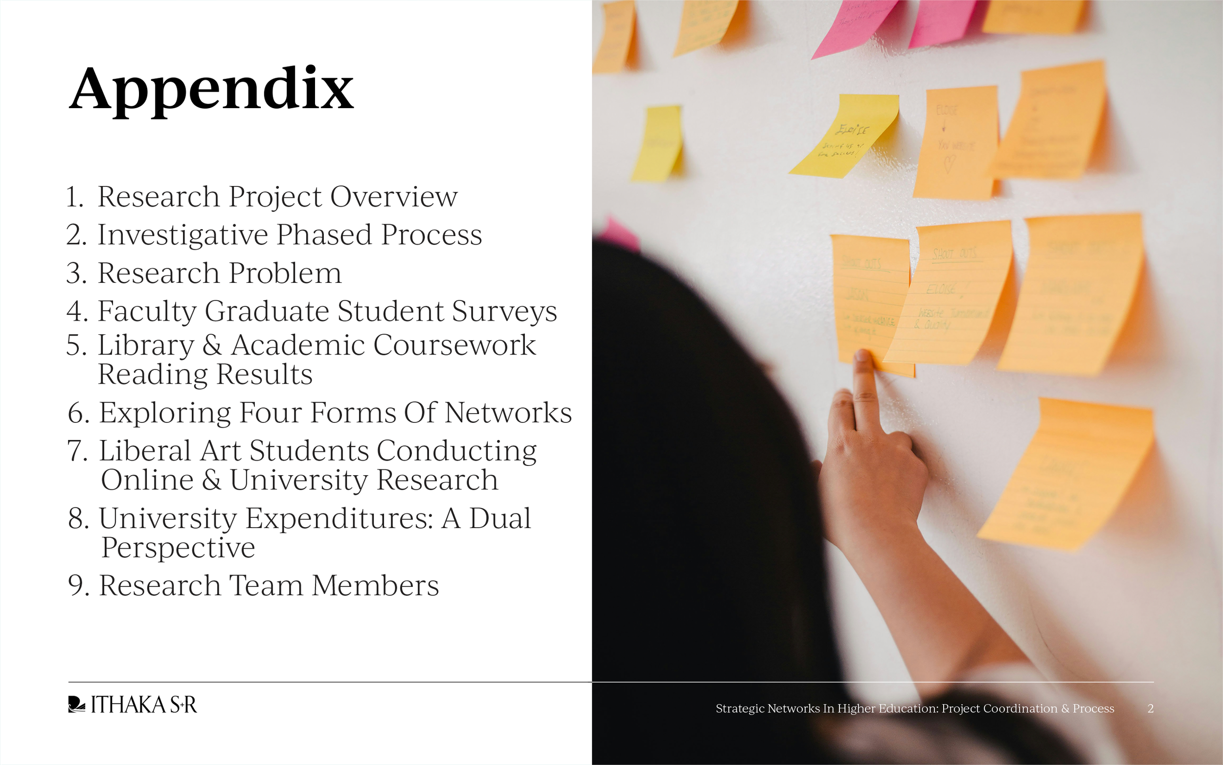
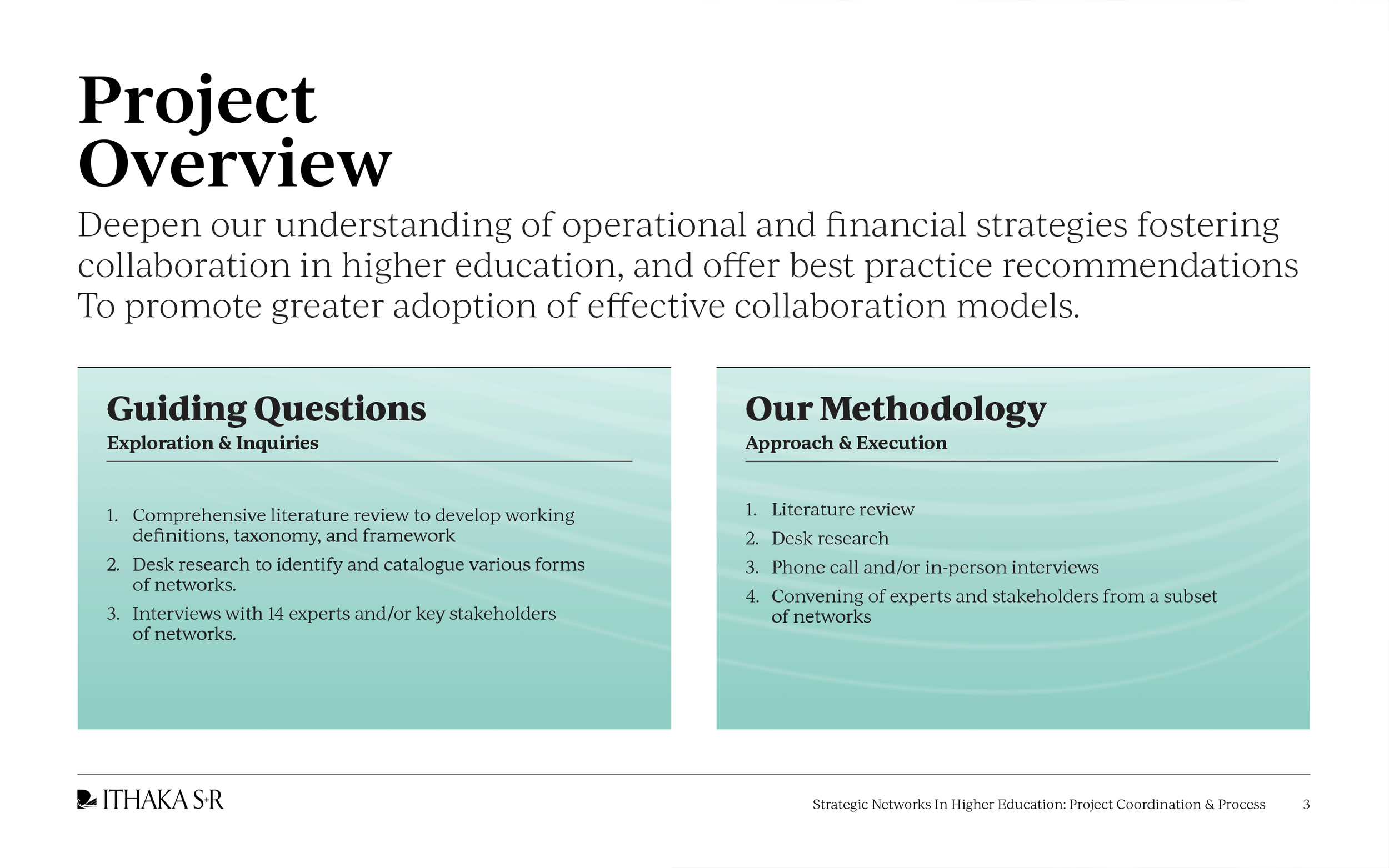
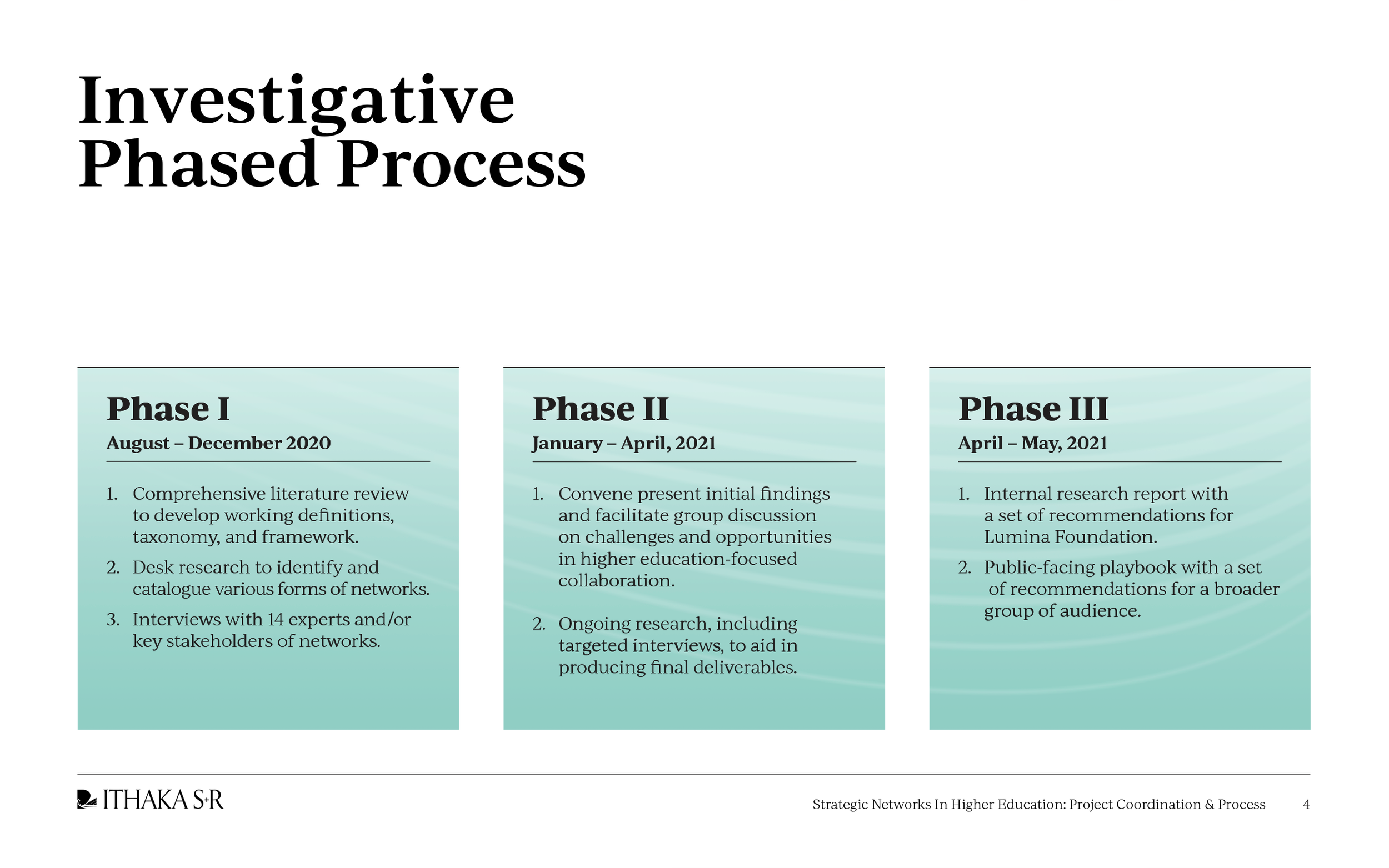
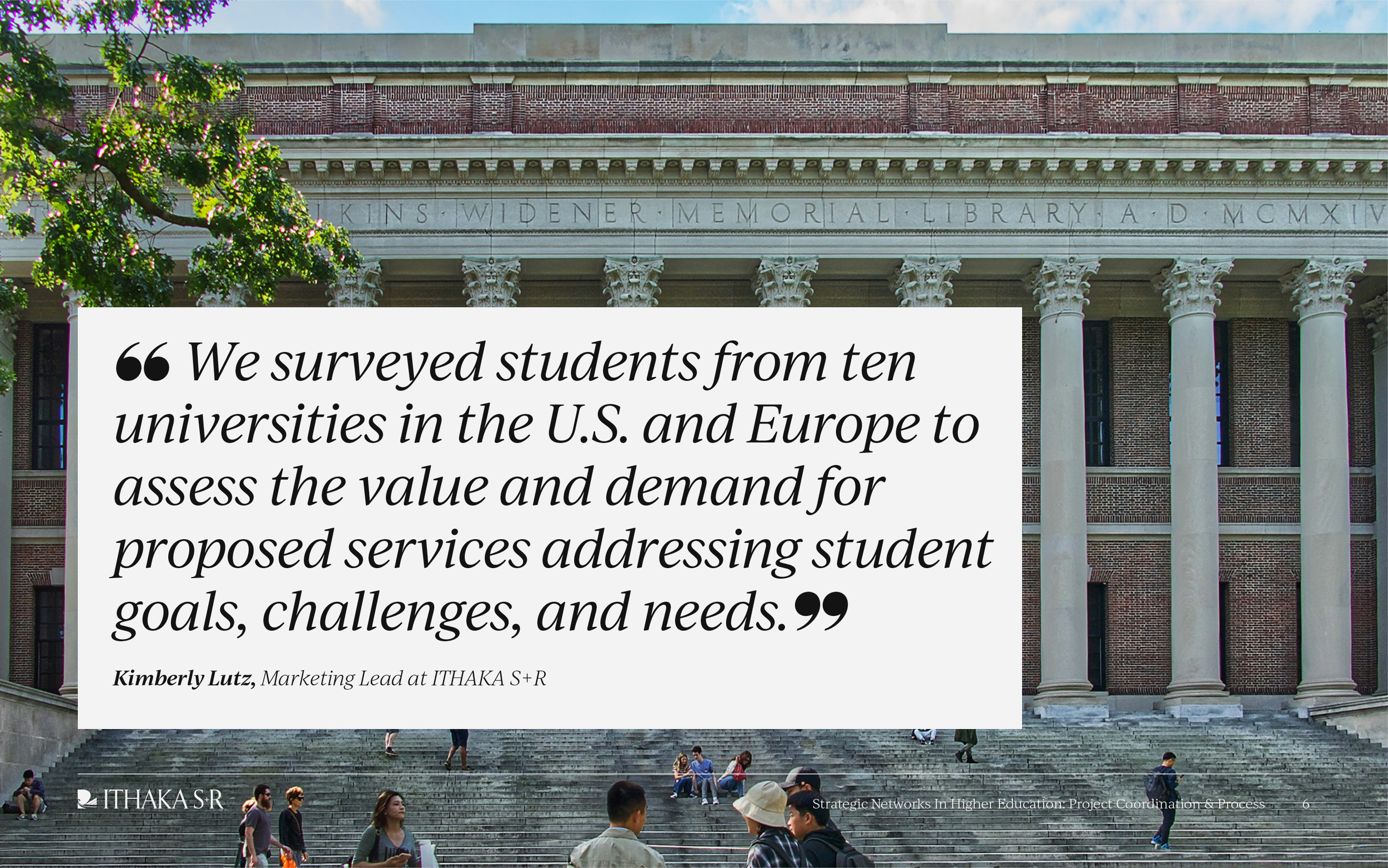
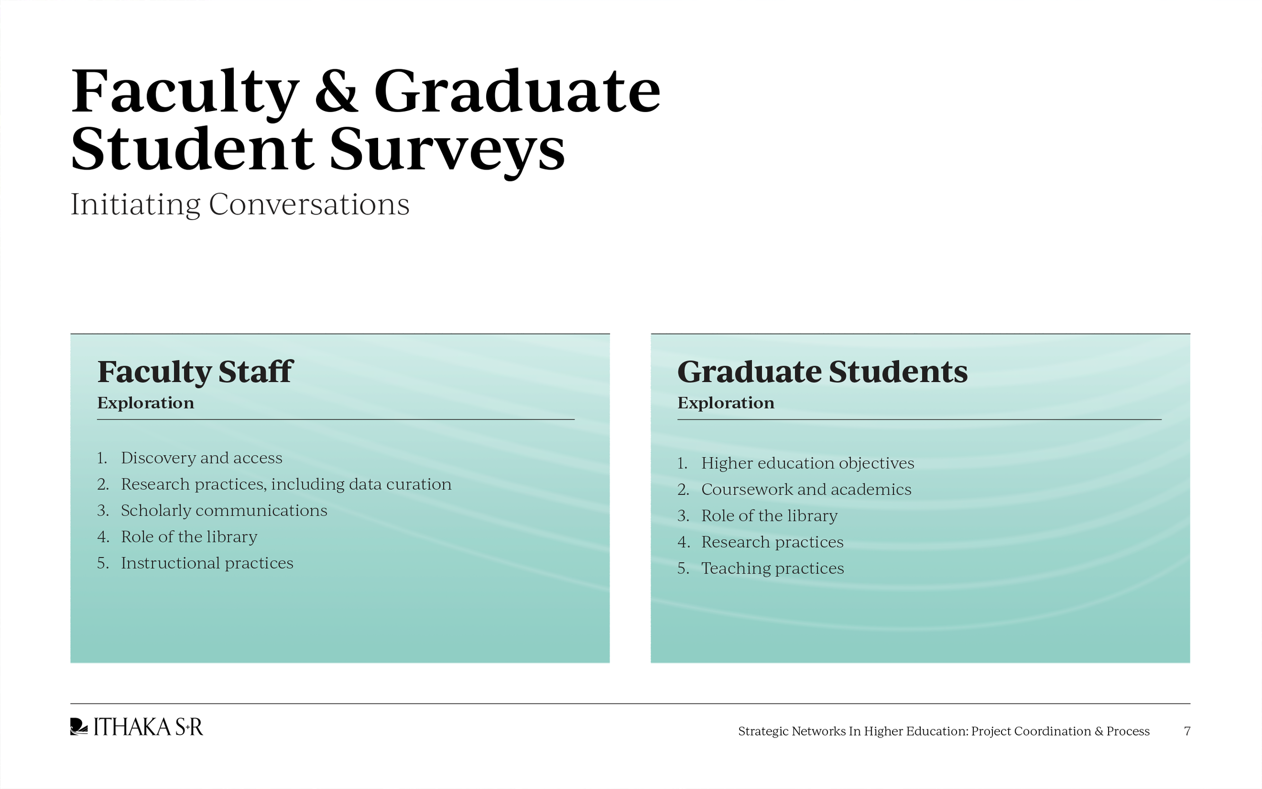
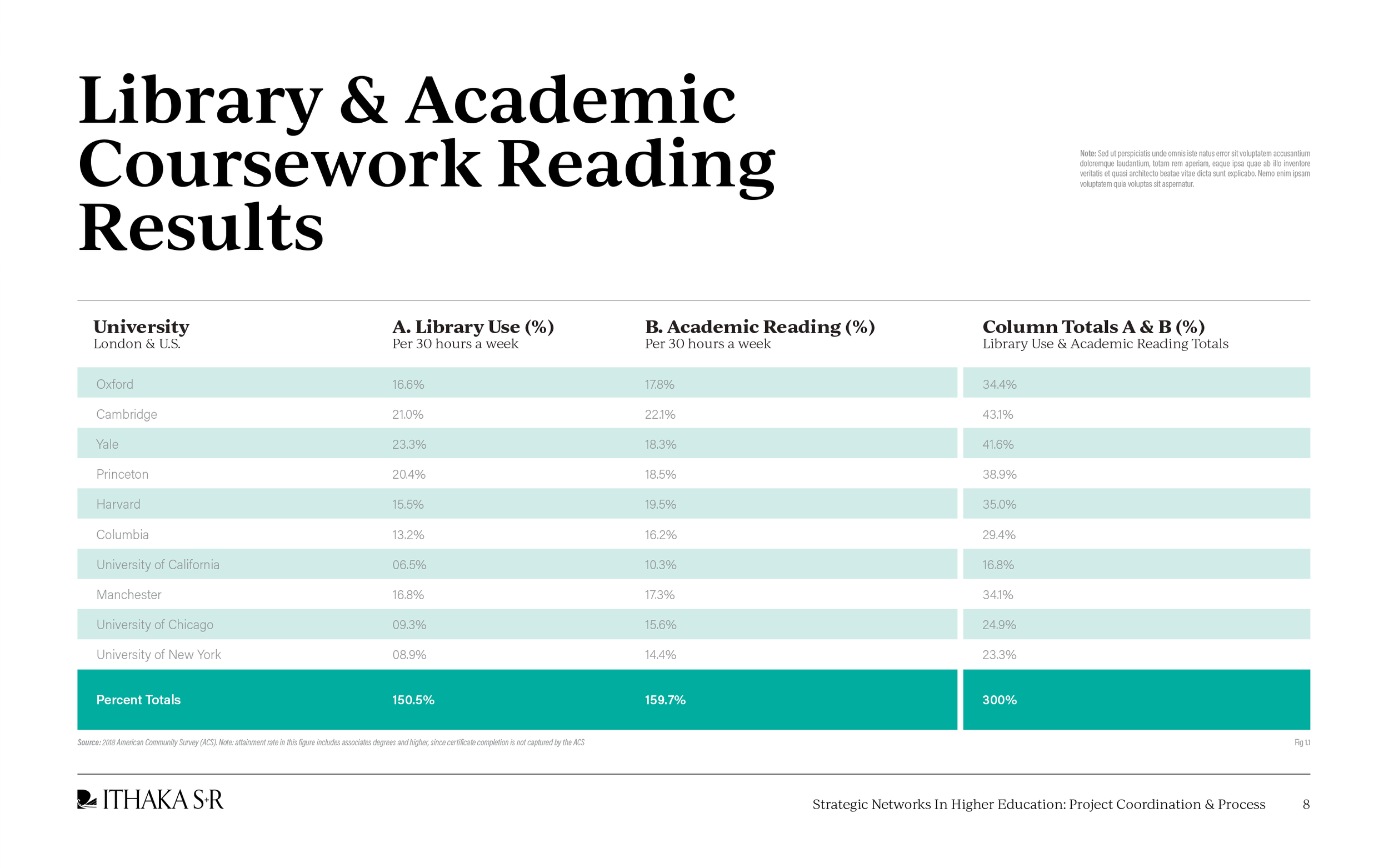
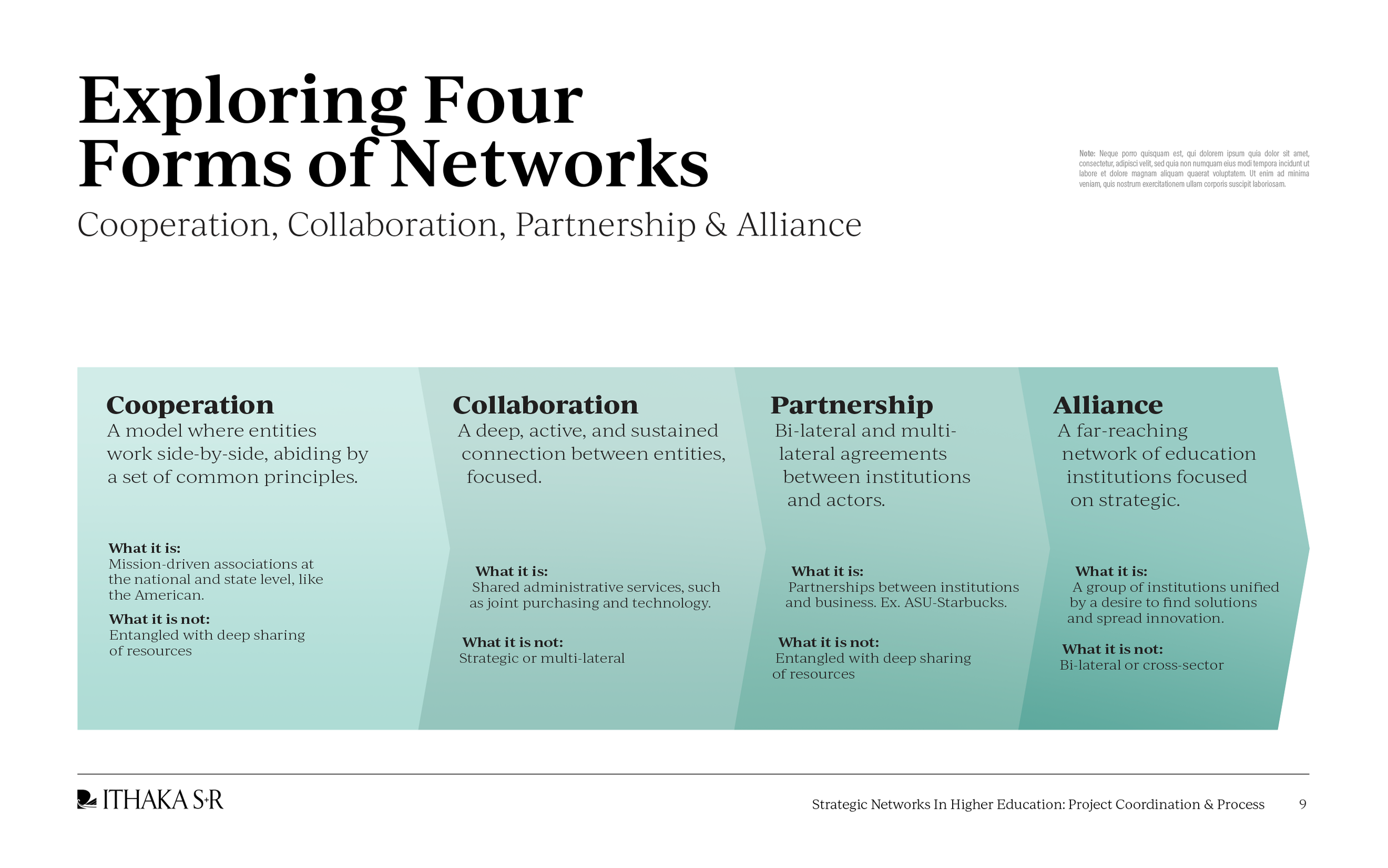
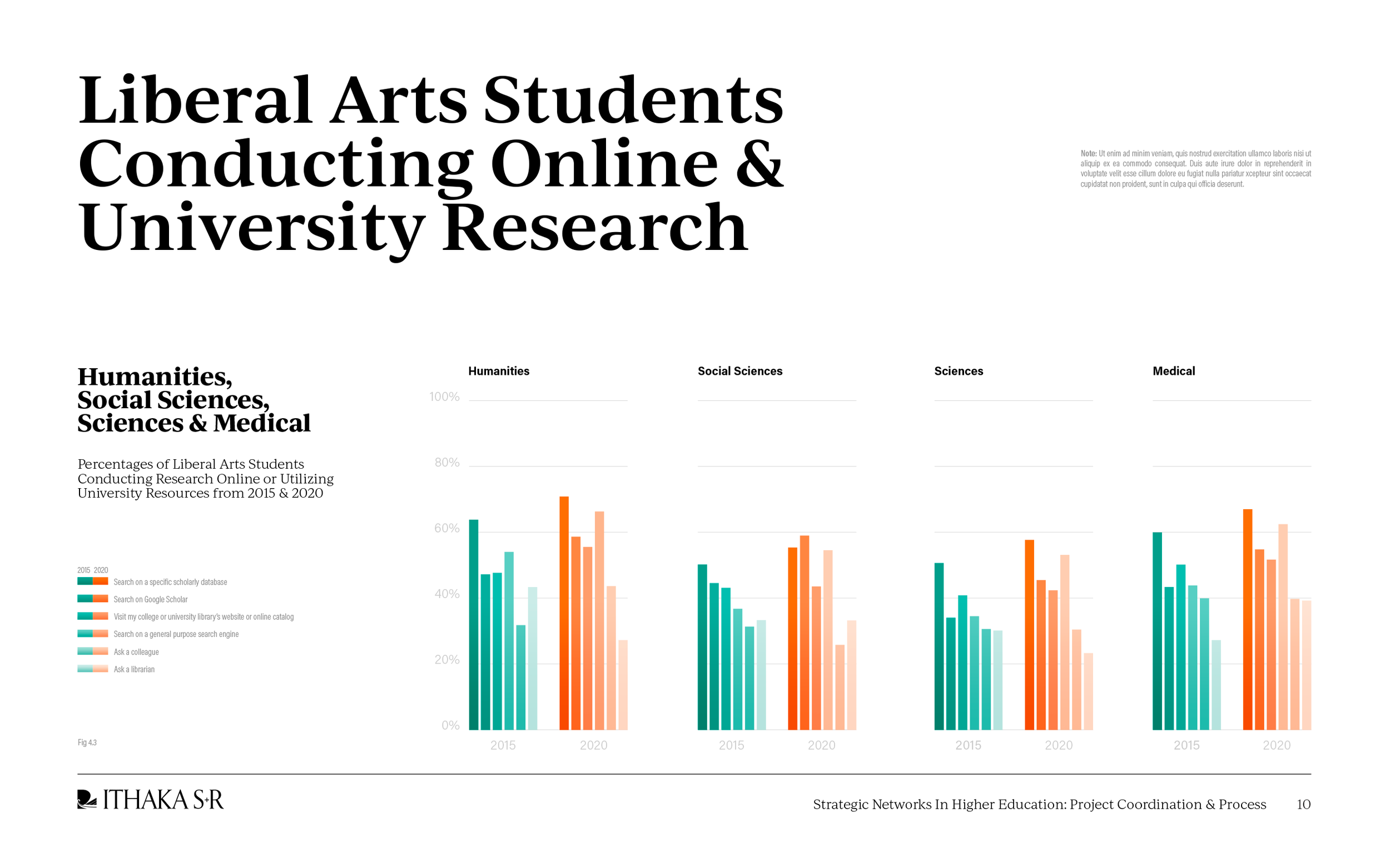
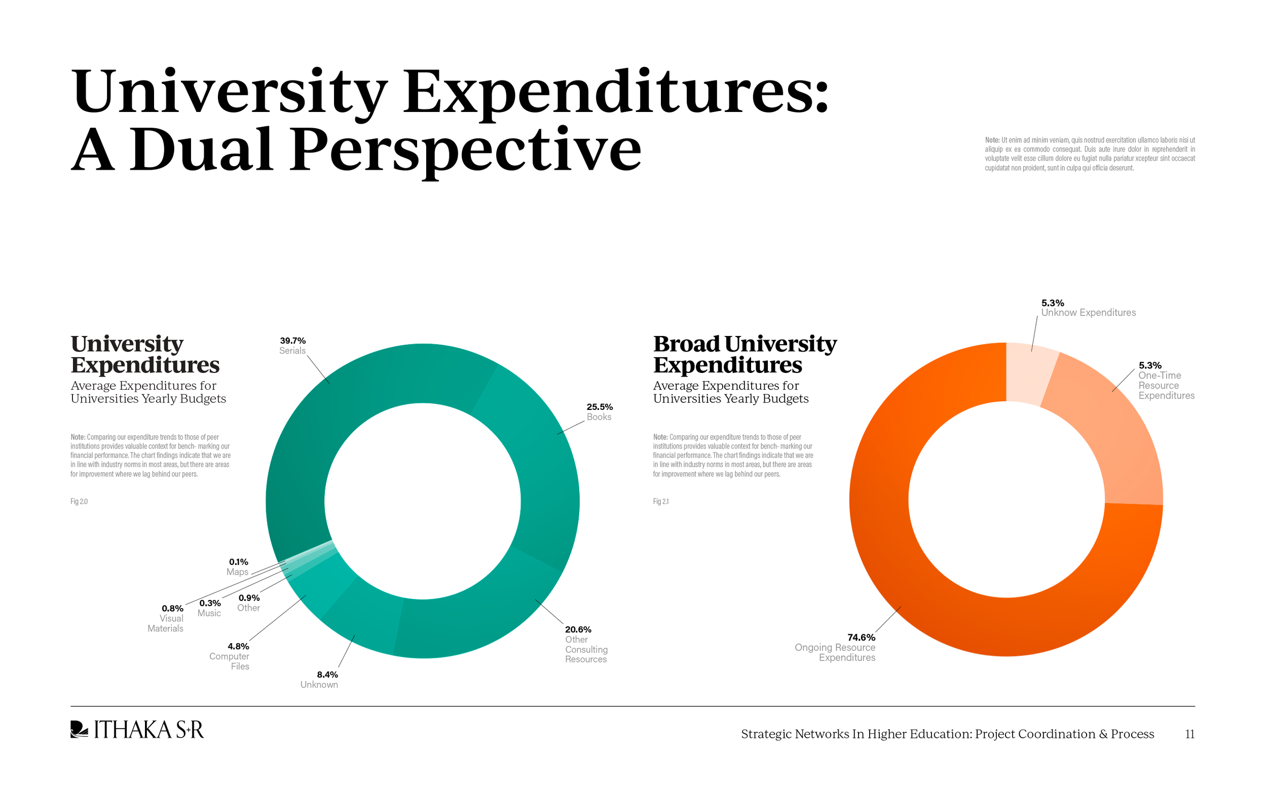
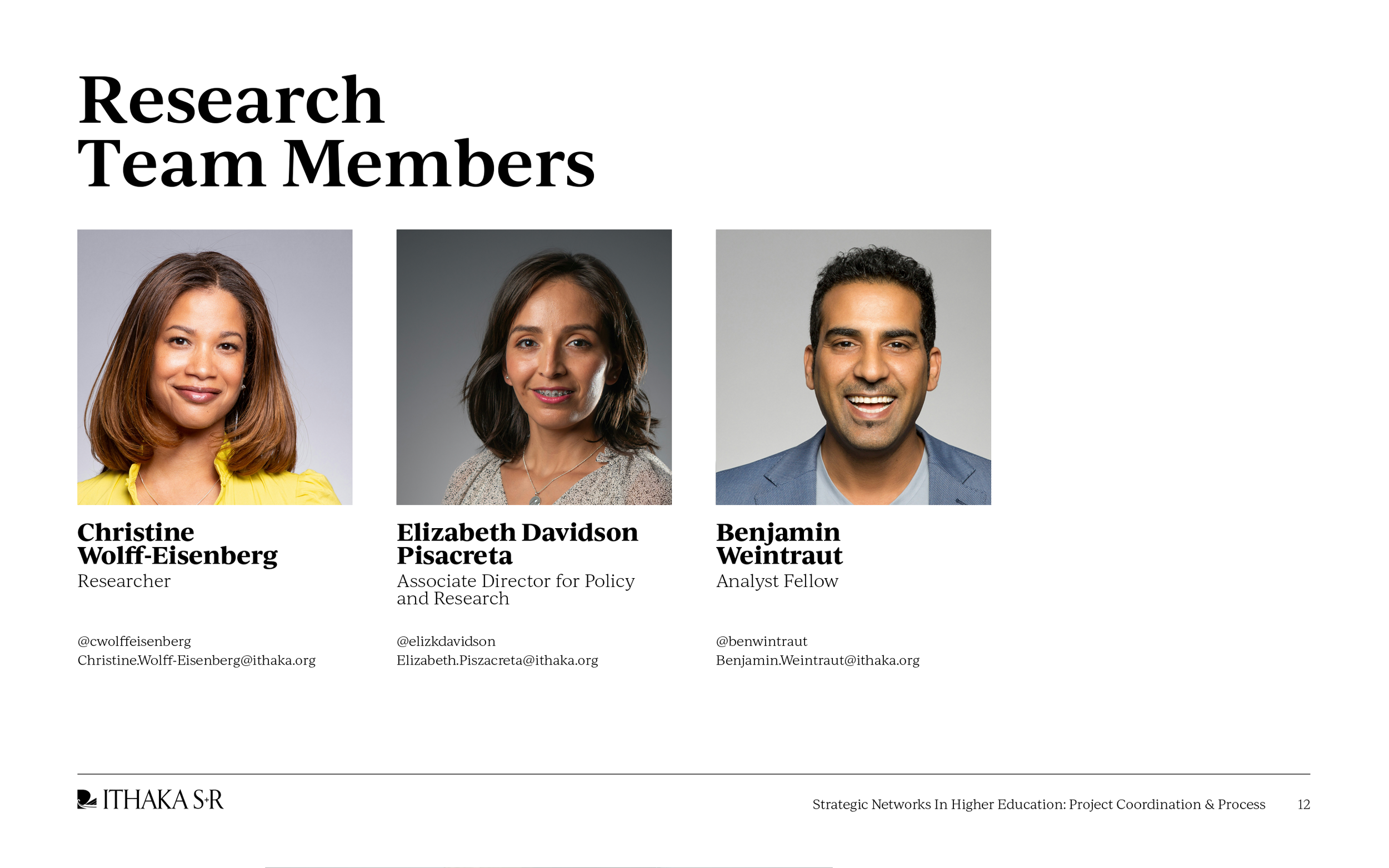
ITHAKA S+R – Brand Collateral Design System


Nonprofit Client Work


ITHAKA S+R – Brand Collateral Design System
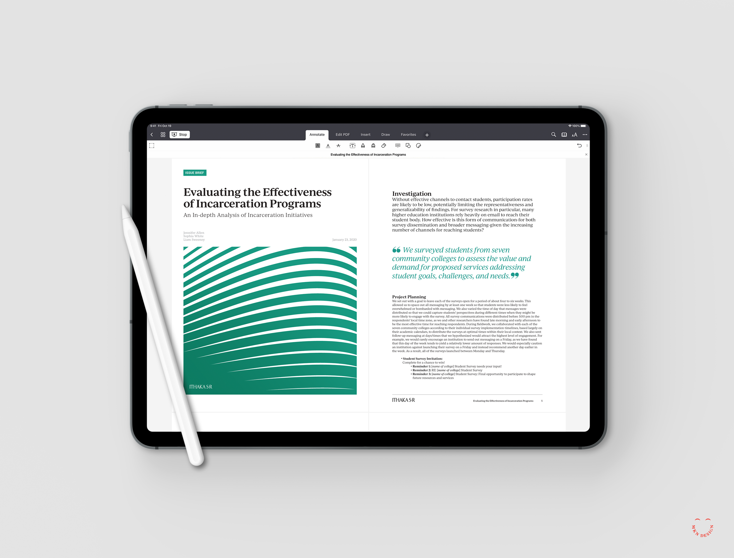
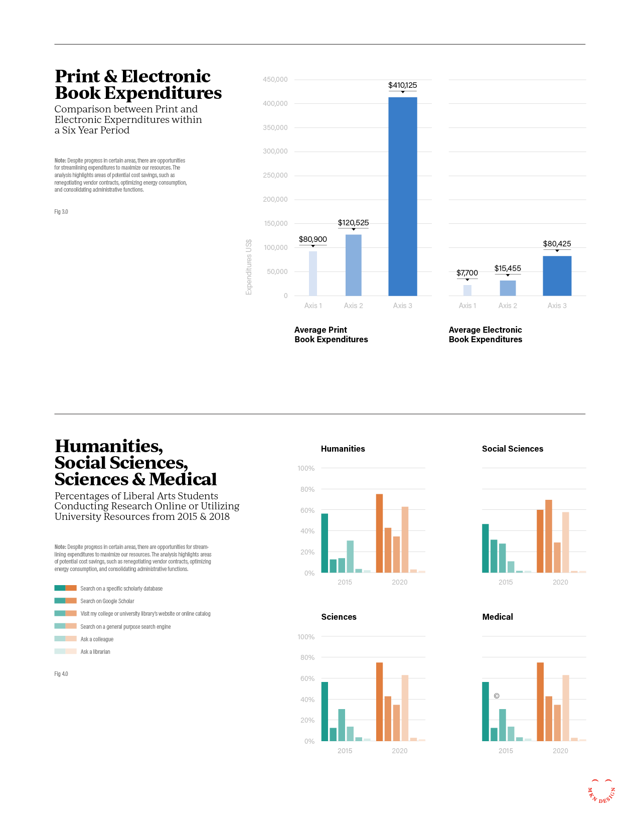
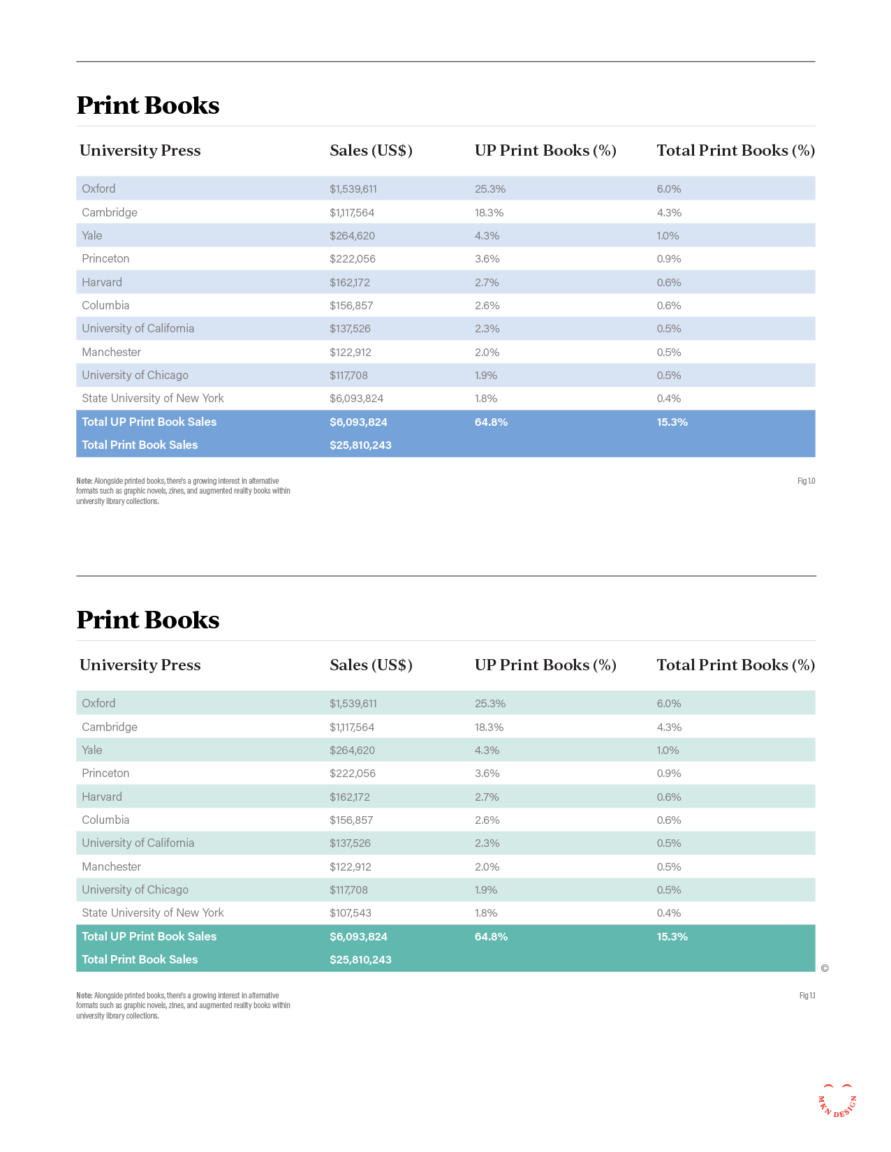
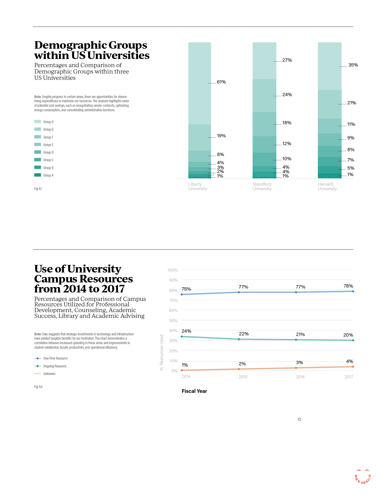
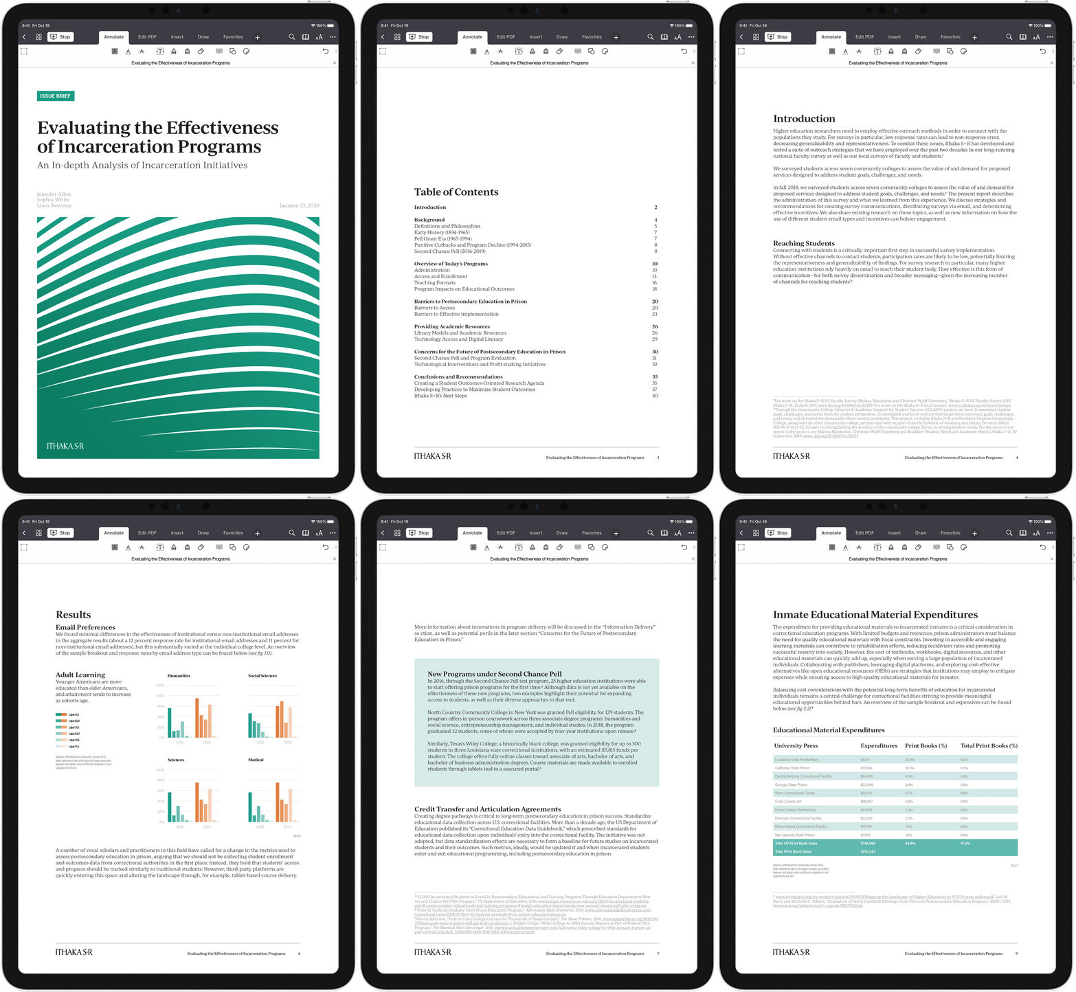
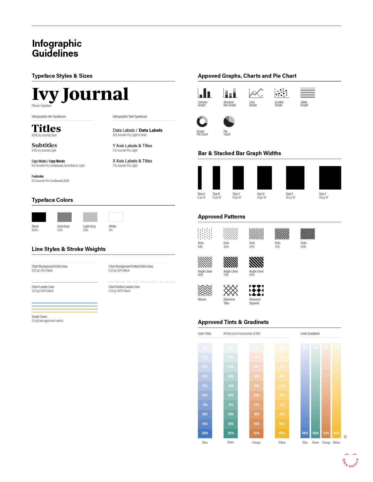
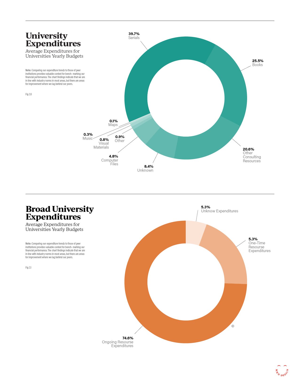
ITHAKA S+R, an organization that conducts research and provides strategic guidance to help the academic community navigate economic and technological change, needed a unified design system for all their communication materials. They hired us to modernize their system by creating an accessible, brand-compliant design that could be easily updated and maintained by their team.

A key requirement was enabling staff to create or update all redesigned materials. Our research identified Google Workspace (Docs, Slides, and Sheets) as the optimal platform for implementation. The resulting design system follows Ithaka’s brand guidelines, incorporates accessibility considerations—including color blindness and visual impairments—and provides clear, distinct visual cues for different document types such as case studies, issue briefs, research reports, and unpublished reports.

Through iterative design explorations, we delivered a unified system that gives Ithaka’s educational research materials and presentations a consistent, distinctive, and accessible visual identity.