
Independent Work
Independent Work

Product
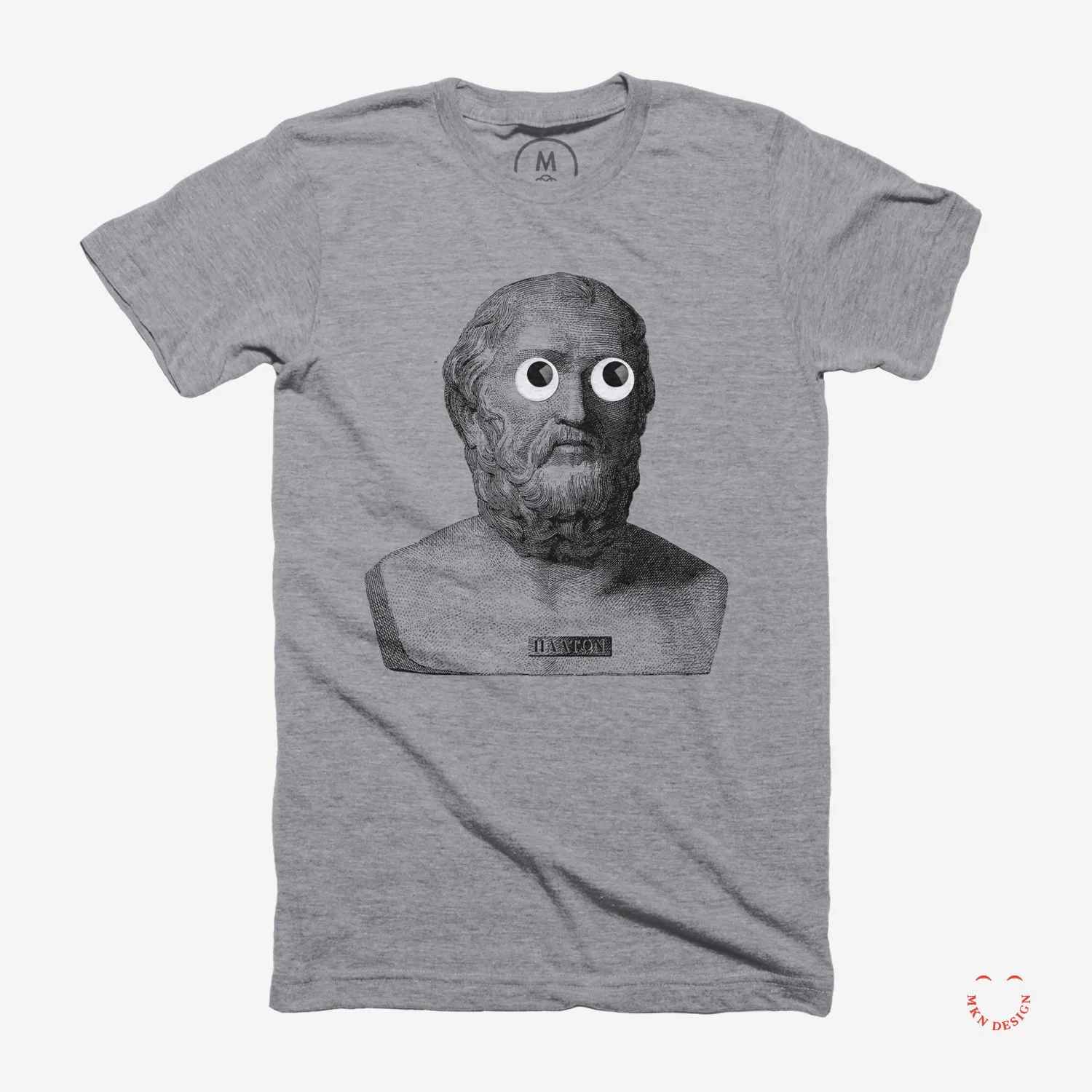
“When men speak ill of thee, live so as nobody may believe them.” – Plato
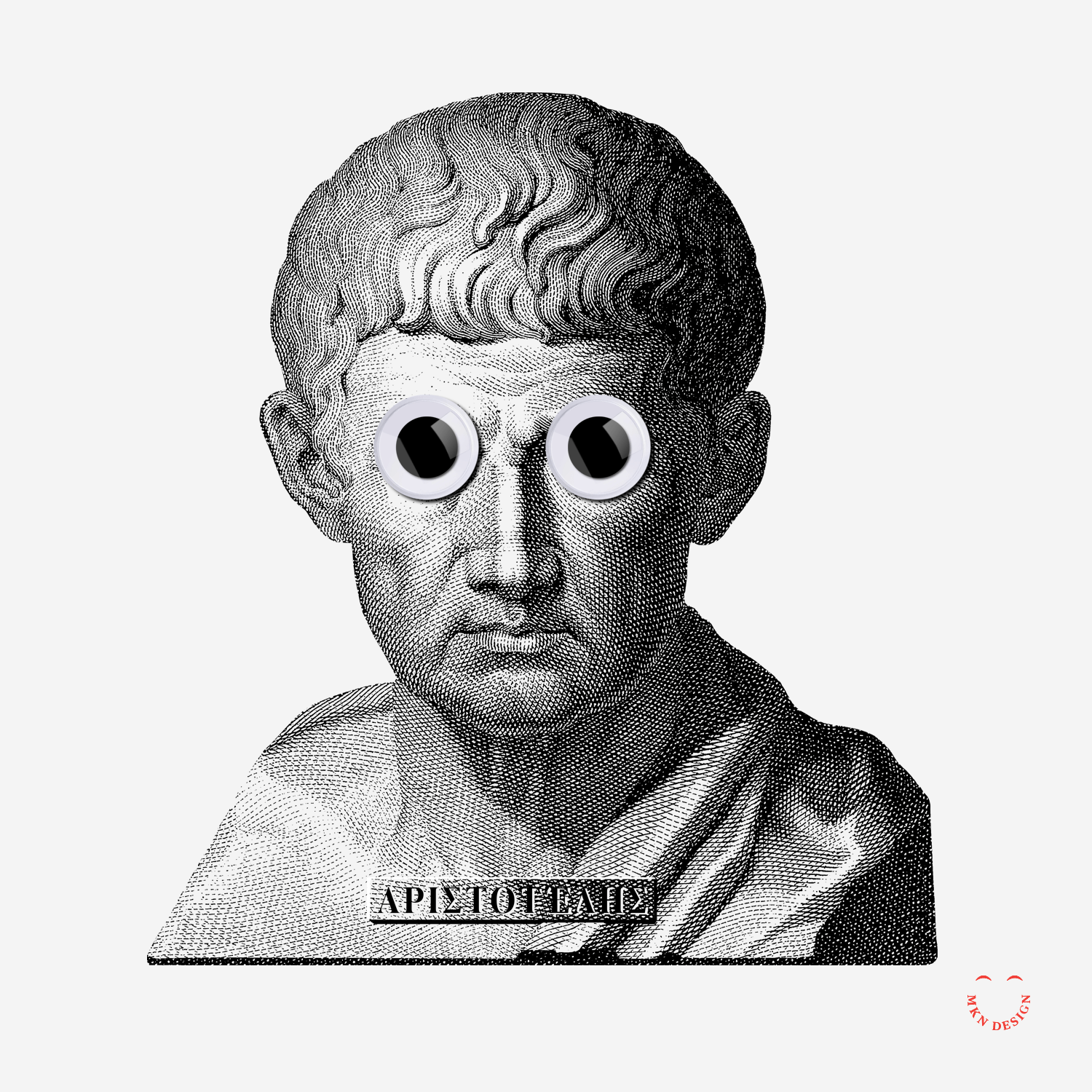
“Educating the mind without educating the heart is no education at all.” – Aristotle
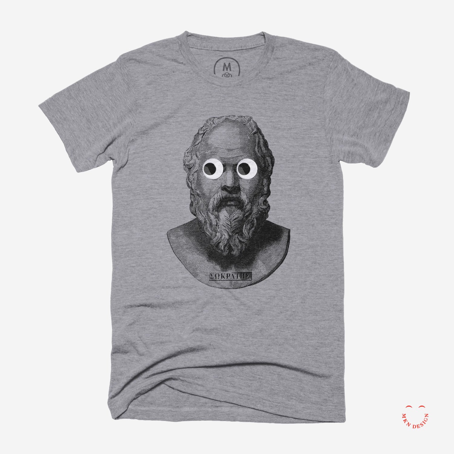
“All I Know Is That I Know Nothing.” – Socrates
Aristotle, Plato, and Socrates graphic tees are available for purchase on Cotton Bureau. Check out more graphic tees on my Cotton Bureau profile page. All Cotton Bureau apparel comes in a variety of clothing types, styles, fits, sizes, materials, and colors.
Independent Work
→ Historical Photo: Holmes Sardine Factories, 1885
→ Lithography: Holmes Sardine Tin Packaging, 1912
→ Historical Photo: Sealing Sardine Cans, 1930
→ Historical Artifact: Artifact of the week, 2024

Independent Work


Independent Work


Client Work
Adrian Butler [AB]
DJ, Designer and Musician
+ Concept Development
+ Sketching and Ideation
+ Illustration
MKN Design Team:
+ Michael Nÿkamp, Design Director
AB Stakeholder:
+ Adrian Butler, DJ, Designer and Musician
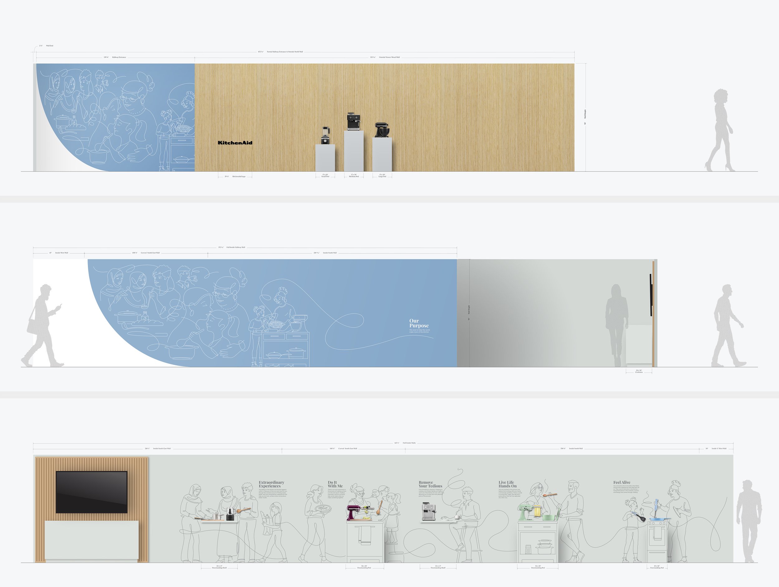
↑ Final Environment Design Concept
↓ Final Environmental Design Environment
↓ Video: KitchenAid Environment Walkthrough
↓ Details: KitchenAid Brand Illustrative & Product Narratives
Client Work
At this year’s meeting, KitchenAid was showcased, and we developed visuals for their updated brand messaging into an illustrative, product-focused walkthrough leading into a beautifully designed kitchen environment, highlighting their most innovative products to investors.
After meetings and a review of their brand messaging and requirements, we deconstructed each brand pillar and translated them into five distinct narratives to bring the “Do It With Me” ethos to life. Each story highlighted households preparing meals, showcasing the interaction of illustrated people with KitchenAid’s countertop appliances, cookware, and utensils in action. These narratives were then seamlessly integrated into a sixth narrative, creating a cohesive story that illustrates how KitchenAid plays a central role in bringing people together, supporting families in food preparation, and fostering meaningful experiences in the kitchen.
The final installation was a seamless blend of clean, minimalist line illustrations paired with physical KitchenAid products, effectively demonstrating how the brand serves as an ‘aid’ in everyday cooking routines. The result was a visually captivating environment that embodied KitchenAid’s brand principles and brought their message to life. This project was a collaborative effort, with the KitchenAid product and CMF teams. Concept sketches where done by Jody Williams.
KitchenAid
Consumer Countertop Appliances
+ Concept Development
+ Design/Art Direction
+ Illustration
+ Narrative Storytelling
+ Print Management
+ Qualitative Research
MKN Design Team:
+ Michael Nÿkamp, Design Director
+ Jody Williams, Illustrator
KitchenAid Stakeholders:
+ John McConnell, Director of Global Design
+ Chadwick Ries, Global Brand Director
+ Brittni Pertijs, CMF Design Manager
+ Brandon Mock, Design Manager


Independent Work

Independent Work
Article


Independent Work


Product
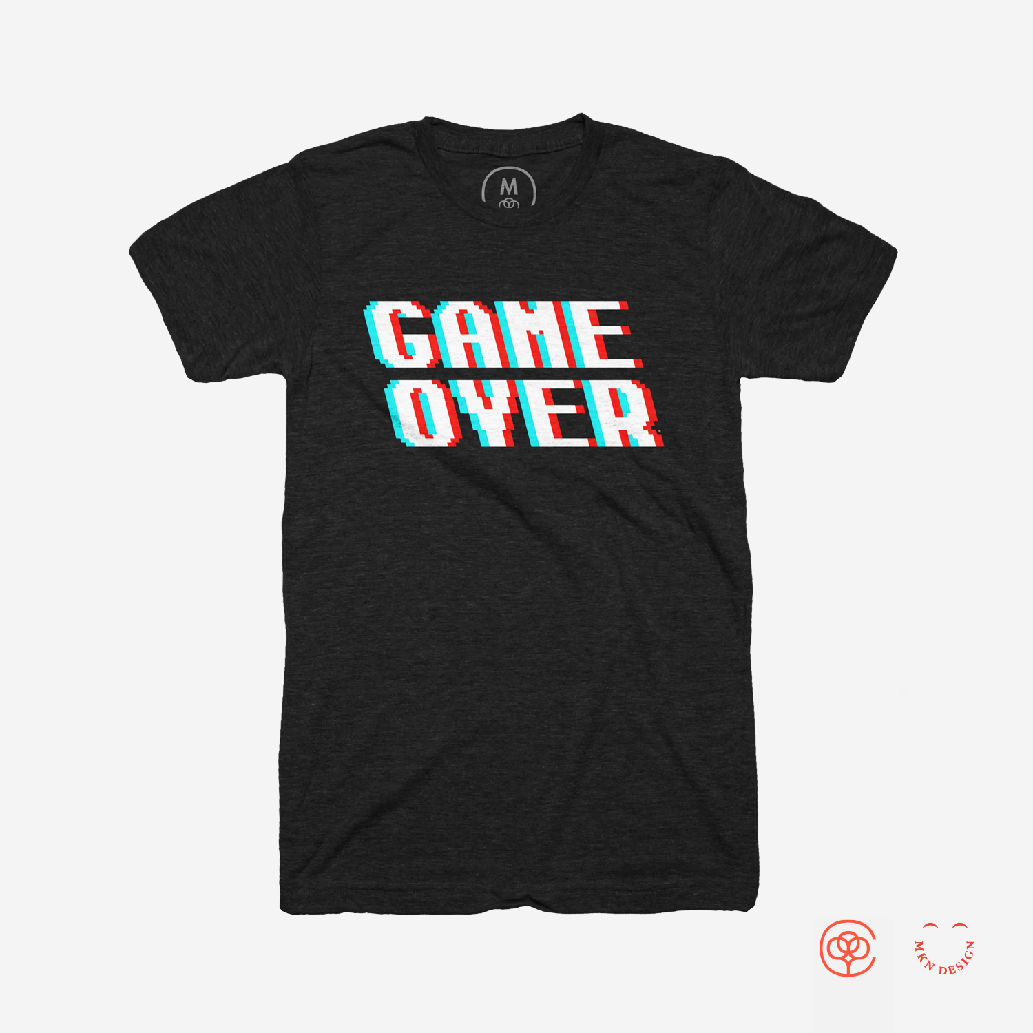
Multiplayer Tetris & Game Over graphic tees are available for purchase on Cotton Bureau. Check out more graphic tees on my Cotton Bureau profile page. All Cotton Bureau apparel comes in a variety of clothing types, styles, fits, sizes, materials, and colors.

Article

Product
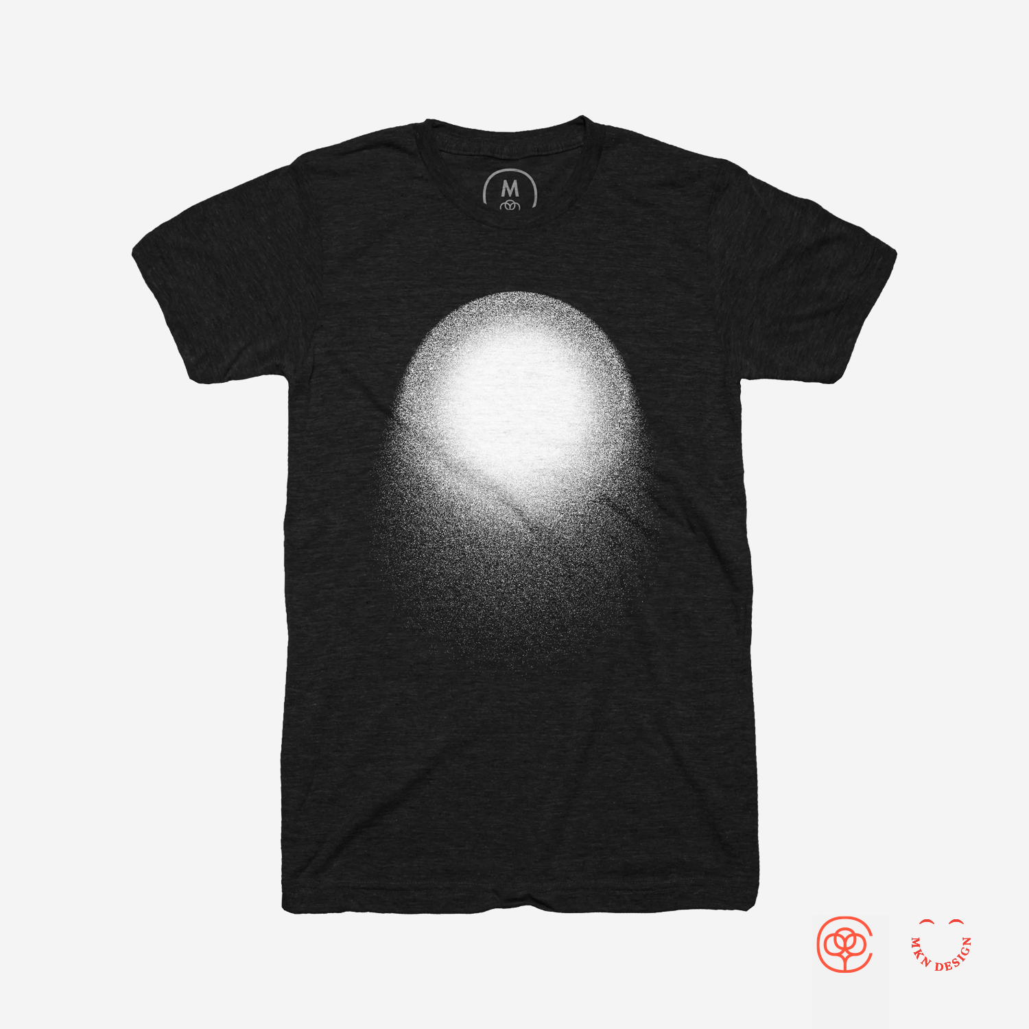
Orb graphic tee is available for purchase on Cotton Bureau. Check out more graphic tees on my Cotton Bureau profile page. All Cotton Bureau apparel comes in a variety of clothing types, styles, fits, sizes, materials, and colors.


Product
Anatomy of Twitter graphic tee is available for purchase on Cotton Bureau. Check out more graphic tees on my Cotton Bureau profile page. All Cotton Bureau apparel comes in a variety of clothing types, styles, fits, sizes, materials, and colors.


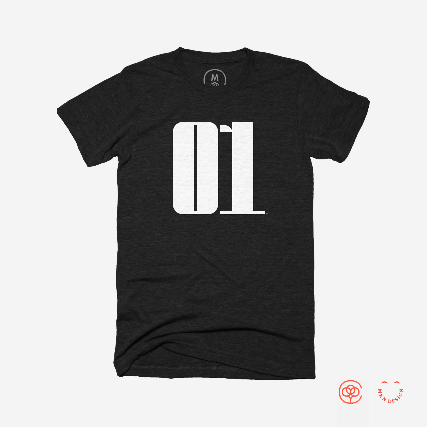

Product
Zero/One & Ninety-Nine graphic tees shown in this post are available for purchase on Cotton Bureau. Check out more graphic tees on my Cotton Bureau profile page. All Cotton Bureau apparel comes in a variety of clothing types, styles, fits, sizes, materials, and colors.
The numbers featured on these tee graphics come from a display typeface I designed. It’s available for purchase, view Sum here.


Product
Super Phat graphic tee, pocket tee and cap are available for purchase. Check out more graphic tees on my Cotton Bureau profile page. All Cotton Bureau apparel comes in a variety of clothing types, styles, fits, sizes, materials, and colors.


Independent Work
↓ City Pours alternate logo directions

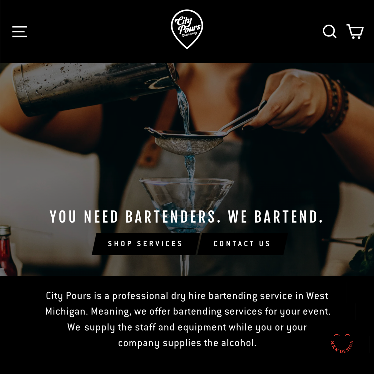
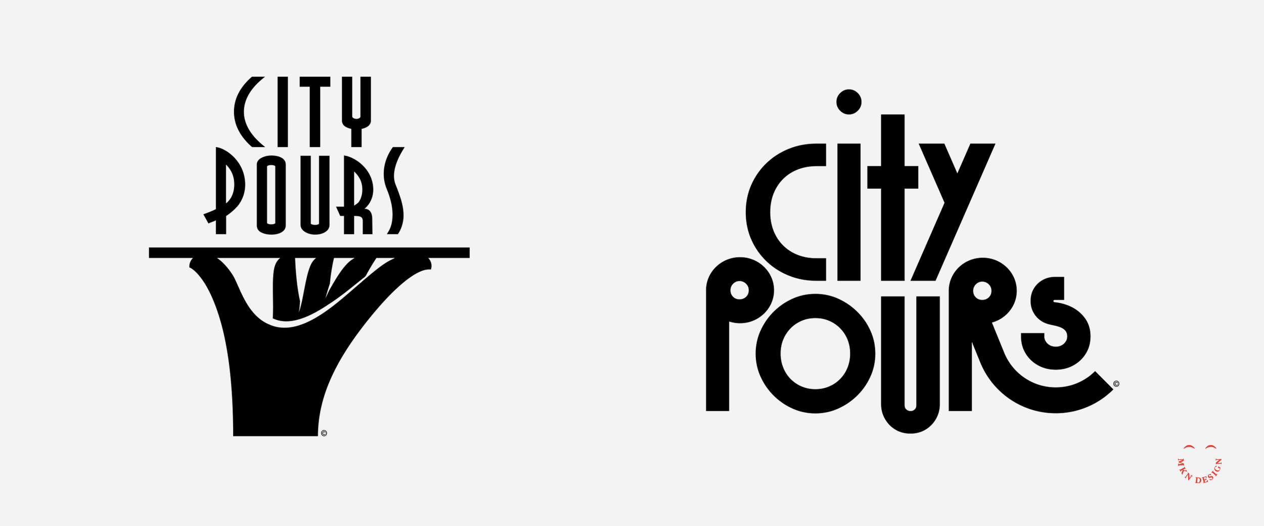
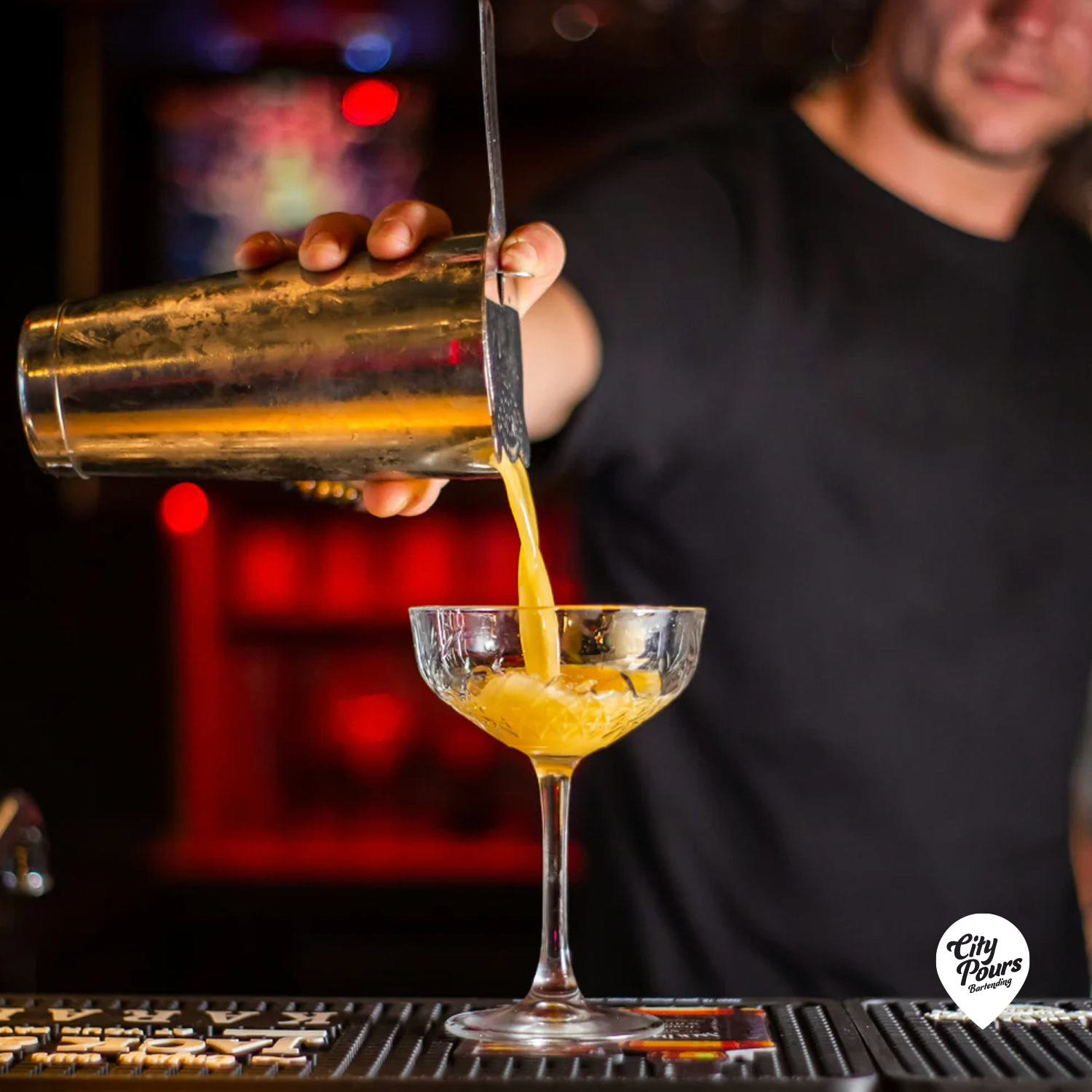
Client Work
City Pours
Mobile Bar & Bartending Service
+ Brand Advisor
+ Concept Development
+ Creative Strategy
+ Design Direction
+ Qualitative Research
+ Visual Identity
MKN Design Team:
+ Michael Nÿkamp, Design Director
City Pour Stakeholder:
+ Alex Corbett, CEO


Product
Mellow Yellow graphic tee, pocket tee and cap are available for purchase. Check out more graphic tees on my Cotton Bureau profile page. All Cotton Bureau apparel comes in a variety of clothing types, styles, fits, sizes, materials, and colors.
MKN Design, LLC
michael@mkn-design.com
1 616 915 1941
Good design is complexity presented simply
MKN Design LLC © 2025
Originally from Ontario, Canada, and currently based in West Michigan, Michael Nÿkamp is dedicated to helping businesses develop and refine creative strategies into clear, impactful solutions that captivate and engage.


