Client Project
April 2016
__
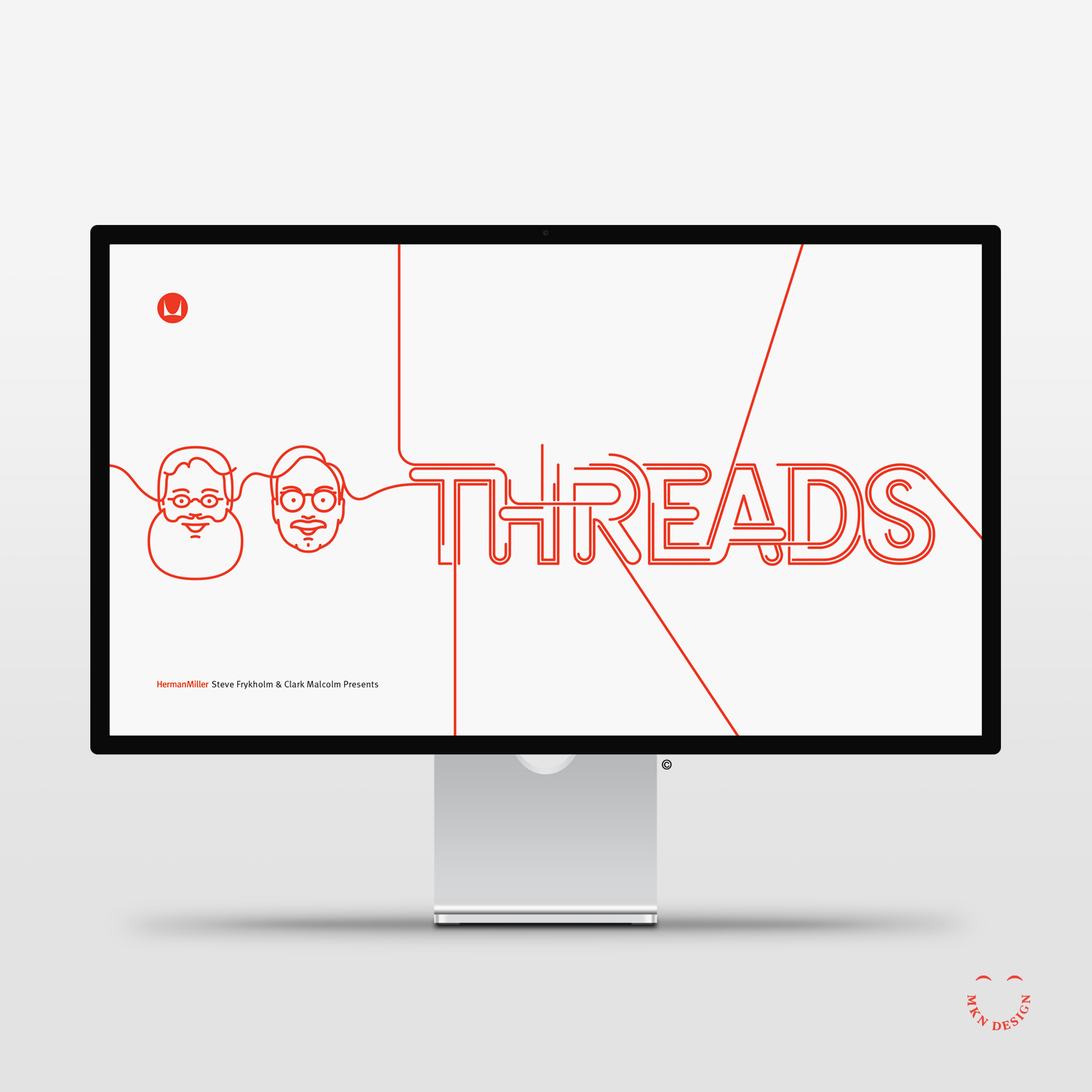
Herman Miller
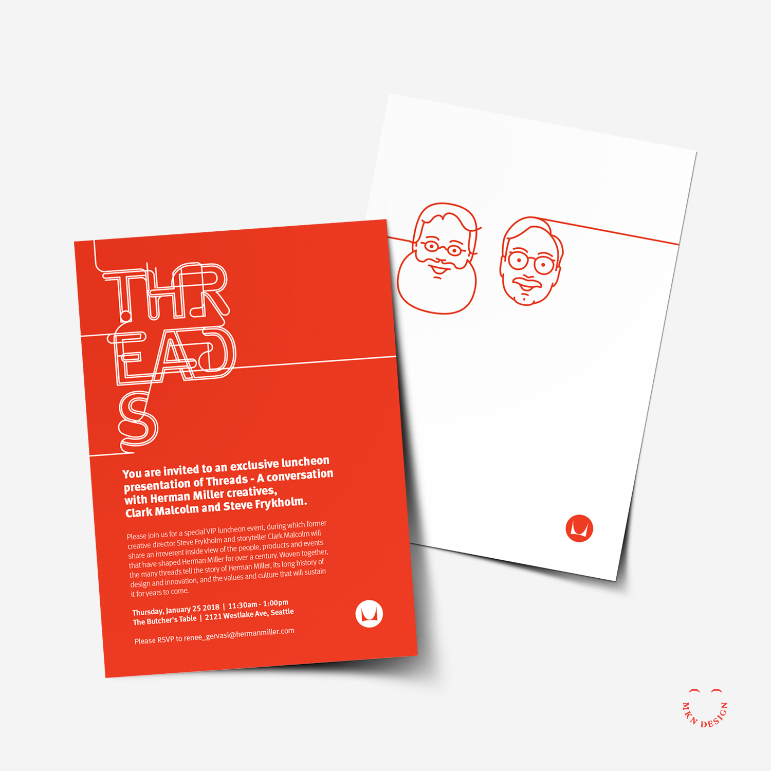
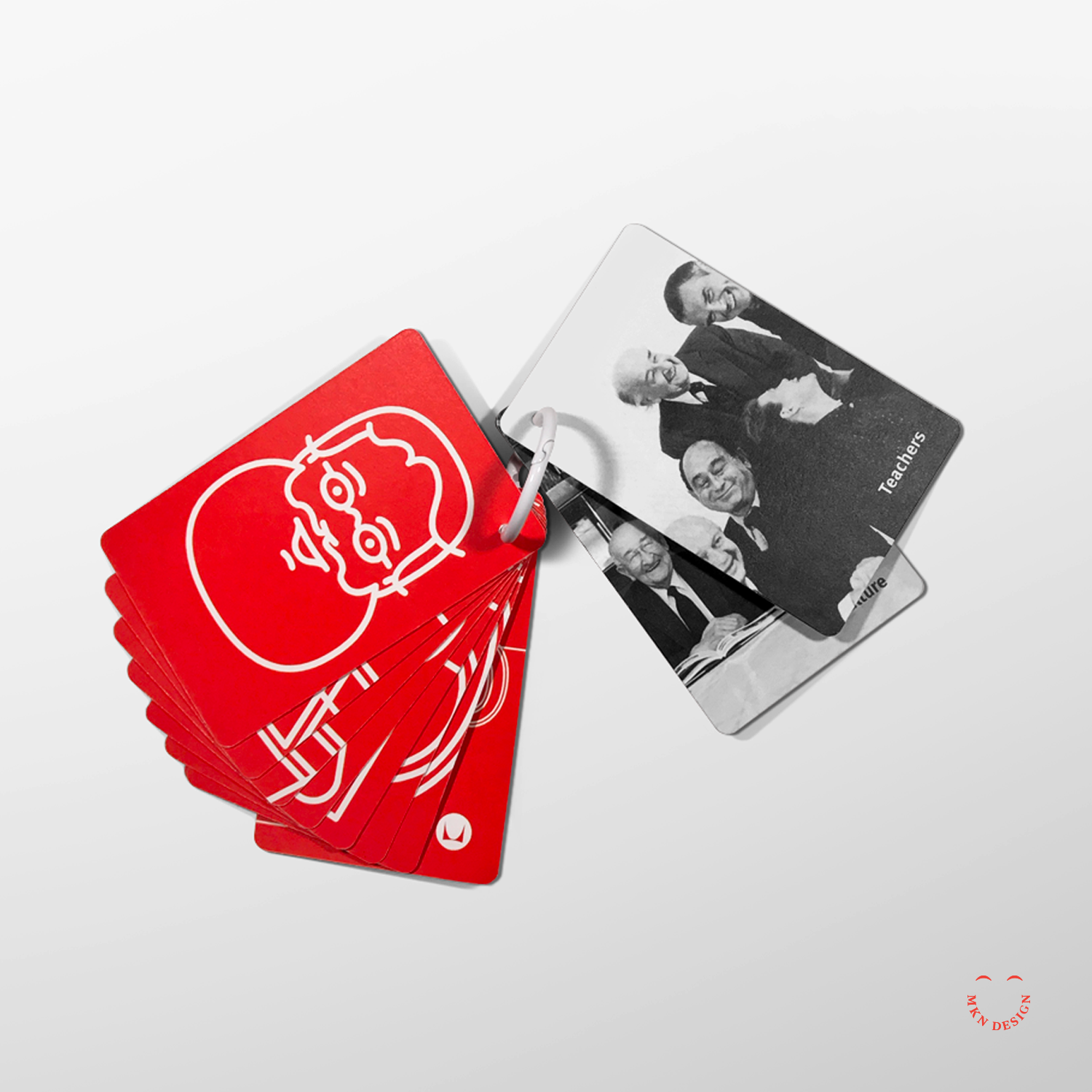
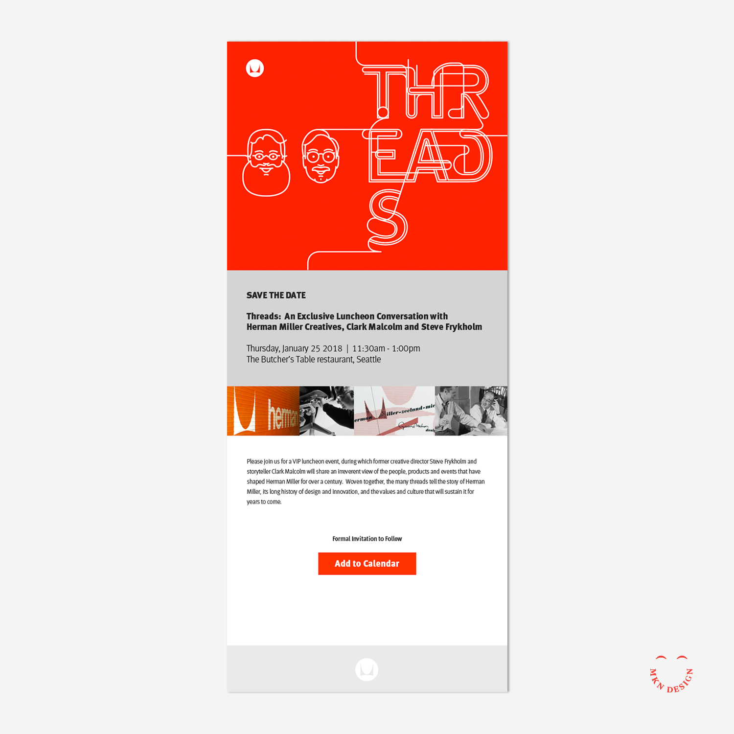
At the heart of the furniture manufacturer's legacy lies its iconic pieces and the visionary designers behind them, such as Alexander Girard, and Ray and Charles Eames. "Threads" is a presentation and conversation lead by former graphic designer Steve Frykholm and writer Clark Malcolm. They weave Herman Miller's rich history of design innovation, its embrace of new ideas and talents through captivating narratives that shaped Herman Miller's 111-year journey. Because of my illustrative portrait line style, I was commissioned to create illustrations tailored to complement the theme of "threads."
Collaborating closely with the Herman Miller design team, I illustrated portraits of Steve and Clark. These portraits were seamlessly integrated into promotional and presentation materials for the event."
-
+ Portrait Illustration
-
+ Style Development
+ Sketching & Ideation
+ Illustration -
My portrait series, formally called Facebook Friends started as a self initiated project illustrating my friends on Facebook. This endeavor evolved into illustrating portraits of speakers for CanUX Conference, and numerous portraits for friends and clients.An article titled "Face Behind the Faces" was written about me and the portrait series.
-
Promotional printed and web materials developed by Herman Miller.