


Client Project
August 2022
__
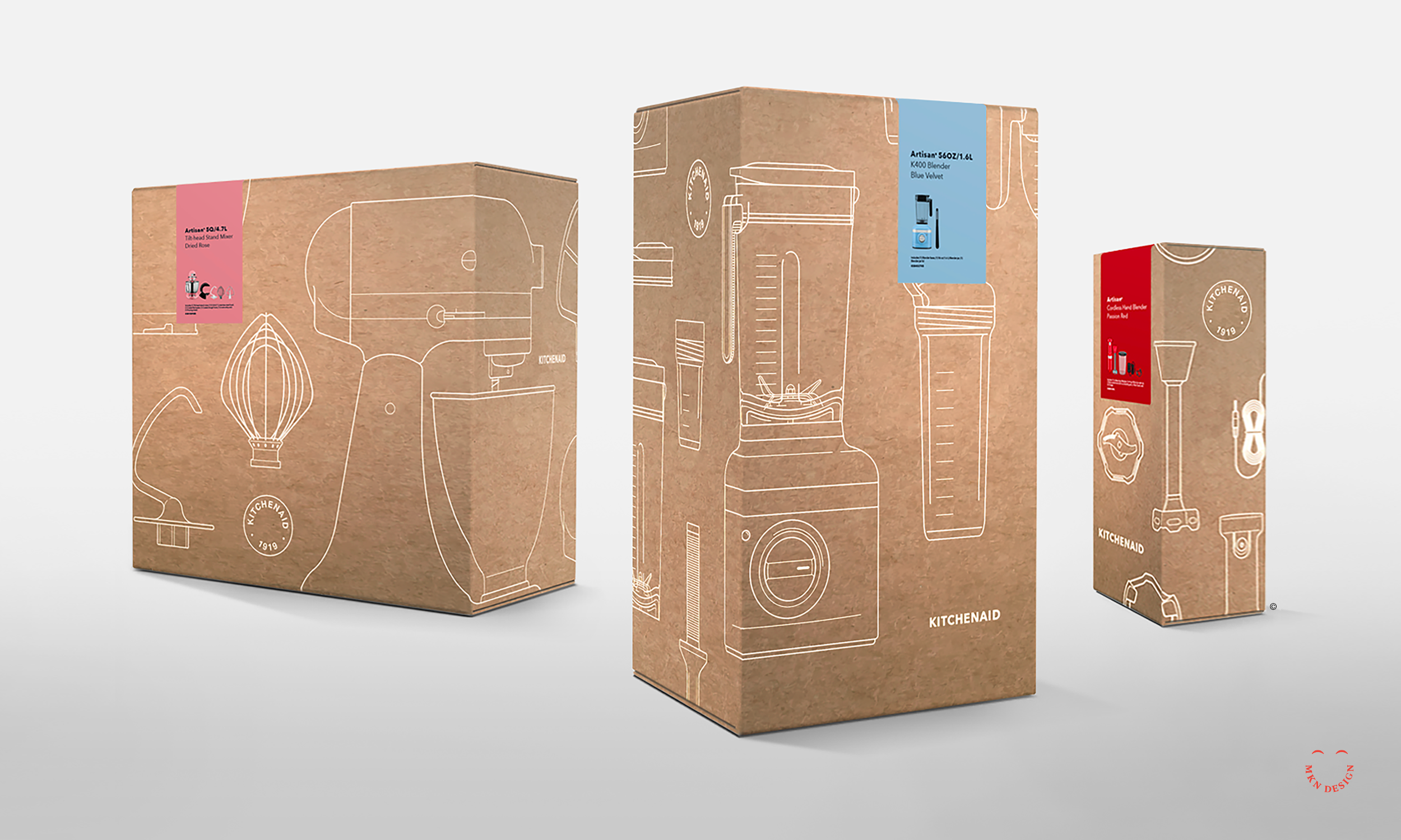
KitchenAid Packaging
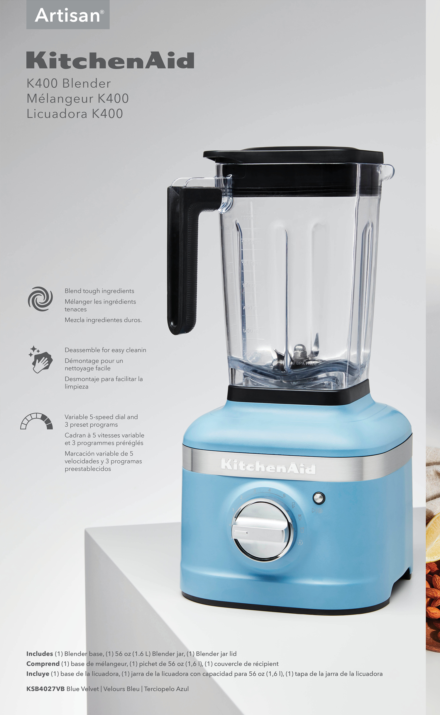
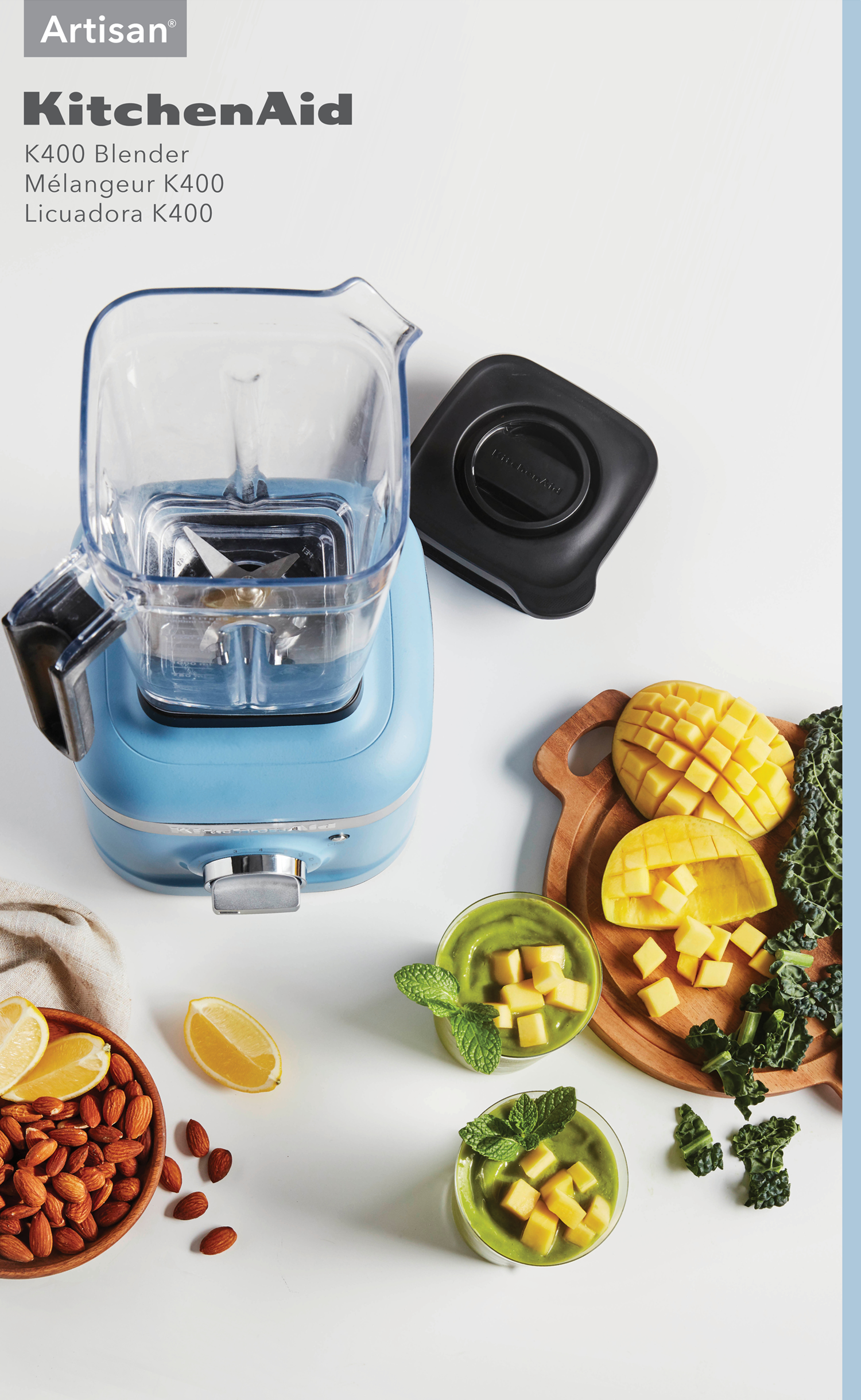
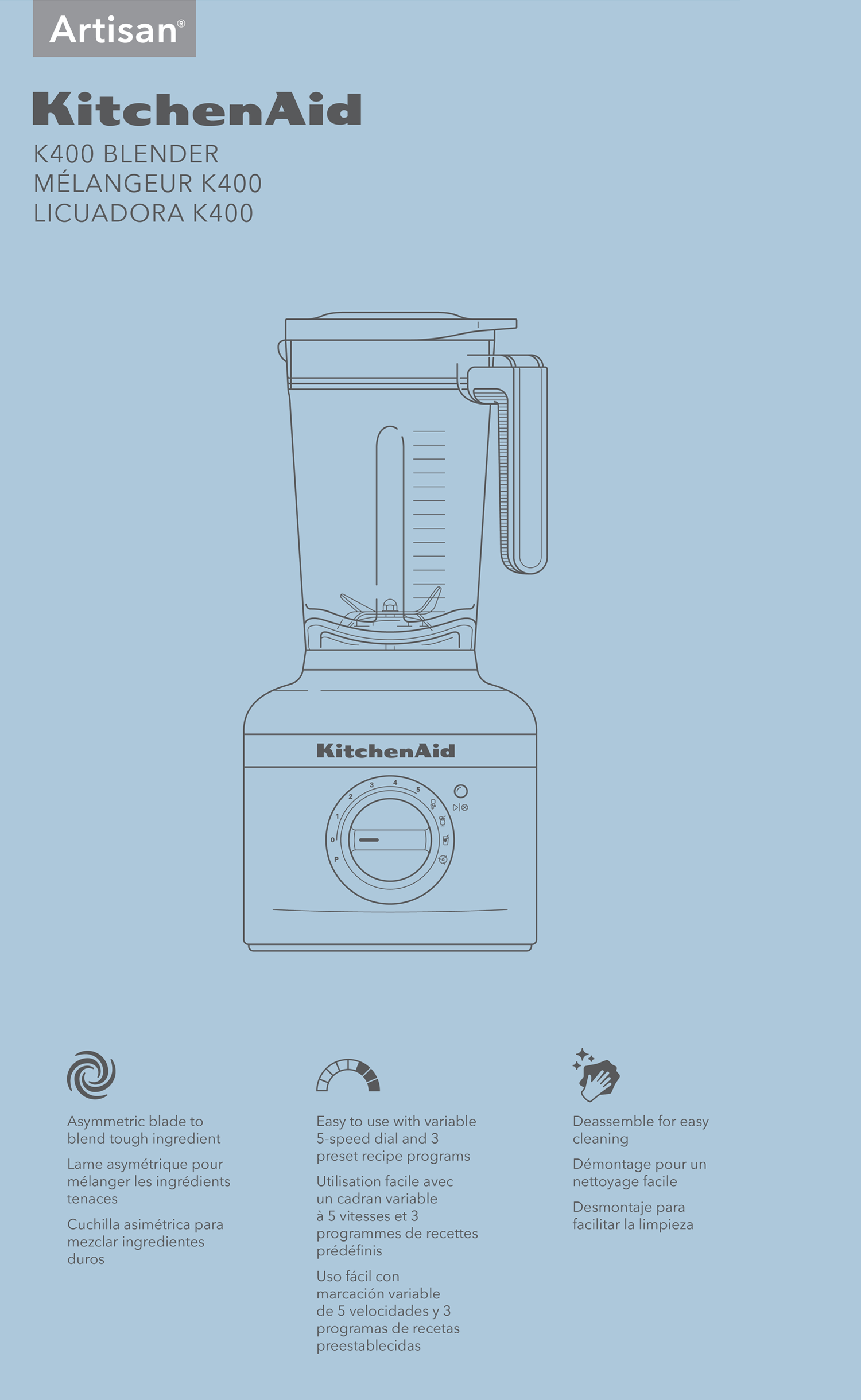
KitchenAid is the leader in home appliance brands. The company was established in 1919 and is headquartered in Saint Joseph, Michigan. Renowned for the innovative and iconic KitchenAid Mixer, now used in most kitchens around the world. The company sells an average of 2.5 million mixers per year.
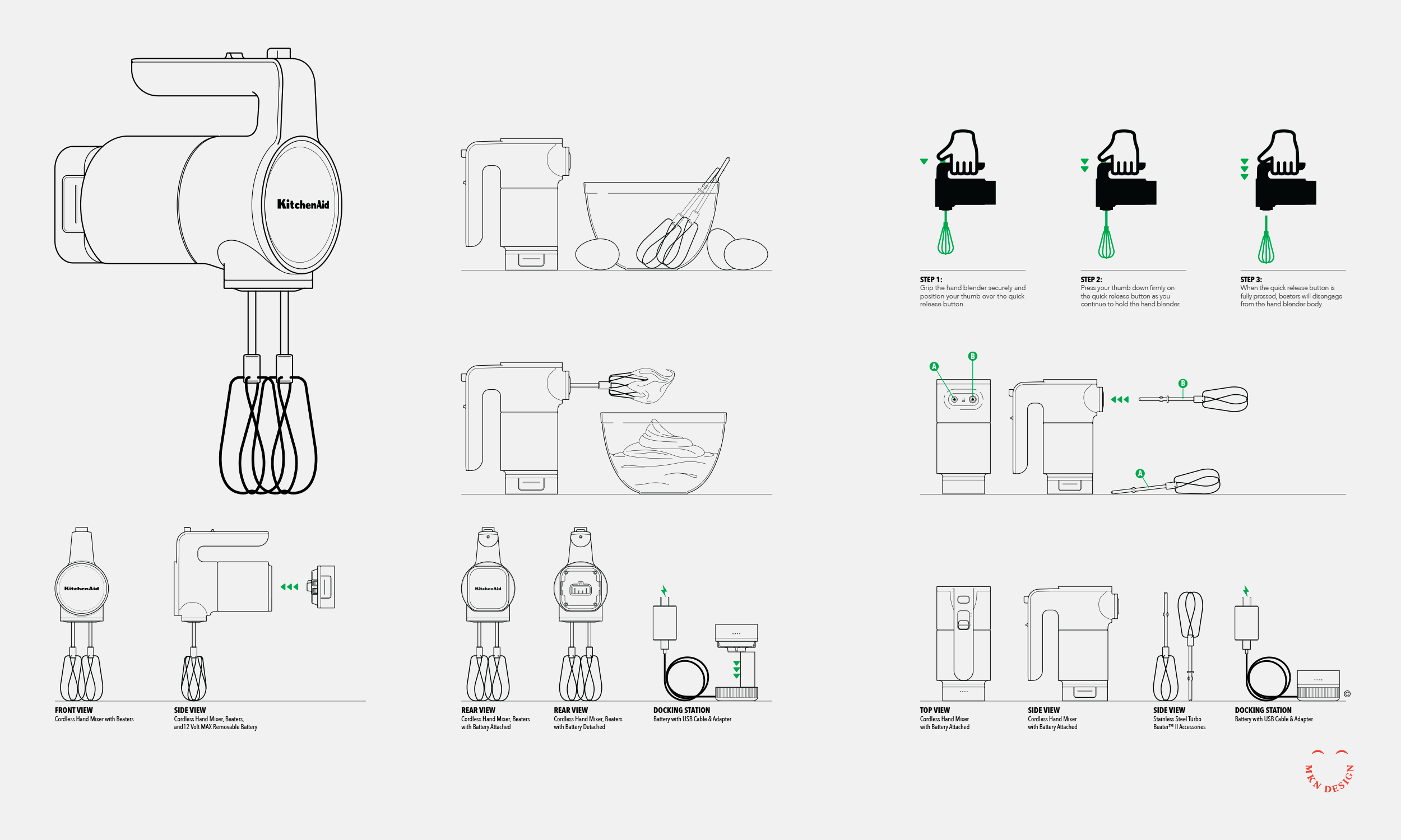
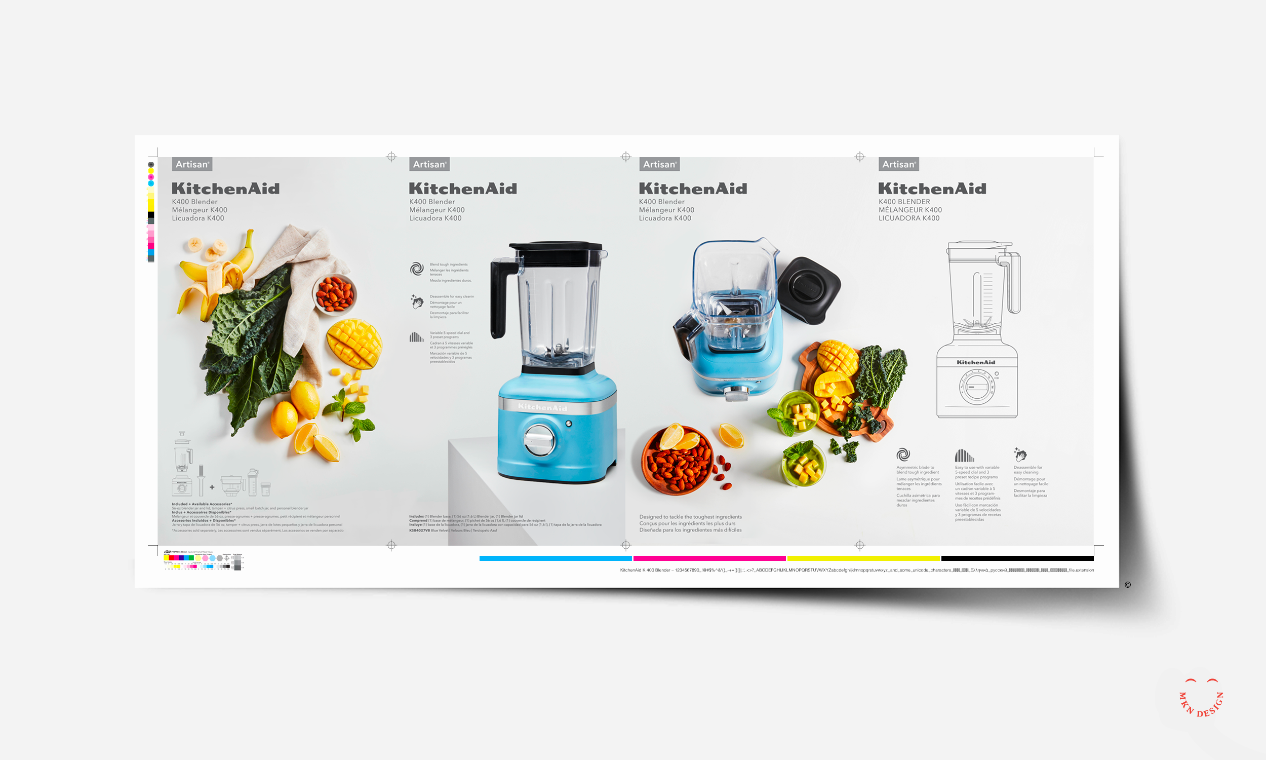
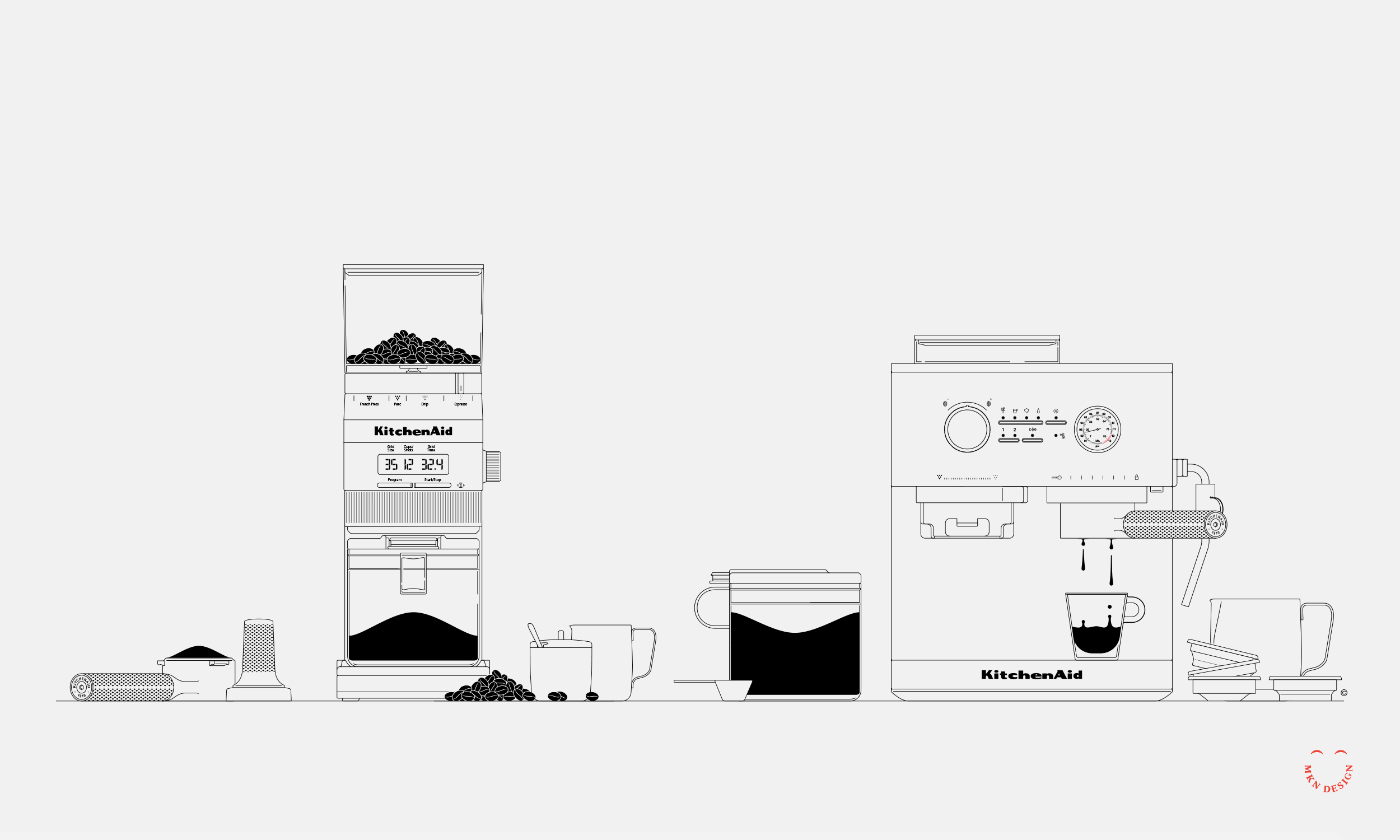
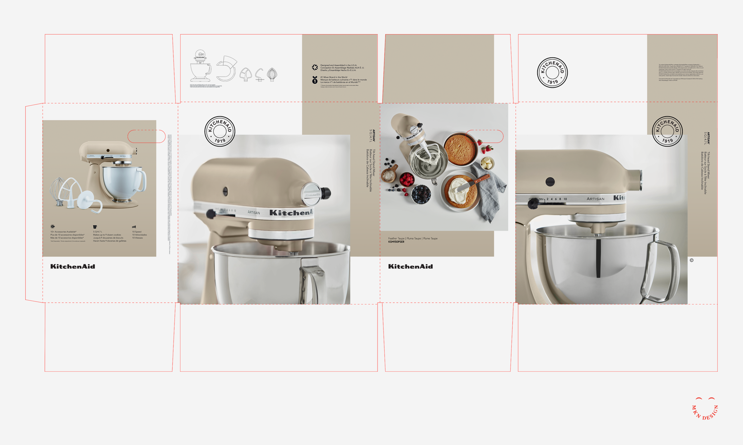
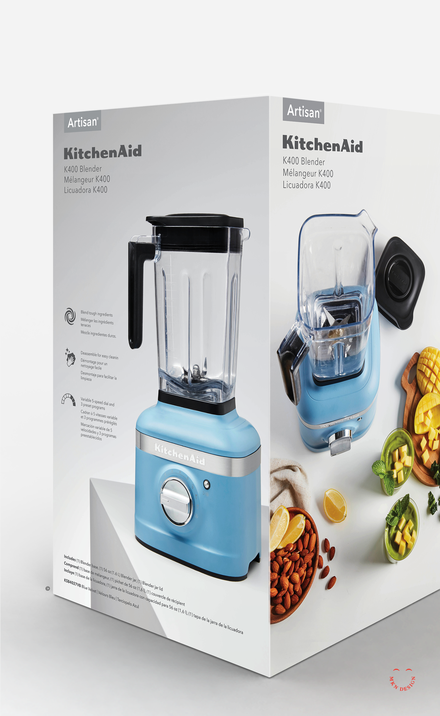
KitchenAid partnered with MKN Design to define and develop new brand packaging using clean design, illustration and iconography.At the project onset, we gathered research on consumer trends, packaging, design, and illustrative styles. Using this research, we conceptualized packaging ideas and brought them to life in physical form. The result was a collection of innovative packaging concepts that highlighted KitchenAid's unique products, establishing them as a bold leader in kitchen appliances tailored to their consumers.
-
+ Packaging Design
-
+ Research (competitive, consumer, trend)
+ Concept Development
+ Sketching & Ideation
+ Graphic Design & Layout
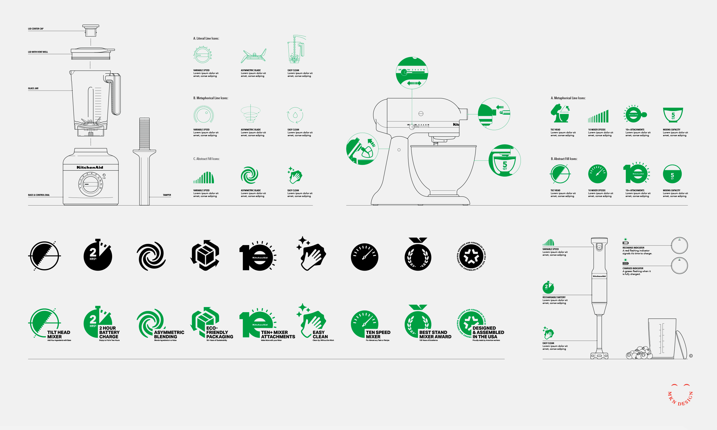
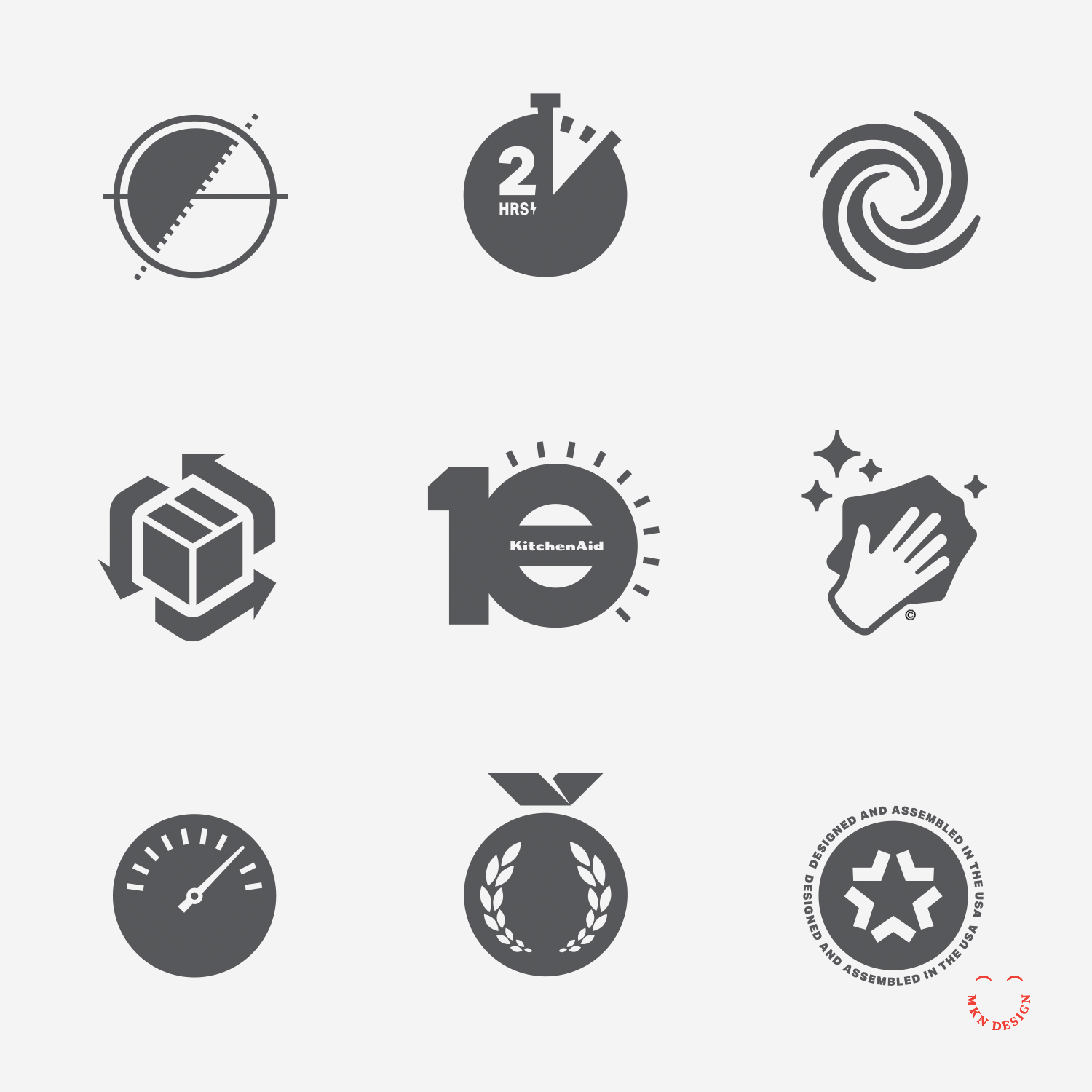
+ Iconography
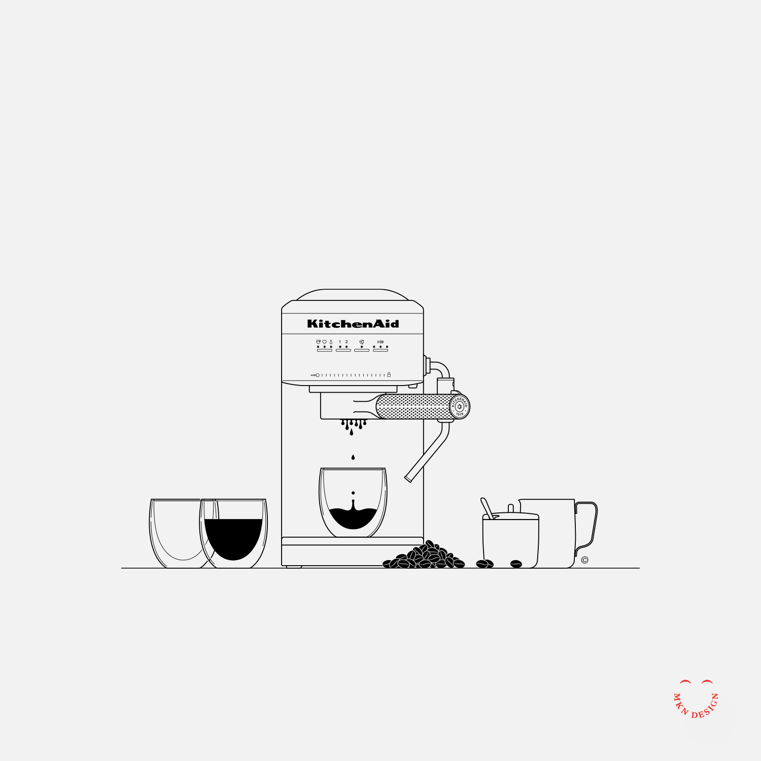
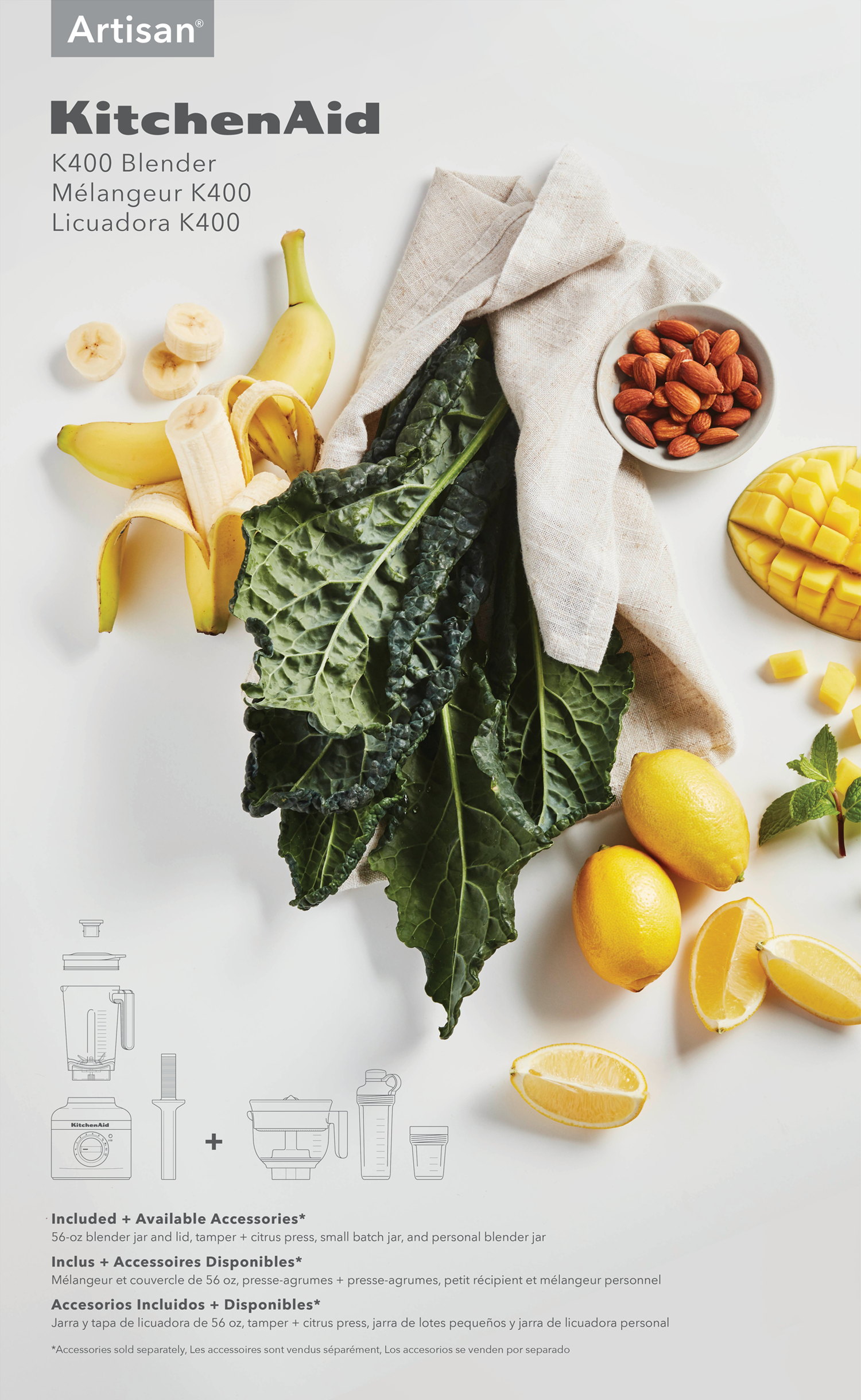
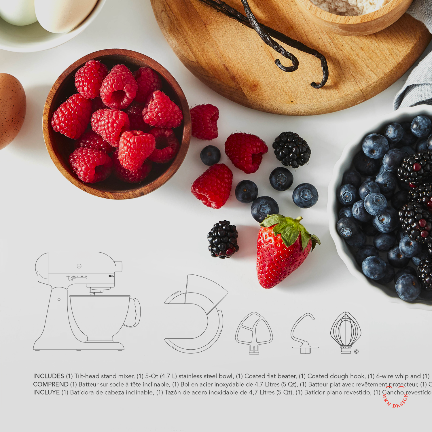
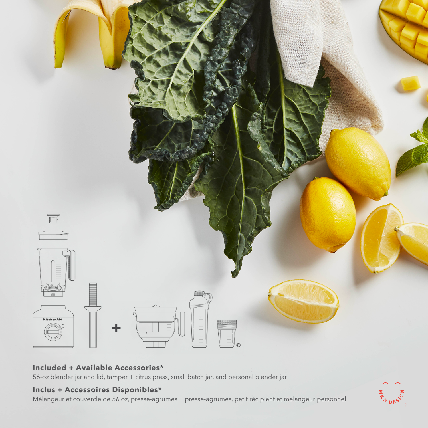
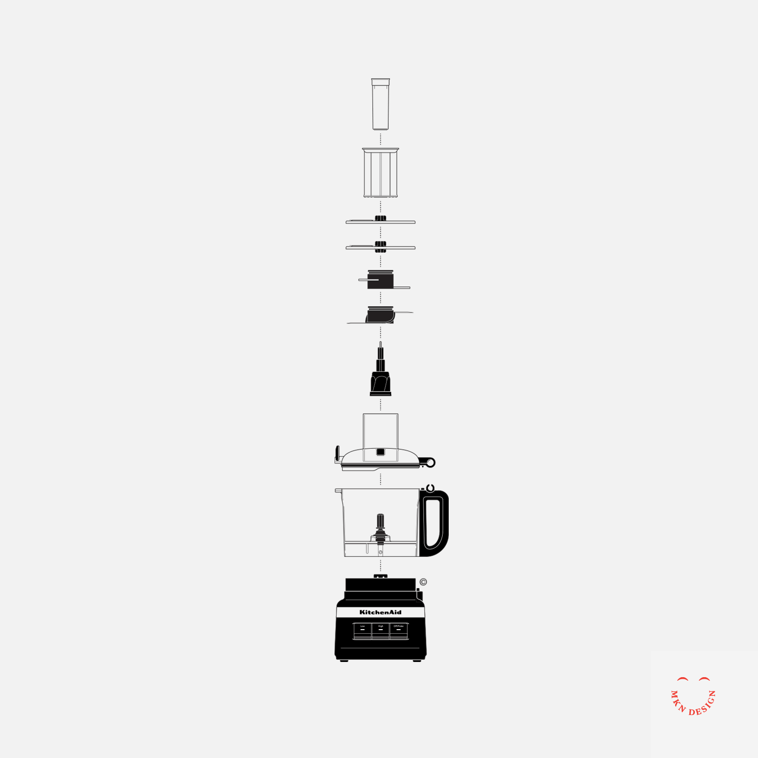
+ Instructional Illustrations
+ Product Illustrations
+ Mockups -
This project was a joint endeavor involving numerous individuals from both the KitchenAid design team and external independent contractors, such as Heather Tucker and myself.