Creative Musing
Creative Musing

Client Project
Patagonia
Outdoor Apparel & Gear
+ Concept Development
+ Illustration
+ Sketching & Ideation
+ Qualitative Research
MKN Design Team:
+ Michael Nÿkamp, Illustrator
Patagonia Stakeholders:
+ Geoff Holstad, Senior Art Director
+ Chris Teig, Director of Graphics & Illustration
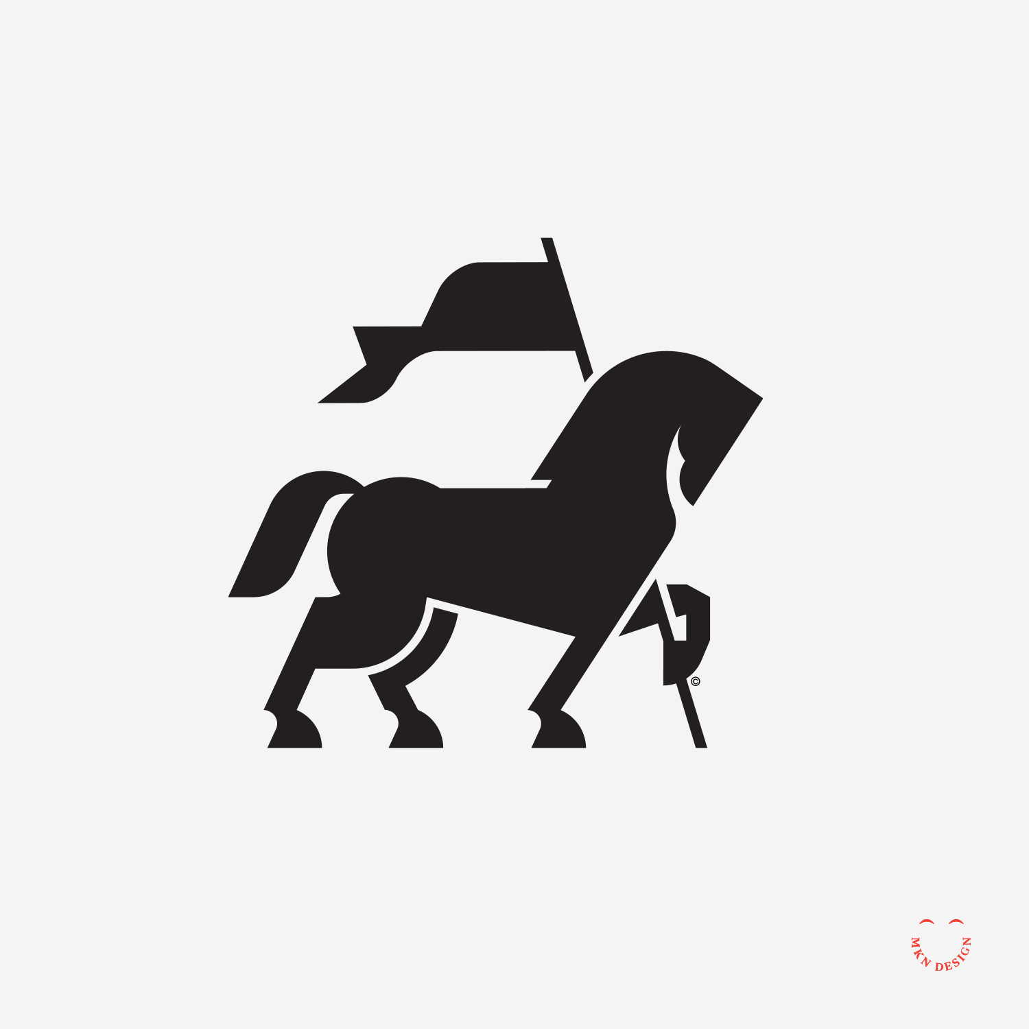
Article + Creative Musing

Client Project
This endeavor required a strategic approach, including the use of personas, iterative wire-framing, and meticulous design iterations to craft a compelling and user-centric digital journey for patients.
The application catered to both new and returning patients of Spectrum Health facilities, offering features such as iPad-based check-in for hospital and doctor appointments, seamless access to medical records, and entertainment options.
Spectrum Health via Mutually Human
Health Care Facilities & Services
+ Concept Development
+ Design Direction
+ Illustration Storytelling
+ Qualitative Research
+ User Experience
+ Sketching & Ideation
MKN Design Team:
+ Michael Nÿkamp, Visual Storytelling & UX/UI
Mutually Human Stakeholders:
+ Ross Hunter, Software Craftsman
+ Mark Van Holstyn, Founder and CTO
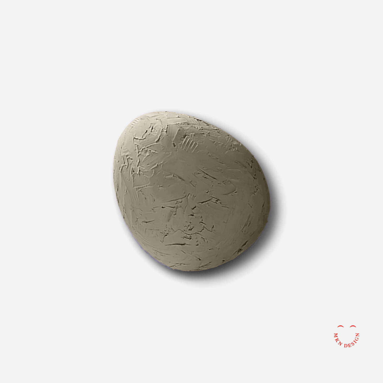
Client Project
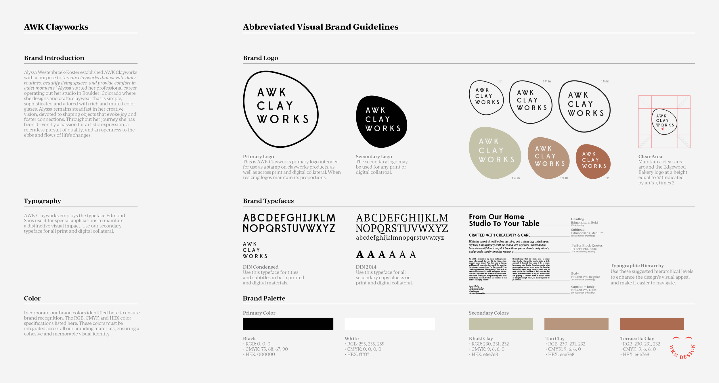
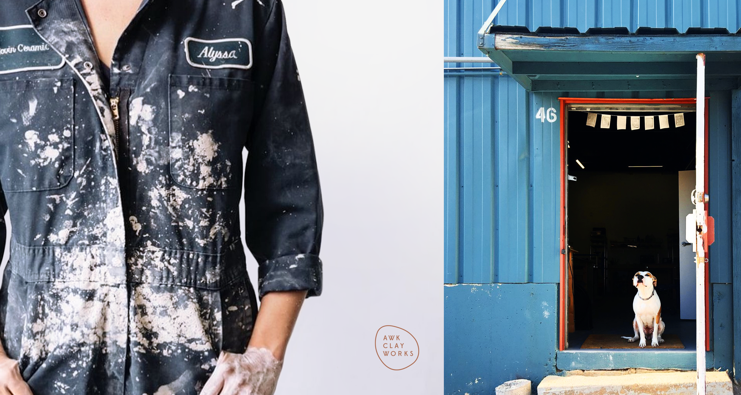
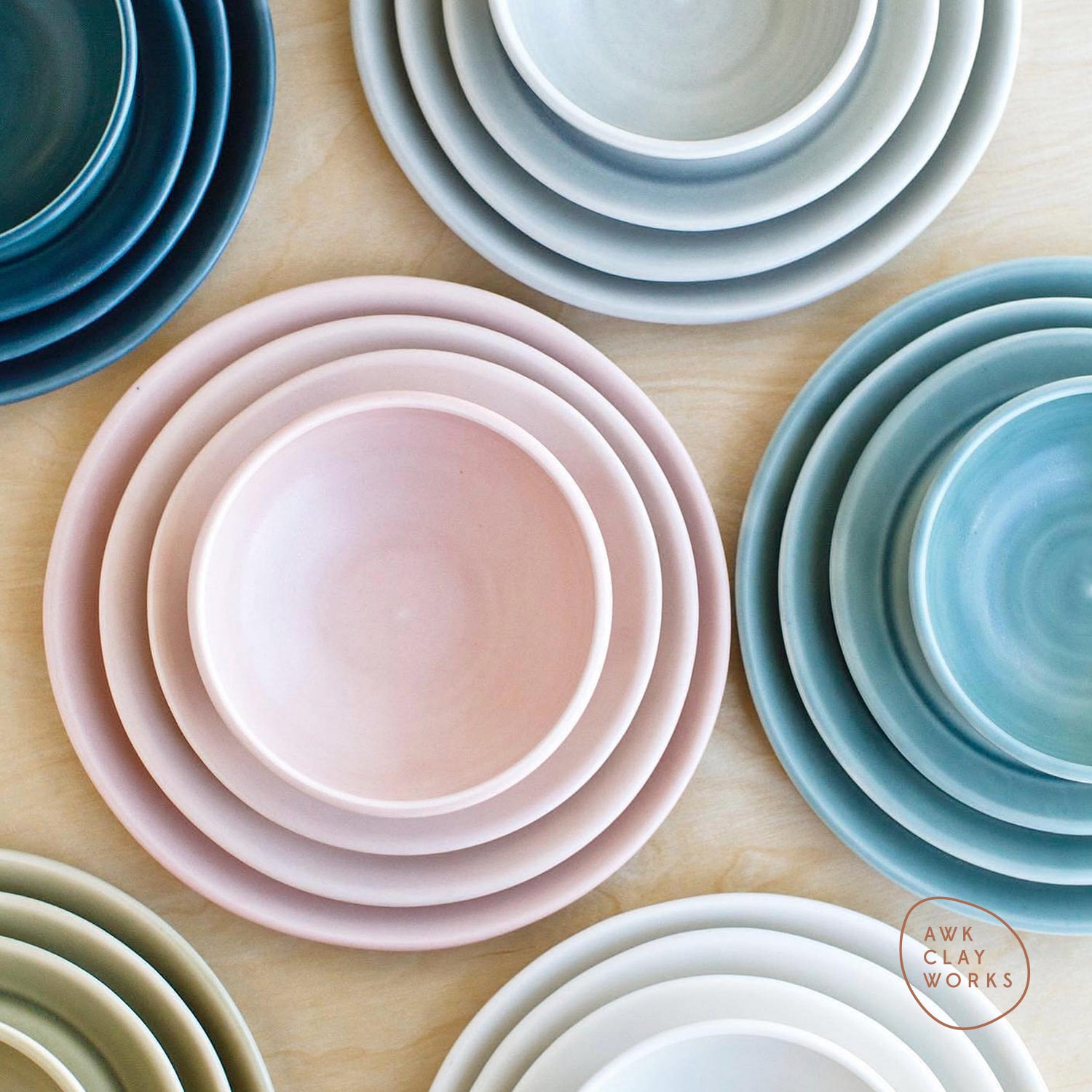
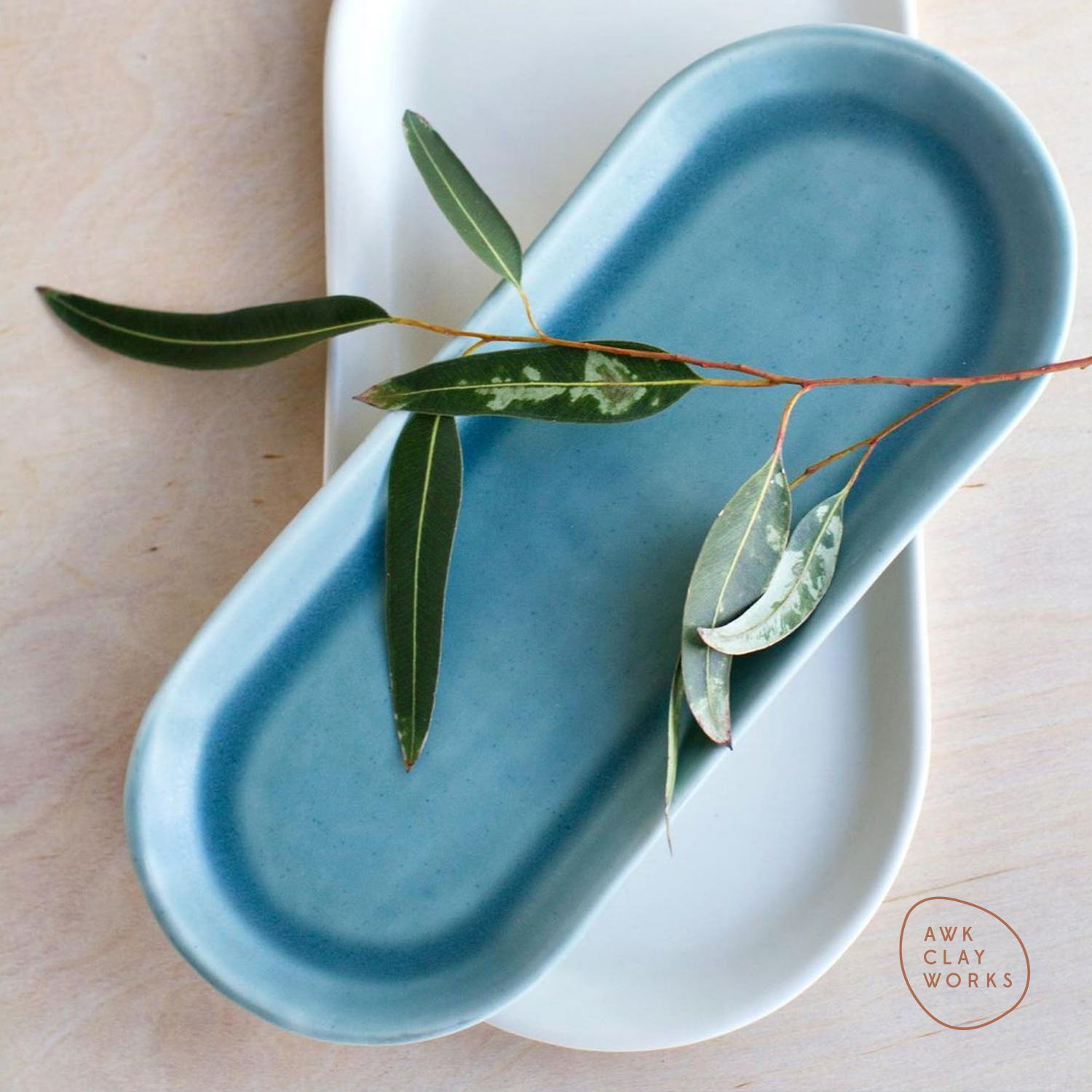
AWK Clayworks
Independent Pottery Studio
+ Brand Advisor
+ Concept Development
+ Creative Strategy
+ Design Direction
+ Qualitative Research
+ Visual Identity
MKN Design Team:
+ Michael Nÿkamp, Design Director
AWK Clayworks Stakeholder:
+ Alyssa Westenbroek-Koster, Owner & Ceramic Artist

Client Project
Crafted to securely hold index cards, with future adaptability to accommodate cell phones. Users can choose from a variety of custom-designed index card options to suit their needs, including Blank, Dot Grid, Line Grid, Isometric Grid, Idea Card, Lined, Time Tracker, Task List, Hourly Task List, and Storyboard.
Notebook Dimensions:
• Closed Notebook: 5¼" x 3⅞"
• Open Notebook: 5¼" x 7¾"
Remarker
Stationery Notebook
+ Brand Advisor
+ Concept Development
+ Creative Strategy
+ Design Direction
+ Qualitative Research
+ Visual Identity
MKN Design Team:
+ Michael Nÿkamp, Design Director
Remarker Stakeholder:
+ Sung Yi, CEO


Client Project
Herman Miller (MillerKnoll)
Furniture Design & Manufacturing
+ Design Direction
+ Brand Advisor
+ Illustration
+ Qualitative Research
MKN Design Team:
+ Michael Nÿkamp, Design Director
Herman Miller Stakeholder:
+ Gretta Peterson, Senior Director of Global Real Estate & Workplace Strategy
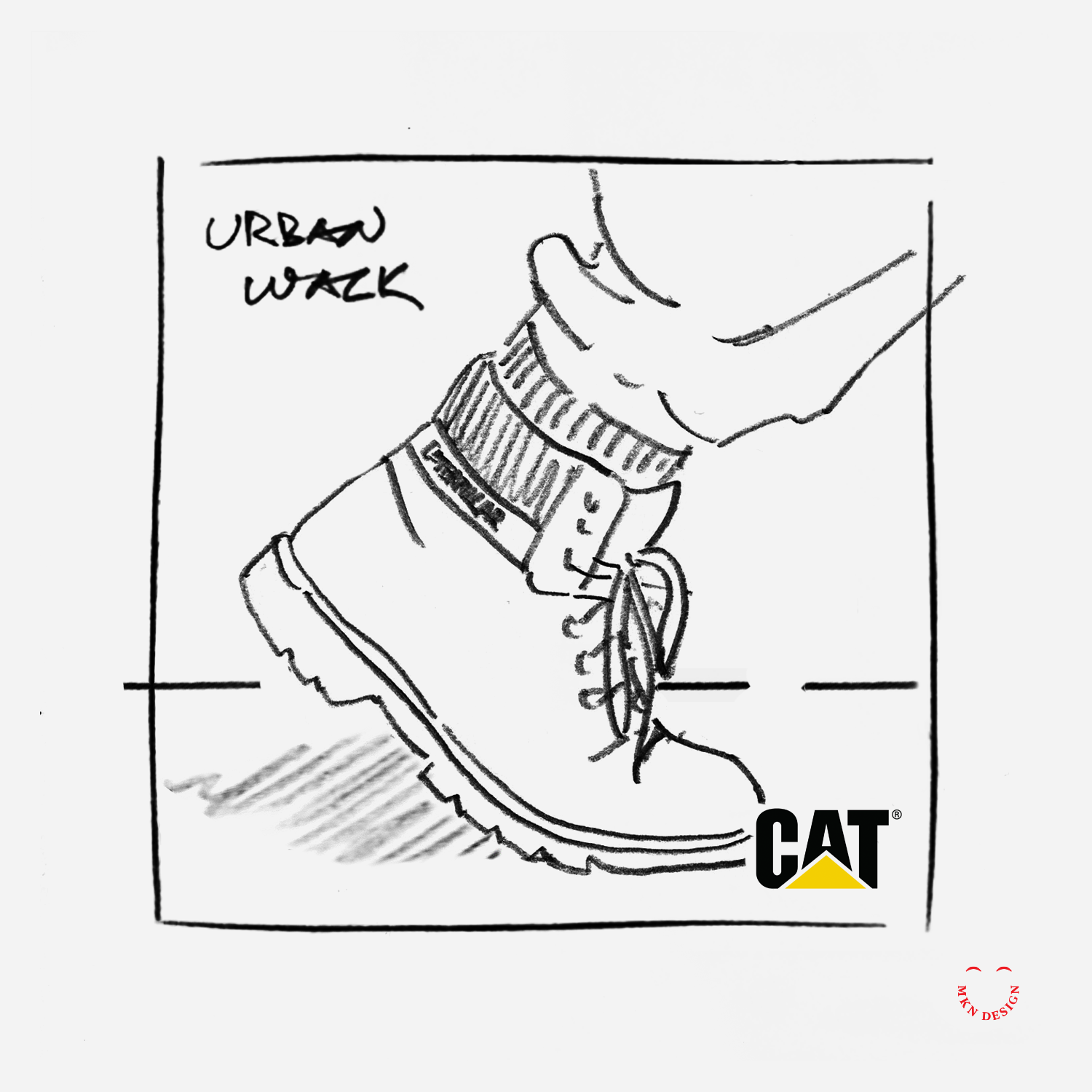


Client Project
The selected photography approach showcased consumers wearing CAT's footwear, focusing specifically on their CAT boots as they engaged in various activities within diverse environments. This concept resonated with our clients, aligned with consumers, and fit the demographics without being overtly masculine or feminine.
This project faced a distinctive challenge, CAT footwear had been successfully manufacturing high-quality construction boots for 20 years, primarily catering to masculine construction workers. However, new customer demographics emerged, as women and teenagers began to purchase their rugged boots. Armed with this information, I produced some of the photography concept directions.
MKN Design, LLC
michael@mkn-design.com
1 616 915 1941
Good design is complexity presented simply
MKN Design LLC © 2025
Originally from Ontario, Canada, and currently based in West Michigan, Michael Nÿkamp is dedicated to helping businesses develop and refine creative strategies into clear, impactful solutions that captivate and engage.