Client Project
April 2020
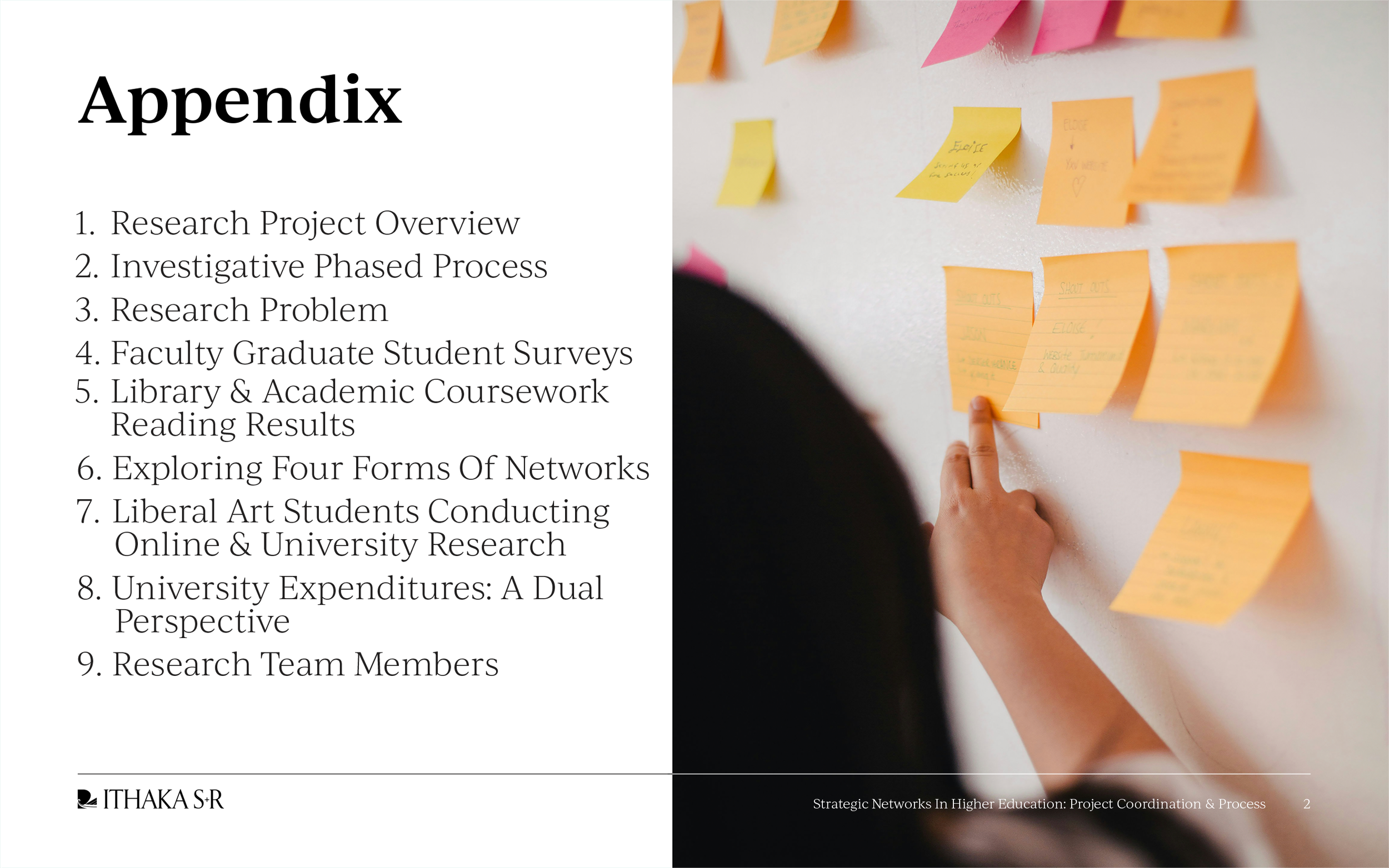
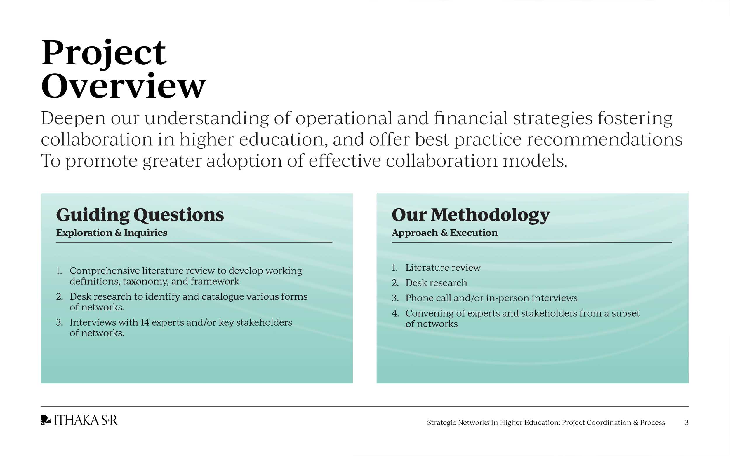
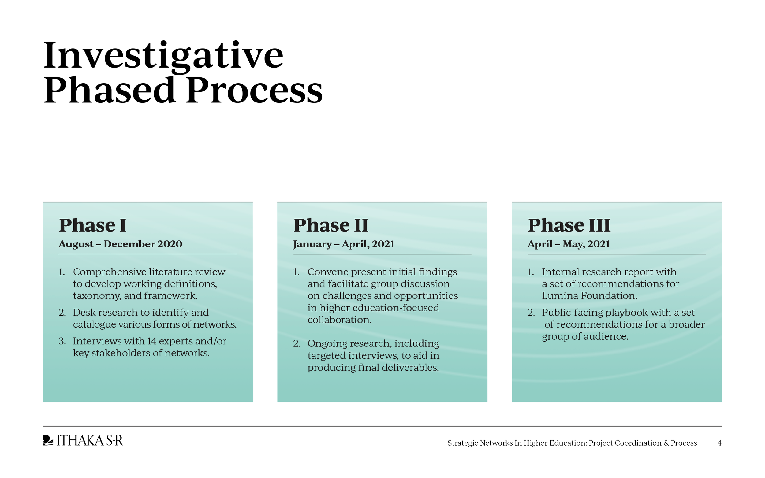
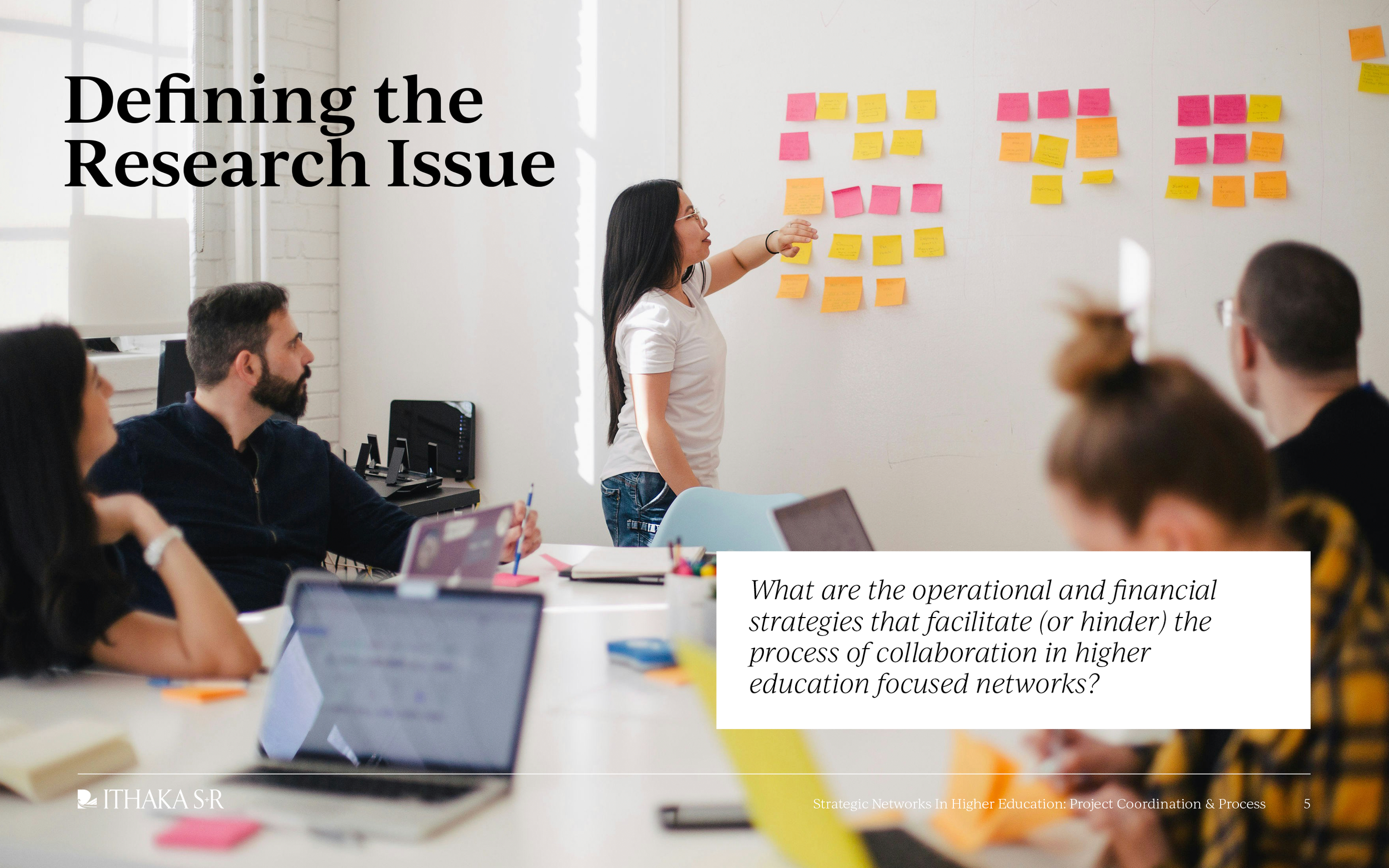
__
ITHAKA S+R
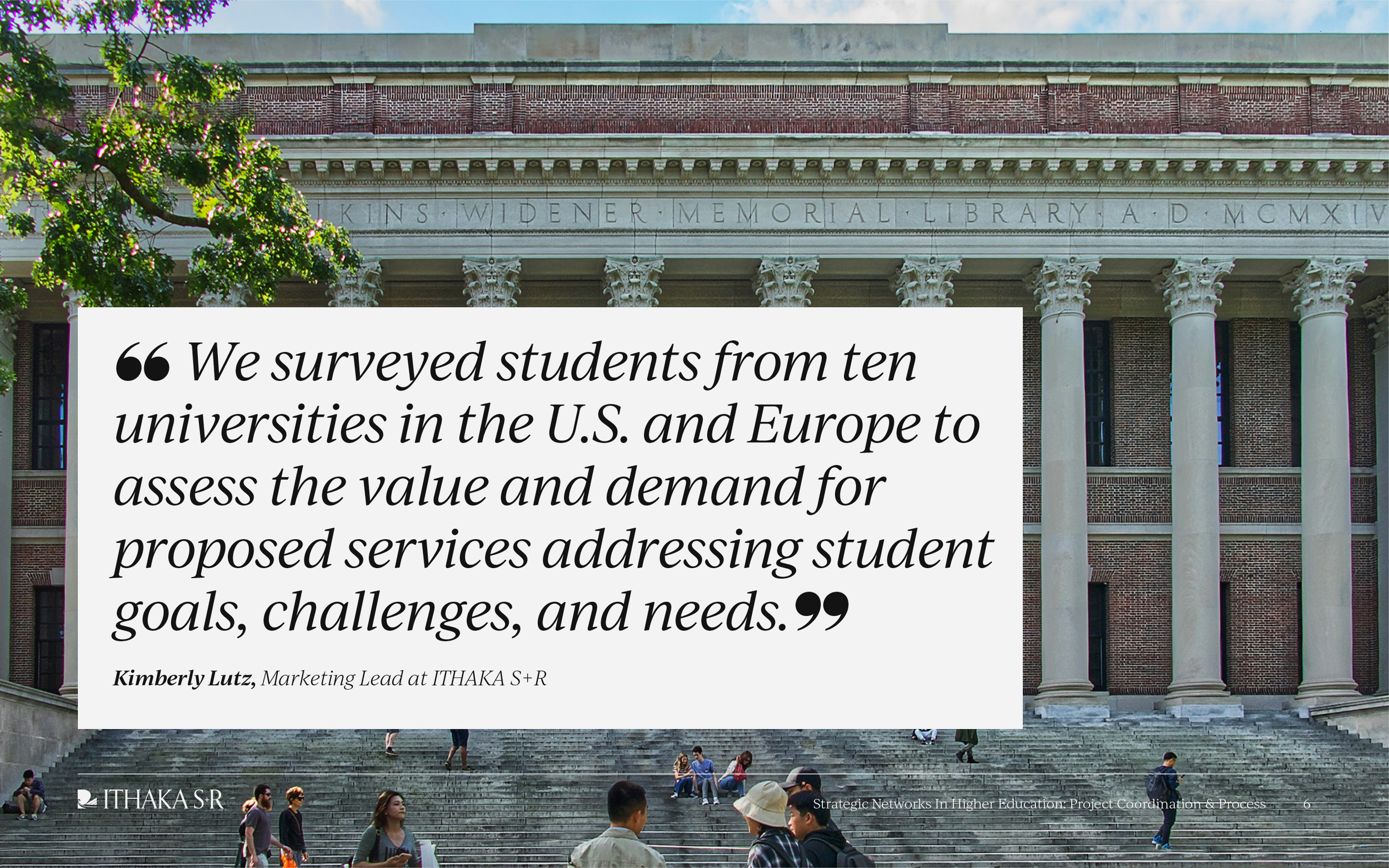
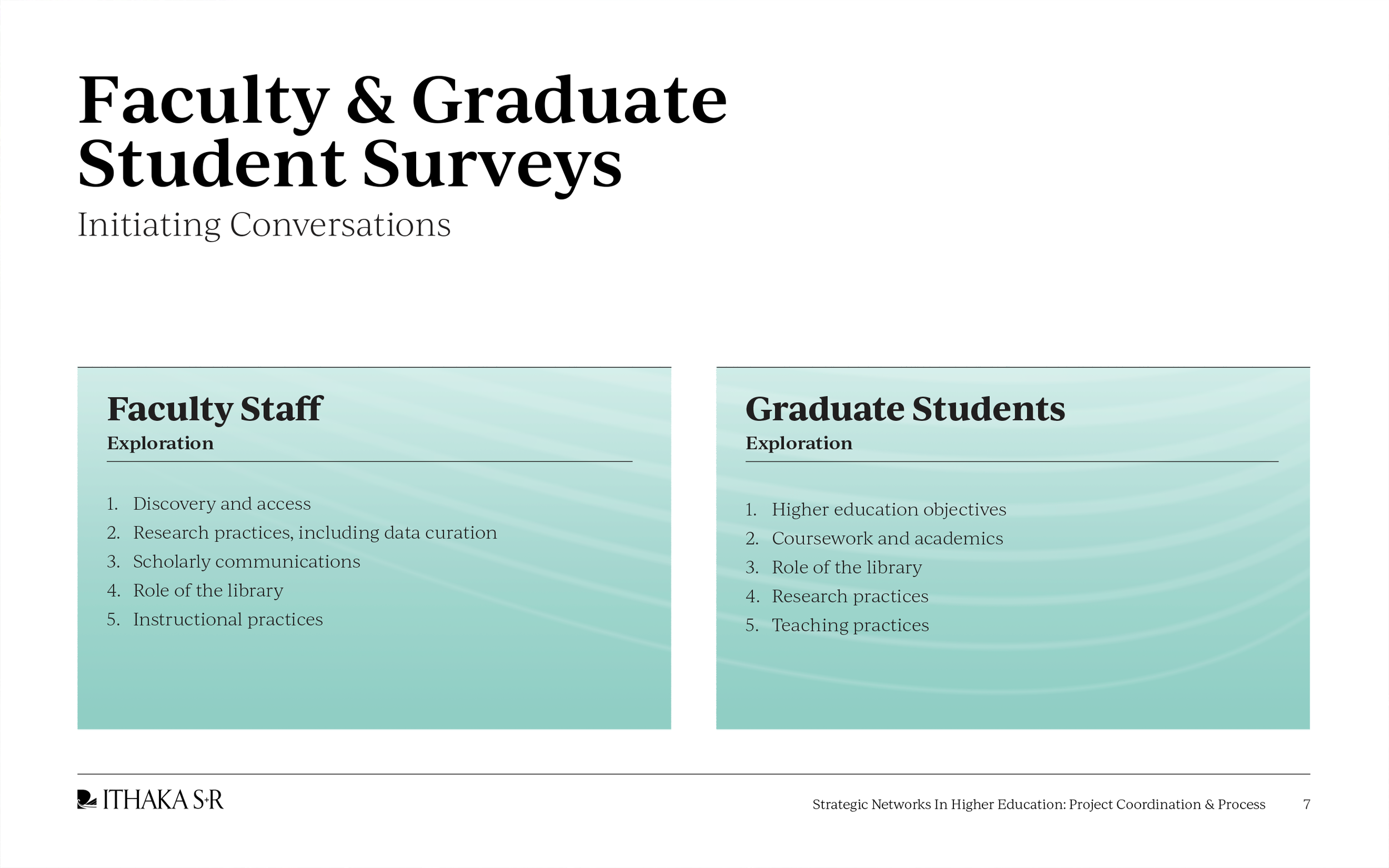
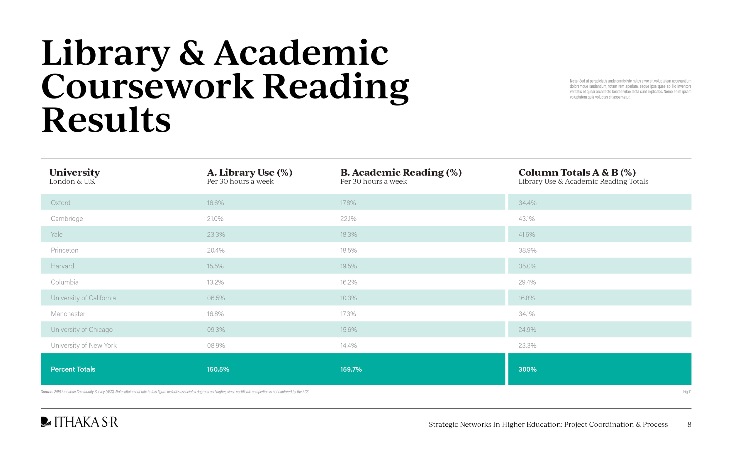
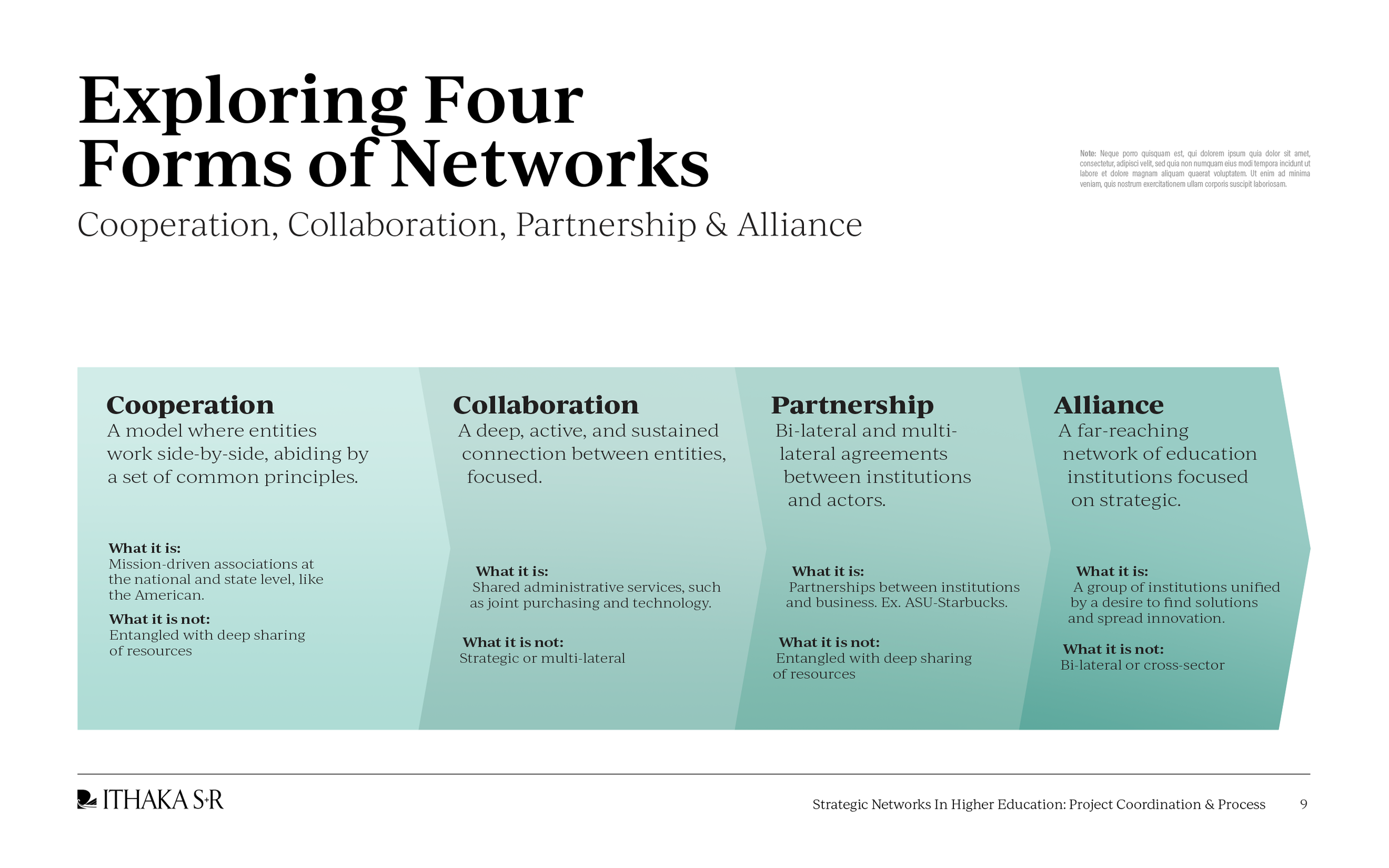
Dedicated to supporting higher education's digital transformation, ITHAKA S+R is a nonprofit conducting research, offering strategic guidance, and providing consulting services. Working closely with ITHAKA S+R, I revamped and modernized their existing design system, creating a beautiful and distinctive visual identity.
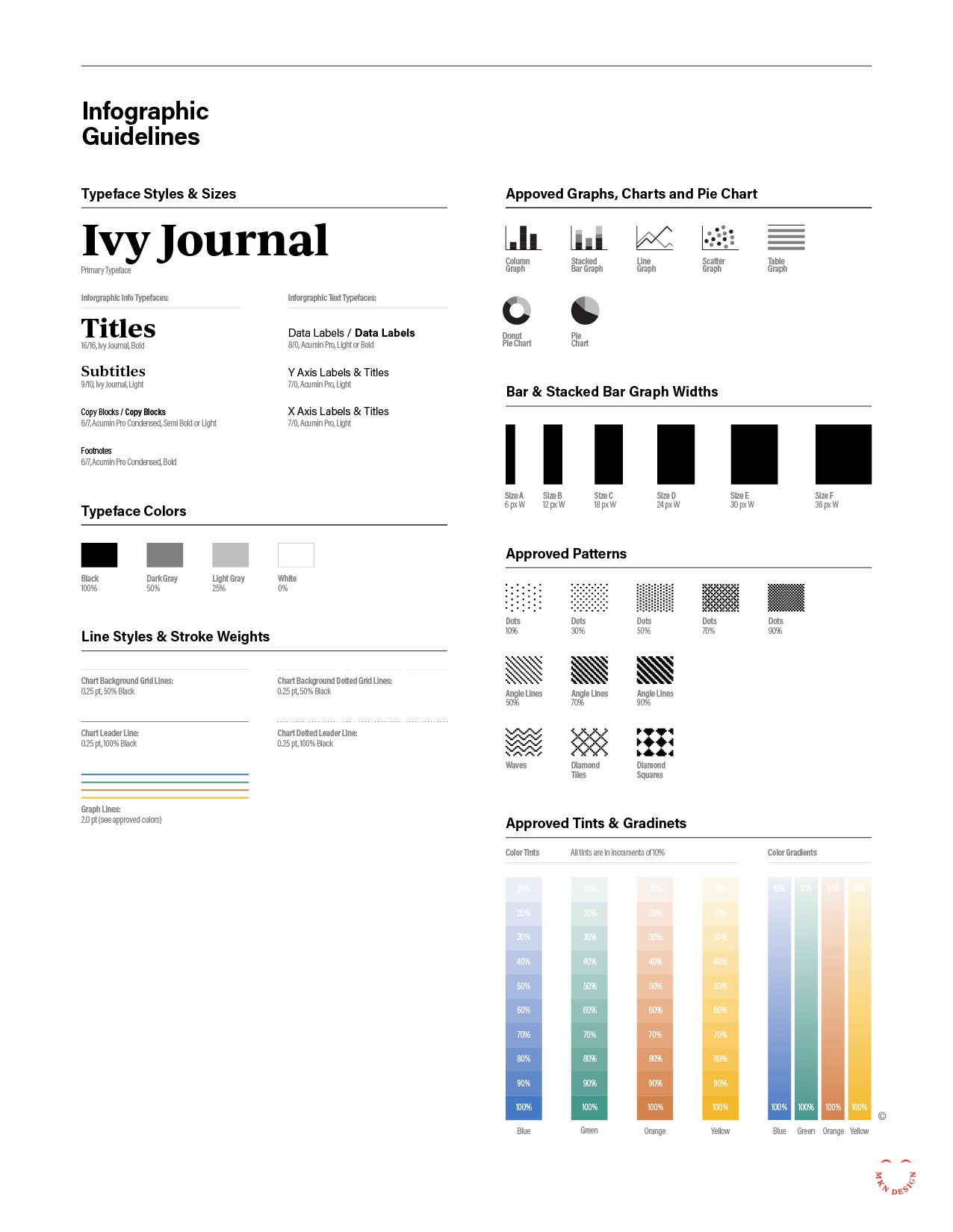
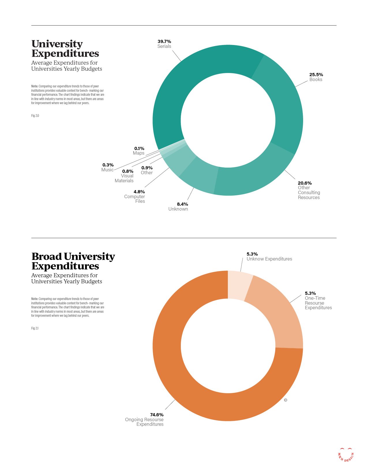
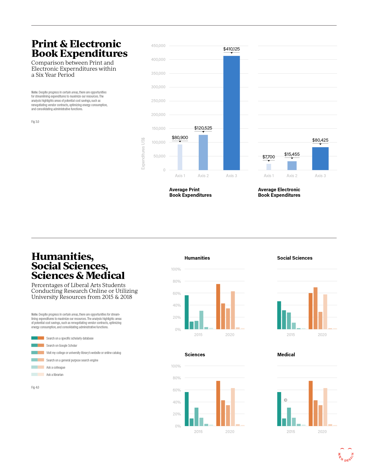
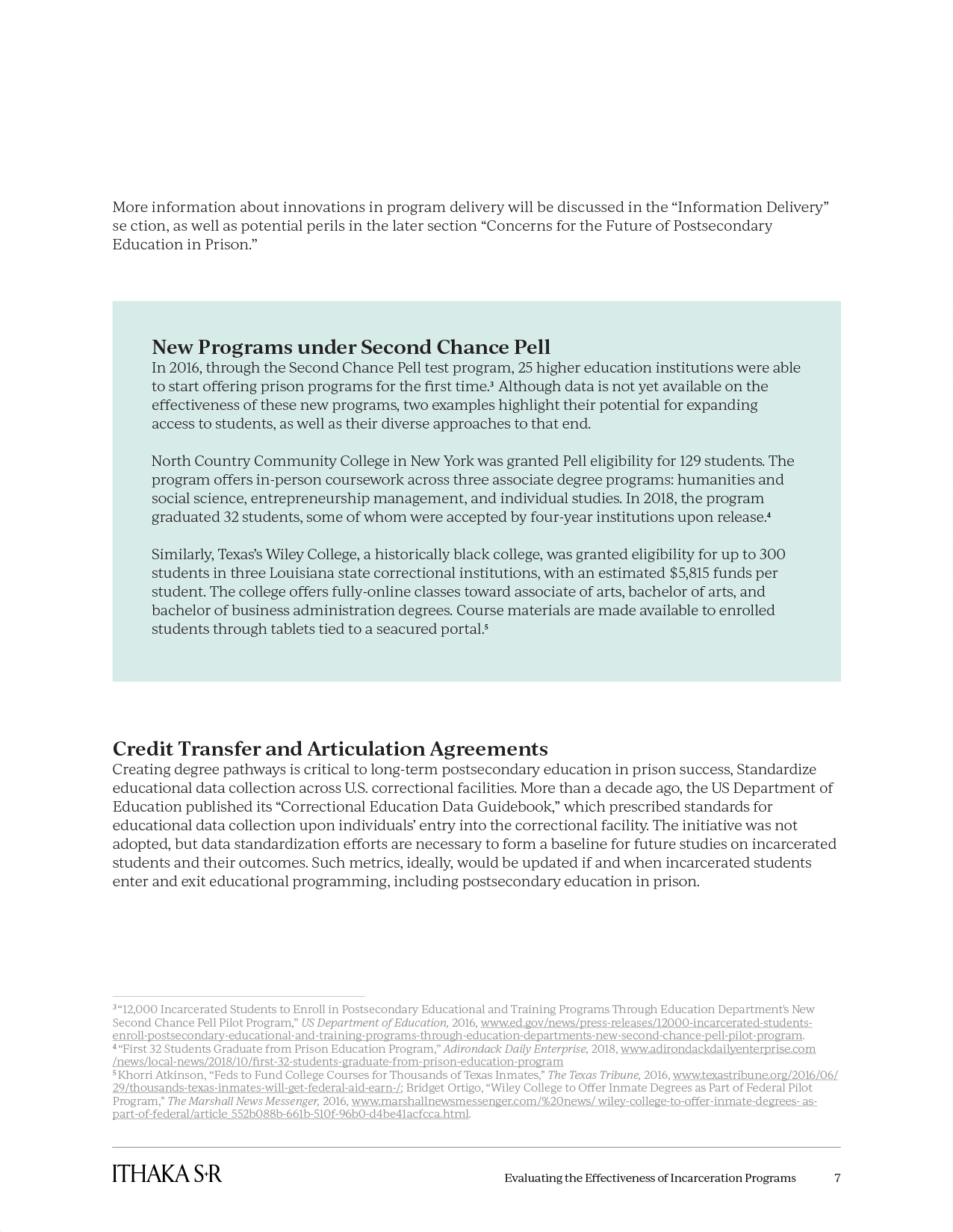
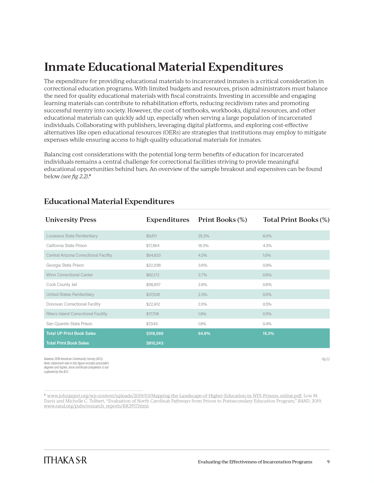
ITHAKA S+R enlisted me to modernize their design for reports, presentations, and infographics, emphasizing enhancements in design, color, and typography within a clear and comprehensive design system. The project had strict requirements, including adherence to brand guidelines, consideration of color blindness and visual impairments, and the need for distinct visual cues for various document types. Additionally, staff needed the capability to create or update all redesigned materials. After research, it was determined that Google Workspace (Docs, Slides, and Sheets) would be the optimal solution for creating these materials. The result was a unified design system that stayed true to ITHAKA S+R’s brand guidelines while providing a distinct visual identity for educational research materials and presentations.