

Creative Musing
February 2022
__
Panda
Logo exploration paired with a hand crafted font.
Conifer


Creative Musing
October 2021
__
Conifer
Pairing a simplified coniferous cone logo with the font Gimlet Display, designed by David Jonathan Ross, from DJR.
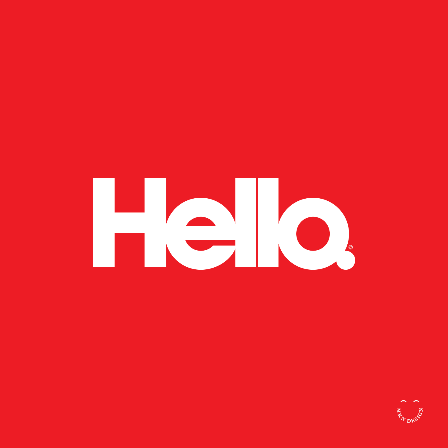
Hello

Creative Musing
July 2021
__
Hello
A very cramped hello. This wordmark is a custom typeface designed specifically for this wordmark.
Fast Company Portraits

Client Project
May 2021
__
Fast Company Portraits
Fast Company commissioned me to create several illustrative portraits for the Define Your Purpose, Special Edition magazine.
-
+ Portrait Illustration
-
+ Style Development
+ Sketching & Ideation
+ Illustration -
Recycle & Die

Creative Musing
May 2021
__
Recycle & Die
An illustrative exploration reveals the deceptive narrative sold to us by plastic companies: the idea that recycling will effectively benefit our planet. However, this notion masks a troubling reality—it serves as a ploy to perpetuate the cycle of production and pollution, ultimately exacerbating our planet.
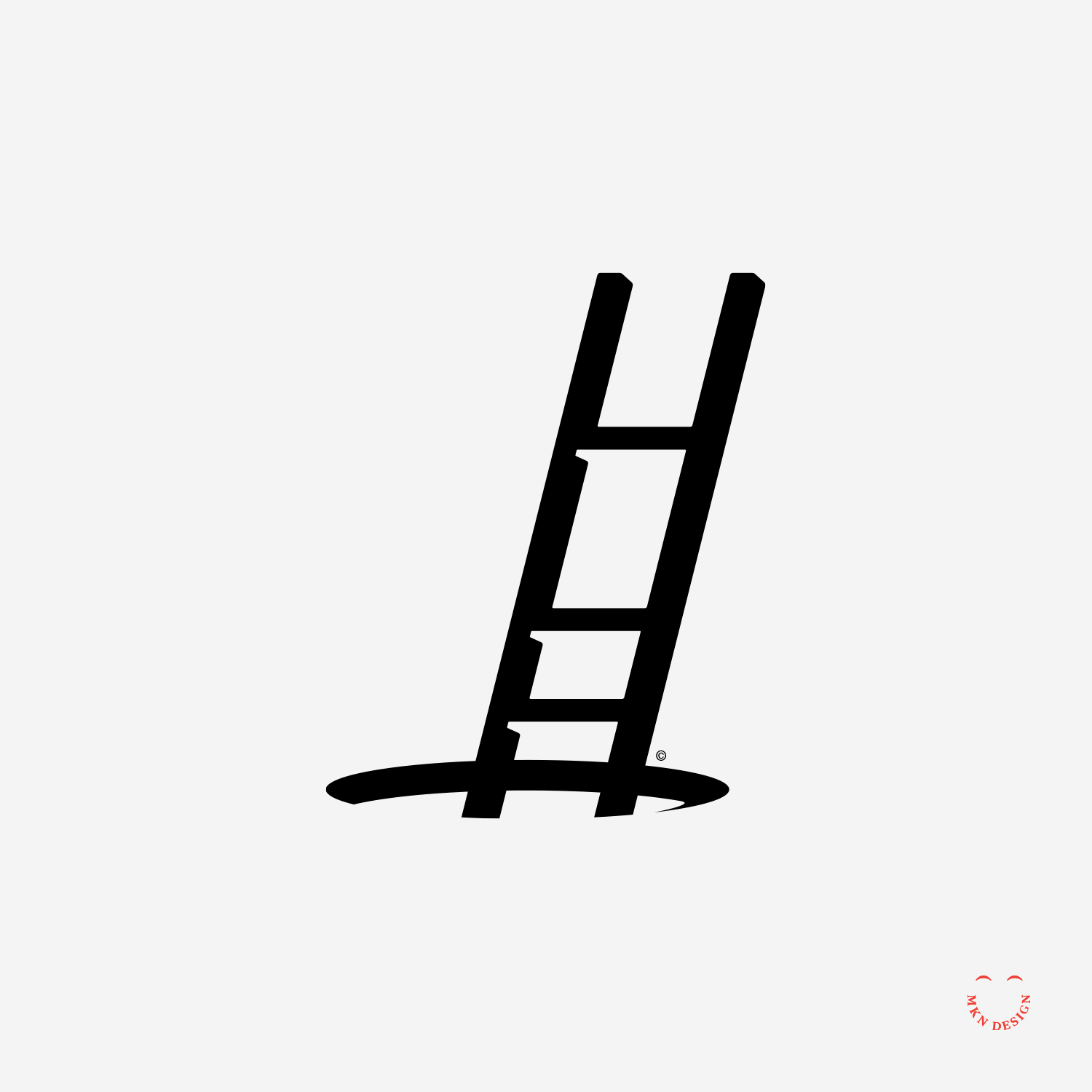
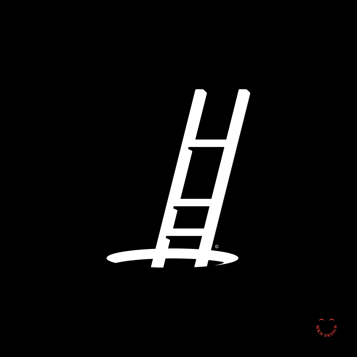
Climbing Out
Creative Musing
January 2021
__
Climbing Out
For some, climbing out of 2020 feels like this… carefully ascending out of a hole, while perhaps navigating loss of a loved one, a job, anxiety, depression, long covid. Wishing all a good year of hope and renewal. As Ian Maclaren wisely stated, "Be kind, for everyone you meet is fighting a hard battle."
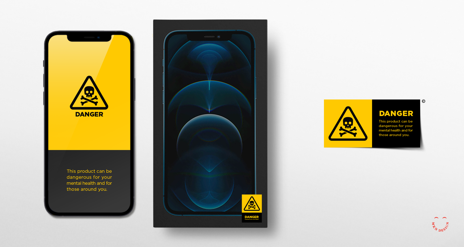
Lost Privacy
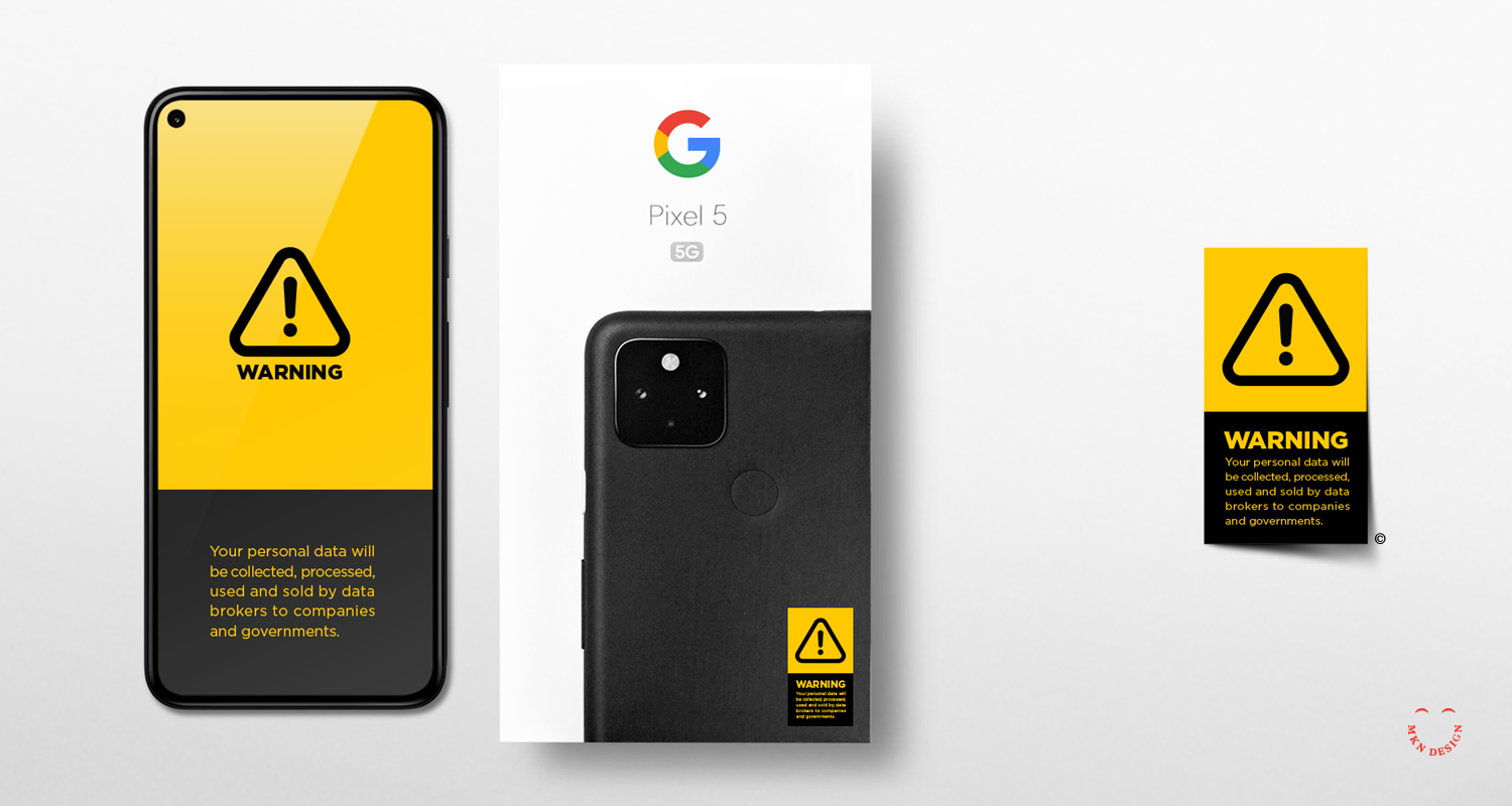
Article + Creative Musing
December 2020
__
Lost Privacy
Illustrative concepts exploring technology, who owns our data, loss of privacy, and our mental health. Technology (specifically the smallish computer in your pocket) has been a wonderful tool for us. But, they also have been used unethically for data collection, observation of dark patterns, and social network disinformation campaigns. Like warning signs located on products that are dangerous for us, should we do the same for technology products?
The Dark Side of the Moon
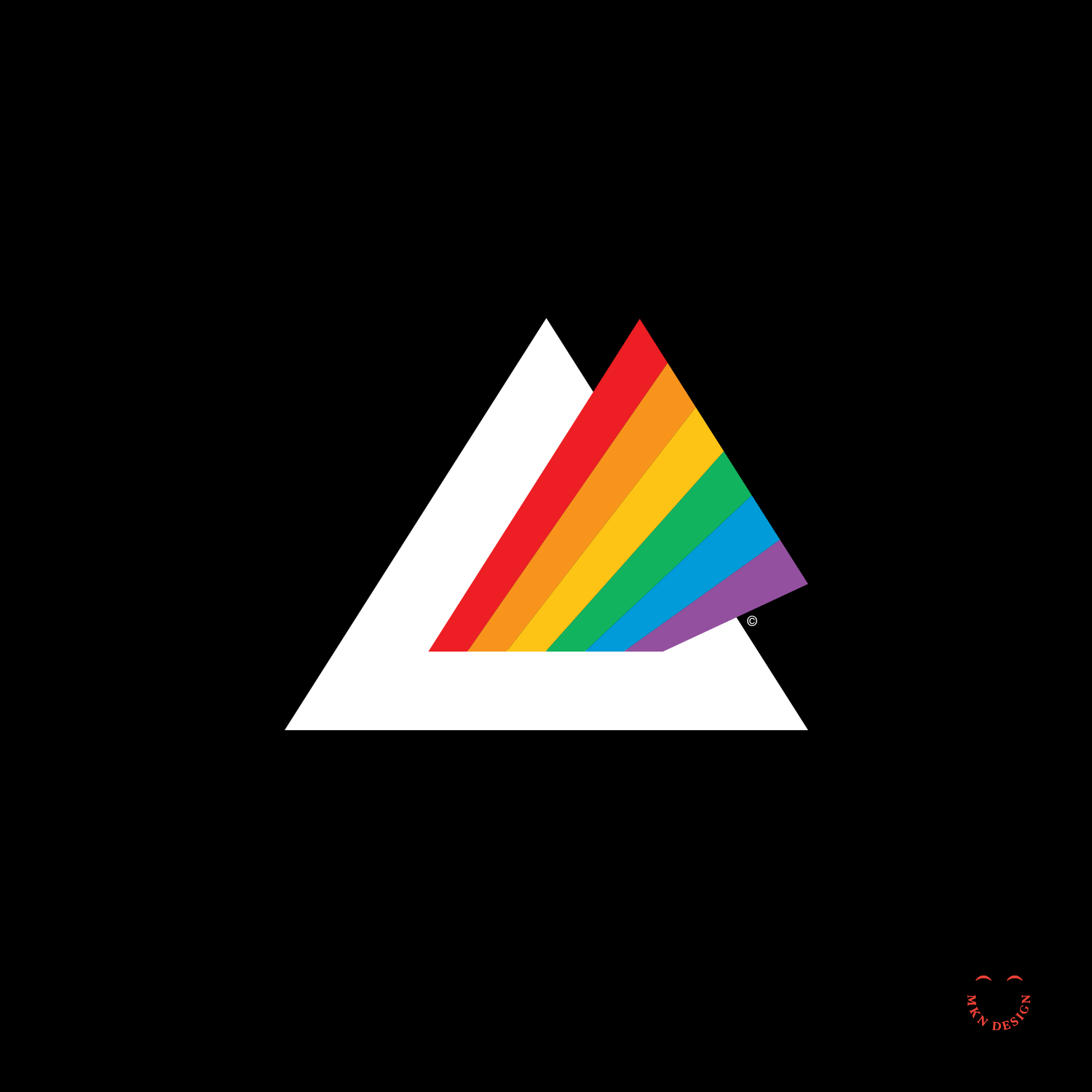
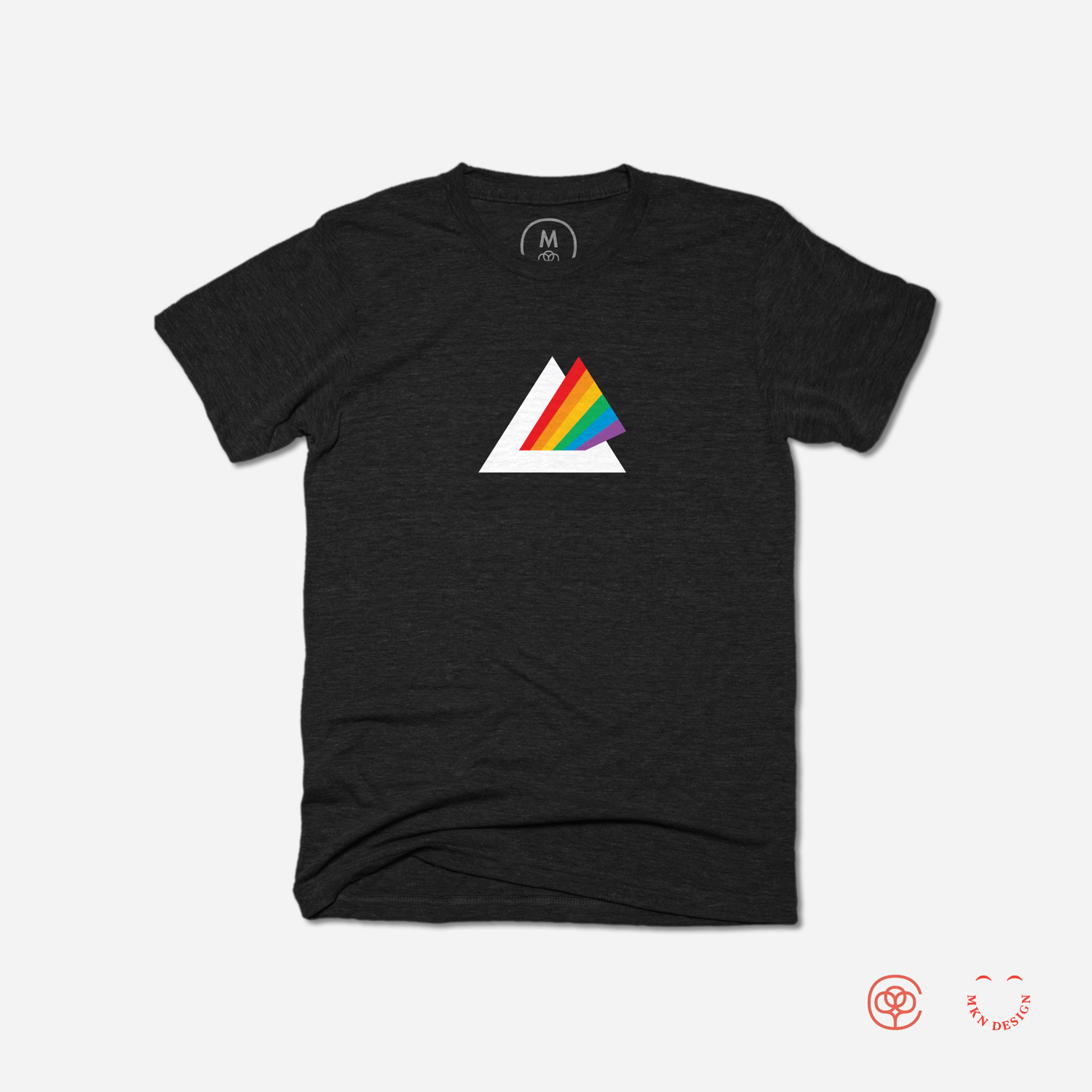
Creative Musing
November 2020
__
The Dark Side of the Moon
A modern take on Pick Floyd’s, Dark Side of the Moon album cover.
Purchase this Tee
The Dark Side of the Moon is currently unavailable for purchase. Check back in June 2024 or pursue my entire collection of graphic tees on Cotton Bureau.
Crow & Pitcher

Creative Musing
June 2020
__
Crow & Pitcher
This weekend I read several fables by Aesop to my kids. One of the fables, The Crow & the Pitcher draws a relationship between problem-solving and wit (critical thinking), and perseverance. Within my own practice of strategic visual communication, these two attributes are critical in the process of developing and building brands. Without it, the ability to perceive, create and innovate is deprived.
The Morning Post
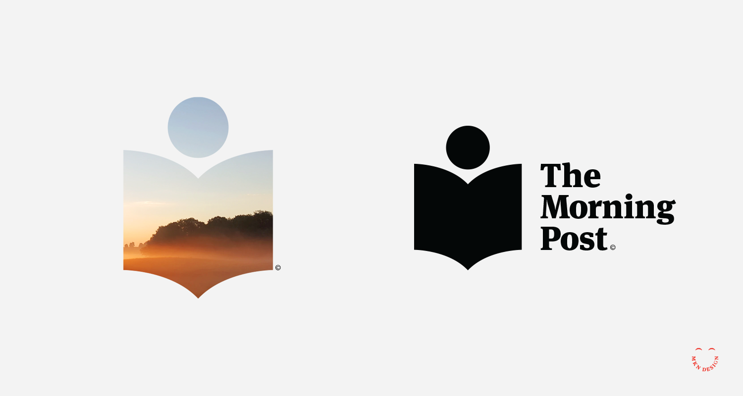
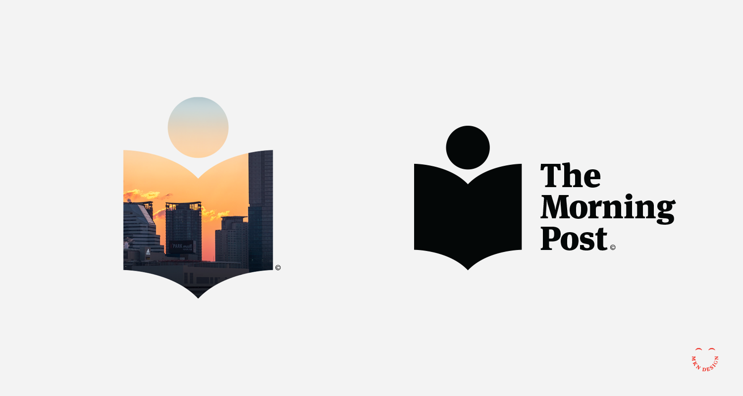
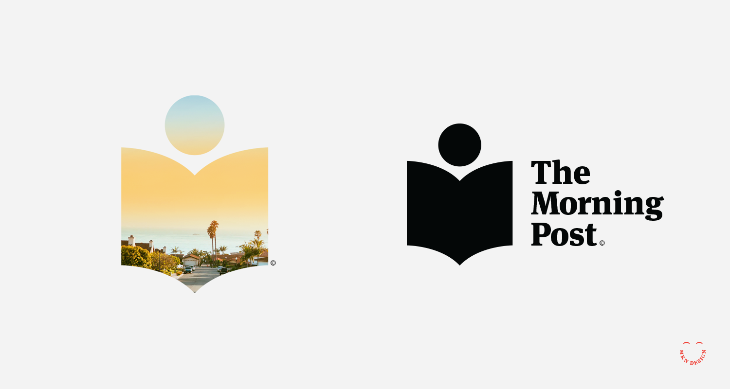
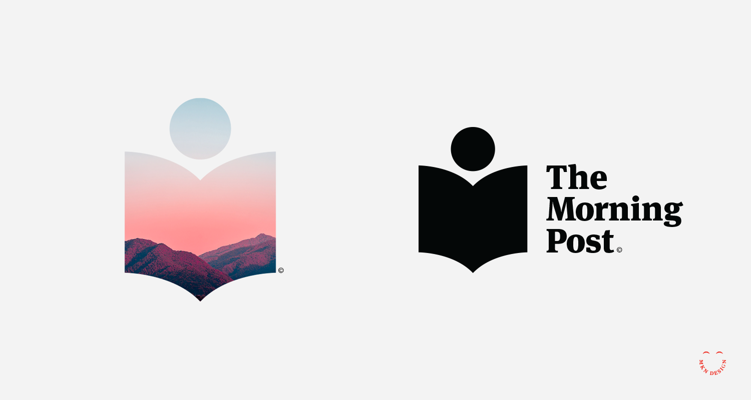
Creative Musing
April 2020
__
The Morning Post
Conceptual expression of a sun coming over hillsides or an individual reading a newspaper. The Mark is paired with the typeface Meta Serif Pro, designed by Botio Nikoltchev, Christian Schwartz, Erik Spiekermann, Kris Sowersby, and Ralph du Carrois from FontFont.
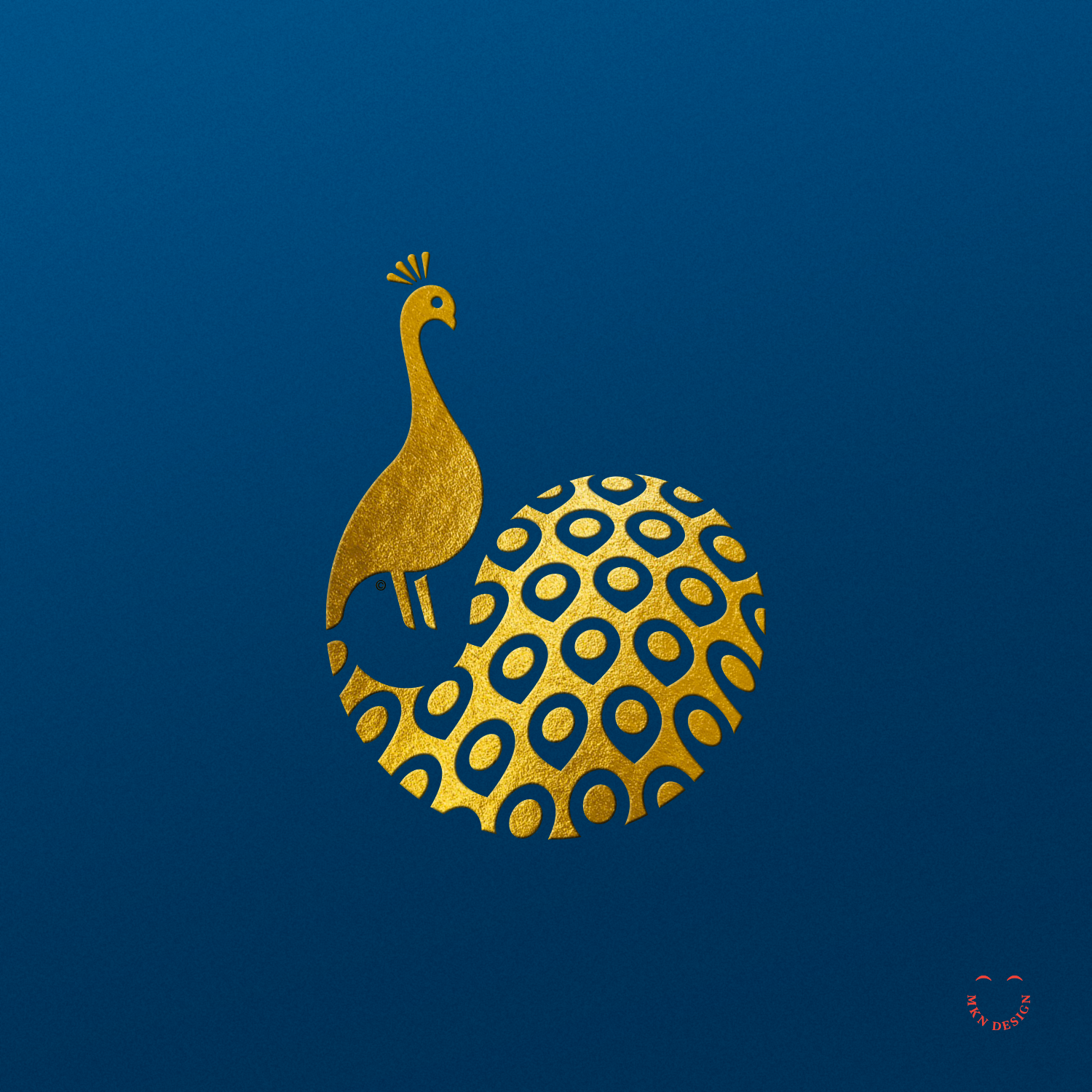
Illustrious Peacock
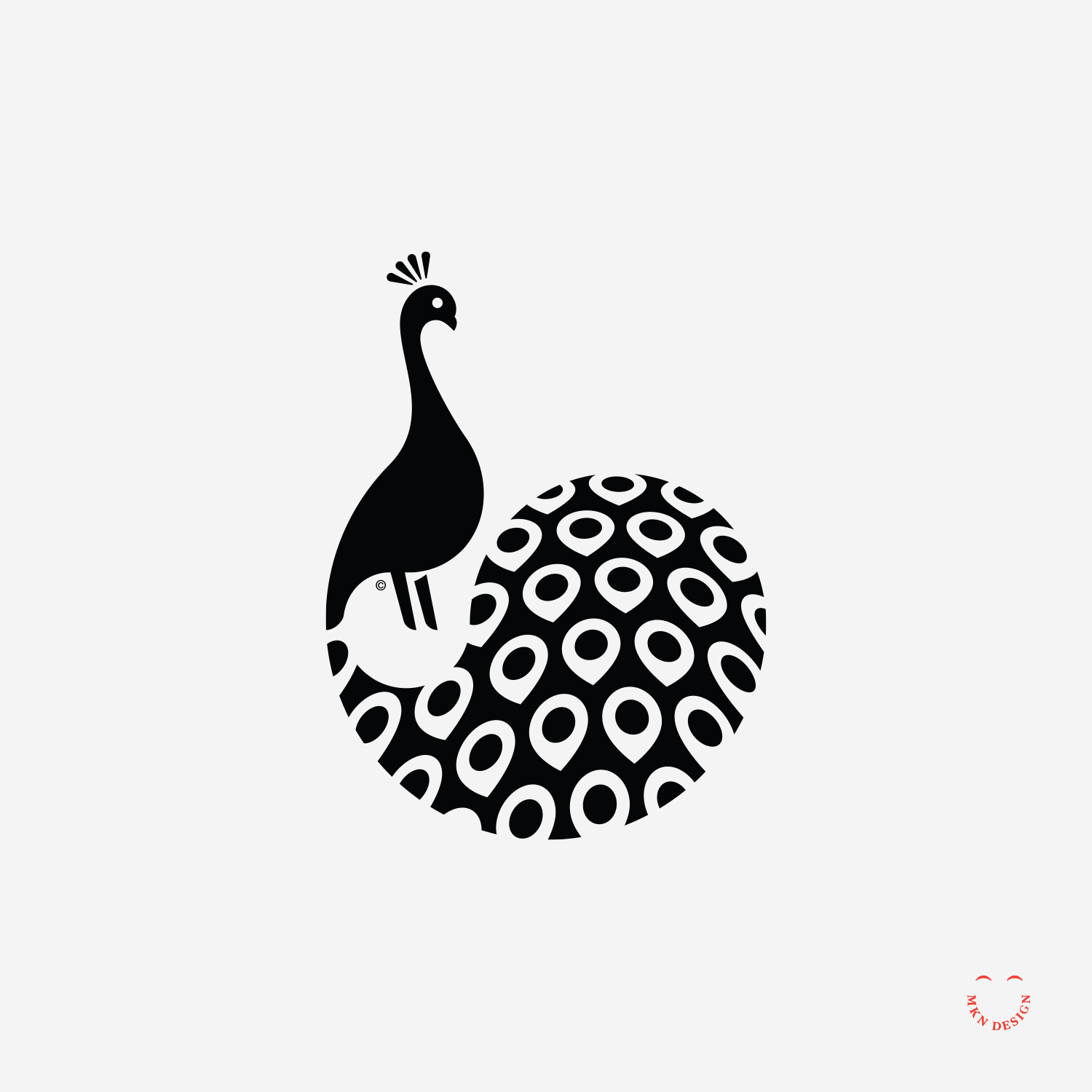
Creative Musing
November 2019
__
Illustrious Peacock
Fun illustrative exploration, though it was difficult to get the tail feather effect I wanted.
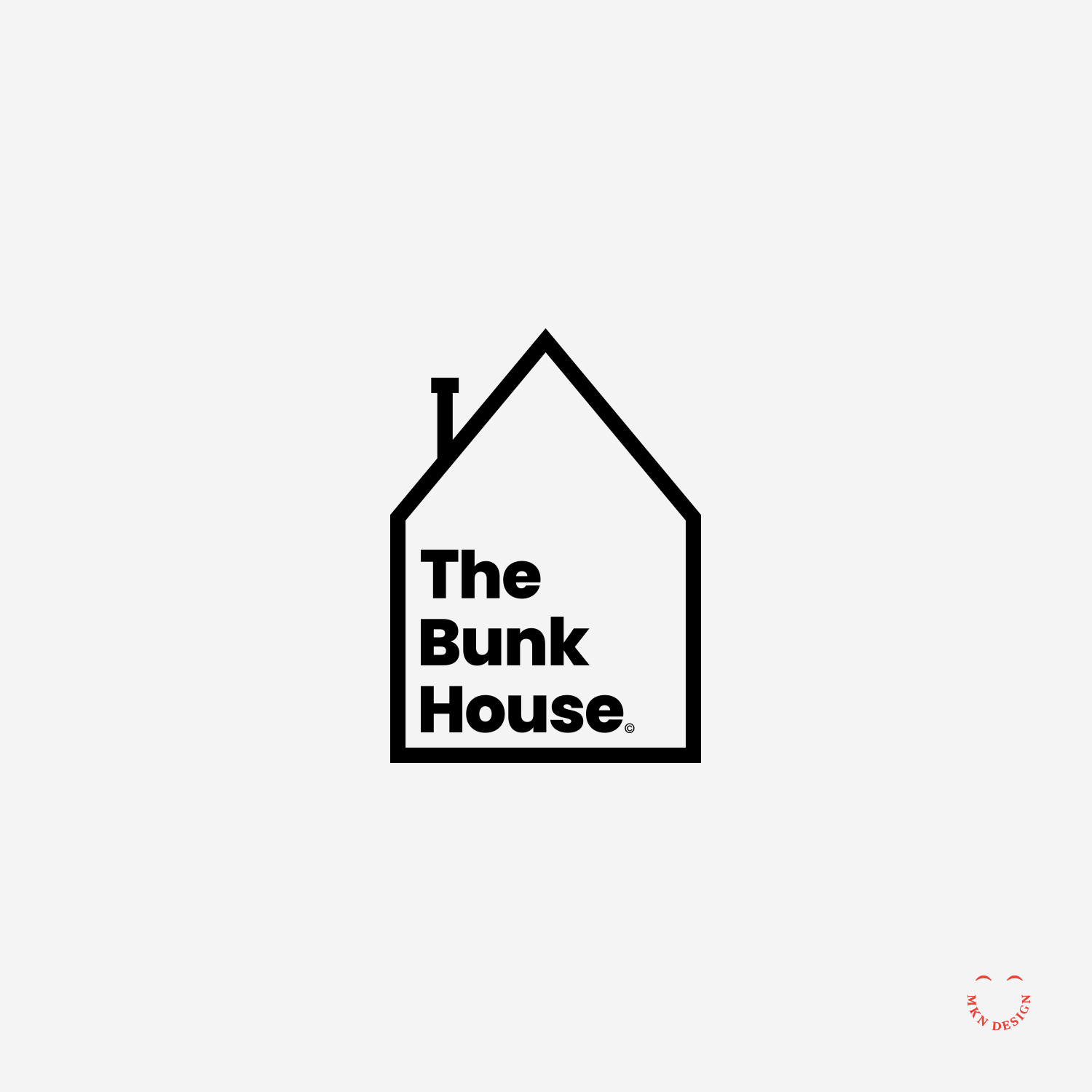
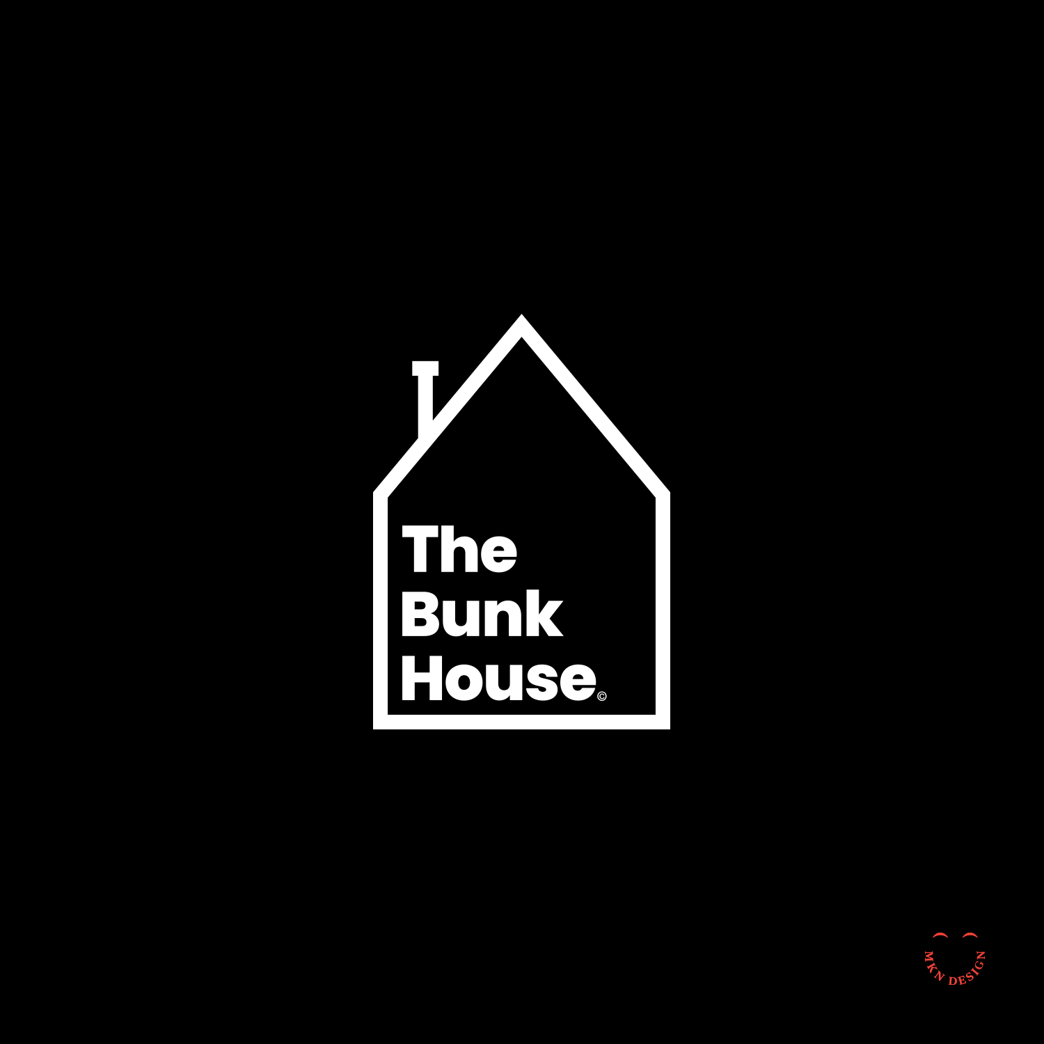
The Bunk House
Creative Musing
December 2017
__
The Bunk House
Simple and literal mark defining its name. The mark is paired with the typeface Poppins designed by Jonny Pinhorn and Ninad Kale from Google.
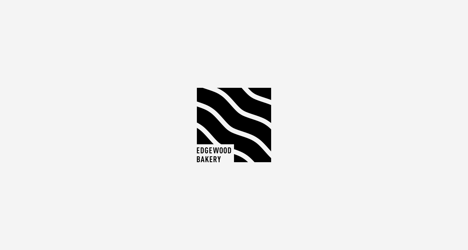
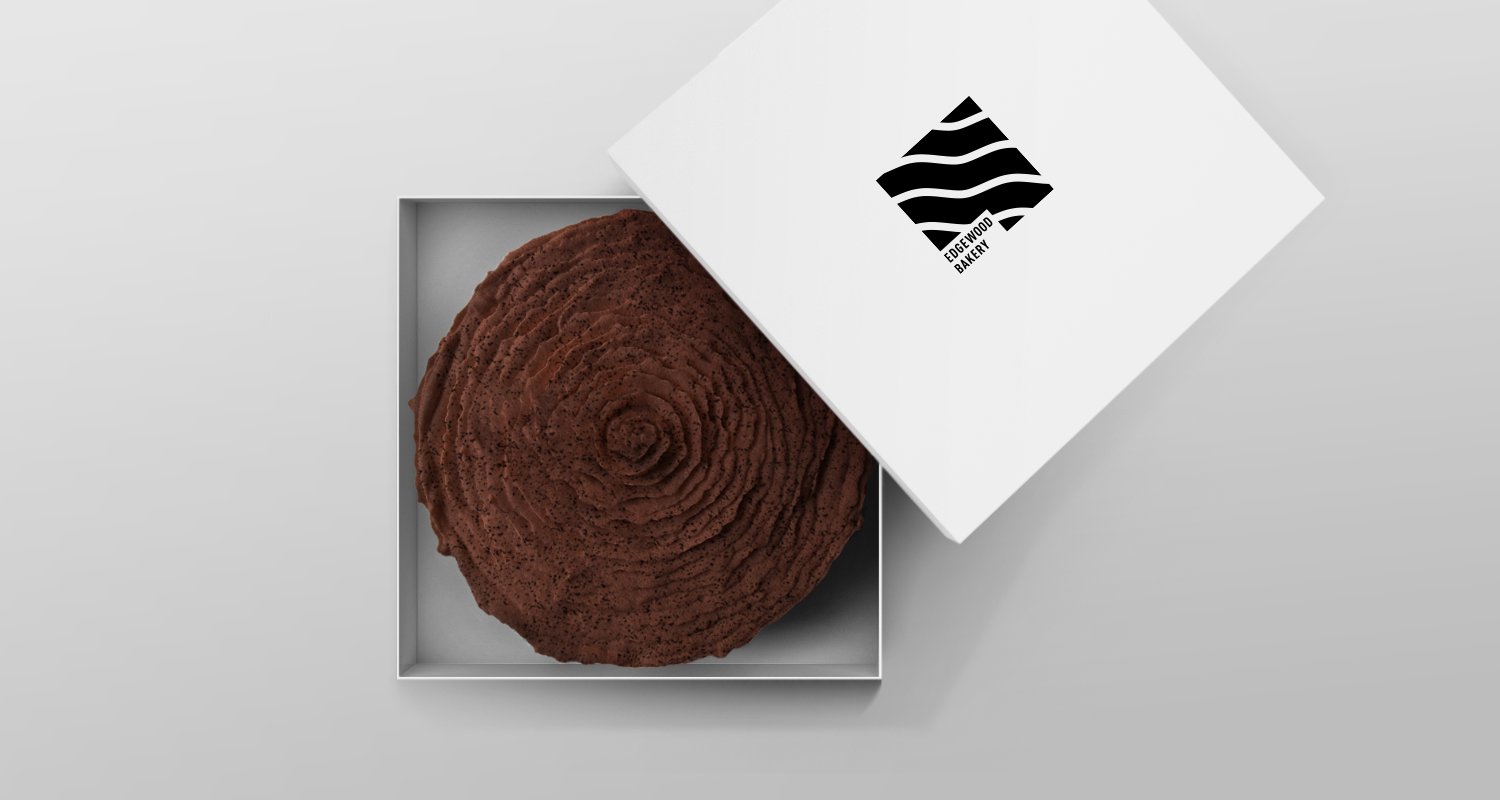
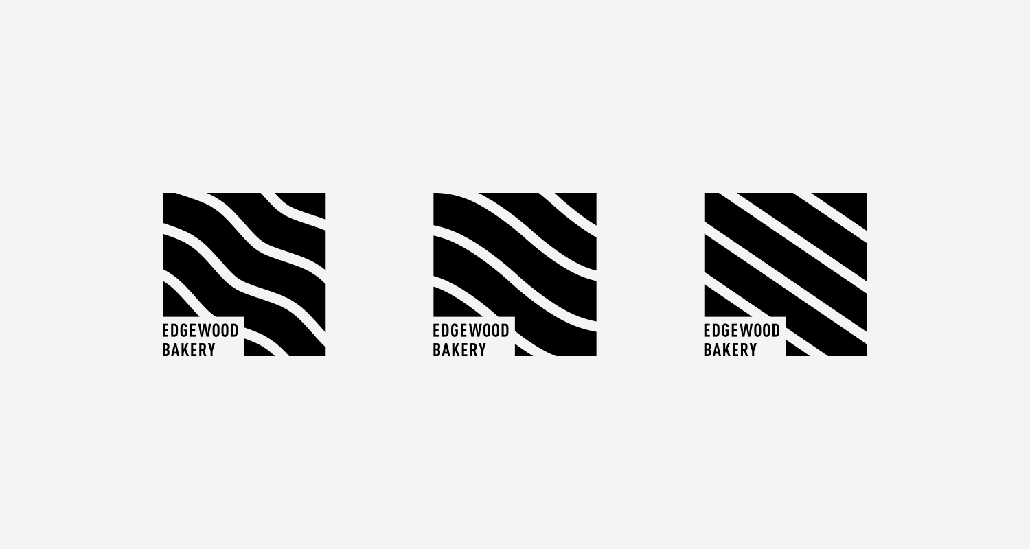
Edgewood Bakery
Client Project
September 2017
__
Edgewood Bakery
I recently completed this logo for Edgewood Bakery. Edgewood bakery carefully curates a mix of American classics and European-inspired desserts. The client's requirements for the logo exploration were that it be: simple, convey desserts, and provide a European/American feel with a modern aesthetic. Take a look by clicking on the link provided.
Services
• Creative Direction
• Project Management
• Research (competitive, consumer, trend)
• Concept Development
• Sketching & Ideation
• Graphic Design
• Illustration
Note:
Photography by Otto Selles
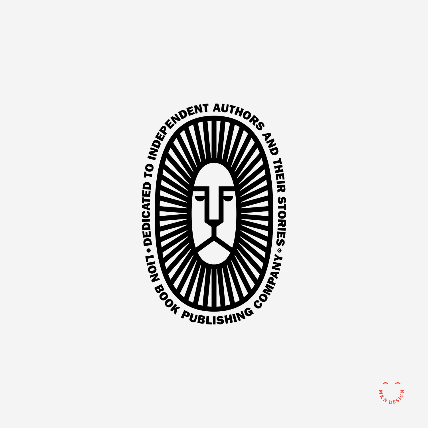
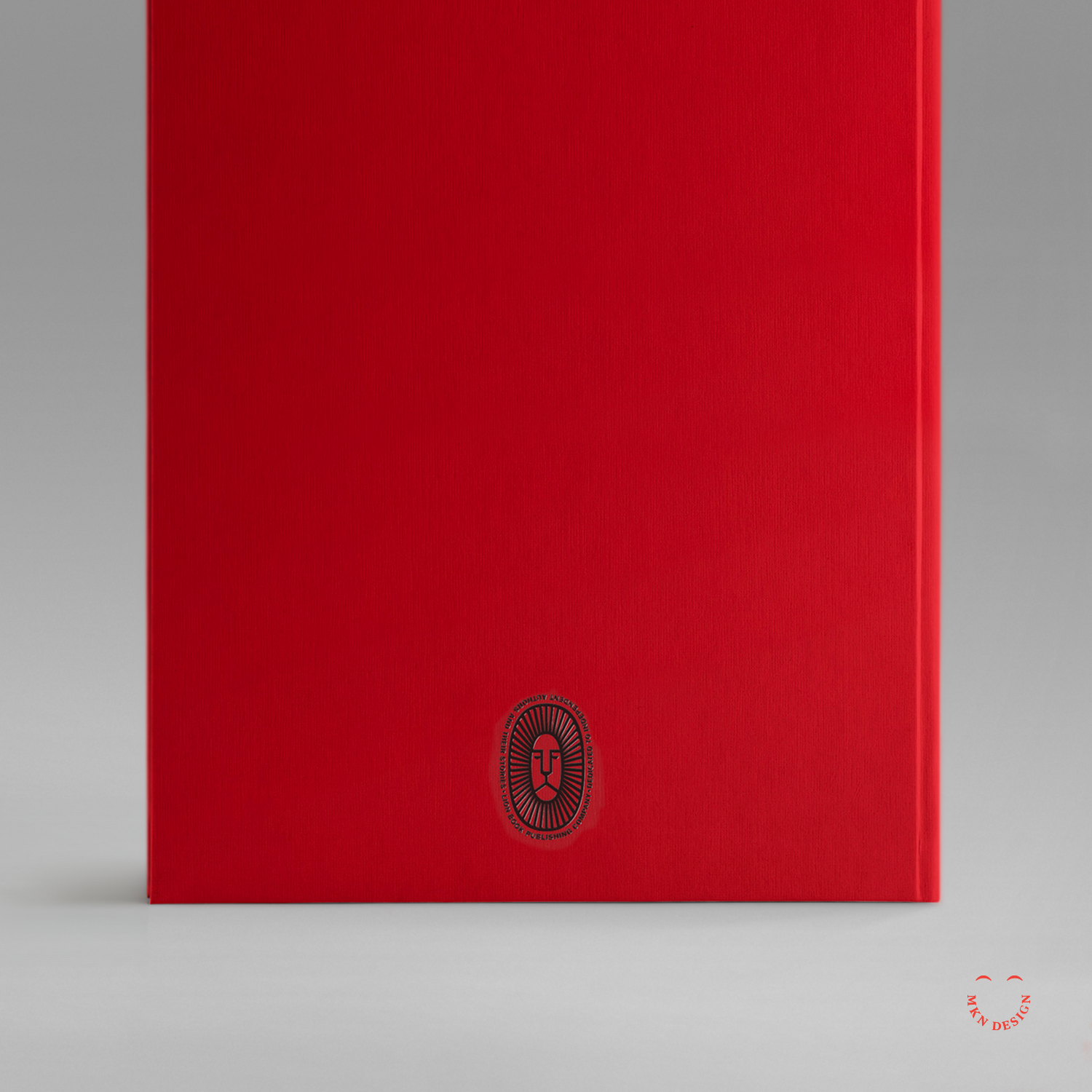
Lion Book Publishing Co.
Creative Musing
March 2017
__
Lion Book Publishing Co.
Dedicated to independent authors and their stories. The typeface utilized around the mark is ATF Franklin Gothic by American Type Founders Collection.
King Lear
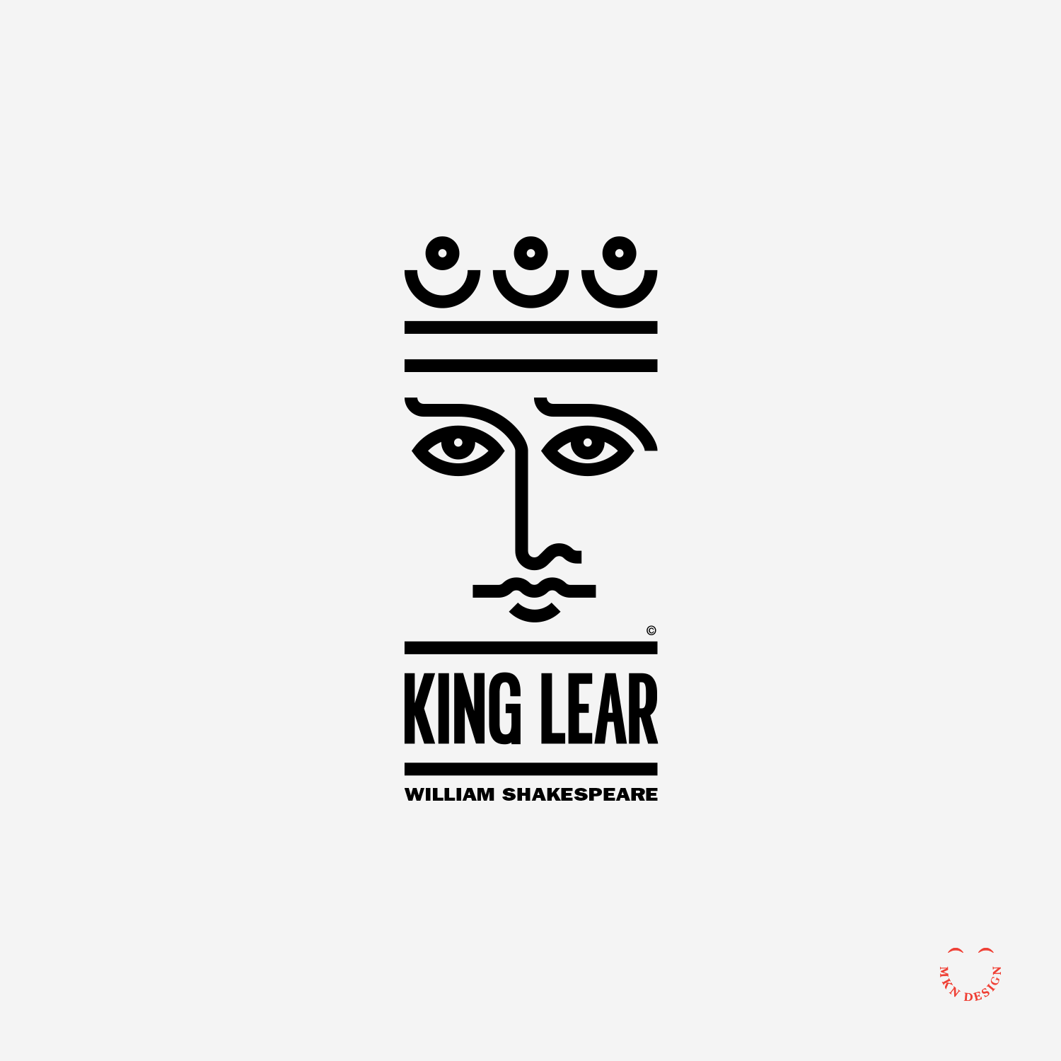
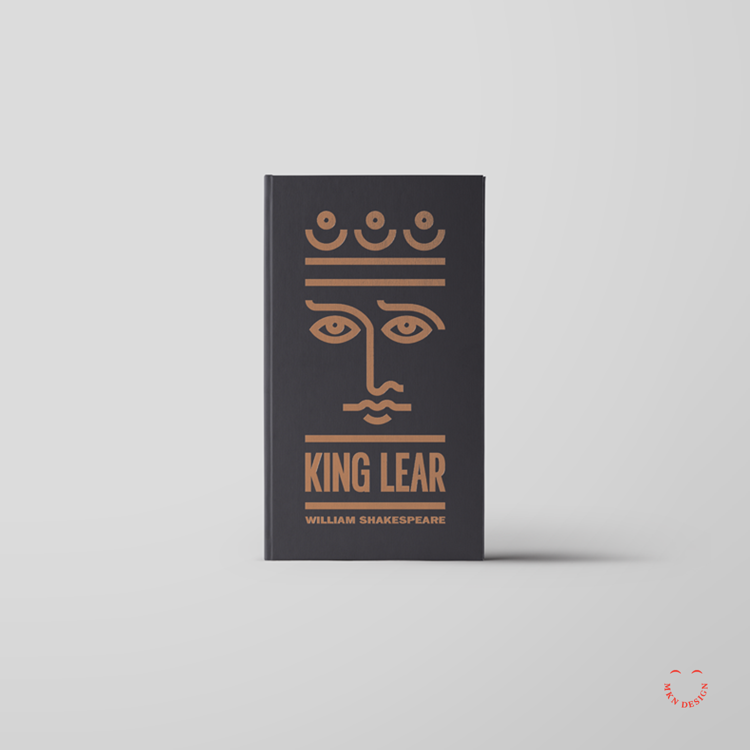
Creative Musing
March 2017
__
King Lear
Simple lines to create this portrait of King Lear for a book jacket. The typeface used on this book jacket is ITC Franklin Gothic LT Pro designed by URW Type Foundry.
Panel Discussion & Portfolio Review


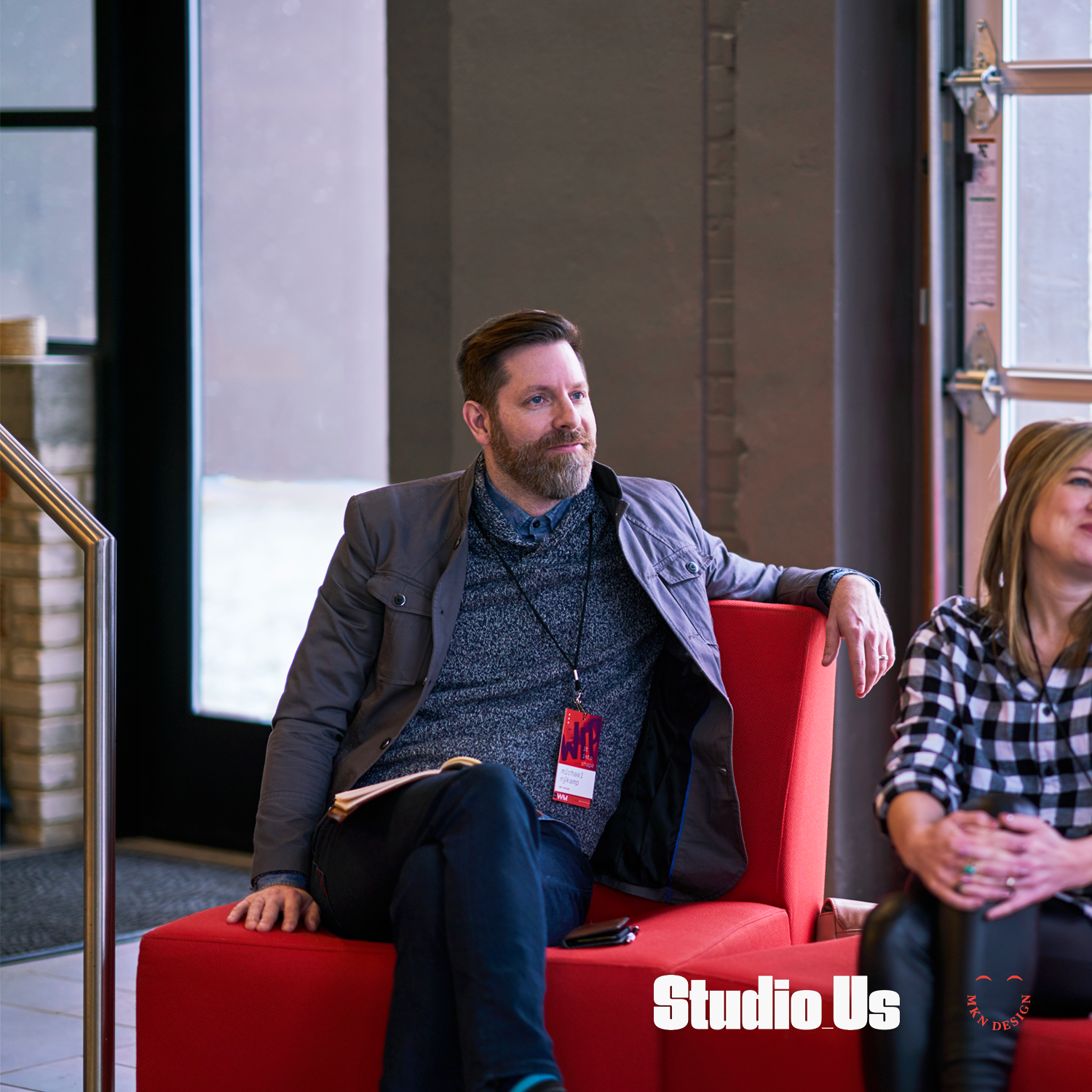


Article
February 2017
__
Panel Discussion & Portfolio Review
Over the weekend, I dedicated my morning to attending "WIP it into Shape," a panel discussion and portfolio review tailored for design students in West Michigan. The event provided an invaluable platform for emerging talents in the design field. Panelists included: Emily Boyd, Sarah Brockett, and Carlos Estrada. This day was organized by AIGA West Michigan, curated by Studio_Us, and graciously hosted and sponsored by Atomic Object.
Note
Program design and photography by two kind and talented humans, Bree and Ross Tanner from Studio_Us.
Camp Pine
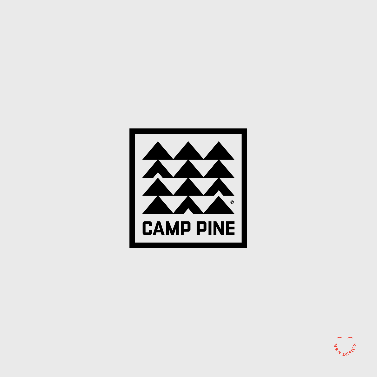
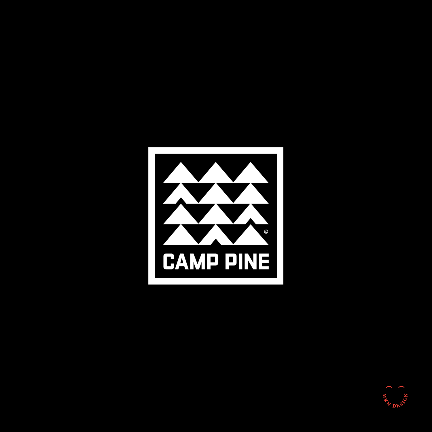
Creative Musing
February 2017
__
Camp Pine
A square, retro mid-century logo with repetitive modern aesthetics. The typeface was custom designed to fit a campy feel.
House Books

Client Project
February 2017
__
House Books
The utilization of a simple line of a roof serves to exemplify the name for House Books. The incorporation of a angled line above the House Books typeface serves as a distinctive marker for the brand's name. The chosen typeface is a customized slab serif that was widened to enhance its presence. I paired the mark with the typeface URW Bodoni Wide designed by Giambattista Bodoni from URW Type Foundry.
-
Brand Identity
-
+ Creative Direction
+ Qualitative Research
+ Concept Development
+ Sketching & Ideation
+ Illustration
Nook Real Estate
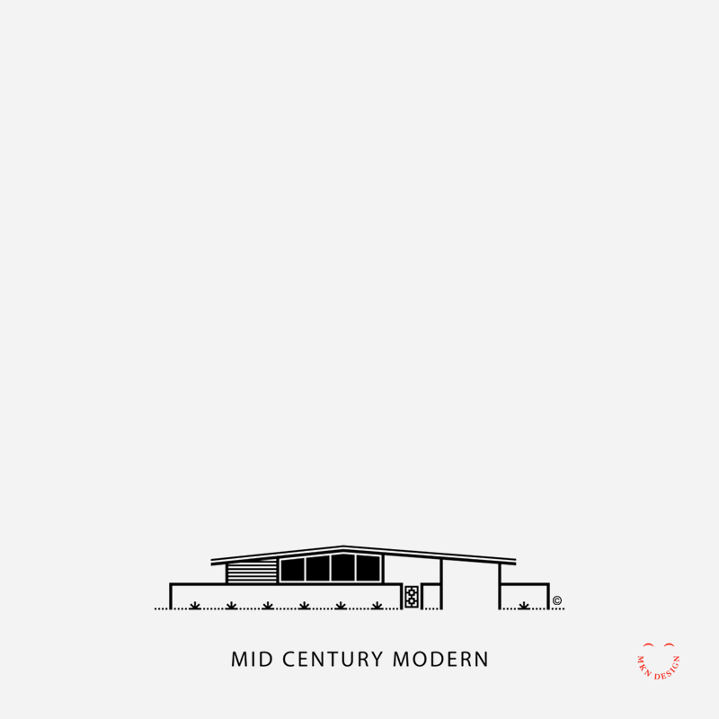
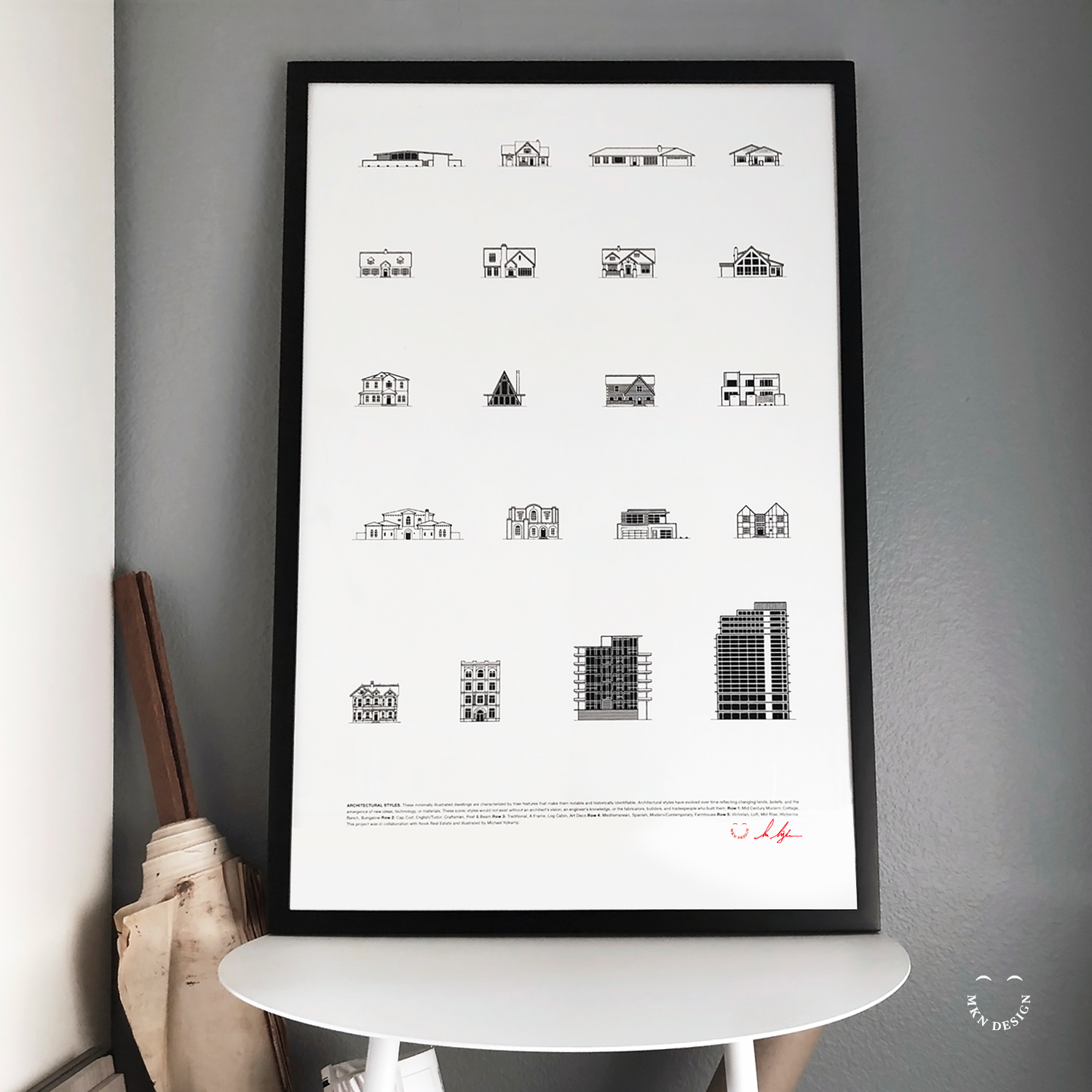
Client Project
January 2017
__
Nook Real Estate
Nook Real Estate, nestled in the heart of Newport Beach, California, epitomizes modernity in the realm of real estate. With a team of astute industry leaders, they specialize in handpicking lifestyle properties that captivate discerning buyers. I've was hired by Nook to craft simple illustrations showcasing the diverse architectural styles of California, enriching their marketing arsenal with visual allure.
Employing my minimalist illustrative approach, I visually captured 20 distinct architectural styles. These illustrations were subsequently compiled into a poster, presenting a comprehensive showcase of the diverse spectrum of architectural designs found in Newport Beach, California.
-
Illustration & Graphic Design
-
+ Creative Direction
+ Research
+ Sketching & Ideation
+ Graphic Design
+ Iconography -
This poster is available for purchase in my shop.
Mitten State

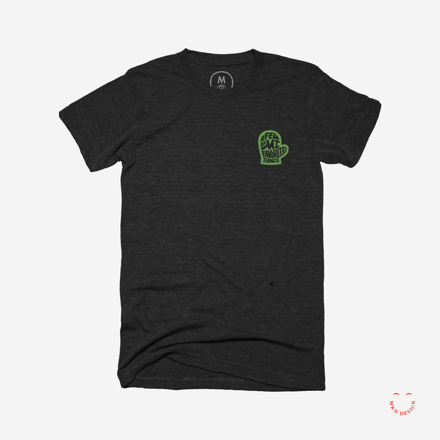
Client Project
December 2016
—
Mitten State
A few of MI (my) favorite things. A mark with custom hand type created by my wife and I for a our children’s school auction—auctioning authentic Michigan paraphernalia. The letterforms in this mark have been custom-designed to fit snugly into the mitten.
-
+ Brand Identity
-
+ Creative Direction
+ Project Management
+ Qualitative Research
+ Concept Development
+ Sketching & Ideation
+ Illustration