


Parks Canada
__
Date: 1973
Designer: Ken Marsh, Roderick Huggins
Studio: Guillon Design Inc
Status: Retired
Industry: Environment
__
parkscanada.ca

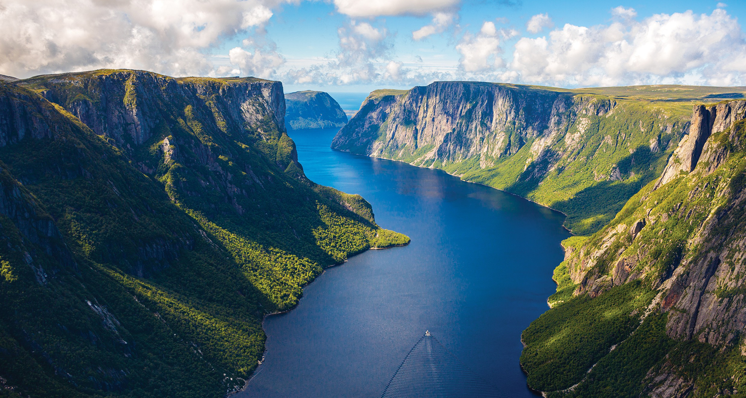
I’ve only visited one Canadian national park—Gros Morne, located on the west coast of Newfoundland. It’s about a 31-hour drive plus fairy ride east of Toronto, but absolutely worth the trip. The park’s main attraction is the Western Brook Pond, a stunning glacier-carved fjord that cuts through the dramatic Long Range Mountains. It’s truly breathtaking. Parks Canada’s emblem used to be one of my favorites—recognizable, bold, and unexpectedly distinctive.
While trekking through the park, we came across a few Park Wardens and staff wearing their standard uniforms, which varied depending on the task and weather conditions. The typical Warden uniform is functional and outdoor-ready—part of a recognizable Parks Canada brand defined by gray shirts, green trousers, ranger hats, caps or toques, and rugged boots built for the terrain. The emblem stood out prominently on their gear—typically displayed on their hats or uniforms.
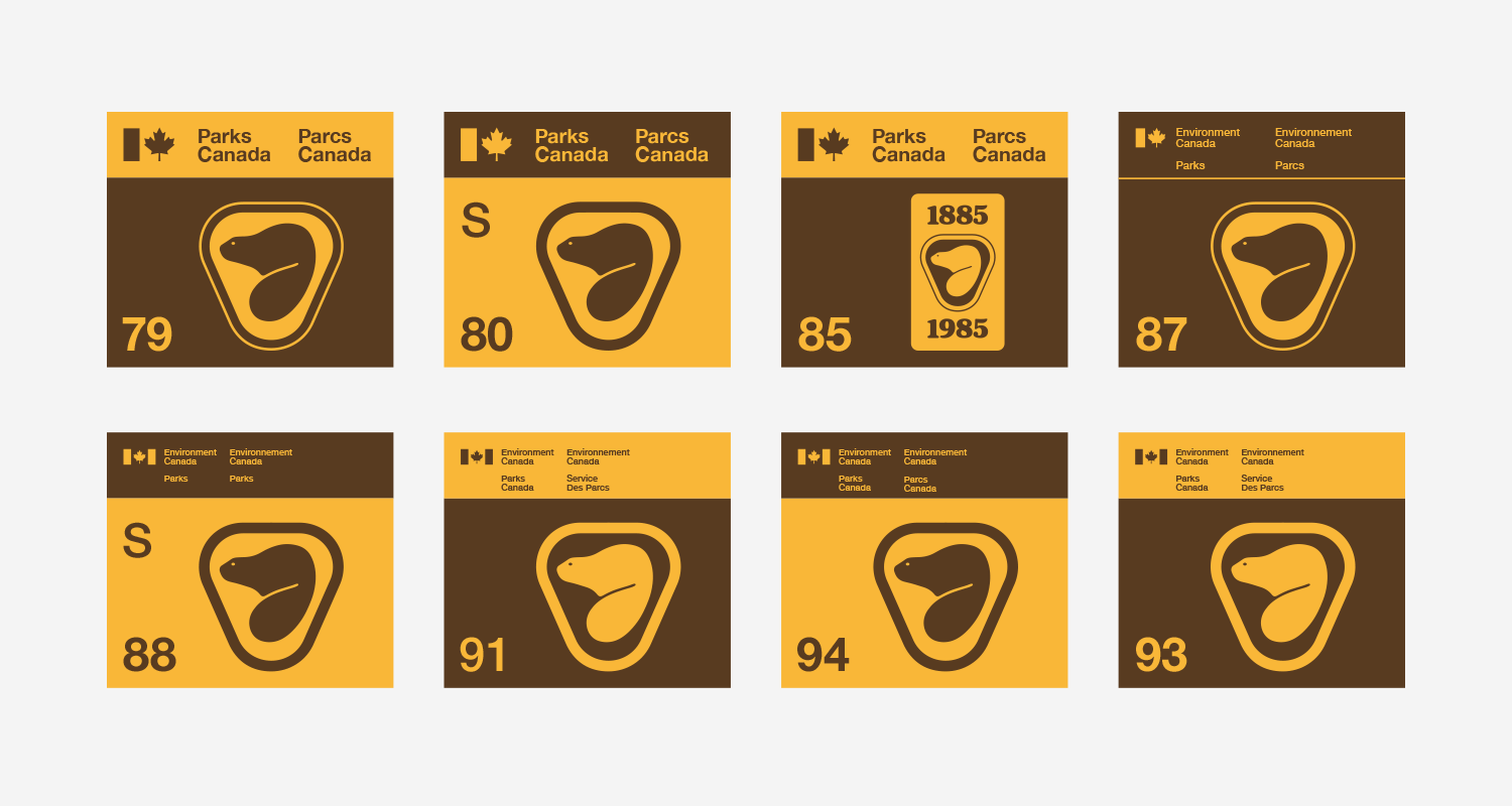
During my visit while in college, Parks Canada had updated its emblem for “legibility and reproducibility”—and honestly, I wasn’t a fan. The new design felt overly cartoony and commercial—more like a marketing piece than a national symbol. It didn’t align with the minimalist design system I’ve always admired in Canada’s past visual identity. My own branding work leans heavily on the principle of “less is more,” so the shift felt out of step.
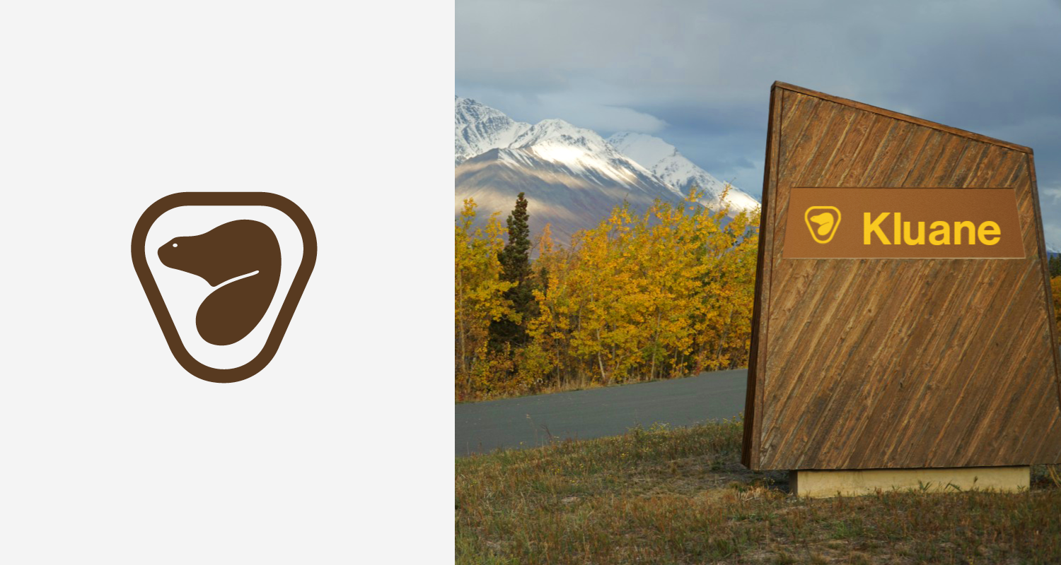
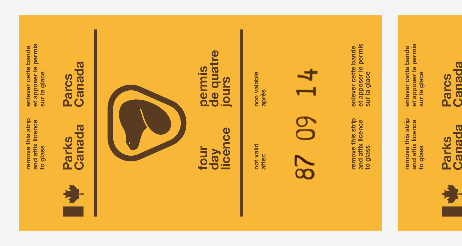
One element that remained consistent throughout the emblems evolution was the beaver—another enduring symbol of Canada’s national identity for nearly 50 years. The original emblem, which I absolutely love was designed in 1973 by Roderick Huggins. It was memorable for its simplified beaver form enclosed within a rounded triangle—a shape that reads like a badge, fitting perfectly for park rangers and staff. What made it especially distinctive were its unique colours—gold and brown—which complemented the park signage beautifully and gave a grounded, natural feel that reflected Canada’s cultural heritage, environment, and expansive scenery.
Canada’s national symbol besides the maple leaf is the beaver. It holds deep cultural significance for both Indigenous Peoples and Canadians. As described by Tatjana and Walter Stolting of Spirits of the West Coast Art Gallery, “The beaver helps people understand the dynamics of teamwork and to appreciate each individual’s talents and contributions in order to accomplish anything. He is a builder of the mind, body, and soul and symbolizes creativity, creation, cooperation, persistence and harmony. The Beaver is also a hard worker and will not quit his job until he is done.”
Today, Parks Canada manages 38 national parks, 3 national marine conservation areas, 171 national historic sites, 1 national urban park (in Toronto), and 1 national landmark. If you haven’t had the chance to explore Canada’s national parks, I highly recommend a visit. There’s something truly special about experiencing the land that has shaped the country's identity.
