


Canadian Tire
__
Designer: William Punkett (original design)
Studio: Unknown
Origin: 1940, Canada
Status: Active (updated)
__
canadiantire.ca

Canadian Tire was my favorite store as a kid. Seeing the red triangle paired with Canada’s maple leaf was a beacon of light from the highway. They had everything—automotive parts, camping equipment, housewares, CCM bikes, tools, fishing rods, toys, sportswear—you name it, they had it! On the weekends, I loved to peruse the Canadian Tire flyer and dream of what I could buy with the Canadian Tire Money I saved (I believe my first purchase was a fishing rod).
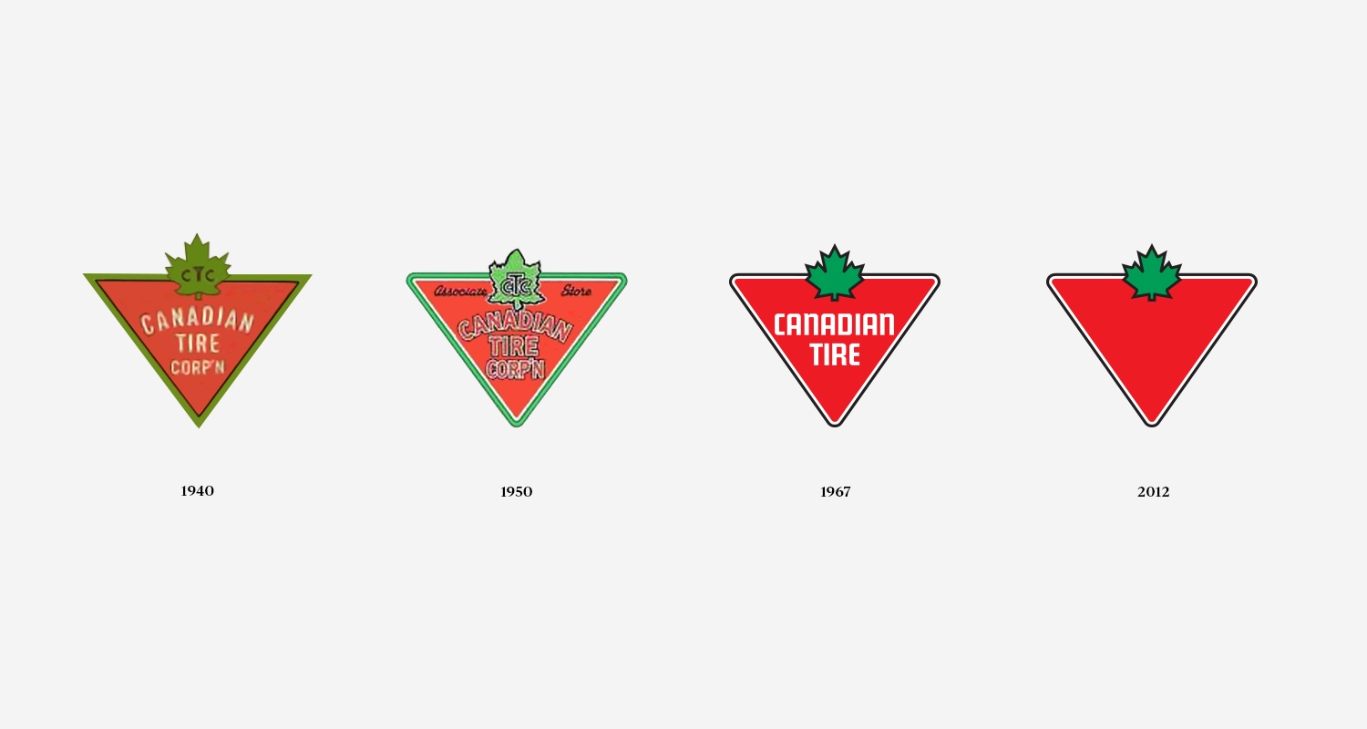
It has been said that Canadian Tire’s iconic shape, the triangle, was chosen because its founders (John and Alfred Billes) wanted a recognizable symbol on their petroleum products. In 1934, the maple leaf was added to the triangle. Thirty-three years later the logo underwent another design update—it is what we know and love today as the Classic Canadian Tire logo.
“This would be the everlasting symbol for the company that would be emblazoned into the psyche of every Canadian.” (Andrew King, Ottawa Rewind, The Canadian Tire Triangle, 2016).
Photo Description & Credit:
1. Canadian Tire stacked shipping containers - unknown photographer
2. Canadian Tire store front – unknown photographer
3. Evolution of Canadian Tire logo from 1940 to 2020
4. Canadian Tire sponsored indy car of Jacques Villeneuve, Laguna Seca Raceway, Quebec, 1985 - Daniel du Plessis
