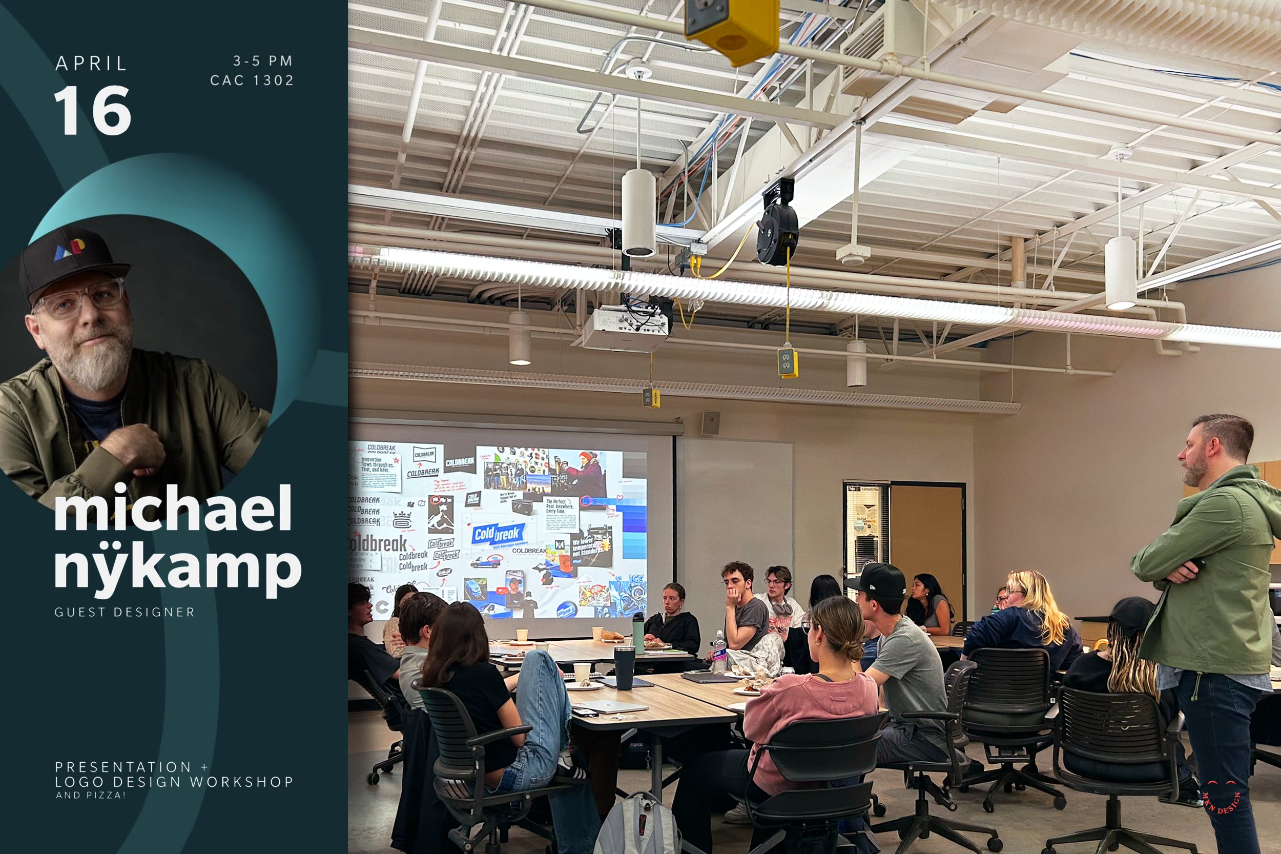
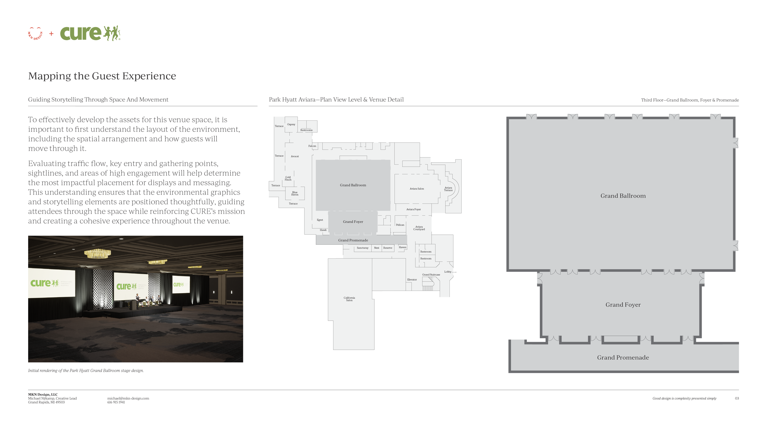
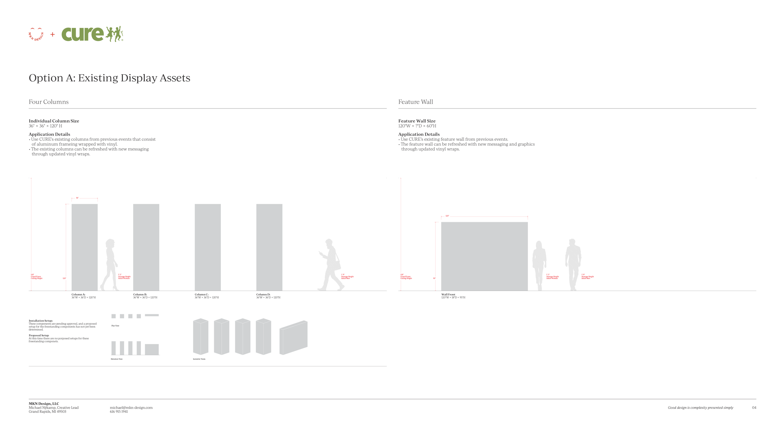
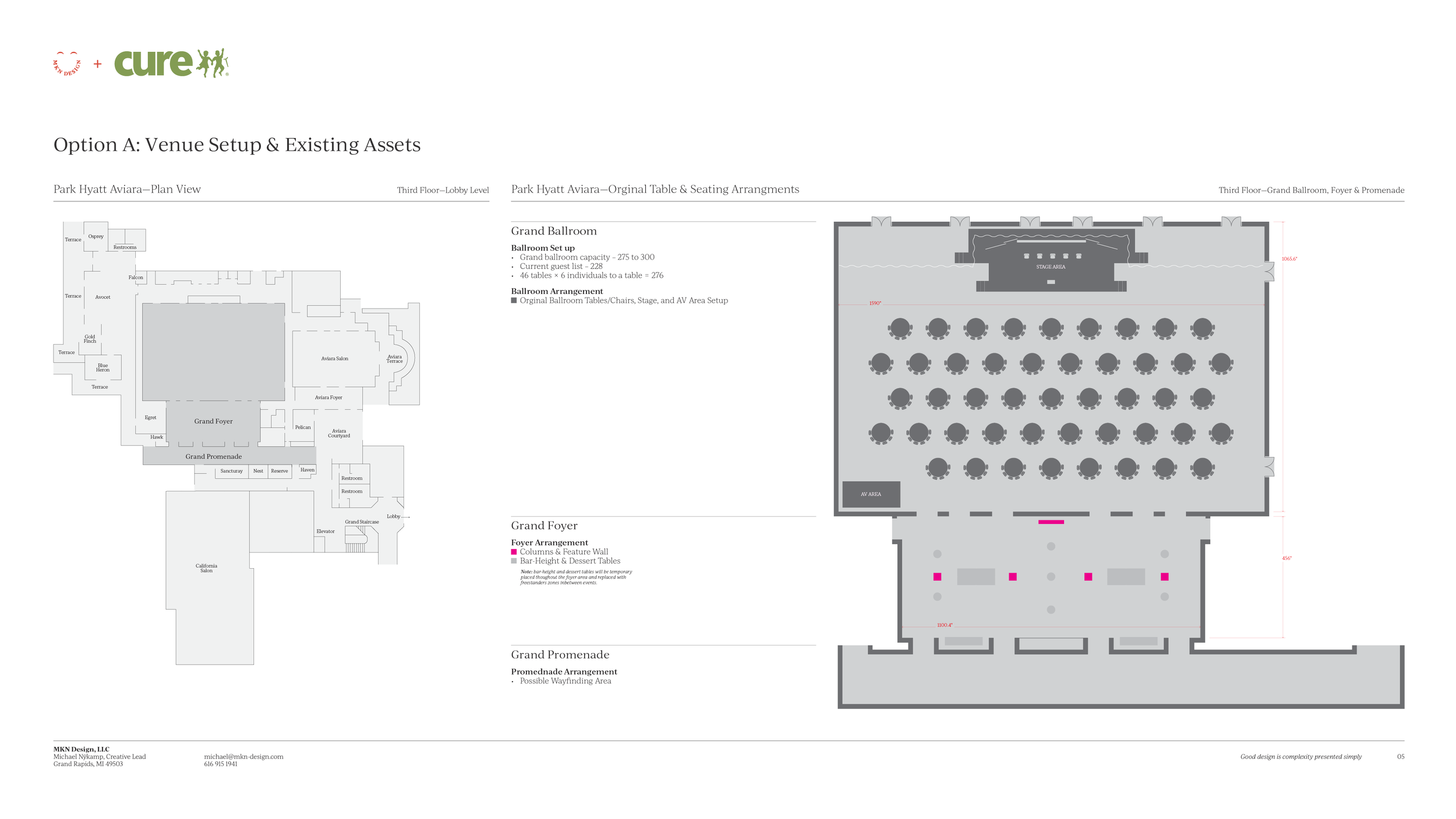
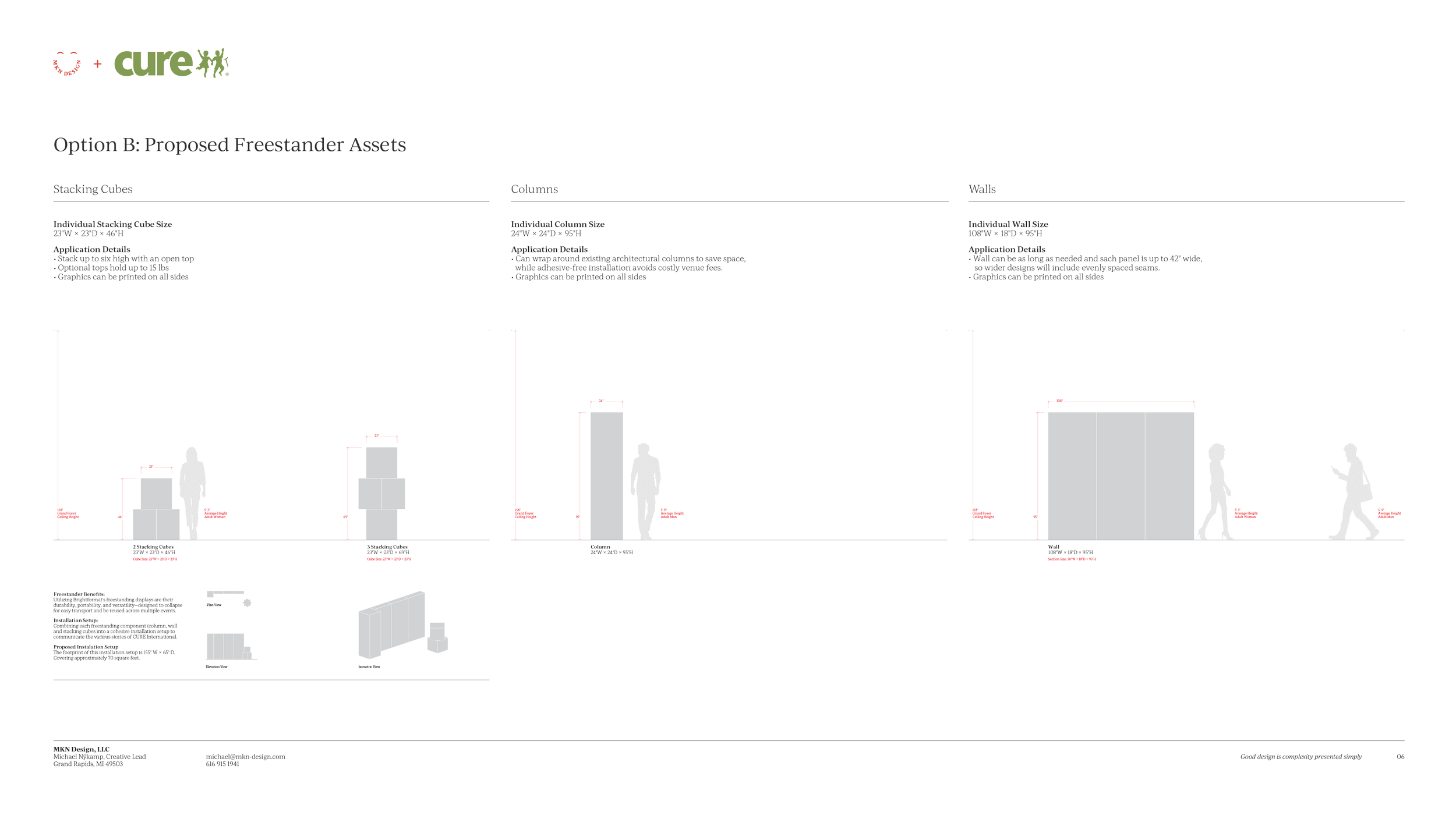
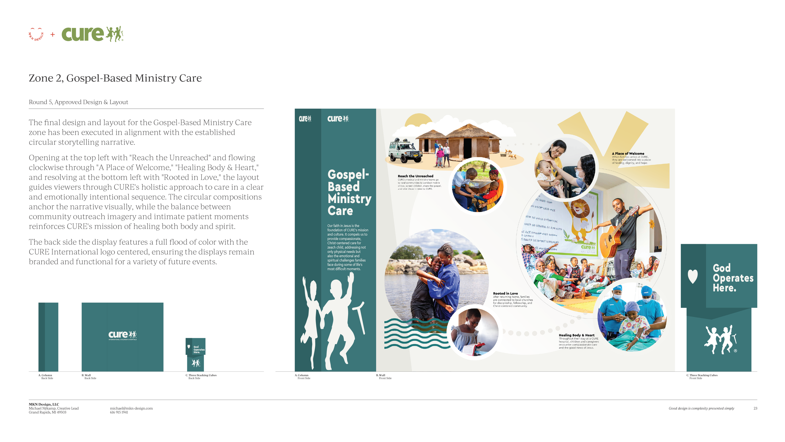
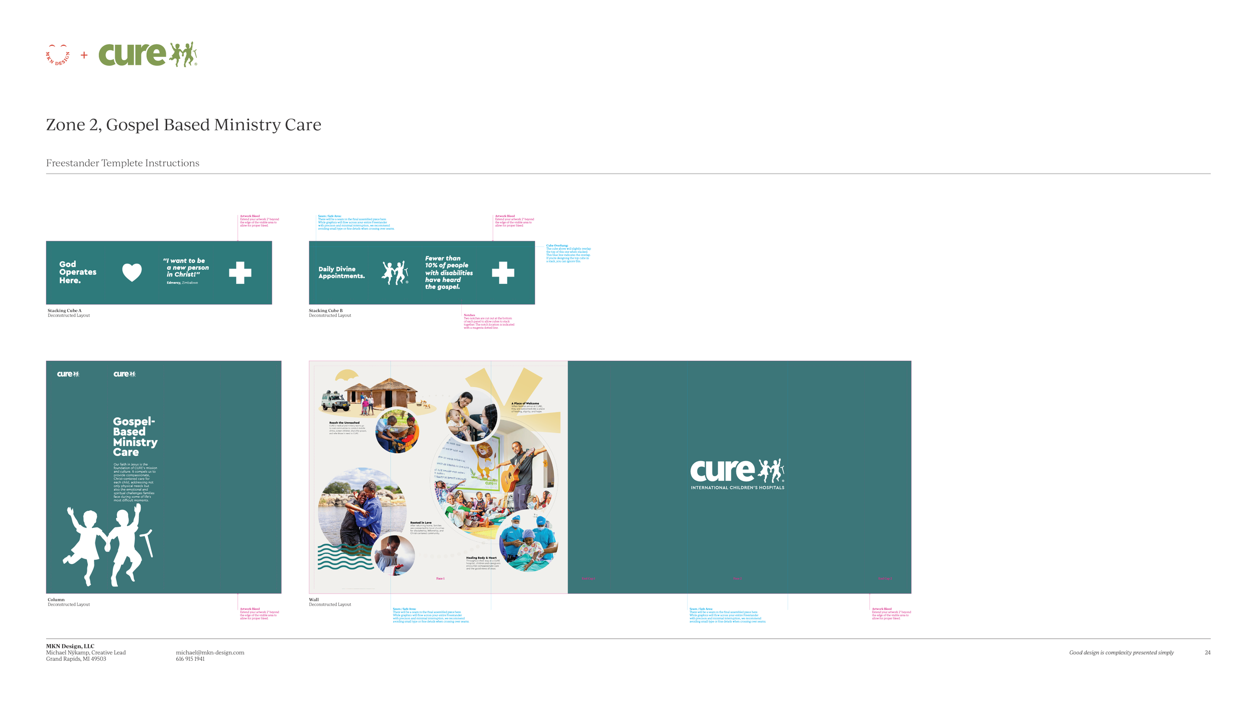
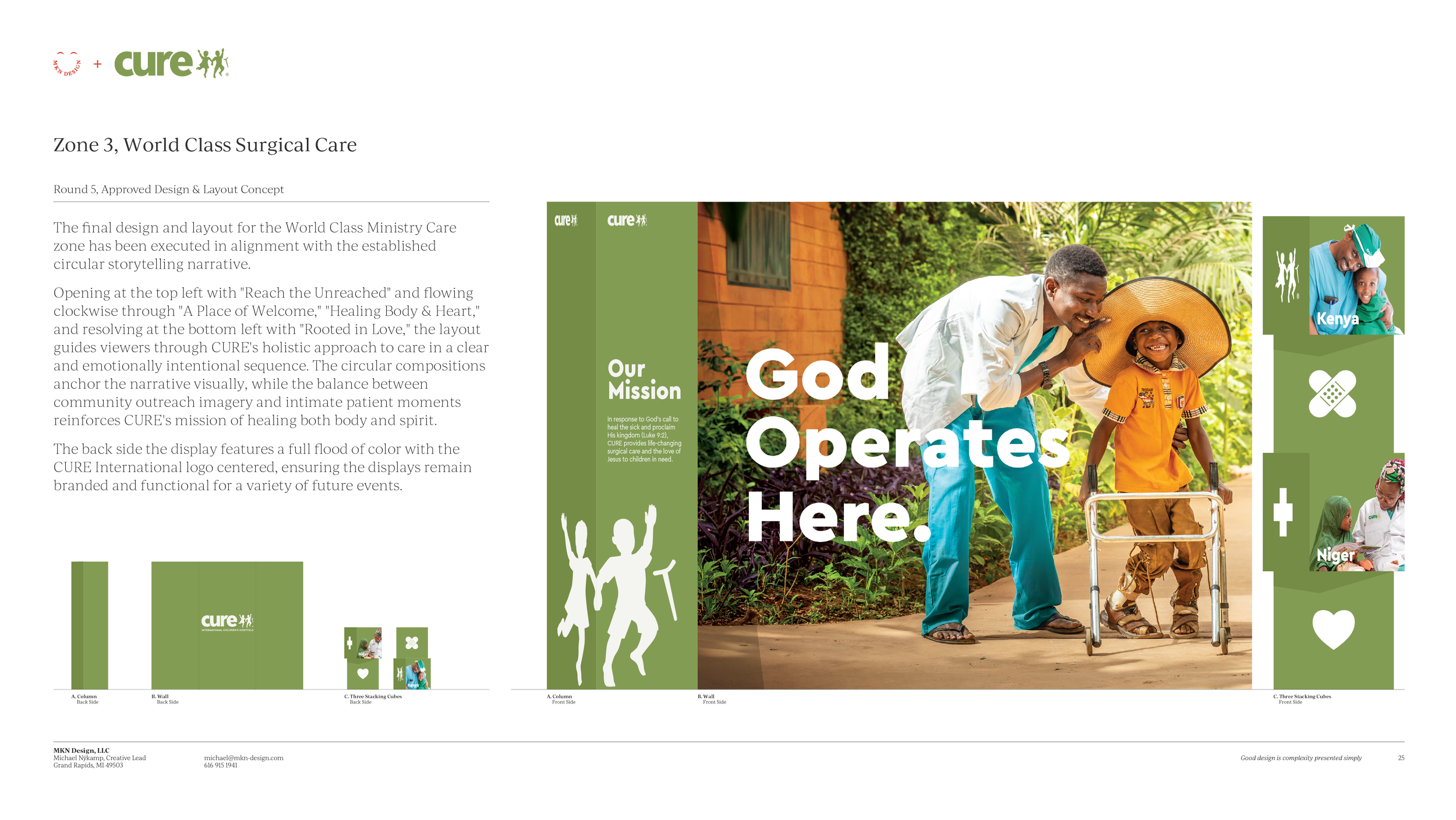
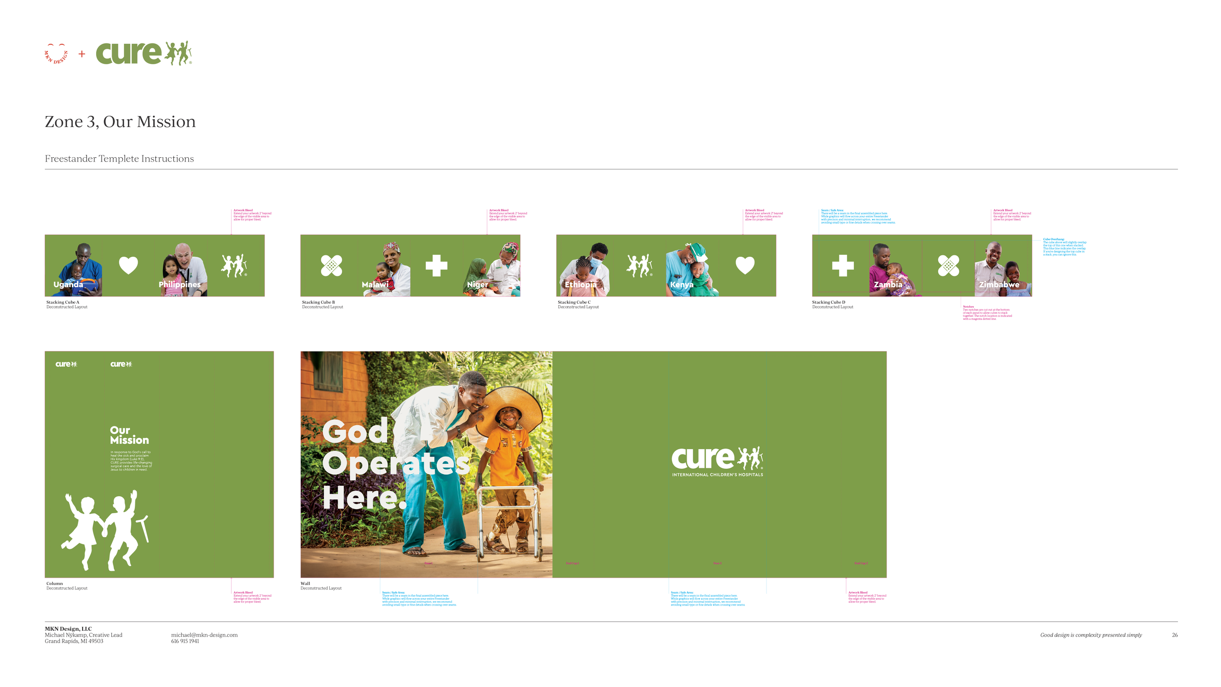
Collected Works
These pages serve as a repository of MKN Design Studio’s articles, client projects, independent work, and products.
Careful, it’s a rabbit hole.
Use the search to find projects by type, or the dropdown to explore by group.
Craft & Clarity
Article
—
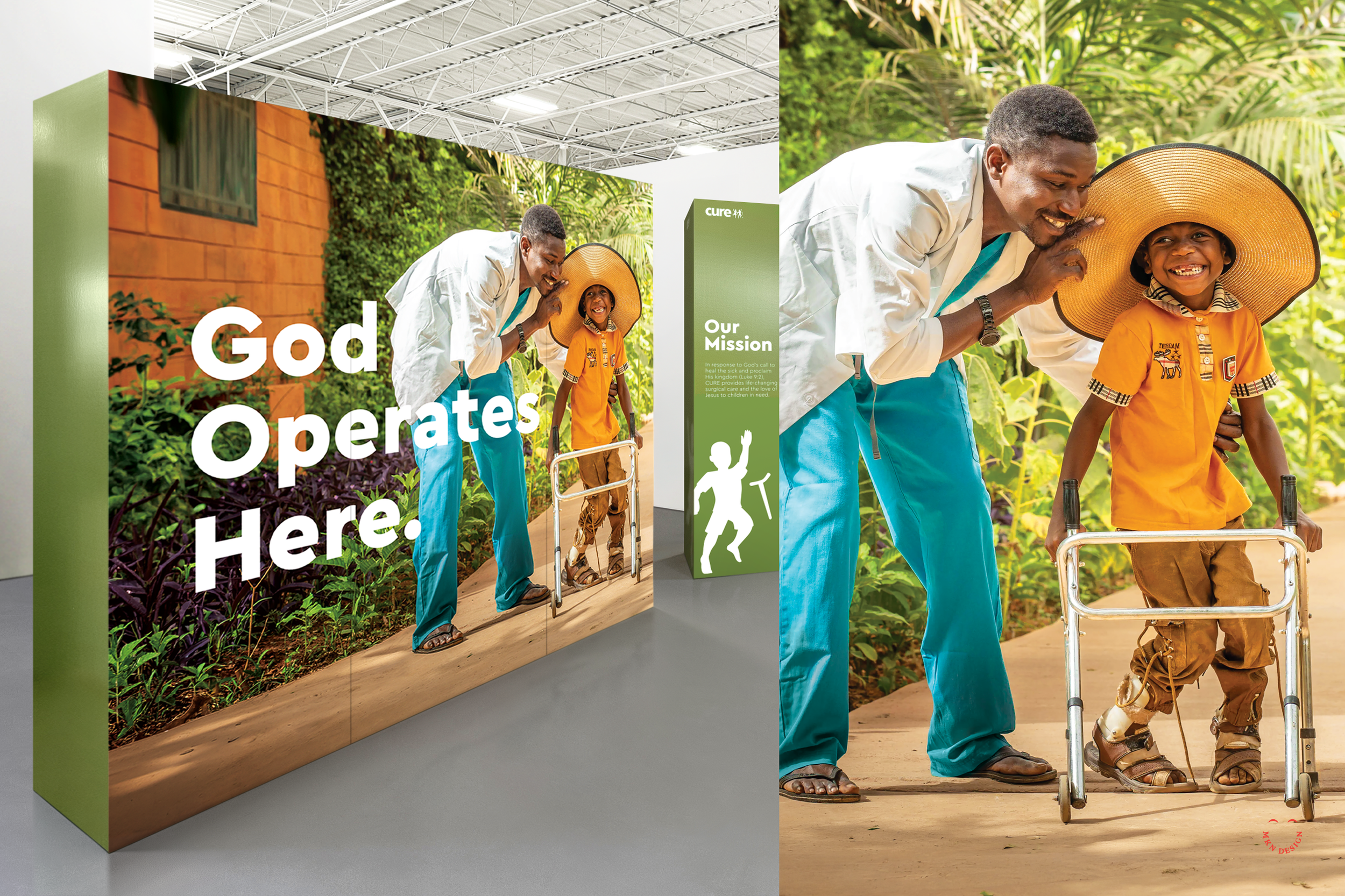
Craft & Clarity
Craft is the foundation. Clarity is the outcome people remember.
For creative leaders, this is not just a principle. It is a responsibility that should remain constant. Our role is to ensure your team understands it deeply, not just conceptually. It must be embodied, practiced, and internalized, not reduced to theory or surface-level understanding. It must be actively taught, consistently reinforced, and embedded into how decisions are made.
Craft is often understood as the result, but it runs deeper than the visual surface of what is produced. In reality, it is everything beneath it: thoughtful decision-making, reduction, attention to detail, consistency across systems, and restraint when more could be added but should not be. It is the discipline of shaping something until it stops feeling designed and starts feeling intuitive and effortless.
While craft is valuable on many levels, the goal must be clarity.
Our job is not simply to produce well-crafted work. It is to ensure that what the user, consumer, or audience experiences is immediately understandable. That what they see or read reduces friction rather than adds to it. That it clearly communicates intent and leads them toward the action, decision, or understanding it was designed to support.
Craft builds the system. Clarity delivers meaning and drives results.