Collected Works
These pages serve as a repository of MKN Design Studio’s articles, client projects, independent work, and products.
Careful, it’s a rabbit hole.
Use the search to find projects by type, or the dropdown to explore by group.
CURE International – Environmental Graphics
Nonprofit Client Work
—
CURE International – Environmental Graphics
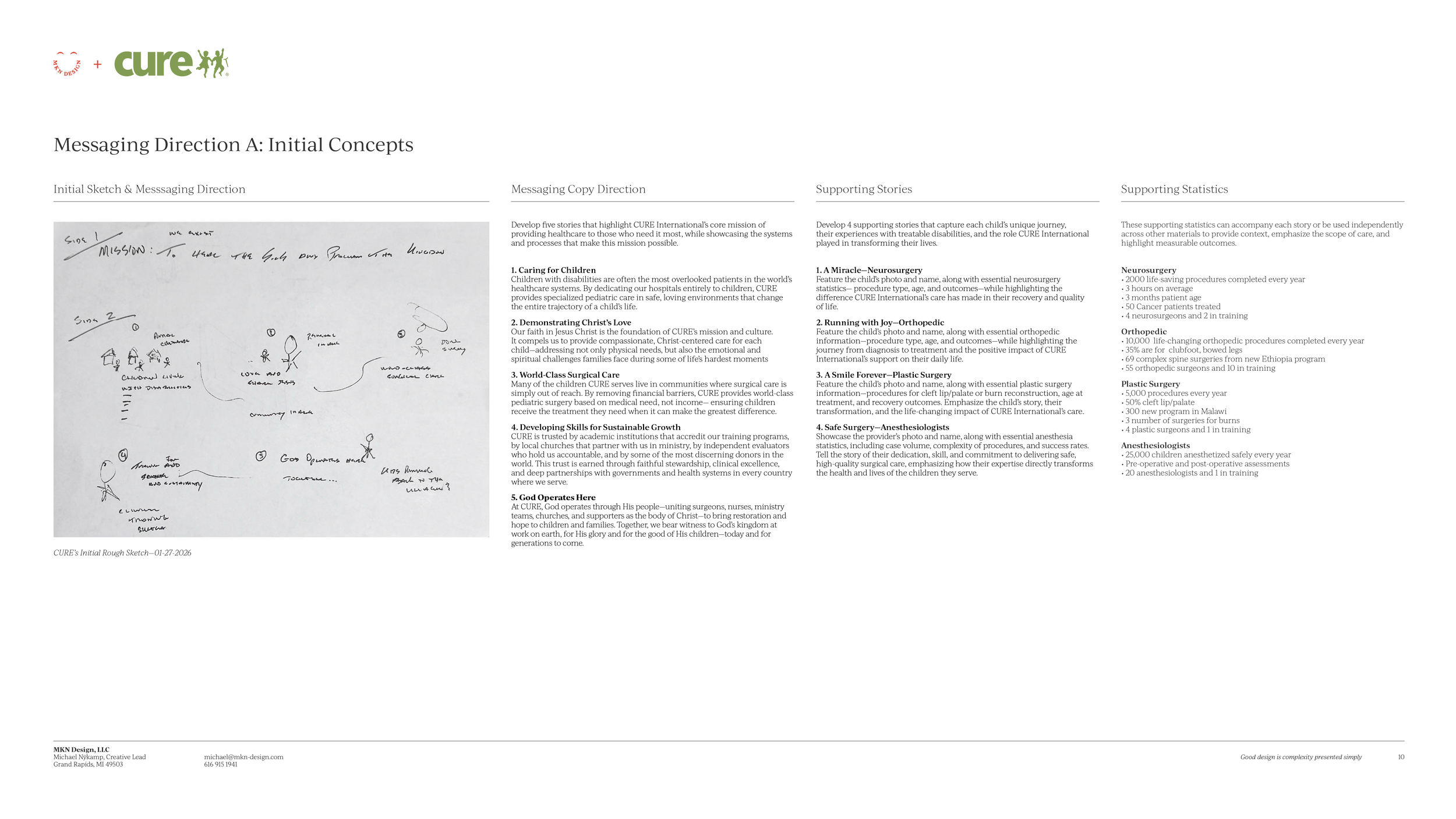
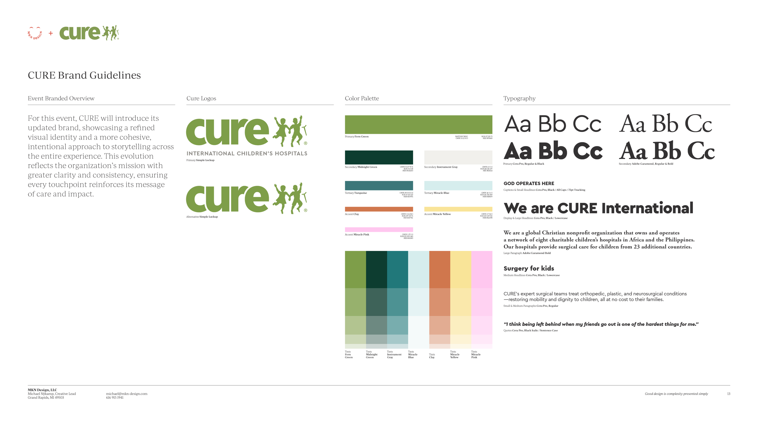
CURE International partnered with MKN Design to create an environmental design experience for President's Weekend 2026—a gathering of 225+ donors and supporters coming together around a shared mission. The goal was simple: bring CURE's story to life through an immersive environment that guided guests through powerful stories of world-class surgical care and the call of Christ to serve children in need. Every design decision was made with care, balancing love, humility, and impact to create an experience that felt as personal as it did purposeful.
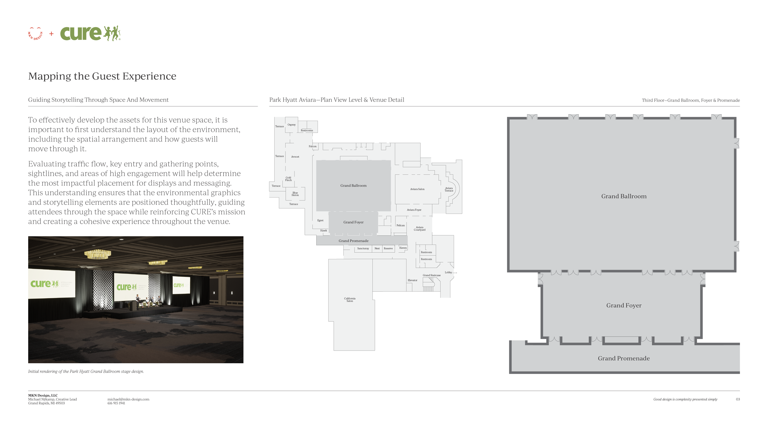
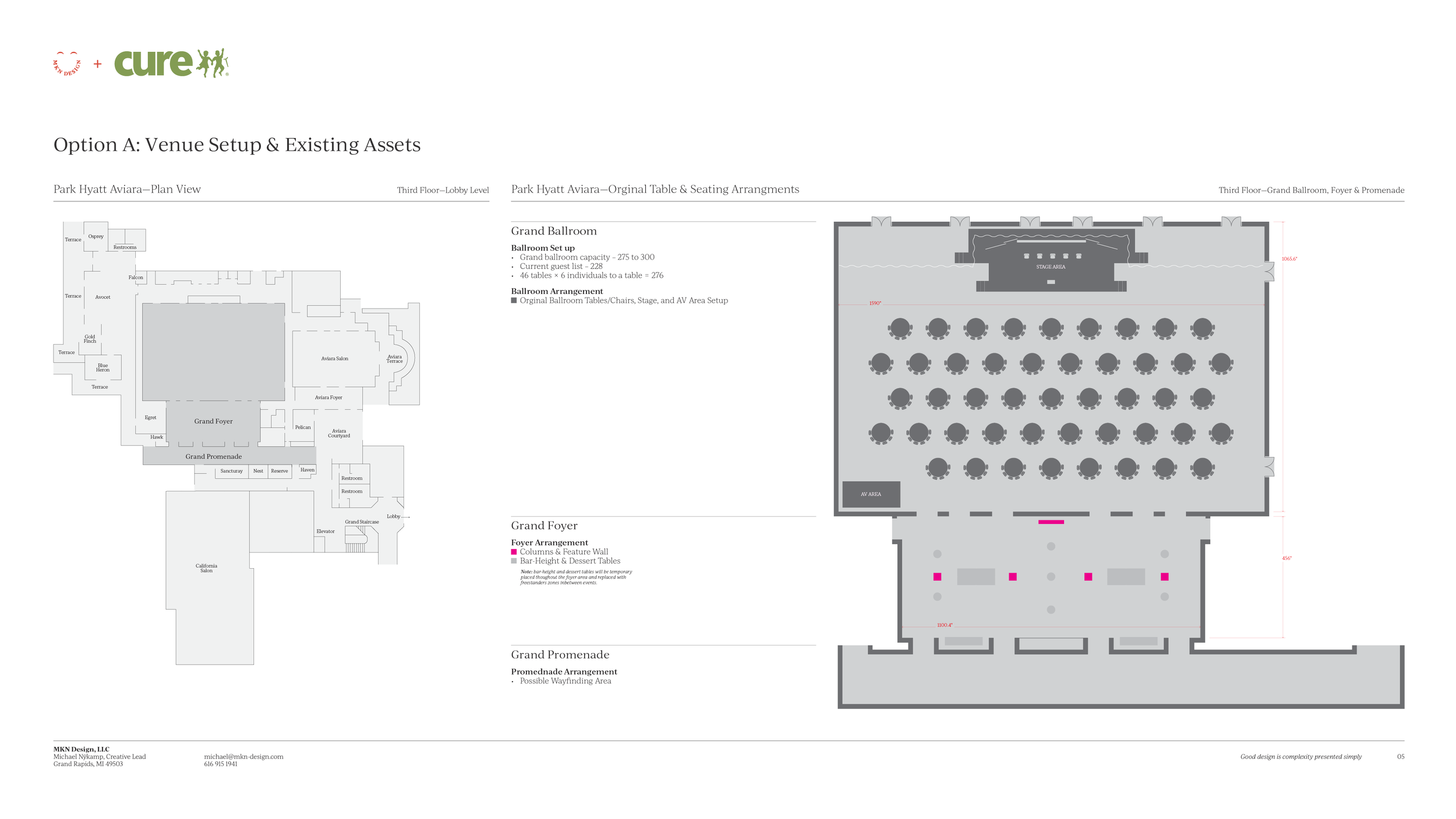
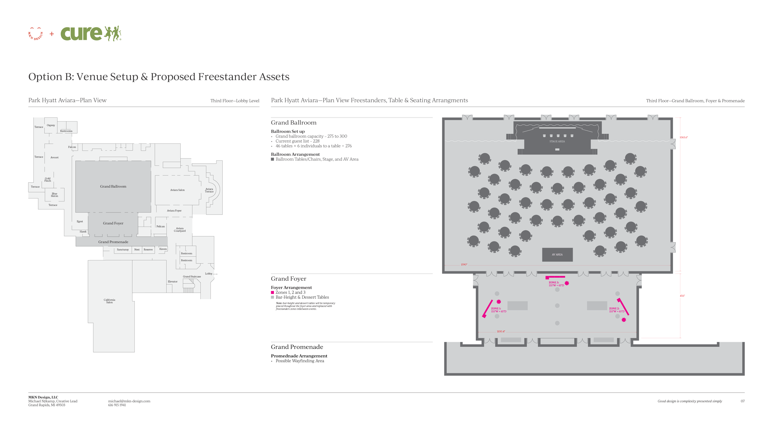
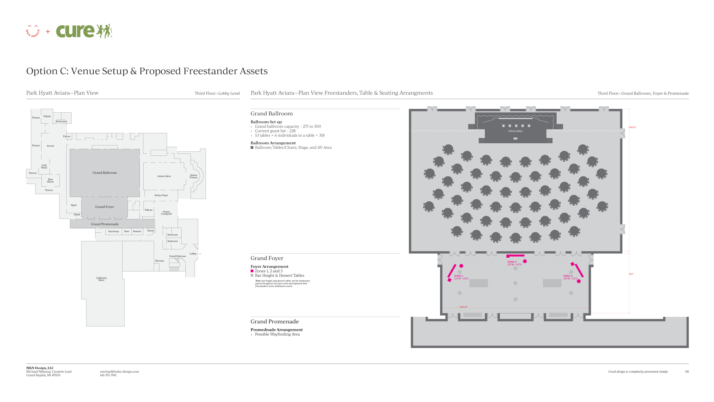
Understanding the venue space—how guests would move through it and where stories would have the greatest impact was essential to shaping the direction of this project.
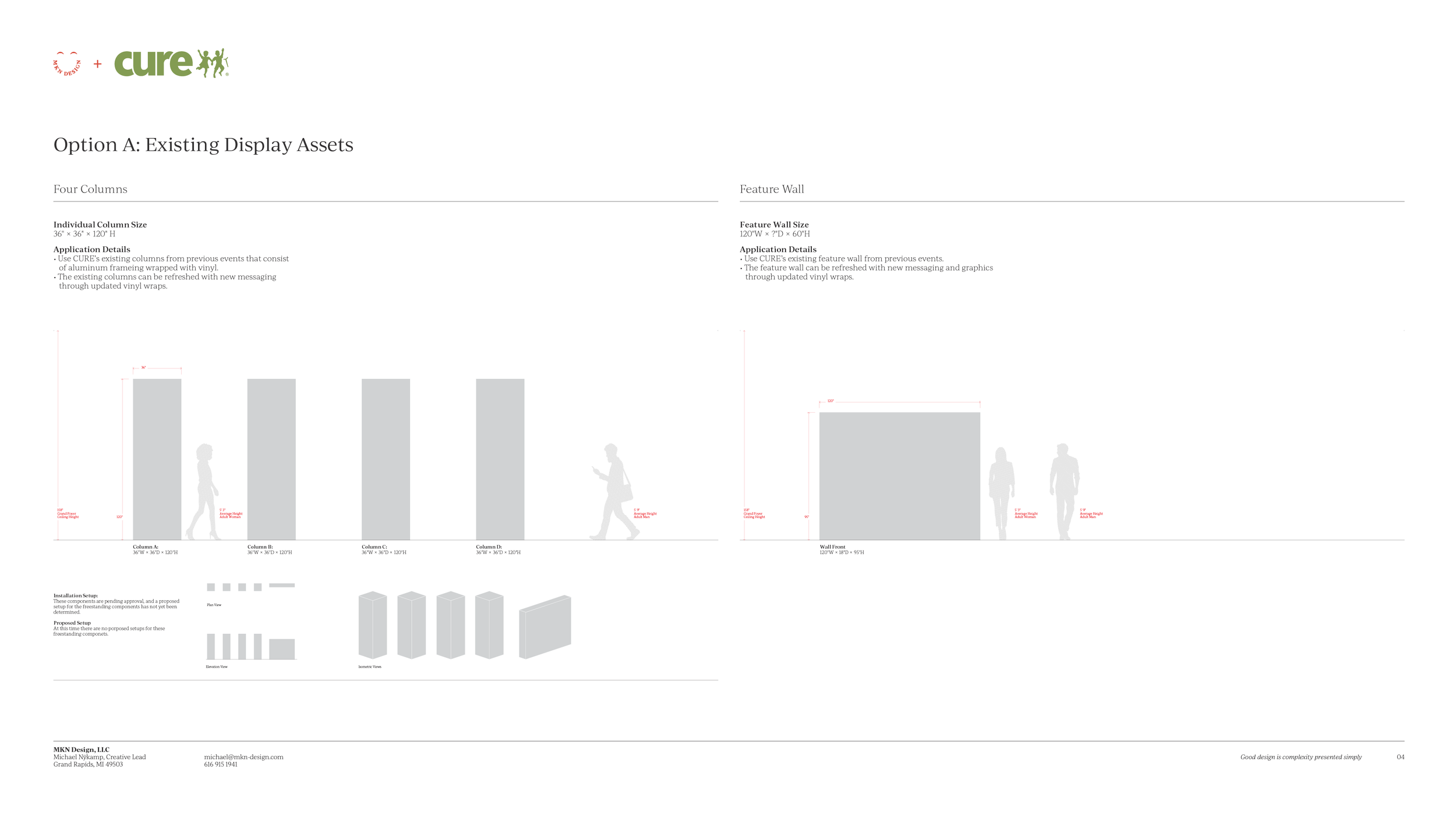
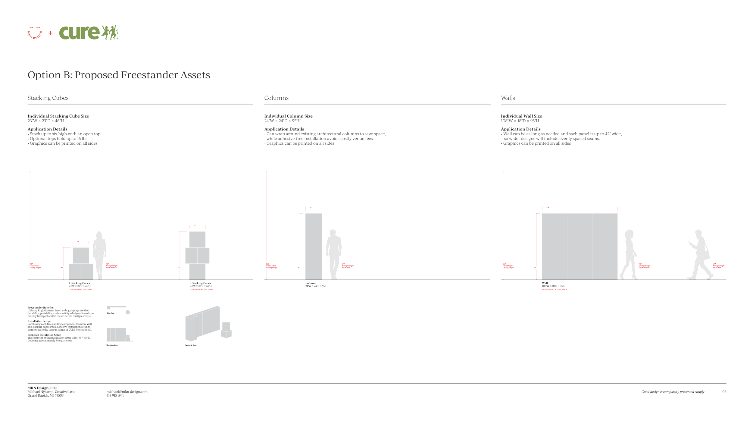
From there, we translated the initial messaging and sketch into a storytelling environment that was both compelling and on-brand. As the concept evolved, we evaluated how the environment would be produced and experienced within the space. While there was an opportunity to reuse CURE’s existing displays from the previous year, we recommended a different direction. Brightformat's freestanding display system was selected for its durability, portability, and reusability across future events.
By bringing a refined visual narrative to life through purposeful color, typography, and a circular storytelling structure, the elements of brand, messaging, and freestanders formed a cohesive attendee experience that connected emotionally with guests—reflecting both the heart of CURE's mission and the spirit of the weekend.
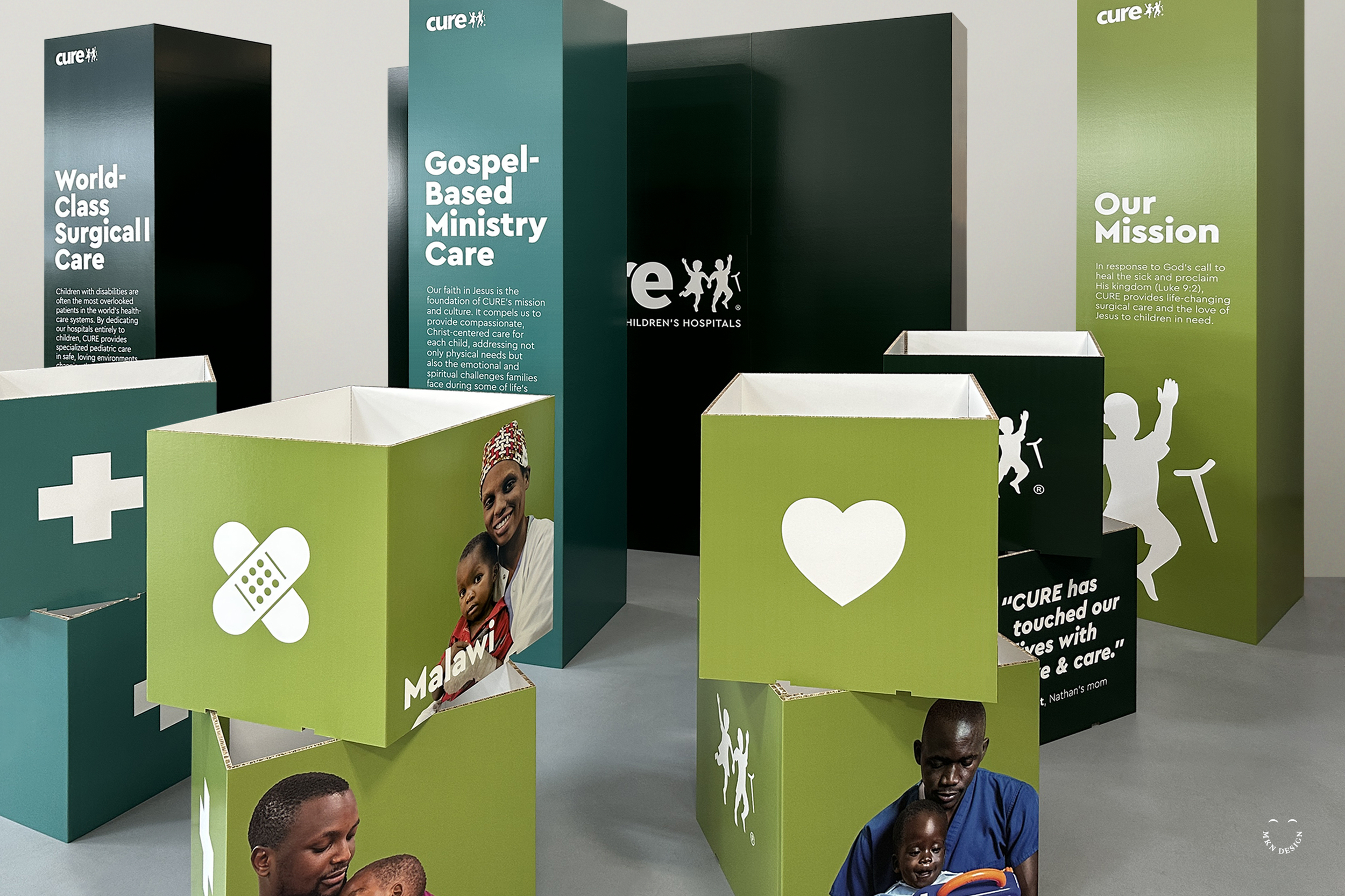
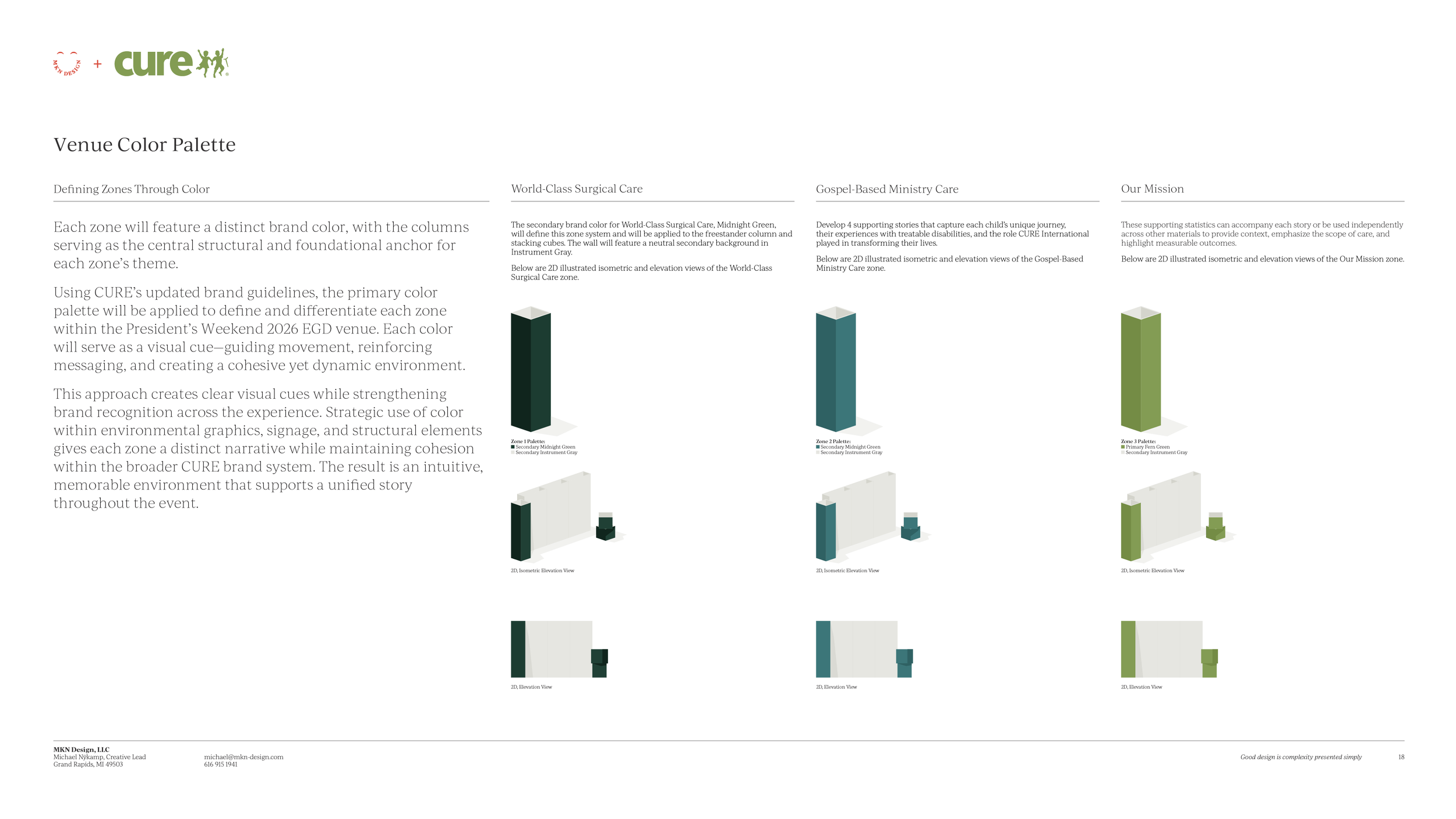
Each zone was designed to carry its own distinct story, all culminating in the third zone which served as the centerpiece of CURE's mission.
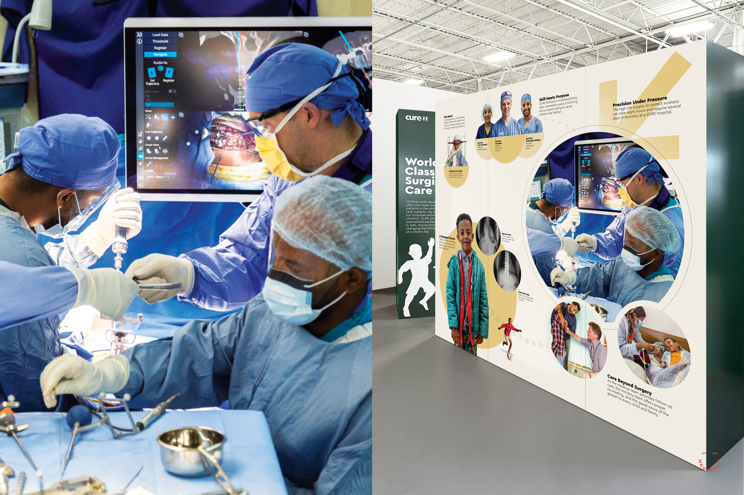
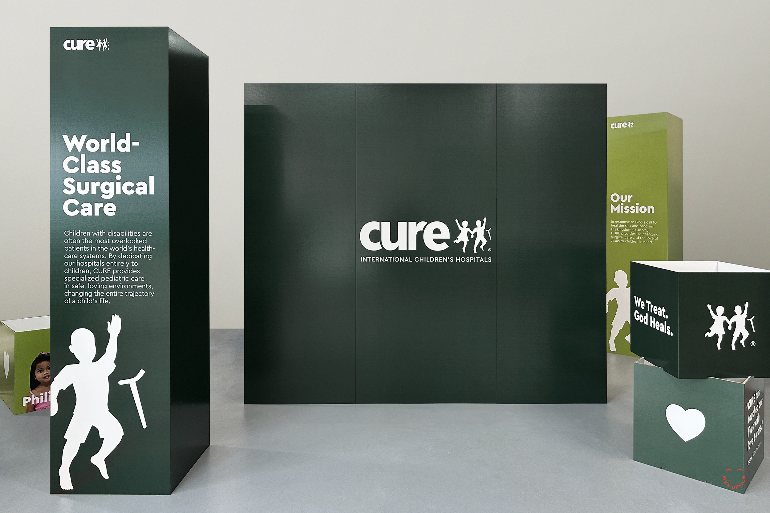
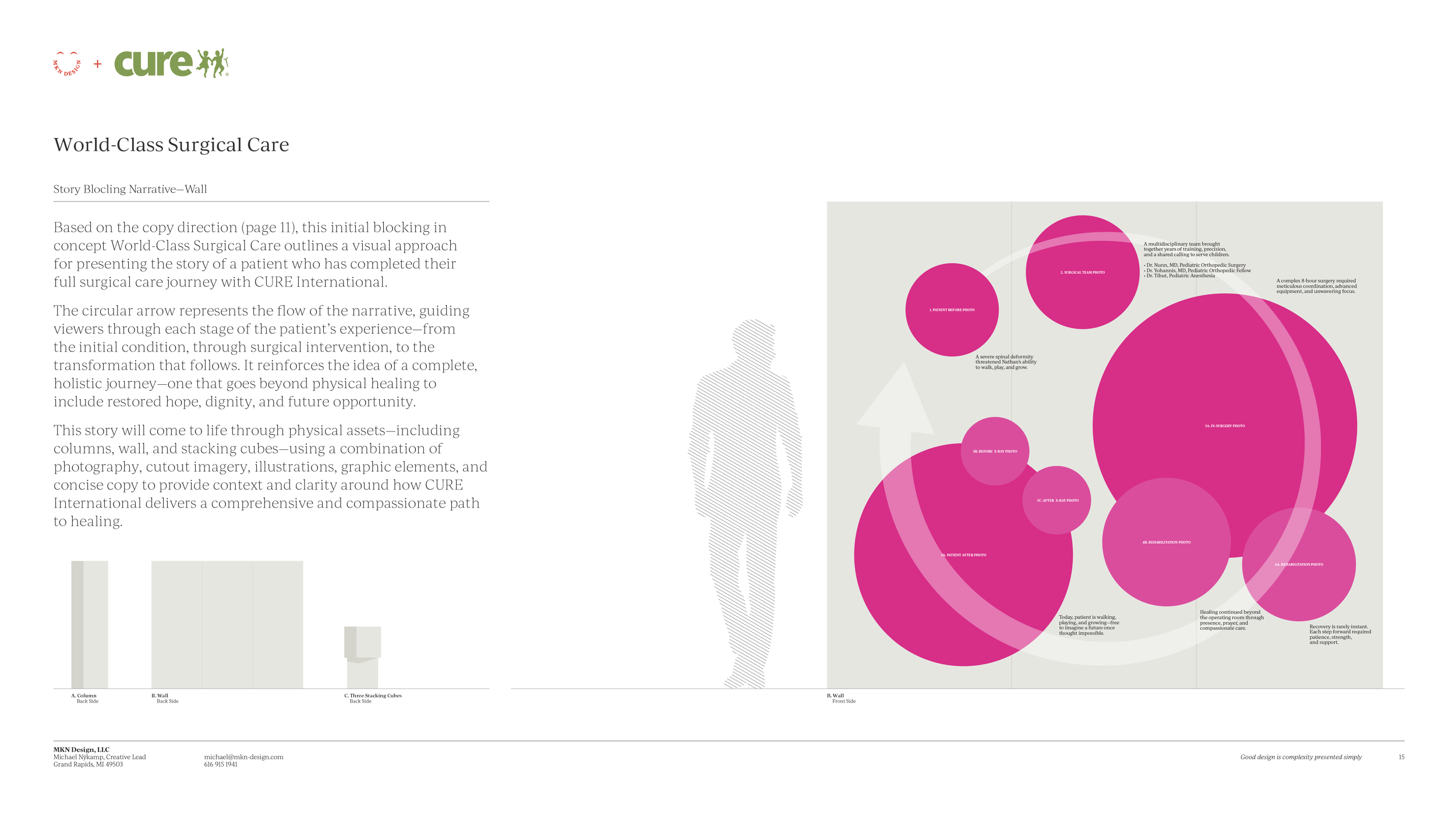
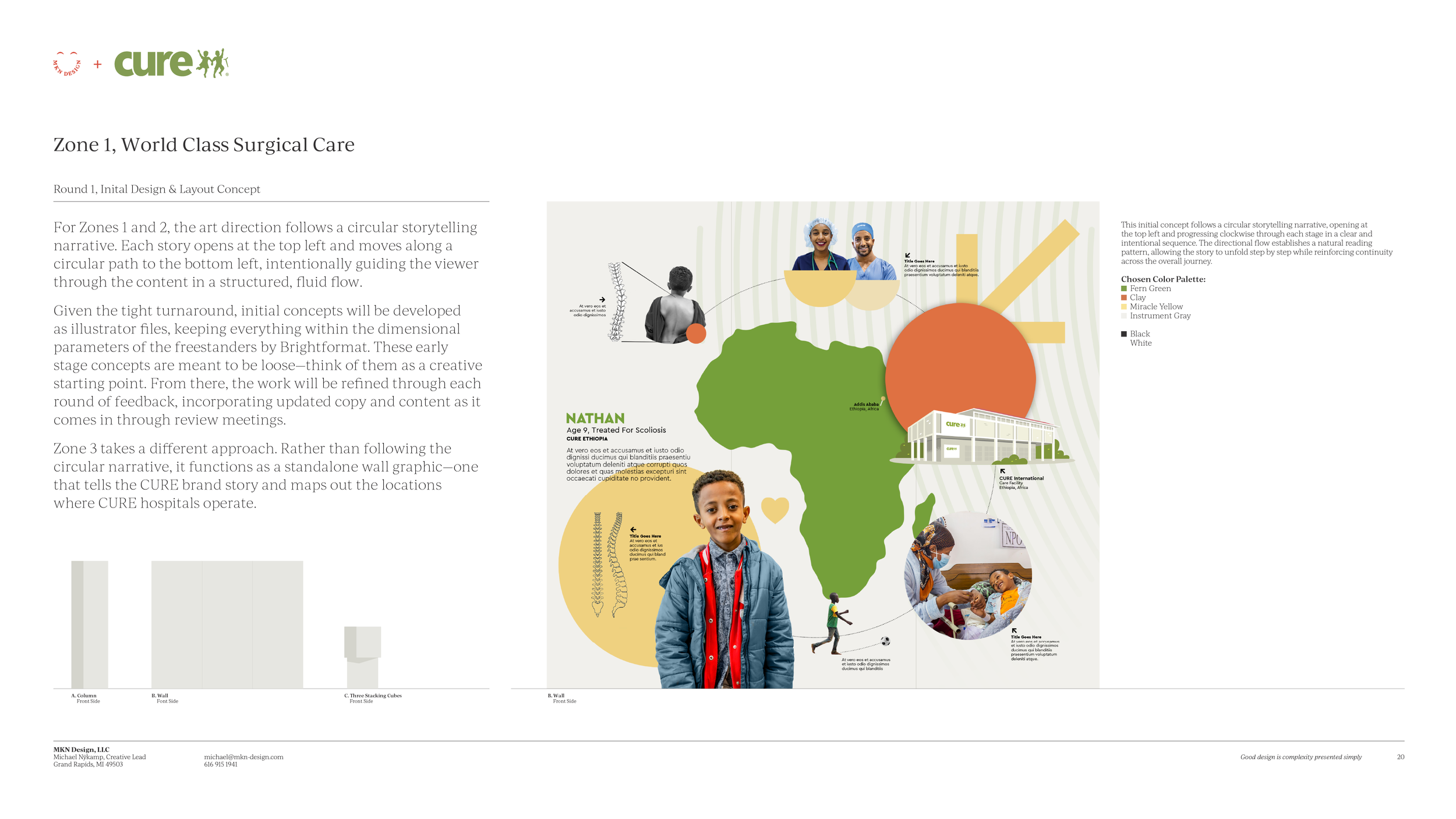
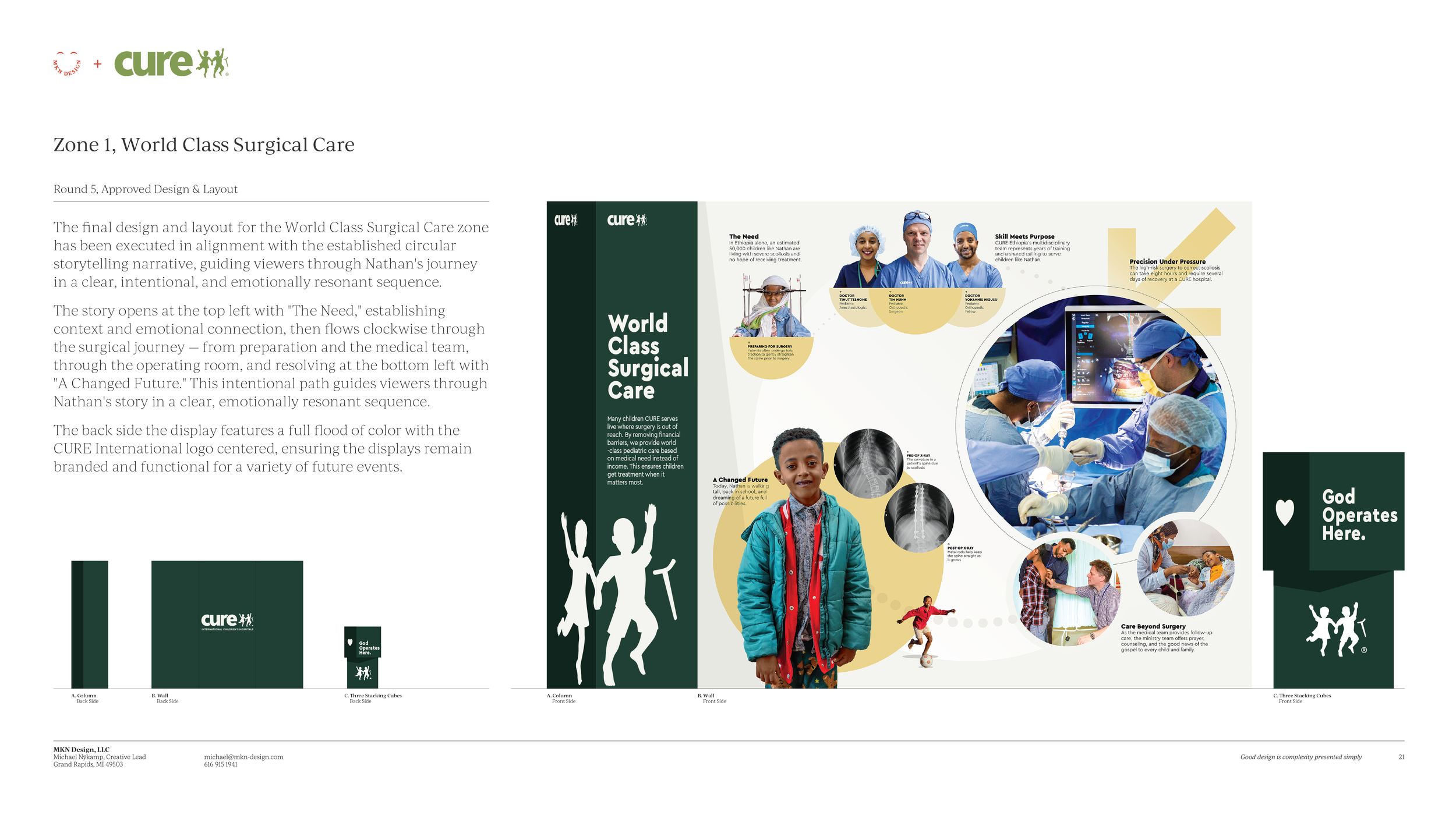
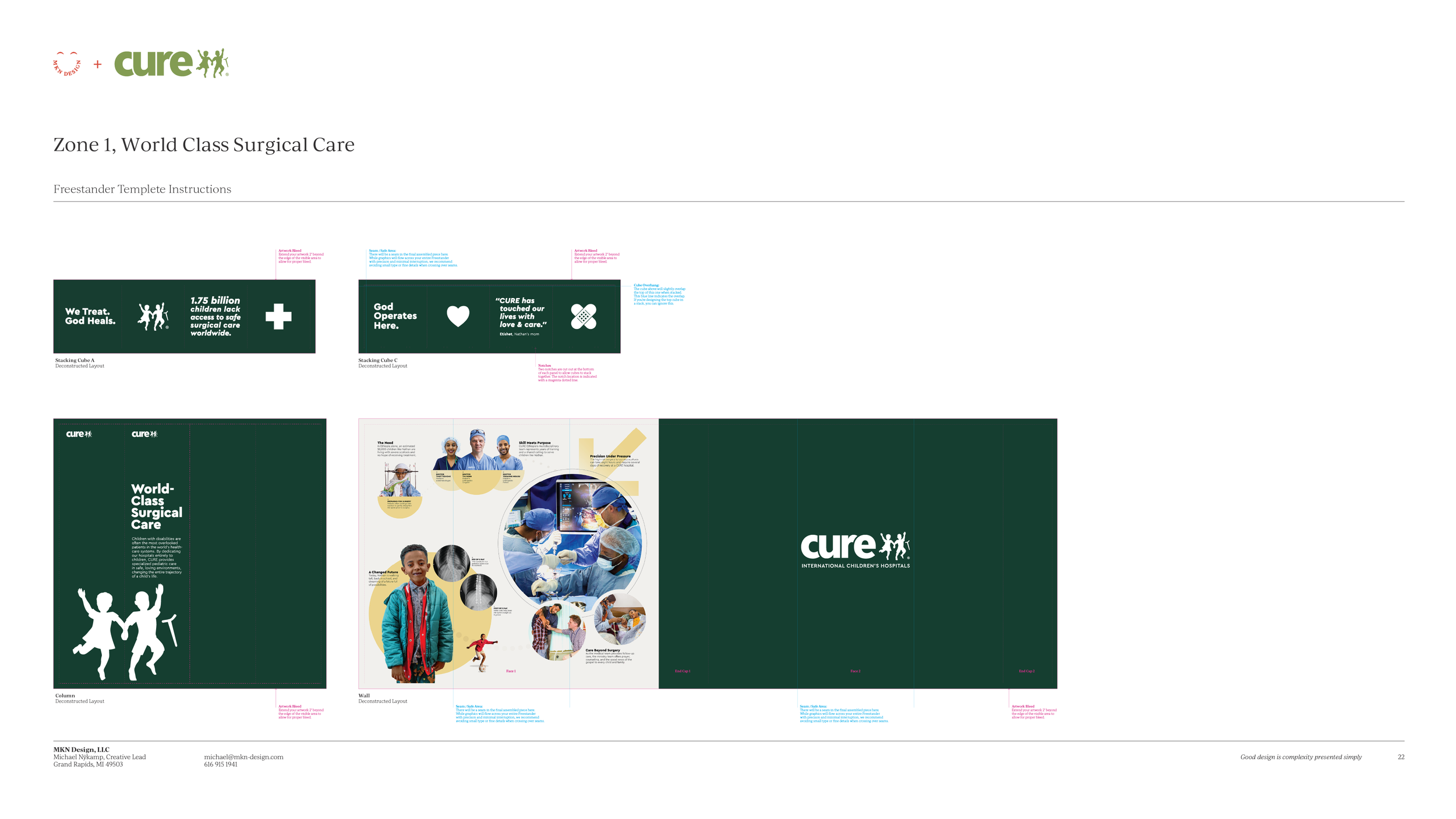
Zone 1, World-Class Surgical Care
Guided viewers through Nathan's scoliosis journey at CURE Ethiopia using a circular clockwise narrative.
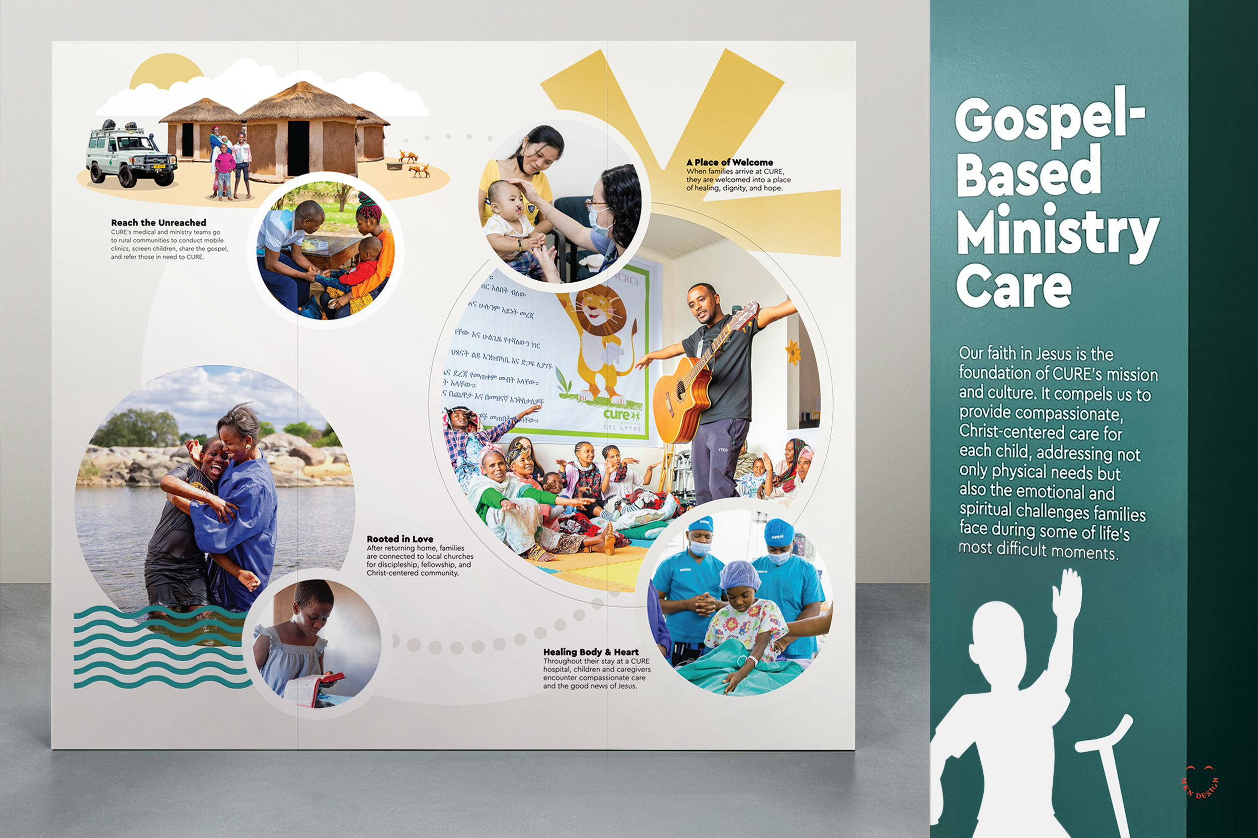
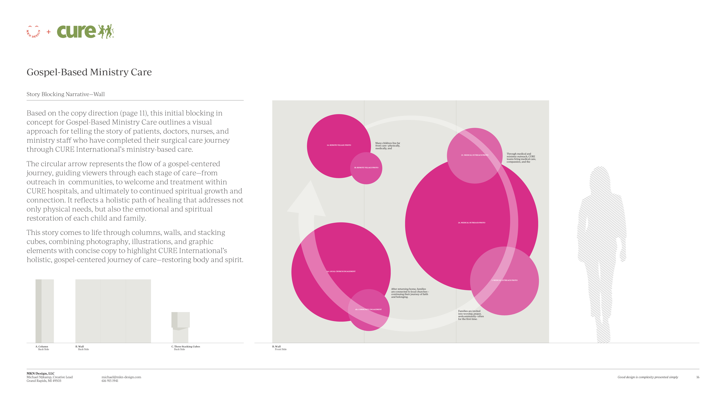
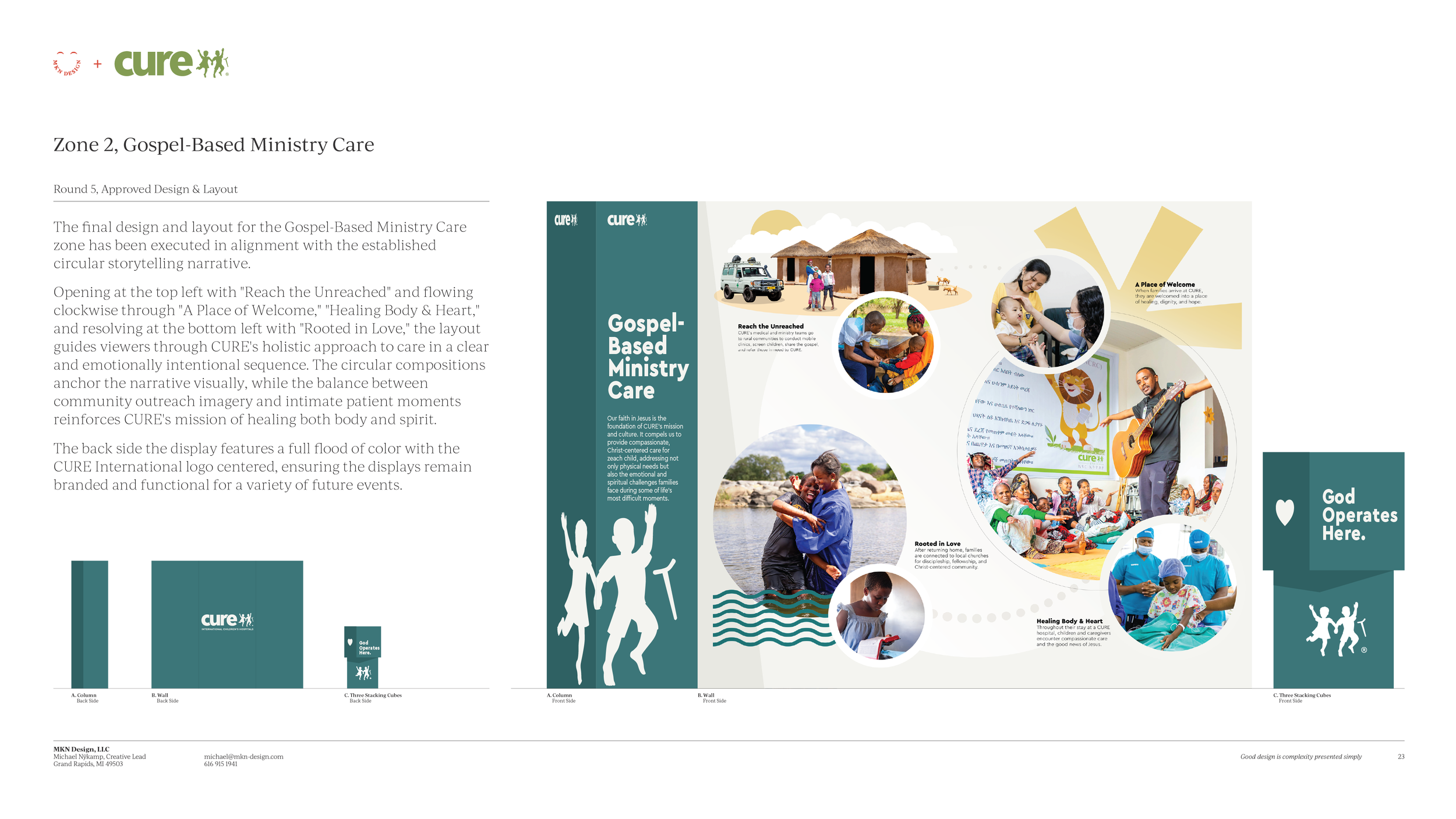
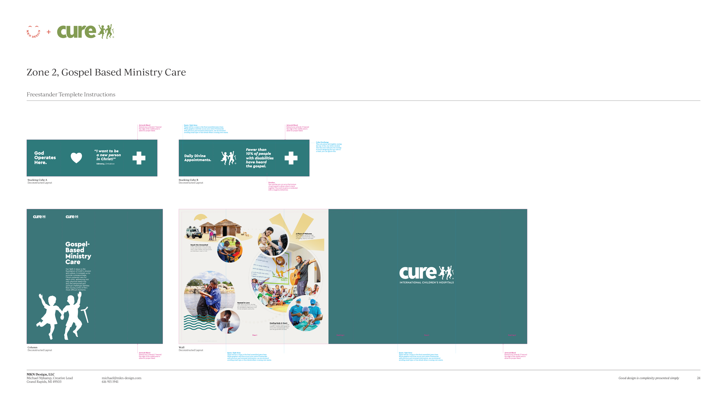
Zone 2, Gospel-Based Ministry Care
Traced CURE's holistic, faith-driven approach from community outreach to post-discharge discipleship.
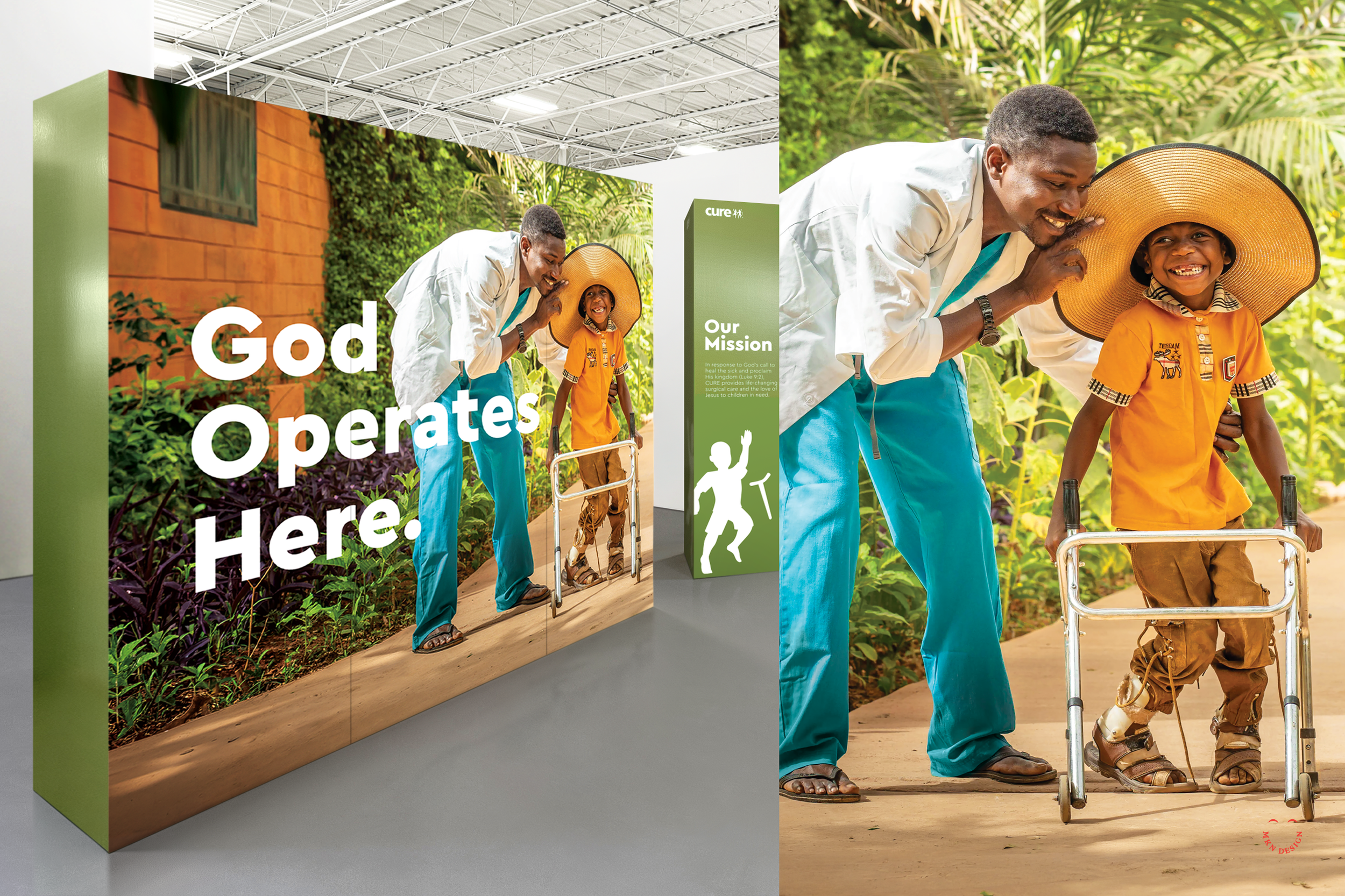
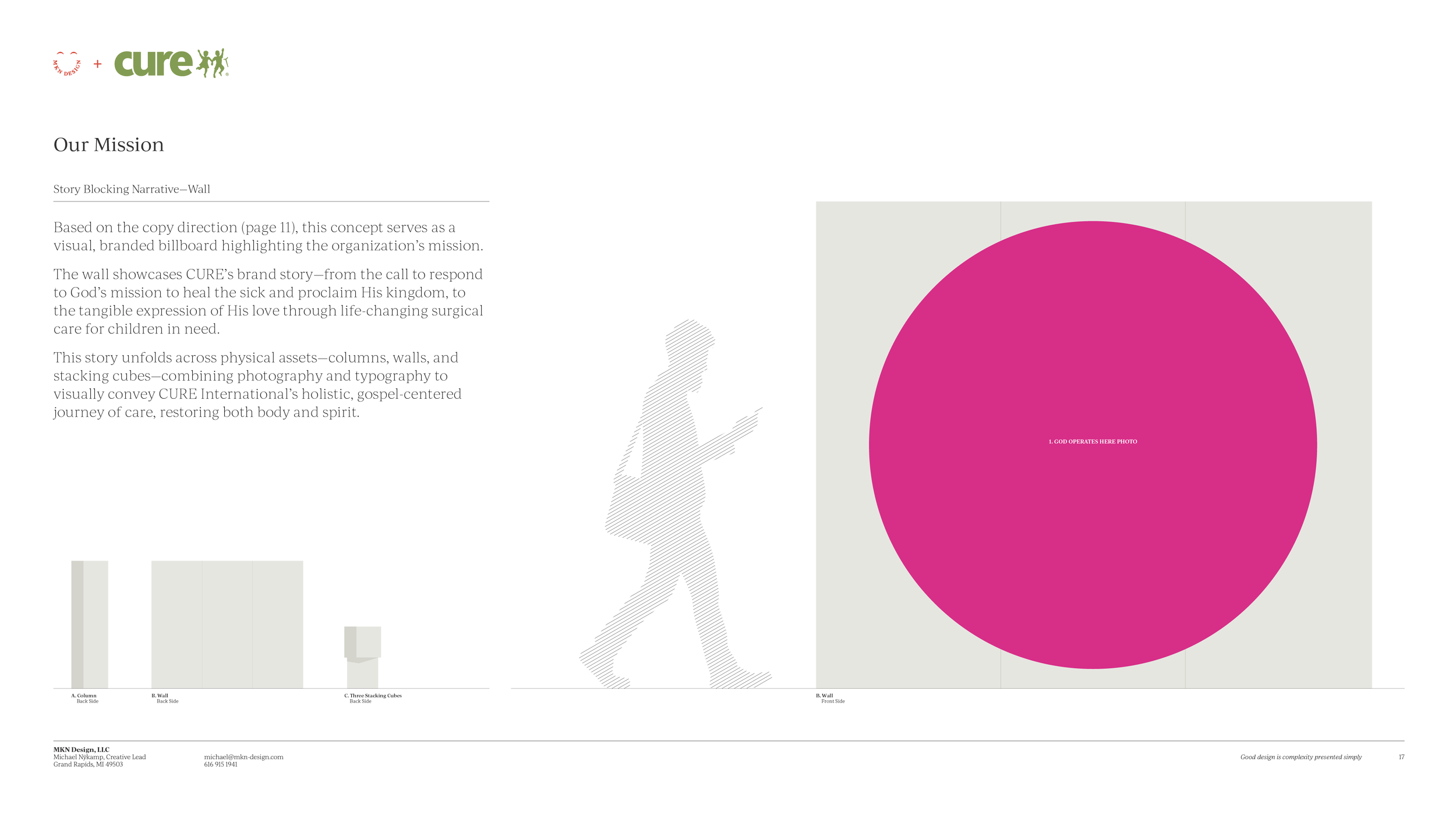
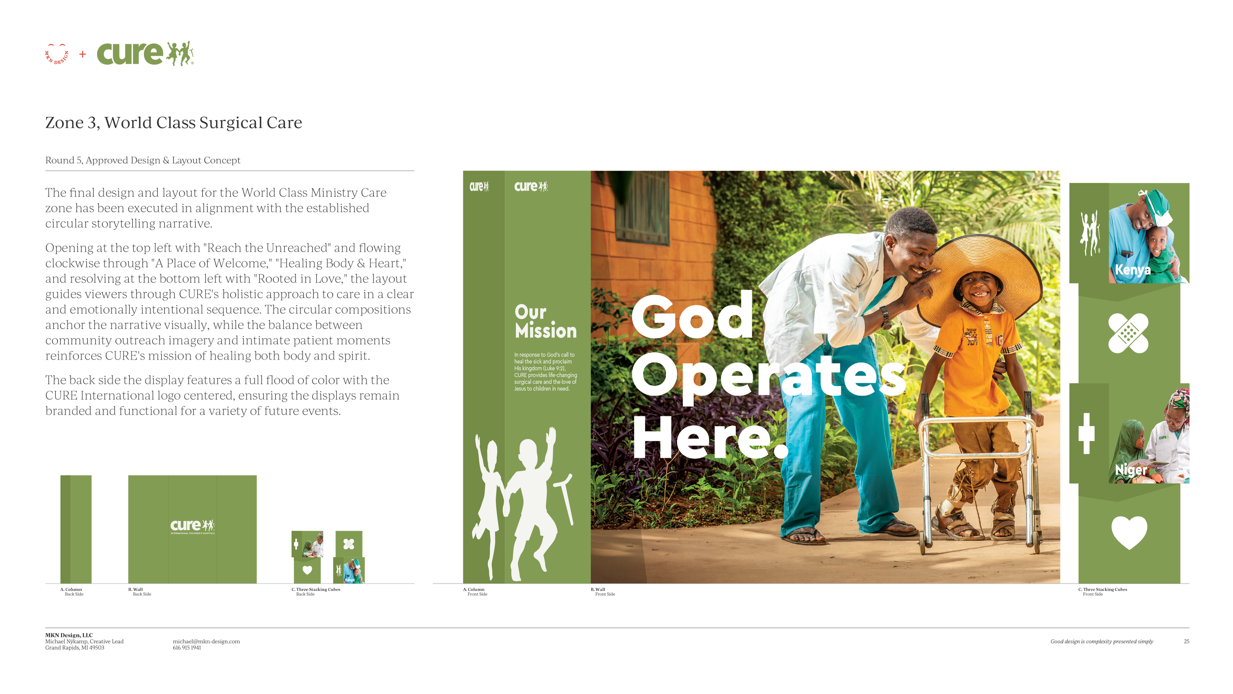
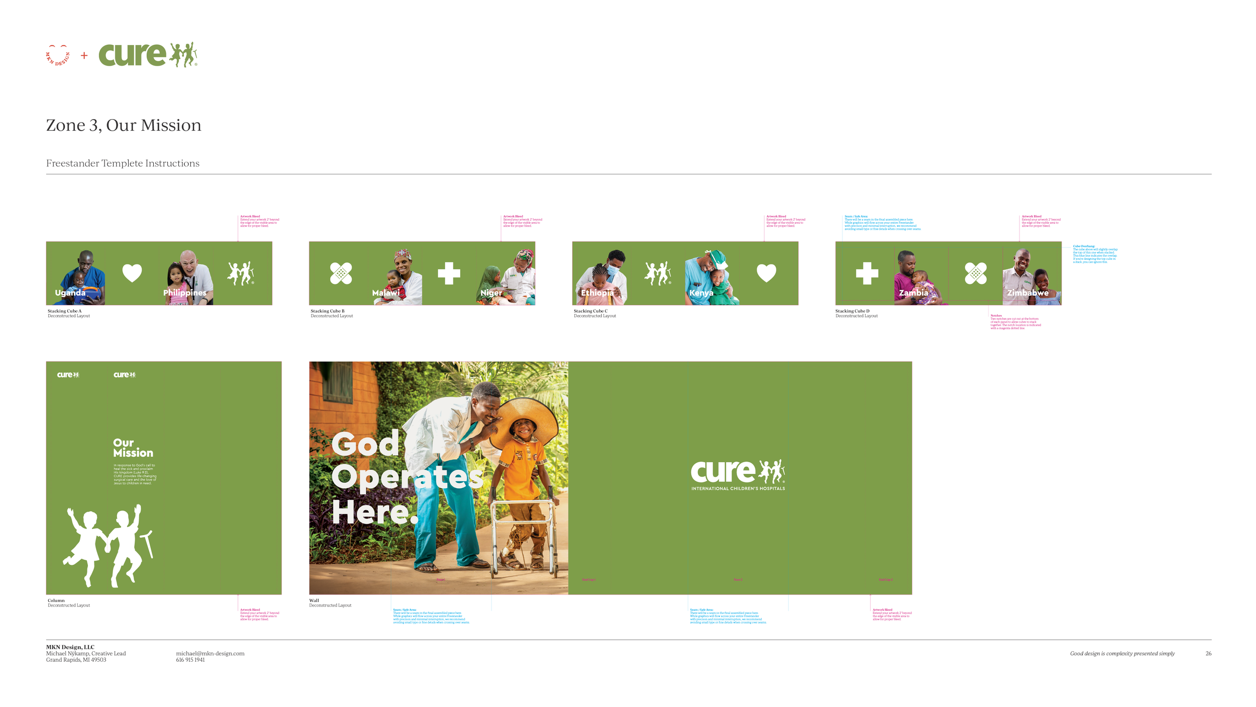
Zone 3, Our Mission
Served as a bold brand statement anchored by "God Operates Here," highlighting CURE's hospital locations across eight countries.
-
CURE International
Non-Profit Organization -
+ Concept Development
+ Creative Strategy
+ Design Direction
+ Qualitative Research
+ Narrative Storytelling
+ Qualitative Research -
MKN Design Team:
+ Michael Nÿkamp, Design DirectorCURE Stakeholders:
+ Justin Narducci, CEO
+ Gary Weyel, Marketing Director
+ Alex Barnes, Project Manager
Print Vendor:
+ Brightformat, Inc -
Supporting article and project focused on Environmental Graphic Design:
→ CURE International President’s Weekend: An Immersive Donor Event with Freestanders, by Brightformat
→ KitchenAid – Branded Environment Graphics


