
Creative Musing
A Faithful Companion & Herzog
Creative Musing
—
A Faithful Companion & Herzog
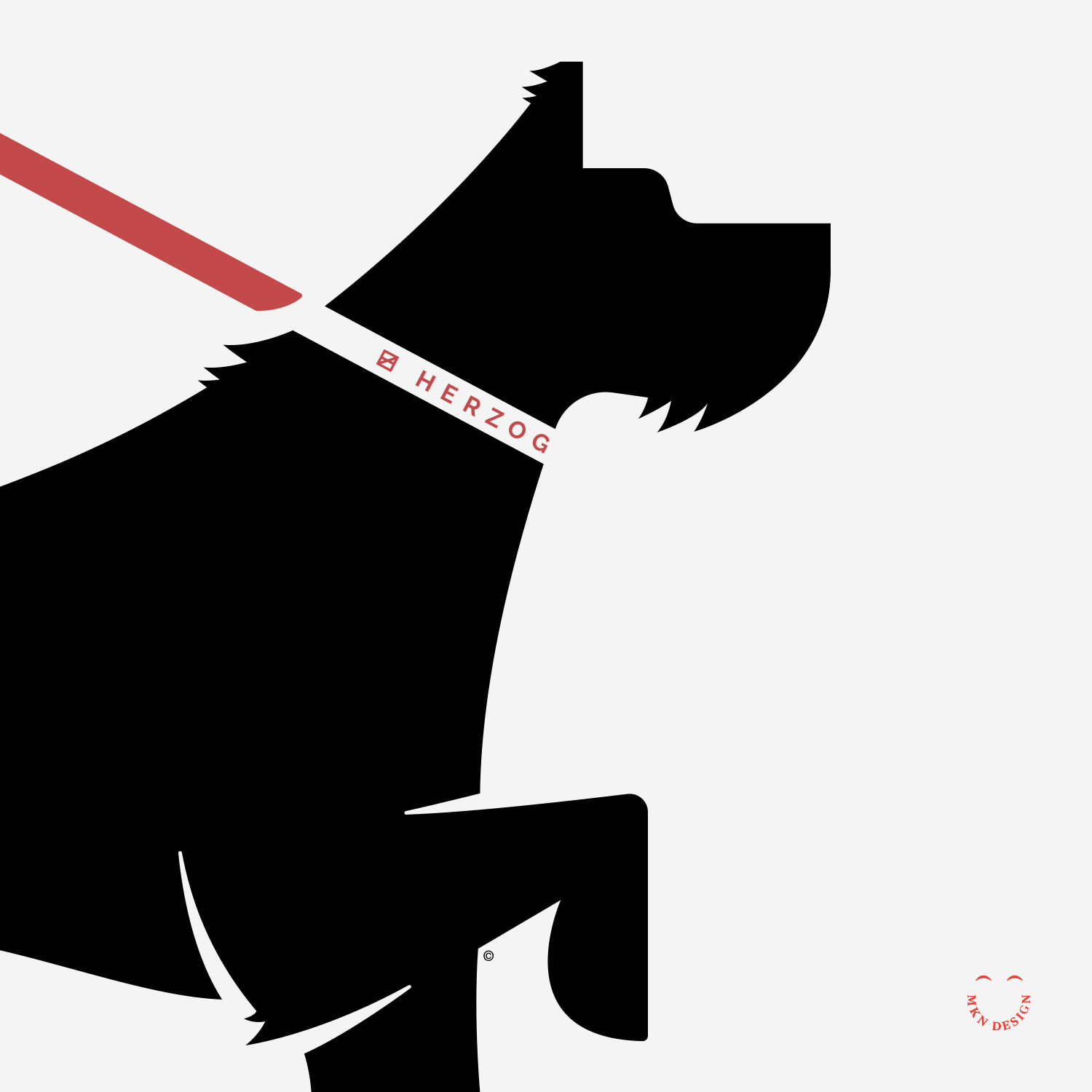
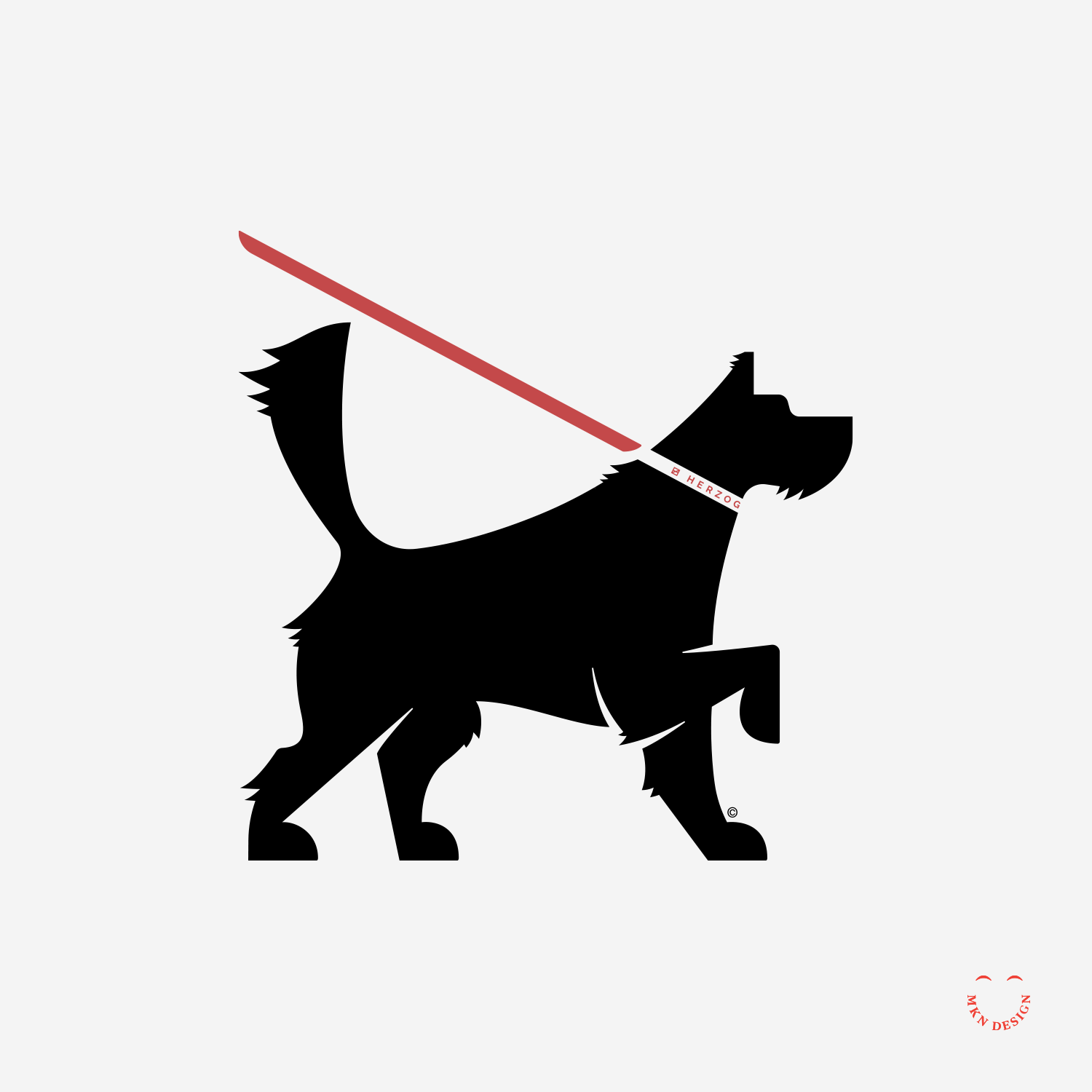
Our family adopted a Norwegian Elkhound from our nearby dog shelter. As one does when getting a dog, I was searching online for a sleek and durable dog collar + leash, Herzog dog gear caught my eye and it was an easy decision to purchase their products (I purchased the Terracotta Collar and Leash as a set). Their meticulously crafted items boast both waterproof and eco-friendly qualities, fitting seamlessly into our minimalist style and complementing our Elkhound perfectly. The silhouette illustration above represents the Leonberger dog breed.
Keepsake

Creative Musing
—
Keepsake
Design exploration to match the word "Keepsake" with a typeface. I settled on the typeface URW Antiqua designed by URW Type Foundry for its balanced combination of thick and thin strokes, giving it an elegant and approachable feel.
Recycle & Die

Creative Musing
—
Recycle & Die
An illustrative exploration reveals the deceptive narrative sold to us by plastic companies: the idea that recycling will effectively benefit our planet. However, this notion masks a troubling reality—it serves as a ploy to perpetuate the cycle of production and pollution, ultimately exacerbating our planet.
Square Bear

Creative Musing
—
Square Bear
Blanking staring off into space.
Death Snail

Creative Musing
—
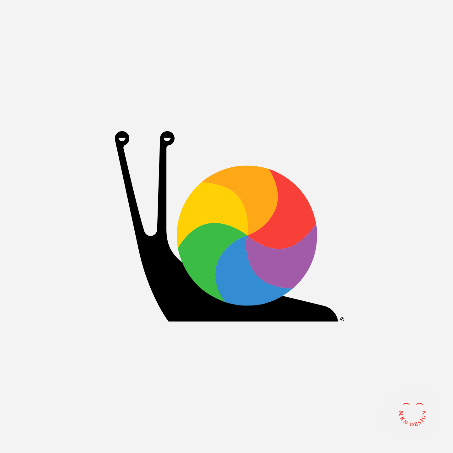
Death Snail
The notorious spinning lollipop of death adorning the rear of a delightful snail. Officially known as the wait cursor, Mac users affectionately dub it by these fitting descriptors: Spinning wheel , spinning beachball and Spinning rainbow.
USPS Mail Truck


Creative Musing
—
USPS Mail Truck
I have been enthralled by the boxy style of the new USPS mail trucks. Such a cool design should warrant a refreshed brand… right? To implement my take on a revitalized brand, I created technical illustration views of the truck and integrated the mock brand to illustrate the redesign visually.
Vessel


Creative Musing
—
Vessel
An elegant combination mark for a memorial urns business. The mark is paired with the typeface Niagara designed by Tobias Frere-Jones from Frere-Jones Type.
Jabber

Creative Musing
—
Jabber
Matching the visual essence of a word into a wordmark. The typeface that I used is Proxima Nova designed by Mark Simonson from Mark Simonson Studio.
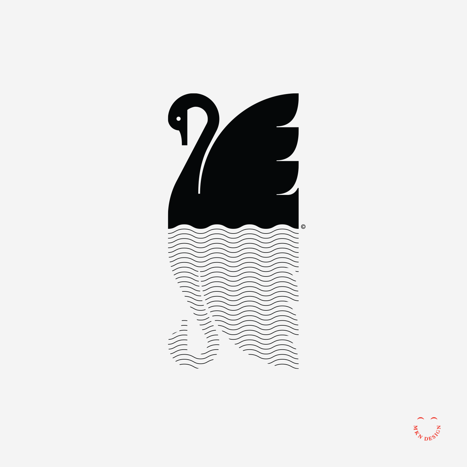
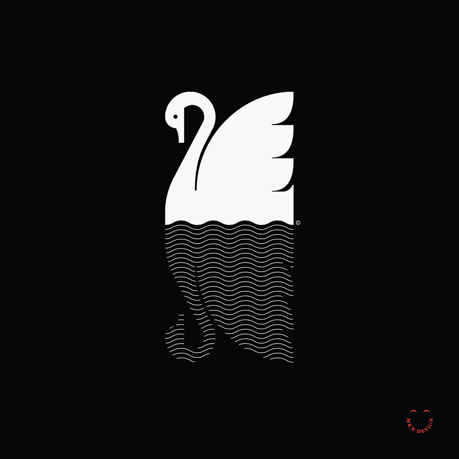
Swans Reflection
Creative Musing
—
Swan Reflection
Black and white swans on the water.
Salad Bowl


Creative Musing
—
Salad Bowl
A medley of fresh greens and protein.
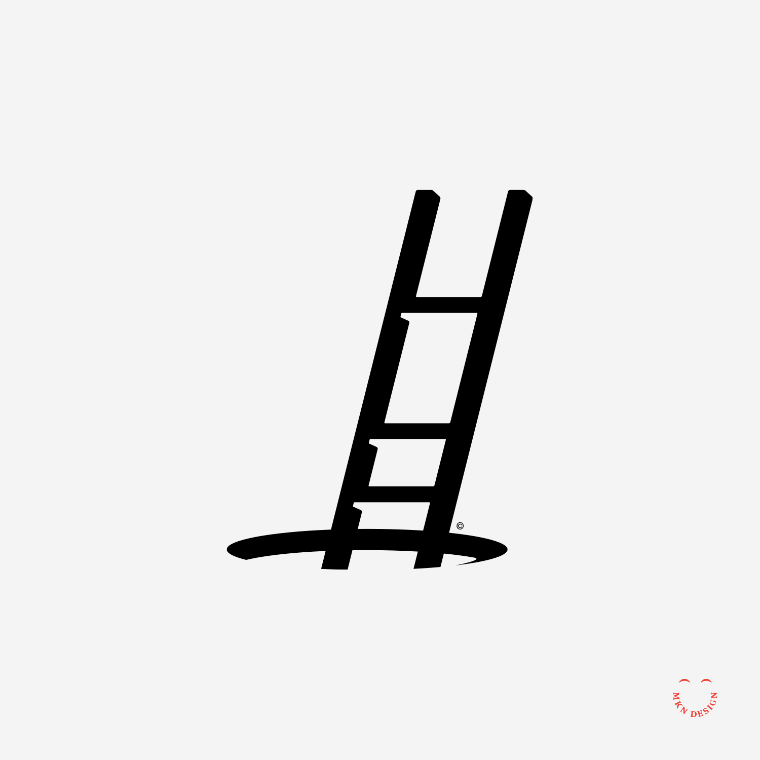
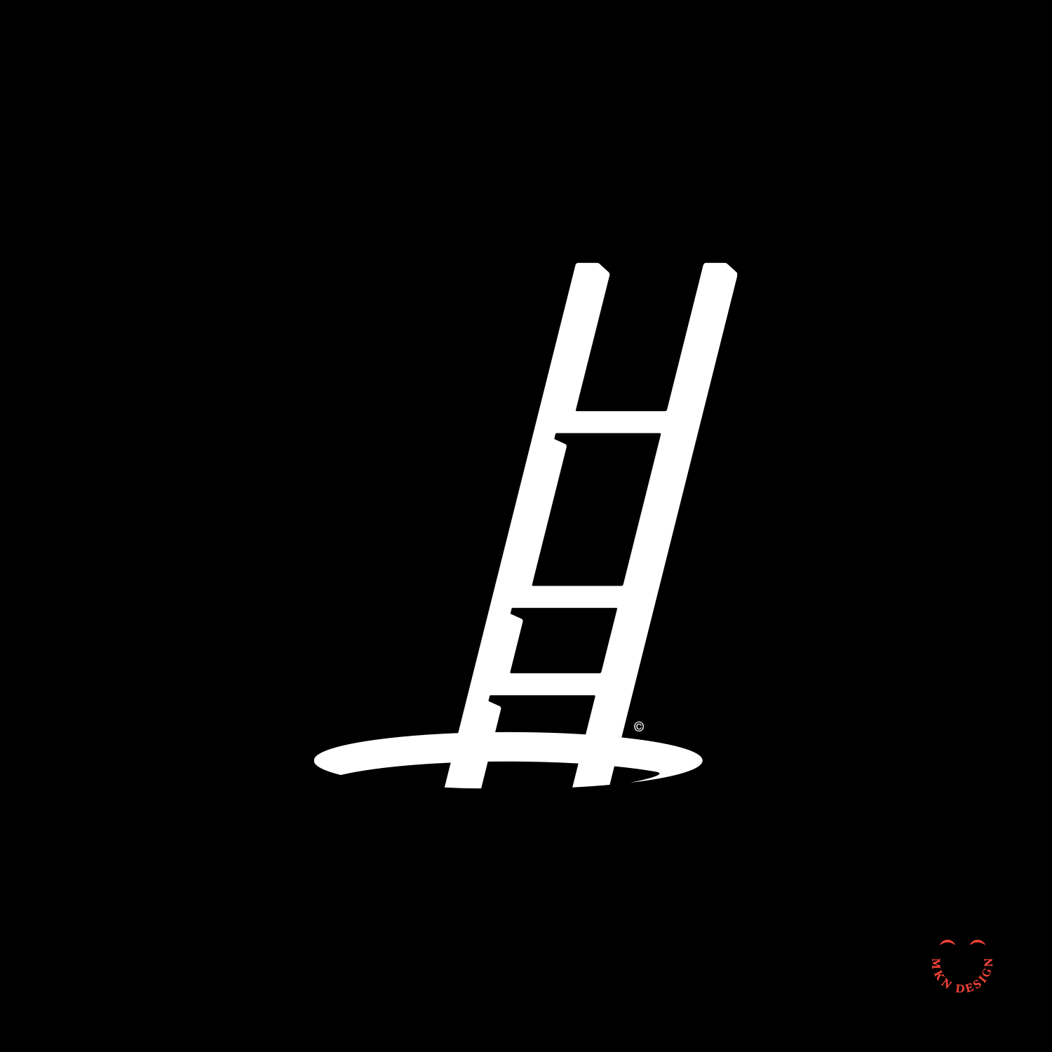
Climbing Out
Creative Musing
—
Climbing Out
For some, climbing out of 2020 feels like this… carefully ascending out of a hole, while perhaps navigating loss of a loved one, a job, anxiety, depression, long covid. Wishing all a good year of hope and renewal. As Ian Maclaren wisely stated, "Be kind, for everyone you meet is fighting a hard battle."
Happy 2021

Creative Musing
—
Happy 2021
Bestowing a character to the year 2021. From left to right, Optimistic 2021, 2021 Balancing Act, and 2021 Surprise.
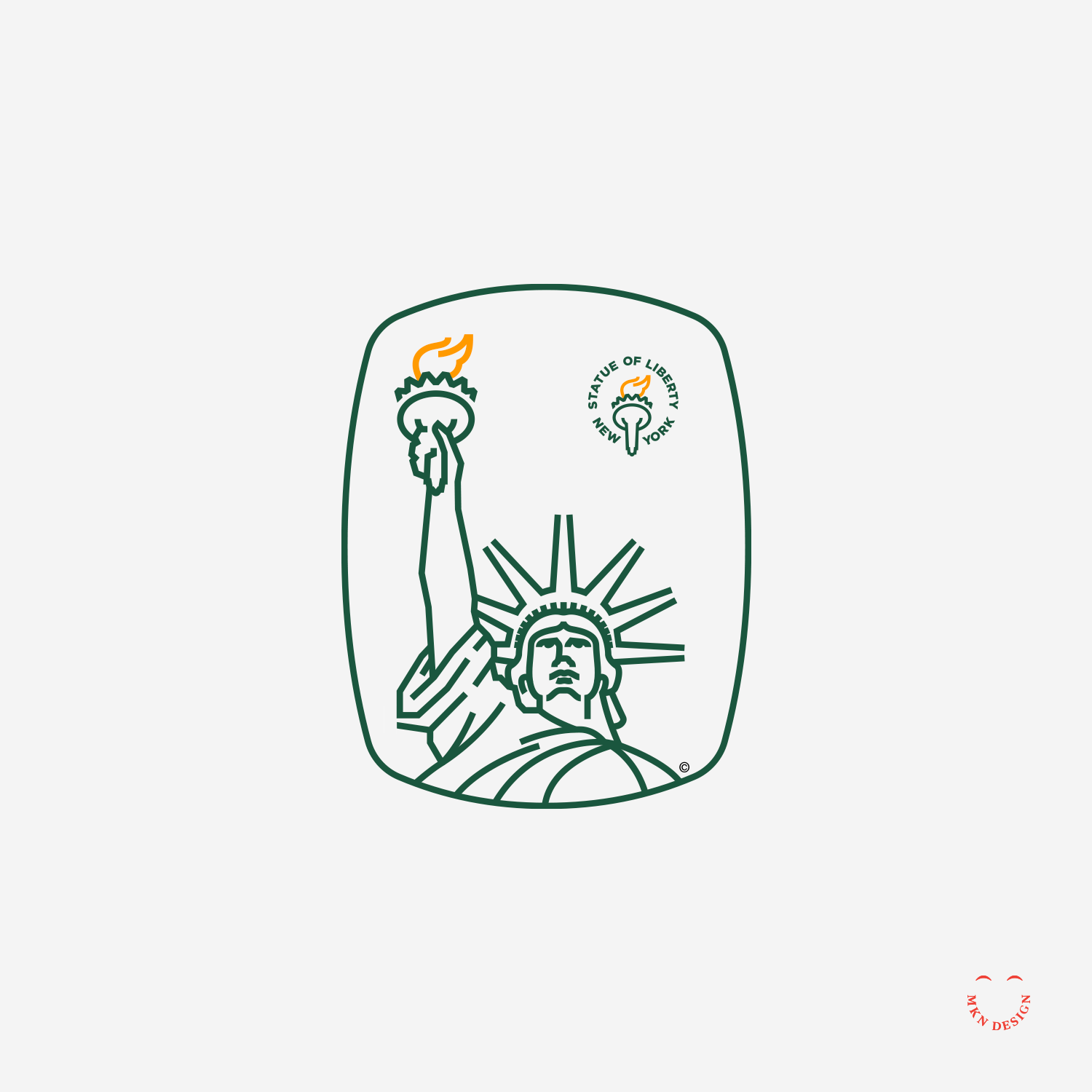
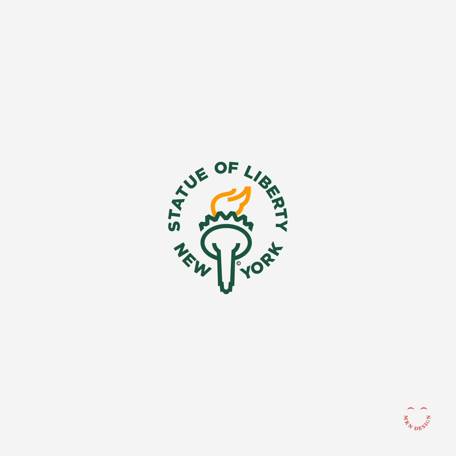
Statue of Liberty
Creative Musing
—
Statue of Liberty
Anticipating better days ahead. The poem, The New Colossus by Emma Lazarus was the inspiration for this mark.
The New Colossus
Not like the brazen giant of Greek fame,
With conquering limbs astride from land to land;
Here at our sea-washed, sunset gates shall stand
A mighty woman with a torch, whose flameIs the imprisoned lightning, and her name
Mother of Exiles. From her beacon-hand
Glows world-wide welcome; her mild eyes command
The air-bridged harbor that twin cities frame.
"Keep, ancient lands, your storied pomp!" cries she
With silent lips. "Give me your tired, your poor,
Your huddled masses yearning to breathe free,
The wretched refuse of your teeming shore.
Send these, the homeless, tempest-tost to me,
I lift my lamp beside the golden door
– Emma Lazarus
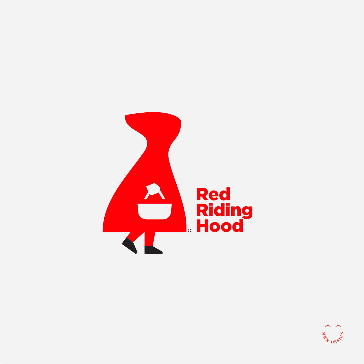
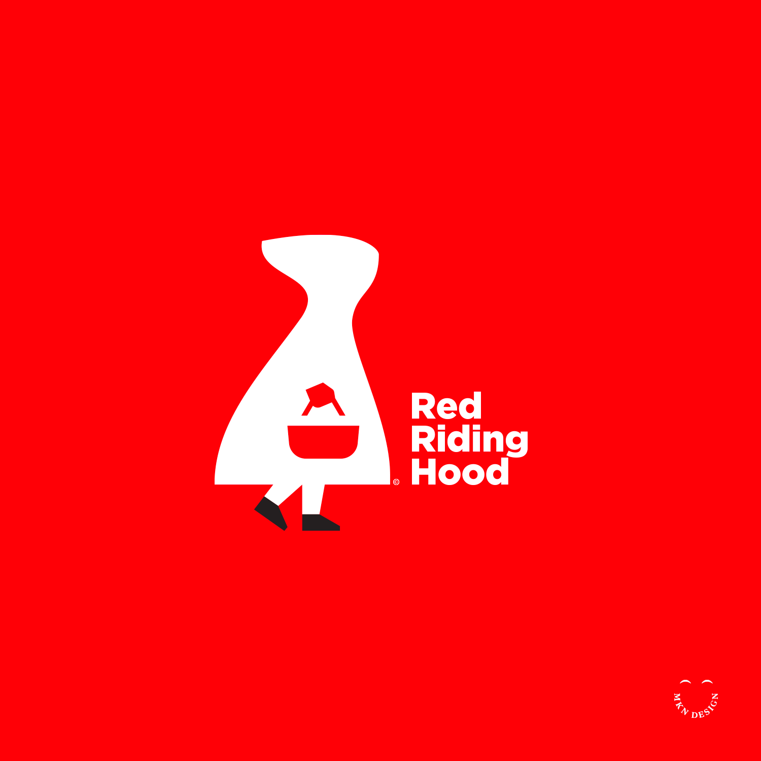
Red Riding Hood

Article + Client Project
—
Red Riding Hood
I have been asked many times about my illustrative logo/icon process, so I thought I would share. (it’s very similar to any design process). Though my illustrative style is simple, it does not mean that it's effortless. Process takes time and is a combination of thoughtfulness, collaboration, knowledge, and craft. In the initial phase, sketches and ideation are crafted based on comprehensive research, with only one or a few selected from a wide array of rough concept drawings. Moving into the second phase, the process progresses to defining sketches, utilizing basic shapes to enhance the conceptualization. Finally, in the third phase, numerous iterations, adjustments, and refinements are undertaken until both the client and/or I are satisfied with the result, leading to the culmination of the final execution. The typeface I used for the copy is Gotham design by Jonathan Hoefler and Tobias Frere-Jones at Hoefler&Co.
-
Green arrows signify progress in the illustration process, while red arrows indicate a pause or halt in the process.
Lark & Poppy

Creative Musing
—
Lark & Poppy
This crest was illustrated upon reflection of the poem, in Flanders Fields. For those who are and are not Canadian, on Remembrance Day, Canadians adorn a red poppy over their heart to honor the veterans that fought and died for our freedoms. Read and reflect on the poem, In Flanders Field. The poem was pened during the First World War by Canadian physician Lieutenant-Colonel John McCrae. Today let's remember all our veterans.
The White House

Creative Musing
—
The White House
New residents in the White House. A fresh start with lots of work to do.
Basin


Creative Musing
—
Basin
Exploration for a combination mark for a lavatory company. The mark is paired with the typeface Kepler designed by Robert Slimbach from Adobe Originals.
Vote


Seymour Chwast
Creative Musing