


Creative Musing
—
City Pours – Brand Identity


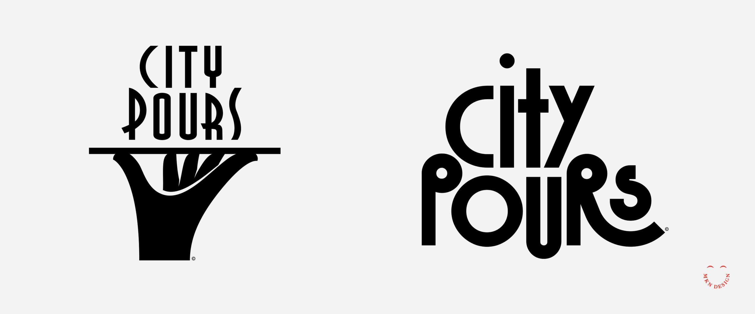
↓ City Pours alternate logo directions
Client Project
—
City Pours – Brand Identity
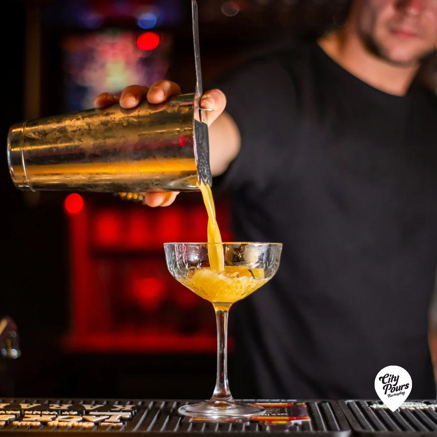
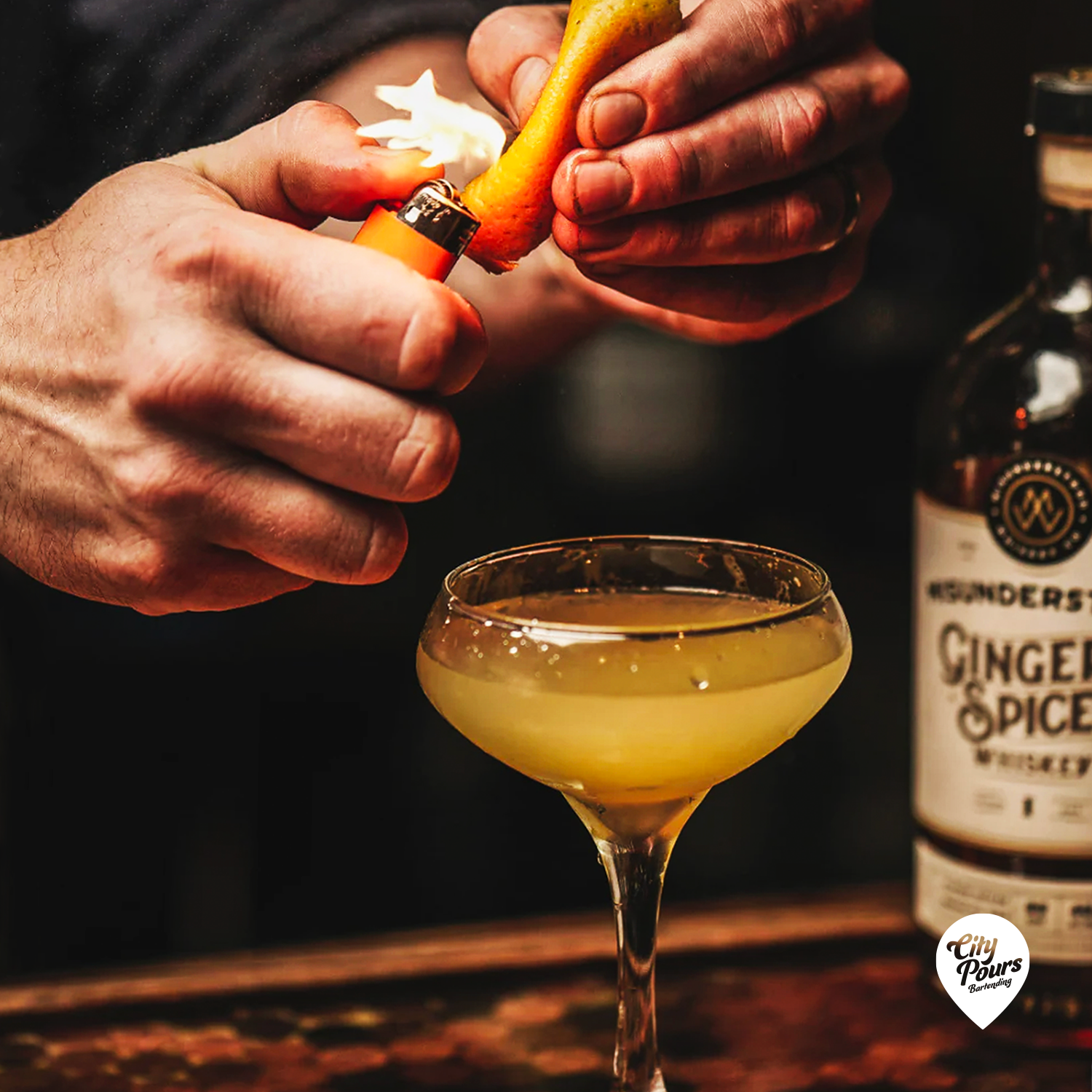
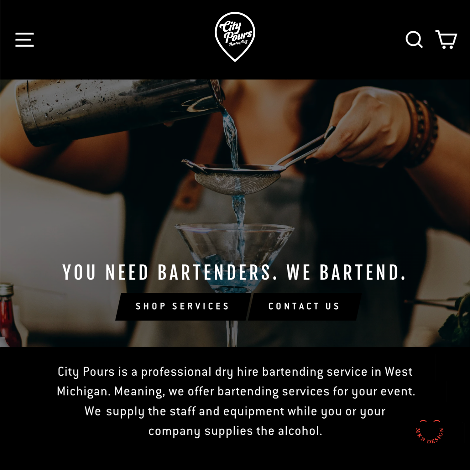
City Pours is a local bartending service that provides professional dry bartending services that offer a range of beverage solutions. Their business specializes in providing a convenient, all-in-one bar service solution for events, ensuring a seamless and exceptional experience. Their professionally trained staff, paired with exceptional bar options and packages, guarantees a top-notch experience for any celebration.
-
City Pours
Mobile Bar & Bartending Service -
+ Brand Advisor
+ Concept Development
+ Creative Strategy
+ Design Direction
+ Qualitative Research
+ Visual Identity -
MKN Design Team:
+ Michael Nÿkamp, Design DirectorCity Pour Stakeholder:
+ Alex Corbett, CEO
Toshiba GP-42


Creative Musing
—
Toshiba GP-42
This is not AI-generated or a 3D rendering, but a 2D product illustration. The GP-42 was developed and designed by Toshiba in 1978 as a portable analog record player combined with an AM Radio and microphone input for karaoke.
Navigator – Brand Identity


Client Project
—
Navigator – Brand Identity
After 23 years of growth, Navigator's brand no longer aligned with its current focus on training young teenagers and adults in smart or autonomous vehicles, nor did it represent the direction Navigator aimed to pursue. Therefore, a new brand was imperative to reflect its evolution accurately.
Navigator had a few distinctive design challenges that required resolution:
1. Develop a logo that intuitively feels like a driving academy without feeling or stating it's a driving academy.
2. Logo to be perceived as trustworthy, safe, and exceptional to parents (core audience), but also conveys a cool factor for teen student drivers (secondary audience).
3. By law, driving academy vehicles are legally required to have ‘student driver’ signage on their vehicles. This is typically resolved with magnetic ‘student driver’ signs prone to slipping or peeling. A solution was needed to seamlessly integrate Navigator's logo with the required signage—ensuring a purposeful design rather than an afterthought, enhancing both safety and branding.
The final combined logo for Navigator successfully tackled every design challenge with a bold, attention-grabbing appearance. It seamlessly integrated the student driver sign by utilizing a vehicle wrap, ensuring a cohesive and visually striking solution.
-
Navigator Driving Academy
Education & Vocational Training -
+ Brand Advisor
+ Concept Development
+ Creative Assets
+ Design Direction
+ Qualitative Research
+ Visual Identity
+ Vehicle Wrap -
MKN Design Team:
+ Michael Nÿkamp, Design DirectorNavigator Stakeholder:
+ Musil Family, Owners & Operators
Robertson

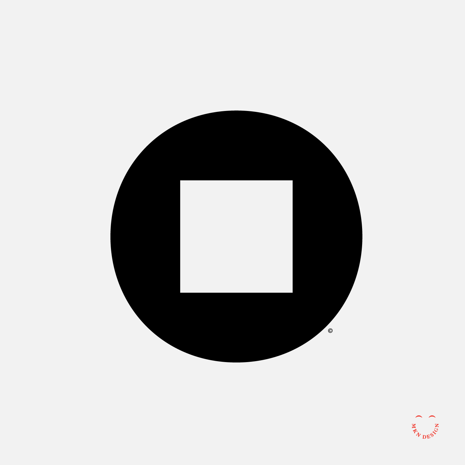


Creative Musing
—
Robertson
A creative exercise taking the square shape from the Robertson Drive and mimicking the font to the style of the mark. The Robertson square-socket drive was invented by Peter Lymburner Robertson, a Canadian inventor, industrialist, salesman, and philanthropist who popularized the square-socket drive for screws.
Llama Fiber Co.


Creative Musing
—
Llama Fiber Co.
Llama Fiber Co. mascot is paired with the typeface Alverata designed by Gerard Unger from TypeTogether.
Panda


Product
—
Panda
Mark exploration featuring a panda framed within a rectangular form and paired with a handcrafted typeface for a strong, recognizable presence.
-
Panda graphic tee is available for purchase. Check out more graphic tees on my Cotton Bureau profile page. All Cotton Bureau apparel comes in a variety of clothing types, styles, fits, sizes, materials, and colors.
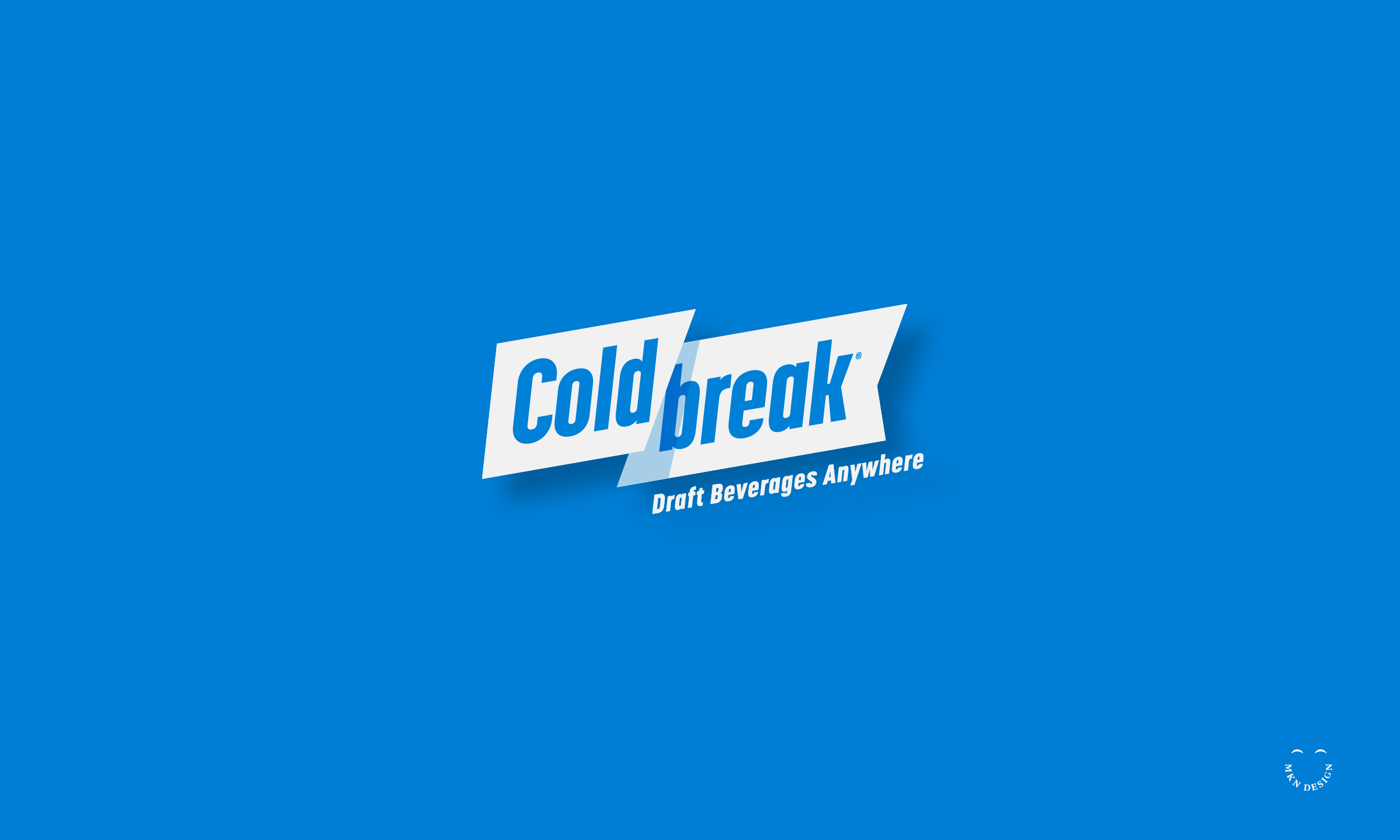
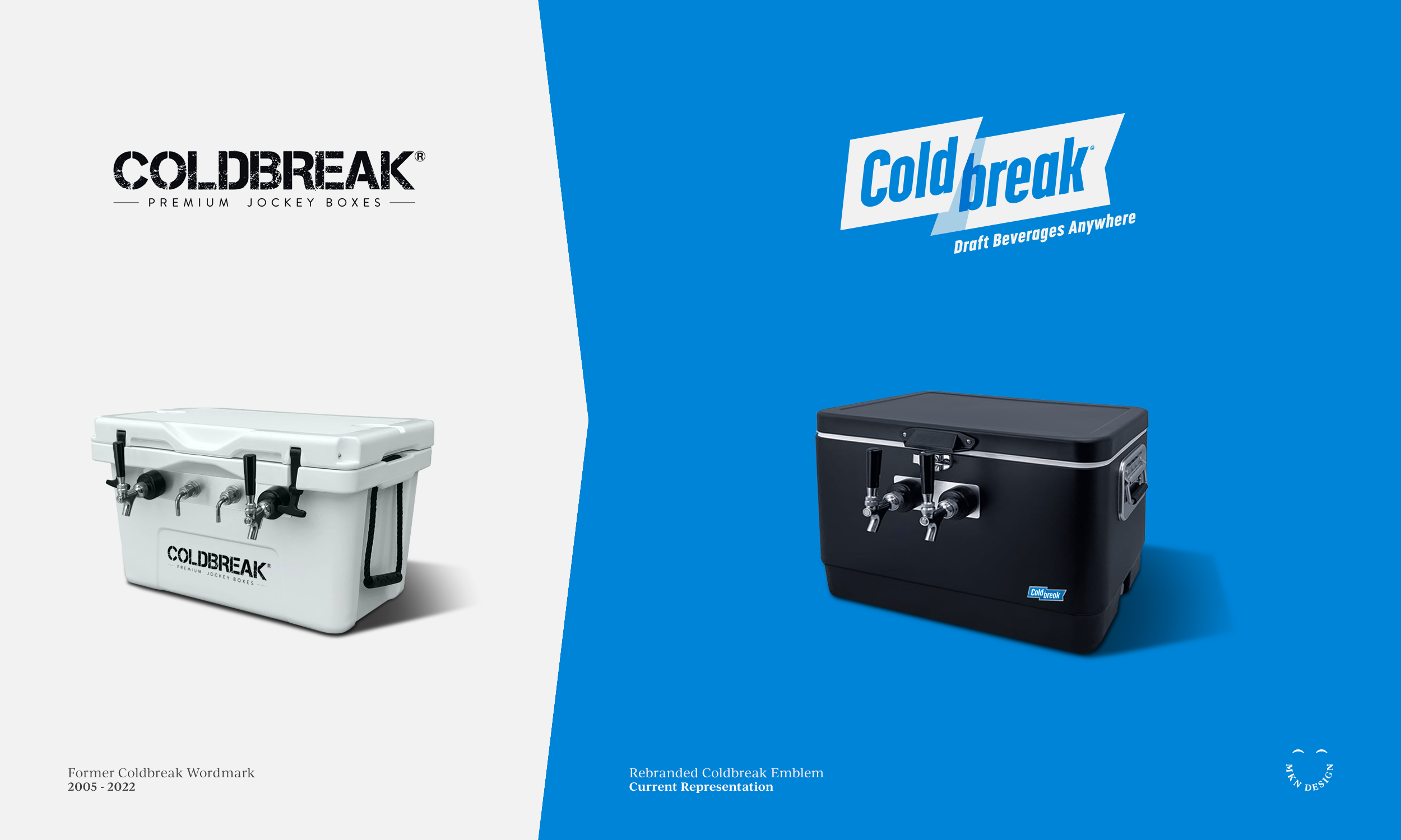
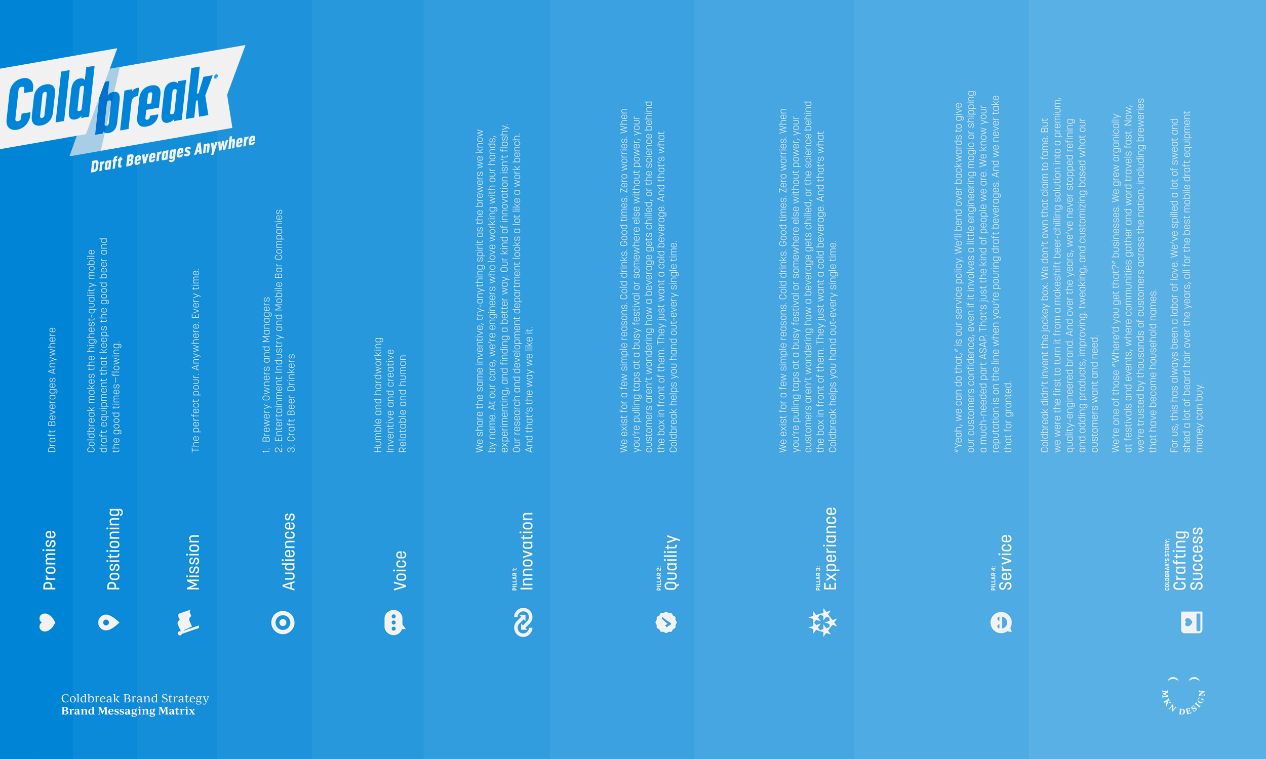
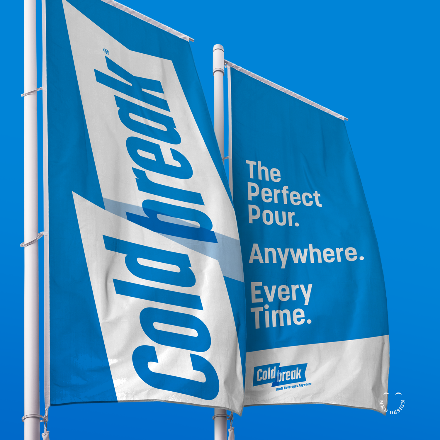
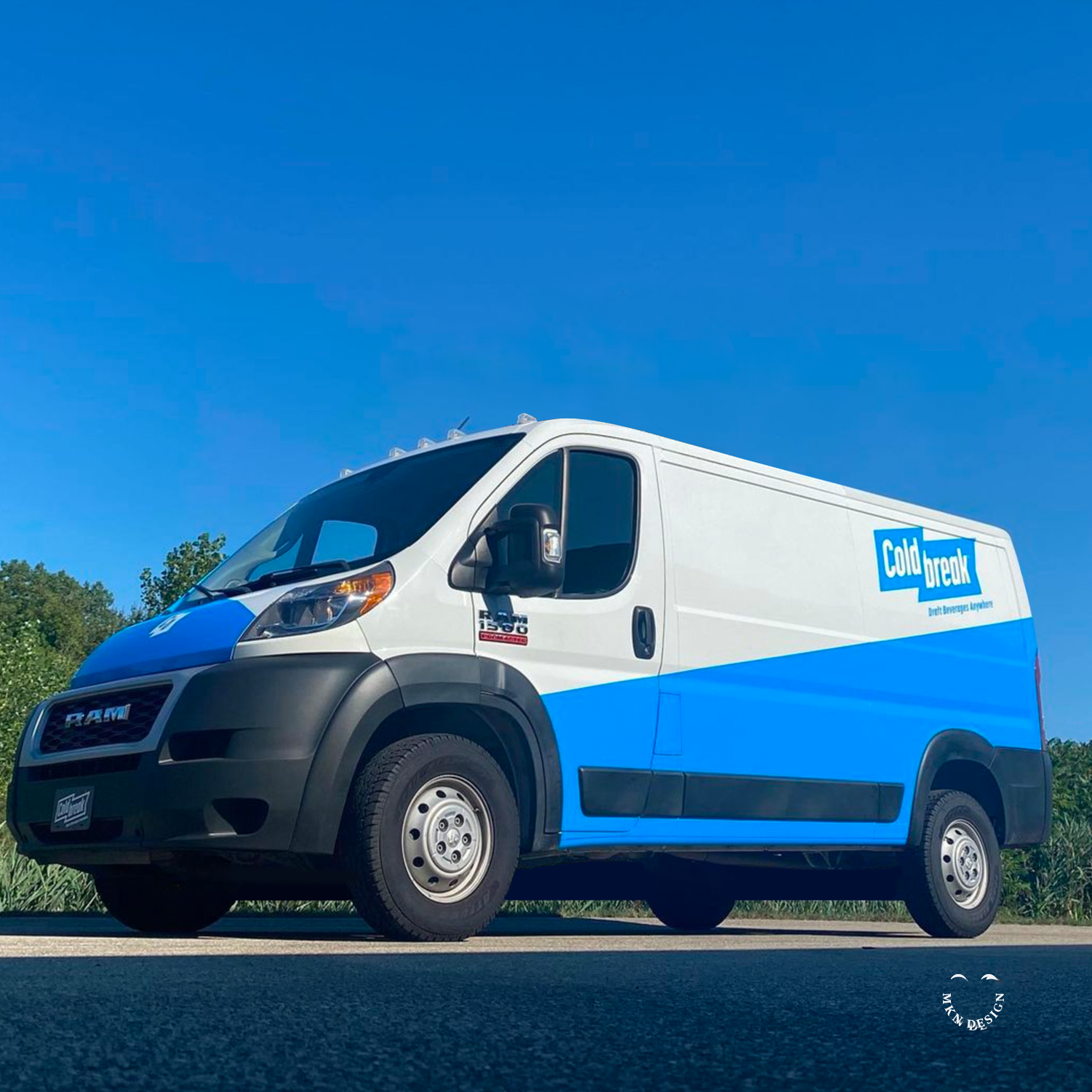
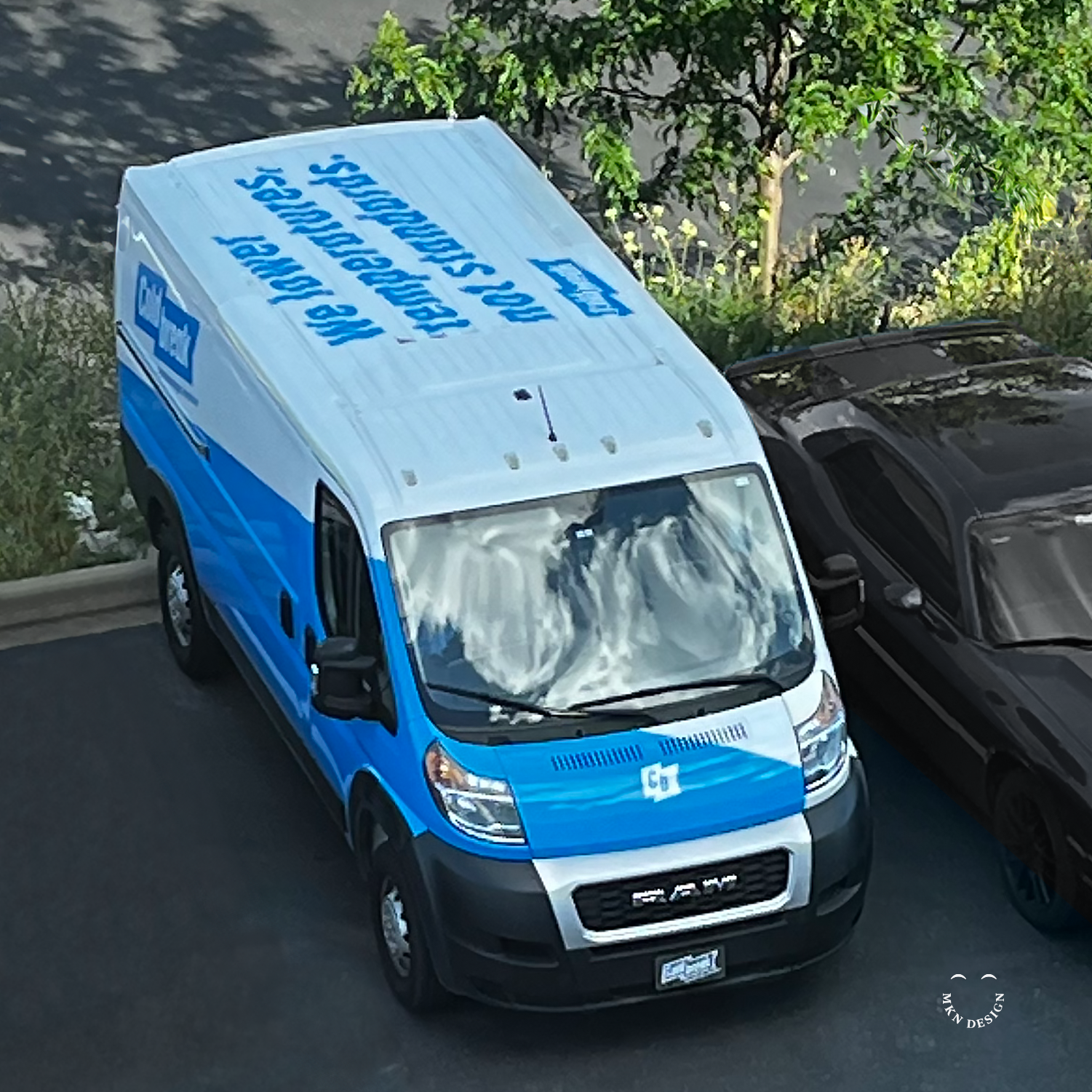
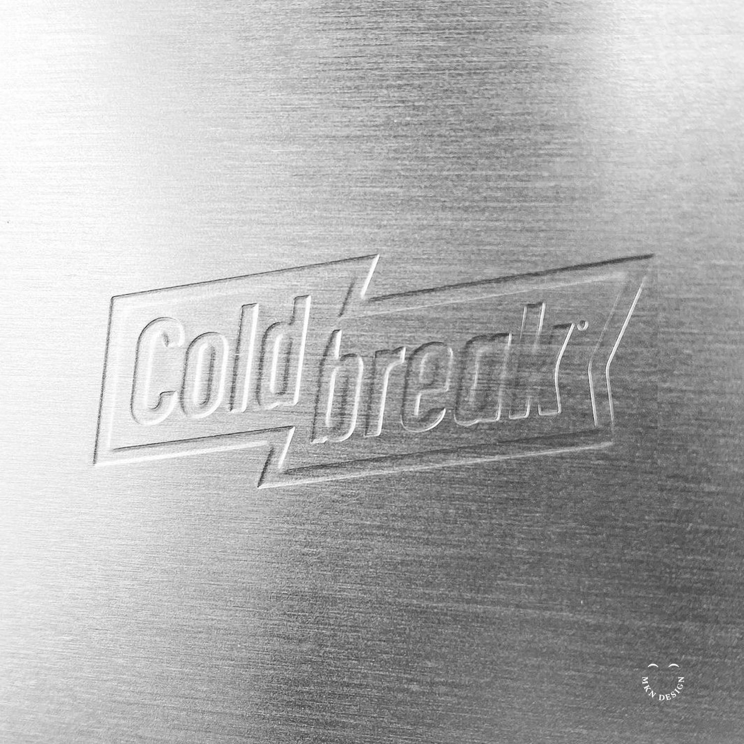
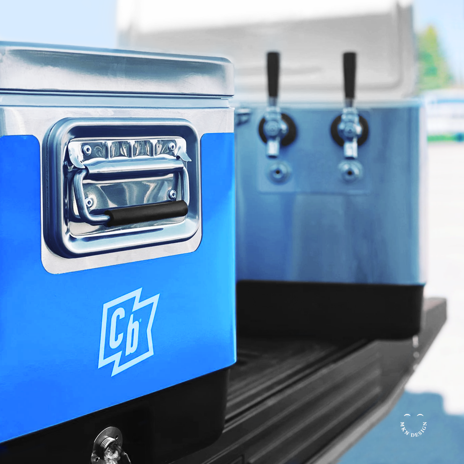
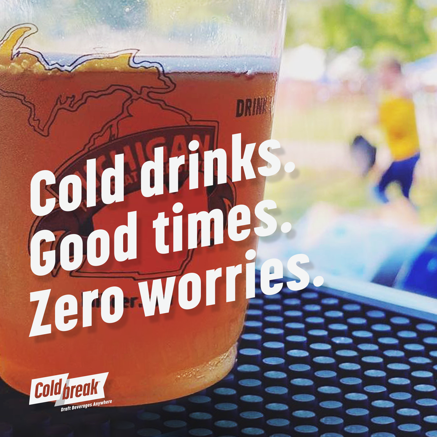
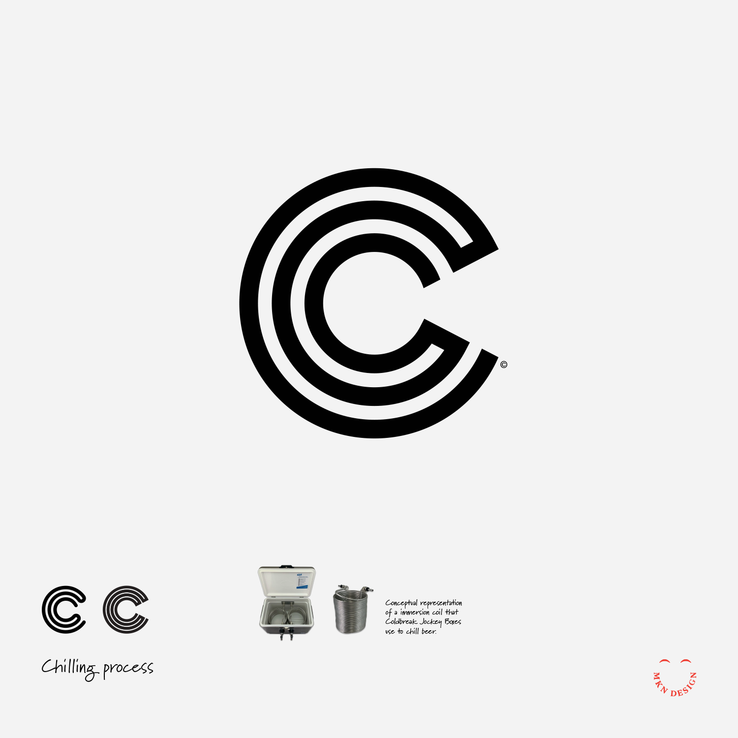
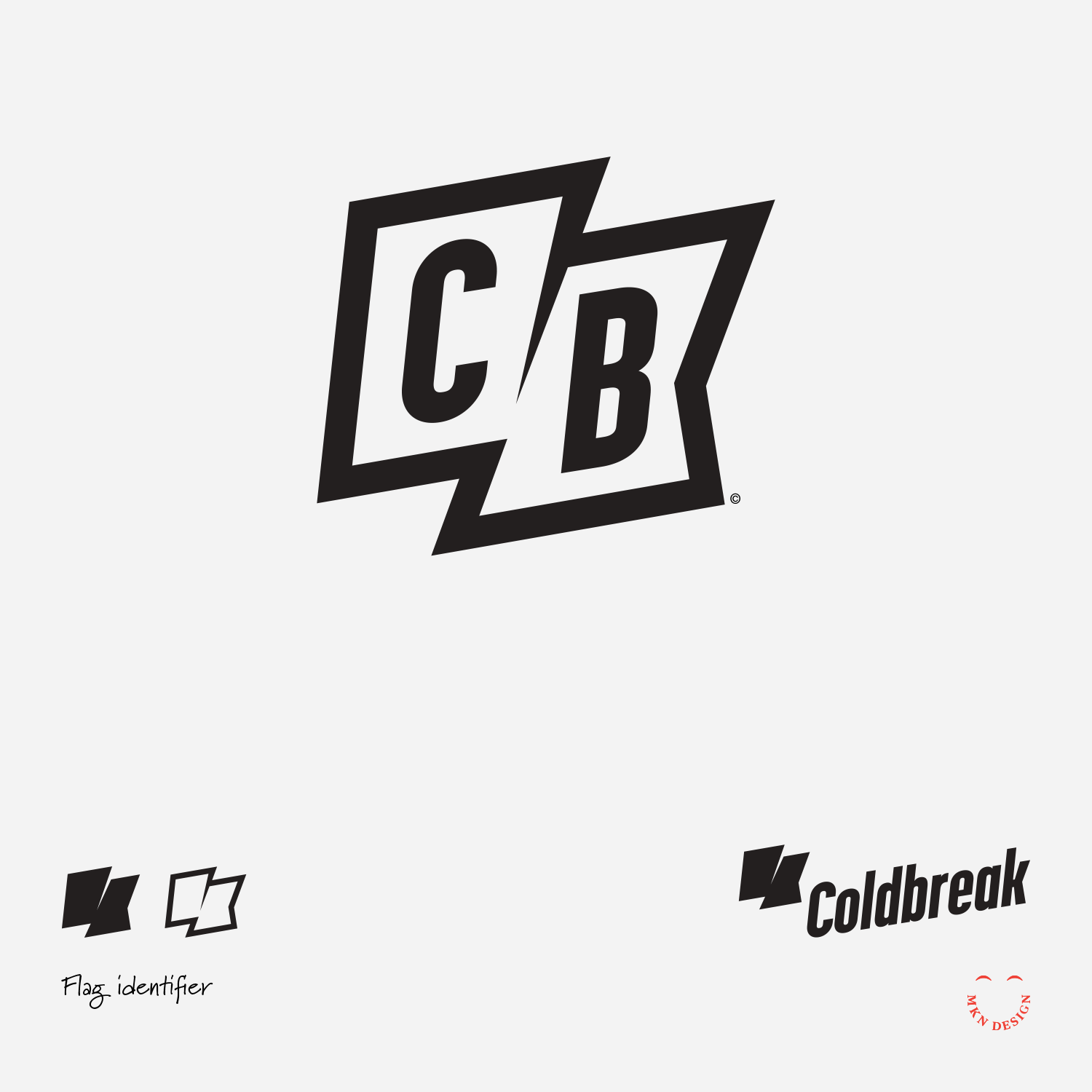
Coldbreak – Brand Strategy & Brand Identity


Client Project
—
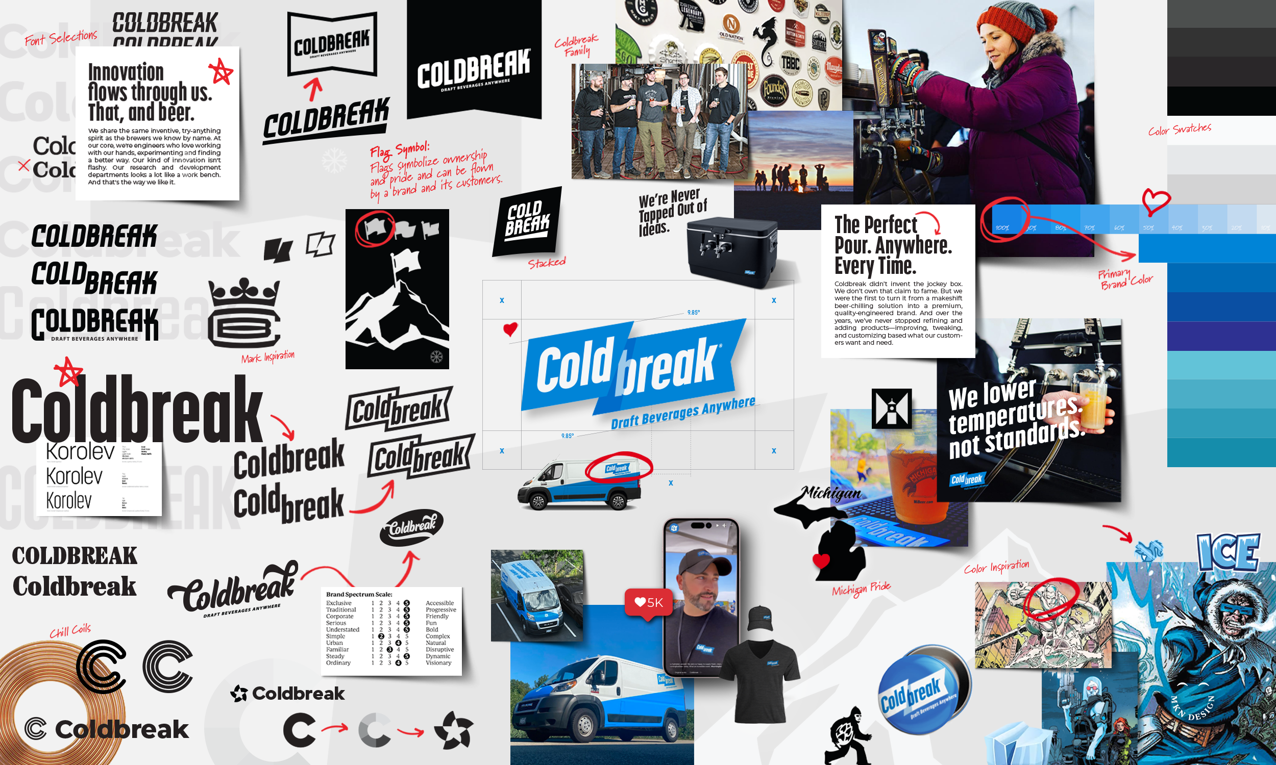
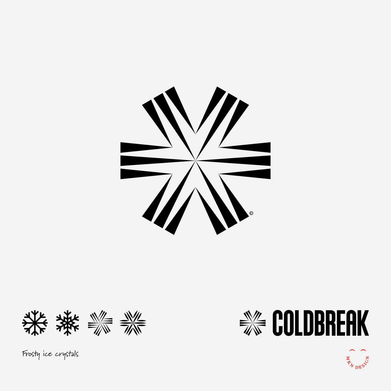
Coldbreak – Brand Strategy & Brand Identity
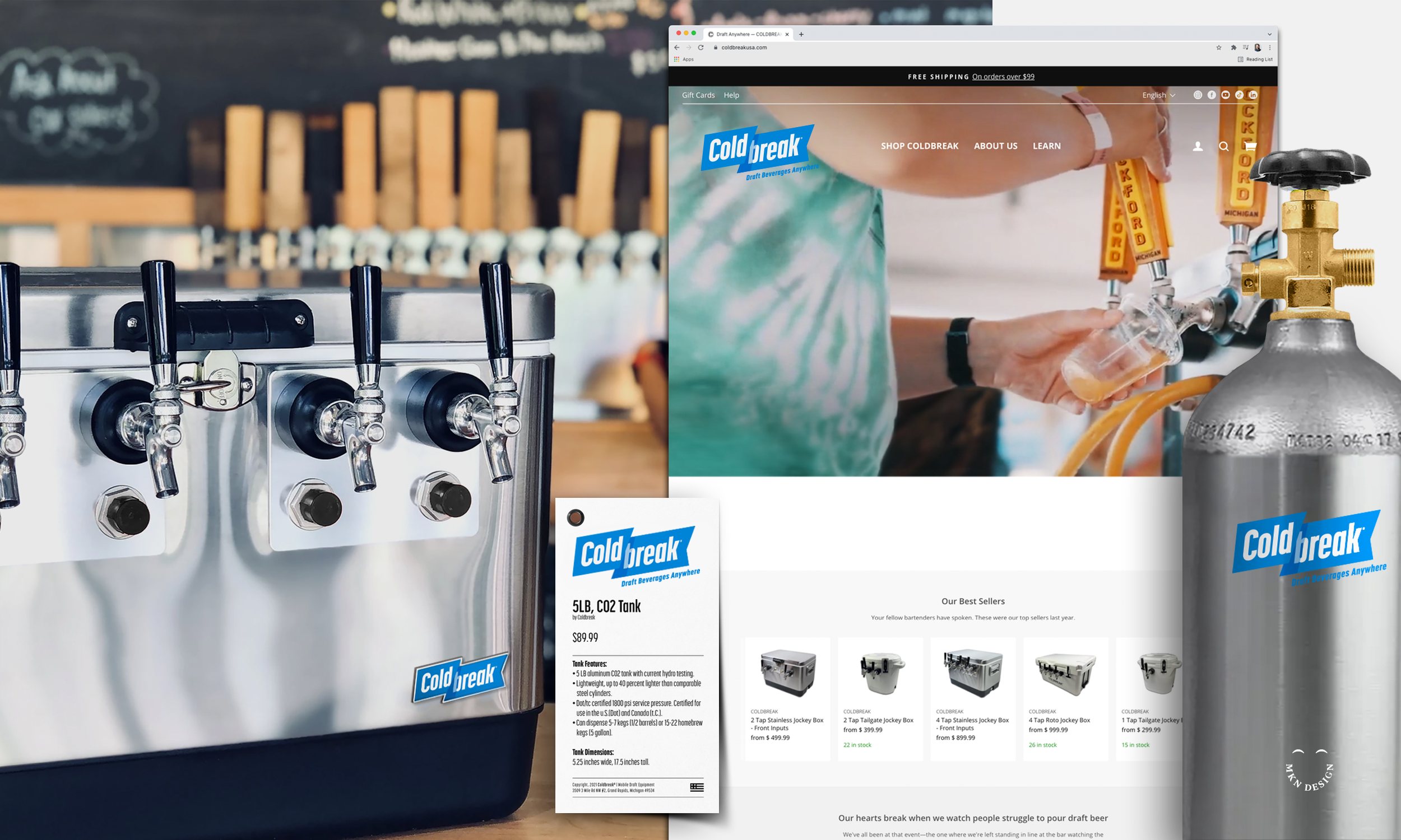
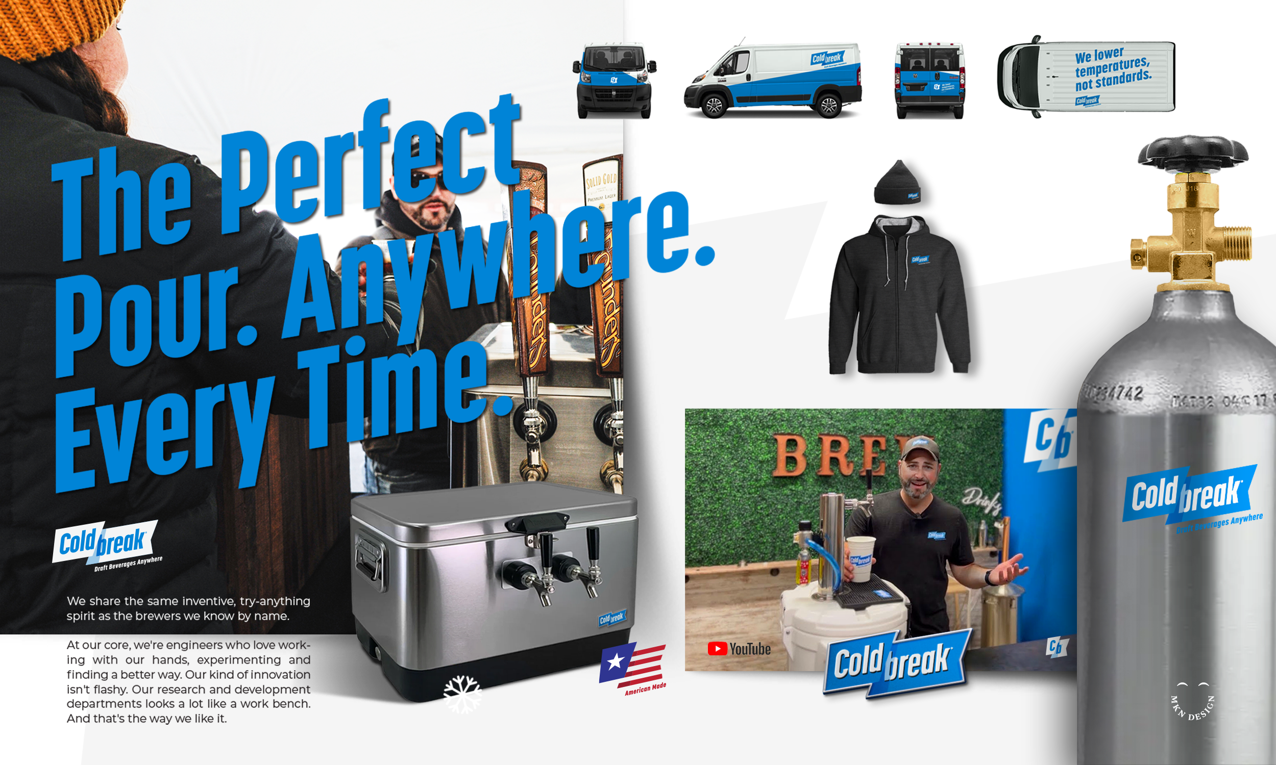
Coldbreak, a leader in mobile draft equipment for breweries, hospitality, entertainment, and beverage enthusiasts, hired us to re-build its brand strategy and identity.
With a legacy dating back to 2005, Coldbreak built a strong reputation for engineering and producing exceptionally reliable draft equipment. Today, they lead the industry in the development, engineering, and design of mobile draft systems. As the business continued to grow, they recognized that their brand no longer reflected their vision or market position. They hired us to lead a full strategic rebrand—grounded in audience and stakeholder insights, consumer and market understanding, and refined through journey mapping, brand architecture, and messaging.
Building the team, I guided the owners and my team of collaborators through the conception, development, and design of the Coldbreak identity. Throughout the process, we distilled insights from audience and stakeholder interviews to establish the brand’s foundation, defining its tone, voice, and visual direction. As the work progressed, we conducted additional research, journey mapping, brand architecture, iterative brand development.
The outcome of this work with Coldbreak was a dynamic logo and precise brand messaging that resonated with the owners and strengthened their connection with customers. To support the ongoing use of the updated brand, we developed materials to guide and maintain consistency in future efforts. These assets included social media guidelines, vehicle wraps, and apparel design, and were all incorporated into a comprehensive brand guidelines document.
←
View the preliminary concepts that where explored for Become.
“After a decade of struggling to define our internal identity, we turned to MKN Design. Michael quickly immersed himself in our company’s culture, history, and future goals to develop an accurate brand strategy and visual identity. Saying we’re happy with the results is a huge understatement.”
Boyd Culver
President of Coldbreak
-
Coldbreak
Portable Draft Beverage Systems -
+ Brand Advisor
+ Brand Strategy
+ Concept Development
+ Creative Assets
+ Creative Strategy
+ Design Direction
+ Qualitative Research
+ Visual Identity -
MKN Design Team:
+ Michael Nÿkamp, Design Director
+ Adam Barr, Copywriter
Coldbreak Stakeholders:
+ Boyd Culver, Chief Executive Officer
+ Chris Musil, Chief Operating Officer
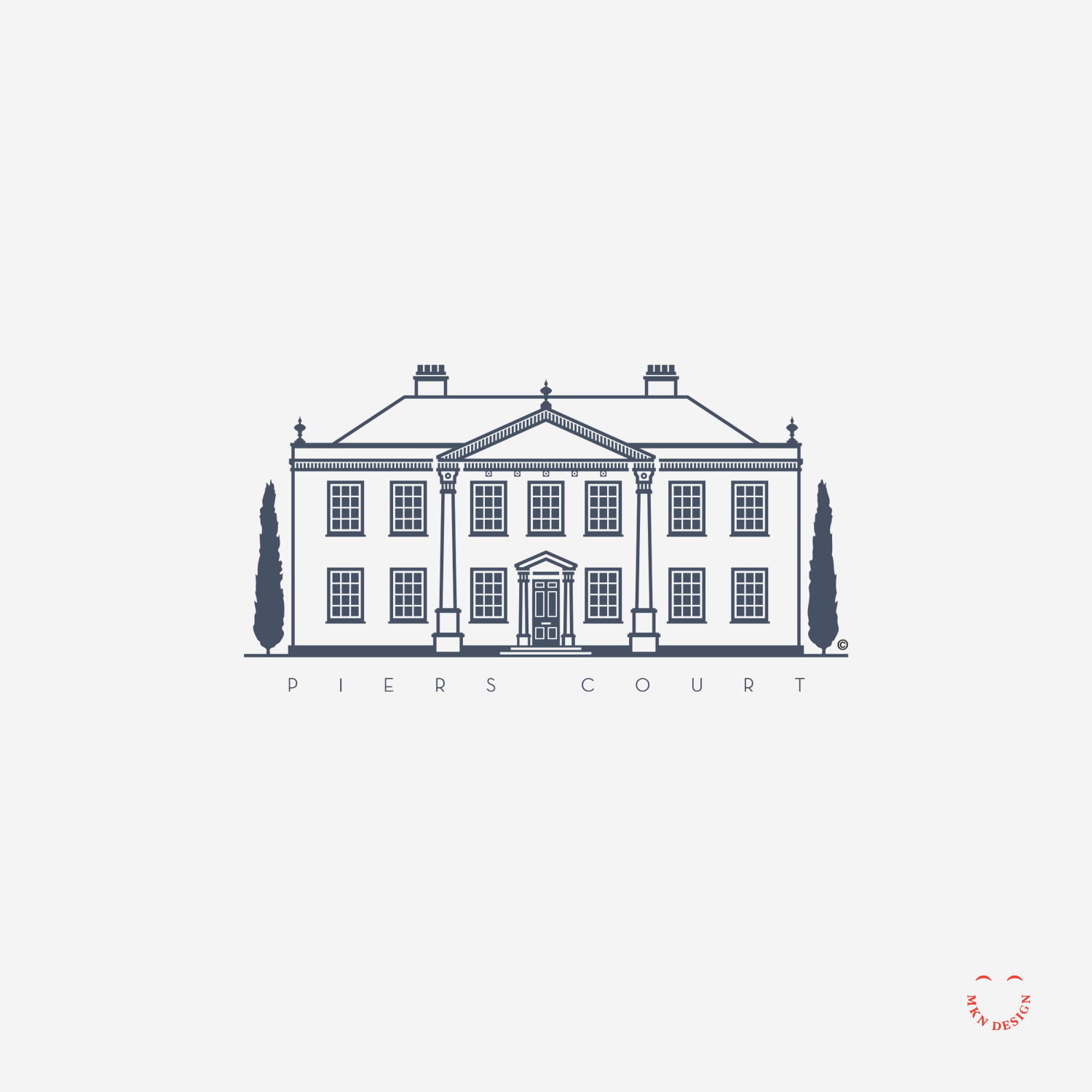
Piers Court
Creative Musing
—
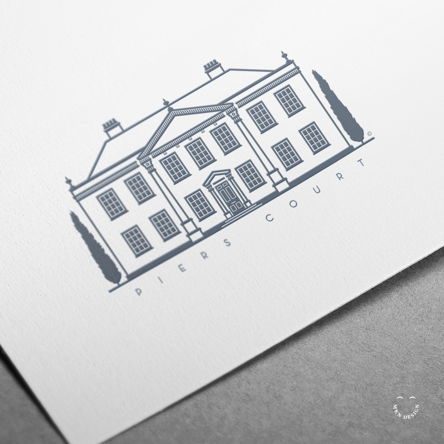
Piers Court
Formally owned by the author, Evelyn Waugh. While residing at Piers Court, he wrote several books while he resided there. His countryside home is located in Stinchcombe, a small village in Gloucestershire, England. It was built on top of an original structure from a 16th-century manor, and reconstructed on its remnants in the 18th century, which is the house that stands today. The mark is paired with the typeface Neutraface by House Industries.
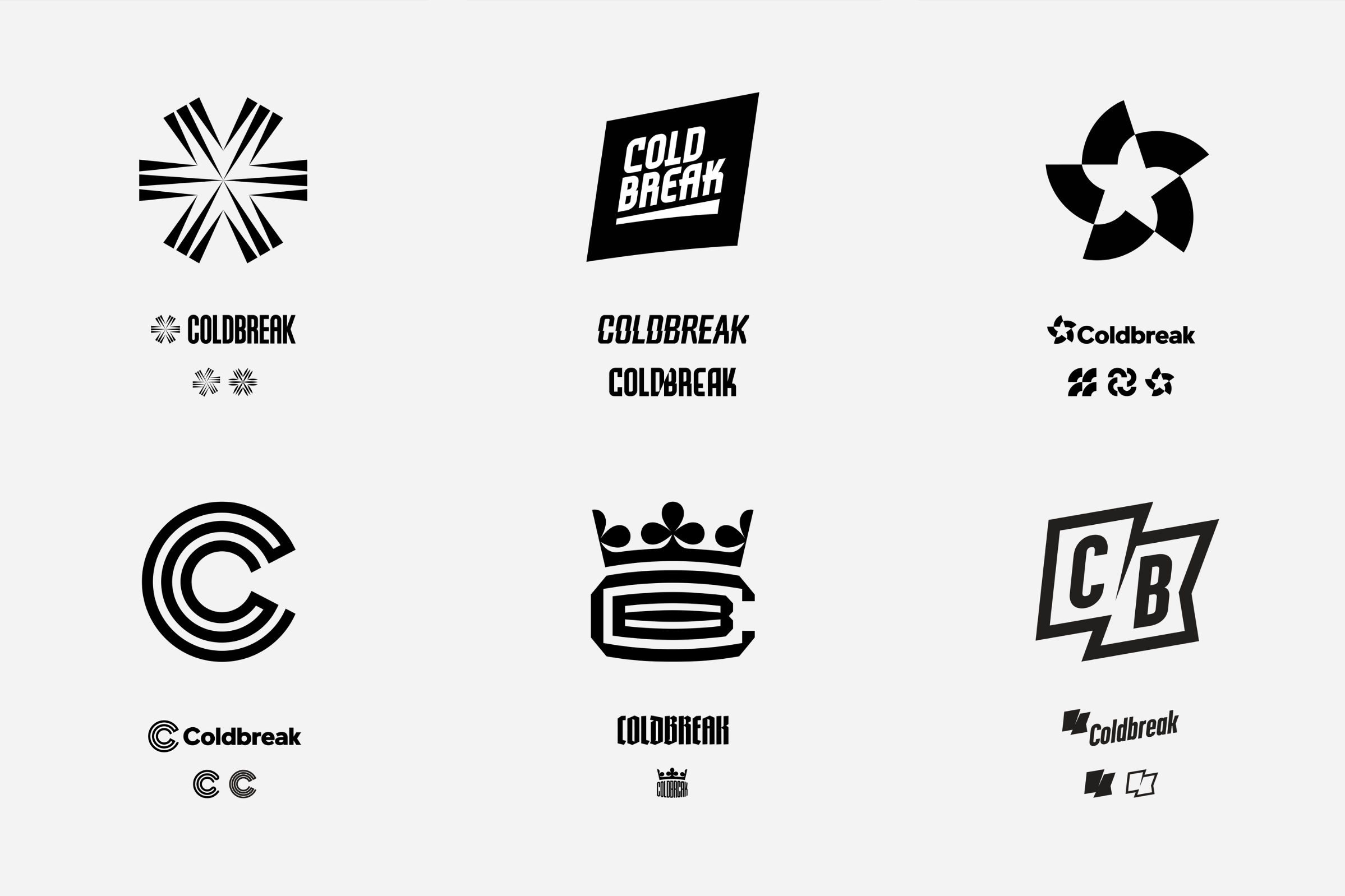
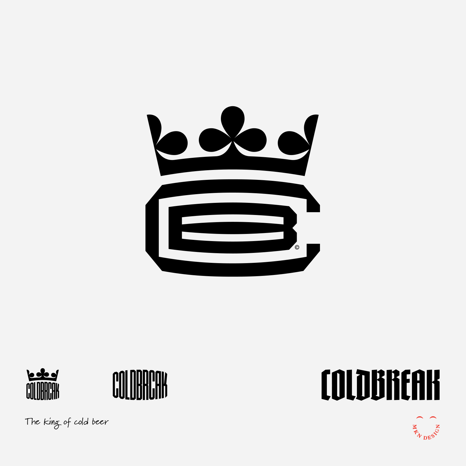
Coldbreak Mark Exploration
Client Project
—
Coldbreak Mark Exploration
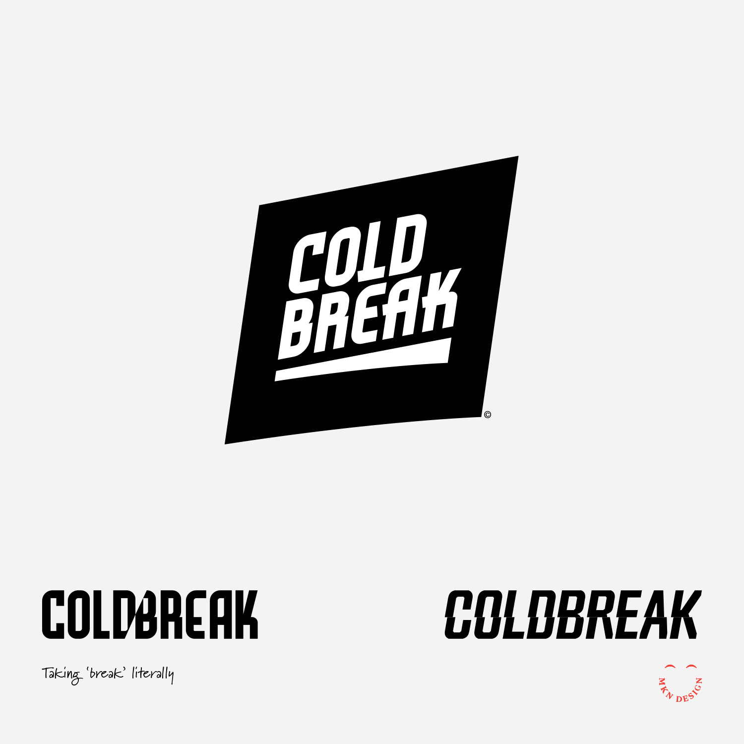
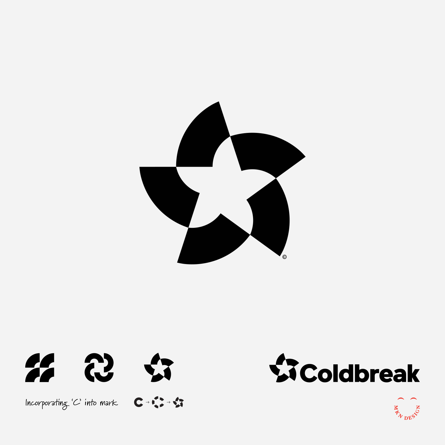
Though these marks where not selected by Coldbreak they laid the groundwork for refinement, ultimately leading to Coldbreak’s final brand identity.
These unselected marks where drawn from research and interviews conducted during the initial discovery phase. While they weren't ultimately chosen they served as a foundation for further refinement, contributing to the execution of Coldbreak’s brand identity. The sixth concept (bottom right) guided the direction towards Coldbreak's ultimate brand identity.
-
Coldbreak
Portable Draft Beverage Systems -
+ Brand Advisor
+ Concept Development
+ Creative Strategy
+ Design Direction
+ Qualitative Research
+ Visual Identity -
MKN Design Team:
+ Michael Nÿkamp, Design Director
+ Adam Barr, Copywriter
Coldbreak Stakeholders:
+ Boyd Culver, Chief Executive Officer
+ Chris Musil, Chief Operating Officer -
View the completed brand strategy and identity project.
The Headless Rooster


Creative Musing
—
The Headless Rooster
A macabre mark is paired with the typeface Conglomerat designed by Greg Shutters from Typetanic.
Yoga Square


Creative Musing
December 2021
__
Yoga Square
A minimalist mark where the concept of "square" is subtly implied through its shapes. The marks is paired with the typeface Conglomerate designed by Greg Shutters from Typetanic.
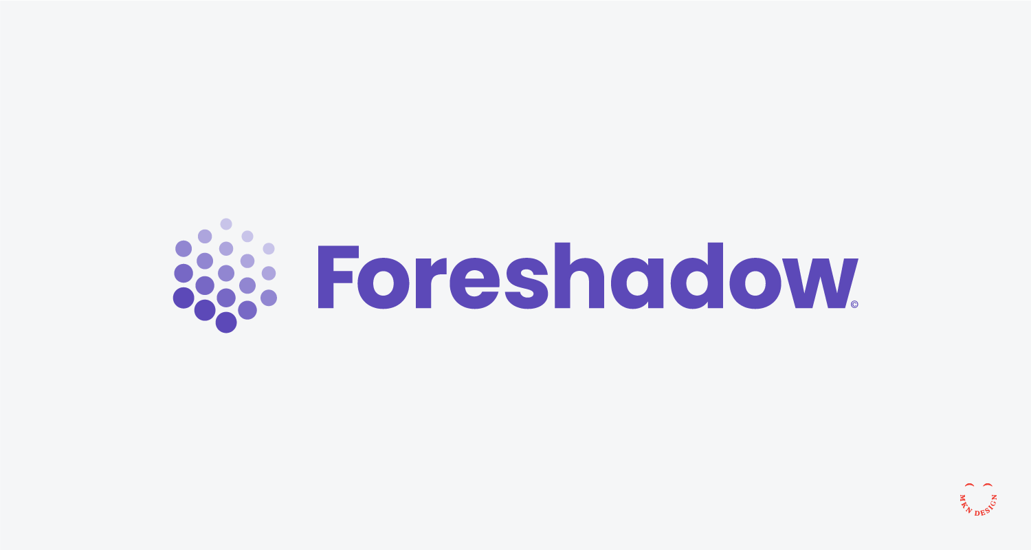
Foreshadow – Brand Identity


Client Project
—
Foreshadow – Brand Identity
This startup developed a machine learning algorithm to preemptively identify potential threats of malicious phishing attacks. Their goal was to alert users of potential threats to their online security and privacy. With a staggering 97% of people unable to discern phishing attacks, their innovative solution aimed to bridge this critical gap in cybersecurity awareness for home use.
-
Foreshadow
Online Security & Privacy -
+ Brand Advisor
+ Concept Development
+ Creative Strategy
+ Design Direction
+ Qualitative Research
+ Visual Identity -
MKN Design Team:
+ Michael Nÿkamp, Design DirectorForeshadow Stakeholder:
+ Ryan Montgomery, CEO
Spiras


Creative Musing
—
Spiras
Exploration on a modern mark for the name Spiras, modern spiral staircase engineers, fabricators, and designers. The mark paired with the typeface Kallisto designed by Rian Hughes from Device Fonts.
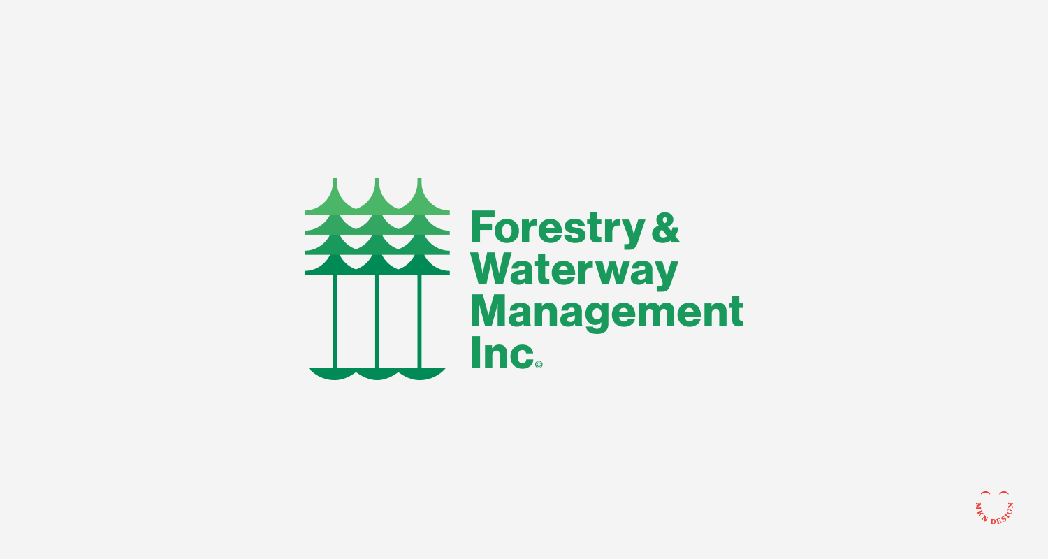
Forestry Waterway Management Inc.


Creative Musing
—
Forestry Waterway Management Inc.
Combining two elements, trees, and water creates this logo. Mark paired with the typeface ITC Avant Garde Gothic designed by Herb Lubalin and Tom Carnase from Monotype.
Atlas


Product
—
Atlas
The Greek mythology god, Atlas holding up the heavens… or is he holding up his head? Altas logo was paired with the typeface Condor designed by David Jonathan Ross from DJR.
-
This illustration of Atlas is available for purchase on various color tees on Cotton Bureau. All Cotton Bureau apparel comes in a variety of clothing types, styles, fits, sizes, materials, and colors.
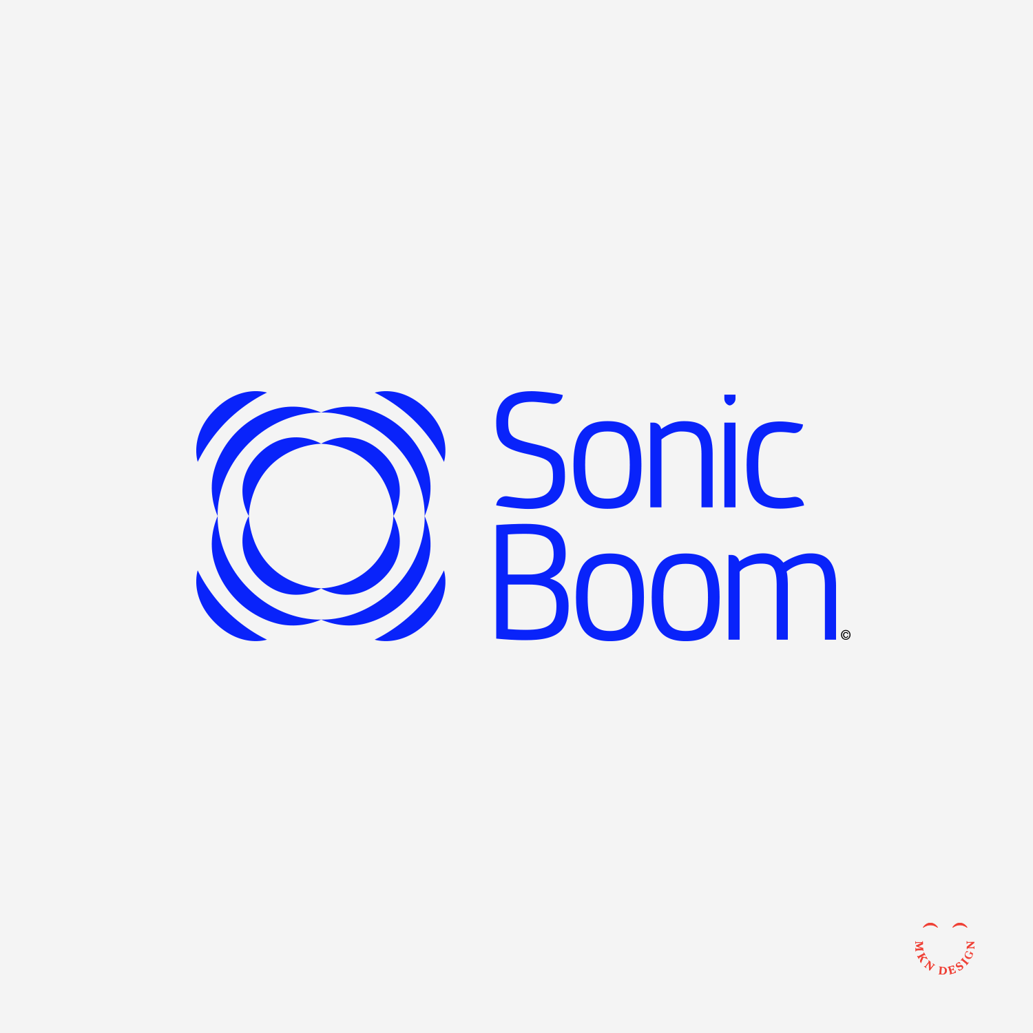
Sonic Boom

Creative Musing
—
Sonic Boom
Visual interpretation of the word, “Sonic Boom”, paired with the typeface Dic Sans designed by Luciano Perondi from CAST – Cooperativa Anonima Servizi Tipografici.
Conifer


Creative Musing
—
Conifer
Pairing a simplified coniferous cone logo with the typeface Gimlet Display, designed by David Jonathan Ross, from DJR.
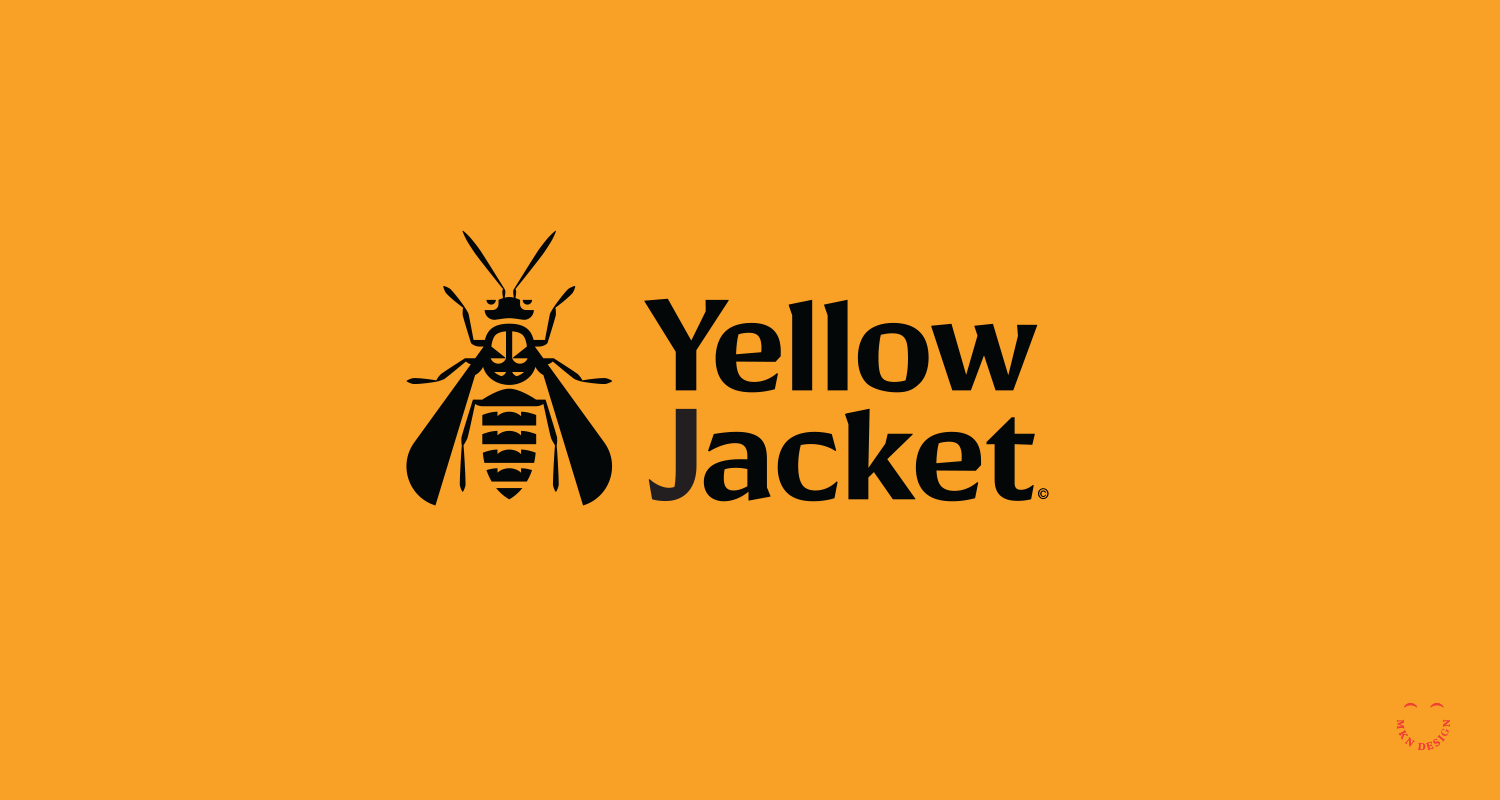
Yellow Jacket


Creative Musing
—
Yellow Jacket
Pairing a simplified Yellow Jacket mark with the typeface Conglomerate, designed by Greg Shutters from Typetanic.
Olympia Book Publishing


Creative Musing