
Creative Musing
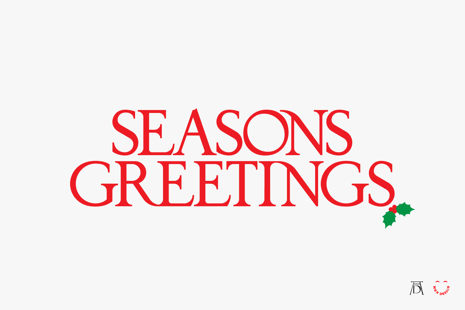
Seasons Greetings

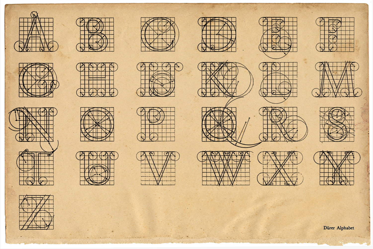
↑ Albrecht Dürer’s Geometric Alphabet
Creative Musing
—
Seasons Greetings
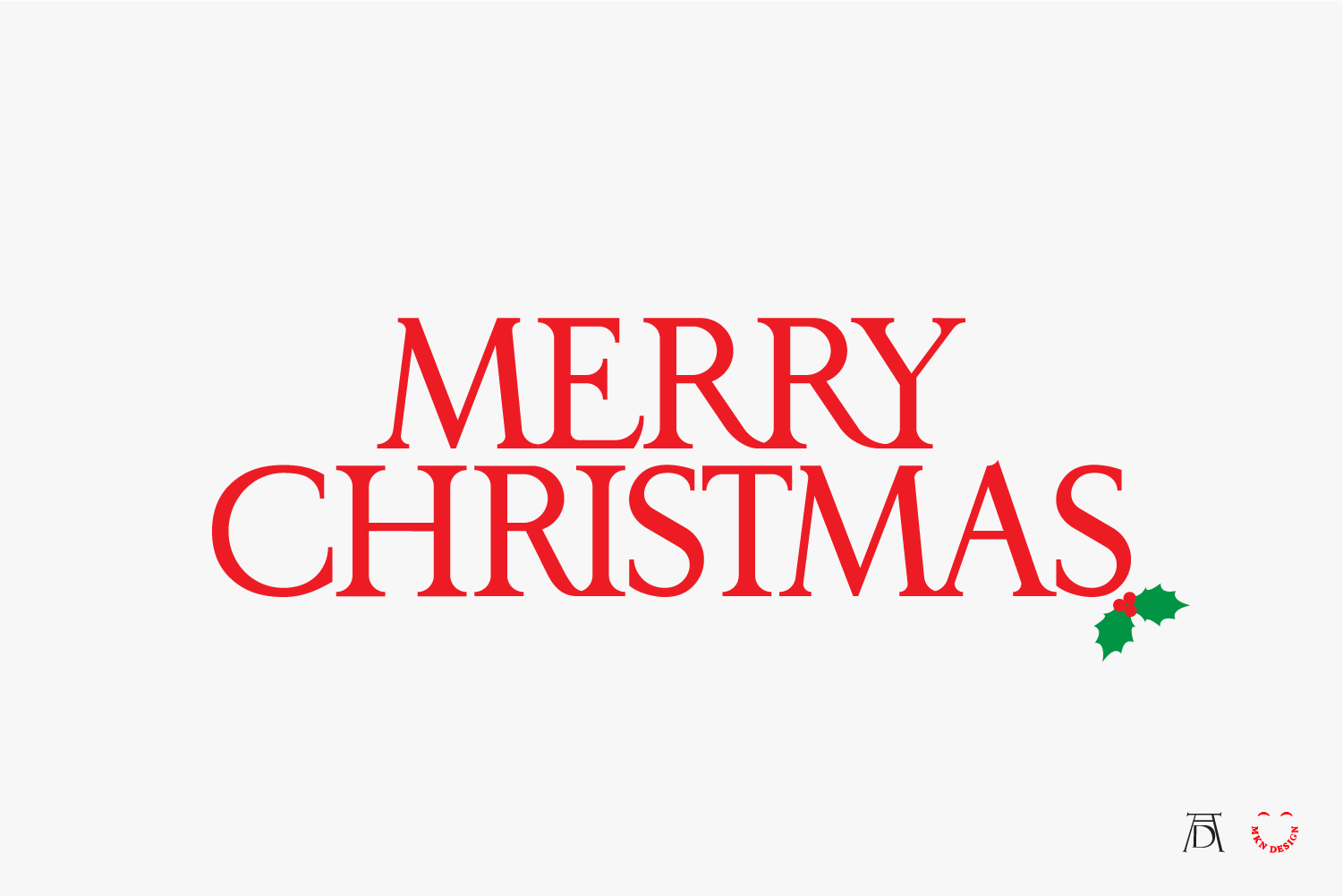
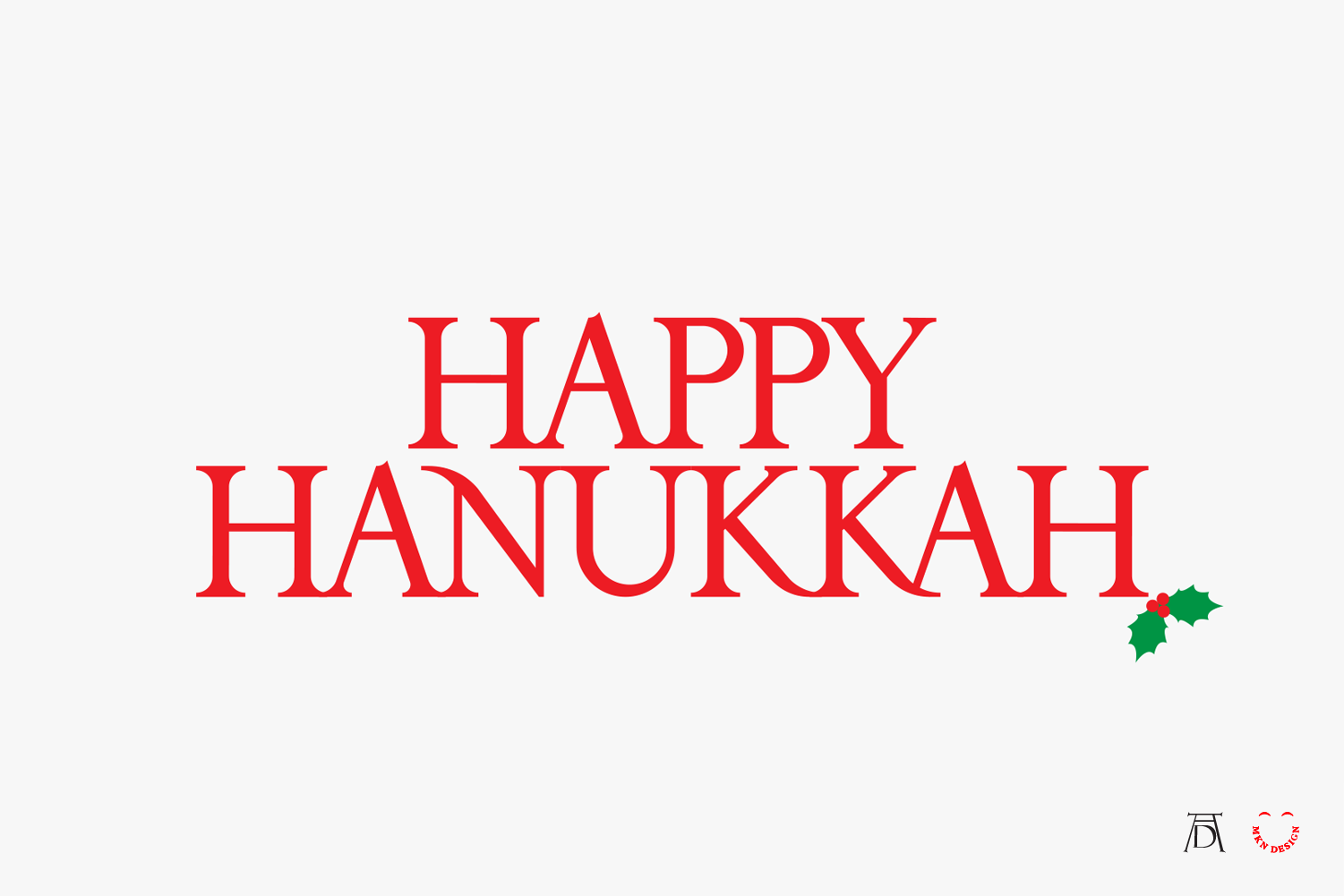
Wishing you all a Feliz Navidad, Happy Holidays, Joyeux Noël, Merry Christmas, Happy Hanukkah, and Season’s Greetings.
The lettering is an adaptation by me of Albrecht Dürer’s geometric alphabet, originally published in 1525, titled, Underweysung der Messung mit dem Zirckel und Richtscheyt (Instruction on Measurement with Compass and Ruler).
Designed to Speak

Article
—
Designed to Speak
Designing an impactful ad often begins with curiosity and research. I can’t say that these 2 ads hit the mark, but I can say they were born from the kind of thinking I admire most. They’re inspired by the timeless VW Bug campaigns from Bill Bernbach, co-founder of Doyle Dane Bernbach (DDB), whose creative philosophy reshaped advertising.
What I admire most about Bill Bernbach’s philosophy is his belief that creativity isn’t decoration—it’s communication. His work showed that honesty, simplicity, and respect for the audience could be more powerful than any gimmick. That idea guides my own approach. Find the truth in what you’re saying, strip away what’s unnecessary, and design it so it speaks clearly and confidently. Below are the core tenets of Bernbach's philosophy:
1. Truth & Purpose: Creativity should serve the truth, not exist for its own sake.
2. Integrated Execution: Art and copy must work together; how a message is delivered matters as much as the message itself.
3. Respecting the Audience: Treat consumers as intelligent humans—direct, honest, and human.
4. Simplicity: Communicate a product’s essence clearly and simply.
5. Relevance: Messages must connect meaningfully to the consumer’s life.
6. Adaptation: Shape techniques around ideas, stay fresh, and don’t fear risk.
7. Stand Out: If you stand for nothing, you’ll have no one against you—and no one for you.
Well Used.
I like to think of myself as a well-used pencil. Not worn—just well practiced.
I haven’t gotten older—but sharper, simpler, smarter.
Over the years, I’ve refined how I help brands tell their story.
I’ve sharpened my skills—smarter strategy, sharper messaging, stronger design.
I’ve improved my process hundreds of times.
I’ve built stronger relationships, better systems, and smarter brands.
I’ve learned what to say—and, more importantly, what not to.
And why all this progress?
Because I focus on what lasts, not what’s trendy.
This is what matters:
Work that communicates.
Ideas that matter.
Design that lasts.
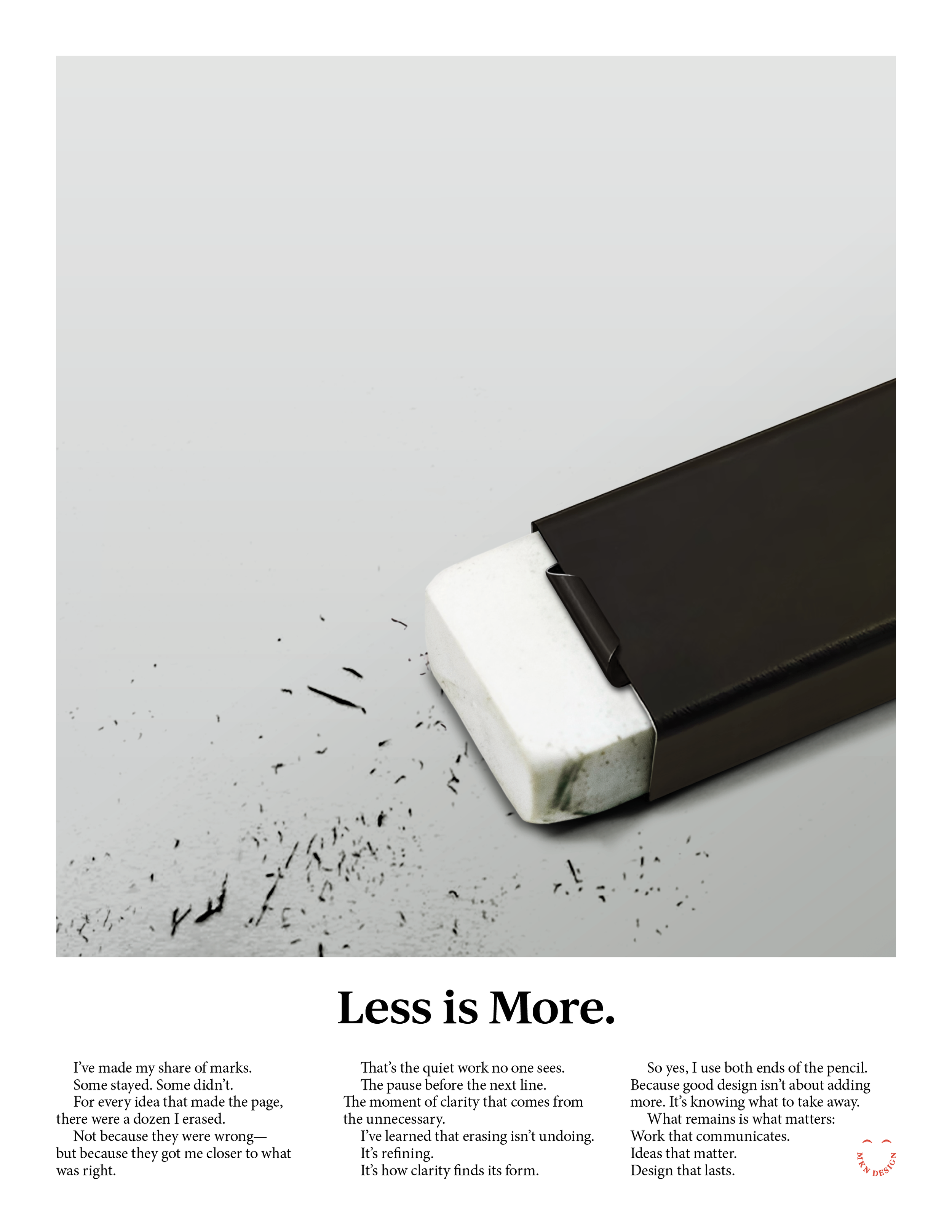
Less is More.
I’ve made my share of marks.
Some stayed. Some didn’t.
For every idea that made the page,
there were a dozen I erased.
Not because they were wrong—but because they got me closer to what was right.That’s the quiet work no one sees.
The pause before the next line.
The moment of clarity that comes from the unnecessary.
I’ve learned that erasing isn’t undoing.
It’s refining.
It’s how clarity finds its form.
So yes, I use both ends of the pencil.
Because good design isn’t about adding more. It’s knowing what to take away.
What remains is what matters:
Work that communicates.
Ideas that matter.
Design that lasts.
-
Learn how my principles guide a thoughtful, transparent design process—one that aligns your brand, business goals, and audience insights to create purposeful, engaging work.
→ Studio Principles & Design Process
Developing a Visual Strategy for Your Brand

Article
—
Developing a Visual Strategy for Your Brand
Bold, simple illustration systems can do more for your brand than you think. It’s not just decoration—it’s a visual strategy. Clean, memorable forms can make your brand instantly recognizable, adapt seamlessly across mediums, and connect with audiences in a way that feels authentic. That’s why I design custom illustarated visuals tailored to your brand’s personality, tone, and story. Built as a scalable system, they work seamlessly across your website, print materials, and social media graphics.
Visual strategies range from literal to conceptual, simple to complex, and extend across iconography, illustration, and environmental design.
The result? Illustrations that not only look great, but also communicate your brand, connect with your audience, and stand the test of time—just like the iconography system I developed with Monotype for Riot Games. View the project here.
To create a strong visual system that delivers real impact, I start by understanding your brand messaging framework and visual identity—what I call input. This includes researching your history, vision, and competitors to uncover what makes your brand unique. From this often-chaotic mix of insights, my role is to distill, clarify, and translate them into an authentic, distinctive, and cohesive visual system—the output. This stage takes time and care, often involving multiple revisions, refinements, additional concepting, and your feedback to ensure it aligns perfectly with your brand’s vision.
↑ A small glimpse into my chaotic artboard, filled endless icon variations and subtle adjustments.
Why Visual Systems Strengthen Your Brand:
1. Instant Recognition
Bold, simplified illustrative forms are easier for people to recall and recognize across different contexts—whether on packaging, digital ads, websites, or a small app icon.
2. Strong Brand Personality
They convey confidence and clarity, giving your brand a distinctive visual voice that can feel approachable, playful, or modern depending on the style.
3. Scalability & Flexibility
Simple illustration styles hold up at any size—from a billboard to a tiny social media avatar—without losing detail or impact.
4. Cross-cultural Accessibility
Clean, universal forms often transcend language barriers, helping your brand connect with diverse audiences more effectively.
5. Consistency Across Mediums
Simple illustrations are easier to adapt for web, print, merchandise, motion graphics, or environmental branding while staying on-brand.
6. Emotional Connection
Even pared-down visuals can carry warmth, humor, or storytelling—making your brand feel human and relatable in ways photography alone sometimes can’t.
7. Modern, Timeless Appeal
Bold, simple illustrations can feel contemporary while avoiding overly trendy details that might age quickly.
8. Cost-effectiveness in Production
They’re often less expensive to reproduce, print, or animate than complex imagery, especially in multi-channel campaigns.
-
Related posts based on similar projects completed:
→ Riot Games Iconography System
→ KitchenAid Branded Environment
→ Coldbreak, Brand Strategy & Identity
→ KitchenAid, Packaging an Icon
→ ITHAKA S+R Design System
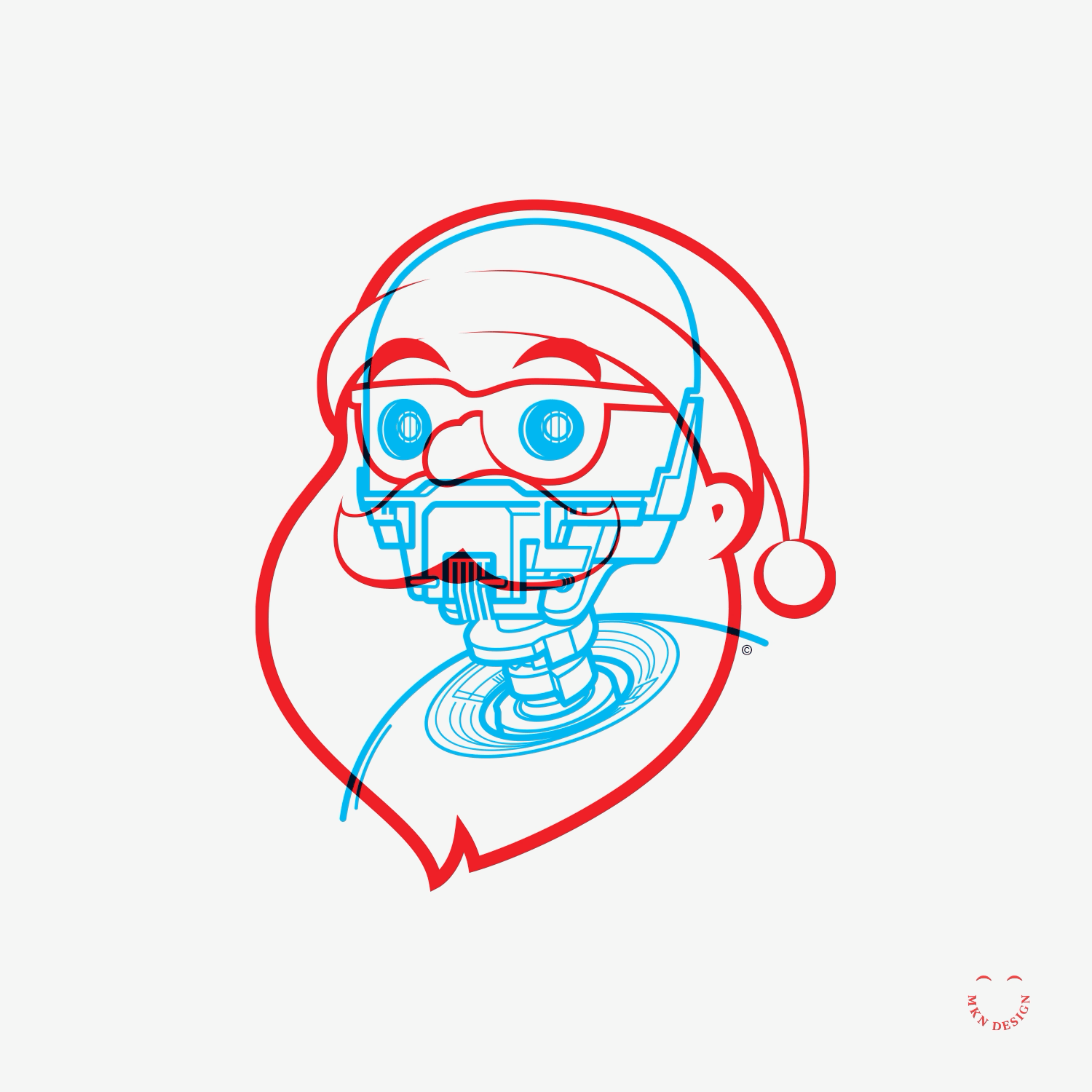
Hamburglar Hijinks


Creative Musing
—
Hamburglar Hijinks
This could be either a solid McDonald’s campaign or just a sly dig at hamburger menus—UI meets UX, a reminder that hidden navigation can be both playful and frustrating.
The Soul in the System
Article
—
The Soul in the System,
Michael Nÿkamp on creativity, AI, & the future of design
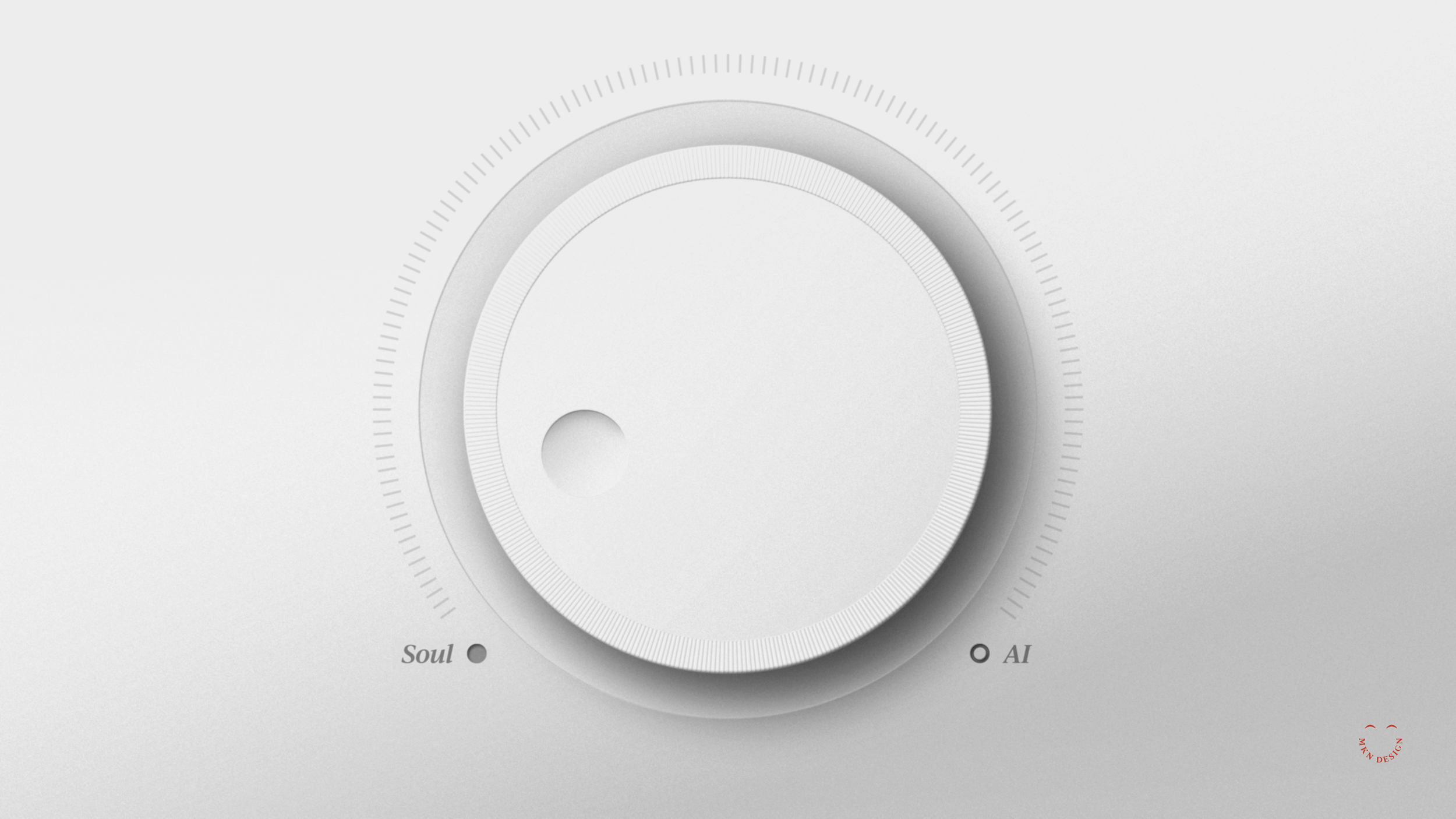
When designer Michael Nÿkamp considers his many years in the field, he offers more than just a list of accomplishments; he shares profound insights into human nature and creativity. In a world swiftly reshaped by artificial intelligence, his reflections serve as both a foundation and a call to action.
Nÿkamp openly acknowledges the tension: AI is rapidly transforming all aspects of life. However, instead of sensational reactions, the perspective of this seasoned design professional is thoughtful and nuanced. He encourages us to participate in a dialogue rather than deliver a final judgment. In short, sometimes we need to sit with something before we can respond to it.
“AI can replicate style,” Nÿkamp shared, “but it can’t replicate soul.”
And that soul, he argues, is the designer’s responsibility to protect—especially now.
Where Imagination Begins
Like many lifelong creatives, Nÿkamp’s journey started with crayons and curiosity. “As a kid, you draw just to draw,” he says. “There’s no right or wrong—just experimentation, just imagination.”
That experimentation continues to shape his approach today. Whether he’s developing creative strategies, designing, illustrating, or crafting brand identities, Nÿkamp depends on the intuitive play developed through years of hands-on, analog experimentation. He even encourages giving kids access to basic, tactile tools – such as paper, pencils, and crayons – not necessarily as a career pathway, but to foster critical thinking.
Nÿkamp consistently underscored this idea: when we allow children to make freely, they learn how to think freely. That flexibility, he believes, will be essential in an AI-driven world.
Tools are not the Threat—Disconnection is
Today, many run around like Chicken Little proclaiming that the sky is falling when discussing AI replacing designers, but Nÿkamp sees it as about relationship, not replacement. He says AI can assist designers – for example, using Photoshop presets for tasks like replacing a background fill or refining language in client materials with ChatGPT – but he knows its limits.
“Because I’m an experienced (and hopefully wiser) designer, I’m showing up with more than just technical skills,” he says. “Those foundational skills still matter in an AI-driven world.”
He perceives the real danger not in the tools themselves but in the temptation to bypass human connection completely. To Nÿkamp, when design turns purely transactional, we forgo not only nuance and empathy but also the chance to create something genuinely meaningful.
A Familiar Model: AI as the new Junior Designer
Nÿkamp reflects on his early experience in the design industry, where he worked under an experienced art director. As a junior designer, his role involved executing ideas from his senior, making quick iterations, and absorbing knowledge through this creation process, which is common within many industries.
Over time, through repeated exposure and practice, he developed the ability to think like a director: strategically, systematically, and empathetically.
“As a junior designer, I had to do a lot of things. I was the hands of the art director,” he says. “And you learn through that process. You hate it—but your own ideas come out through it.”
From this perspective, he sees AI not as a replacement but more as a willing intern or assistant. It can adhere to instructions and produce initial ideas, yet it still needs guidance, judgment, and oversight.
“You still need someone to direct that no matter what,” he emphasized. “Creativity, imagination, and those wow moments where things connect—that’s still ours to do.”
Sensitivity, Strategy, and the Soul of Design
Nÿkamp repeatedly returned to one word: sensitivity. Whether he is interpreting client cues or reflecting on his own emotional experiences, his work is driven by a profound attentiveness to the individuals at the other end of the communication.
“When you are designing something, you are being sensitive to the people that you’re creating for,” he says. “Sometimes it’s not even for others—sometimes it’s for yourself.”
He believes that the true worth of design is in the emotional experience it evokes, not just the visual appearance. While AI can replicate shapes and tone, it cannot derive inspiration from real-life experiences such as heartbreak, joy, or the depth of long-term collaboration.
Michigan as creative soil
Nÿkamp, based in Michigan, has observed the state’s transition from a manufacturing power to a subtle yet influential design center. However, he is concerned that the focus on marketable skills such as user experience and user interface might cause us to overlook something more fundamental.
“We’ve kind of lost the soul of what painting is, or what design is, from pure expression,” he says. “It feels like a production line.”
He champions the conservation of fundamental, analog techniques in design education—like sketching, storytelling, and manual work. These are more than just nostalgic practices; they are essential tools for cultivating voice, vision, and conceptual clarity.
Designing for a World in Transition
We’ve been interacting with AI for a longer time than many realize – through Google autocomplete, Grammarly suggestions, and spam filters, all examples of this evolving tech. However, what’s changed now is the speed and breadth of AI's development. For Michael Nÿkamp, this signals that creatives must now take time to reflect, adapt, and lead the way.
“Designers need to keep asking better, deeper questions,” he says. “That’s how you build work that resonates on a real level.”
His final call is not to turn away from technology but to infuse it with more human touch, embracing what he refers to as the “wandering” that fuels creative expression. After all, ideas don’t always come instantly; they require space, questions, and connection with people.
A Story We’re Still Writing
Michael Nÿkamp doesn’t provide simple solutions, but he clarifies that design will persist because people will, too. Tools may evolve, and the speed of change will quicken. However, the fundamental needs to connect, to move, and to imagine remain as essential as before.
This serves as a reminder that we have always depended on tools to support our thinking. Like any effective collaboration, the outcome varies based on who holds the pencil and their intentions.
Photos provided by Tommy Allen and Michael Nÿkamp of MKN Design. Please visit his website for more examples of his work.
-
Tommy Allen, a Communications Major from Calvin University, is a founding member of Rapid Growth and the innovative placemaker behind the "no topic off-limits" weekly G-Sync column as well as the author of more than 2,500 stories on the Greater Grand Rapids art scene from 2008 until March 2020.
→ Link to Article on Rapid Growth
Five Principles Behind the Process


Article
—
Five Principles Behind the Process
I’ve been asked many times, “What sets you apart from other independent designers, and what value or innovative approach do you bring beyond just delivering the design that’s been asked for?”
Honestly, nothing out of the ordinary. Sure, great visuals matter (and yes, I can deliver those). But what makes the difference is the climb—step by step, together. Think of the process like climbing a ladder. We don’t jump to the top—we start on the first rung. That means taking time to learn about your goals, your team (if that’s helpful), and most importantly the people you serve. It’s a deliberate pace, often uncertain at first, but always intentional. Each step reveals more clarity—what drives your organization, what sets you apart, and what resonates deeply with your audience. As we climb, we begin shaping thoughtful, creative solutions (don’t worry, I’ll handle most of it), but we’re in it together—grounded in insight, purpose, and meaning. With each rung, brings greater clarity, and your brand becomes more defined, more authentic, and more connected. By the time we reach the top, we’re not focused on the climb we had—we’re standing on something solid, looking out over what we’ve built: a brand foundation that’s steady, strategic, and ready for the long haul.
That foundation I mentioned, it was built on these guiding principles:
Design Happens Together:
Just because you aren’t the designer doesn’t mean you aren’t an integral part of the process. Great challenges are tackled—and great solutions are found—together.
Approached with Thoughtfulness:
The best design taps into something deeper. It considers all angles. All people. All possibilities. It takes time, and it should. Because a thoughtful approach leads to a valuable outcome.
Design with Intention:
At the end of the day, you need results. You need a design to work hard. To make people think. Or laugh. Or buy. Whatever your need, we’ll work hard to make it happen.
Acumen Equals Impact:
You can’t fake experience. It takes years of practice and dedication, mistakes, and successes. Plenty of designers can make something. It takes experience to make something worth investing in.
Crafted to Compel:
From a common understanding, we’ll create meaning and magic. It’s not easy. It takes time. It’s a process, and some-times it’s messy. But it’s always beautiful and useful in the end.
-
This article builds on a previous piece where I shared the foundational experiences that shaped how I think, collaborate, and design with purpose.
Foundations of My Design Practice
Article
—
Foundations of My Design Practice
I didn’t just wake up one day and decide to become a graphic designer, or what some might call a design generalist or T-shaped designer. My path started much earlier as a kid who loved to draw and express ideas through color. That early curiosity eventually led me to study fine art, illustration, and user experience—five years of focused learning, exploration, and hands-on practice. Though these studies were instrumental in shaping how I work, I do not practice just one of these disciplines. Over time, they’ve blended into a focused approach that has taught me to observe closely, think conceptually, and design with sensitivity to the human experience.
It was from these foundational beginnings that I naturally flowed into practicing graphic design, but with a unique, visually driven, illustrative approach woven into my design work. Over time, this developed into my style and has helped me shape brands and build design materials grounded in thoughtfulness, meaning, clarity, and how people relate to and engage with them.
Not only have these foundations shaped my work, but they’ve also led to a set of guiding principles, approaches that continue to influence how I collaborate, problem-solve, and design with purpose.
These are the guiding principles I work by (in no particular order):
• Design Happens Together
• Approached with Thoughtfulness
• Design with Intention
• Acumen Equals Impact
• Crafted to Compel
-
This article expands on an later piece I wrote where I reflect on my process and why principles matter.
-
The reel above is a mix of client collaborations and personal creative explorations I’ve pursued between projects. They express the breadth of my skills, my evolving style, and the passion I bring to every piece of work—whether driven by client goals or personal curiosity.
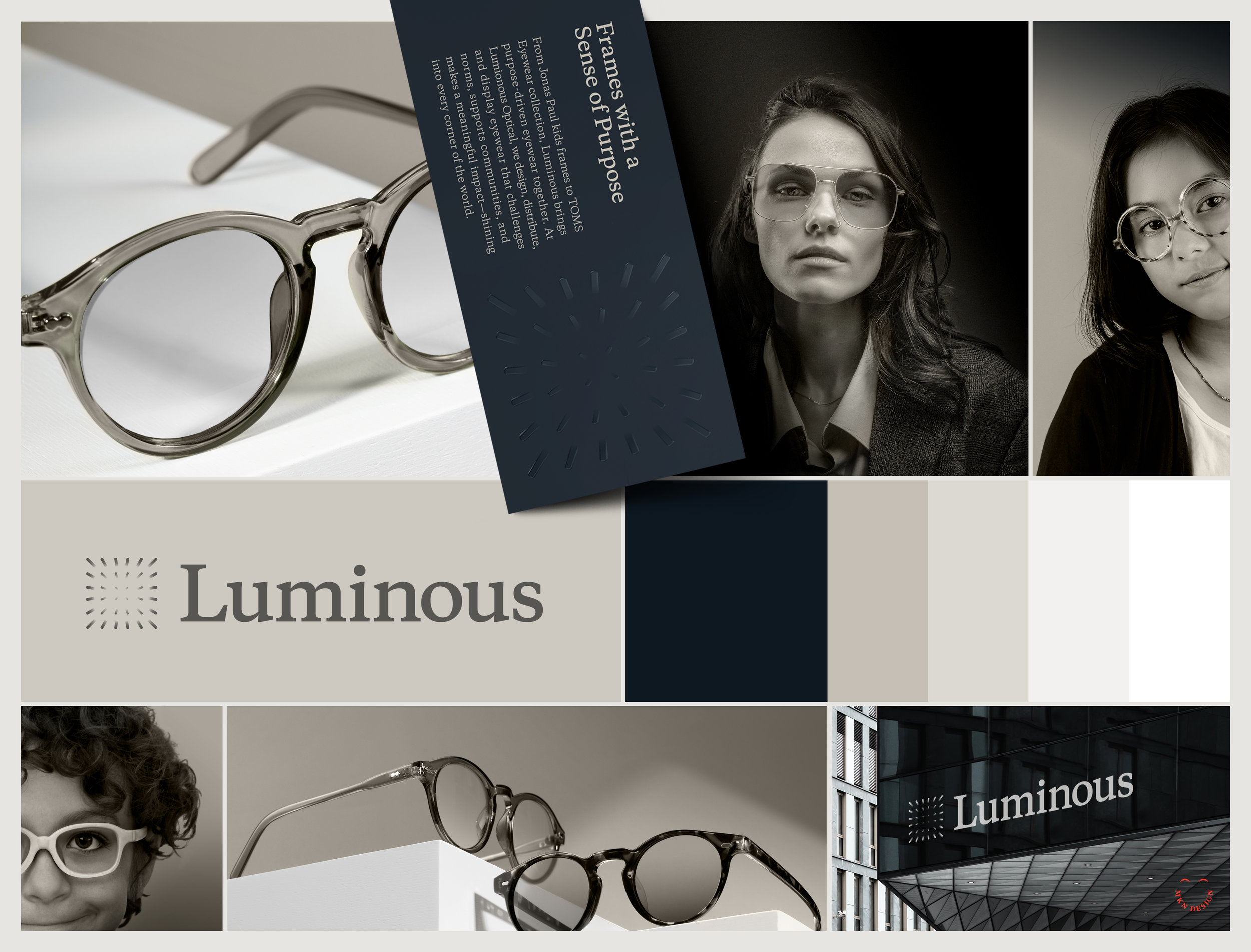
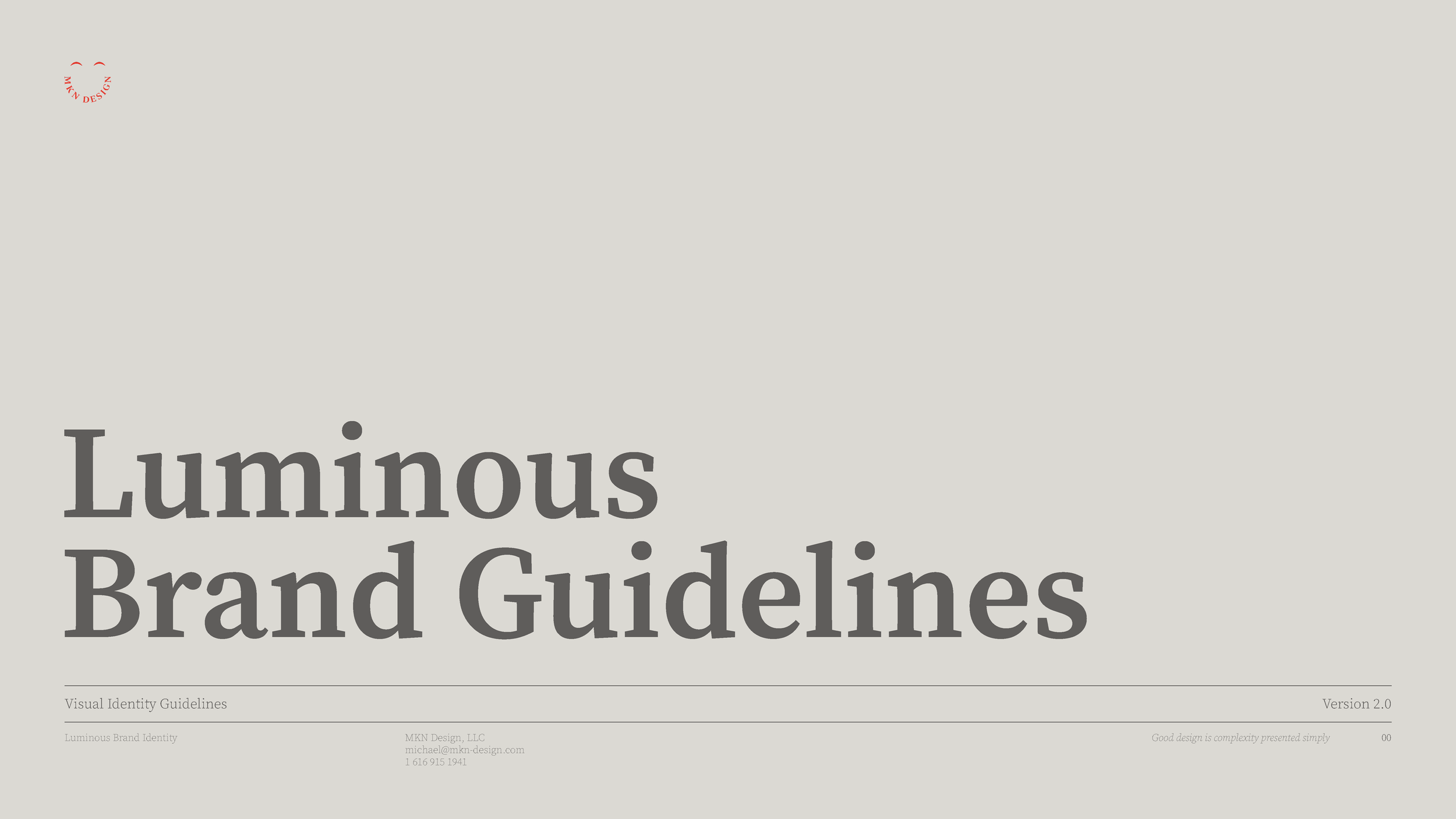
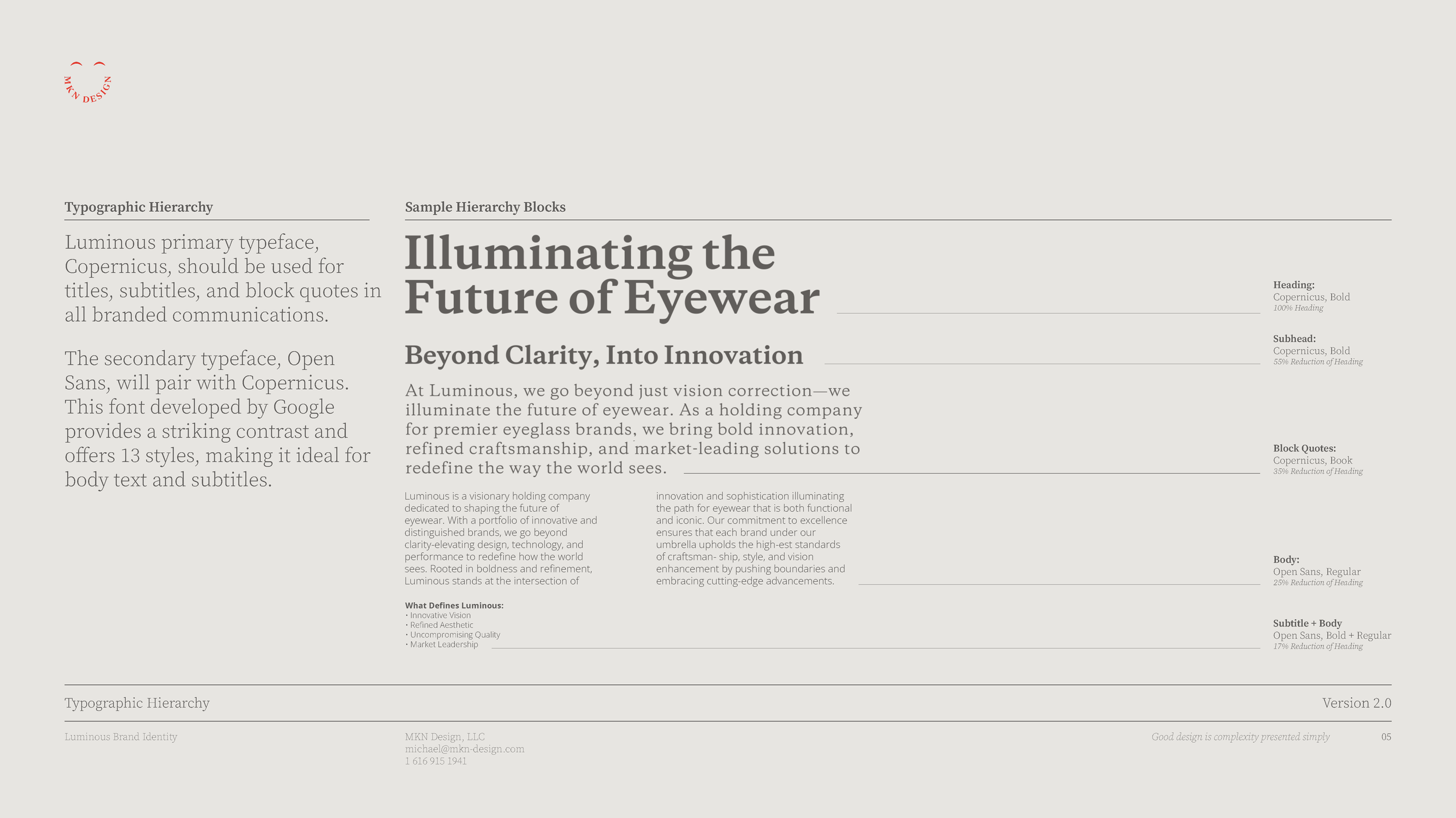
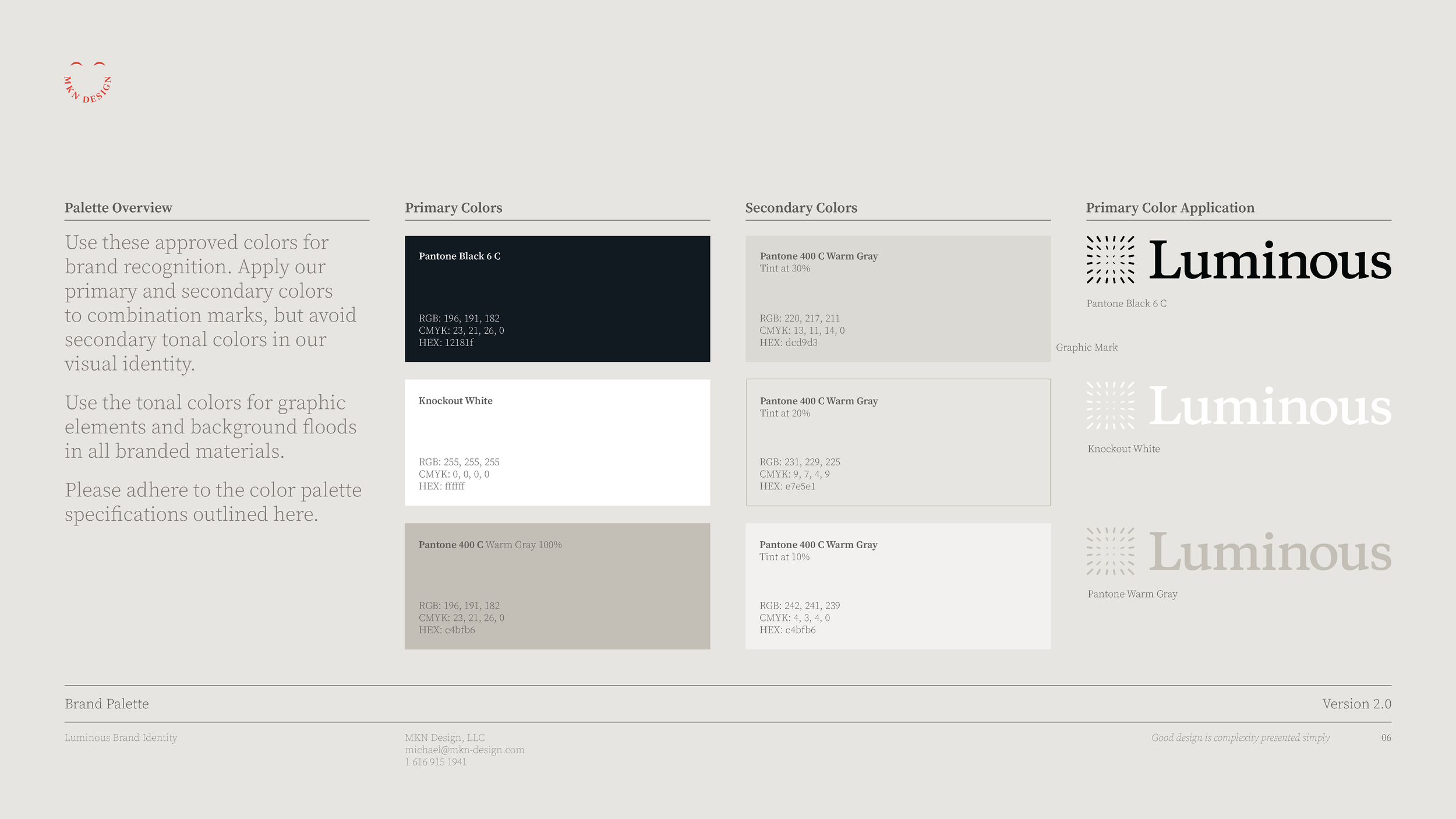
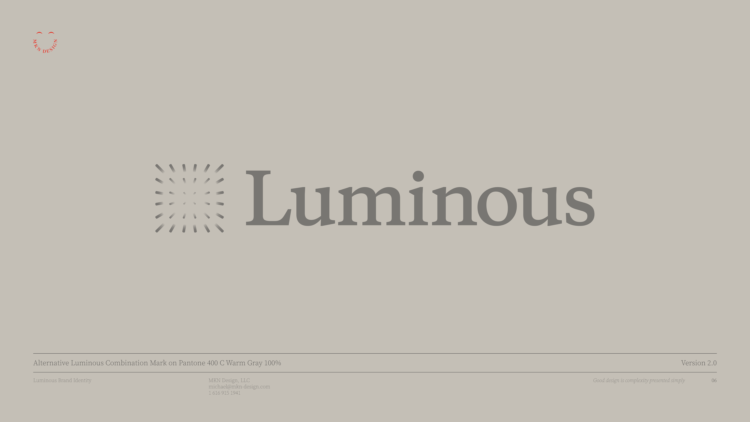
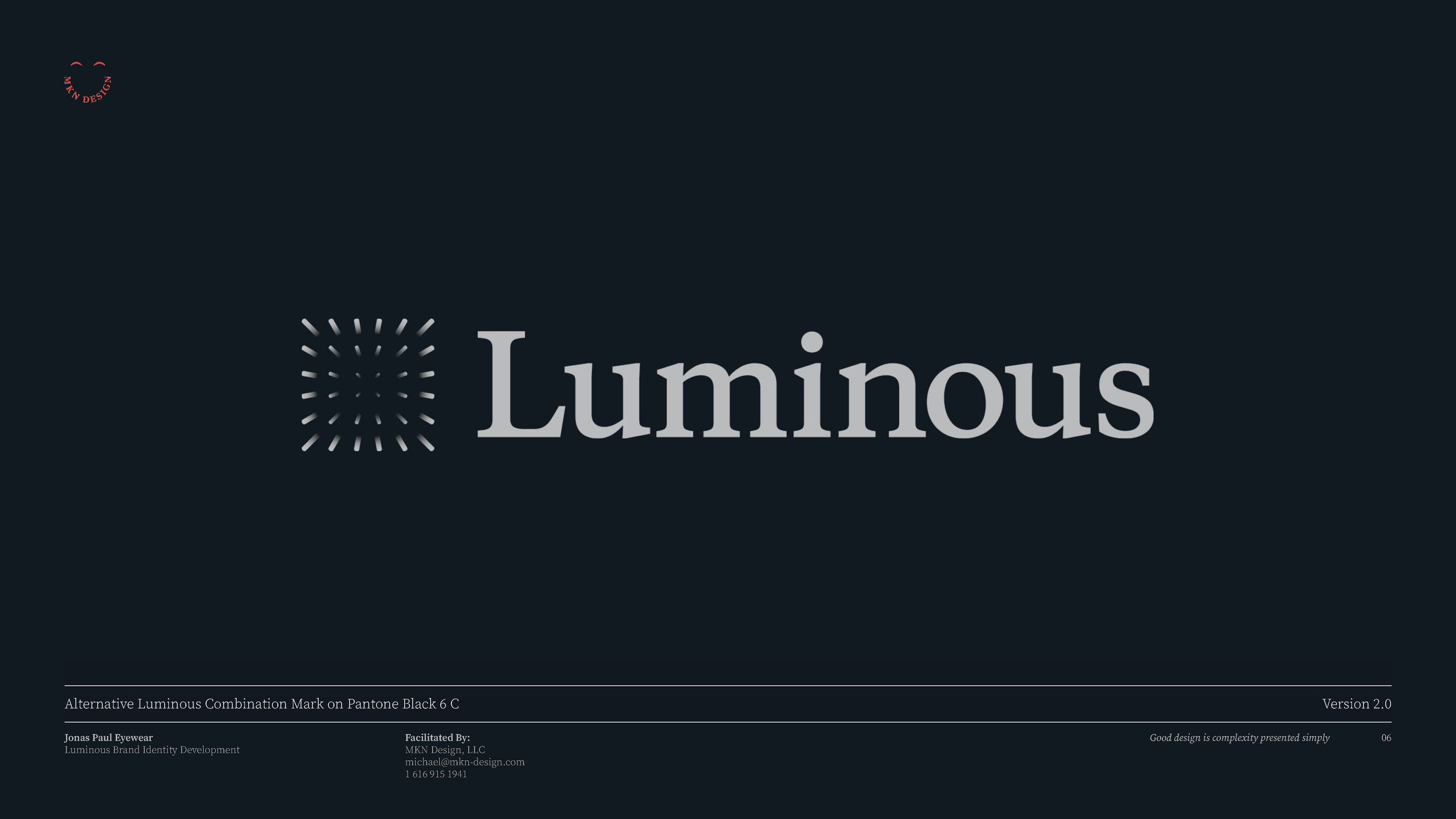
Luminous – Brand Identity
↓ Brand Development Deck
Deck slides are an overview of the process behind defining and executing the development of the Luminous identity.


↓ Abbreviated Brand Guidelines
The below guidelines outline the essential elements and standards for presenting the Luminous brand accurately.
Client Project
—
Luminous – Brand Identity
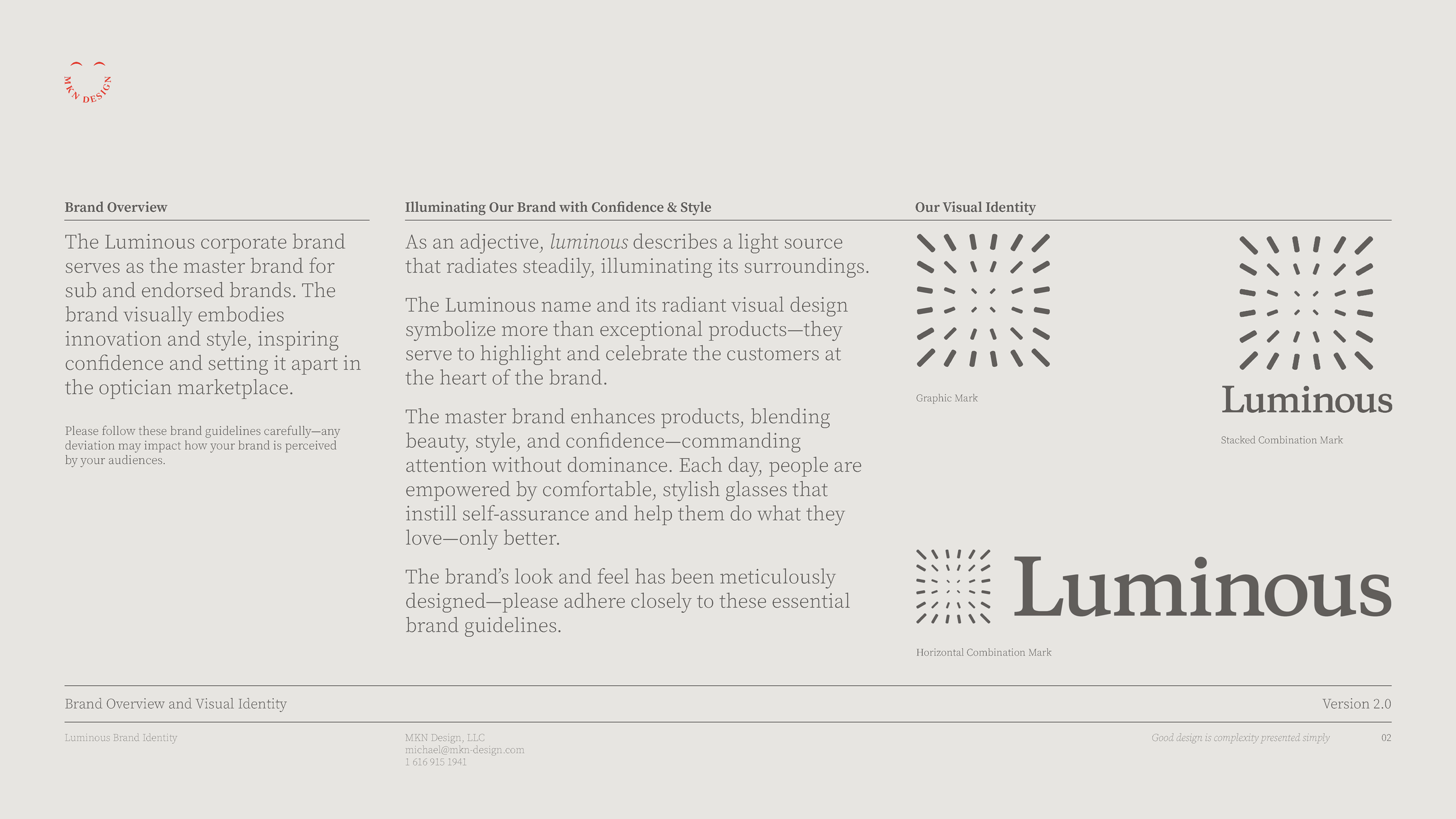
Luminous engaged us to elevate its master brand and portfolio, guiding the development of a comprehensive visual identity that connects the parent brand with its sub-brands, reflects its mission, and positions it distinctively in the optical market. Luminous originated from Jonas Paul Eyewear and today, Luminous serves as the holding company for Jonas Paul and several other optical brands—dedicated to, “Shedding light into every corner of the optical space.”
Guided by research, collaboration, and informed insights provided by the team, my primary design goals were to establish a strong identity that connects the master brand with its sub-brands, stands out in a competitive market, and reflects boldness, innovation, and meaningful impact.
Despite early design challenges, our shared determination and open dialogue allowed us to refine concepts until one emerged that aligned seamlessly with the brand’s vision, core audience, and markets. Achieving this alignment demanded a rigorous process, carefully balancing innovation, design, and brand consistency.
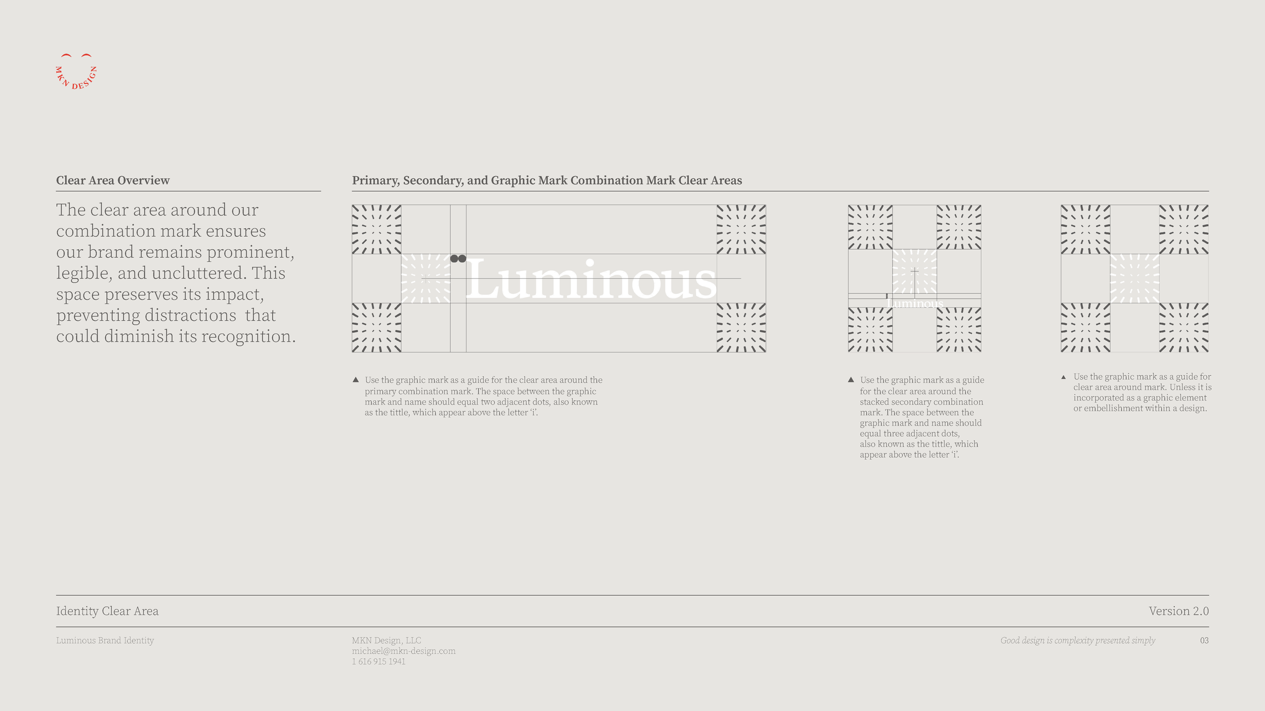
The result is a distinctive and innovative identity that thoughtfully reflects their mission and current brand offerings. It embodies quiet sophistication—illuminating rather than overwhelming—and conveys intentional brilliance balanced with confident contrast, capturing the essence of the brand.
-
Luminous
Optical & Eyewear Services -
+ Brand Advisor
+ Concept Development
+ Creative Strategy
+ Design Direction
+ Qualitative Research
+ Visual Identity -
MKN Design Team:
+ Michael Nÿkamp, Design DirectorLuminous Stakeholders:
+ Ben Harrison, Chief Executive Officer
+ Laura Harrison, Chief Operating Officer
+ Spencer Blanchard, Chief Revenue Officer
Rosso Bitters


Creative Musing
—
Rossa Bitters
A independent design execution on for a bitters brand. Rossa Bitters. a bold, vibrant infusion of Red Lemon crafted for the curious palate. Whether you're elevating a classic cocktail or experimenting with something new, Rosso Bitters brings a citrus-forward complexity that balances bitter and bright in every drop.
Own Your Superpower
Article
—
Own Your Superpower
While watching an episode of The Resident, one scene really stood out to me. Detective Cordelia Cupp a smart, strong, and quirky character was talking to her nephew. It was her final sentence (found in the video above) that struck me, “This is not the only way to be, but… it is the way that I am.” That line reminded me that there’s no single “right” way to be in this world. Your way of being is valid, valuable, and worthy of respect.
That quote came to life for me recently during a night out with friends I hadn’t seen or spoken to in quite some time. As the evening wrapped up, I drove a friend home, and during the ride, our conversation shifted toward the topic of personal traits. I won’t share his story—but I’ll share what I told him (in its abbreviated form).
Growing up, I was an introverted, sensitive kid—or at least, that’s what my parents and teachers often told me. I think the line they used was, “You’re too sensitive.” I never thought it was a bad thing. But over time, hearing it again and again made me feel like something was wrong with me (know that I don’t hold it against my parents or teachers. It was part of the culture back then—boys were expected to hide their emotions). Eventually, I internalized that message as a weakness and started to believe I wasn’t good enough because of it. I tried my best to hide that part of myself, to toughen up, and to be who I thought others wanted me to be.
This continued through grade school and into middle school. But during high school, I slowly began to let my guard down. As I did, I realized I could feel and see things
others seemed to overlook. Later, while attending Sheridan College, that realization deepened. Through introspection and the encouragement of my Conceptual Studies professor, I came to understand that sensitivity wasn’t a flaw—it was a gift, or as some might say, a superpower. When applied with thoughtfulness and intention, it adds meaningful depth to the design process and can enhance both the clarity and impact of design.
My hope is that, if you’ve read this far, you might see a bit of yourself in it and understand that while these traits shape us, they don’t define you. Below are some qualities that often accompany sensitivity.
Key Benefits of Emotional Intelligence in the Workplace
🧠 Emotional Intelligence
You naturally sense what others might miss. This allows you to create designs that connect deeply with people—because you can read tone, nuance, and emotional undercurrents. Designing for how something feels, not just how it looks.
👂 Empathy for Clients & Users
You’re tuned in to people’s needs, even when they can’t quite express them. You listen deeply, absorb subtext, and translate vague feedback into visual clarity—turning emotional intuition into practical, usable design.
🎯 Sensitivity to Detail
You notice the small things—the weight of a line, the tension between typefaces, how a color shift changes a mood. These subtleties matter to you because you know they matter to others, too. Precision rooted in feeling, not just form.
🌀 Creative Depth & Inner Reflection
You process the world internally, which gives you a rich, reflective creative well to draw from. That introspection often translates into thoughtful, meaningful work—design that reflects depth, not just decoration.
🔄 Intuition & Adaptability
You can tell when a concept “feels off” before anyone else does. That intuitive sense helps course-correct early—saving time and deepening impact. Knowing when to push, pause, or pivot—without needing all the data.
🌱 Integrity & Purpose-Driven Work
You’re driven by meaning. You’re not here to make noise—you want to make something that matters. Designing with soul, not ego.
-
-
This video is affiliated with Netflix.
Corewell Health – Wayfinding Design


↓ Process Detail: Phase III - Alternative Main Level & Parking Wayfinding
↑ Complete Three-Phase Process Development Map
↓ Process Detail: Phase II - Application & Concept Review
Client Project
—
Corewell Health – Wayfinding Design
This project set out to design an intuitive, user-centered wayfinding map for Corewell Health’s 25 and 35 Michigan buildings, sparked by a critical insight: patients were frequently arriving late to their appointments due to confusion about their location within the parking structures. The first point of contact for patients typically begins with an email from Corewell Health, directing them to the appropriate parking area for their appointment. From that point on, our project began to take shape—expanding on the existing wayfinding system implemented by Corewell Health to reduce stress, improve punctuality, and enhance the overall experience of navigating their campus.
In response to this challenge, the project focused on enhancing the physical navigation experience through a structured, research-driven approach. Starting with onboarding and immersion, the team worked to under-stand user needs, identify key service traits, and align it with Corewell Health exsisting brand system. Through thorough research, benchmarking, observational studies, and concept development, the project established clear design directions that reflected the organization’s vision—while emphasizing that effectively guiding patients, visitors, and staff was essential.
From initial audits to refined prototypes, the final solution resulted in a simple, effective set of wayfinding signs that clearly communicated a person’s location within the parking structure while also identifying the surrounding buildings across Corewell Health’s campus. The result was a new, human-centered wayfinding components designed not only to guide people to their destinations, but just as importantly, to help them find their way back.
-
Corwell Health via Augusto Digital
Health Industry -
+ Design Director
+ Illustration
+ Graphic Design
+ Qualitative Research
+ User Experience -
This project was a joint endeavor with The Corewell Health Consumer Experience Team, Augusto Digital via Christy Ennis-Kloote and David Schofield.
Holla!


Creative Musing