Foundations of My Design Practice


Article
July 2025

__
Foundations of My Design Practice
I didn’t just wake up one day and decide to become a graphic designer, or what some might call a design generalist or T-shaped designer. My path started much earlier as a kid who loved to draw and express ideas through color. That early curiosity eventually led me to study fine art, illustration, and user experience—five years of focused learning, exploration, and hands-on practice. Though these studies were instrumental in shaping how I work, I do not practice just one of these disciplines. Over time, they’ve blended into a focused approach that has taught me to observe closely, think conceptually, and design with sensitivity to the human experience.

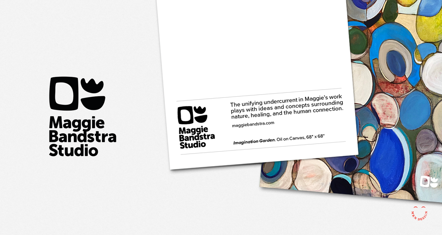
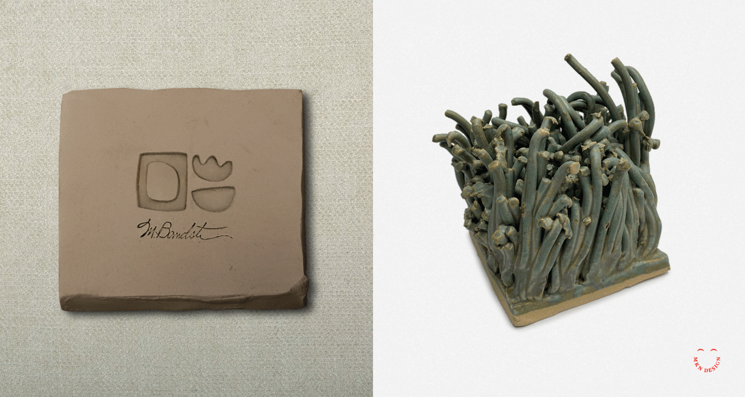
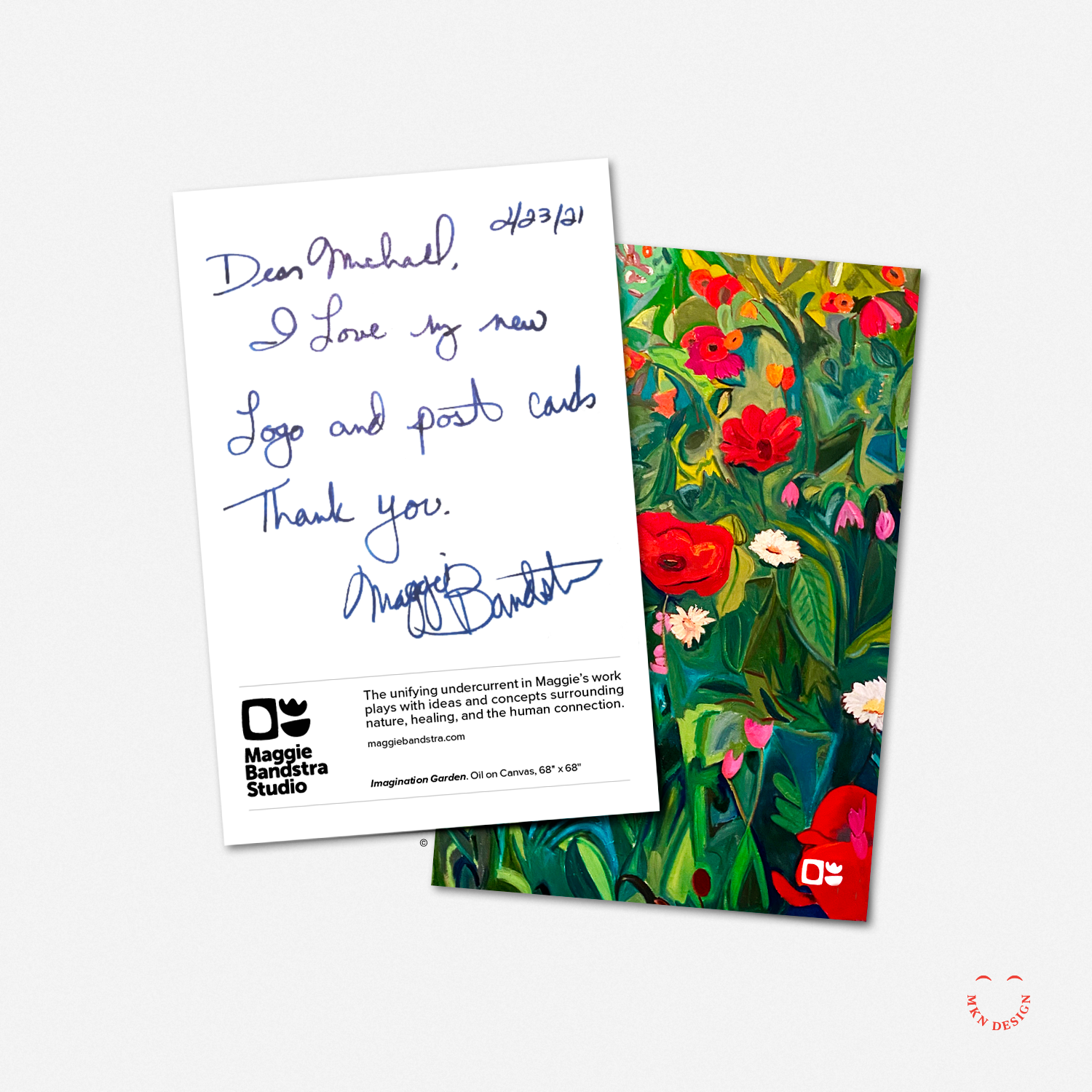
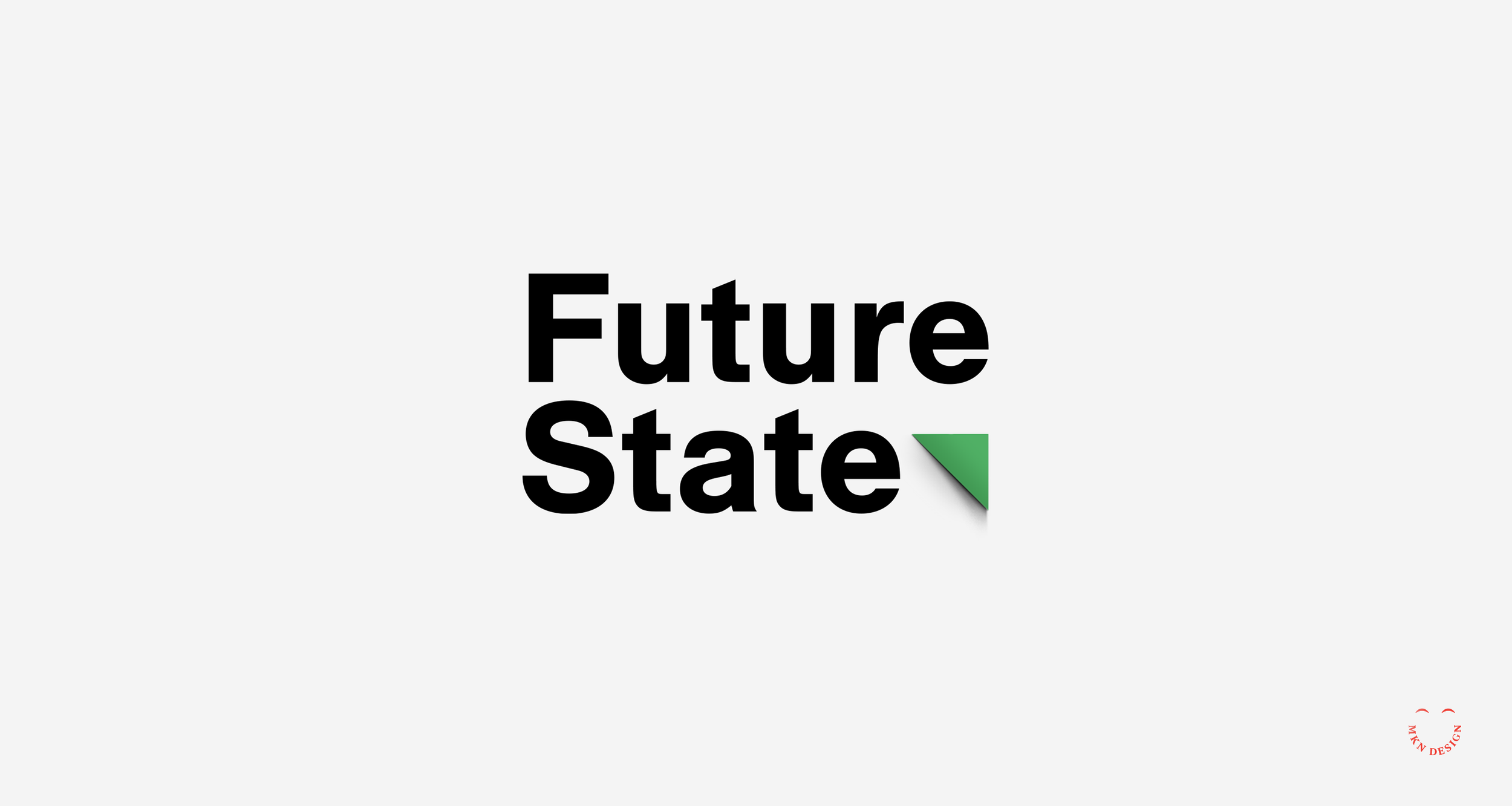
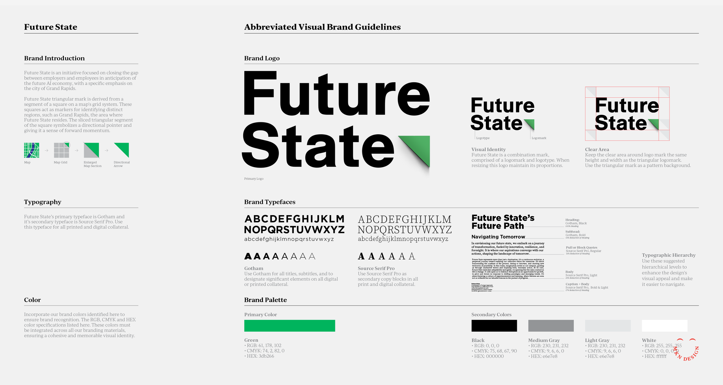
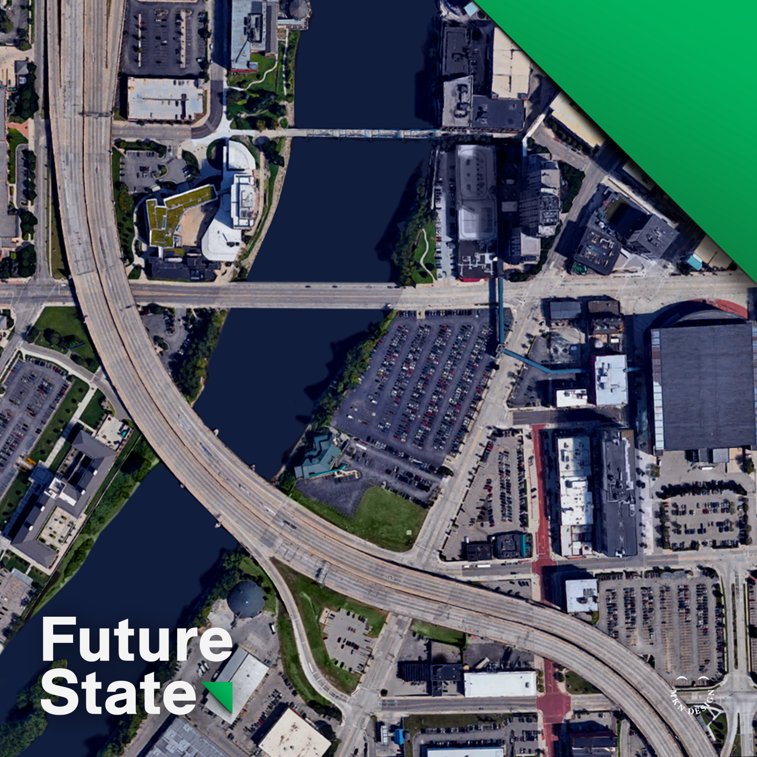
It was from these foundational beginnings that I naturally flowed into practicing graphic design, but with a unique, visually driven, illustrative approach woven into my design work. Over time, this developed into my style and has helped me shape brands and build design materials grounded in thoughtfulness, meaning, clarity, and how people relate to and engage with them.

Not only have these foundations shaped my work, but they’ve also led to a set of guiding principles, approaches that continue to influence how I collaborate, problem-solve, and design with purpose.

These are the guiding principles I work by (in no particular order):

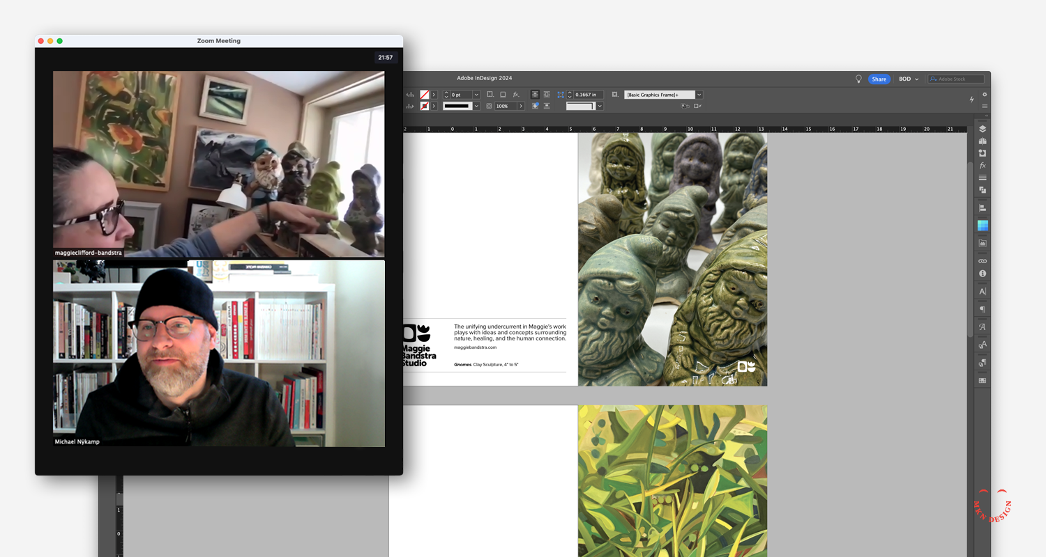
• Design Happens Together
• Approached with Thoughtfulness
• Design with Intention
• Acumen Equals Impact
• Crafted to Compel

  • This article expands on an later piece I wrote where I reflect on my process and why principles matter.

    5 Principles Behind the Process

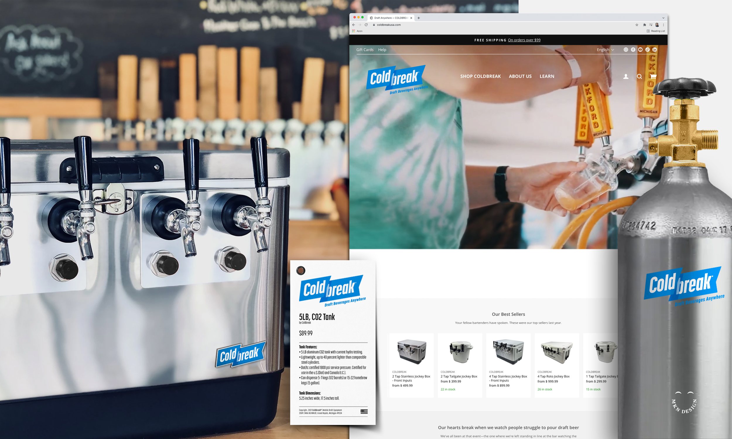
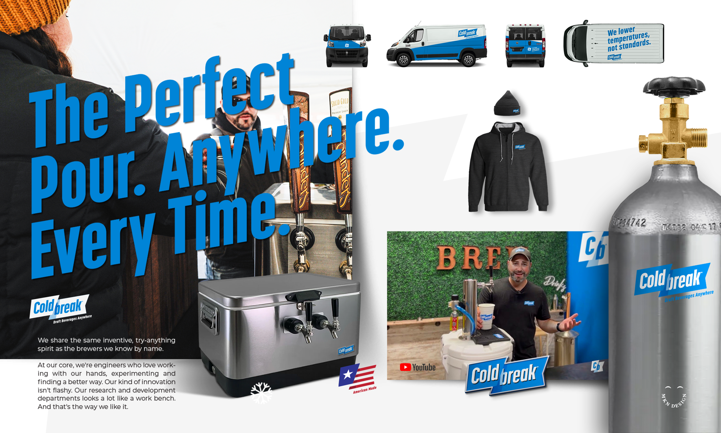
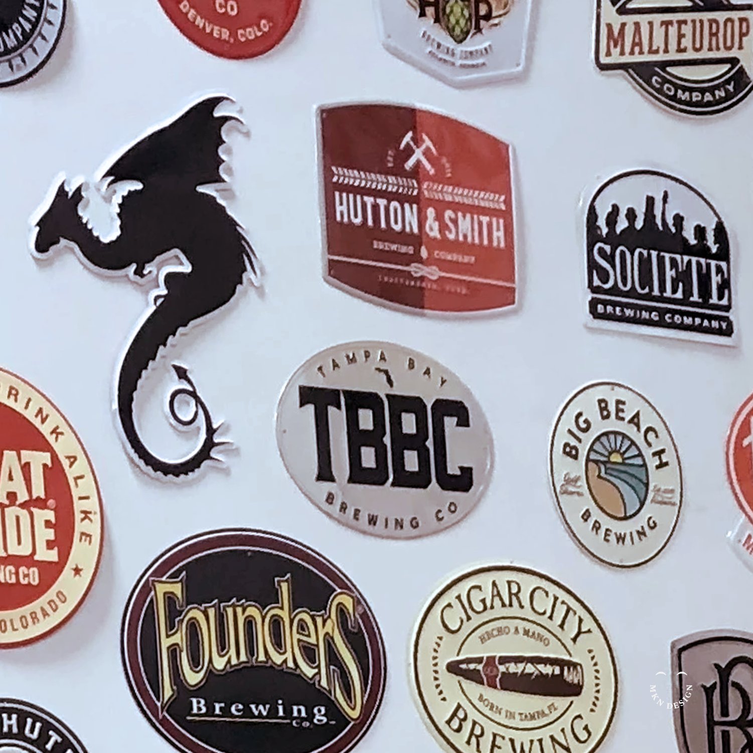
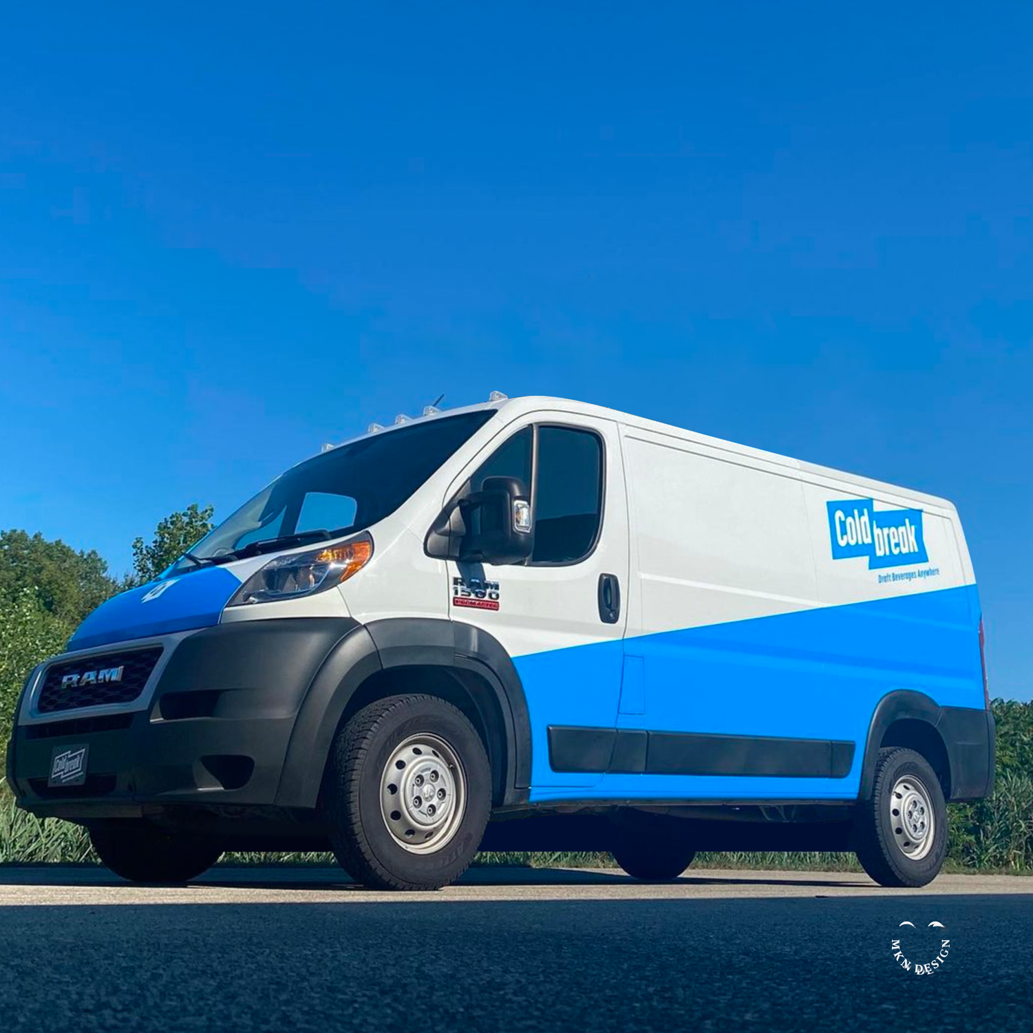
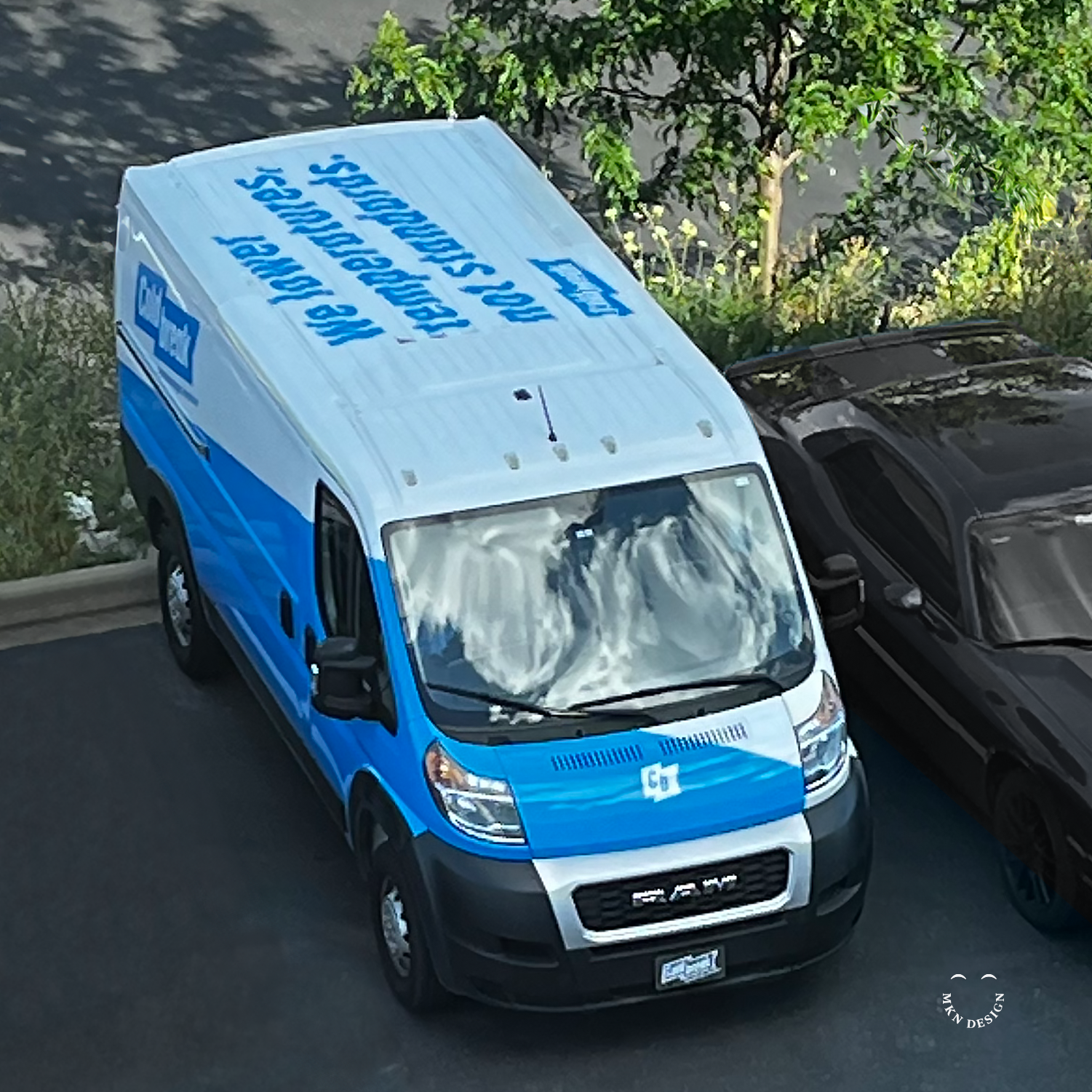
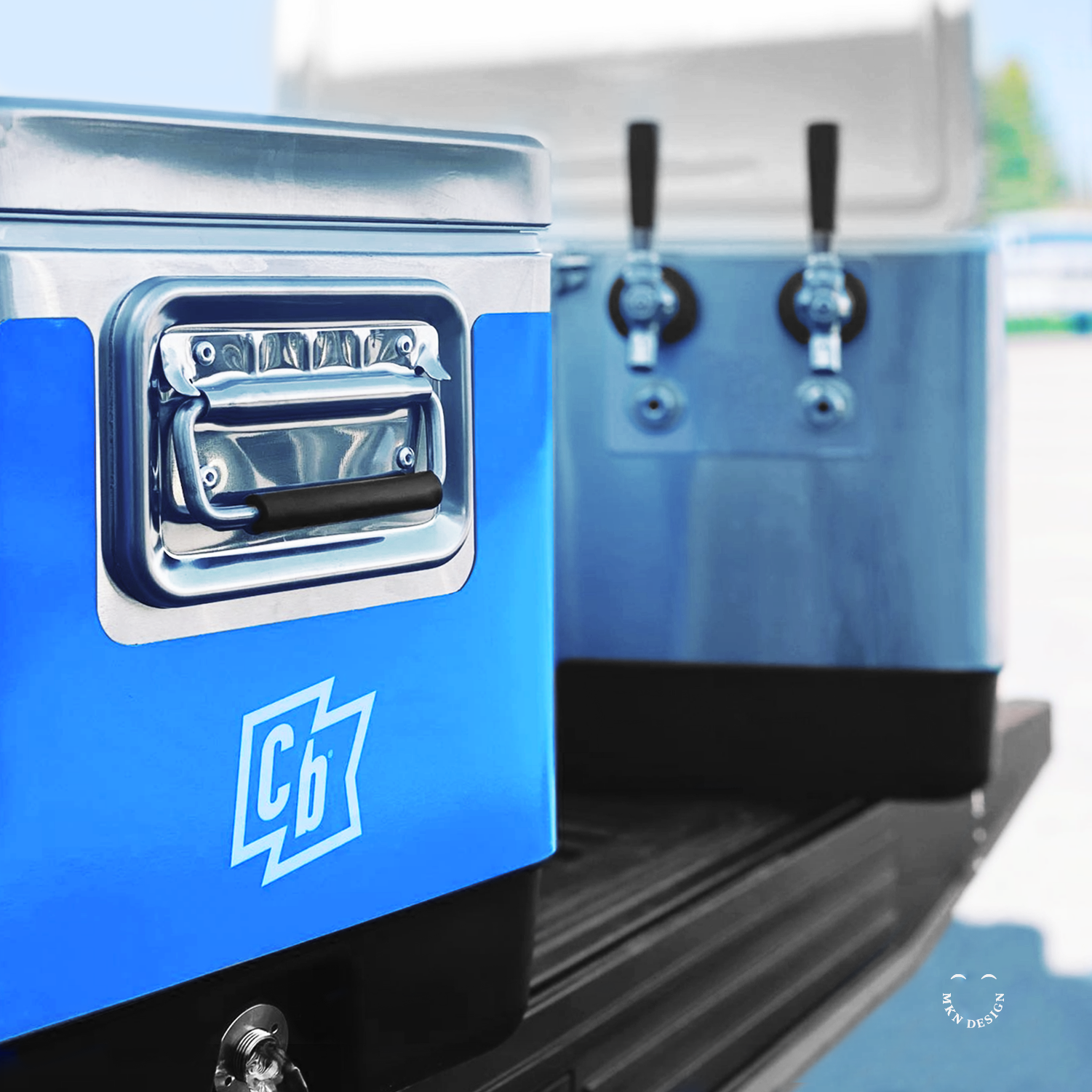
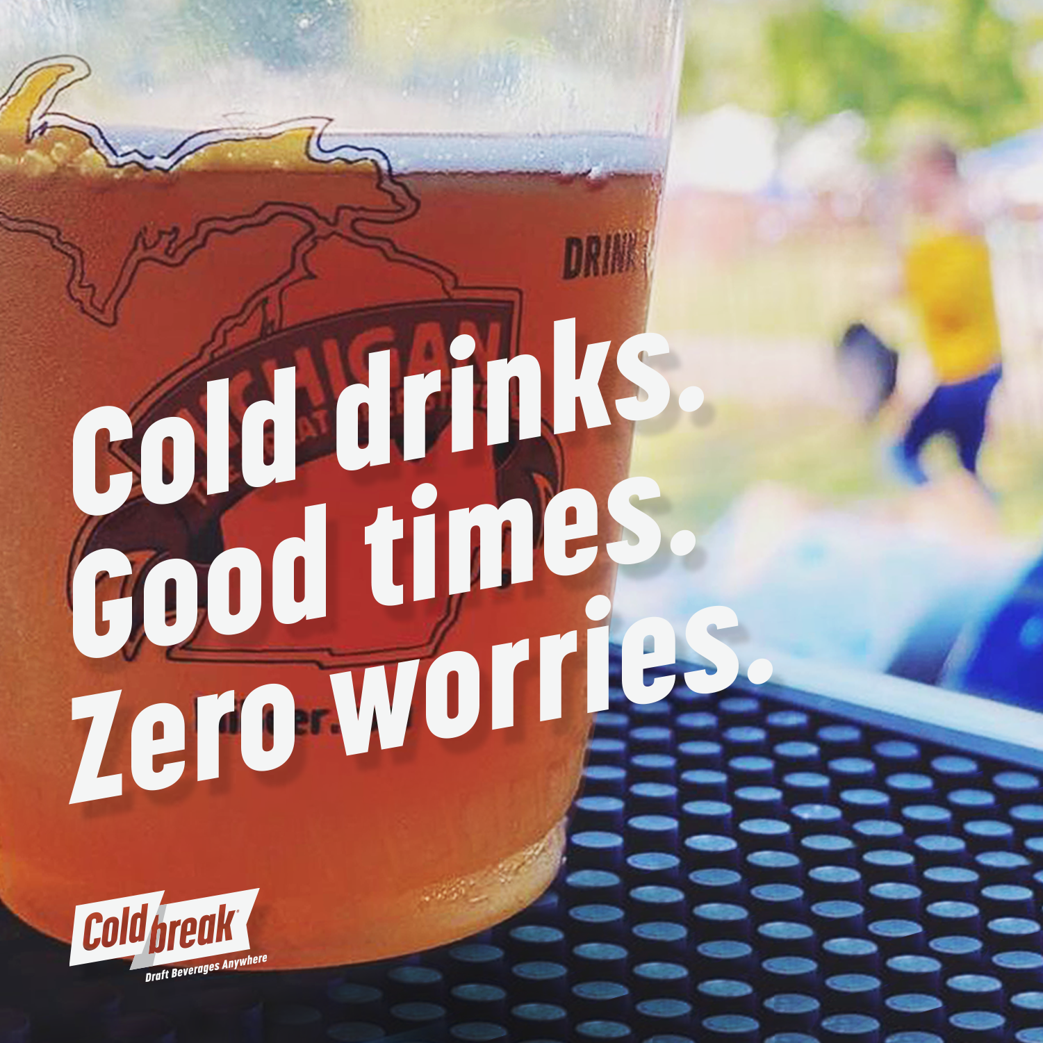
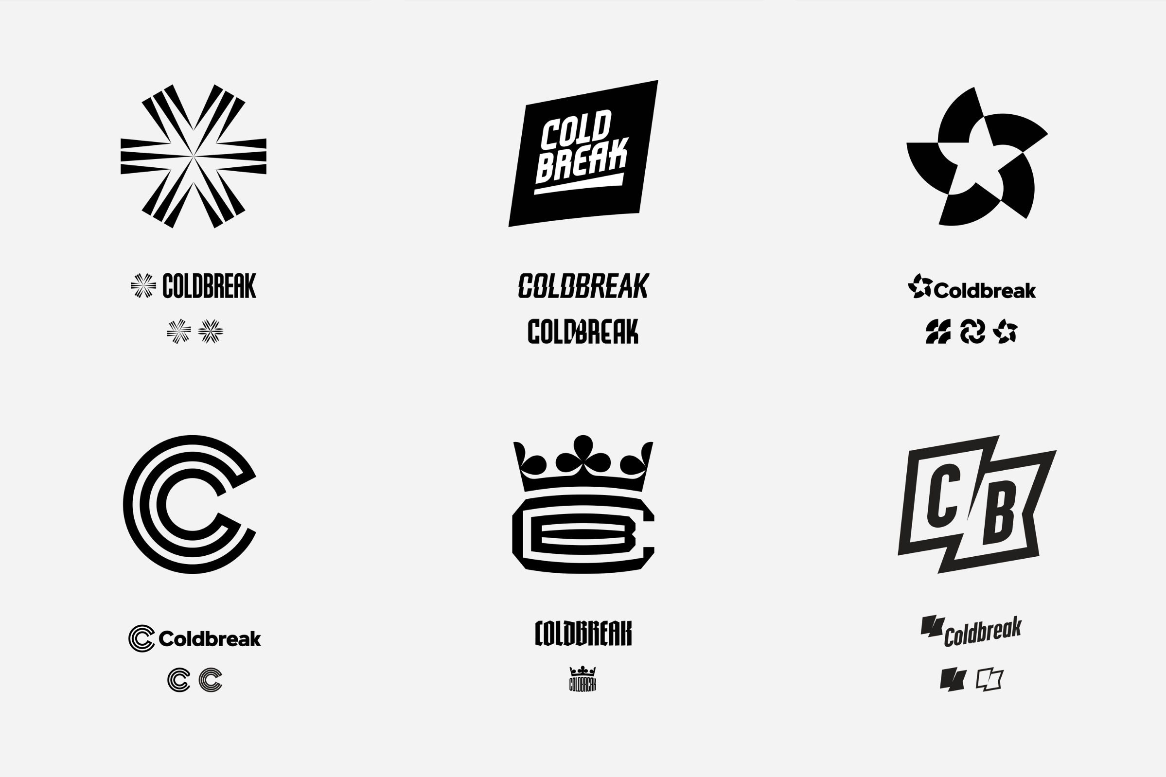
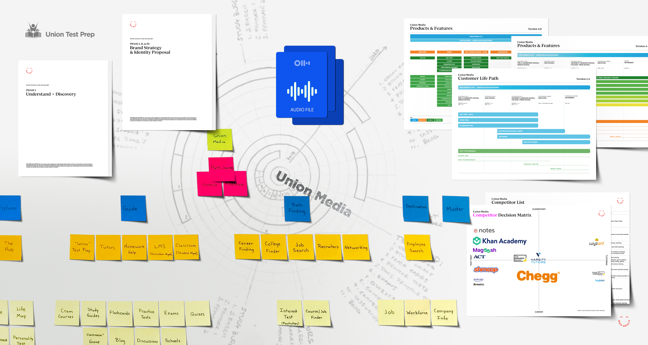
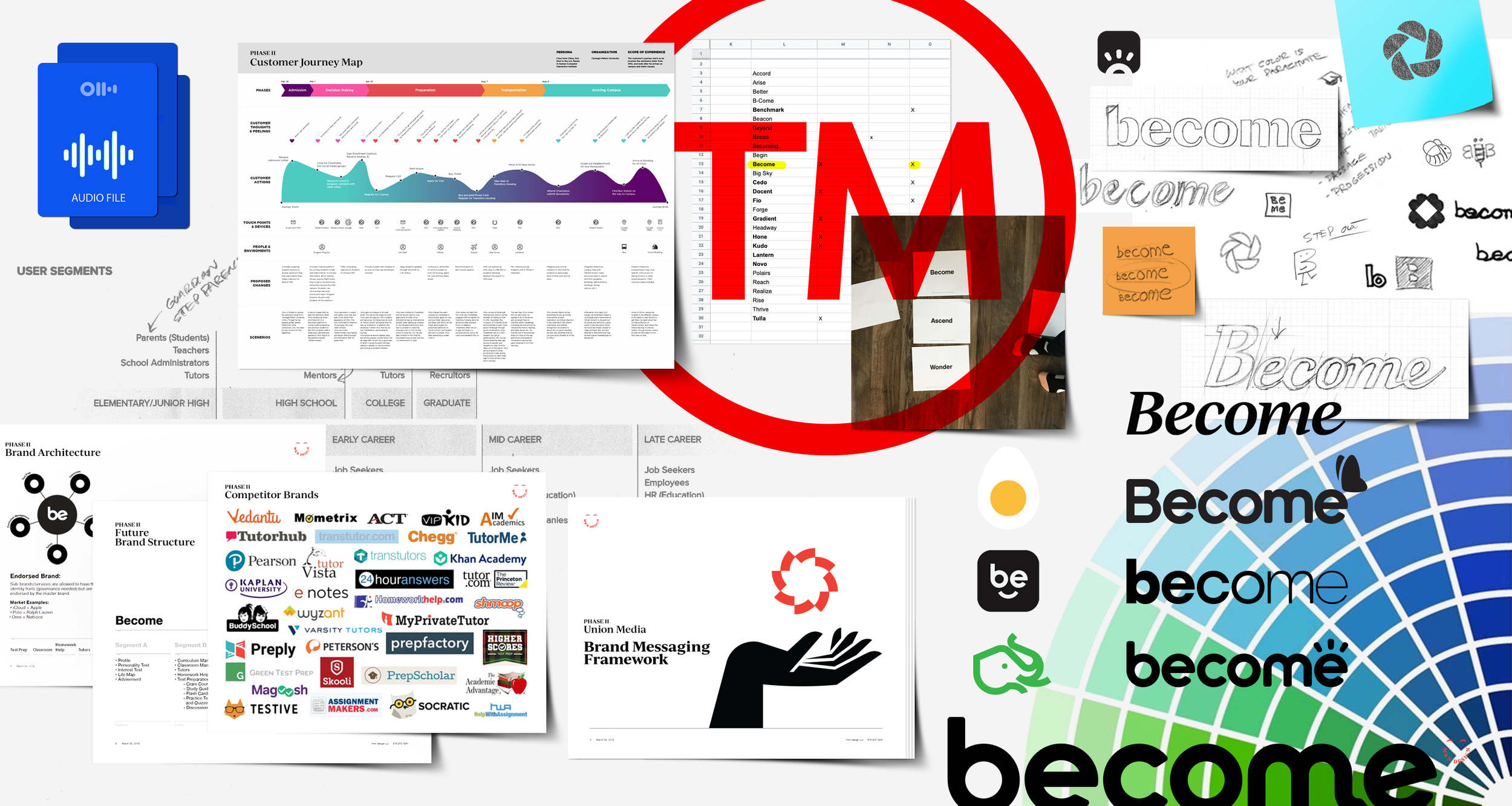
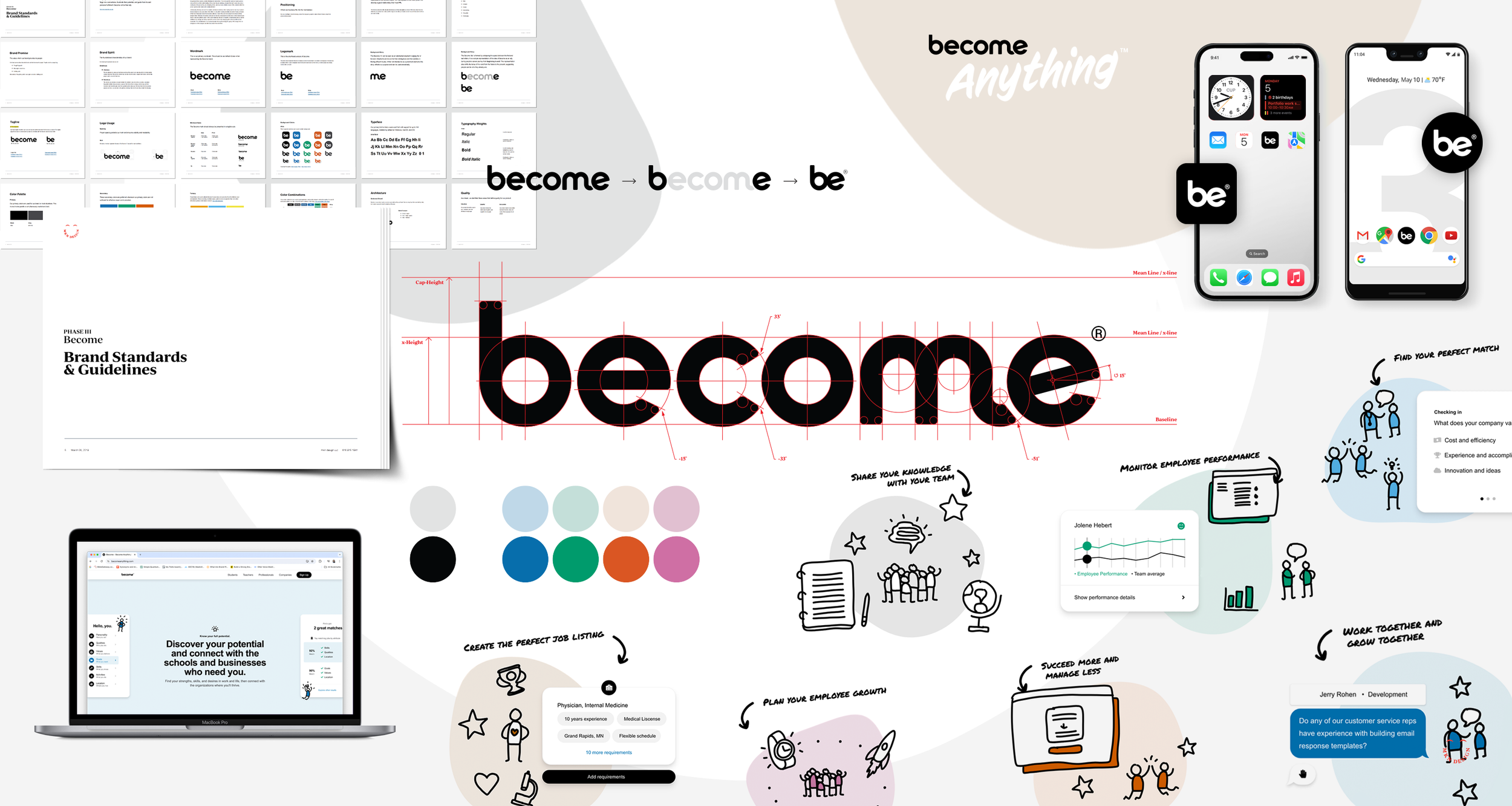
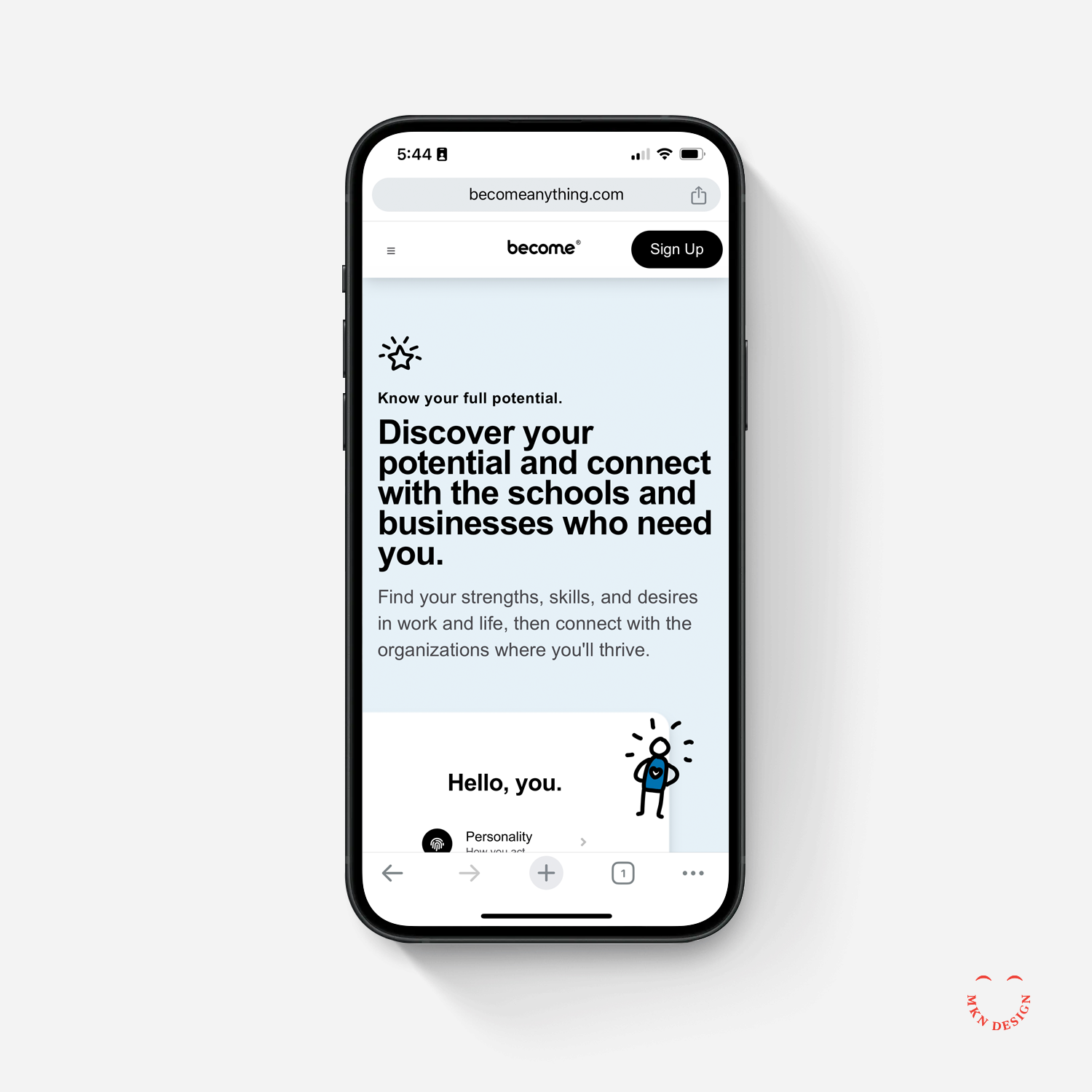
  • The reel above is a mix of client collaborations and personal creative explorations I’ve pursued between projects. They express the breadth of my skills, my evolving style, and the passion I bring to every piece of work—whether driven by client goals or personal curiosity.


Luminous – Brand Identity


↑ Brand Development Deck
Deck slides are an overview of the process behind defining and executing the development of the Luminous identity.


↓ Abbreviated Brand Guidelines
The below guidelines outline the essential elements and standards for presenting the Luminous brand accurately.

Client Project


Luminous – Brand Identity
Luminous engaged us to elevate its master brand and portfolio, guiding the development of a comprehensive visual identity that connects the parent brand with its sub-brands, reflects its mission, and positions it distinctively in the optical market. Luminous originated from Jonas Paul Eyewear and today, Luminous serves as the holding company for Jonas Paul and several other optical brands—dedicated to, “Shedding light into every corner of the optical space.”

Guided by research, collaboration, and informed insights provided by the team, my primary design goals were to establish a strong identity that connects the master brand with its sub-brands, stands out in a competitive market, and reflects boldness, innovation, and meaningful impact.

Despite early design challenges, our shared determination and open dialogue allowed us to refine concepts until one emerged that aligned seamlessly with the brand’s vision, core audience, and markets. Achieving this alignment demanded a rigorous process, carefully balancing innovation, design, and brand consistency.

The result is a distinctive and innovative identity that thoughtfully reflects their mission and current brand offerings. It embodies quiet sophistication—illuminating rather than overwhelming—and conveys intentional brilliance balanced with confident contrast, capturing the essence of the brand.

 
  • Luminous
    Portable Draft Beverage Systems

  • Brand Identity

  • + Brand Advisor
    + Concept Development
    + Creative Direction
    + Qualitative Research
    + Visual Identity


Riot Games – Iconography Design System


Pengu

Dan

Tacibear

Poro


Client Project


Riot Games – Iconography Design System
Monotype hired MKN Design to assist in leading Riot Games’ development of a custom, scalable iconography system. We oversaw iterative design, cross-team collaboration, and standards development, culminating in the delivery of an iconography library, which supports the brand’s growing product ecosystem and strengthens its visual language. Over the project’s six-month period, I co-led the effort as the icon systems specialist. My role focused on guiding, developing, and establishing standards that shaped a comprehensive toolkit of pixel-perfect icons, capturing the bold and playful spirit of Riot Games.

The goal of this project was to create a cohesive iconography system of 350+ icons that scaled seamlessly across three sizes—16, 24, and 32 pixels—while staying true to Riot Games’ brand. The system was designed to be bespoke, scalable, and unified—enhancing the user experience, reinforcing the brand’s visual language, and ensuring consistency across all Riot products.

The process involved research, iterative design, and collaboration across Monotype and Riot teams to ensure each icon met functional and aesthetic requirements. Every icon was carefully crafted to be pixel-perfect, visually cohesive, and easily recognizable at multiple sizes. This iconography system not only provides a sustainable foundation for developing future icons that align with Riot’s brand but also streamlines workflow, supports cross-product consistency, and strengthens the overall player experience.


Learn more about the process of developing and crafting this extensive iconography set.

“MKN Design played a key role in developing a strategic and refined iconography library for Riot Games. Their leadership and guidance across both Monotype and Riot Games ensured seamless collaboration, aligning the visual identity with brand goals through a thoughtful and systematic approach. They demonstrated the ability to solve complex design challenges while maintaining keen attention to detail, making a significant impact on the project’s success. Reliable, communicative, and consistently exceeding expectations.”

Robert Ignasiak
Product & Interaction Lead, Riot Games

 
  • Monotype & Riot Games
    Video Game Software & Entertainment

  • Iconography Design System

  • + Client Liaison
    + Co-Leadership
    + Brand Advisor
    + Design Direction
    + Design Ideation
    + Iconography System Design
    + Iconography System Guidelines
    + Illustration
    + Qualitative Research
    + Visual QA & Testing


Flagship


Creative Musing
December 2023

__
Flagship
Wordmark for Flagship. The typeface I used is Good Headline designed by Łukasz Dziedzic from FontFont.


ITHAKA S+R – Brand Collateral Design System


Client Project


ITHAKA S+R – Brand Collateral Design System
ITHAKA S+R, an organization that conducts research and provides strategic guidance to help the academic community navigate economic and technological change, needed a unified design system for all their communication materials. They hired us to modernize their system by creating an accessible, brand-compliant design that could be easily updated and maintained by their team.

A key requirement was enabling staff to create or update all redesigned materials. Our research identified Google Workspace (Docs, Slides, and Sheets) as the optimal platform for implementation. The resulting design system follows Ithaka’s brand guidelines, incorporates accessibility considerations—including color blindness and visual impairments—and provides clear, distinct visual cues for different document types such as case studies, issue briefs, research reports, and unpublished reports.

Through iterative design explorations, we delivered a unified system that gives Ithaka’s educational research materials and presentations a consistent, distinctive, and accessible visual identity.

 
  • ITHAKA S+R
    Research & Consulting Services

  • Brand Collateral Design System

  • + Concept Development
    + Creative Assets
    + Illustration
    + Infographic Design
    + Qualitative Research
    + Visual Identity


Remarker


Client Project
May 2013

__
Remarker
Collaborating with Sung Yi via Carambito I assisted with developing a logo and defining the aesthetic of his notebook. Through thorough research, it became evident that the logo needed to embody both the notebook’s simple sophistication and resonate with its intended audience. The outcome was a logo that conveyed individuality and simplicity. The logos freehand script mimicked a fluid motion of pen meeting paper. Crafted to be comfortably handheld, this product provides effortless access to personalized index cards that perfectly align with users’ needs.

Crafted to securely hold index cards, with future adaptability to accommodate cell phones. Users can choose from a variety of custom-designed index card options to suit their needs, including Blank, Dot Grid, Line Grid, Isometric Grid, Idea Card, Lined, Time Tracker, Task List, Hourly Task List, and Storyboard.

Notebook Dimensions:
• Closed Notebook: 5¼" x 3⅞"
• Open Notebook: 5¼" x 7¾"

  • + Brand Identity

  • + Creative Direction
    + Market Research
    + Concept Development
    + Sketching & Ideation
    + Graphic Design
    + Illustration

  • This product was developed and designed by Sung Yi of Carambito. MKN Design assisted with ideas around binding, fabric selection and developing a logo for the product.


Herman Miller Icon System


Client Project
May 2013

__
Herman Miller Iconography System
Led the Workplace Knowledge Team at Herman Miller (presently MillerKnoll) in the development and design of an iconography system pivotal in delineating crucial research methodologies within their workflow. These icons were not only instrumental in establishing definitive research practices but also needed to adhered to Herman Miller's strict brand guidelines.

  • + Iconography System

  • + Creative Direction
    + Research
    + Concept Development
    + Sketching & Ideation
    + Illustration