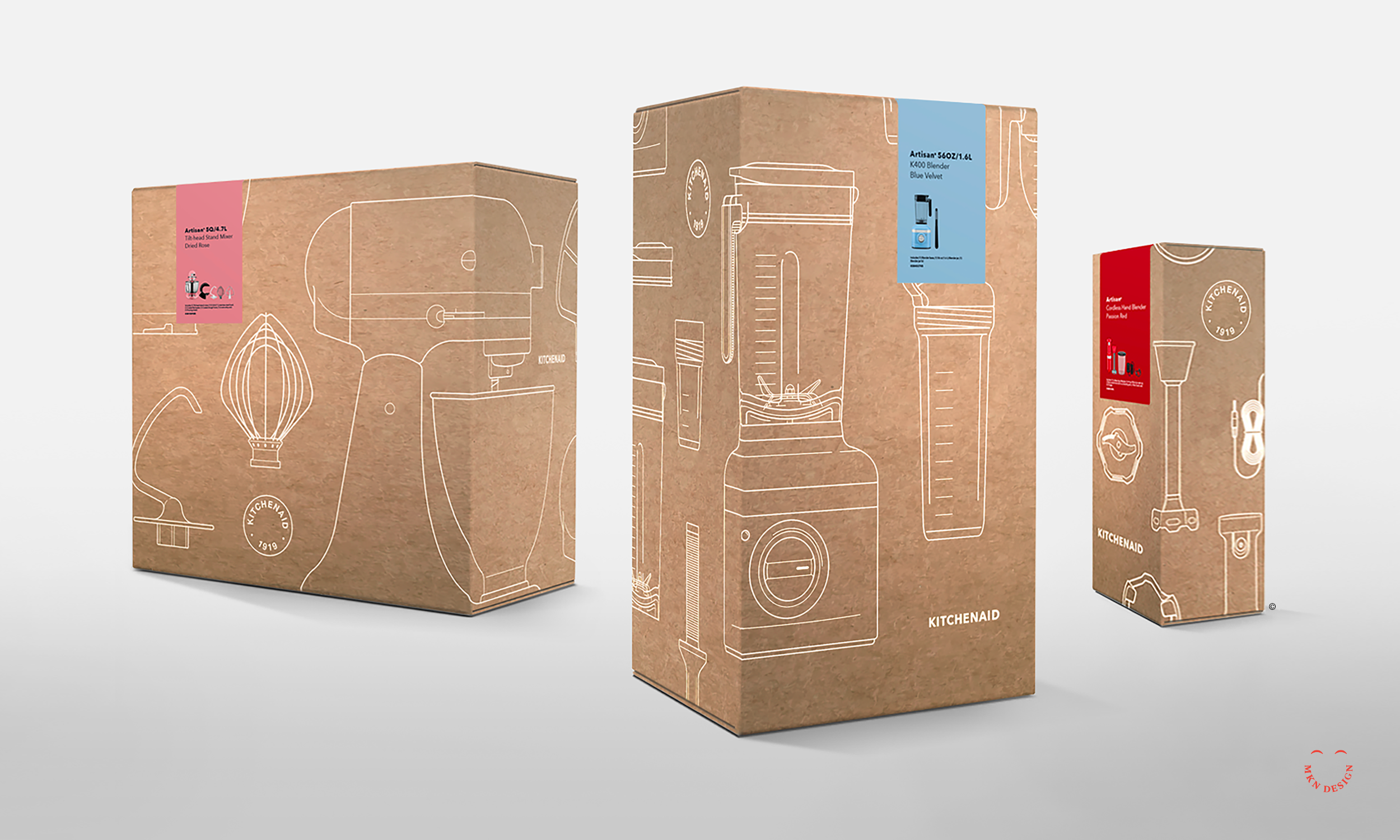
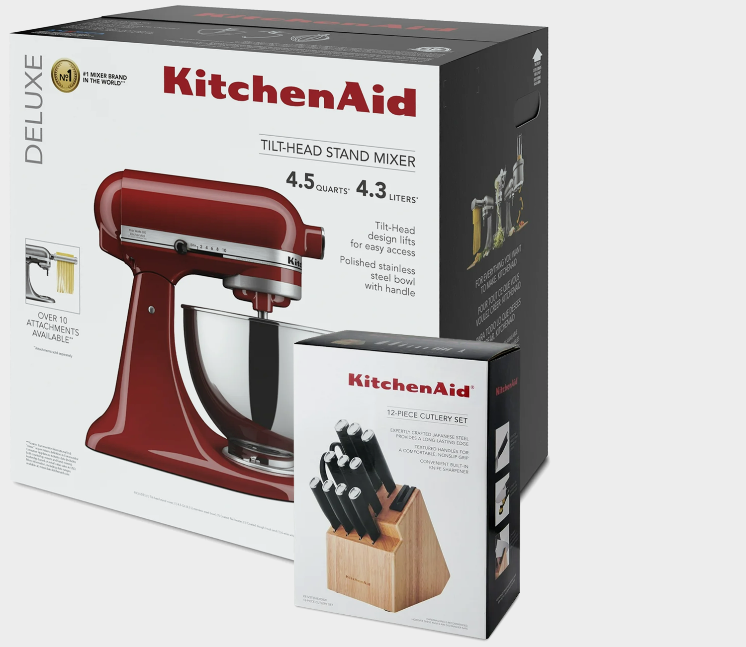
Building on research and consumer insights from the first phase, we developed a clear design strategy to guide multiple packaging concepts—showcasing KitchenAid’s products as innovative, high-quality, and reinforcing the brand’s position as a leader in kitchen appliances.
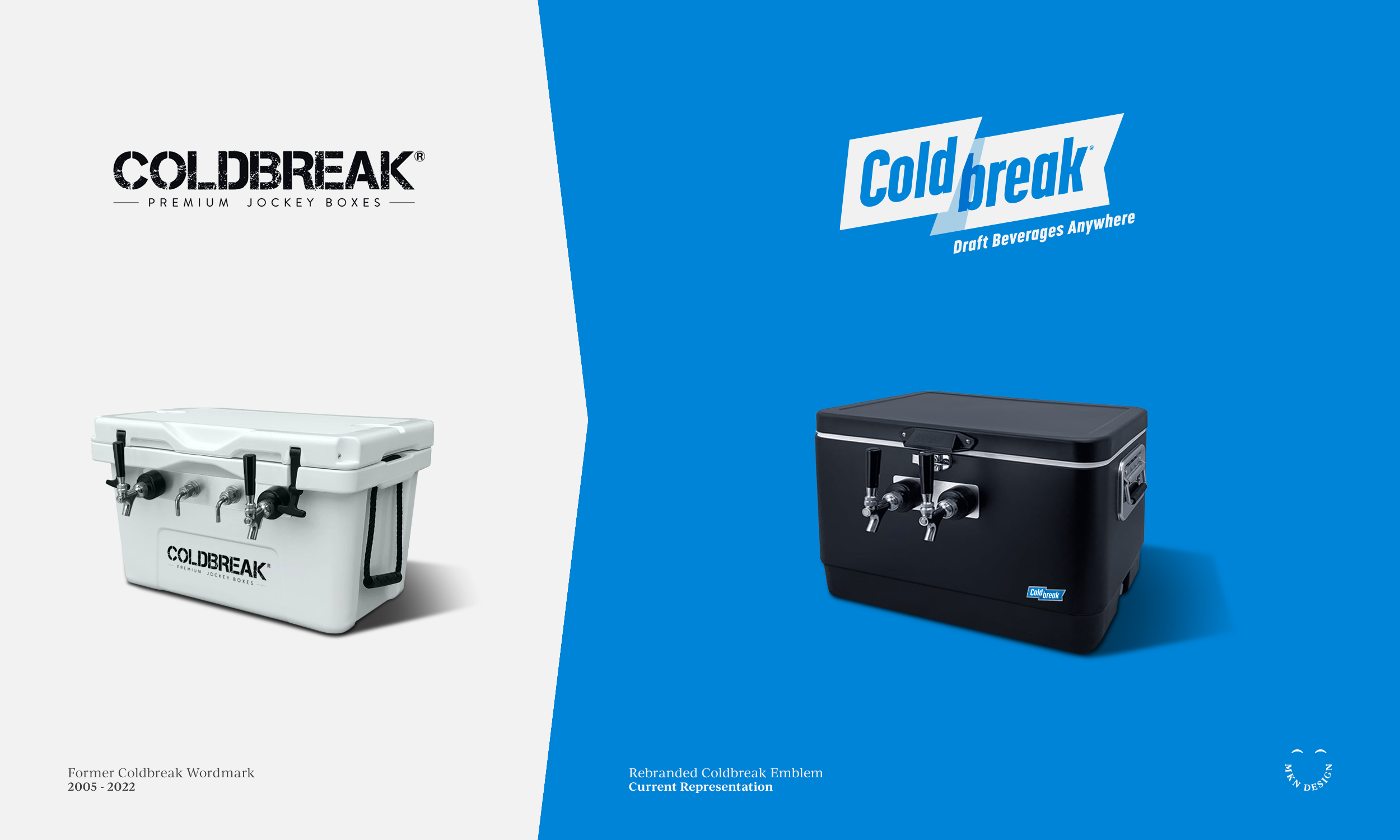
When we audited the existing packaging, it became evident that it no longer reflected the expectations of today’s consumers or the evolution of KitchenAid’s products. In a market moving toward bold simplicity, clean visual storytelling, and modern minimalism, the packaging appeared dark, cluttered, and outdated.
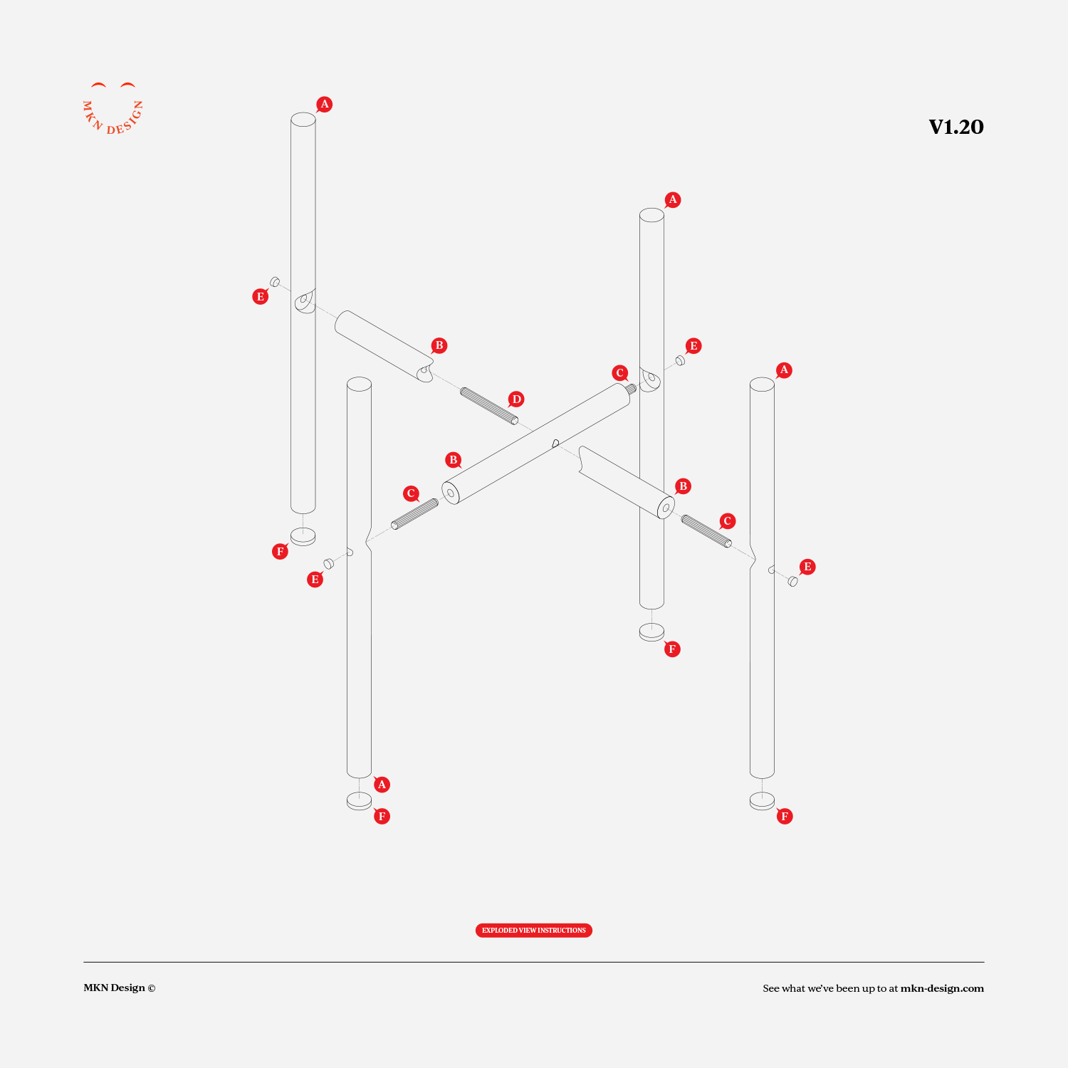
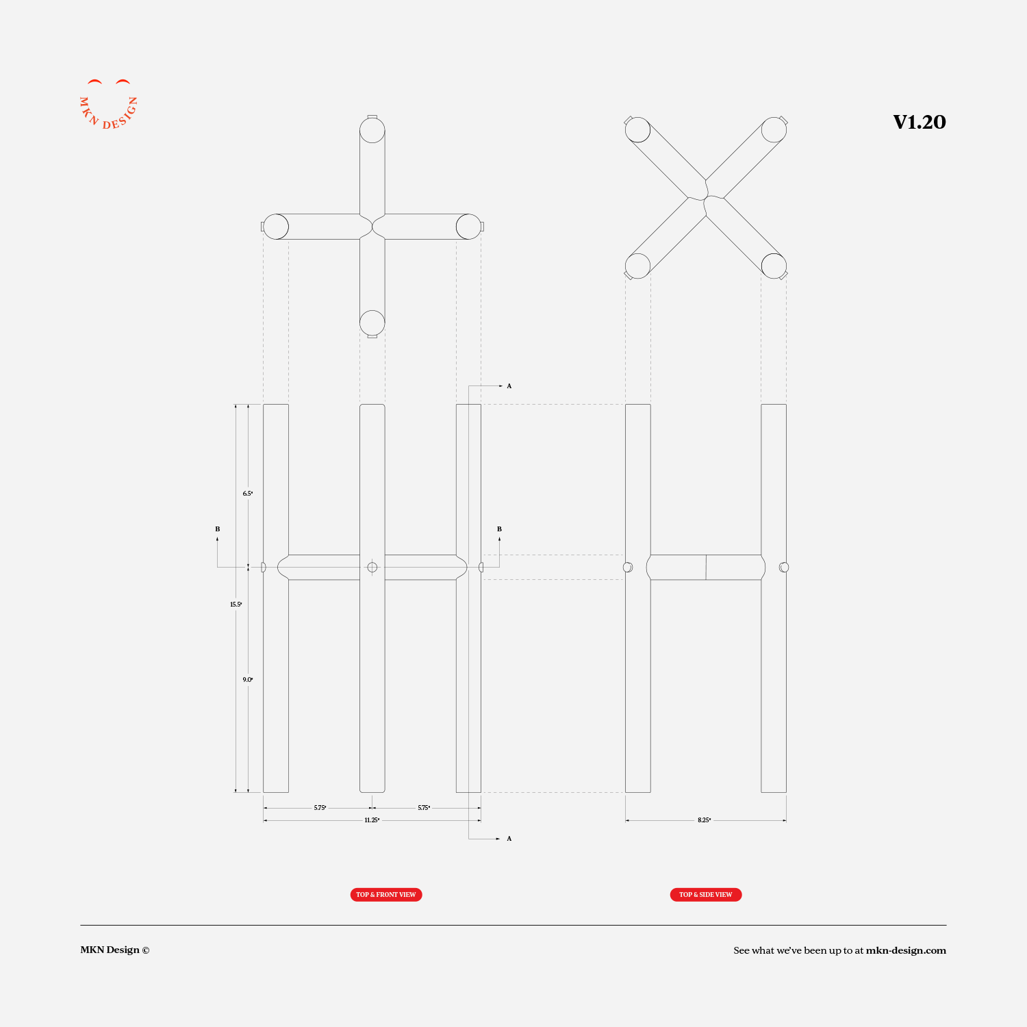
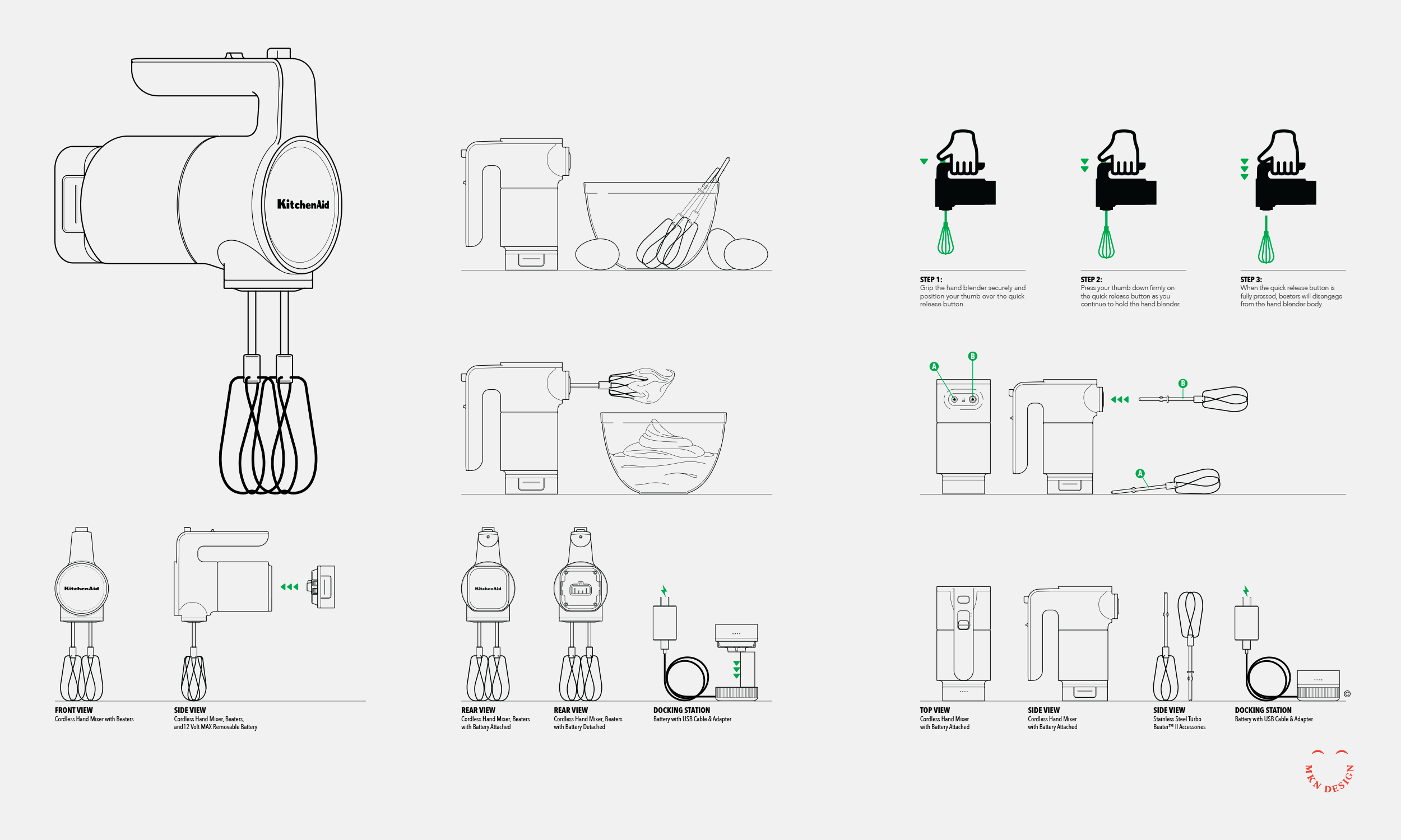
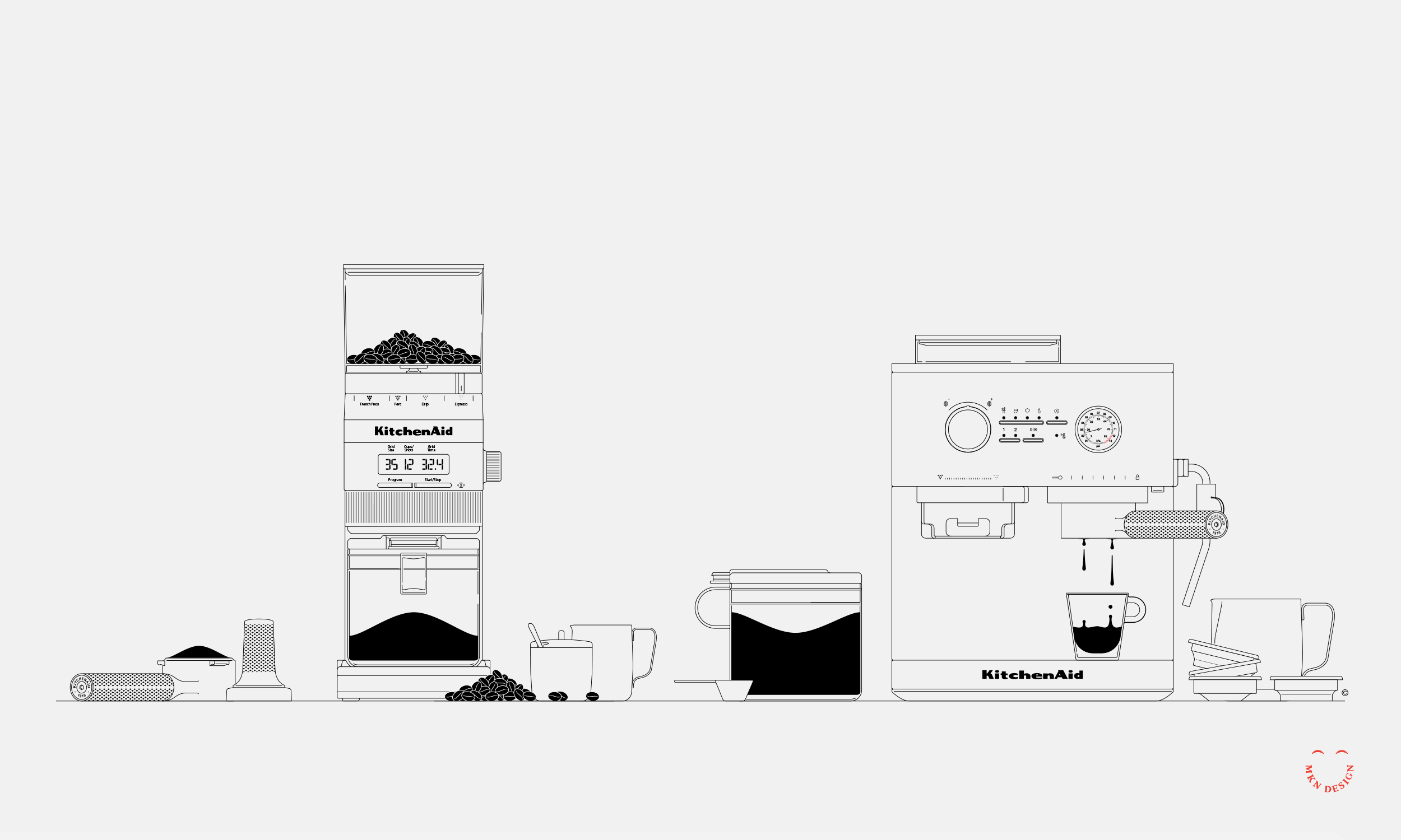
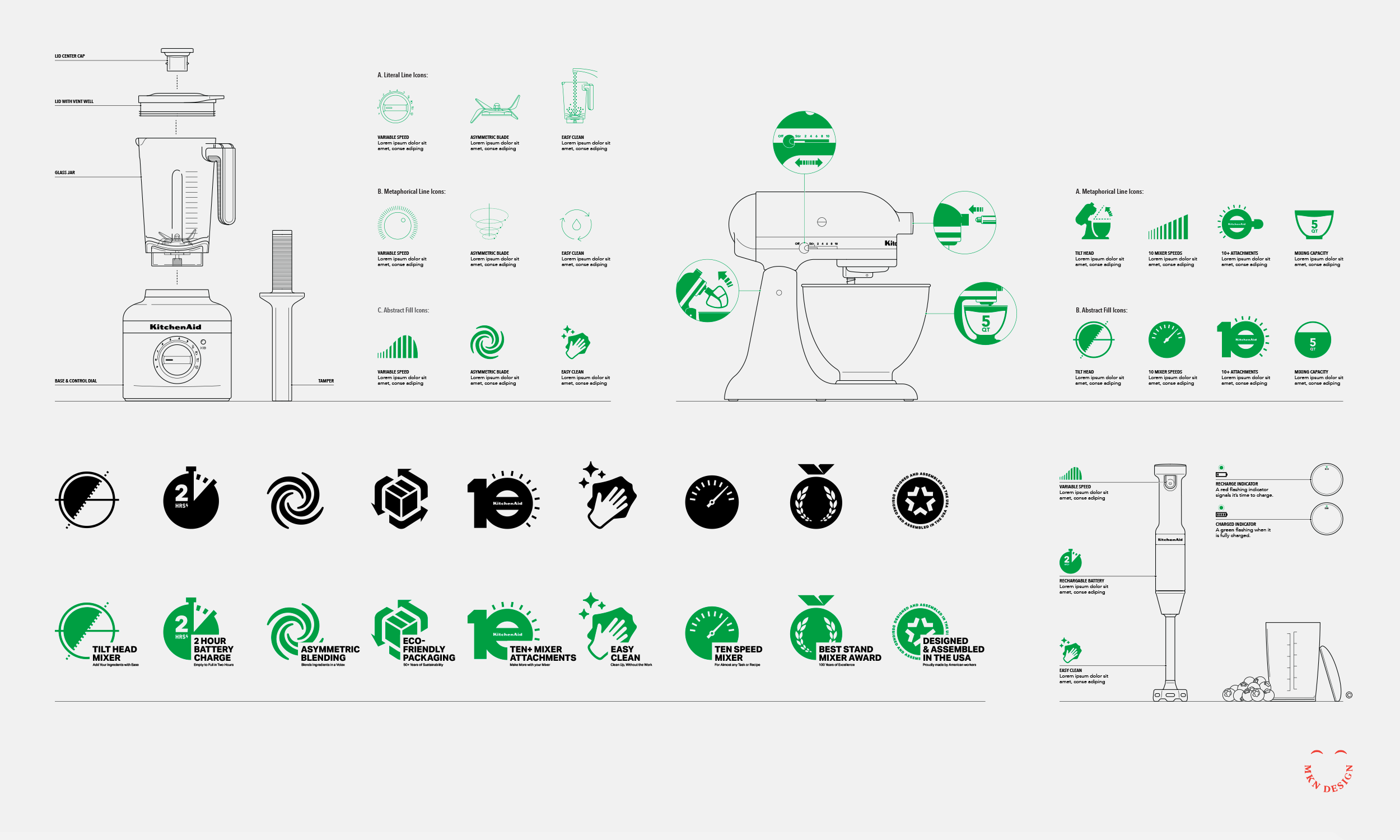
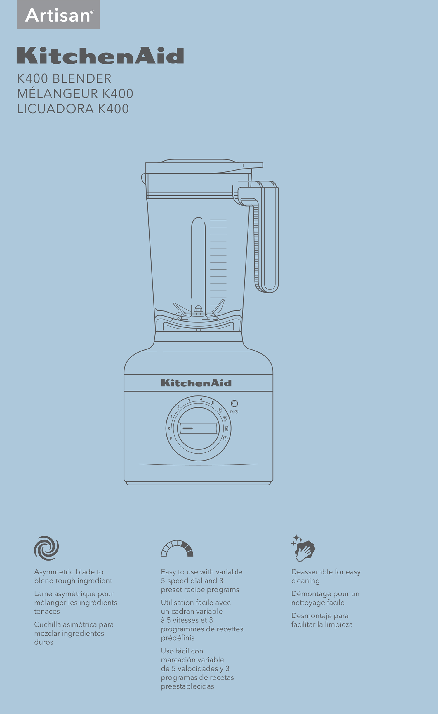
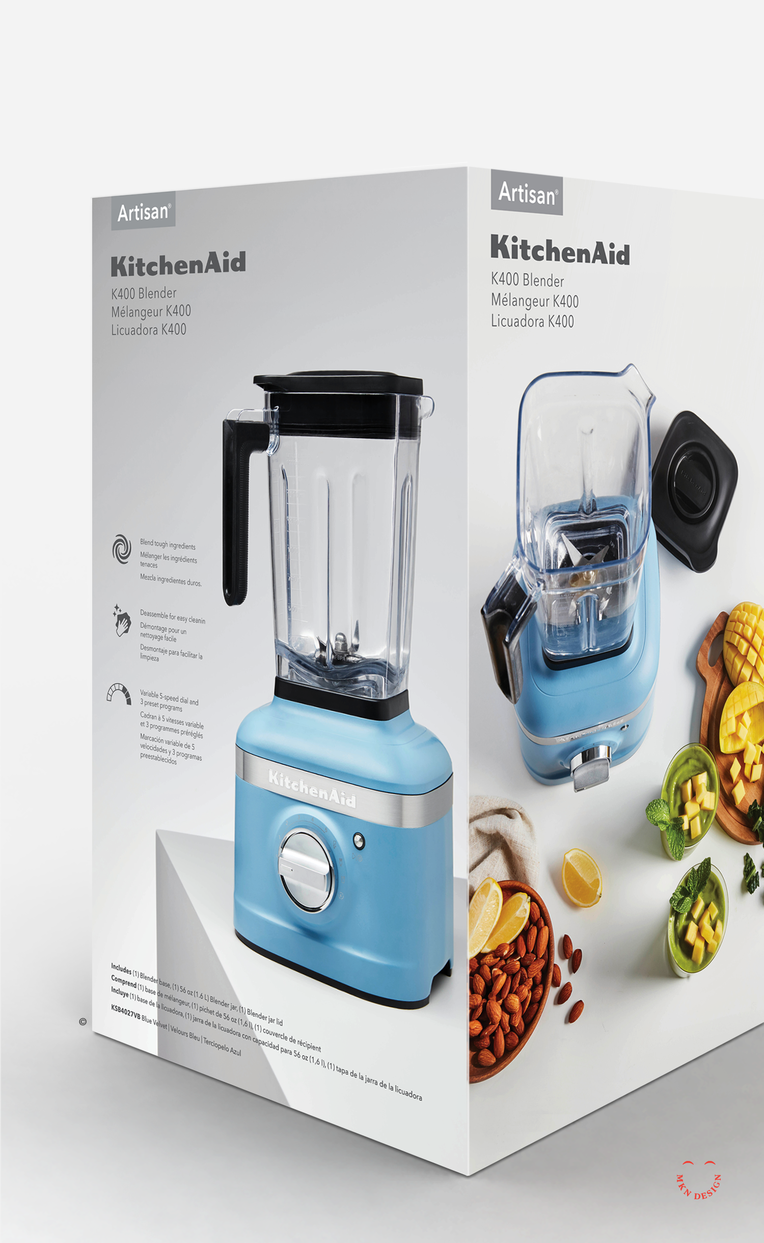
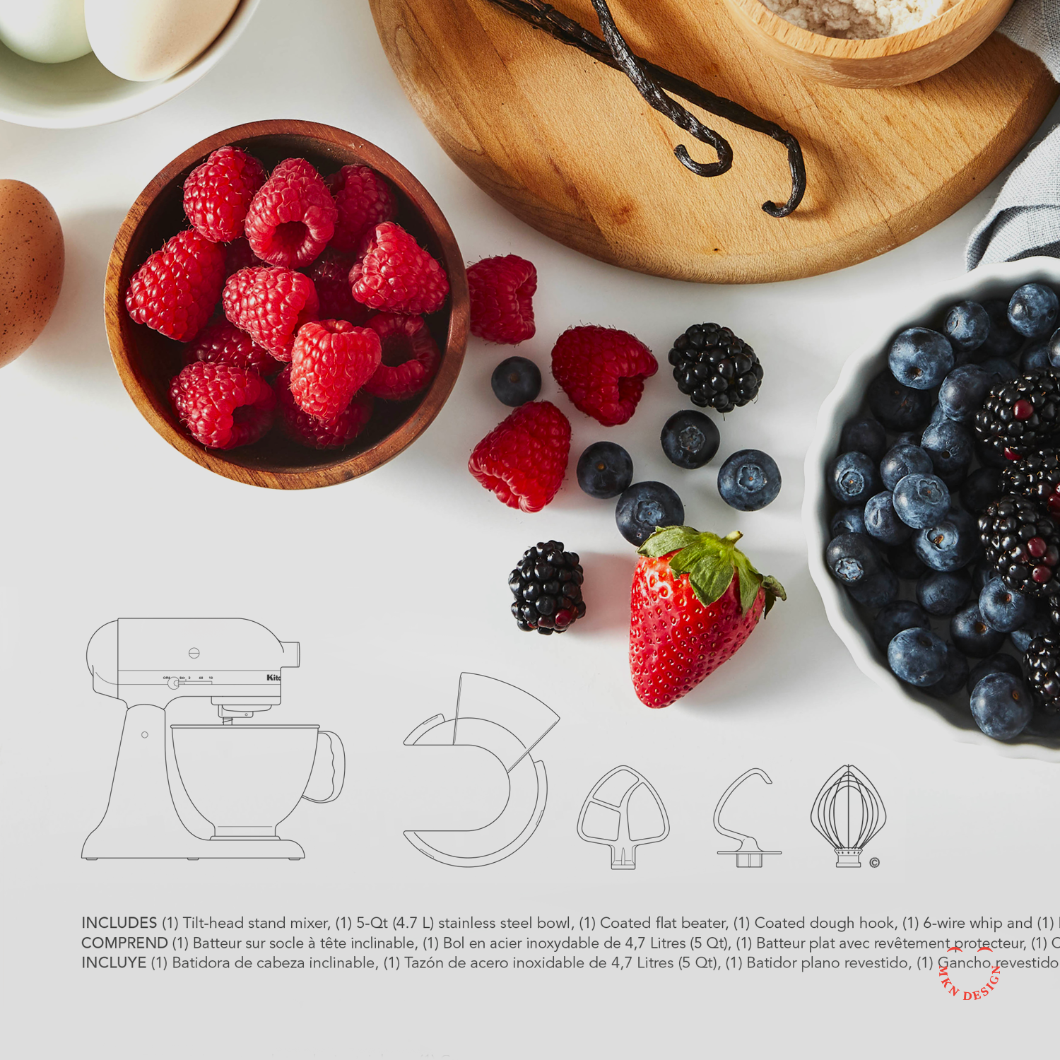
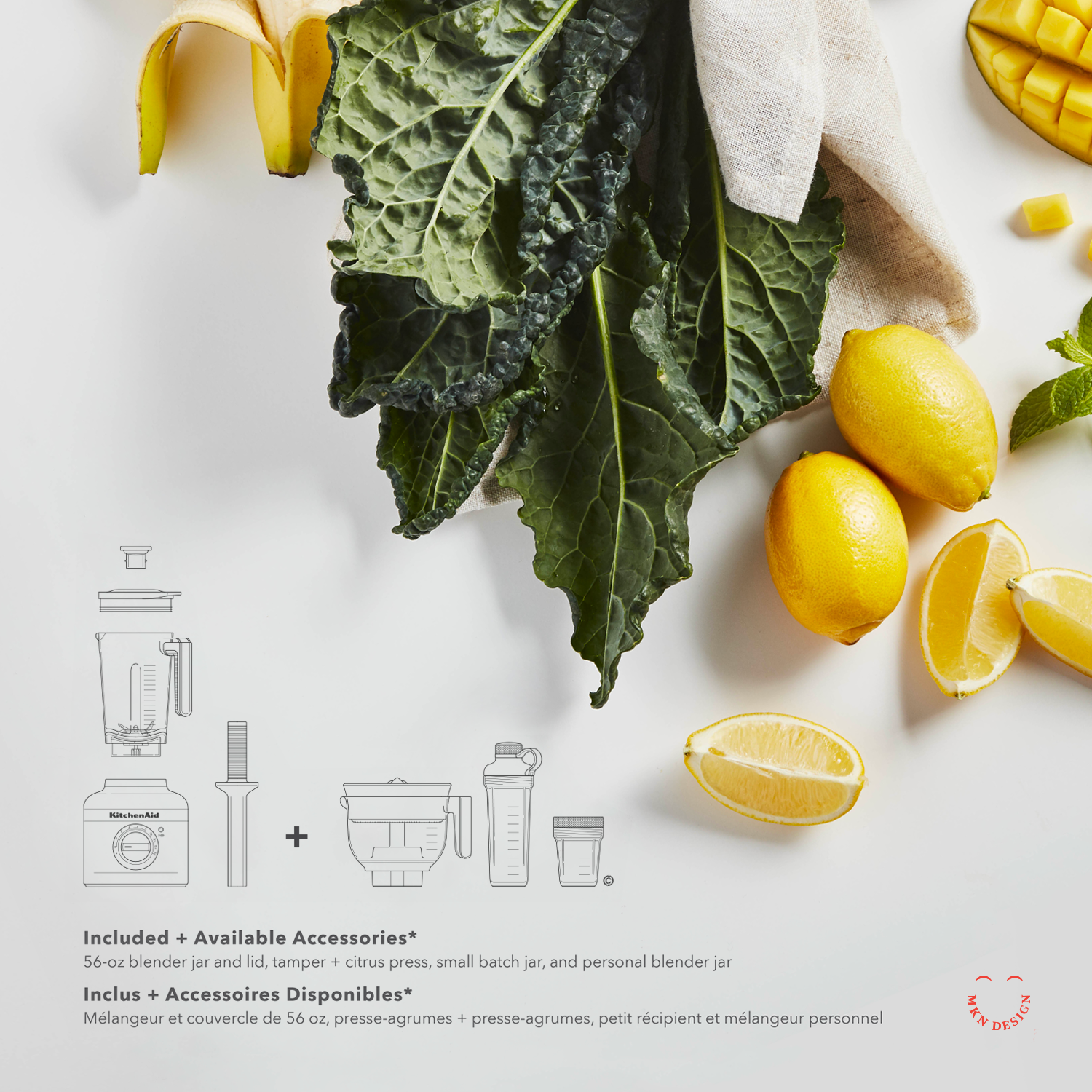
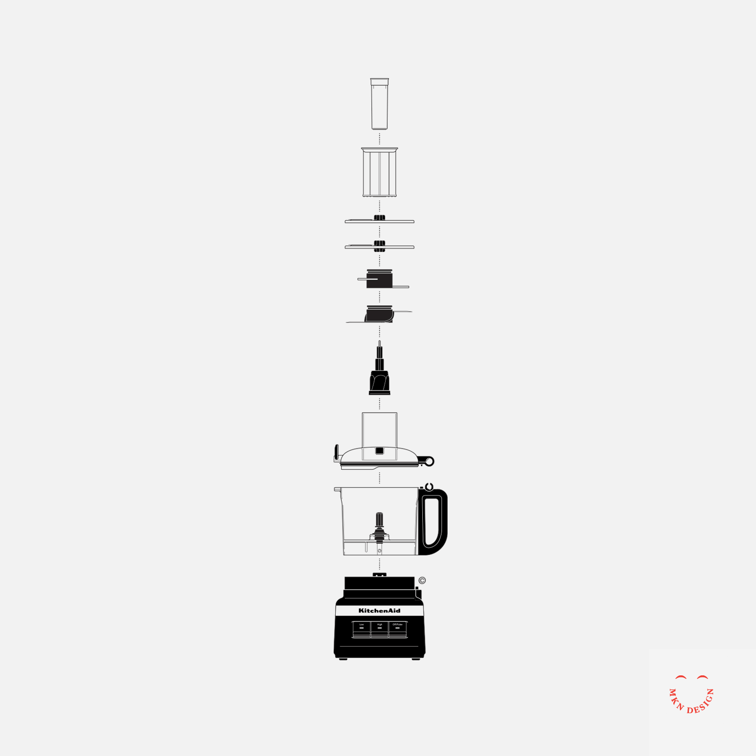
The design challenge was clear—reimagine the packaging in a way that honored KitchenAid’s heritage, spoke directly to today’s consumers, and embraced a modern visual language. To support this evolution, we also conceptualized a modern iconography language and illustrative system that could seamlessly integrate across the new packaging.
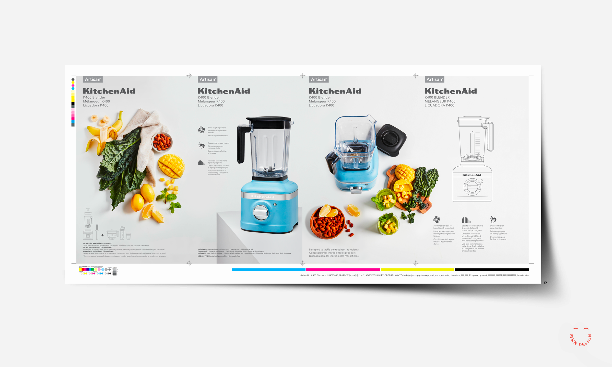
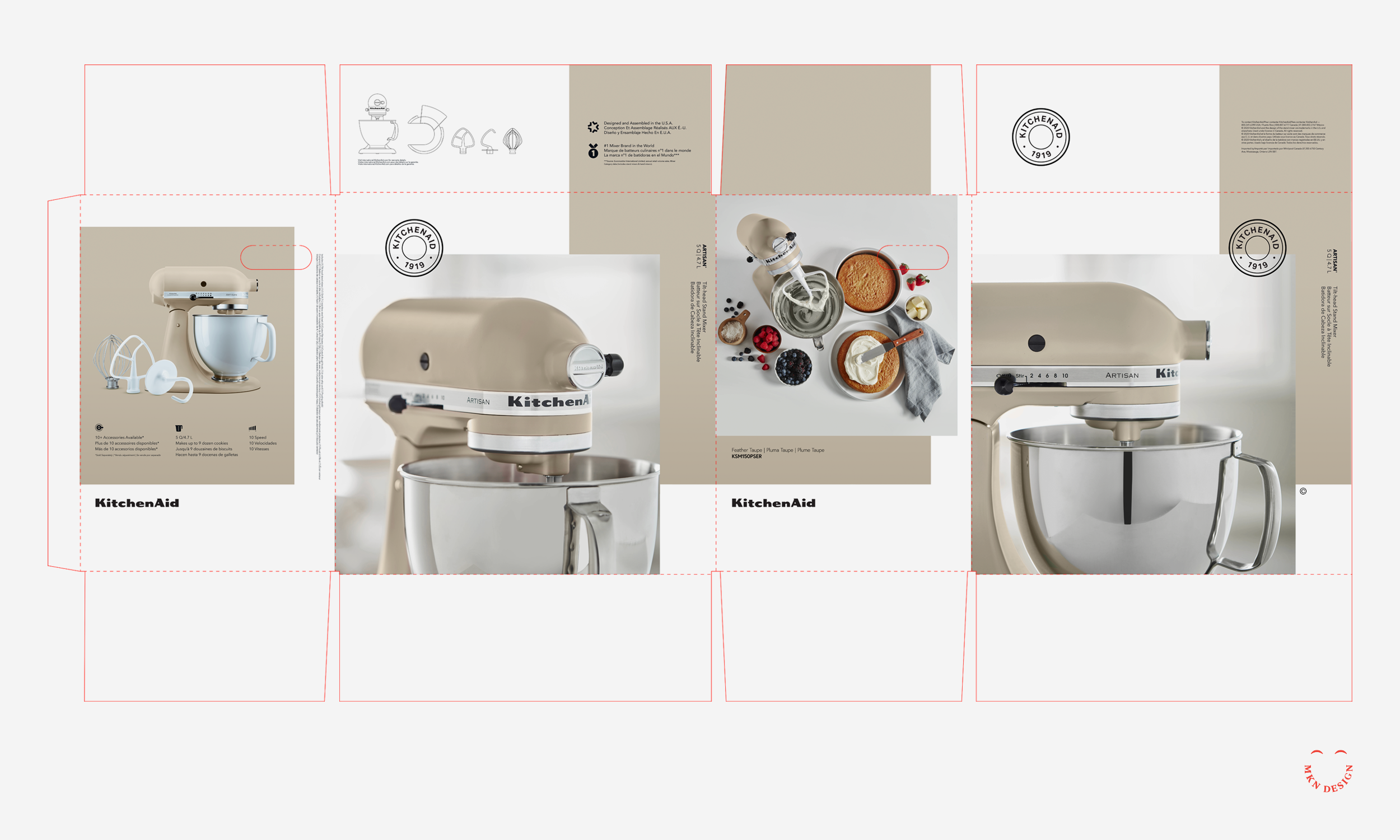
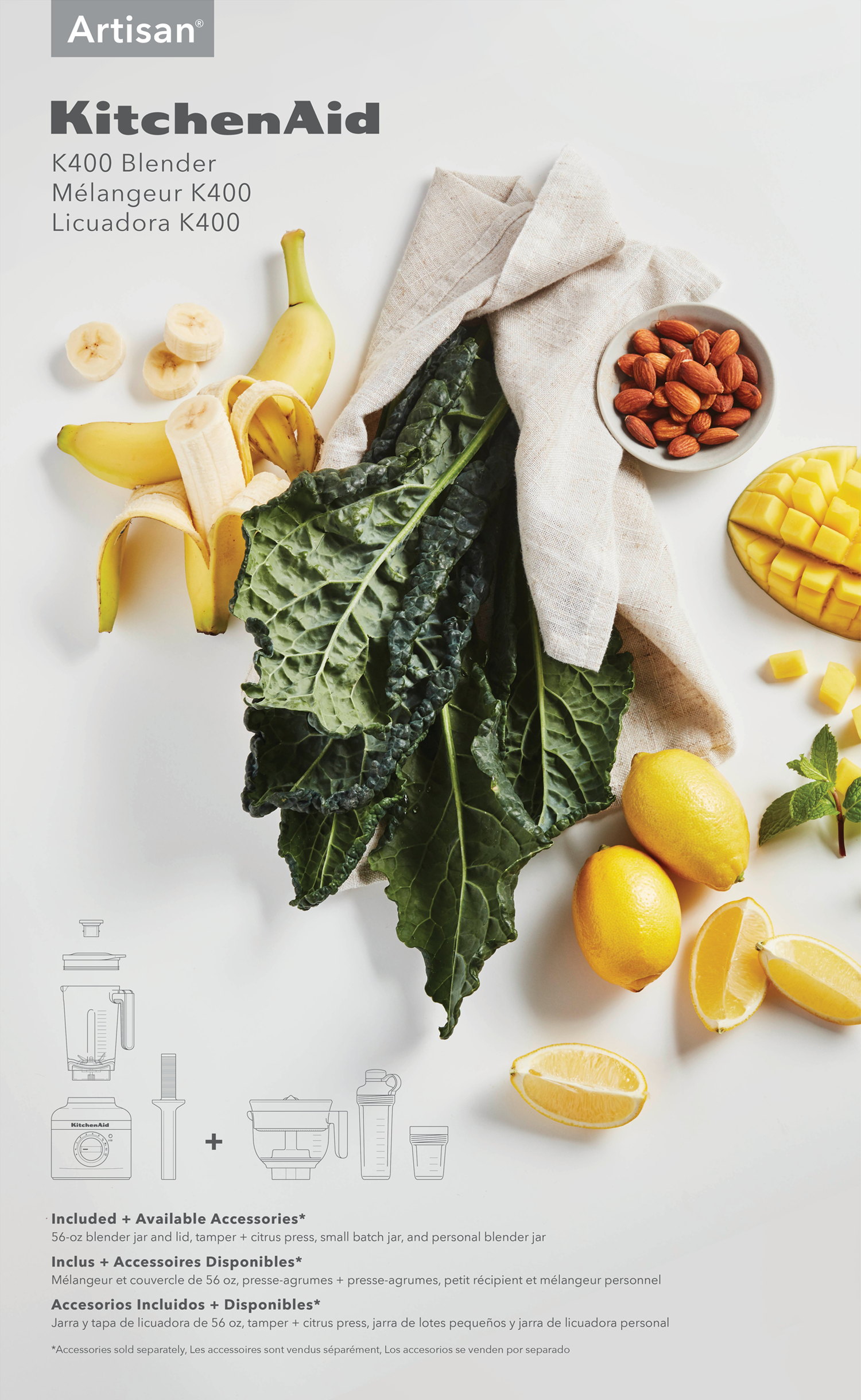
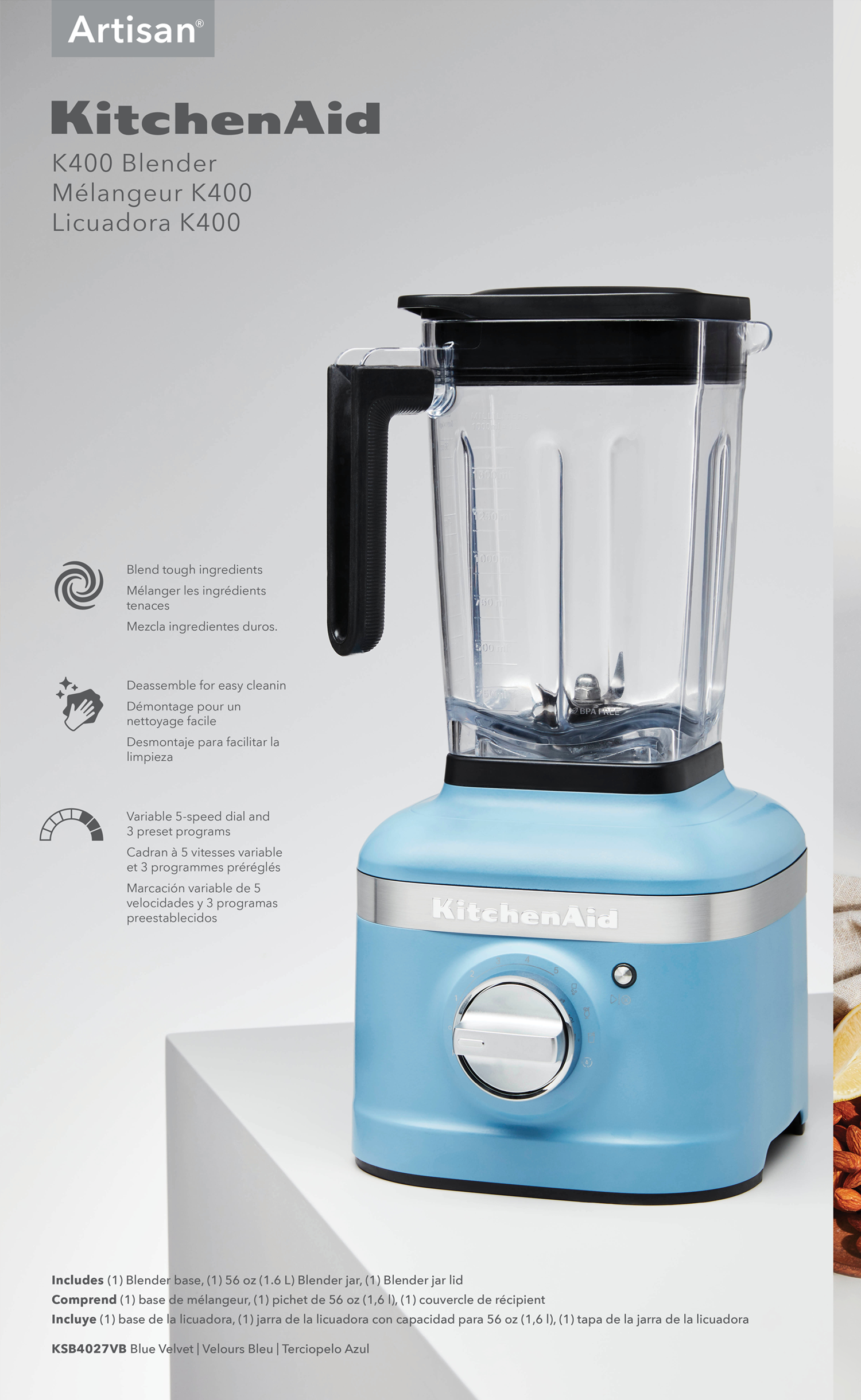
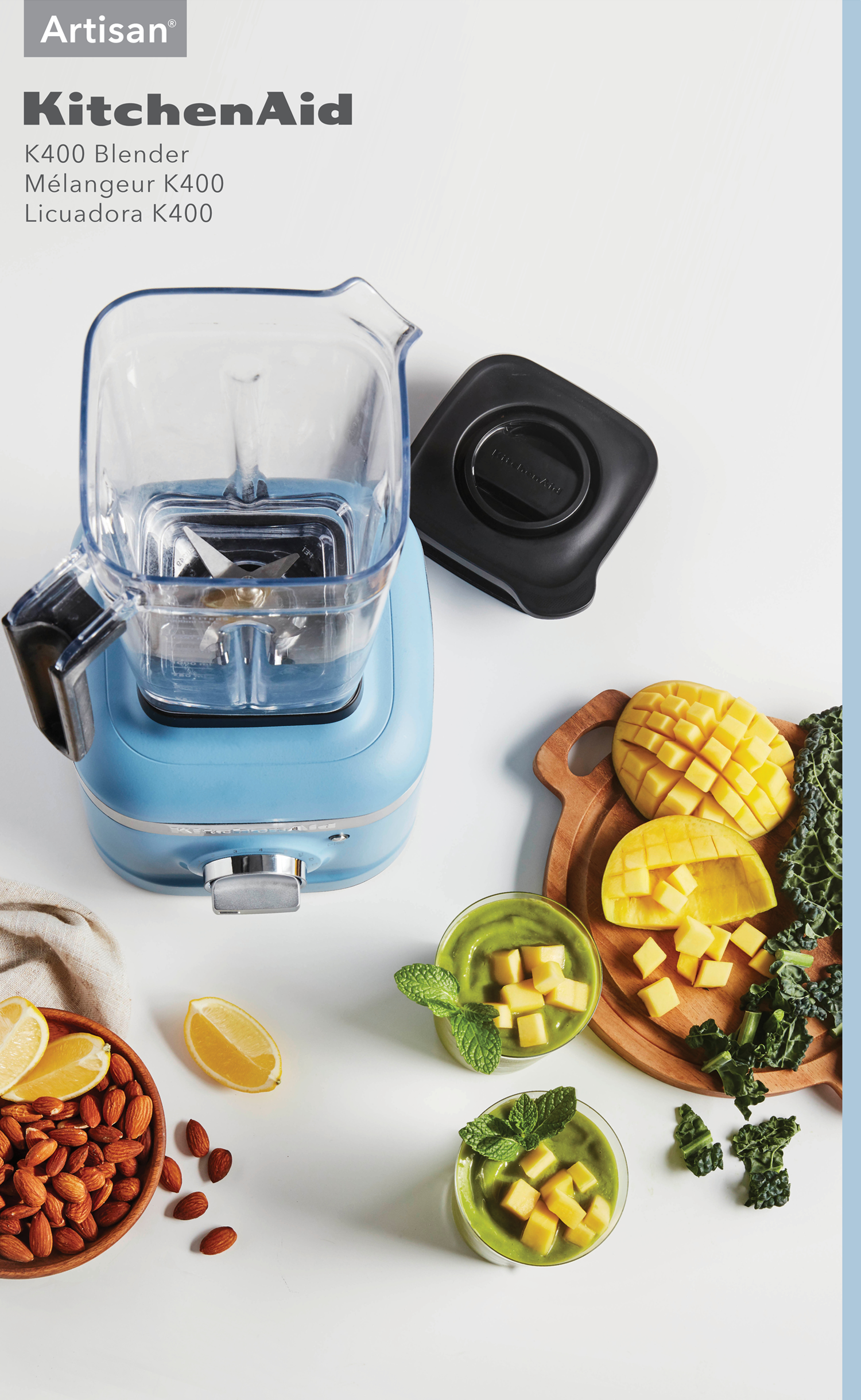
Working closely with the internal KitchenAid team, we began by diving into consumer insights, packaging trends, and design systems across related industries while also bringing our own creative perspective to the process. From this research, we developed a series of concepts built on a refined visual language that combined bespoke product illustrations with photography to drive storytelling, supported by iconography, color, and typography. All of this was organized within a thoughtful packaging system that could extend across product lines and packaging sizes, reinforcing the brand while prioritizing clarity and consumer engagement.
The final result was a flexible, strategic packaging system that scaled across all products—unmistakably KitchenAid, while reinforcing the brand and putting clarity and consumer engagement at the forefront.