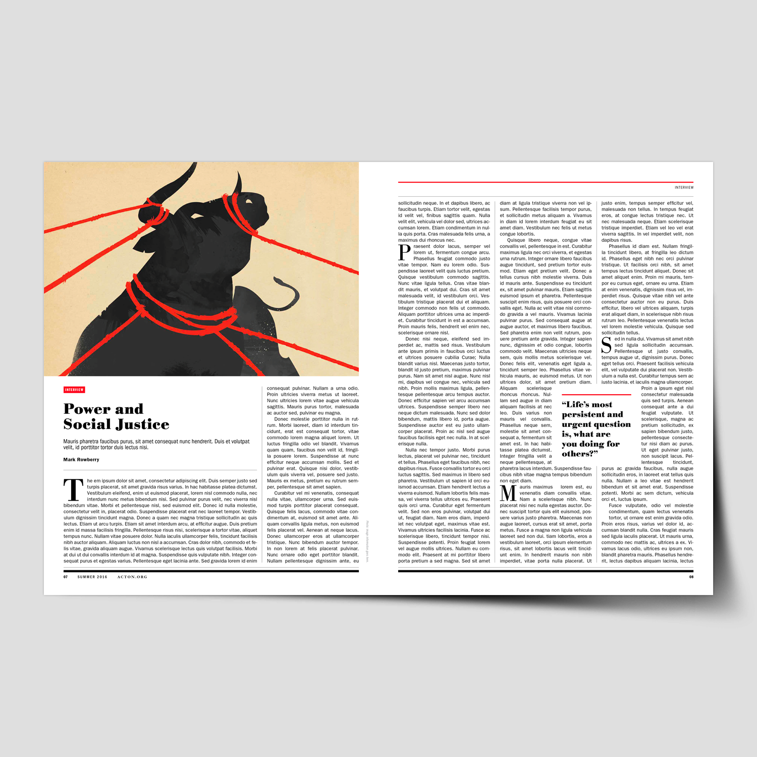
Article
—
Developing a Visual Strategy for Your Brand
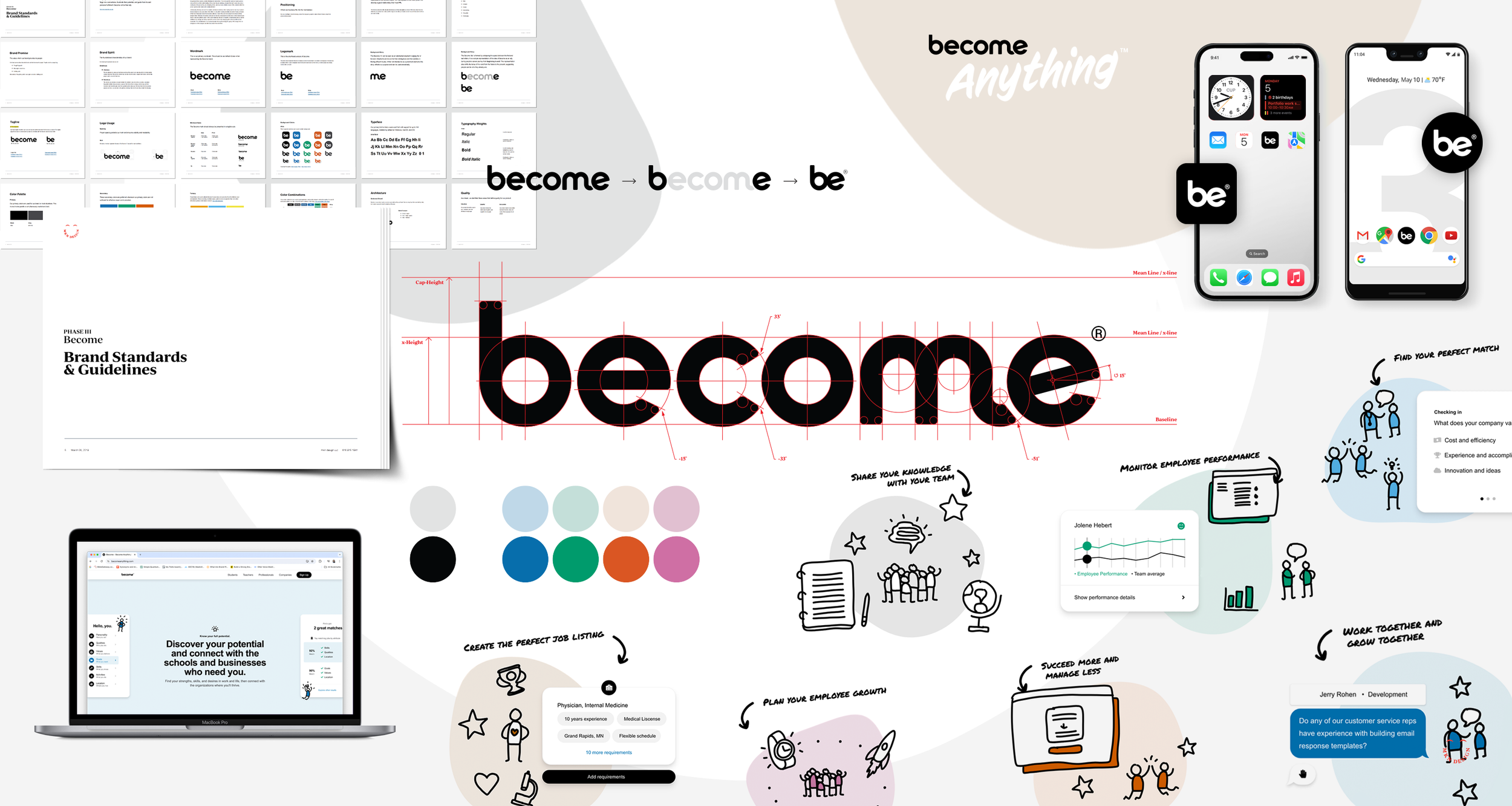
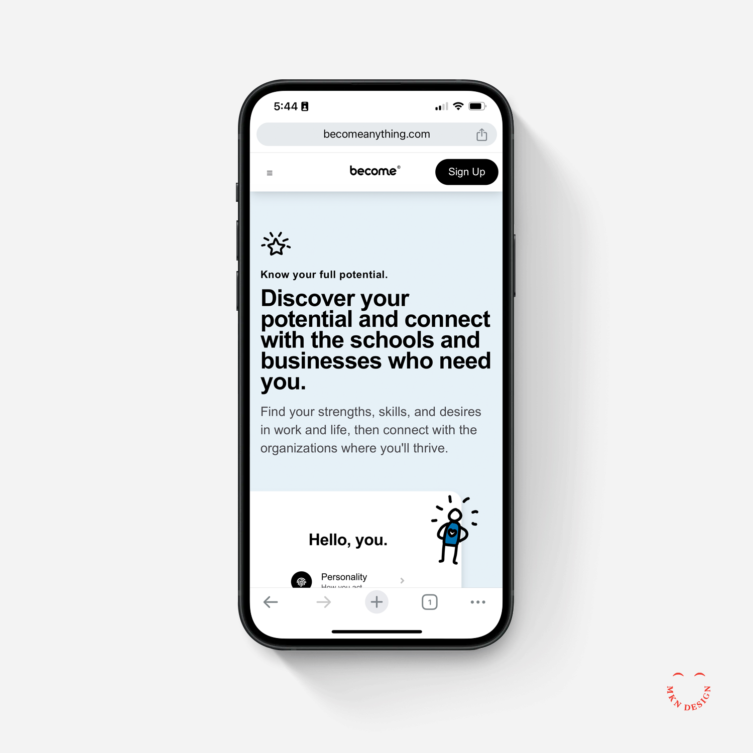
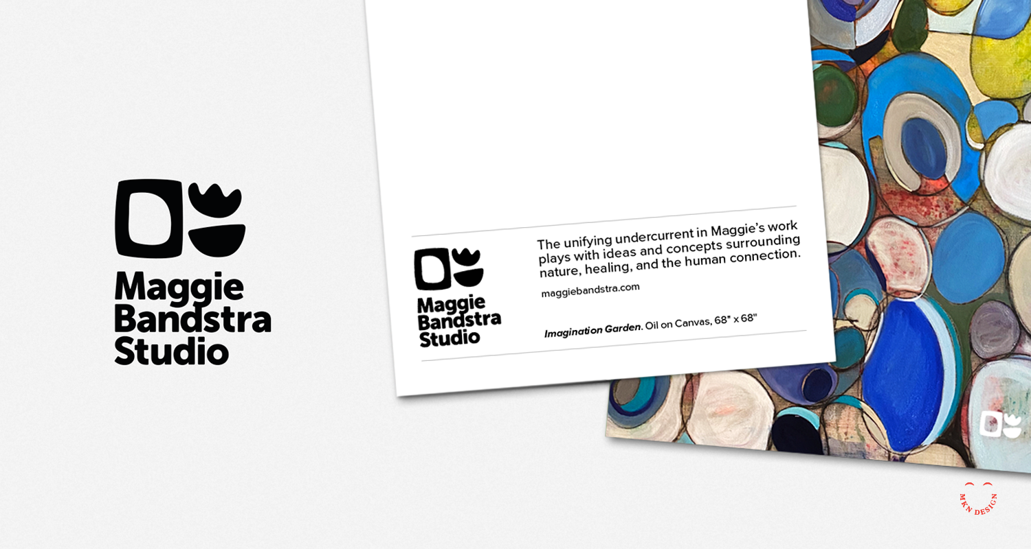
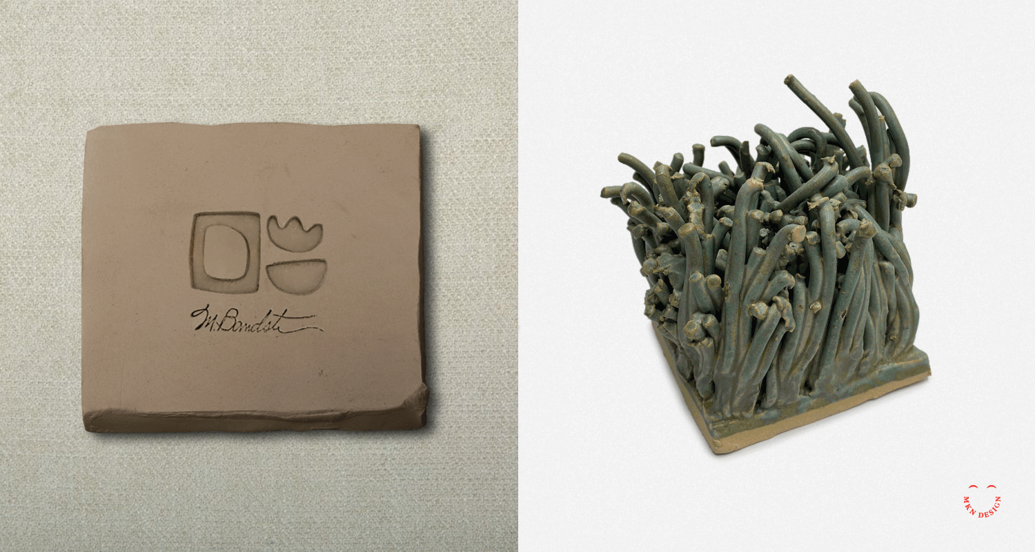
Bold, simple illustration systems can do more for your brand than you think. It’s not just decoration—it’s a visual strategy. Clean, memorable forms can make your brand instantly recognizable, adapt seamlessly across mediums, and connect with audiences in a way that feels authentic. That’s why I design custom illustarated visuals tailored to your brand’s personality, tone, and story. Built as a scalable system, they work seamlessly across your website, print materials, and social media graphics.
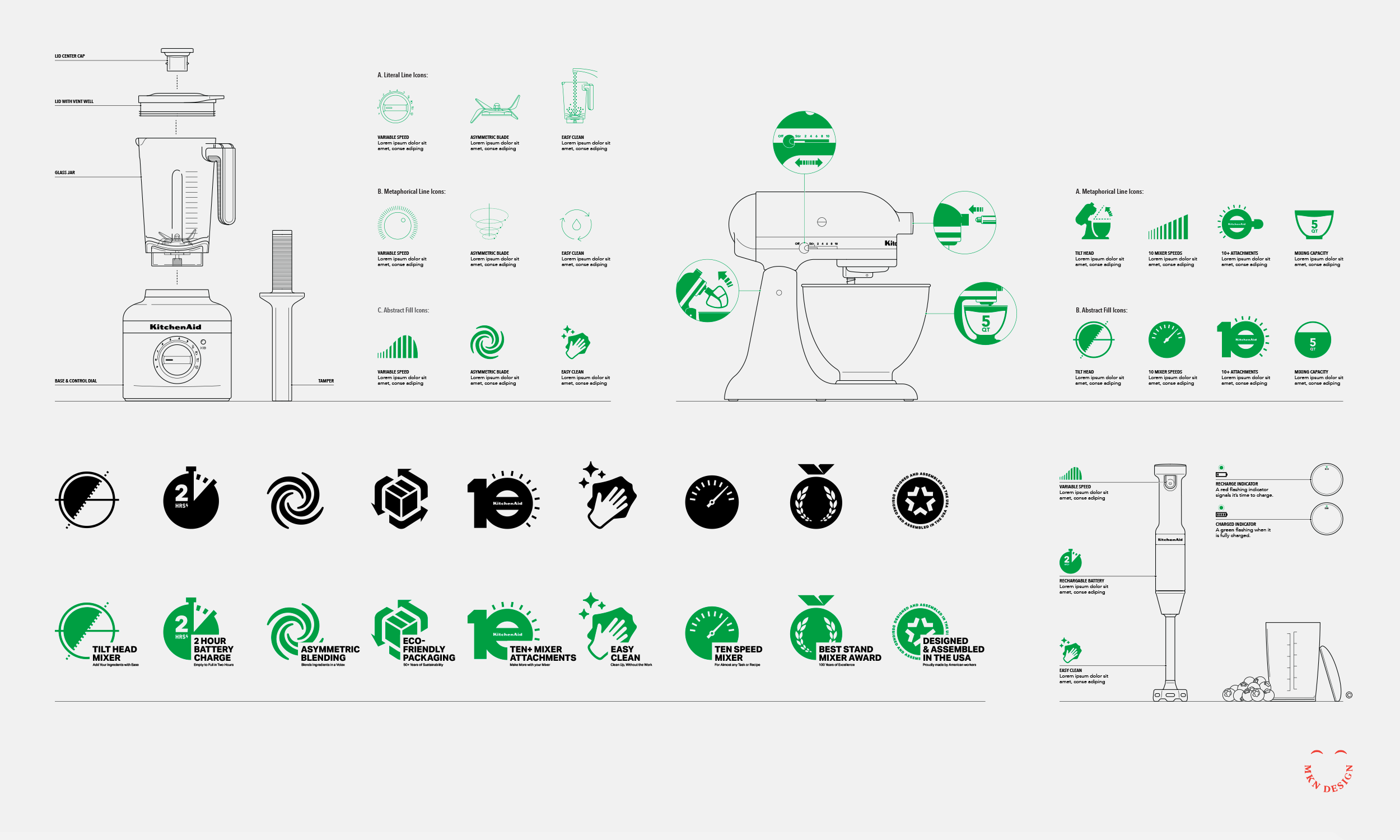
Visual strategies range from literal to conceptual, simple to complex, and extend across iconography, illustration, and environmental design.
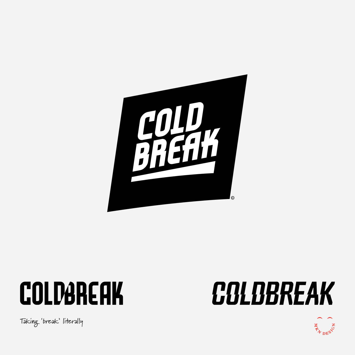
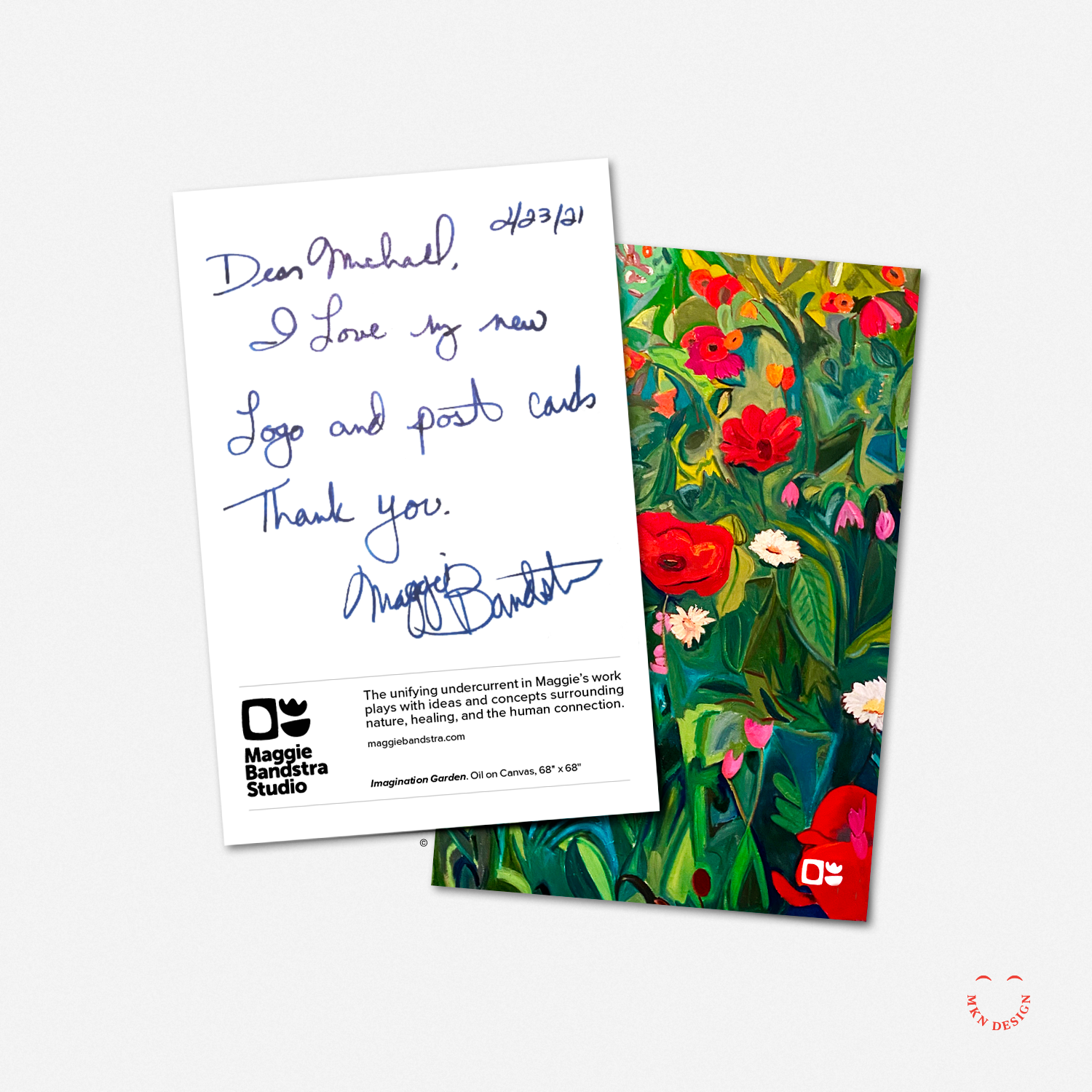
The result? Illustrations that not only look great, but also communicate your brand, connect with your audience, and stand the test of time—just like the iconography system I developed with Monotype for Riot Games. View the project here.
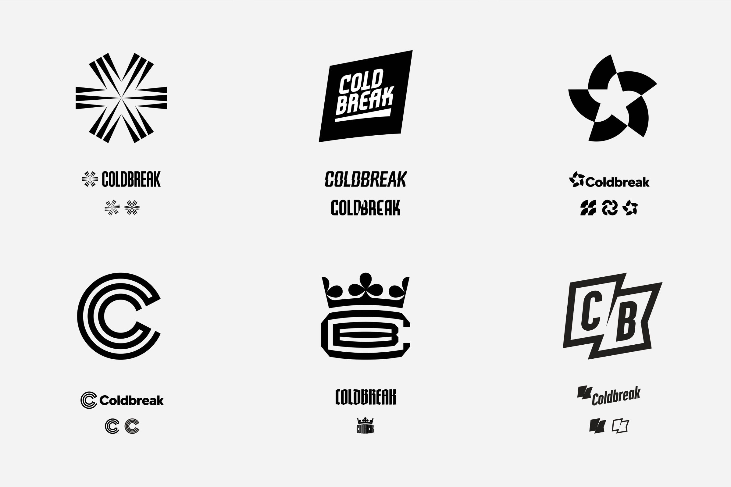
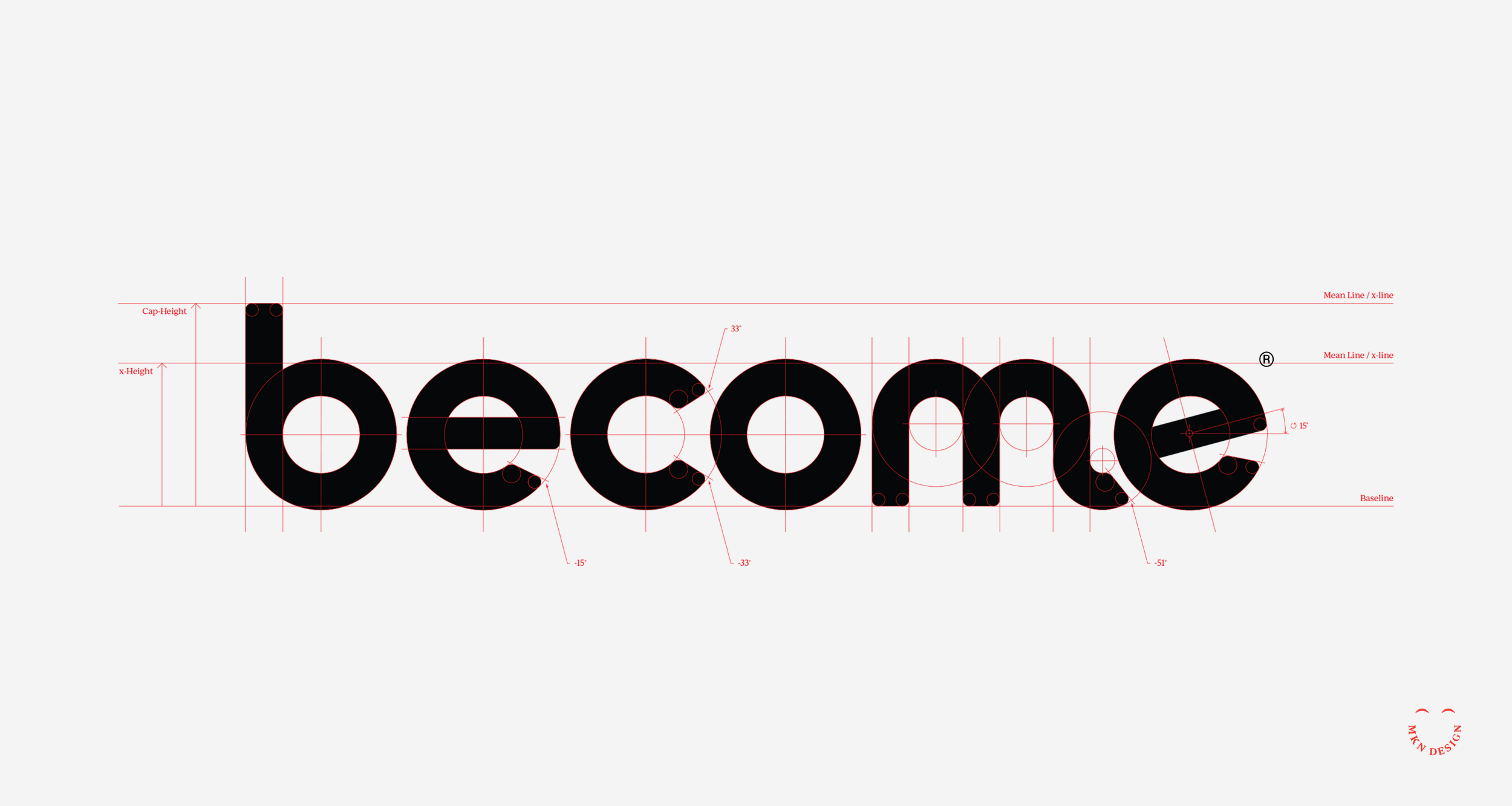
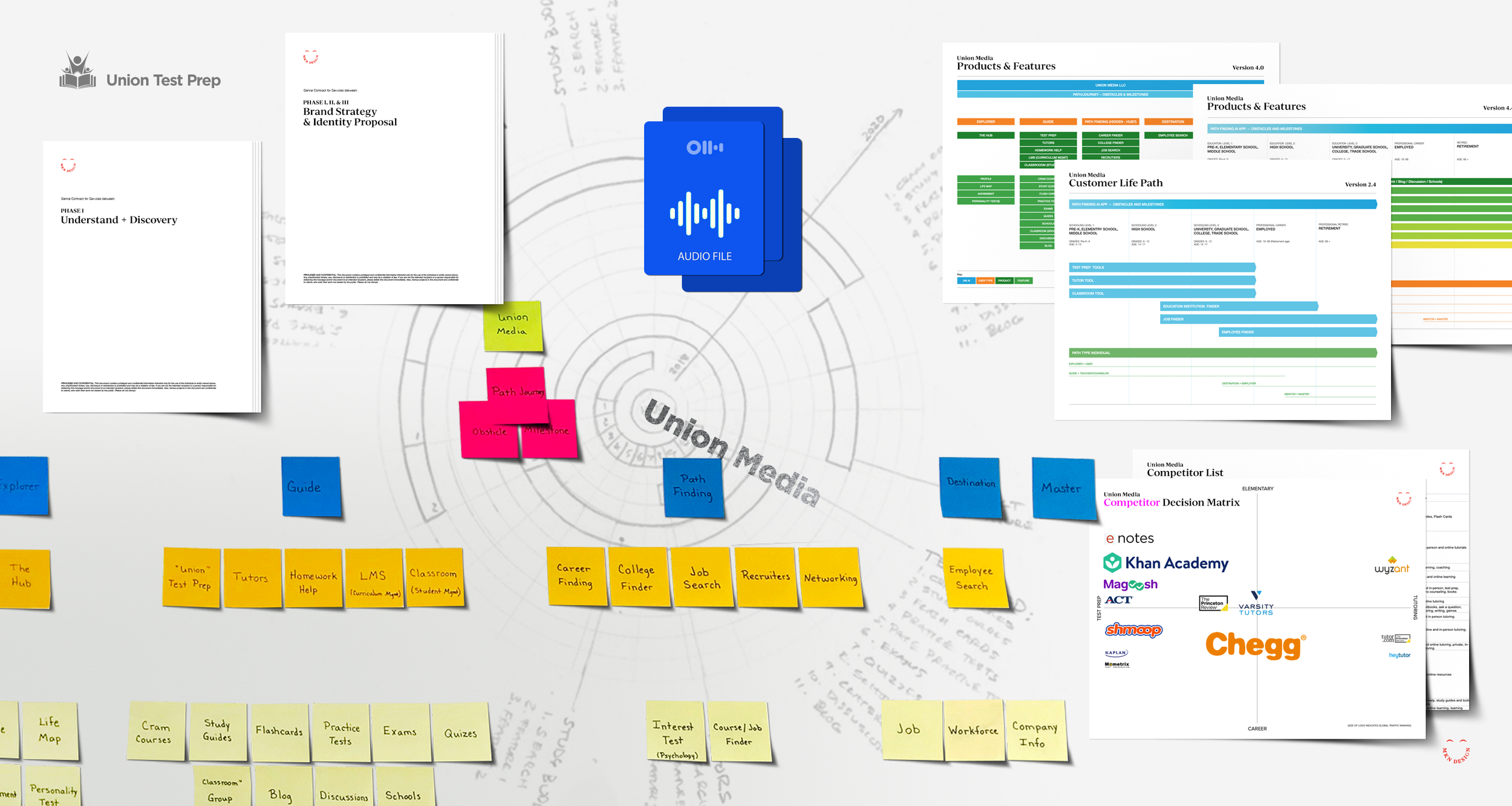
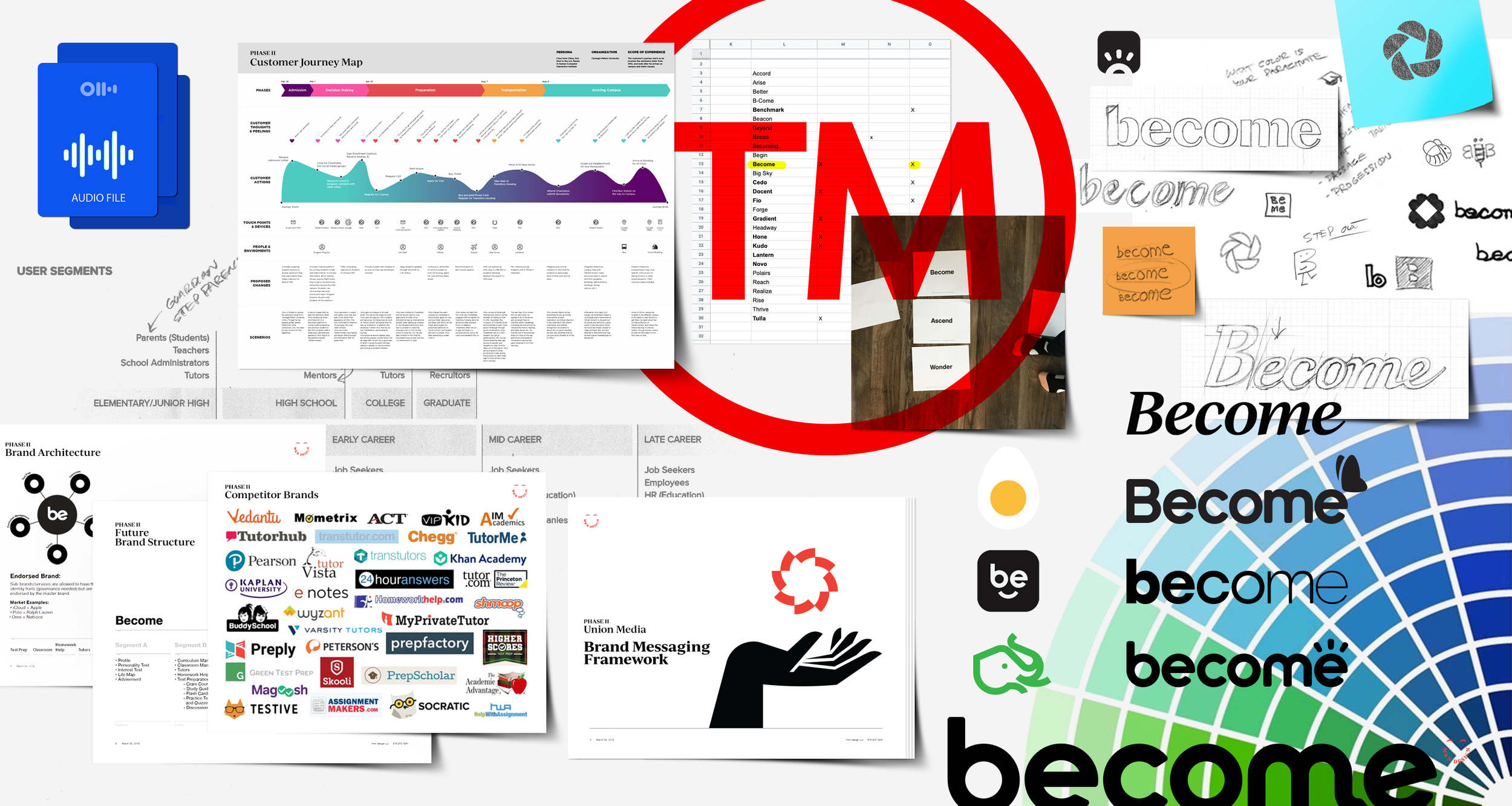
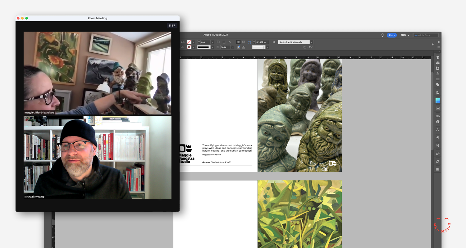
To create a strong visual system that delivers real impact, I start by understanding your brand messaging framework and visual identity—what I call input. This includes researching your history, vision, and competitors to uncover what makes your brand unique. From this often-chaotic mix of insights, my role is to distill, clarify, and translate them into an authentic, distinctive, and cohesive visual system—the output. This stage takes time and care, often involving multiple revisions, refinements, additional concepting, and your feedback to ensure it aligns perfectly with your brand’s vision.
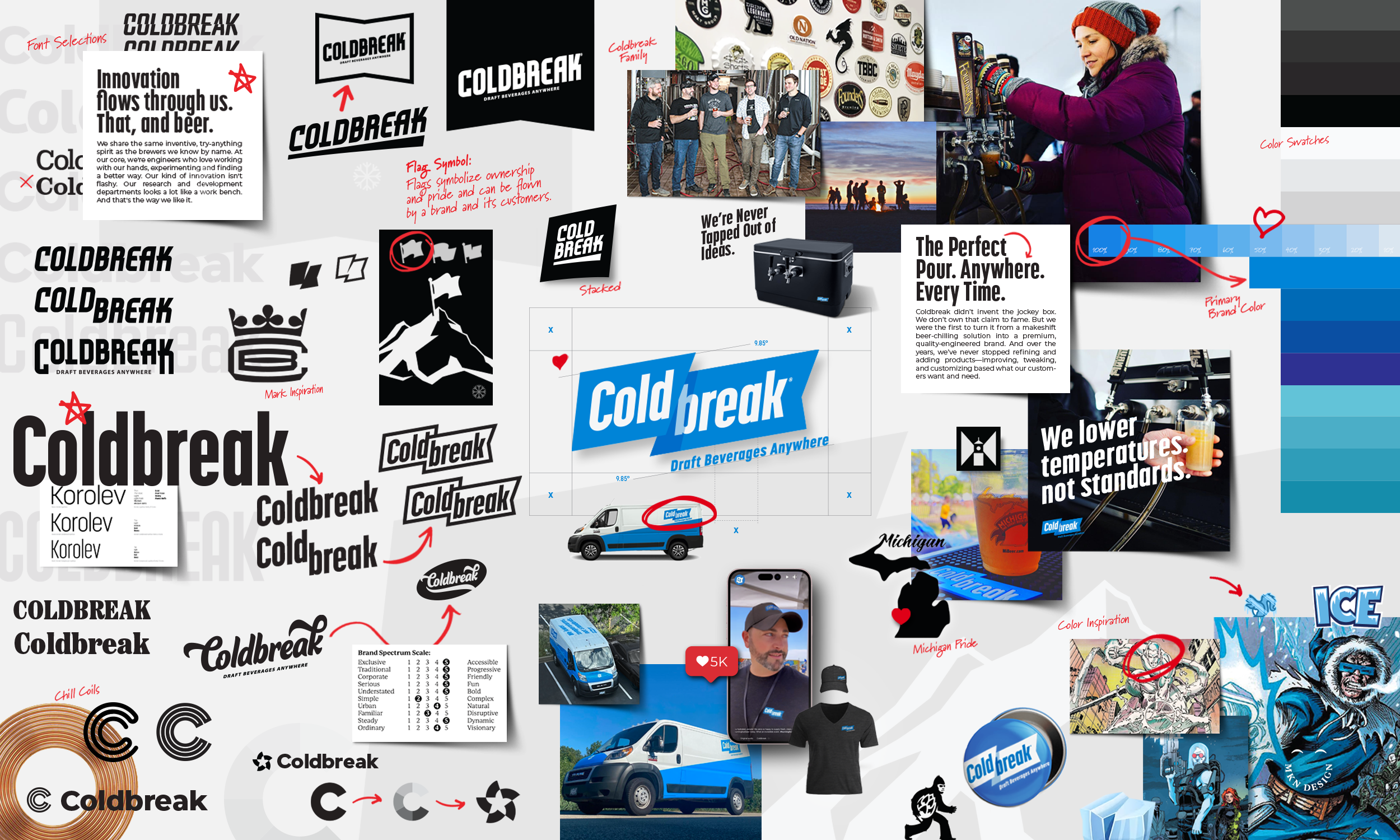
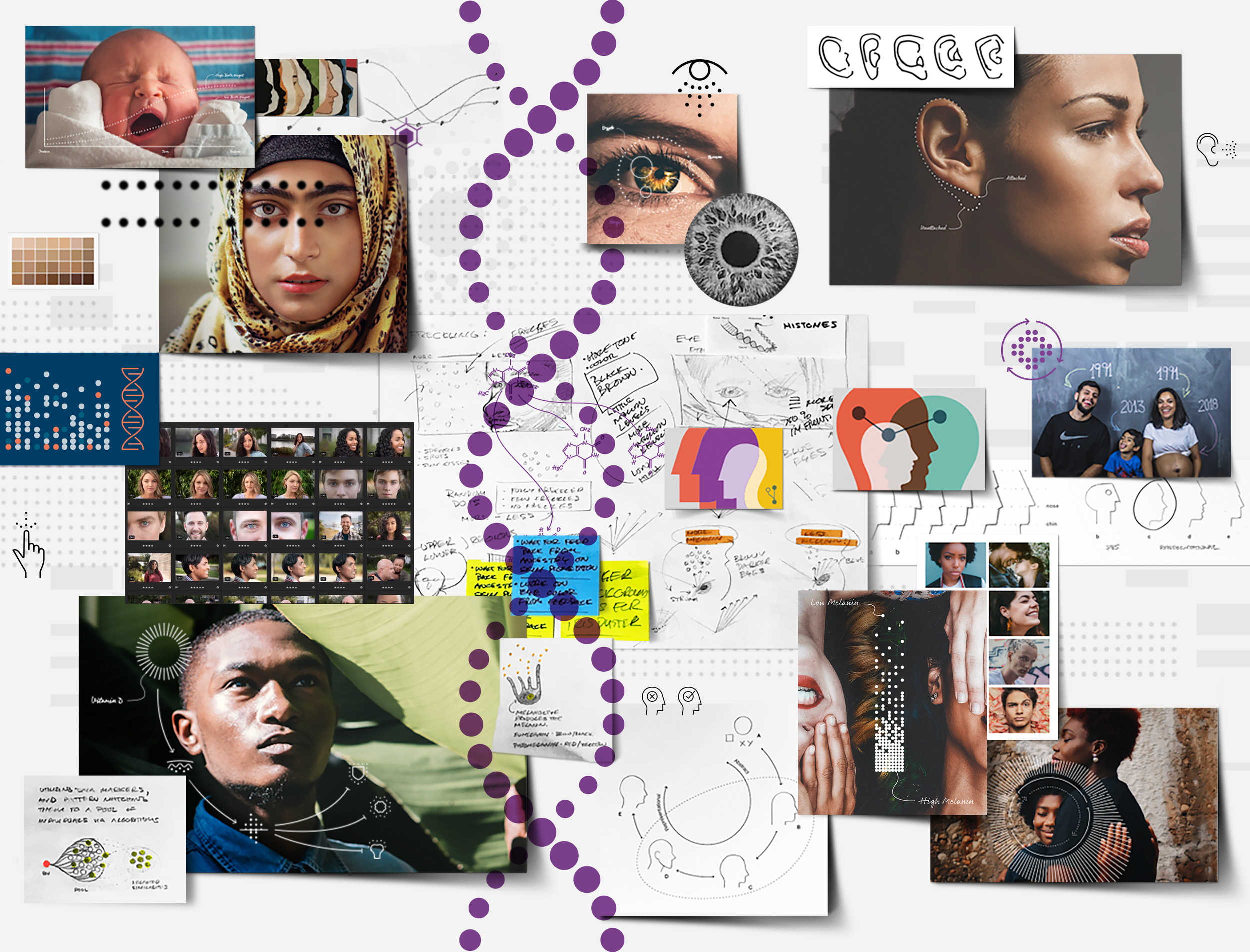
↑ A small glimpse into my chaotic artboard, filled endless icon variations and subtle adjustments.
Why Visual Systems Strengthen Your Brand:
1. Instant Recognition
Bold, simplified illustrative forms are easier for people to recall and recognize across different contexts—whether on packaging, digital ads, websites, or a small app icon.
2. Strong Brand Personality
They convey confidence and clarity, giving your brand a distinctive visual voice that can feel approachable, playful, or modern depending on the style.
3. Scalability & Flexibility
Simple illustration styles hold up at any size—from a billboard to a tiny social media avatar—without losing detail or impact.
4. Cross-cultural Accessibility
Clean, universal forms often transcend language barriers, helping your brand connect with diverse audiences more effectively.
5. Consistency Across Mediums
Simple illustrations are easier to adapt for web, print, merchandise, motion graphics, or environmental branding while staying on-brand.
6. Emotional Connection
Even pared-down visuals can carry warmth, humor, or storytelling—making your brand feel human and relatable in ways photography alone sometimes can’t.
7. Modern, Timeless Appeal
Bold, simple illustrations can feel contemporary while avoiding overly trendy details that might age quickly.
8. Cost-effectiveness in Production
They’re often less expensive to reproduce, print, or animate than complex imagery, especially in multi-channel campaigns.
-
Related posts based on similar projects completed:
→ Riot Games Iconography System
→ KitchenAid Branded Environment
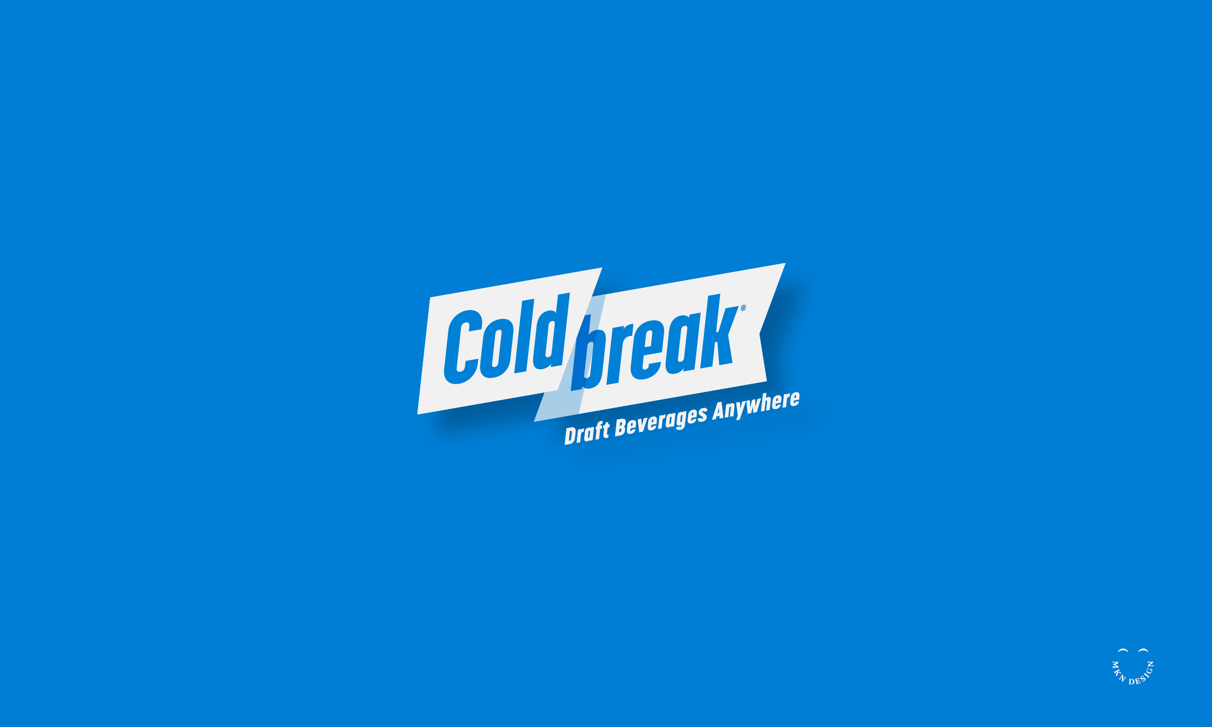
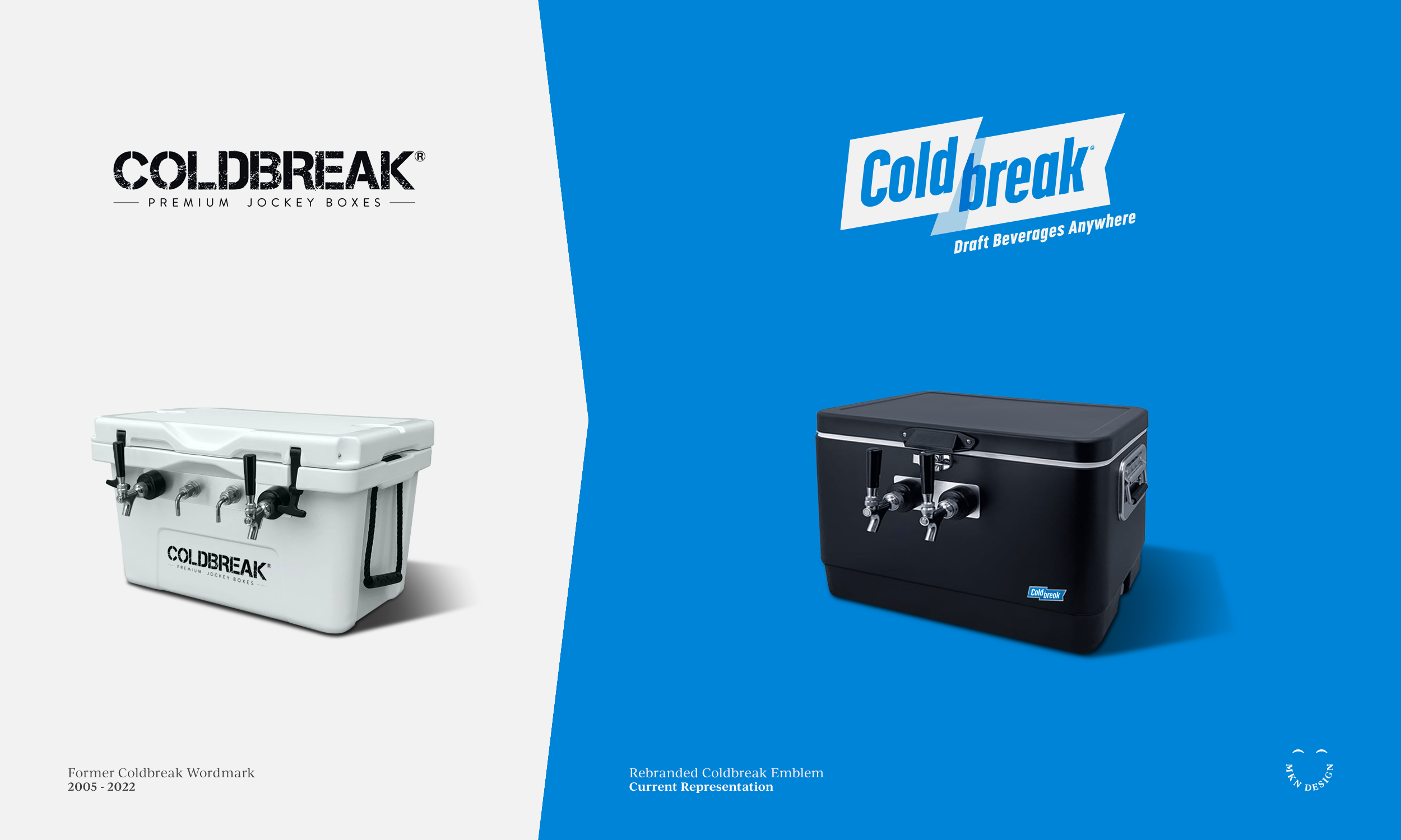
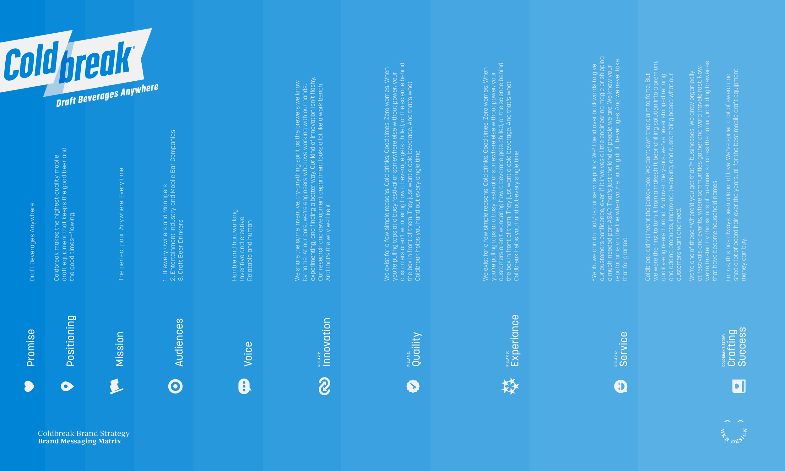
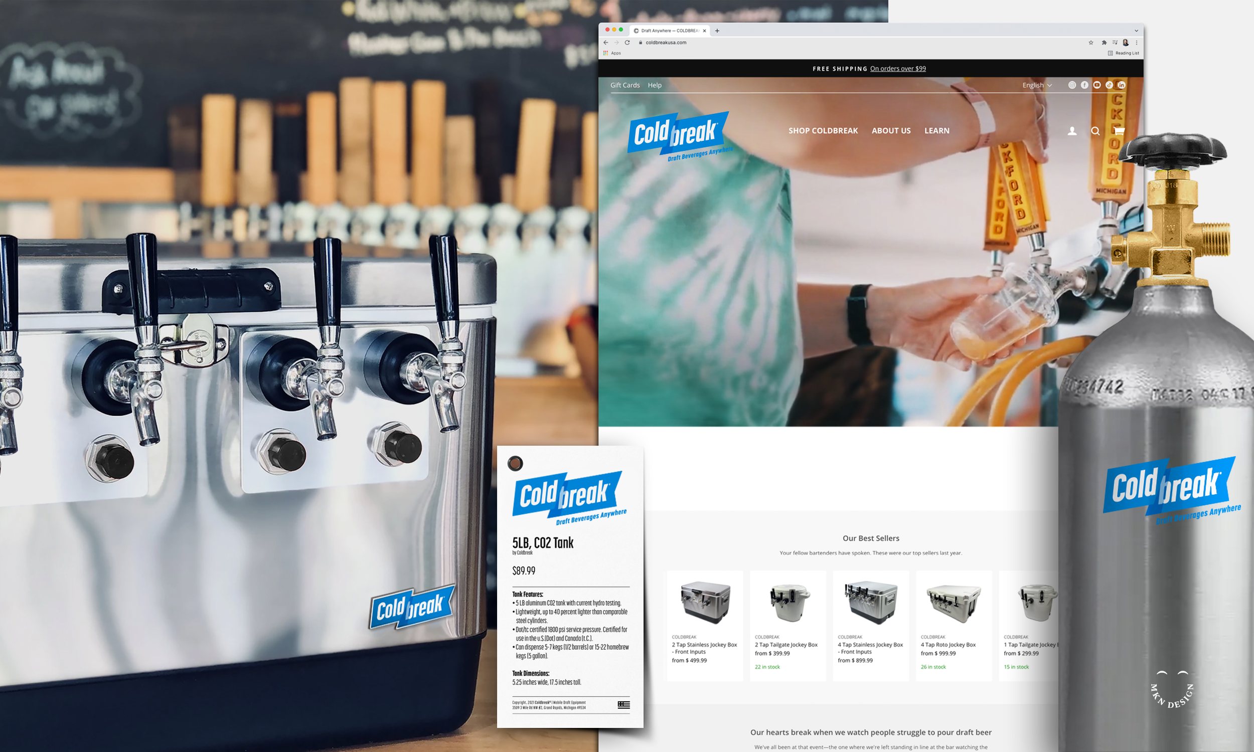
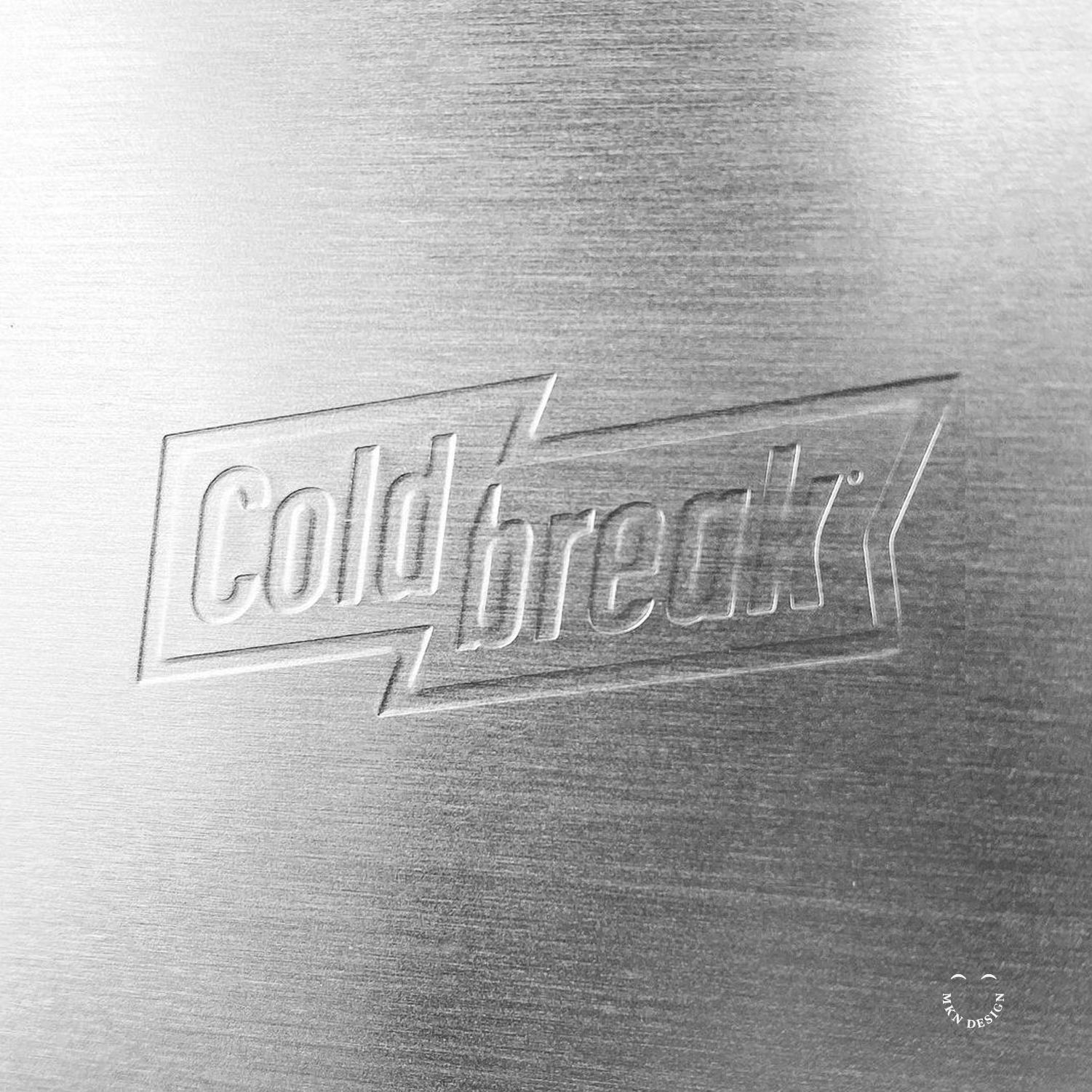
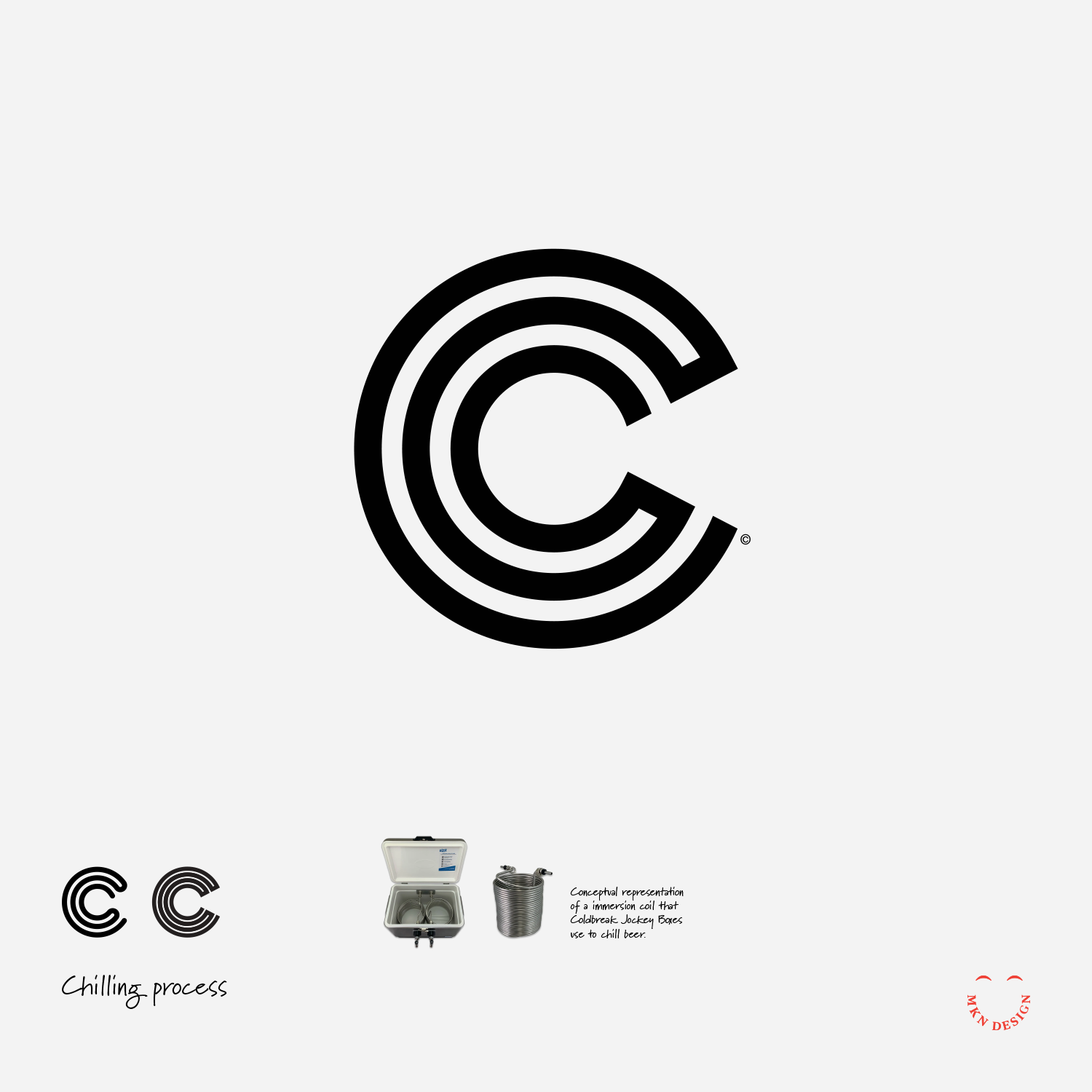
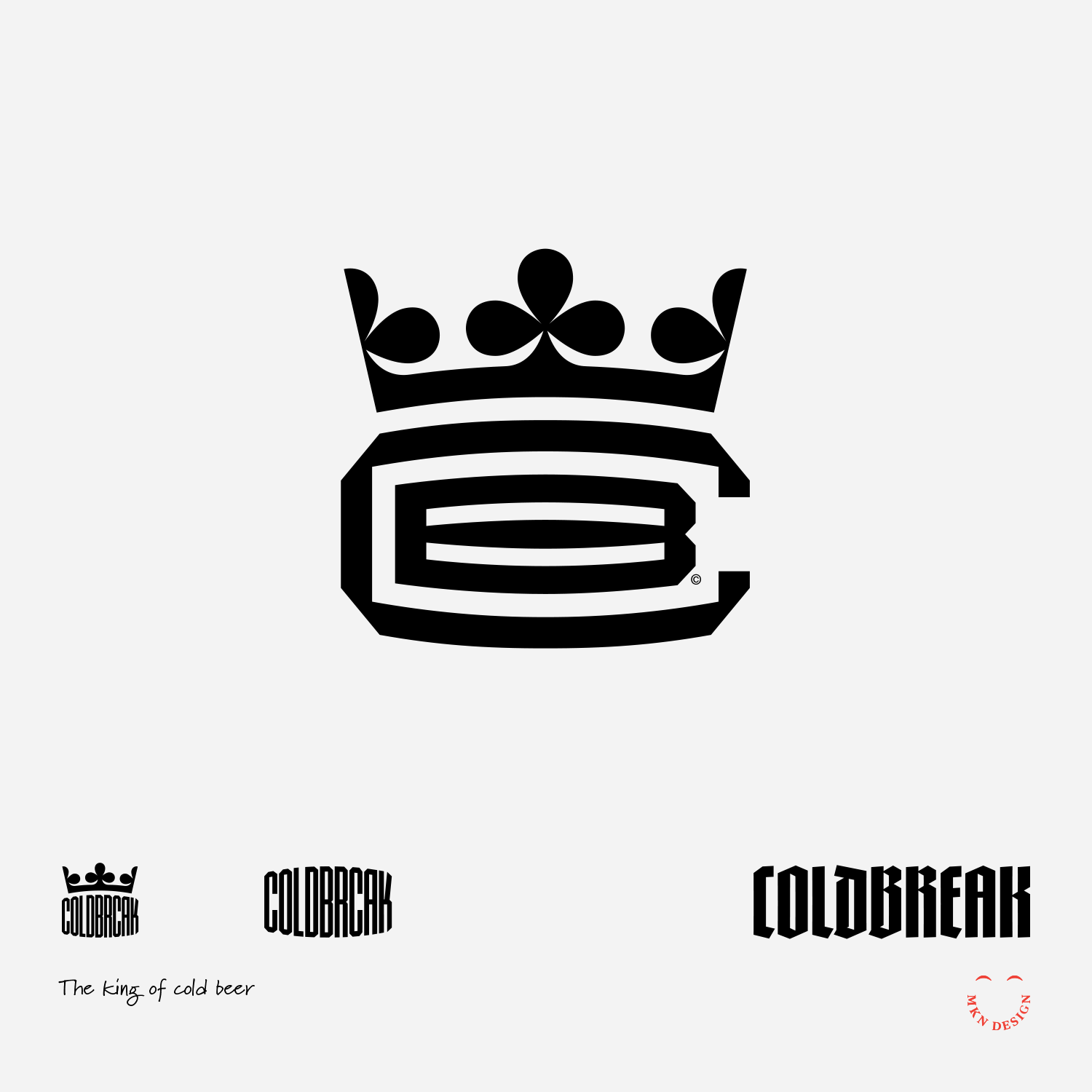
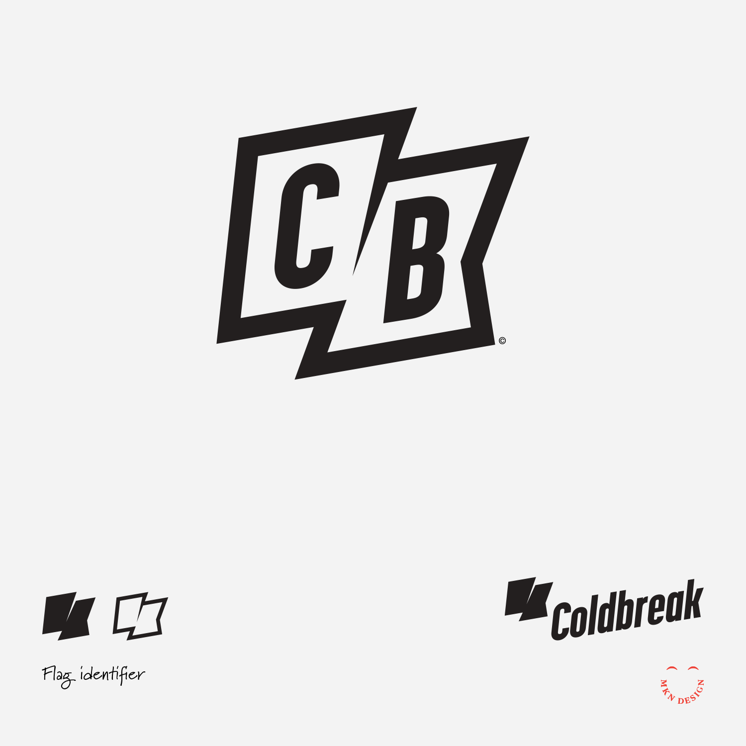
→ Coldbreak, Brand Strategy & Identity
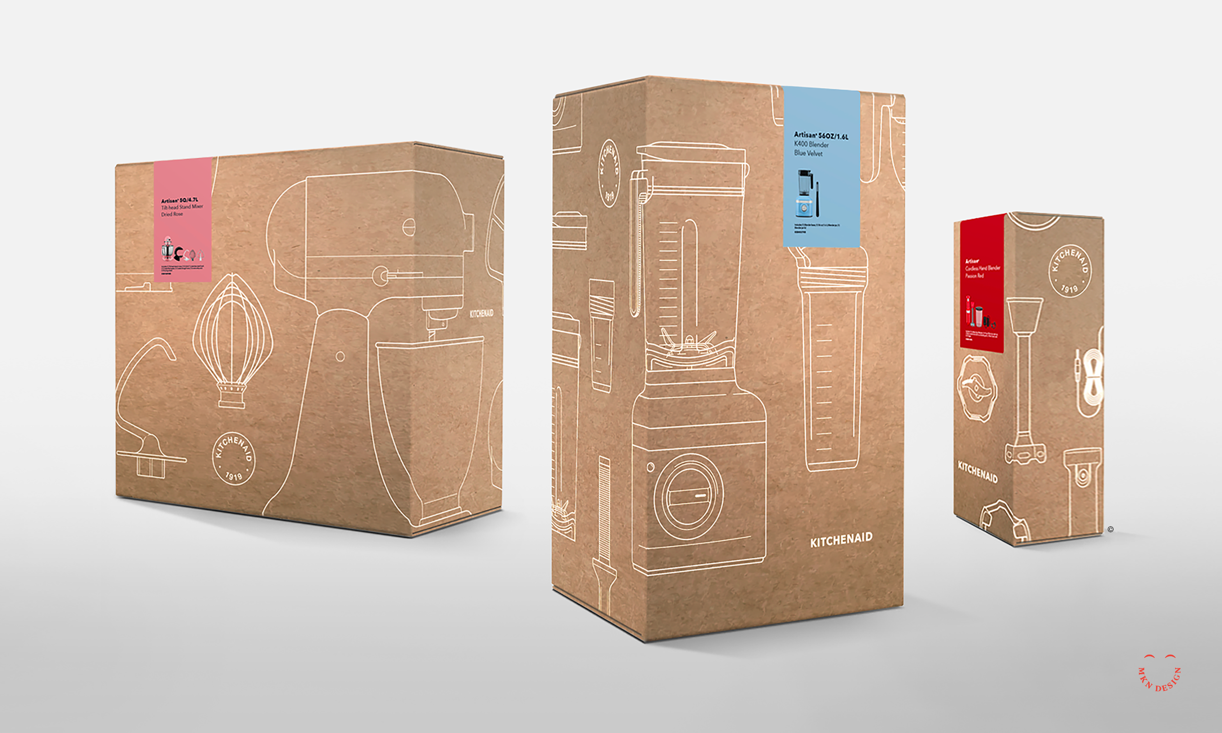
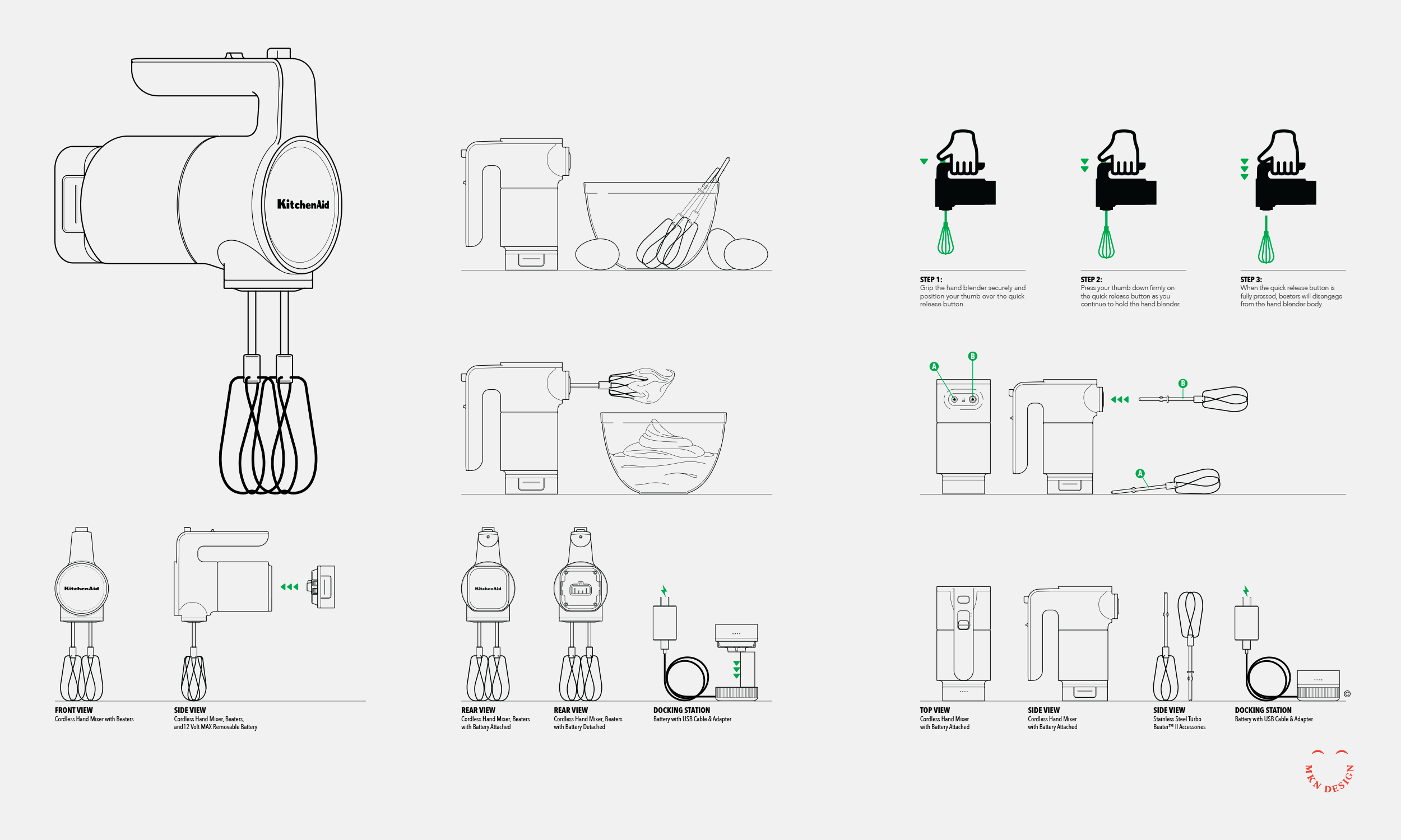
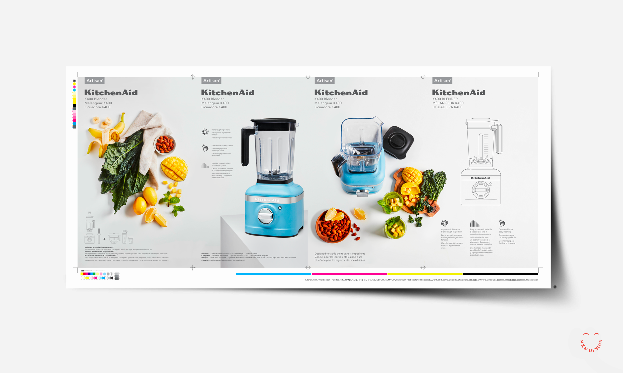
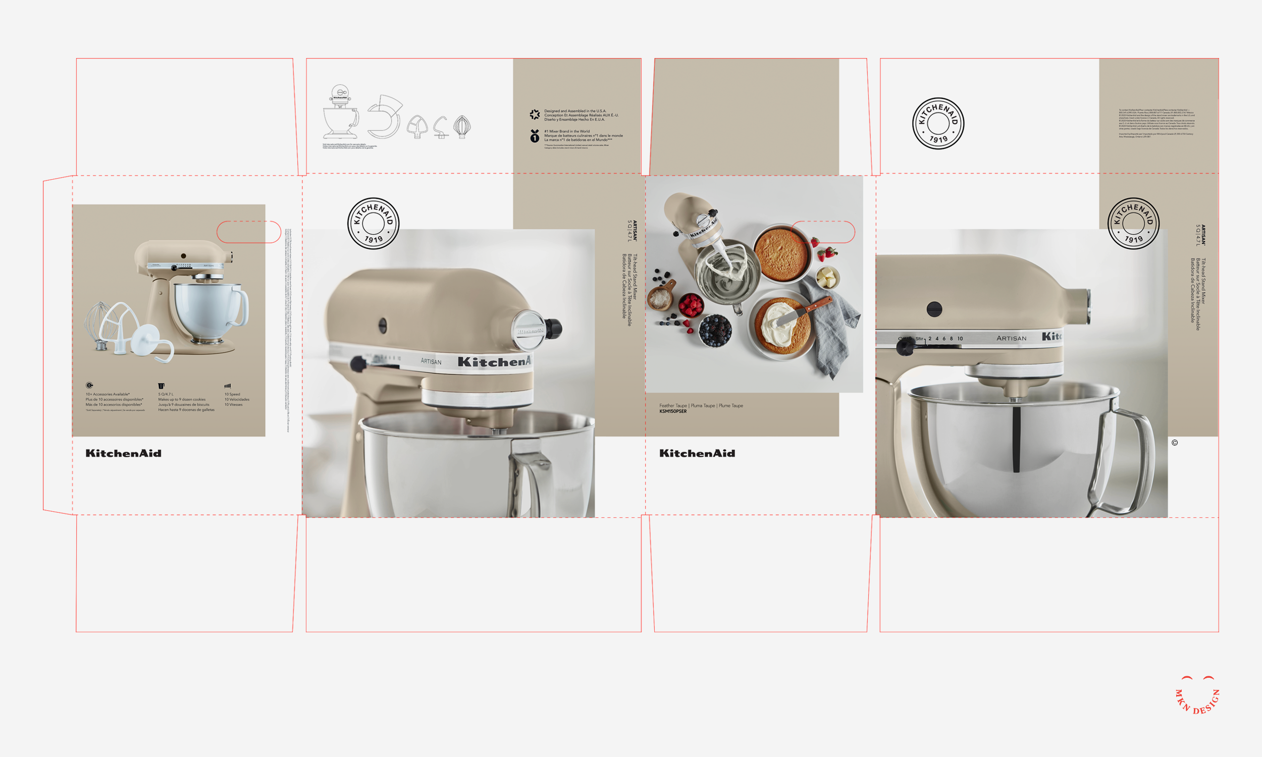
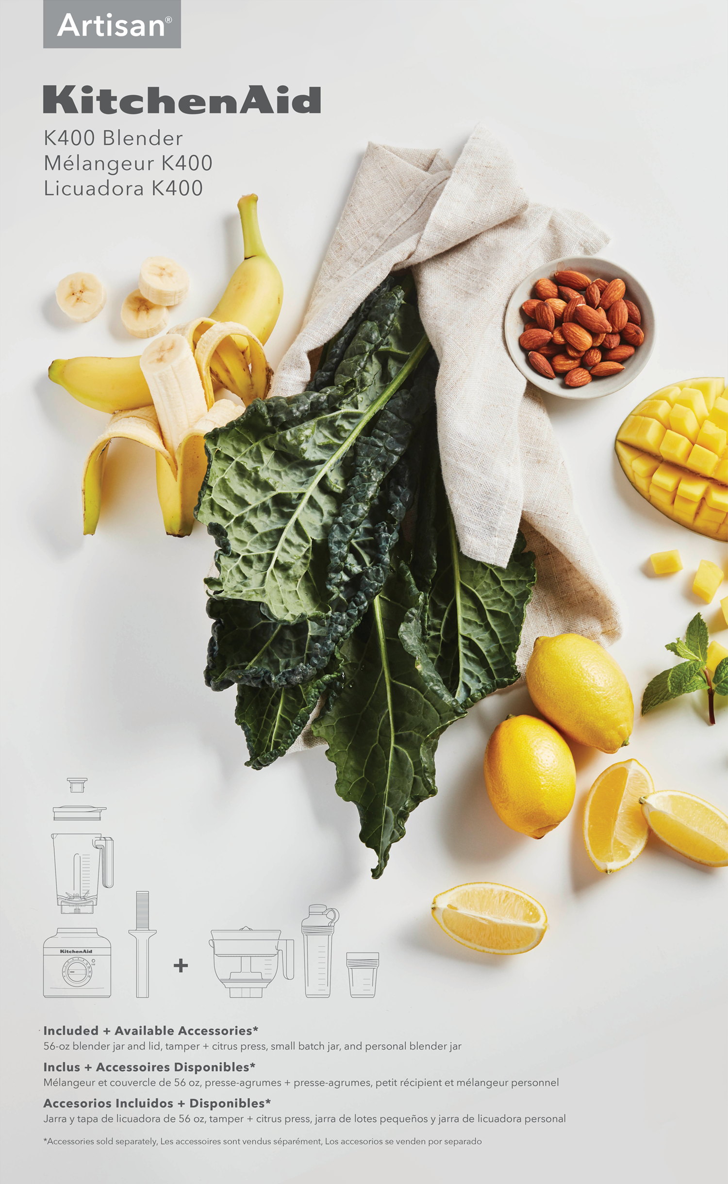
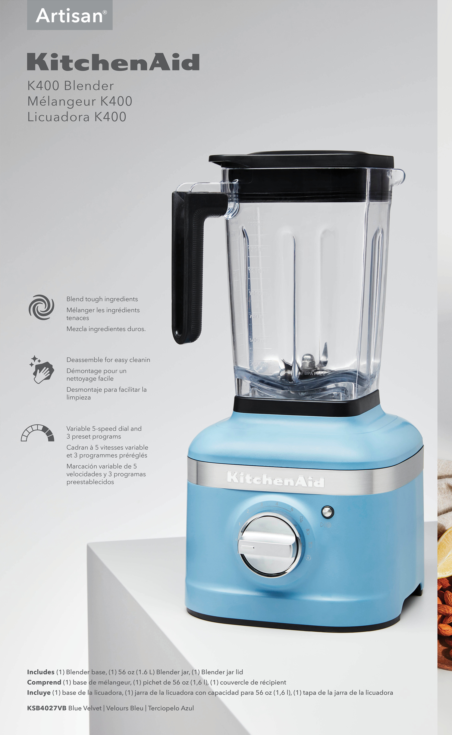
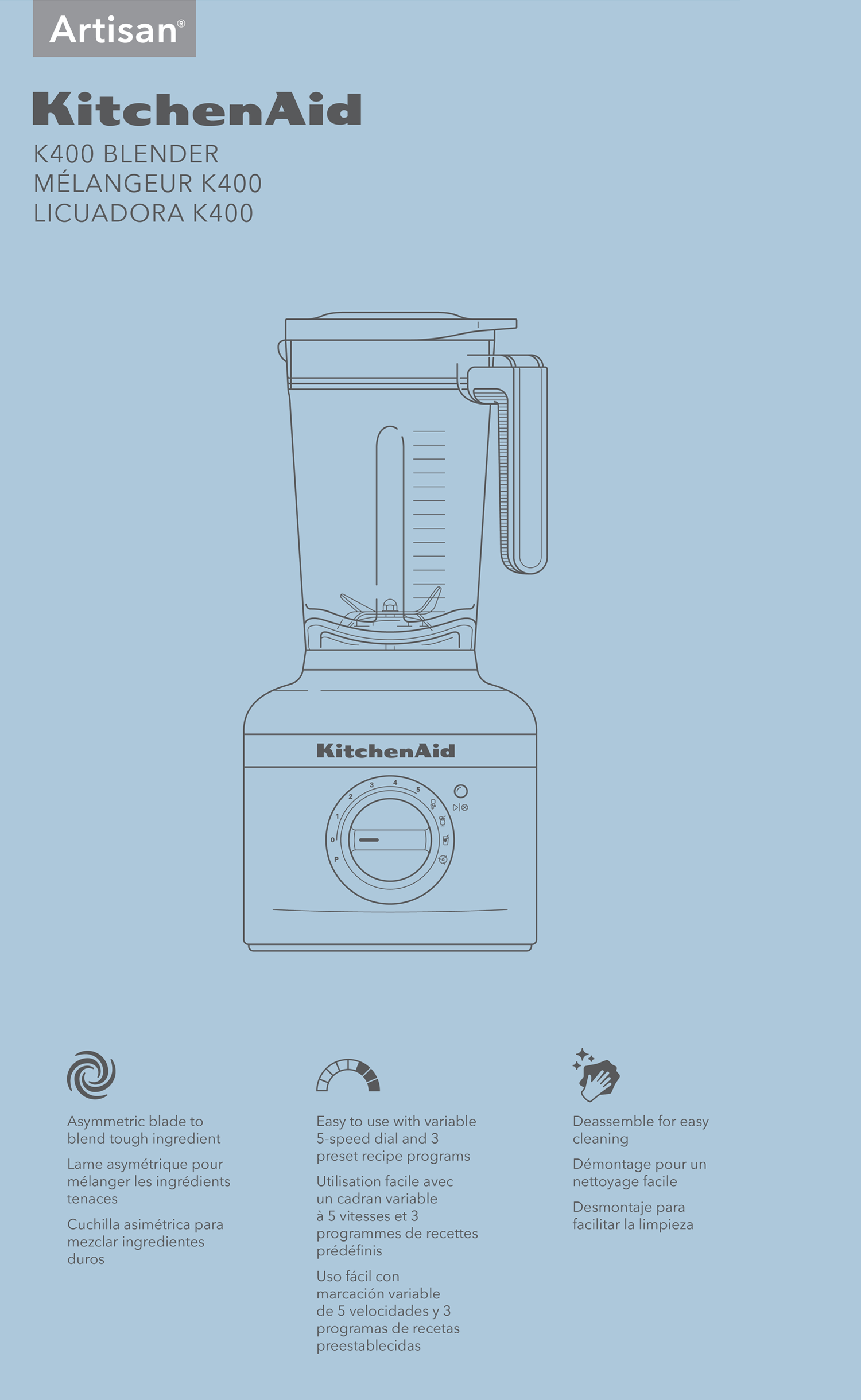
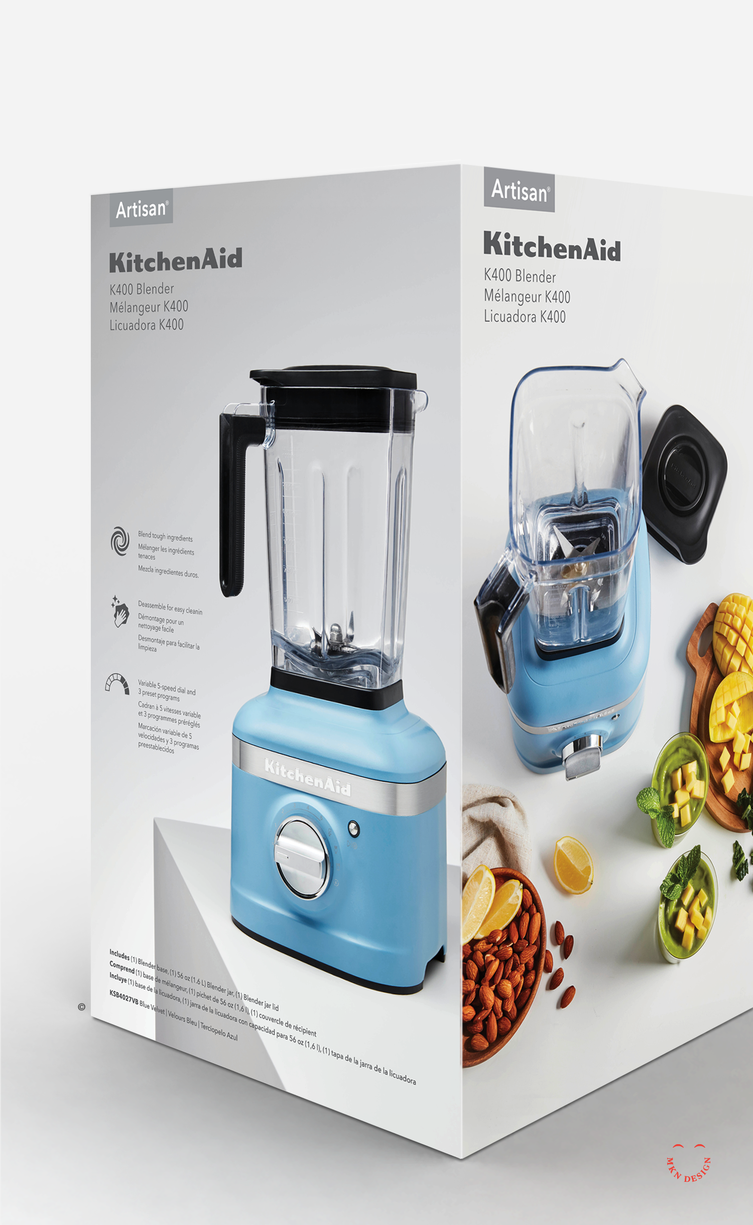
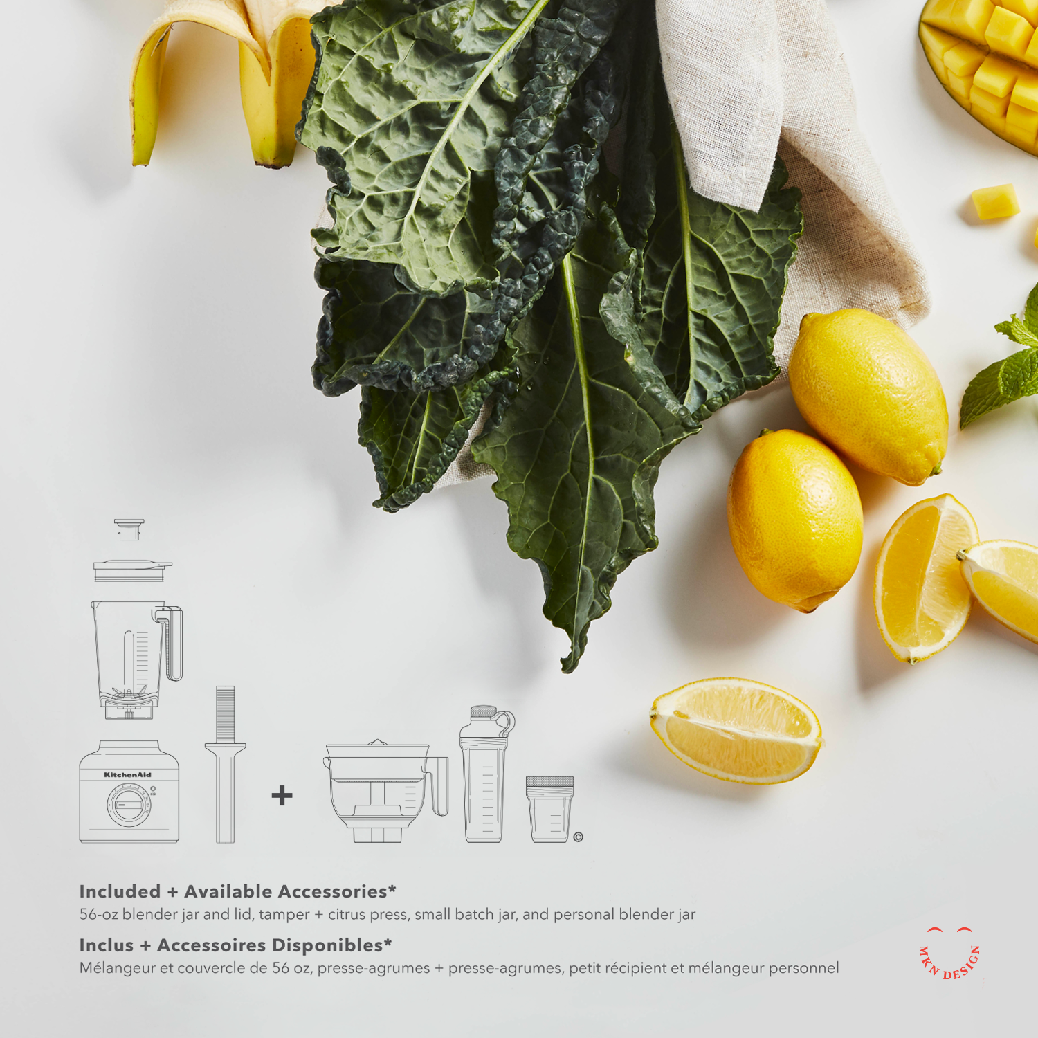
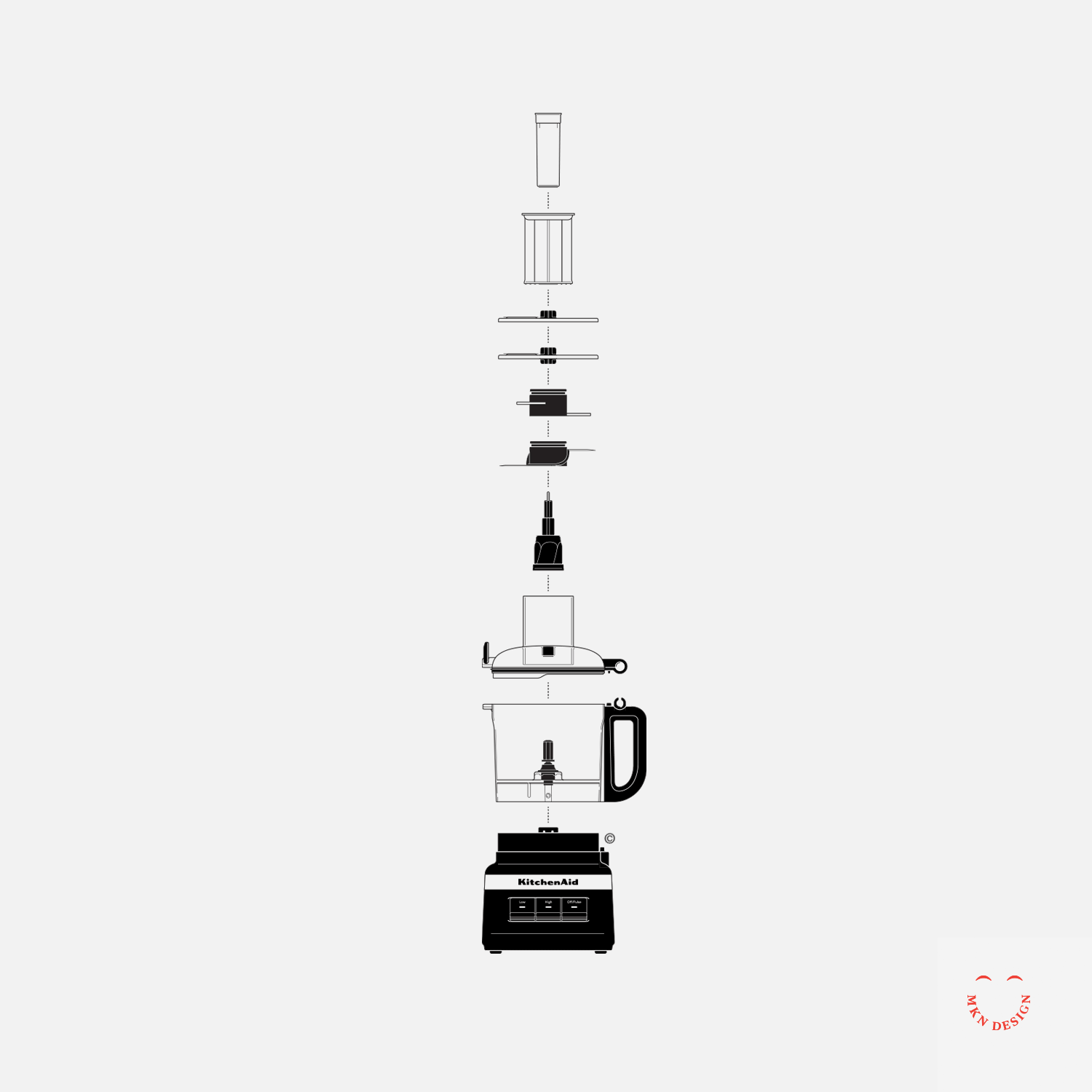
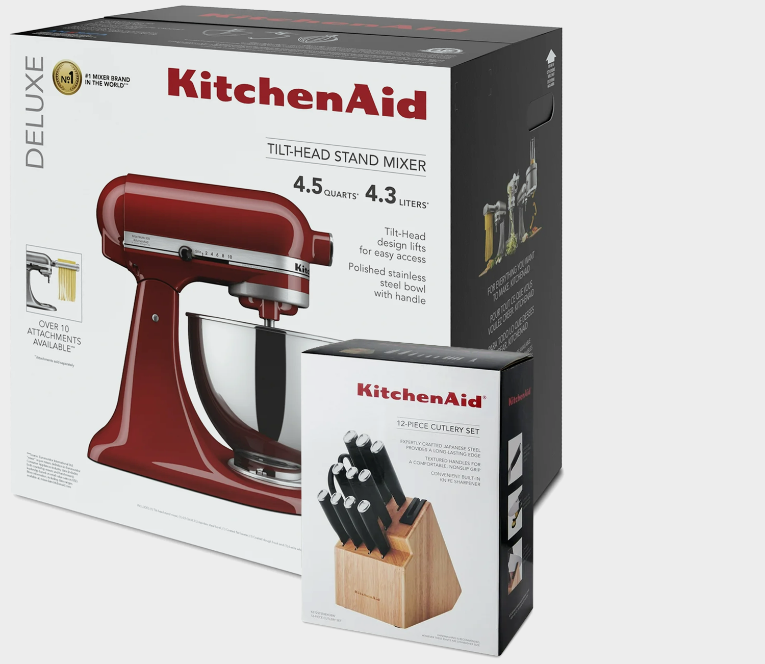
→ KitchenAid, Packaging an Icon
→ ITHAKA S+R Design System