Creative Musing
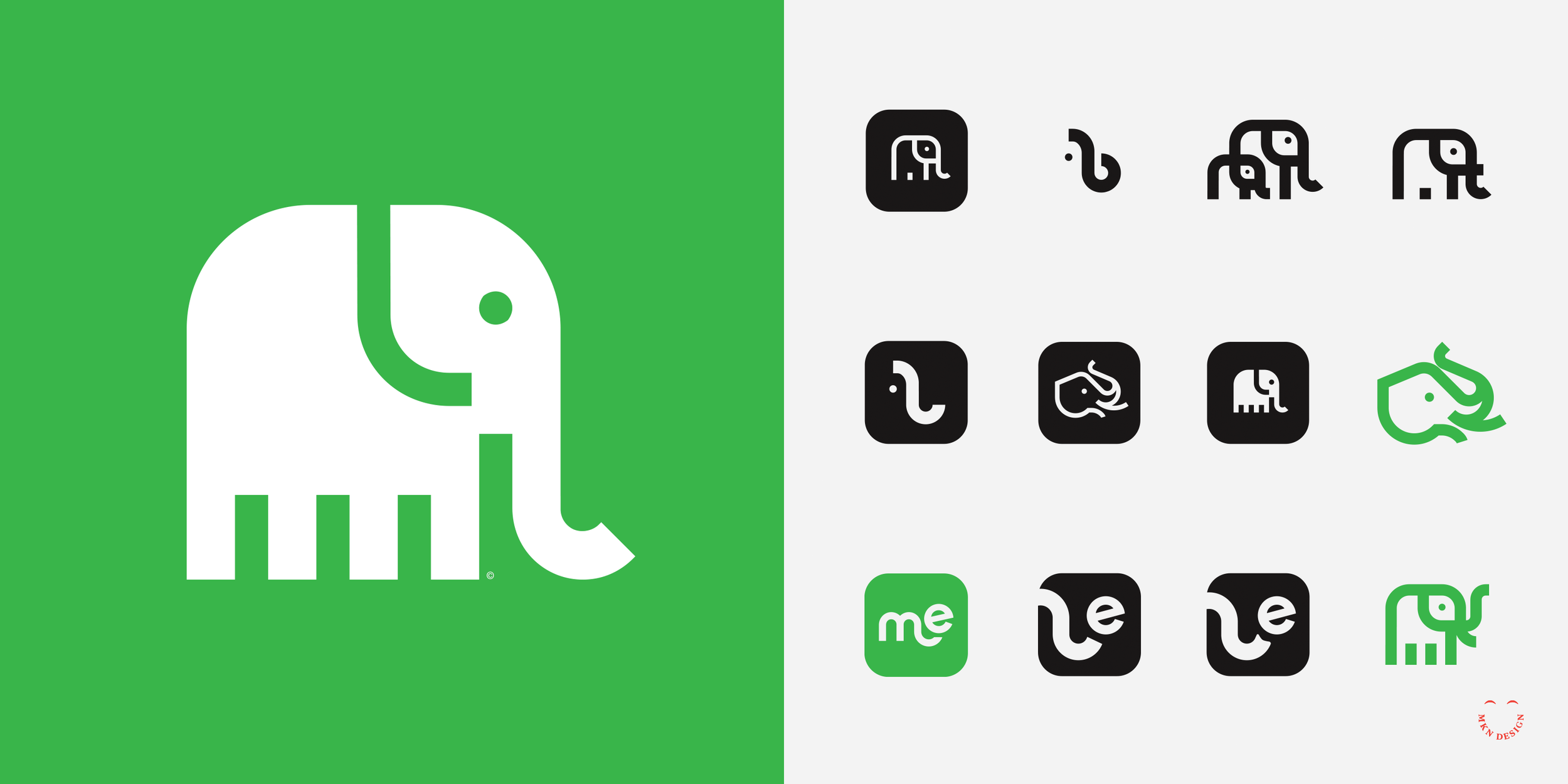
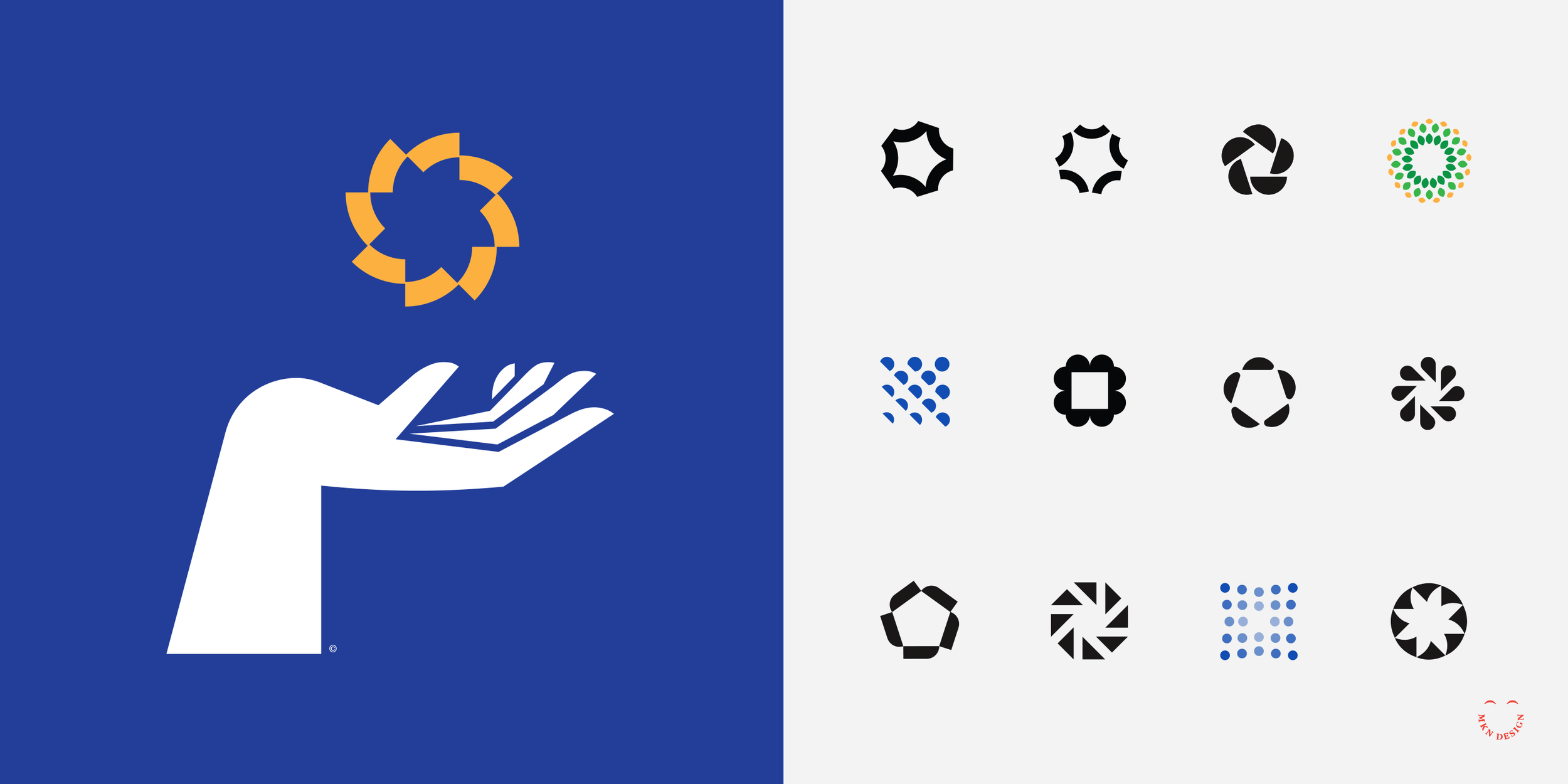
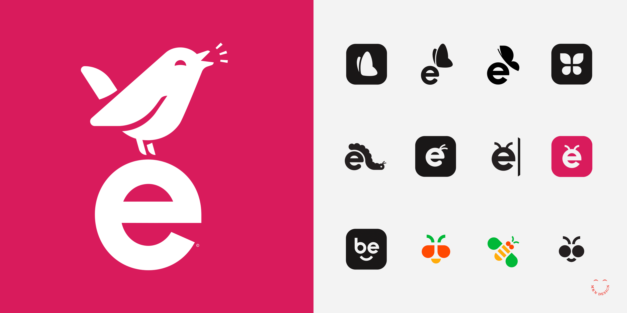
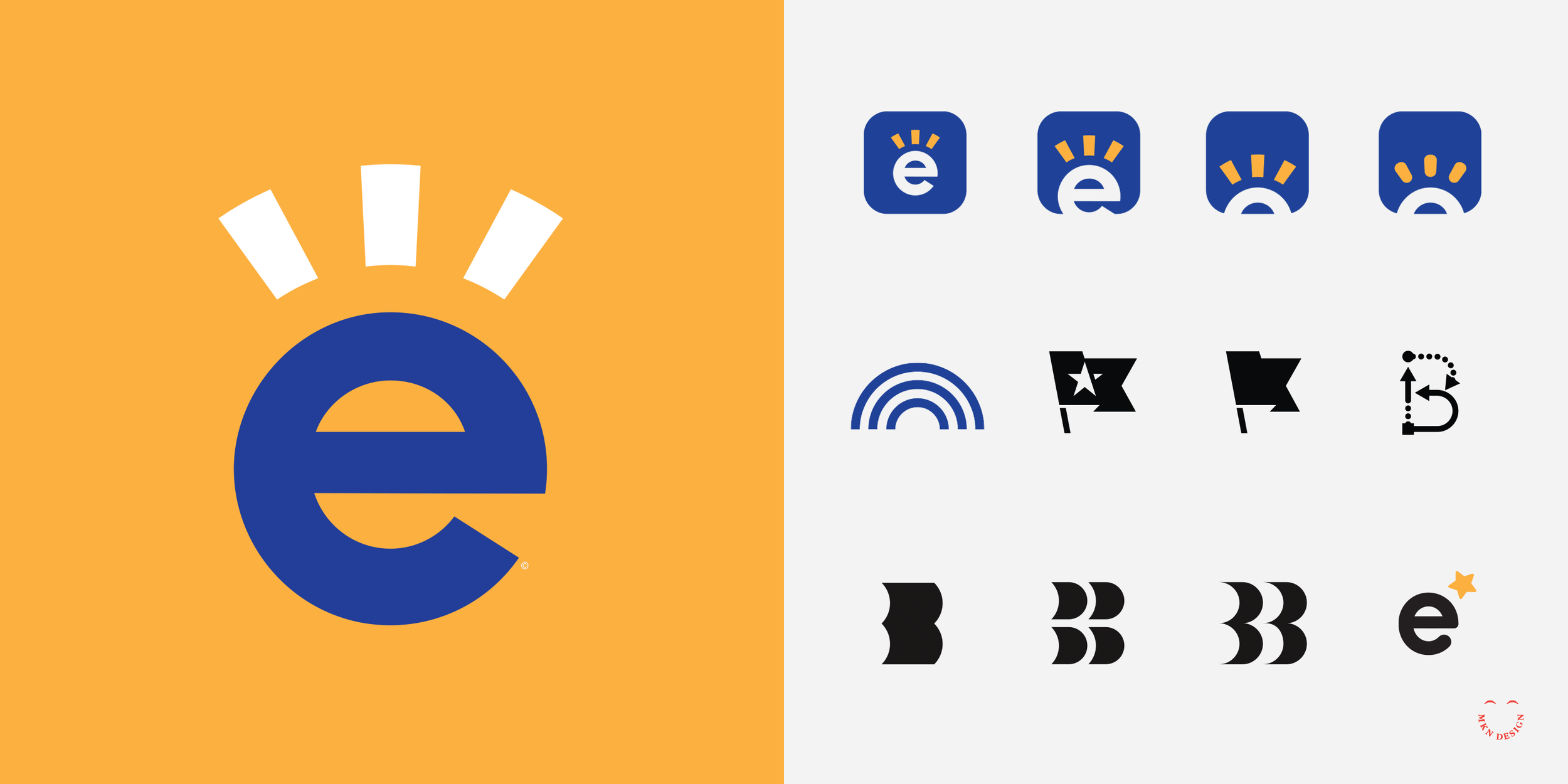
Become Mark Exploration

Client Project
—
Become Mark Exploration
I was hired by Become to develop their brand messaging framework and new identity. With the first phase completed we had language that helped create these concept marks. While the new identity has not launched, I wanted to share these initial concept explorations—the good, the bad, and the ugly. Not all of these explorations were shown to the client, but they all played a crucial part in shaping the final brand identity.
-
Coldbreak
Portable Draft Beverage Systems -
+ Brand Advisor
+ Concept Development
+ Creative Strategy
+ Design Direction
+ Qualitative Research
+ Visual Identity -
MKN Design Team:
+ Michael Nÿkamp, Design Director & Strategist
+ Rob Monacelli, Strategist
+ Nate Netti, Brand Copywriter
Union Media Stakeholders:
+ Ryan Montgomery, Chief Executive Officer
+ Andrea Montgomery, Managing Editor
+ David Schofield, Designer -
→ View the completed Become Identity.
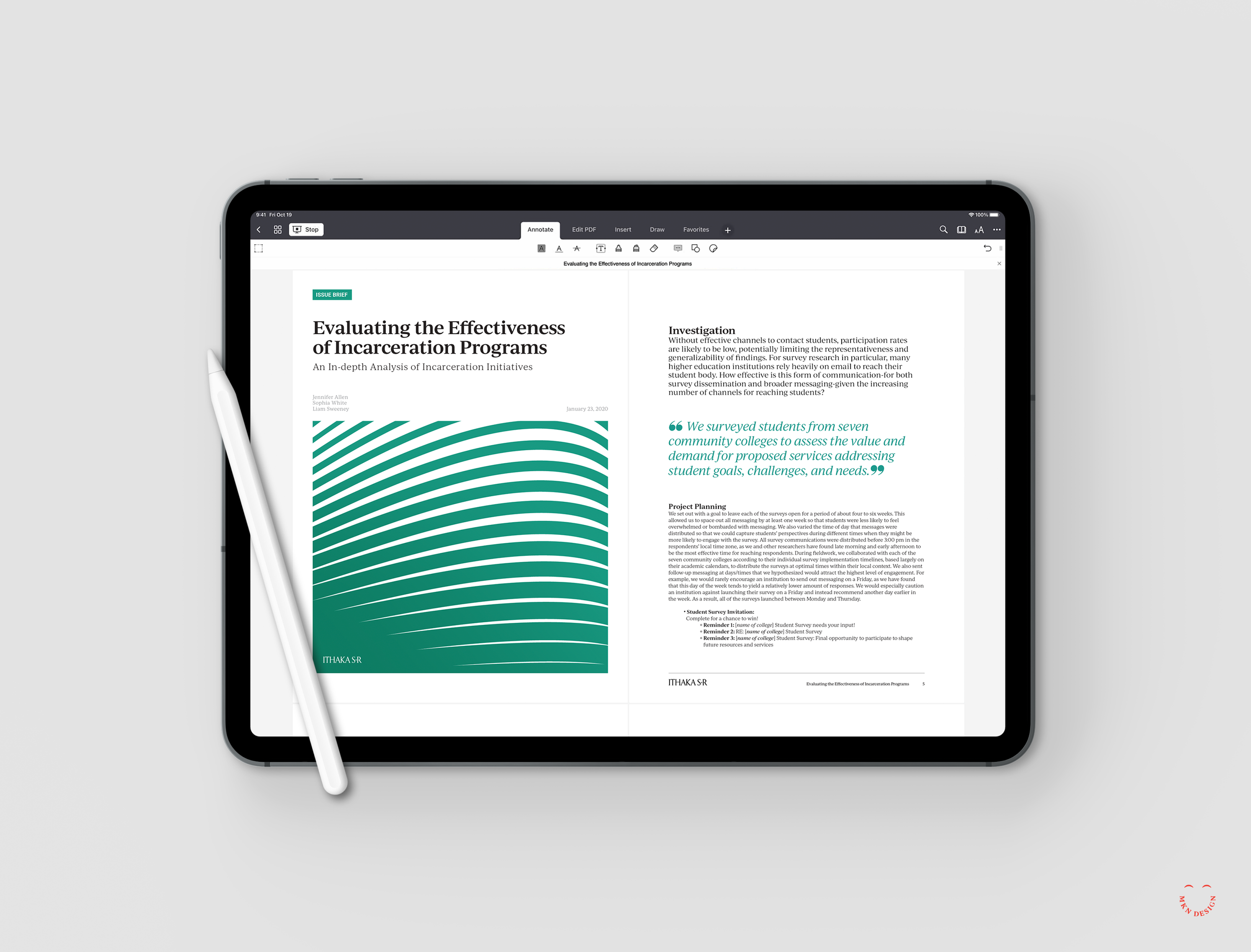
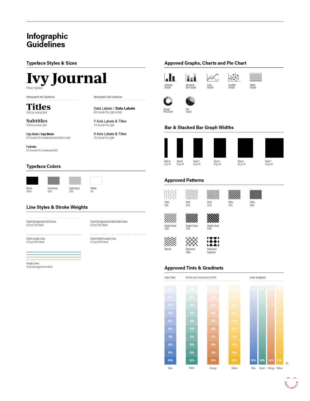
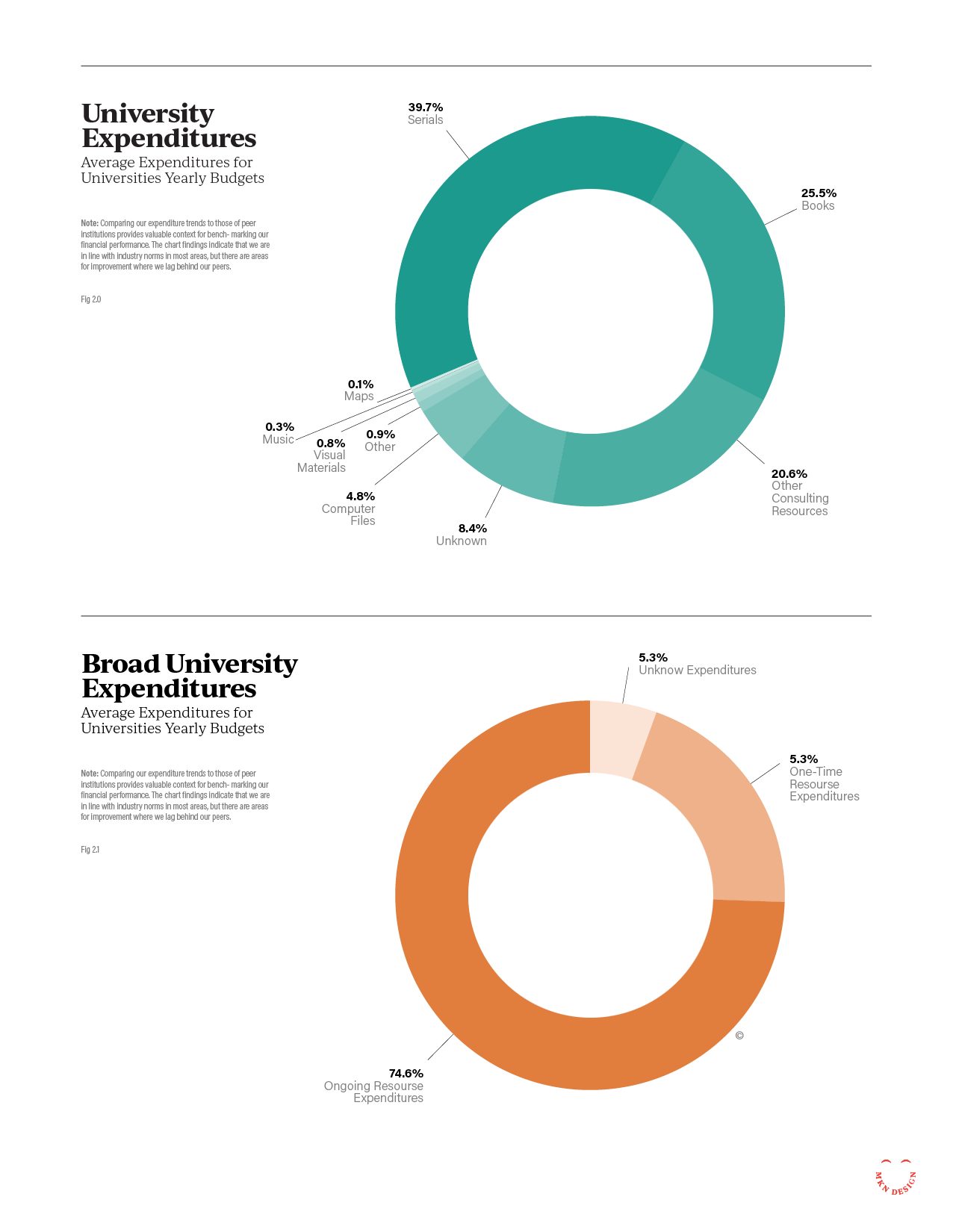
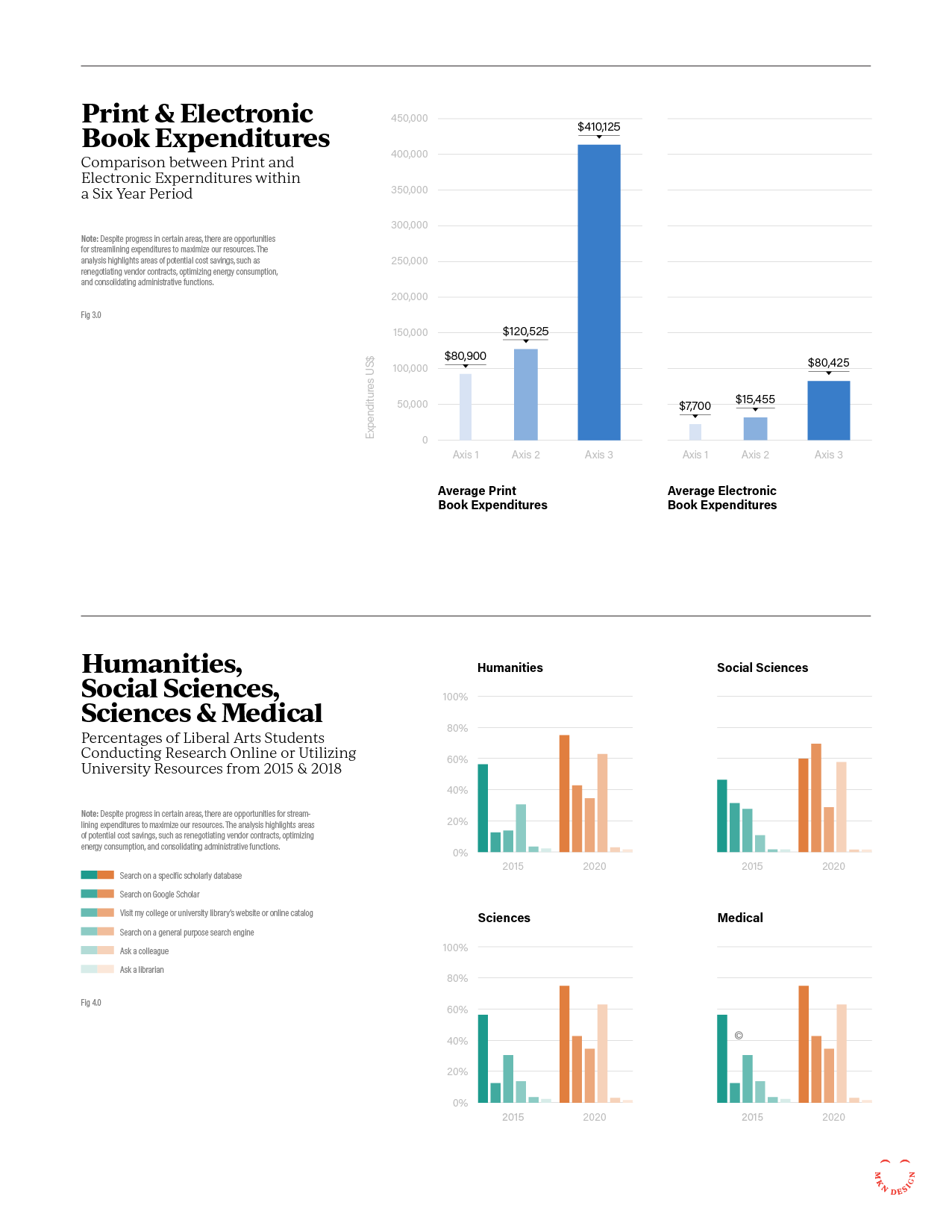
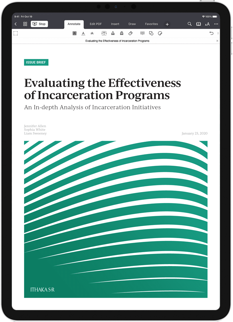
ITHAKA S+R – Brand Collateral Design System

Nonprofit Client Project
—
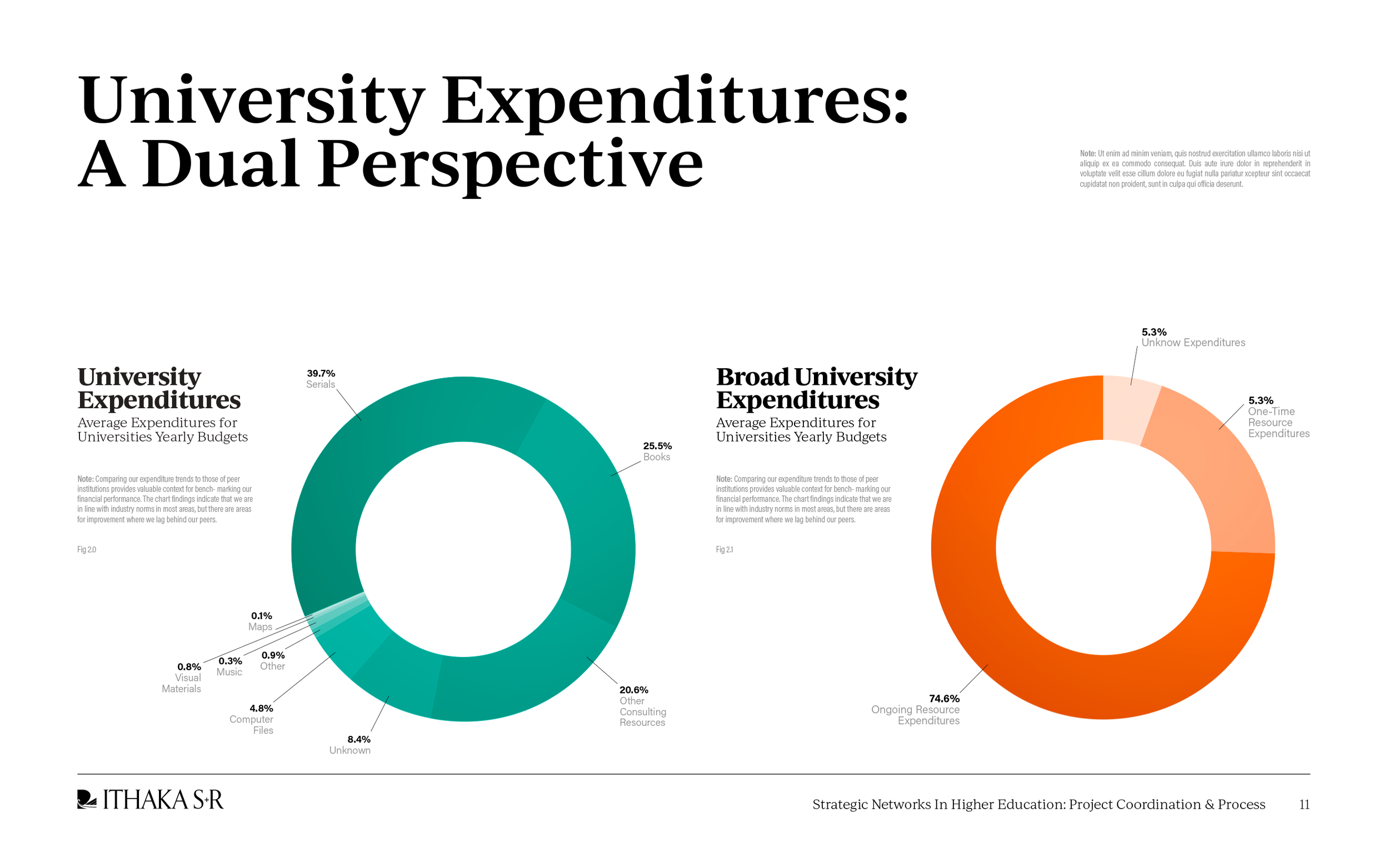
ITHAKA S+R – Brand Collateral Design System
ITHAKA S+R, an organization that conducts research and provides strategic guidance to help the academic community navigate economic and technological change, needed a unified design system for all their communication materials. They hired us to modernize their system by creating an accessible, brand-compliant design that could be easily updated and maintained by their team.
A key requirement was enabling staff to create or update all redesigned materials. Our research identified Google Workspace (Docs, Slides, and Sheets) as the optimal platform for implementation. The resulting design system follows Ithaka’s brand guidelines, incorporates accessibility considerations—including color blindness and visual impairments—and provides clear, distinct visual cues for different document types such as case studies, issue briefs, research reports, and unpublished reports.
Through iterative design explorations, we delivered a unified system that gives Ithaka’s educational research materials and presentations a consistent, distinctive, and accessible visual identity.
-
ITHAKA S+R
Research & Consulting Services -
+ Art Direction
+ Concept Development
+ Creative Assets
+ Illustration
+ Infographic Design
+ Qualitative Research
+ Visual Identity -
MKN Design Team:
+ Michael Nÿkamp, Art Director
+ Kate Folkert, Graphic Designer
ITHAKA S+R Stakeholders:
+ Liza Pagano, Creative Director
+ Kimberly Lutz, Publications, Communications, Marketing Director
+ Travis Shook, Microsoft 365 Specialist
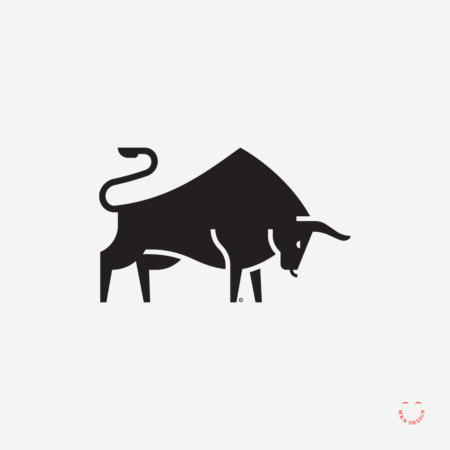
Aggressive Bulls

Creative Musing
—
Aggressive Bulls
Exploring different simplified bull illustrations, the right emulates cave paintings while the other adopts a sleek minimalist approach.
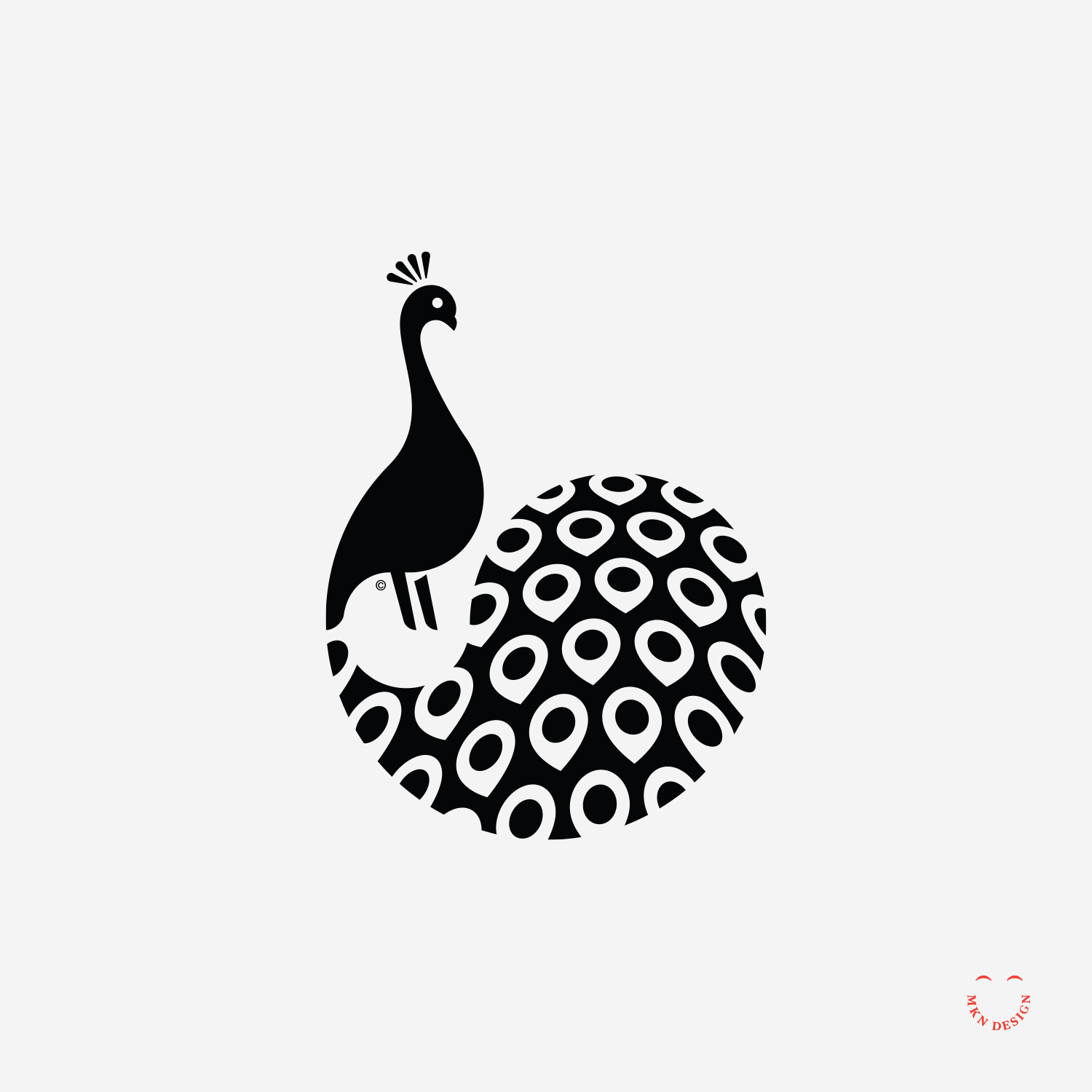
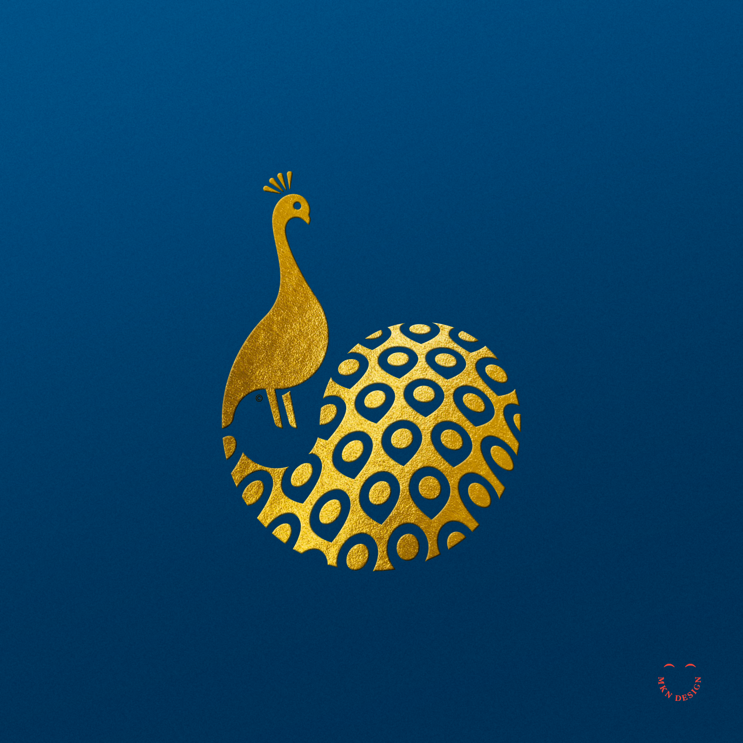
Illustrious Peacock
Creative Musing
—
Illustrious Peacock
Fun illustrative exploration, though it was difficult to get the tail feather effect I wanted.
Space Invaders

Creative Musing
—
Space Invaders
These illustrations were explorations of hand location/position while holding a phone. It was boring with blank screens so I added the vintage Apple logo and Space Invaders.
Google Doodle Building Blocks

Creative Musing
—
Google Doodle, Building Blocks
My idea of writing 'Google' with building blocks came from playing with my two kids and their wooden blocks. We were using a set of primary color blocks, and the colors and shapes reminded me of Google. This inspired me to use the blocks to create an abstract version of Google's wordmark.
For nearly two centuries, wooden building blocks have been a common presence in children's playrooms (and for the adults who join in), enriching their playtime experiences. In the 1800s, German education pioneer Friedrich Fröbel crafted wooden block set, laying the groundwork for his innovative approach to early childhood education.
Fröbel, renowned for inventing "Kindergarten," revolutionized the field and his educational concept remains influential today.
Spectrum Health – UX & Illustration Storytelling

Client Project
—
Spectrum Health – UX & Illustration Storytelling
A prominent healthcare provider dedicated to delivering exceptional medical services and improving community health, Spectrum Health (now Corwell Health) plays a vital role in enhancing the well-being of individuals across various West Michigan. Working alongside a team of engineers and developers, I helped design and develop functional prototype application named My Chart.
This endeavor required a strategic approach, including the use of personas, iterative wire-framing, and meticulous design iterations to craft a compelling and user-centric digital journey for patients.
The application catered to both new and returning patients of Spectrum Health facilities, offering features such as iPad-based check-in for hospital and doctor appointments, seamless access to medical records, and entertainment options.
-
Spectrum Health via Mutually Human
Health Care Facilities & Services -
+ Concept Development
+ Design Direction
+ Illustration Storytelling
+ Qualitative Research
+ User Experience
+ Sketching & Ideation -
MKN Design Team:
+ Michael Nÿkamp, Visual Storytelling & UX/UIMutually Human Stakeholders:
+ Ross Hunter, Software Craftsman
+ Mark Van Holstyn, Founder and CTO
Red Headed Finch

Creative Musing
—
Red Headed Finch
Minimalist study on this Red Headed Finch.
Weekend Exploration


Creative Musing
—
Weekend Exploration
Fun exploration with typeface and illustration this weekend.
Remarker – Brand Identity


Client Project
—
Remarker – Brand Identity
Collaborating with Sung Yi via Carambito I assisted with developing a logo and defining the aesthetic of his notebook. Through thorough research, it became evident that the logo needed to embody both the notebook’s simple sophistication and resonate with its intended audience. The outcome was a logo that conveyed individuality and simplicity. The logos freehand script mimicked a fluid motion of pen meeting paper. Crafted to be comfortably handheld, this product provides effortless access to personalized index cards that perfectly align with users’ needs.
Crafted to securely hold index cards, with future adaptability to accommodate cell phones. Users can choose from a variety of custom-designed index card options to suit their needs, including Blank, Dot Grid, Line Grid, Isometric Grid, Idea Card, Lined, Time Tracker, Task List, Hourly Task List, and Storyboard.
Notebook Dimensions:
• Closed Notebook: 5¼" x 3⅞"
• Open Notebook: 5¼" x 7¾"
-
Remarker
Stationery Notebook -
+ Brand Advisor
+ Concept Development
+ Creative Strategy
+ Design Direction
+ Qualitative Research
+ Visual Identity -
MKN Design Team:
+ Michael Nÿkamp, Design DirectorRemarker Stakeholder:
+ Sung Yi, CEO
Herman Miller – Iconography Design System


Client Project
—
Herman Miller – Iconography Design System
Led the Workplace Knowledge Team at Herman Miller (presently MillerKnoll) in the development and design of an iconography system pivotal in delineating crucial research methodologies within their workflow. These icons were not only instrumental in establishing definitive research practices but also needed to adhered to Herman Miller's strict brand guidelines.
-
Herman Miller (MillerKnoll)
Furniture Design & Manufacturing -
+ Design Direction
+ Brand Advisor
+ Illustration
+ Qualitative Research -
MKN Design Team:
+ Michael Nÿkamp, Design Director
Herman Miller Stakeholder:
+ Gretta Peterson, Senior Director of Global Real Estate & Workplace Strategy
CAT Footwear


Client Project
—
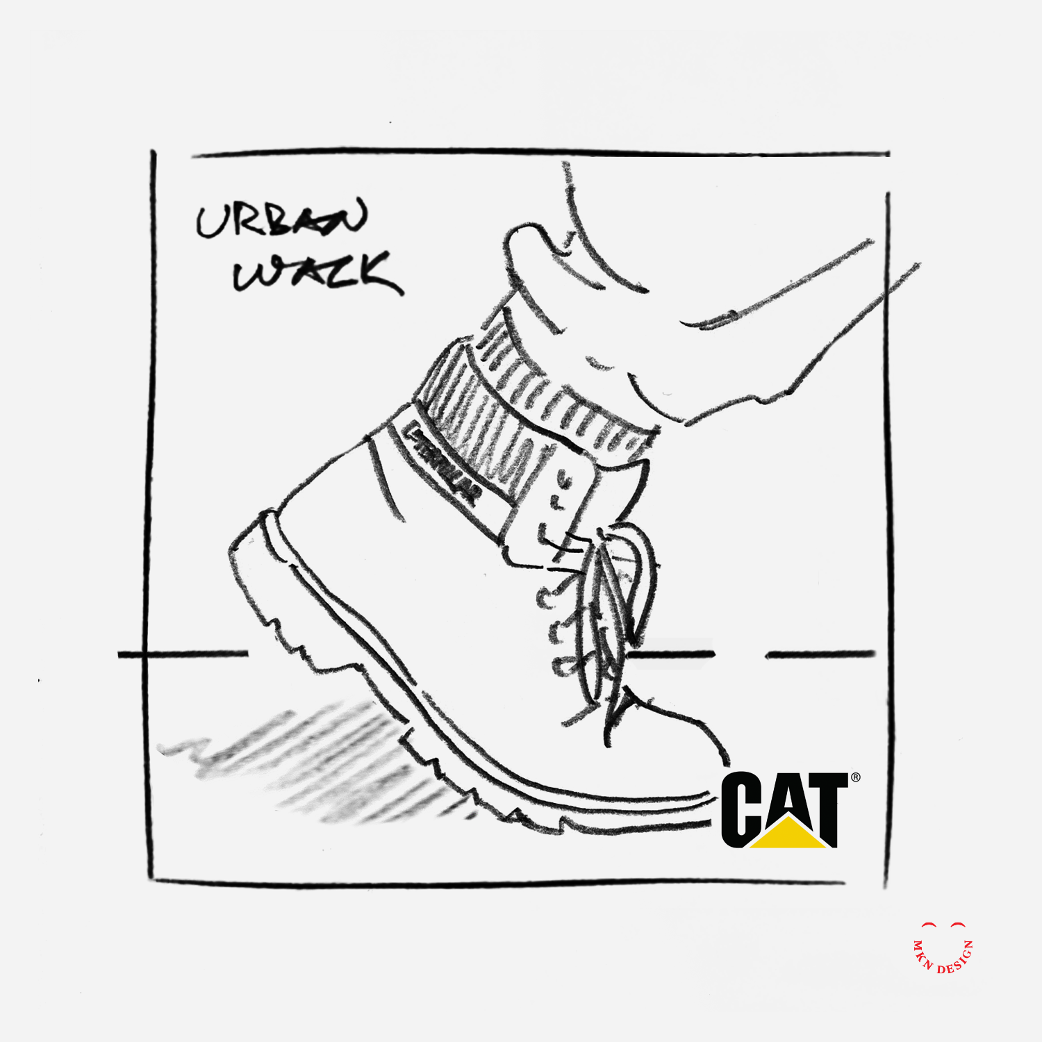
CAT Footwear
While employed at Designvox I helped create the photography concept direction for Cat Footwear. Cat Footwear is a renowned brand recognized for its rugged and durable footwear designs, built to withstand tough environments and provide exceptional comfort and protection. With a legacy rooted in craftsmanship and innovation, Cat Footwear continues to be a go-to choice for individuals seeking reliable footwear for work and leisure alike.
The selected photography approach showcased consumers wearing CAT's footwear, focusing specifically on their CAT boots as they engaged in various activities within diverse environments. This concept resonated with our clients, aligned with consumers, and fit the demographics without being overtly masculine or feminine.
This project faced a distinctive challenge, CAT footwear had been successfully manufacturing high-quality construction boots for 20 years, primarily catering to masculine construction workers. However, new customer demographics emerged, as women and teenagers began to purchase their rugged boots. Armed with this information, I produced some of the photography concept directions.