

Independent Work
FluMist® – Packaging Design System
Client Work
—
FluMist® – Packaging Design System
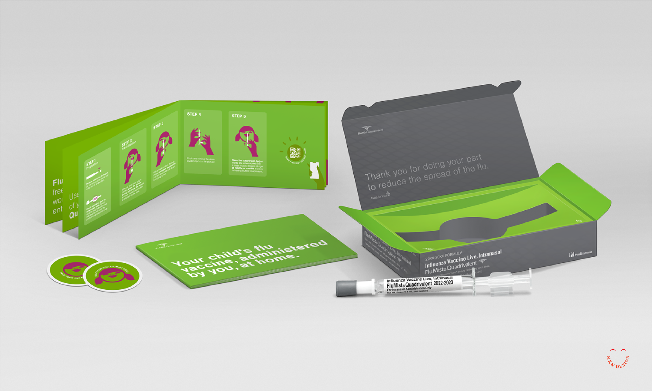
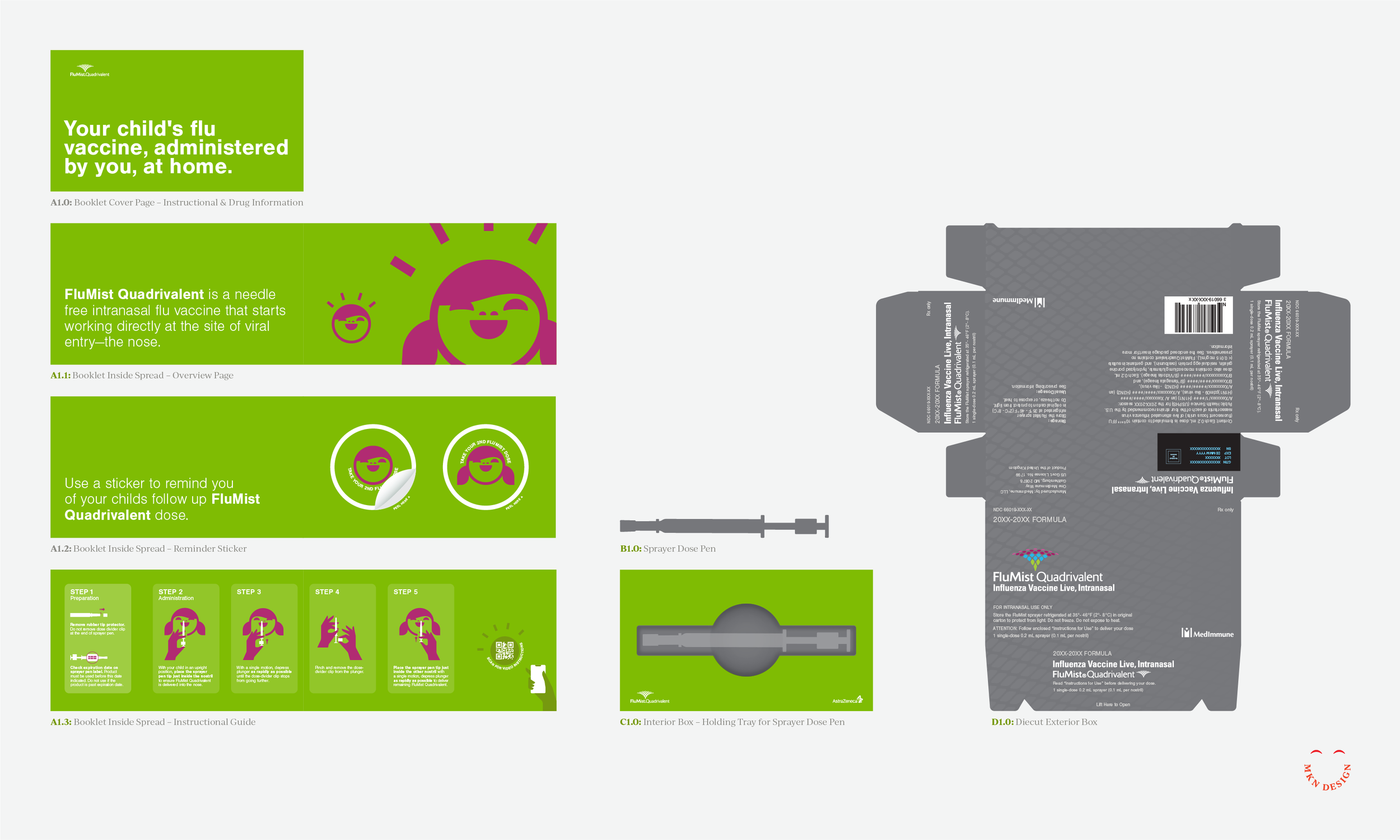
VML hired me as a packaging specialist to create a distinctive design for AstraZeneca’s FluMist®, including physical prototypes and instructional illustrations.
Given the innovative delivery method—a single-dose nasal spray rather than a traditional needle—this project also demanded a creative approach to the visual design and unboxing experience. Our design approach was dual- focused, targeting both parents and children and included exterior and interior design considerations.
The system included a clear visual guide for administering the dose, reminder stickers, and the physical dose mechanism, all designed to work cohesively within the overall experience.
To achieve an approachable, refined, and safe feel for the design and unboxing experience, we incorporated the brand’s vibrant color palette, friendly typography, and playful illustrations. Our goal was to instill a sense of trustworthiness, friendliness, and clarity in both the exterior and interior packaging while ensuring all strict FDA packaging regulations were prominently displayed. This approach created an unboxing experience that was engaging, clear, and professional, balancing approachability and safety.
Successful packaging begins with a deep understanding of who it’s being designed for, guiding both the visual direction and overall strategy. Equally important is having the expertise to design and develop physical mock-ups, which help identify structural requirements and limitations before applying the visual design. Creating these mock-ups further strengthens the process by providing real-world insight into how the structure, materials, and design elements work together. This ensures that the visual and structural components align seamlessly with the overall design goals, especially within strict pharmaceutical guidelines.
-
AstraZeneca
Pharmaceuticals & Biotechnology -
+ Communication Design
+ Concept Development
+ Creative Assets
+ Instructional Illustration
+ Physical Prototyping
+ Photoshop & Physical Mockups
+ Qualitative Research
+ Unboxing Experience -
MKN Design Team:
+ Michael Nÿkamp, Graphic Designer and IllustratorVML Stakeholder:
+ David Swearingen, Group Design Director
+ AstraZeneca, FluMist Marketing Department
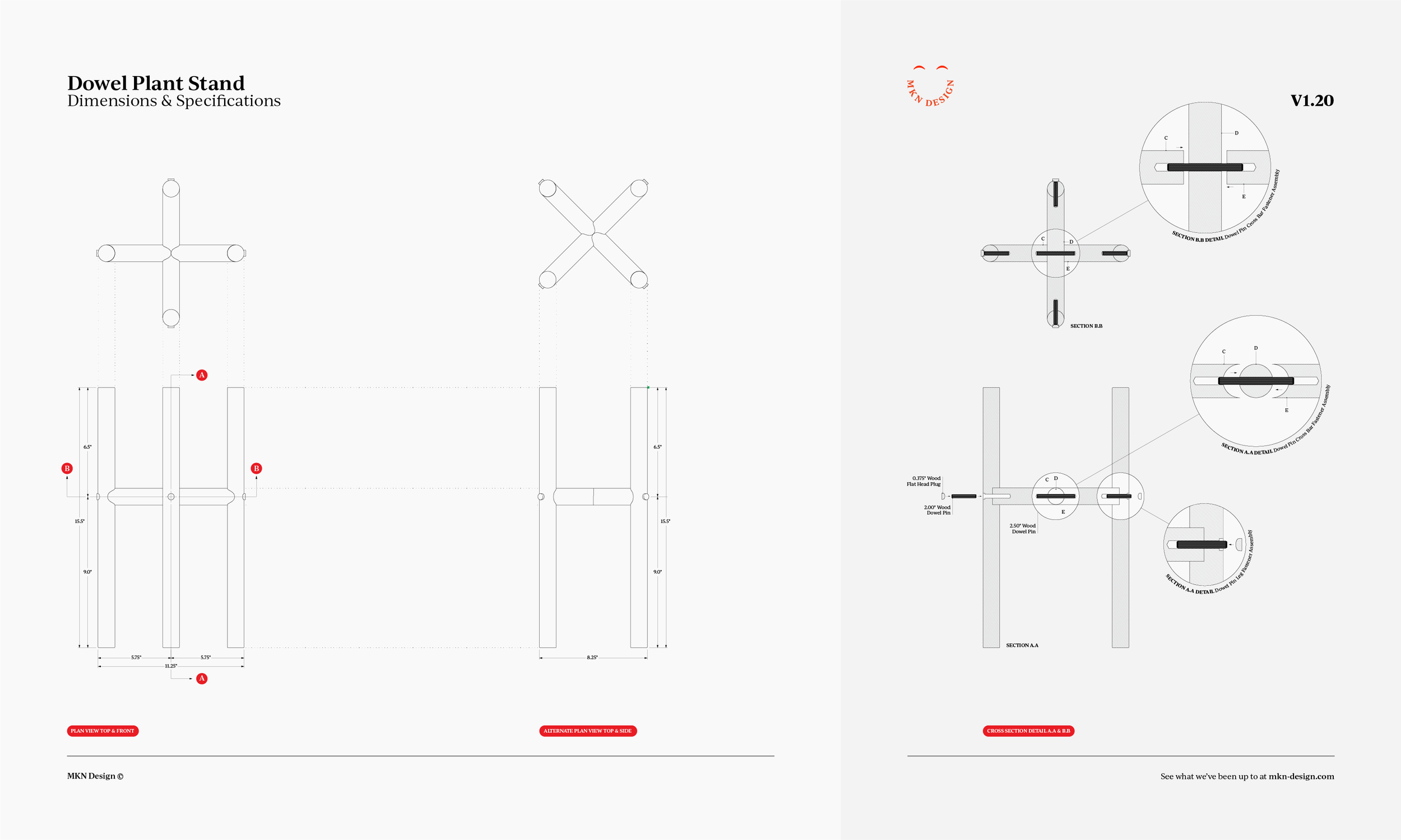
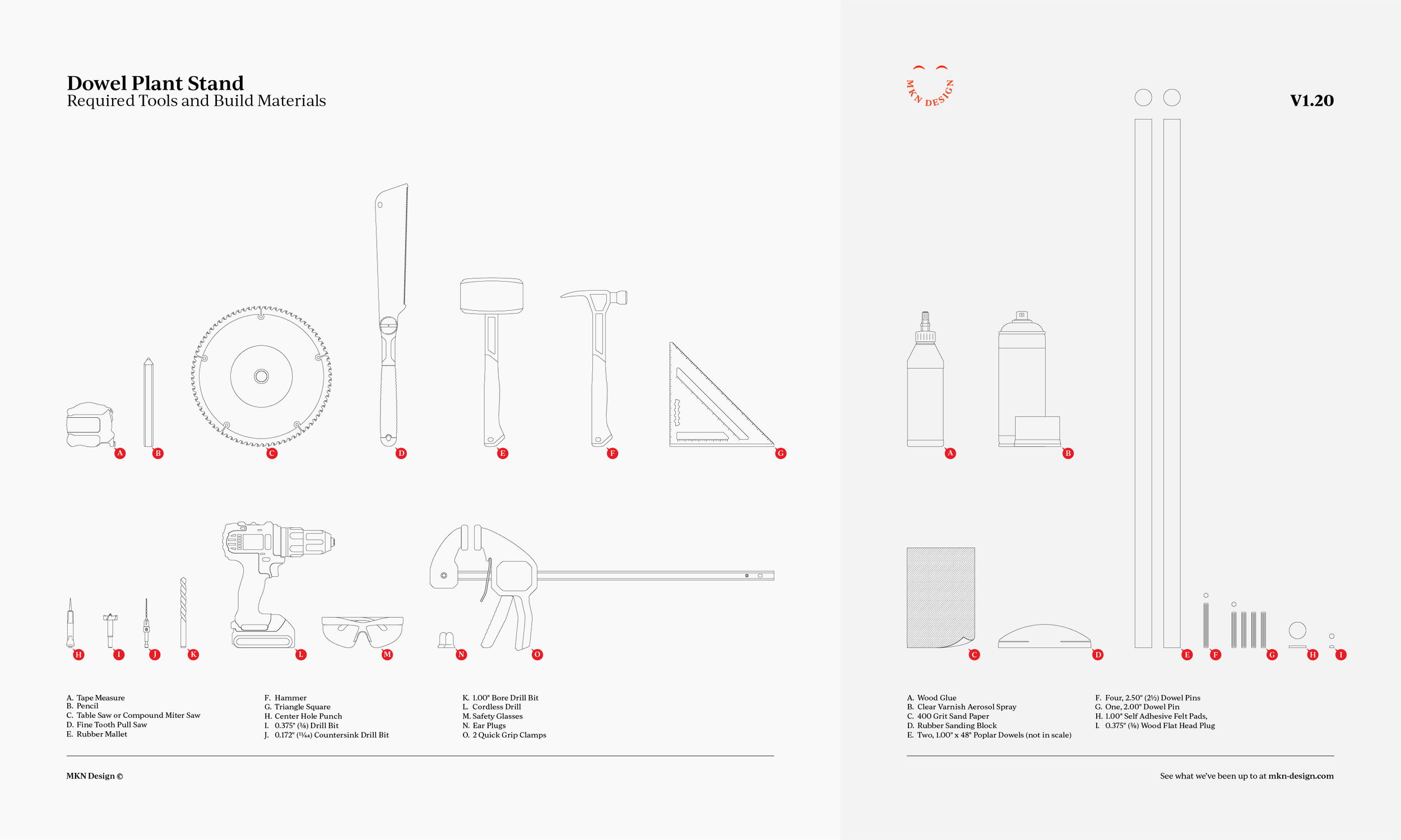
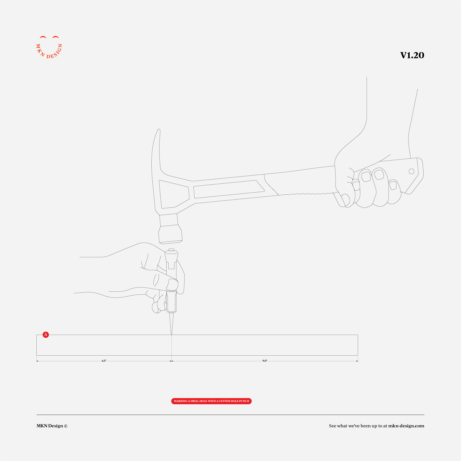
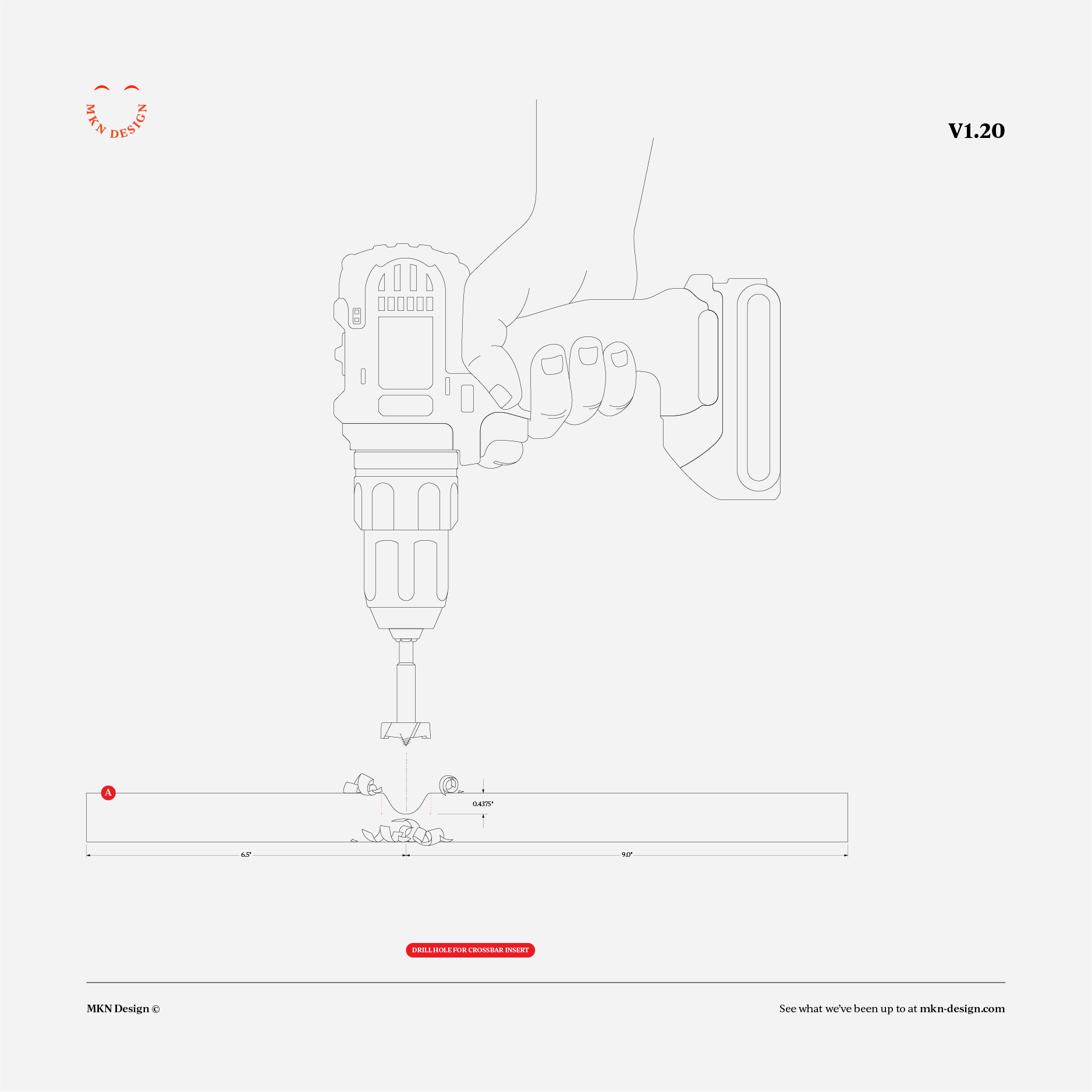
Dowel Plant Stand
Independent Work
—
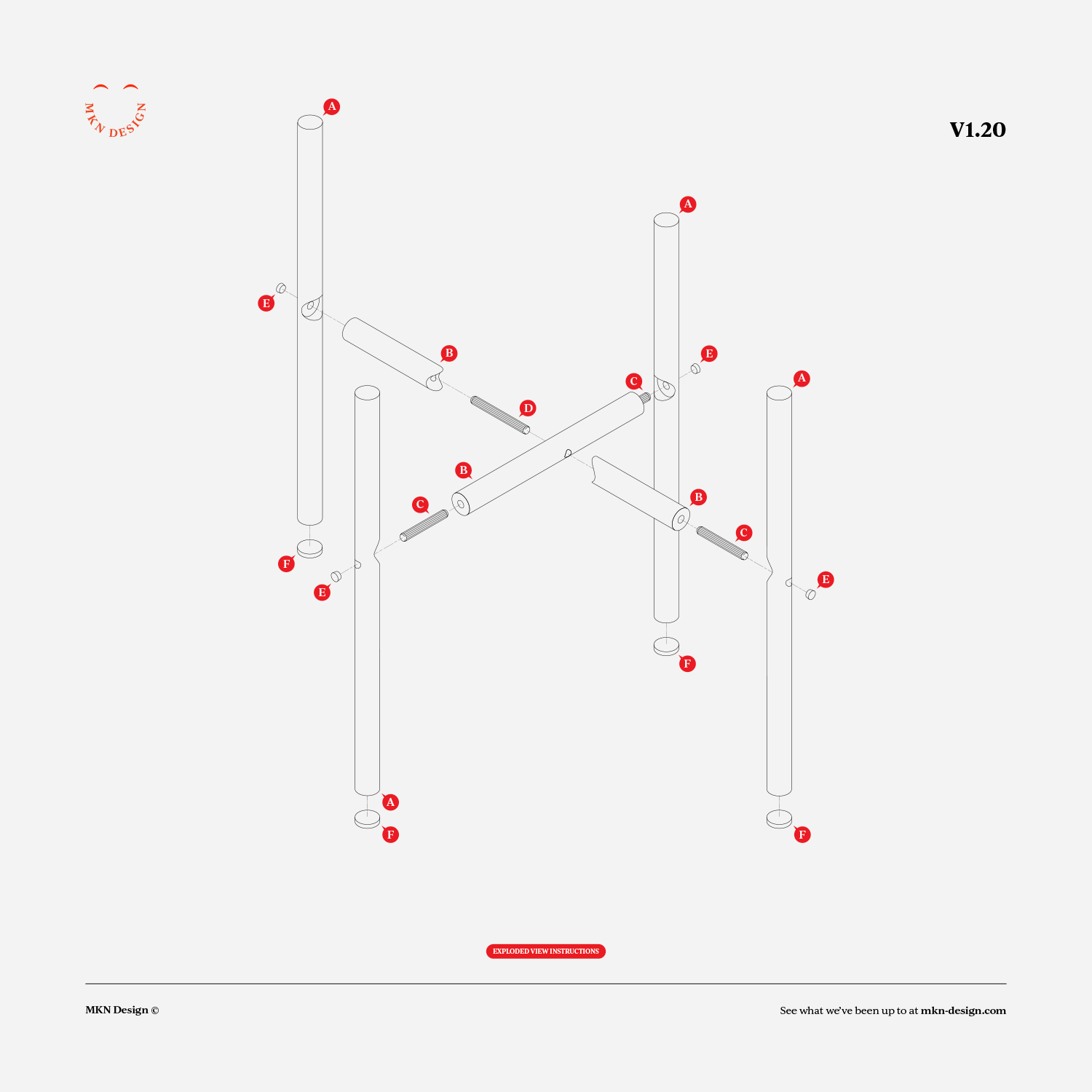
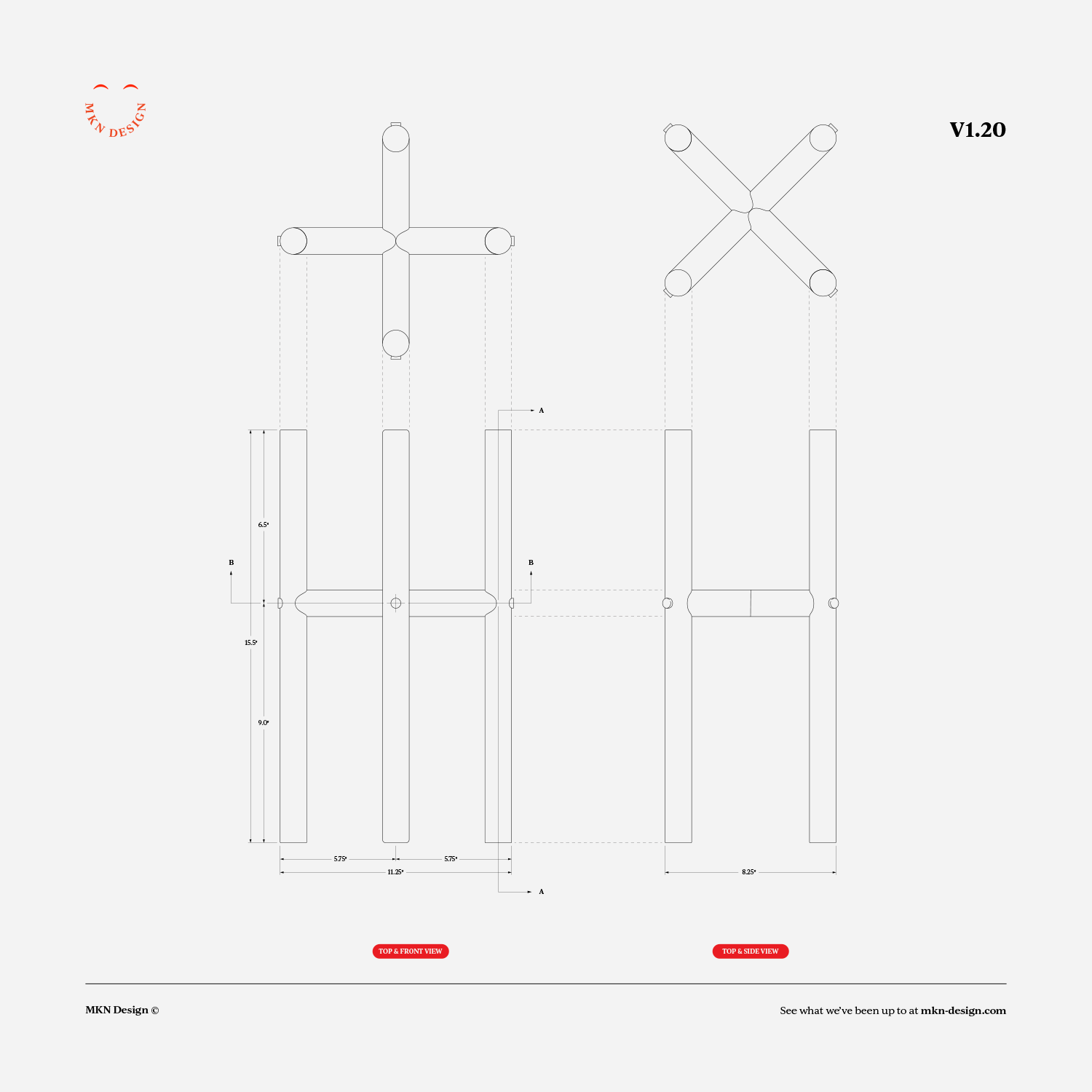
Dowel Plant Stand
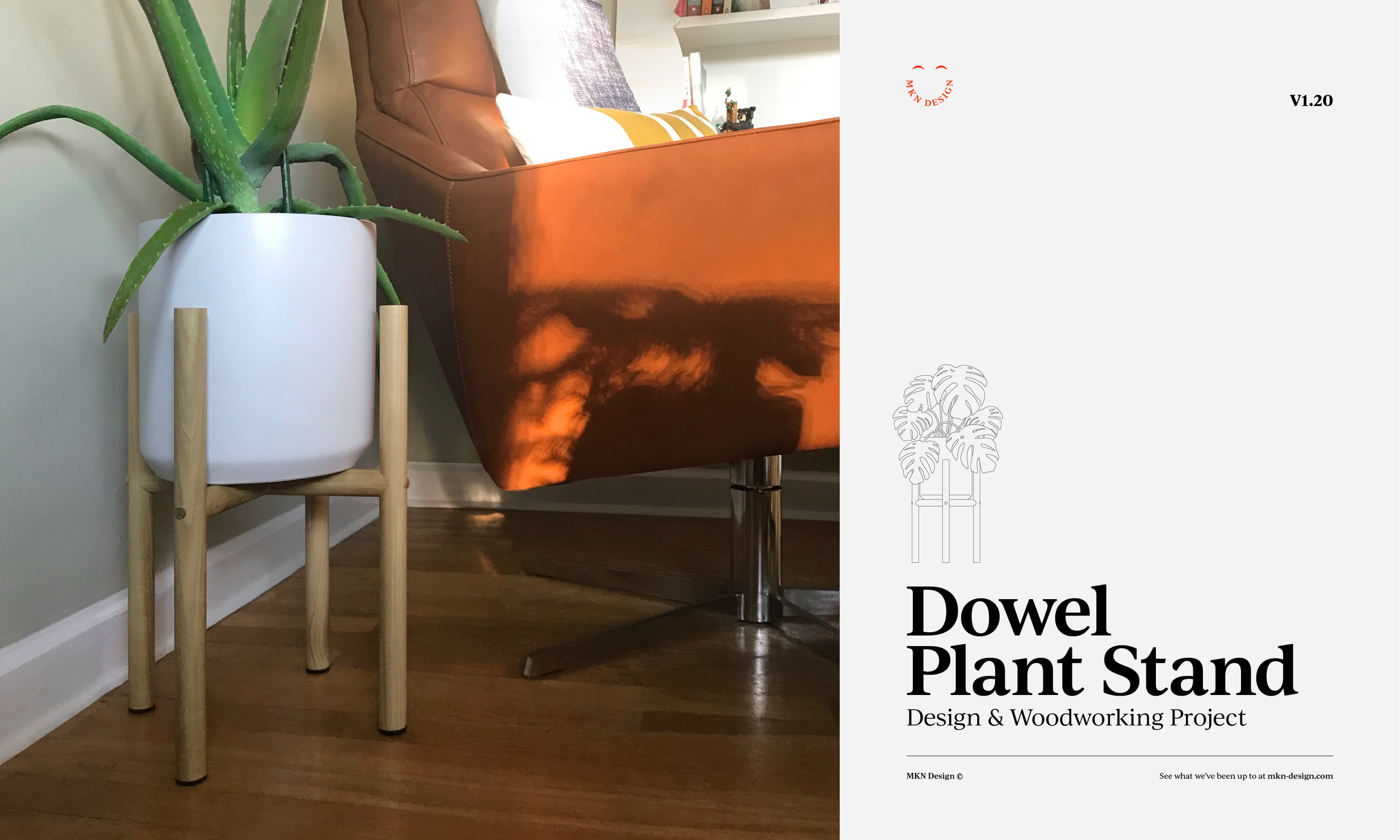
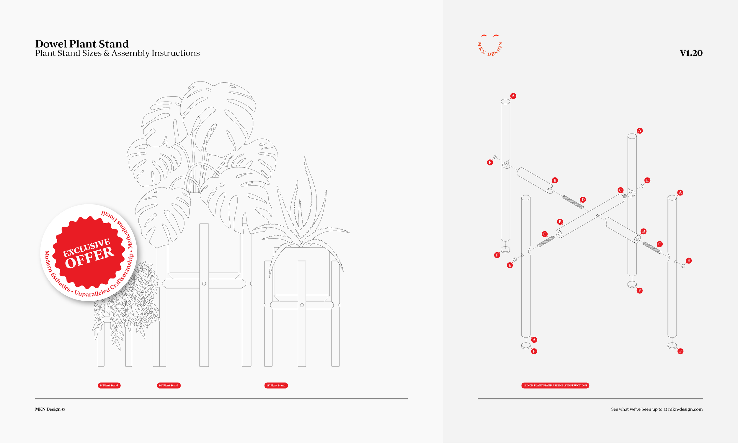
During my downtime, not only do I like to illustrate, but I like to design and build small woodworking projects, like this Dowel Plant Stand. Made from Poplar and constructed only using wood and glue.
-
These plans are available to purchase, email me for cost.
Queen Elizabeth II

Independent Work
—
Queen Elizabeth II
In memory of the queen, 1926 - 2022
Spooky Cat


Independent Work
—
Spooky Cat
Getting into the Halloween spirit by creating illustrations of two spooky black cats. Which one do you prefer, three-eyed cat or the ordinary one?
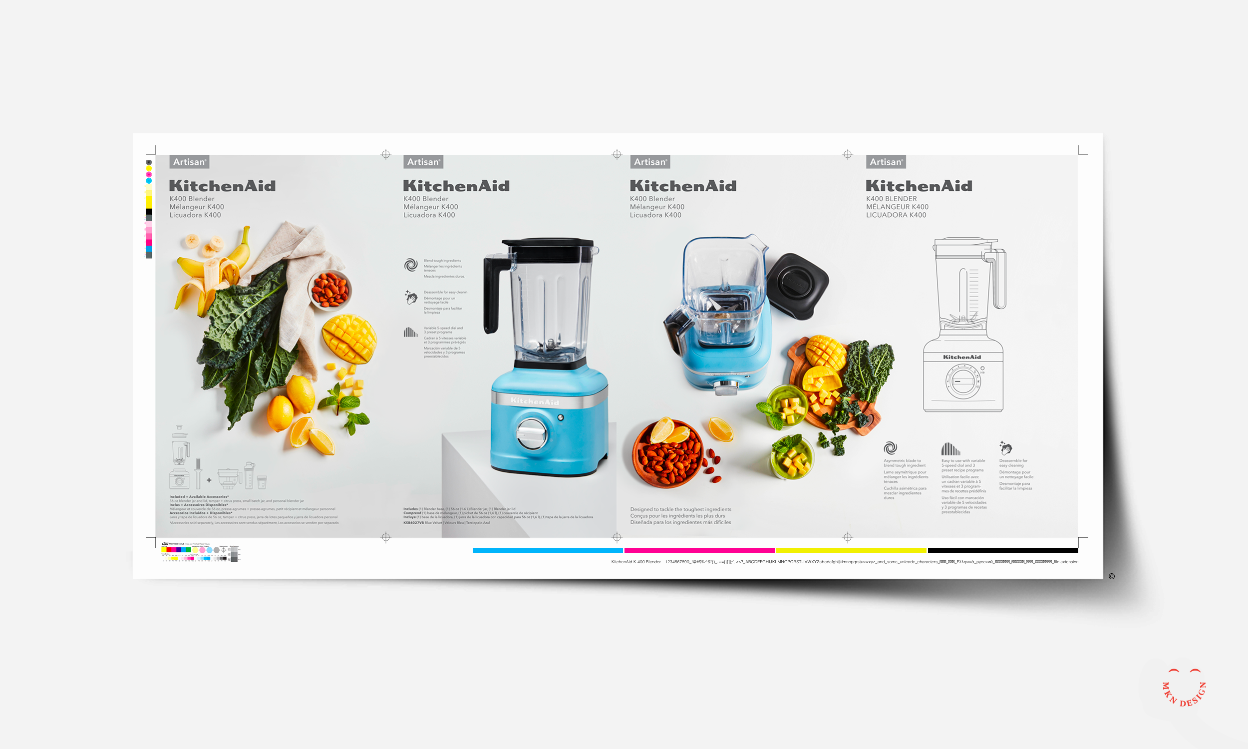
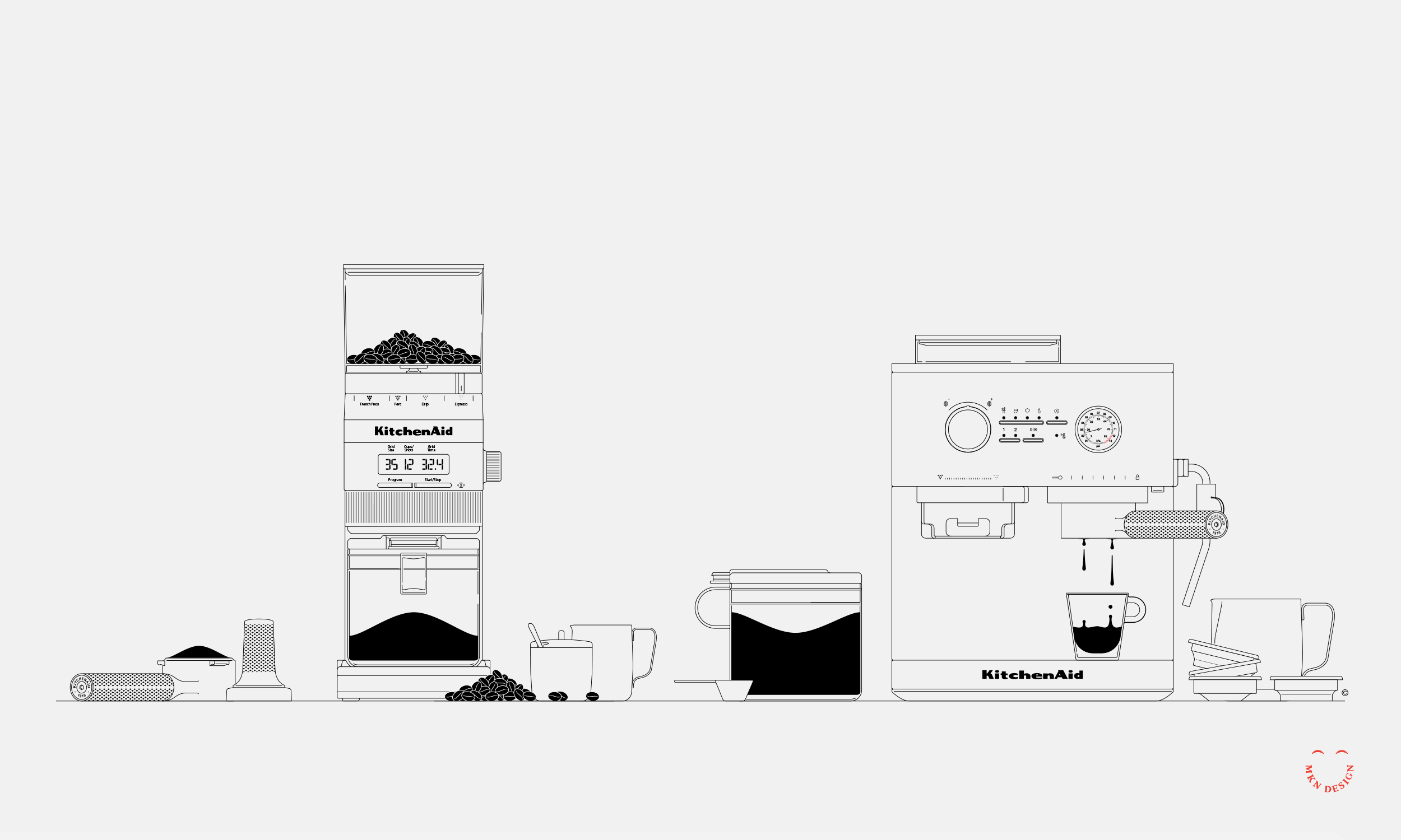
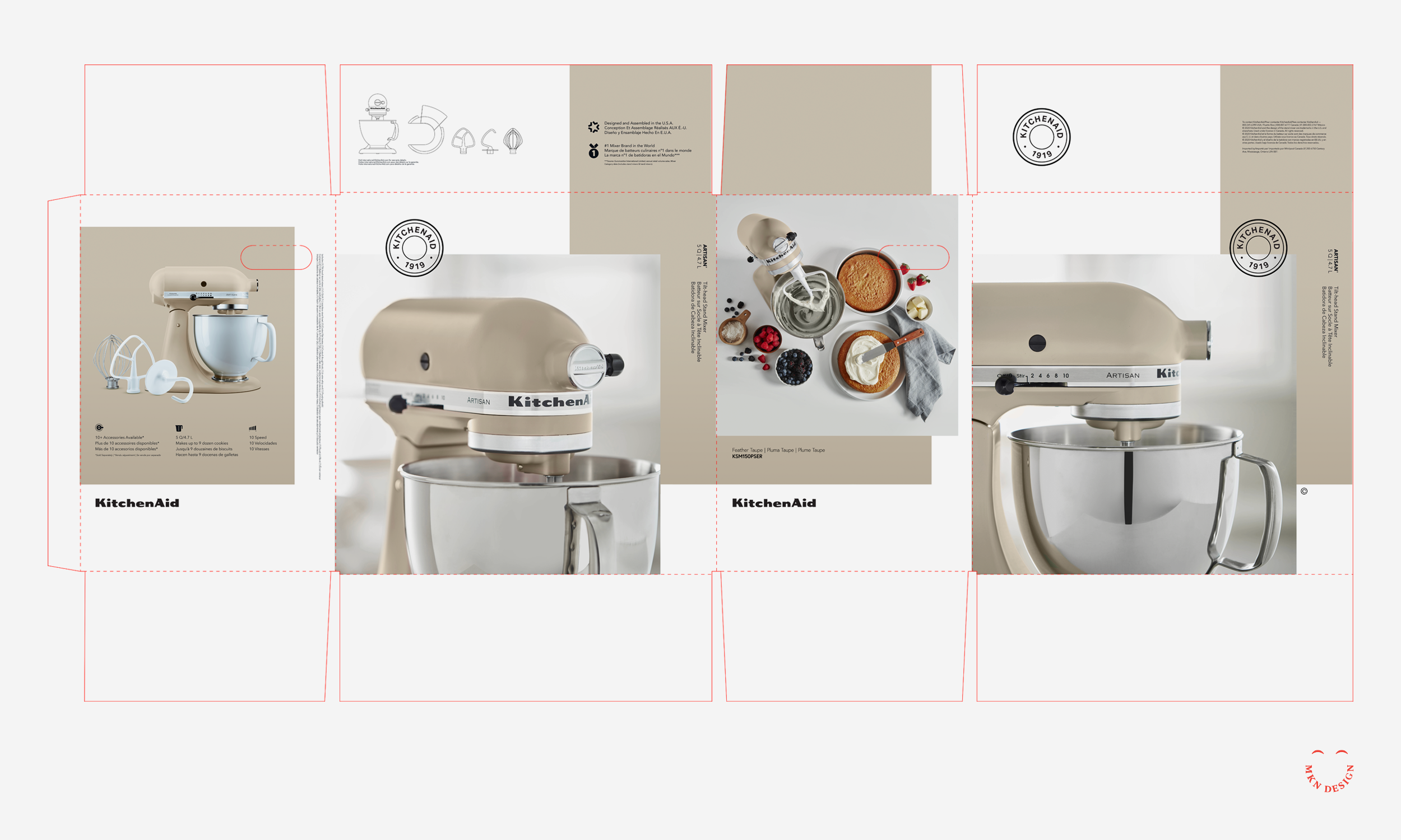
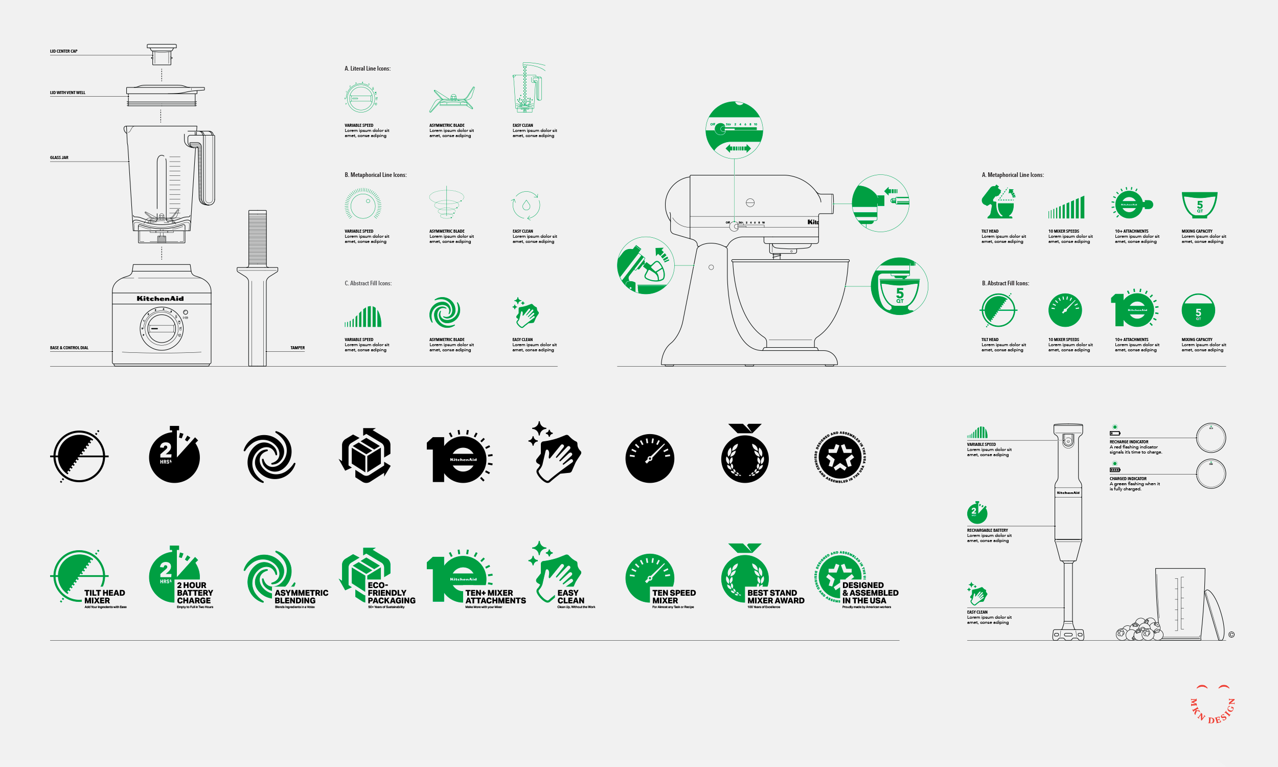
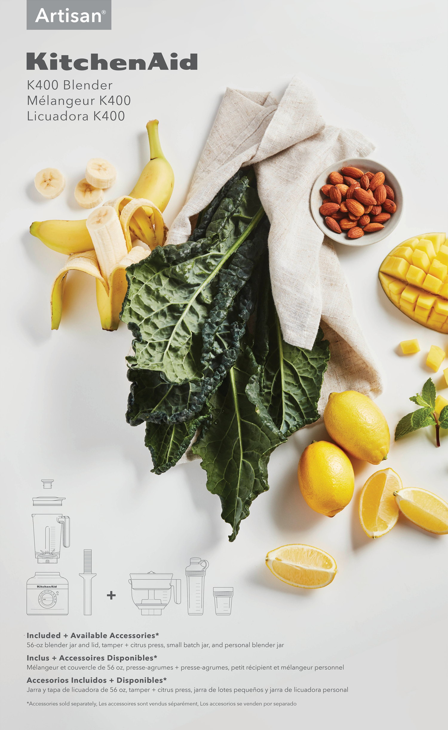
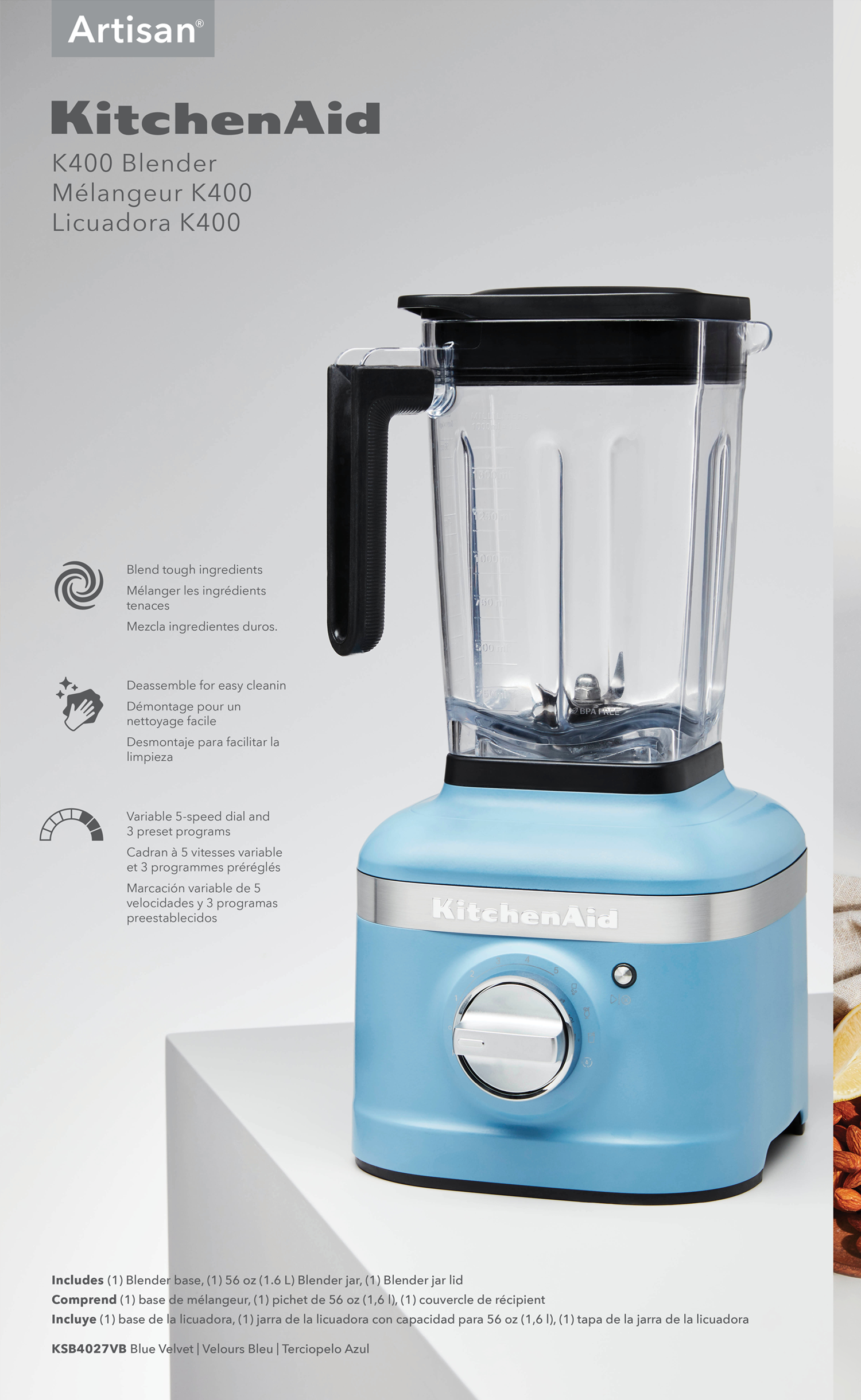
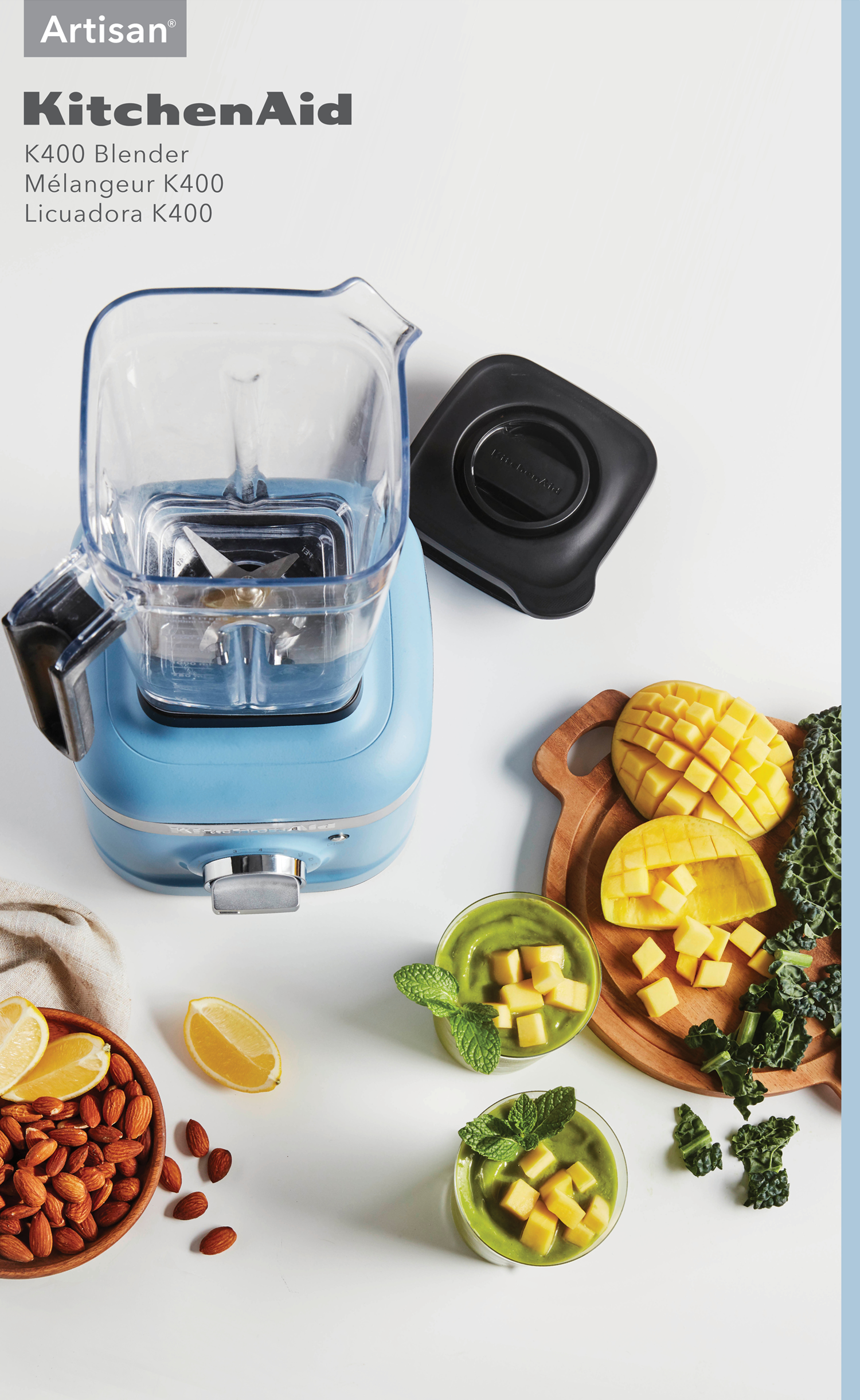
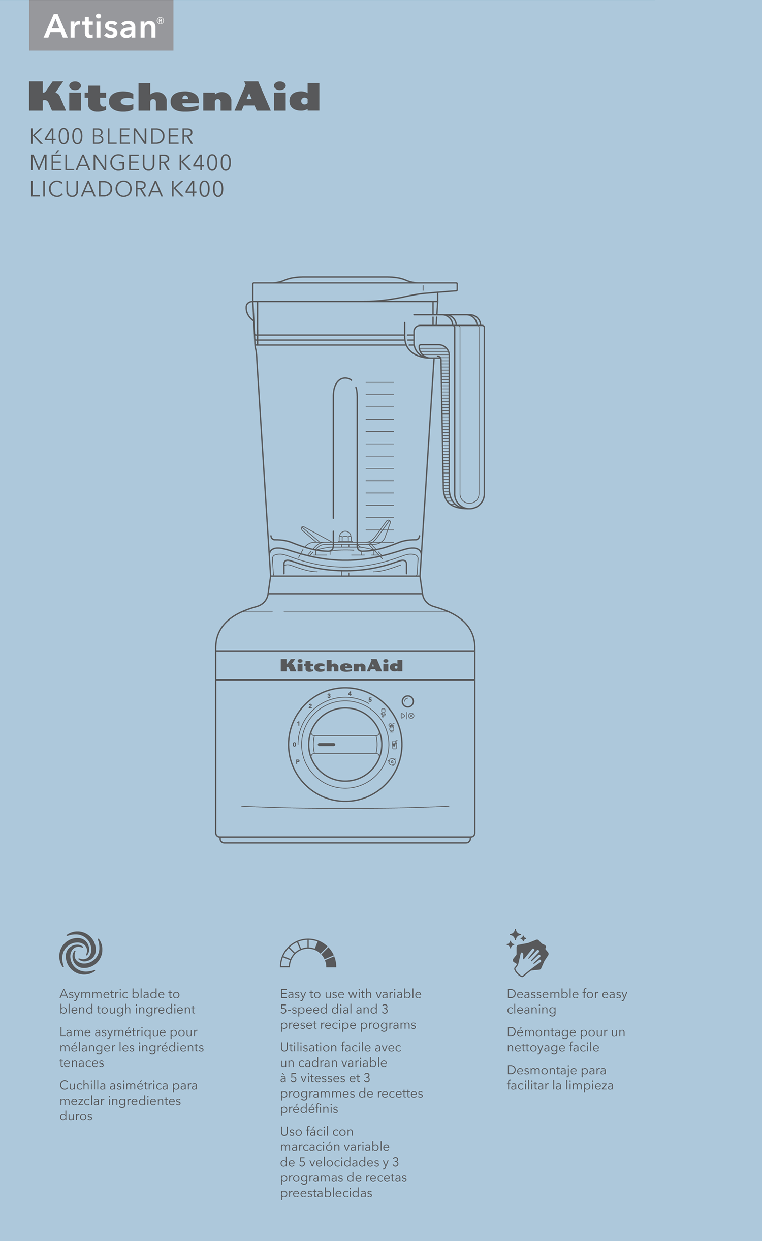
KitchenAid – Packaging Design System

Client Work
—
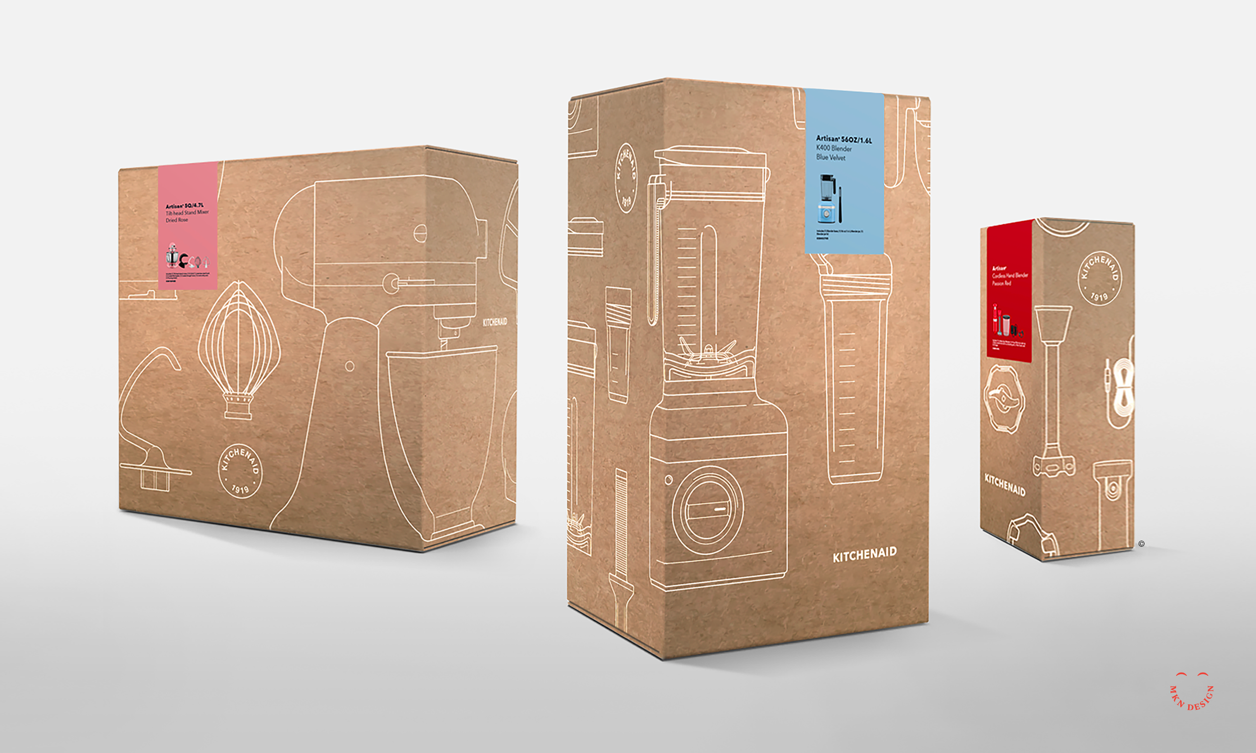
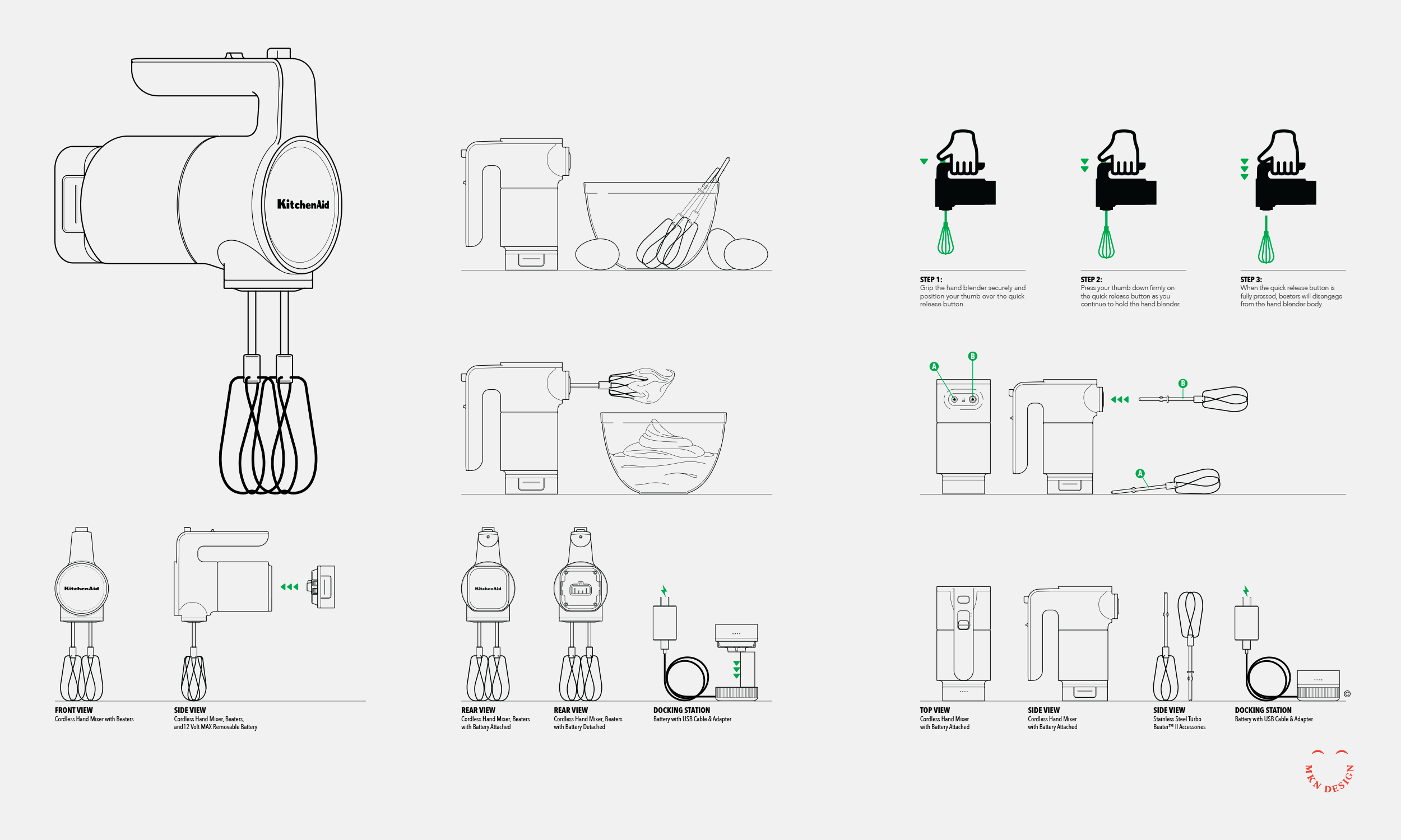
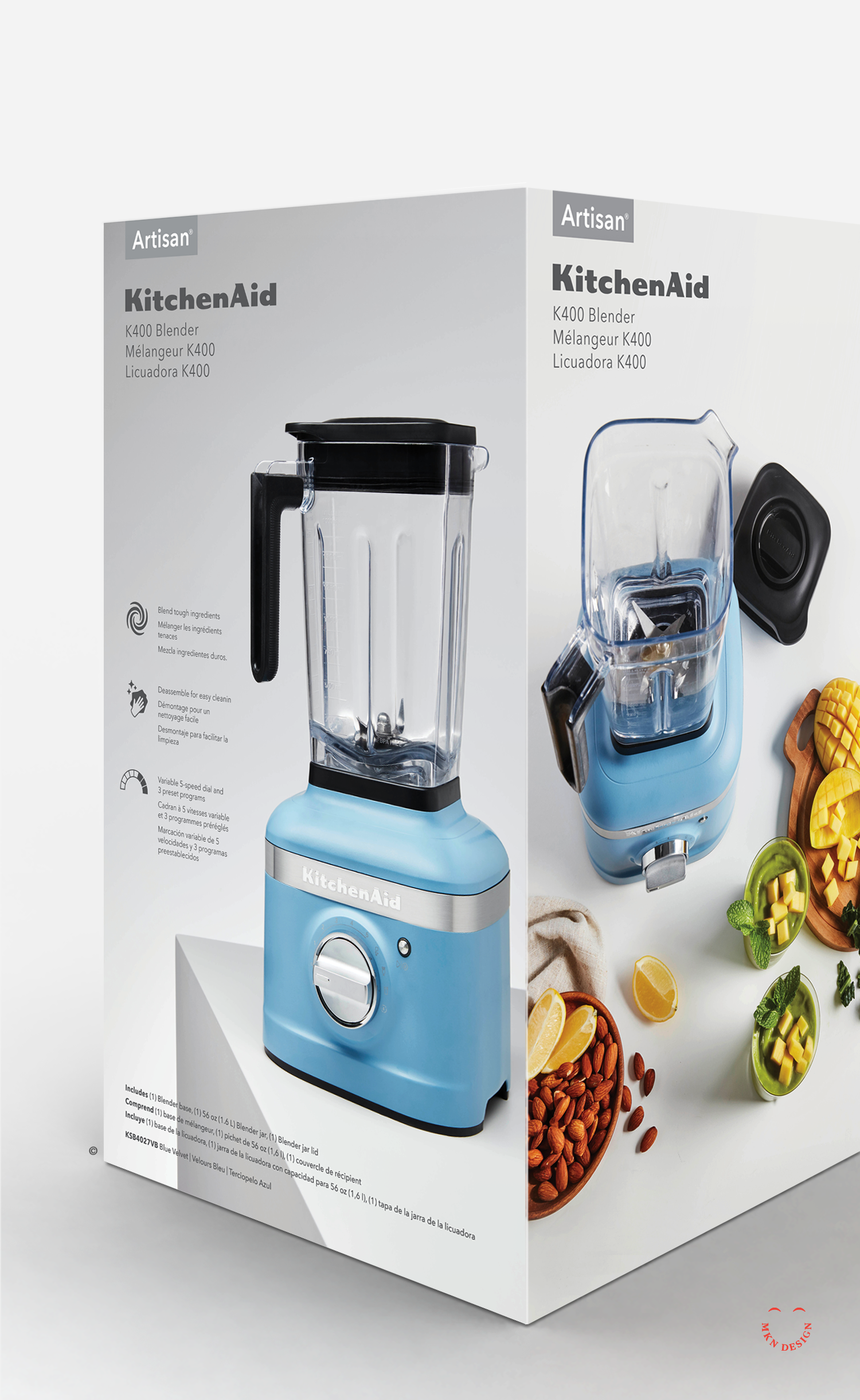
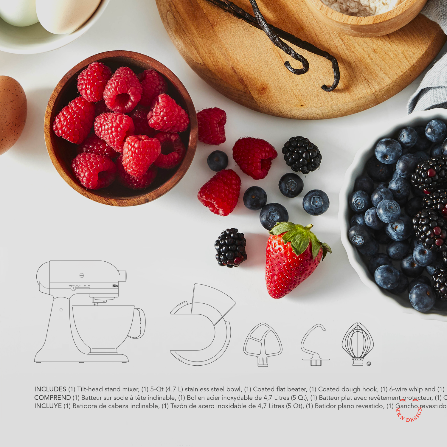
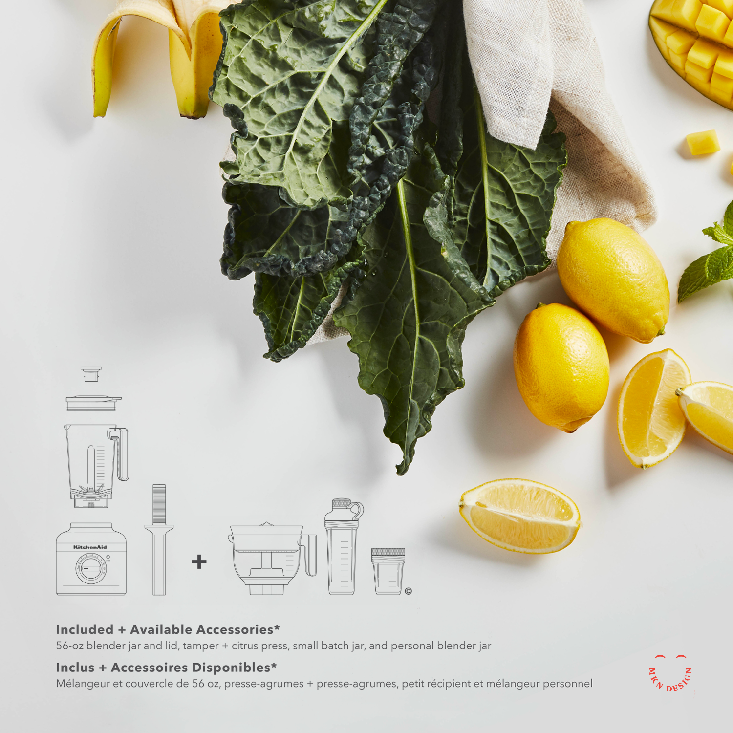
KitchenAid – Packaging Design System
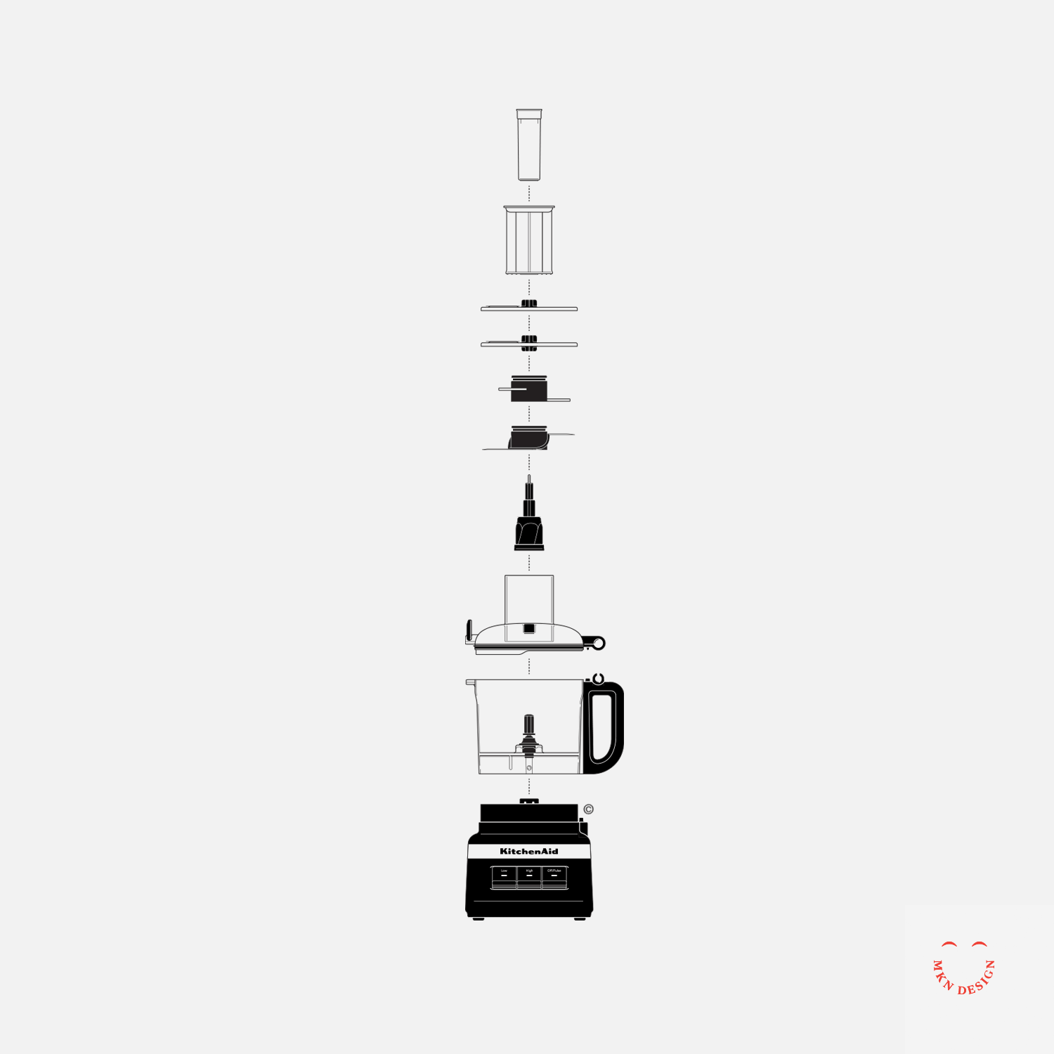
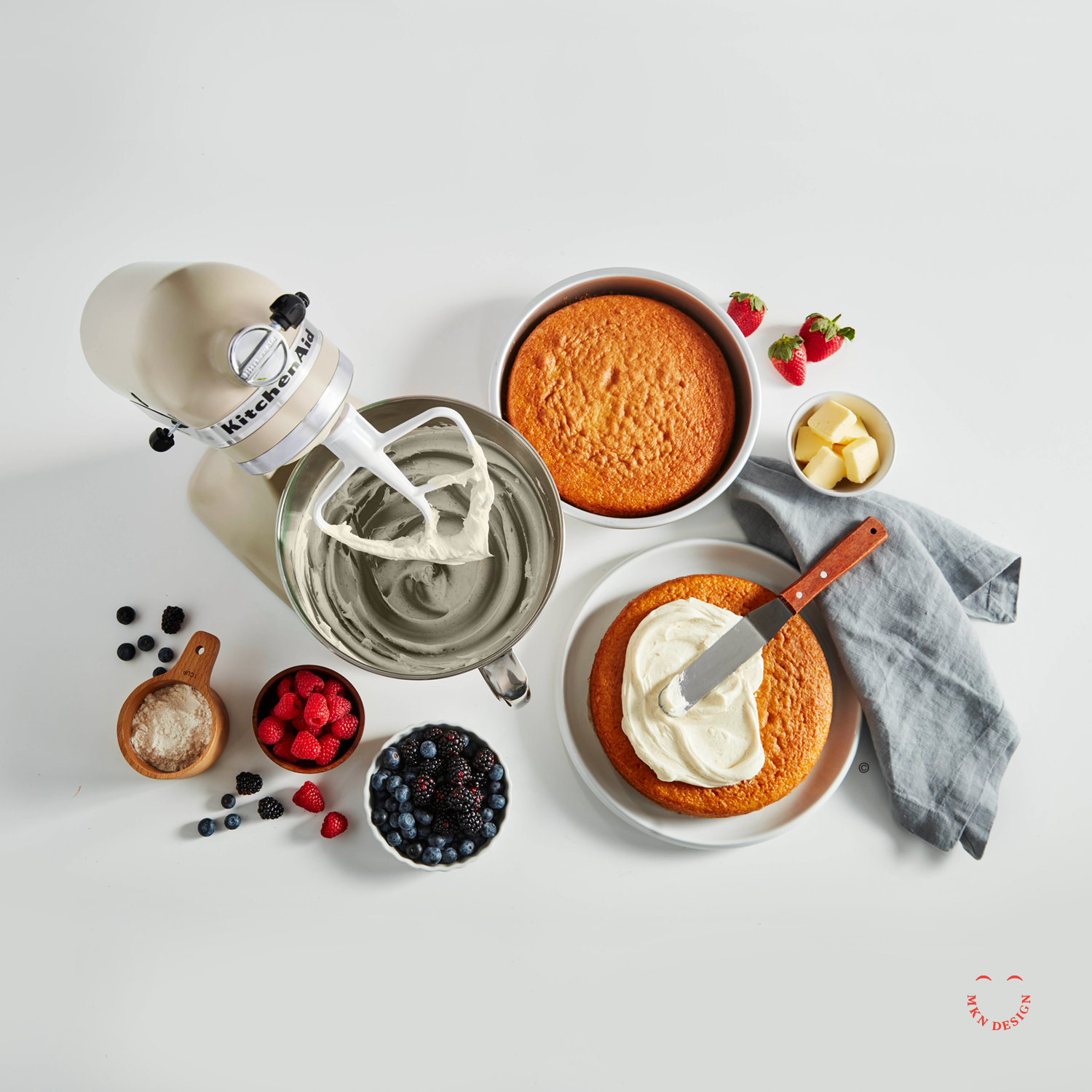
We were hired by KitchenAid to collaborate with their team of designers, engineers, photographers, and food stylists to define, develop, and design innovative packaging concepts for their award winning appliance products.
When KitchenAid approached me, they weren’t just looking to refresh their packaging—they were looking to reimagine how their iconic products could better connect to consumers, stand out on store shelves alongside competing brands, and reflect the modern, design-forward brand they had become. At the same time, they wanted to ensure that any evolution stayed rooted in the heritage that made KitchenAid a household name—especially with their globally recognized stand mixer.
Building on research and consumer insights from the first phase, we developed a clear design strategy to guide multiple packaging concepts—showcasing KitchenAid’s products as innovative, high-quality, and reinforcing the brand’s position as a leader in kitchen appliances.
When we audited the existing packaging, it became evident that it no longer reflected the expectations of today’s consumers or the evolution of KitchenAid’s products. In a market moving toward bold simplicity, clean visual storytelling, and modern minimalism, the packaging appeared dark, cluttered, and outdated.
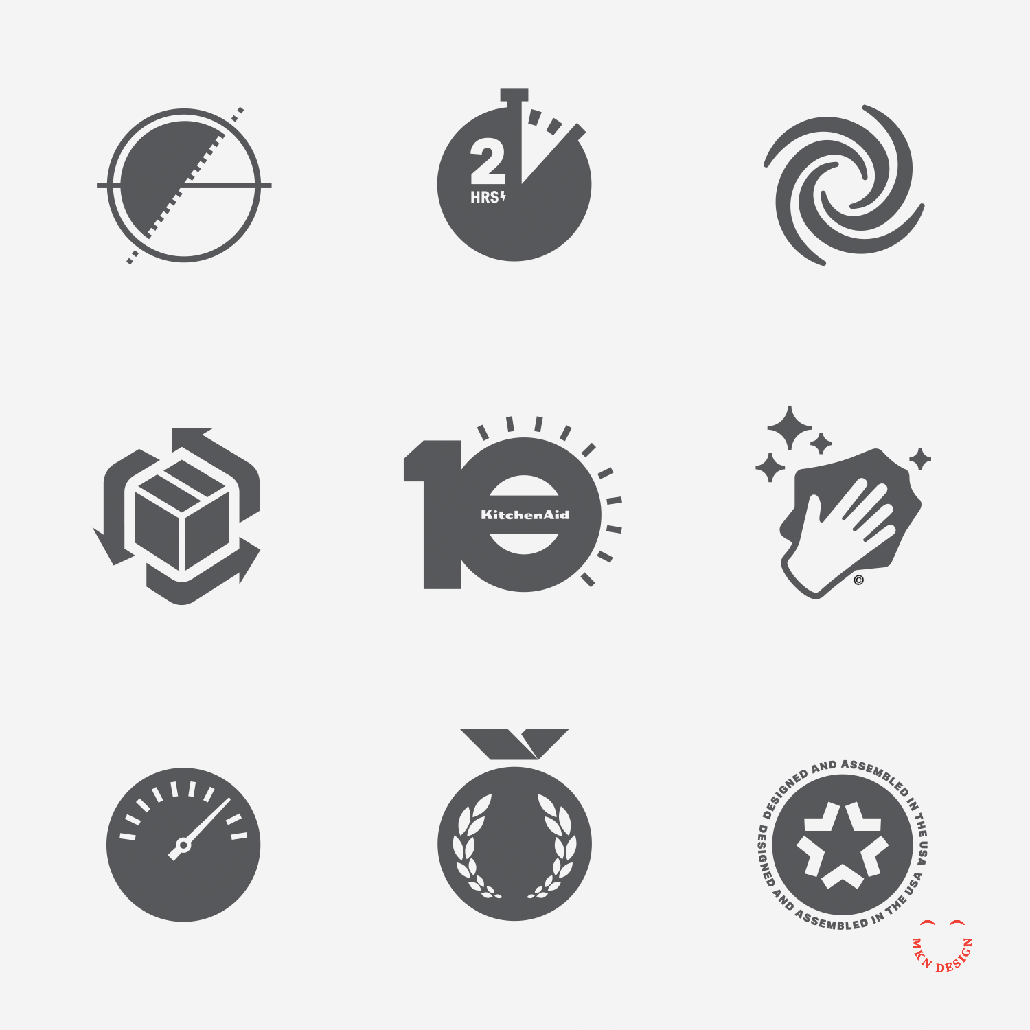
The design challenge was clear—reimagine the packaging in a way that honored KitchenAid’s heritage, spoke directly to today’s consumers, and embraced a modern visual language. To support this evolution, we also conceptualized a modern iconography language and illustrative system that could seamlessly integrate across the new packaging.
Working closely with the internal KitchenAid team, we began by diving into consumer insights, packaging trends, and design systems across related industries while also bringing our own creative perspective to the process. From this research, we developed a series of concepts built on a refined visual language that combined bespoke product illustrations with photography to drive storytelling, supported by iconography, color, and typography. All of this was organized within a thoughtful packaging system that could extend across product lines and packaging sizes, reinforcing the brand while prioritizing clarity and consumer engagement.
The final result was a flexible, strategic packaging system that scaled across all products—unmistakably KitchenAid, while reinforcing the brand and putting clarity and consumer engagement at the forefront.
This project came to life through a true cross-disciplinary partnership. Designers, packaging engineers, photographers, and CMF teams each brought their own craft, perspective, and problem-solving to the table—layering ideas, refining details, and ultimately shaping the final packaging concepts together.
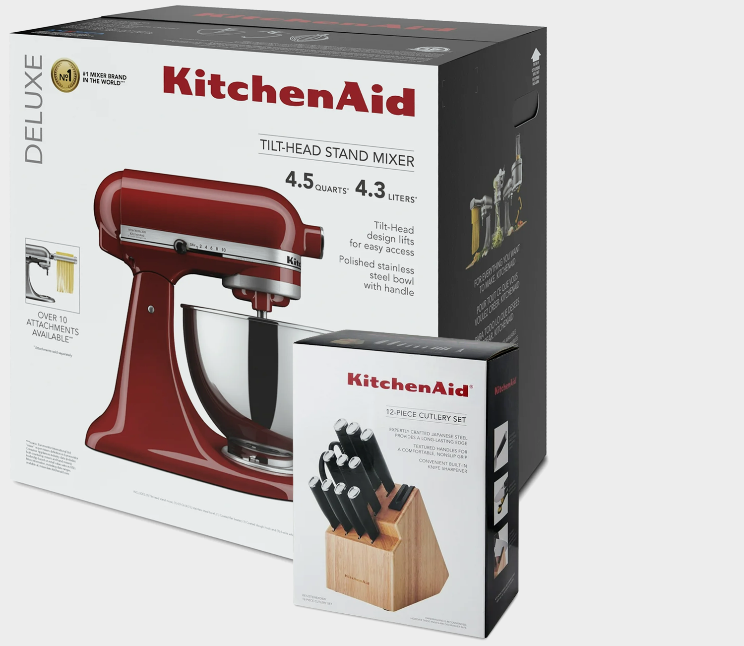
↑ Original KitchenAid Packaging
-
KitchenAid
Kitchen Appliance Manufacturing -
+ Branded Iconography
+ Communication Design
+ Concept Development
+ Consumer & Trend Research
+ Iconography System Design
+ Instructional Illustration
+ Photoshop & Physical Mock-ups
+ Product Research
+ Qualitative Research -
MKN Design Team:
+ Michael Nÿkamp, Graphic Designer and IllustratorKitchenAid Team/Stakeholders:
+ Brian Edlefson, Global Creative Manager
+ Heather Tucker, Contract Art Director
+ Katie Mubita, Senior CMF Designer
+ Calvin Beisiege, Graphics Strategy, Brand & Trends
+ Ashley Klee, Global Graphic Designer
+ Steven Tillstrom, Global Graphic Designer
The Midwest Coast


Product
—
The Midwest Coast
A badge-inspired design from my home state of Michigan and its pristine coastline. The inspiration came from our family trip to Sleeping Bear Dunes, National Park—it’s just one of the many places to experience Michigan’s wonderful coast.
-
The Midwest Coast is currently not available. Check back in early June 2024. View additional graphic tee’s on my Cotton Bureau profile page. All Cotton Bureau apparel comes in a variety of clothing types, styles, fits, sizes, materials, and colors.
Lady of Guadalupe


Product
—
Lady of Guadalupe
A modern Illustrative take on the Our Lady of Guadalupe painting found in Tepeyac Hill, Mexico City.
-
Lady of Guadalupe graphic tee is available for purchase. Check out more graphic tees on my Cotton Bureau profile page. All Cotton Bureau apparel comes in a variety of clothing types, styles, fits, sizes, materials, and colors.
Robertson


Independent Work
—
Robertson
A creative exercise taking the square shape from the Robertson Drive and mimicking the font to the style of the mark. The Robertson square-socket drive was invented by Peter Lymburner Robertson, a Canadian inventor, industrialist, salesman, and philanthropist who popularized the square-socket drive for screws.
Alfred & Mickey Mashup


Product
—
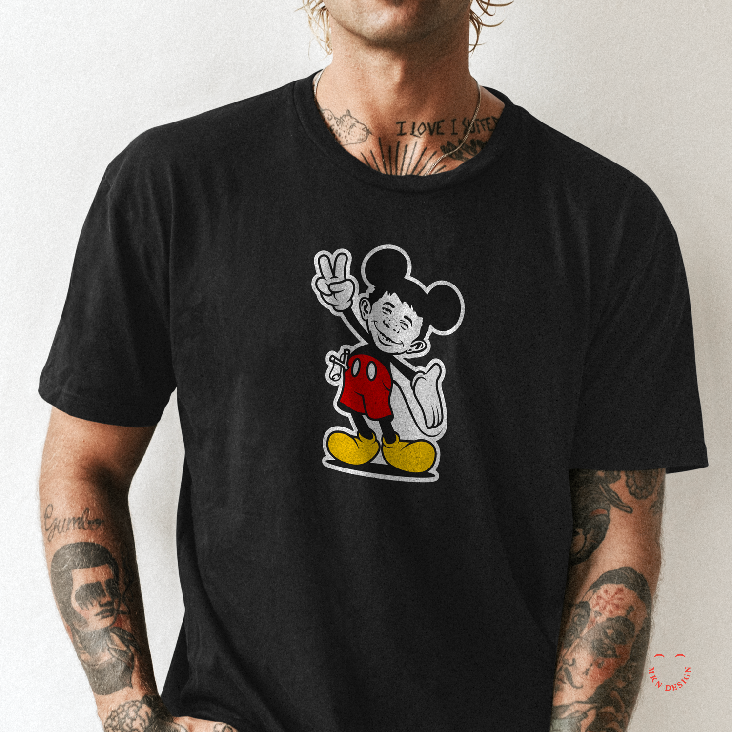
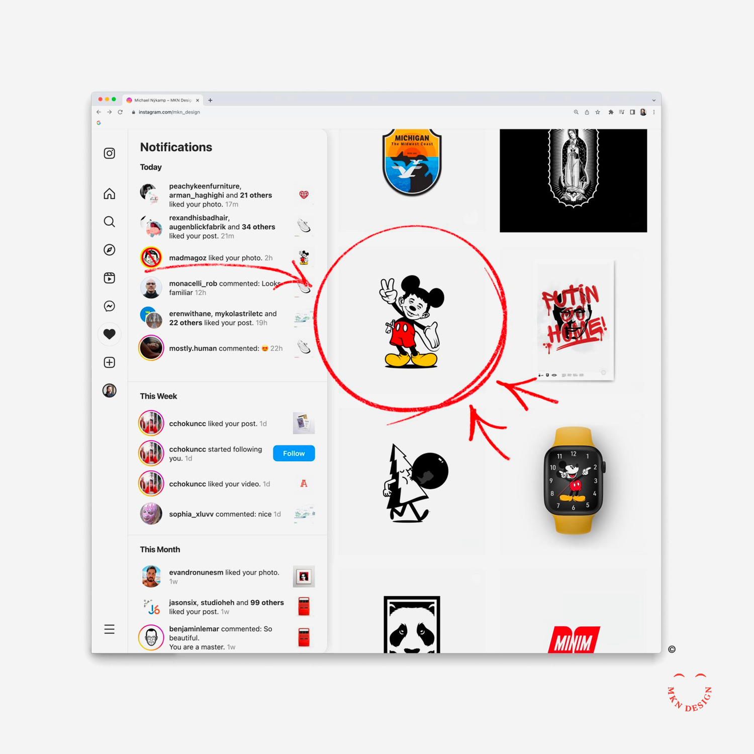
Alfred & Mickey Mashup
A mad mashup of Mickey Mouse & Alfred E. Neuman from Mad Magazine flashing a peace sign and waving the stars and stripes. The title takes from Mickey's favorite word, "Gosh" and merging it with Alfred's, "Me Worry?" Even Mad Magazine saw it on Instagram and ❤️ it.
-
Gosh, Me Worry – ‘Merica & Gosh, Me Worry – Peace graphic tees are available for purchase. Check out more graphic tees on my Cotton Bureau profile page. All Cotton Bureau apparel comes in a variety of clothing types, styles, fits, sizes, materials, and colors.
Graphis – Designers for Peace


Independent Work
—
Graphis – Designers for Peace
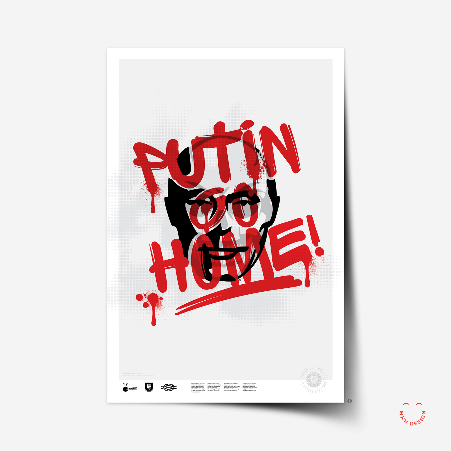
I submitted a "Designers for Peace" poster series (A.K.A. Ukraine War Series) for the Graphis poster competition. It received an Honorable Mention. This series began as a personal project sparked by Russia's unprovoked war on Ukraine. My aim with this project was to capture a powerful, somber, and raw portrayal of the global emotional response to the conflict.
-
Congratulations! Your excellent poster design has been chosen as an Honorable Mention in our international Designers for Peace competition.
— B. Martin Pedersen, Creative Director & Publisher
Bubble Gum Pine
Product
—
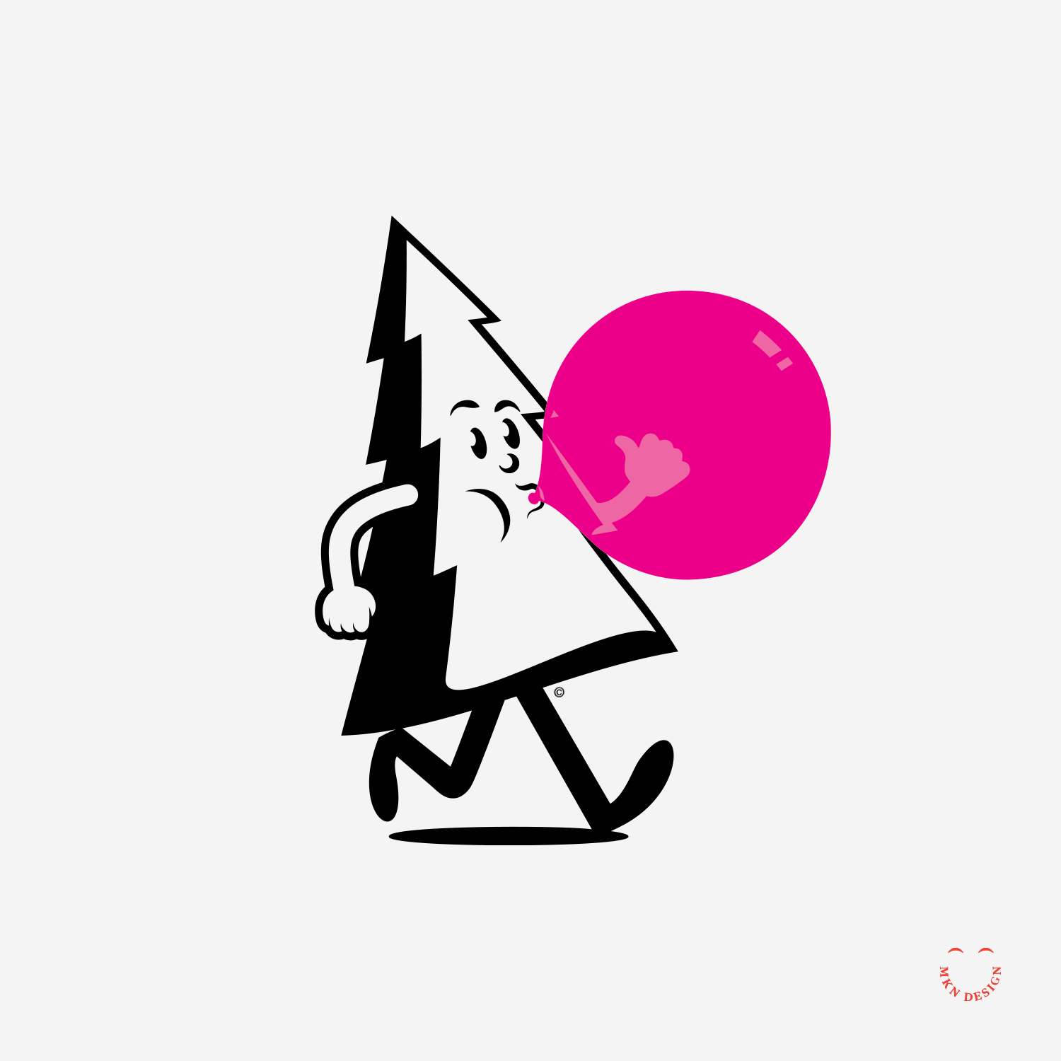
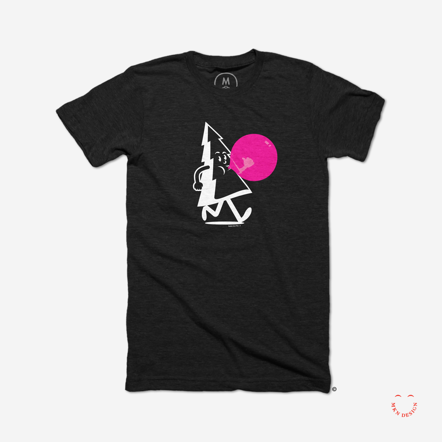
Bubble Gum Pine
This pine tree is happy that spring is finally here in Michigan... well... almost.
-
Bubble Bum Pine graphic tee is available for purchase. Check out more graphic tees on my Cotton Bureau profile page. All Cotton Bureau apparel comes in a variety of clothing types, styles, fits, sizes, materials, and colors.
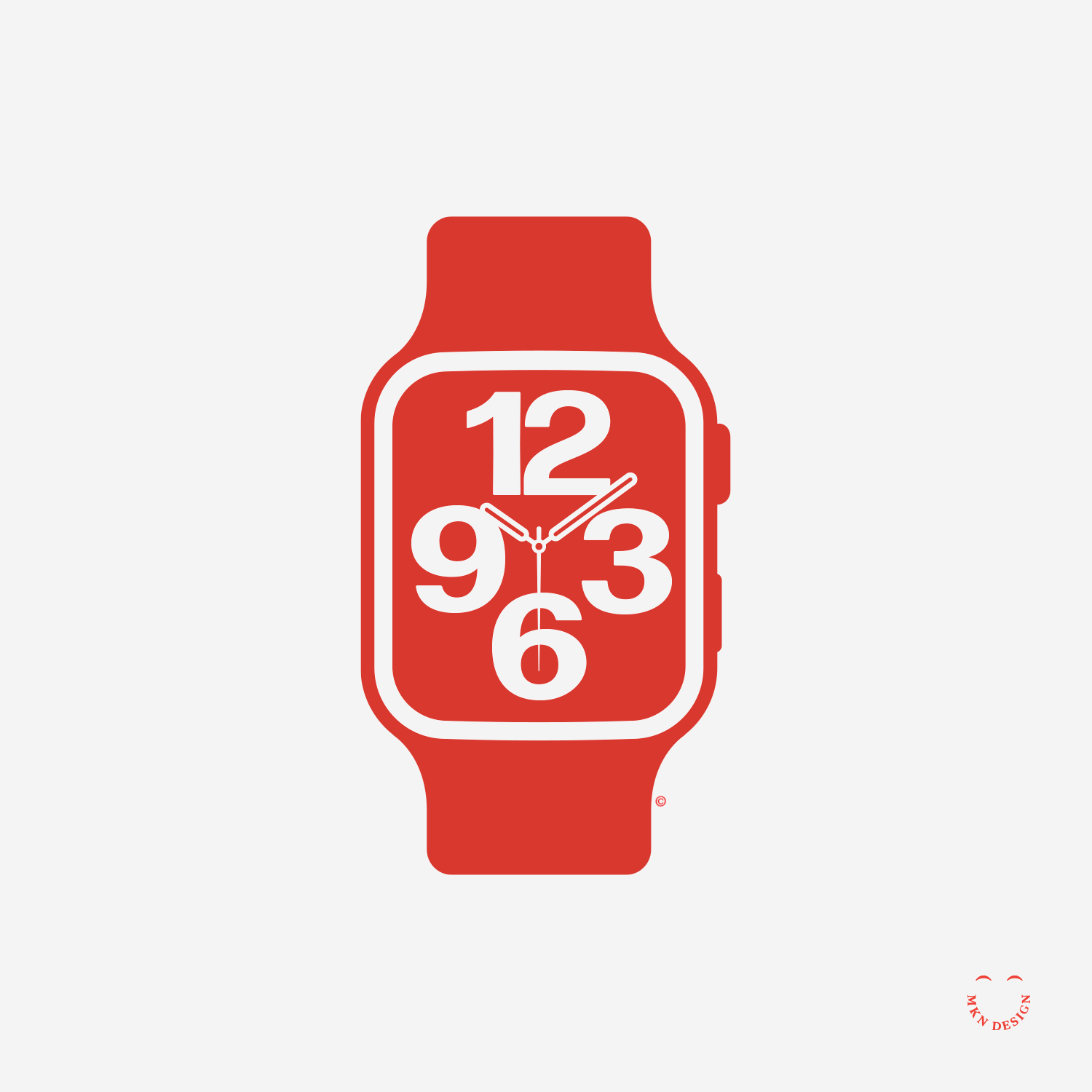
Mikey Mouse Apple Watch


Independent Work
—
Mikey Mouse Apple Watch
This is an illustration rendering of an Apple Watch, not to be confused with a 3D rendering. A trick with illustrating realistic objects is understanding how light, shadow, and reflections behave on objects.
ReVox – Poster


Product
—
ReVox
I’ve always had an affinity for vintage electronics, especially buttons, knobs, and sliders. The illustration is a ReVox Studer 700 Reel-To-Reel Tape Recorder, designed, engineered, and manufactured in Switzerland in 1973.
-
Revox, High Fidelity poster is available for purchase. Explore more posters in my shop.
Llama Fiber Co.


Independent Work
—
Llama Fiber Co.
Llama Fiber Co. mascot is paired with the typeface Alverata designed by Gerard Unger from TypeTogether.
Panda


Product
—
Panda
Mark exploration featuring a panda framed within a rectangular form and paired with a handcrafted typeface for a strong, recognizable presence.
-
Panda graphic tee is available for purchase. Check out more graphic tees on my Cotton Bureau profile page. All Cotton Bureau apparel comes in a variety of clothing types, styles, fits, sizes, materials, and colors.
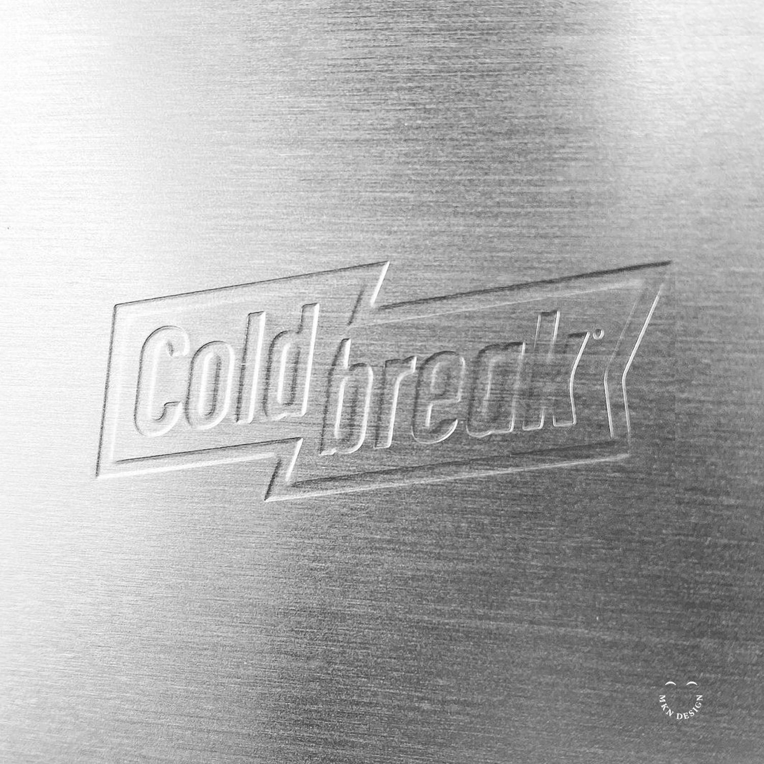
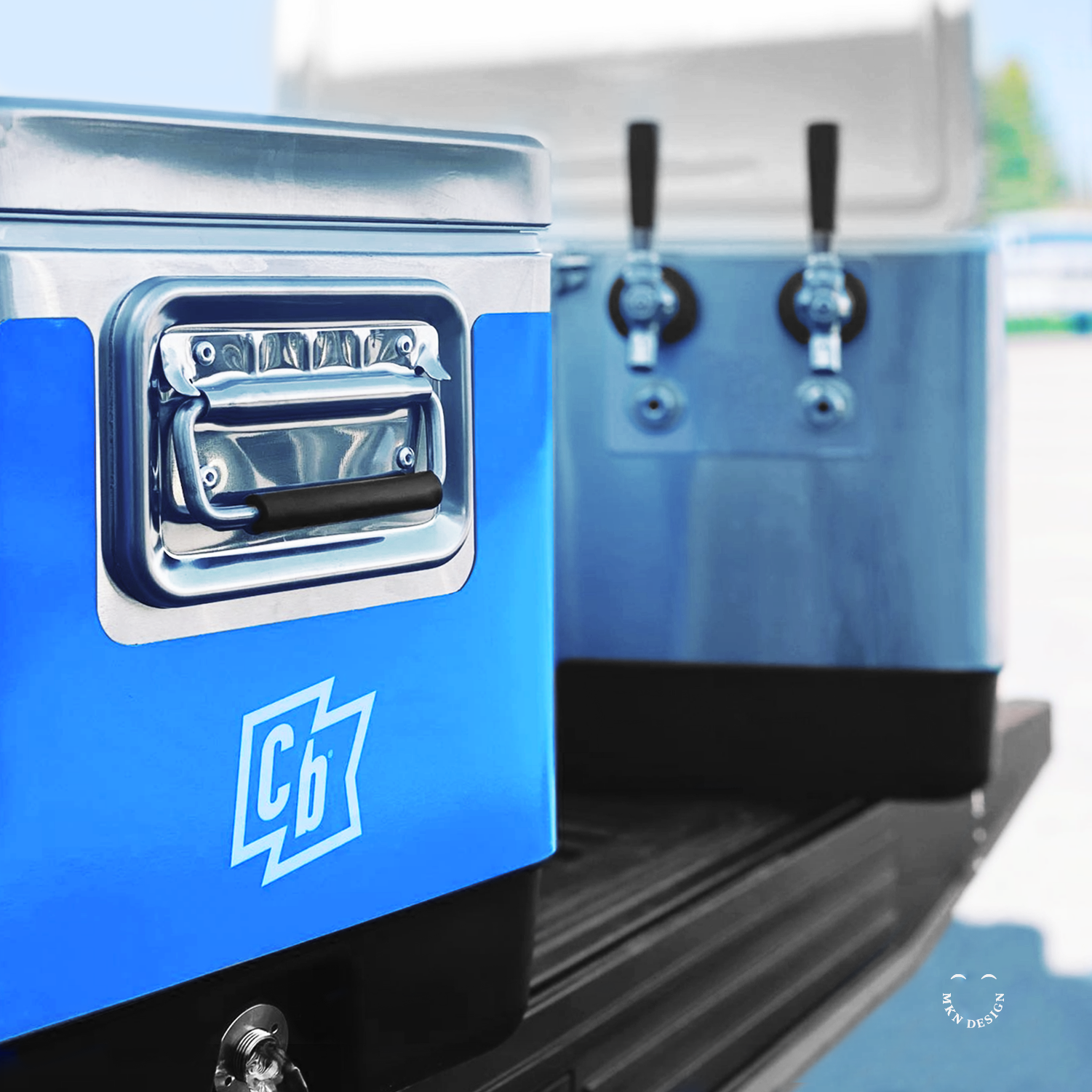
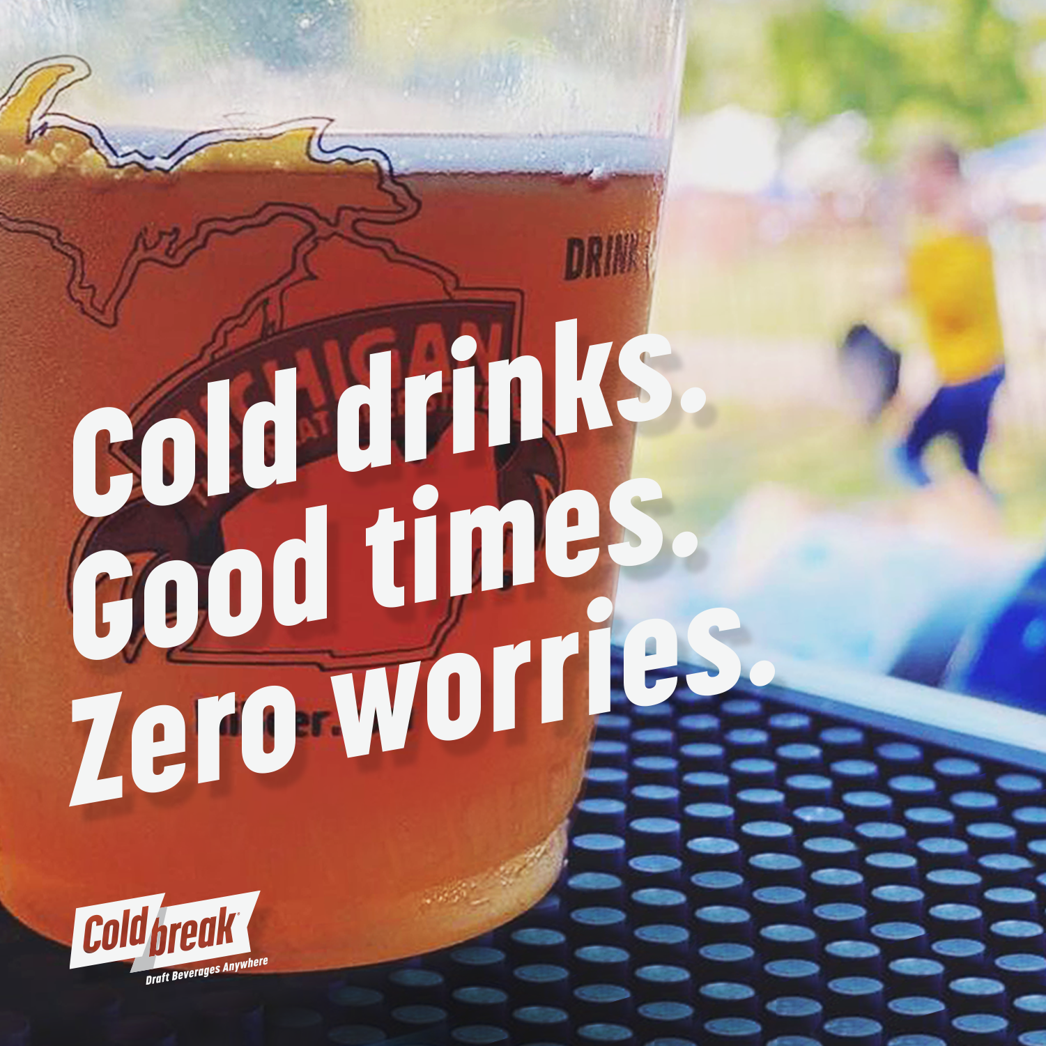
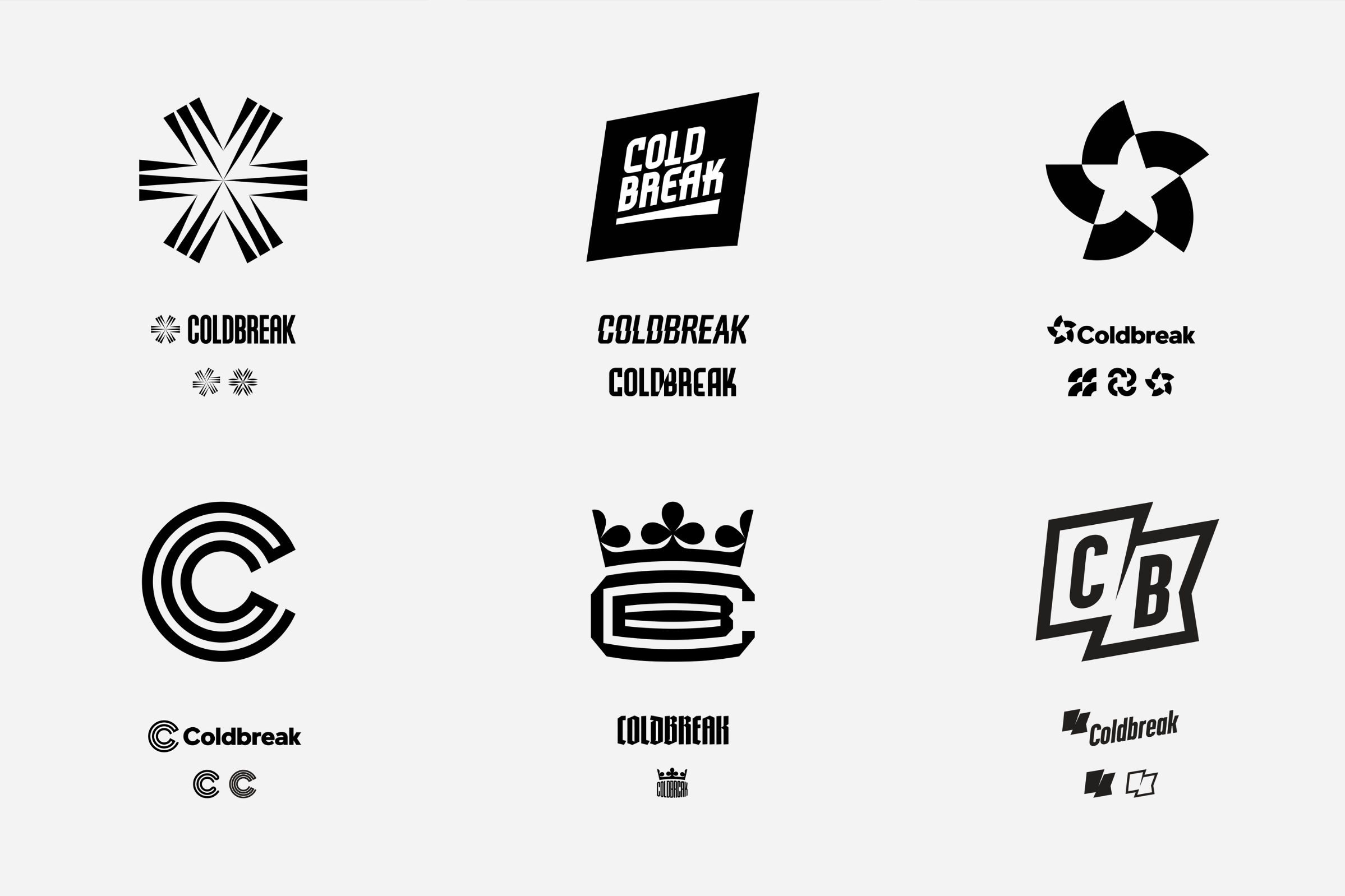
Coldbreak – Brand Strategy & Brand Identity


Client Work
—
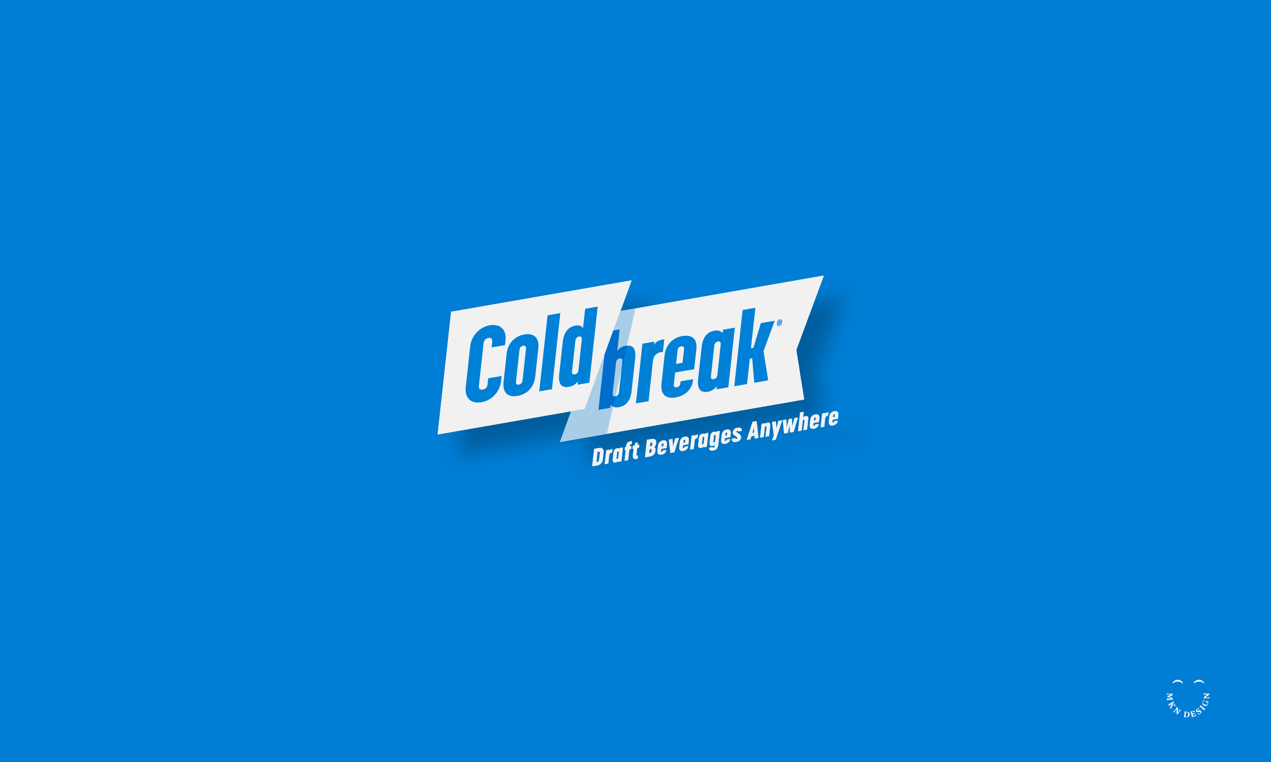
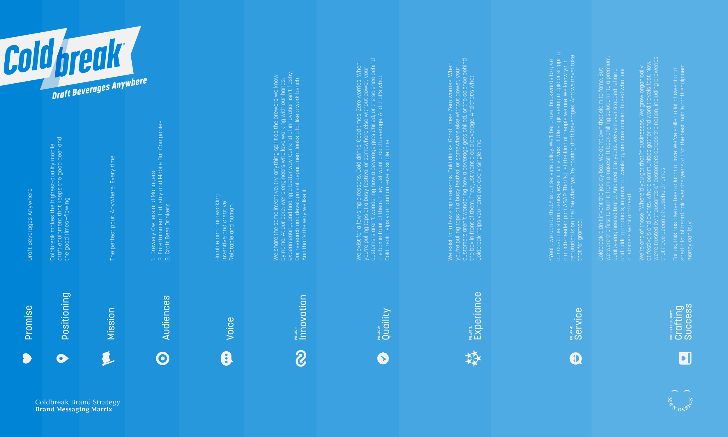
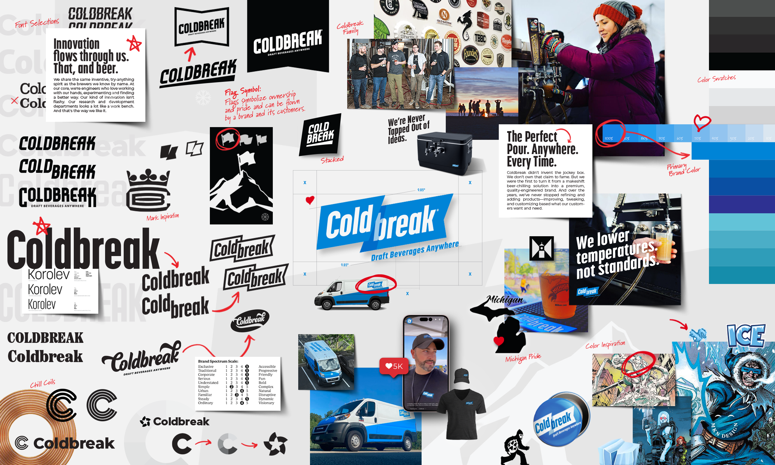
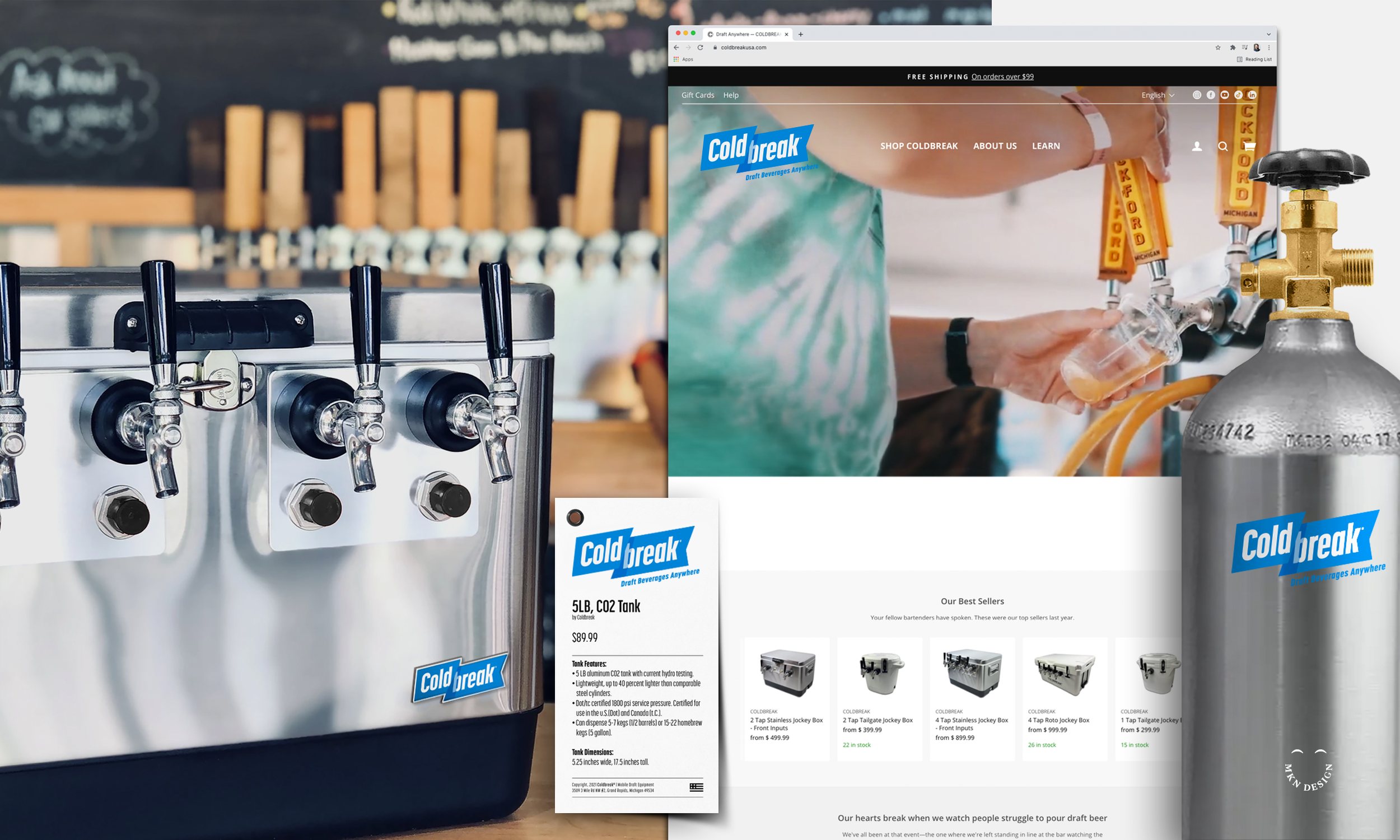
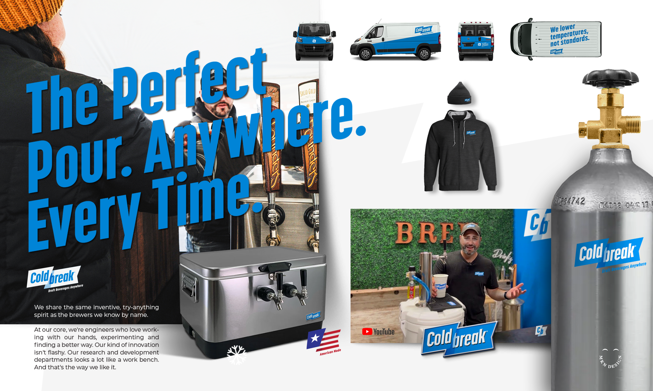
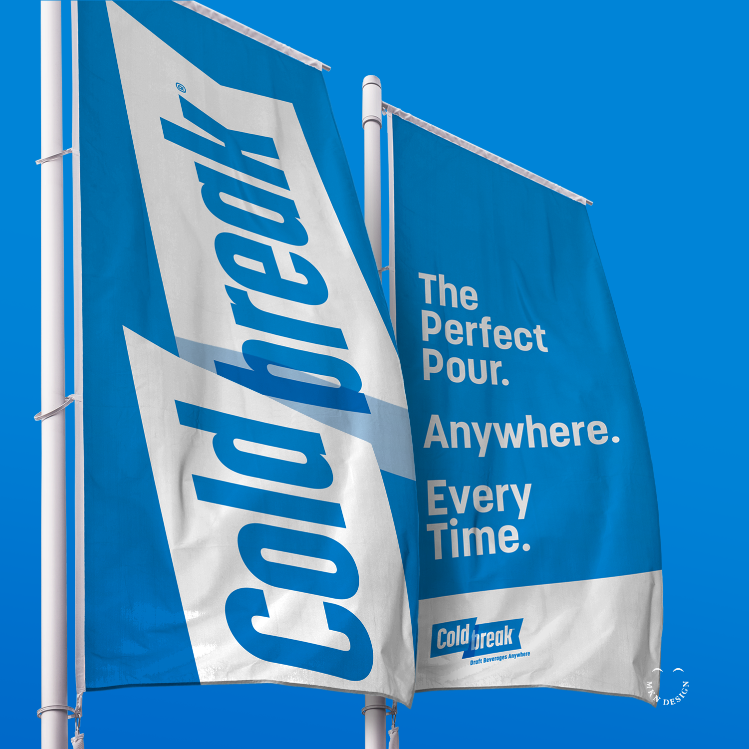
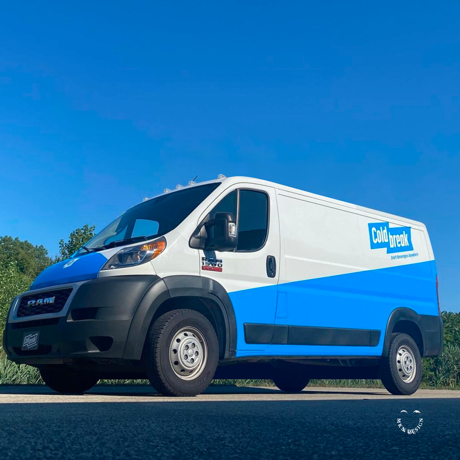
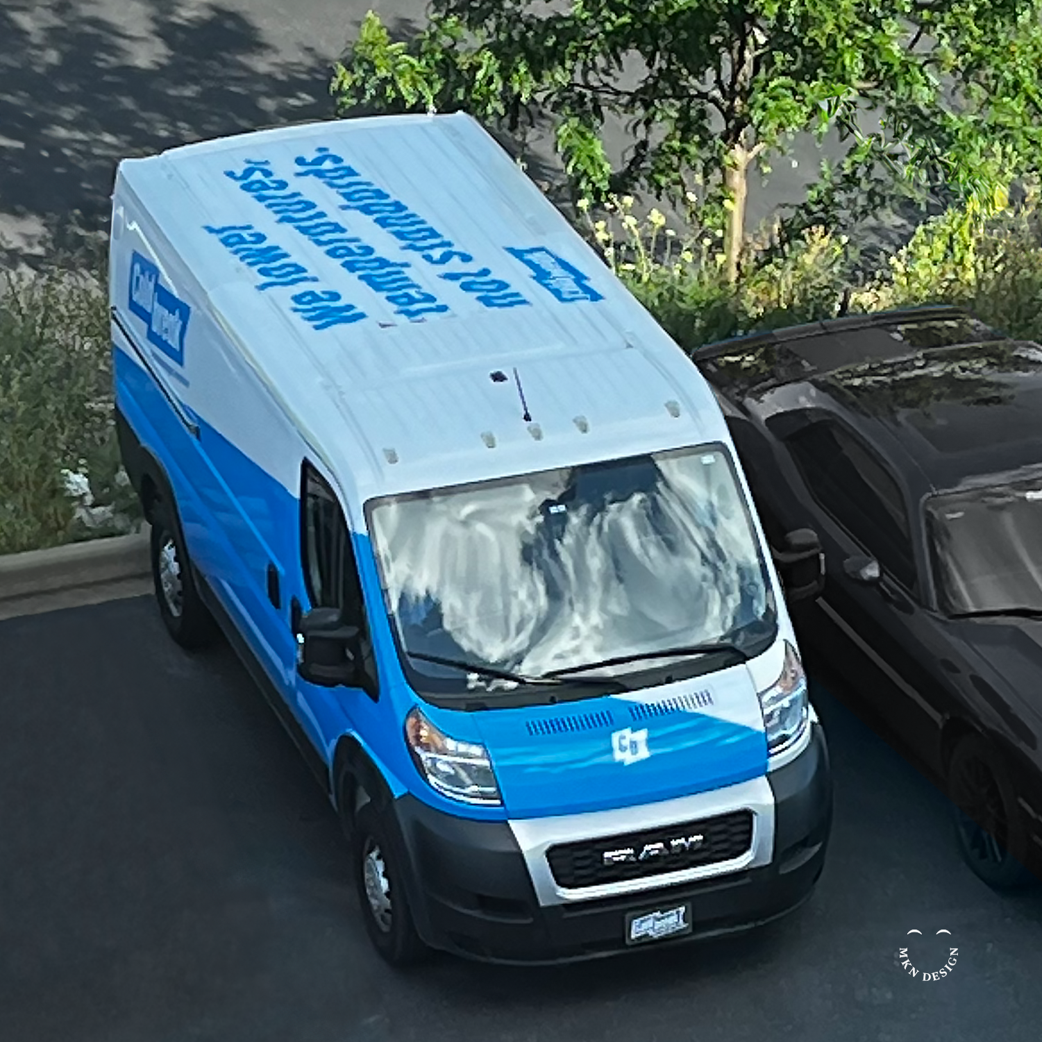
Coldbreak – Brand Strategy & Brand Identity
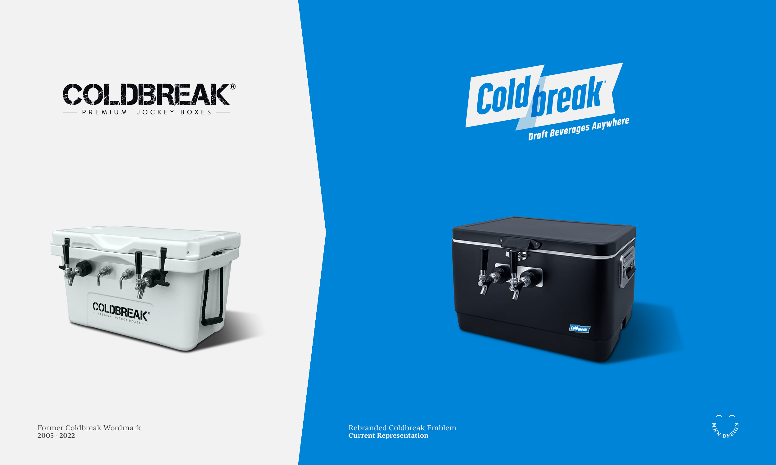
Coldbreak, a leader in mobile draft equipment for breweries, hospitality, entertainment, and beverage enthusiasts, hired us to re-build its brand strategy and identity.
With a legacy dating back to 2005, Coldbreak built a strong reputation for engineering and producing exceptionally reliable draft equipment. Today, they lead the industry in the development, engineering, and design of mobile draft systems. As the business continued to grow, they recognized that their brand no longer reflected their vision or market position. They hired us to lead a full strategic rebrand—grounded in audience and stakeholder insights, consumer and market understanding, and refined through journey mapping, brand architecture, and messaging.
Building the team, I guided the owners and my team of collaborators through the conception, development, and design of the Coldbreak identity. Throughout the process, we distilled insights from audience and stakeholder interviews to establish the brand’s foundation, defining its tone, voice, and visual direction. As the work progressed, we conducted additional research, journey mapping, brand architecture, iterative brand development.
The outcome of this work with Coldbreak was a dynamic logo and precise brand messaging that resonated with the owners and strengthened their connection with customers. To support the ongoing use of the updated brand, we developed materials to guide and maintain consistency in future efforts. These assets included social media guidelines, vehicle wraps, and apparel design, and were all incorporated into a comprehensive brand guidelines document.
←
View the preliminary concepts that where explored for Become.
“After a decade of struggling to define our internal identity, we turned to MKN Design. Michael quickly immersed himself in our company’s culture, history, and future goals to develop an accurate brand strategy and visual identity. Saying we’re happy with the results is a huge understatement.”
Boyd Culver
President of Coldbreak
-
Coldbreak
Portable Draft Beverage Systems -
+ Brand Advisor
+ Brand Strategy
+ Concept Development
+ Creative Assets
+ Creative Strategy
+ Design Direction
+ Qualitative Research
+ Visual Identity -
MKN Design Team:
+ Michael Nÿkamp, Design Director
+ Adam Barr, Copywriter
Coldbreak Stakeholders:
+ Boyd Culver, Chief Executive Officer
+ Chris Musil, Chief Operating Officer
Apparel Iconography


Product
—
Apparel Iconography
Crisp bold icons designed for an apparel brand. If you need custom designed iconography, I can help you.
-
This icon set is available for purchase, email me for licensing and cost.
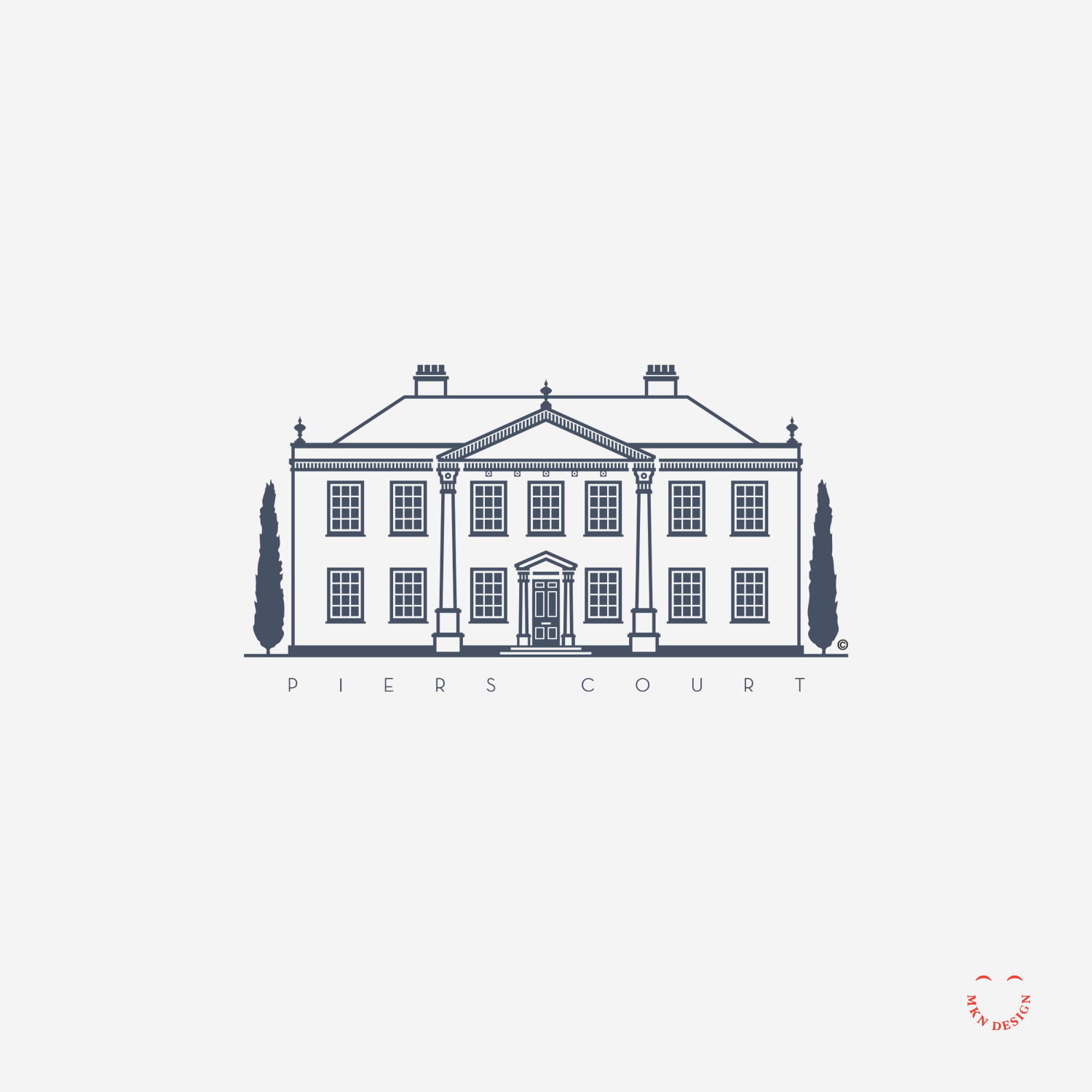
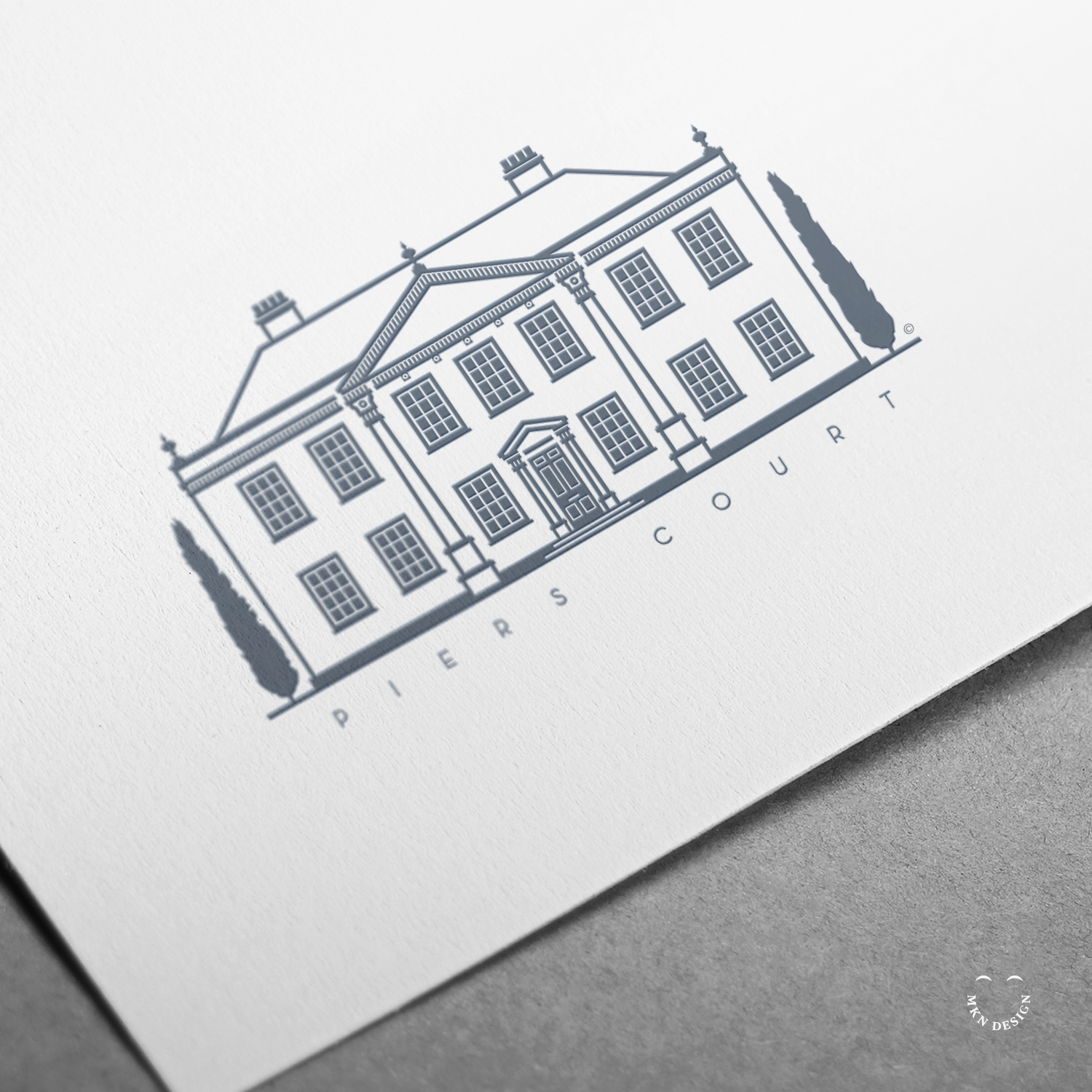
Piers Court
Independent Work
—
Piers Court
Formally owned by the author, Evelyn Waugh. While residing at Piers Court, he wrote several books while he resided there. His countryside home is located in Stinchcombe, a small village in Gloucestershire, England. It was built on top of an original structure from a 16th-century manor, and reconstructed on its remnants in the 18th century, which is the house that stands today. The mark is paired with the typeface Neutraface by House Industries.
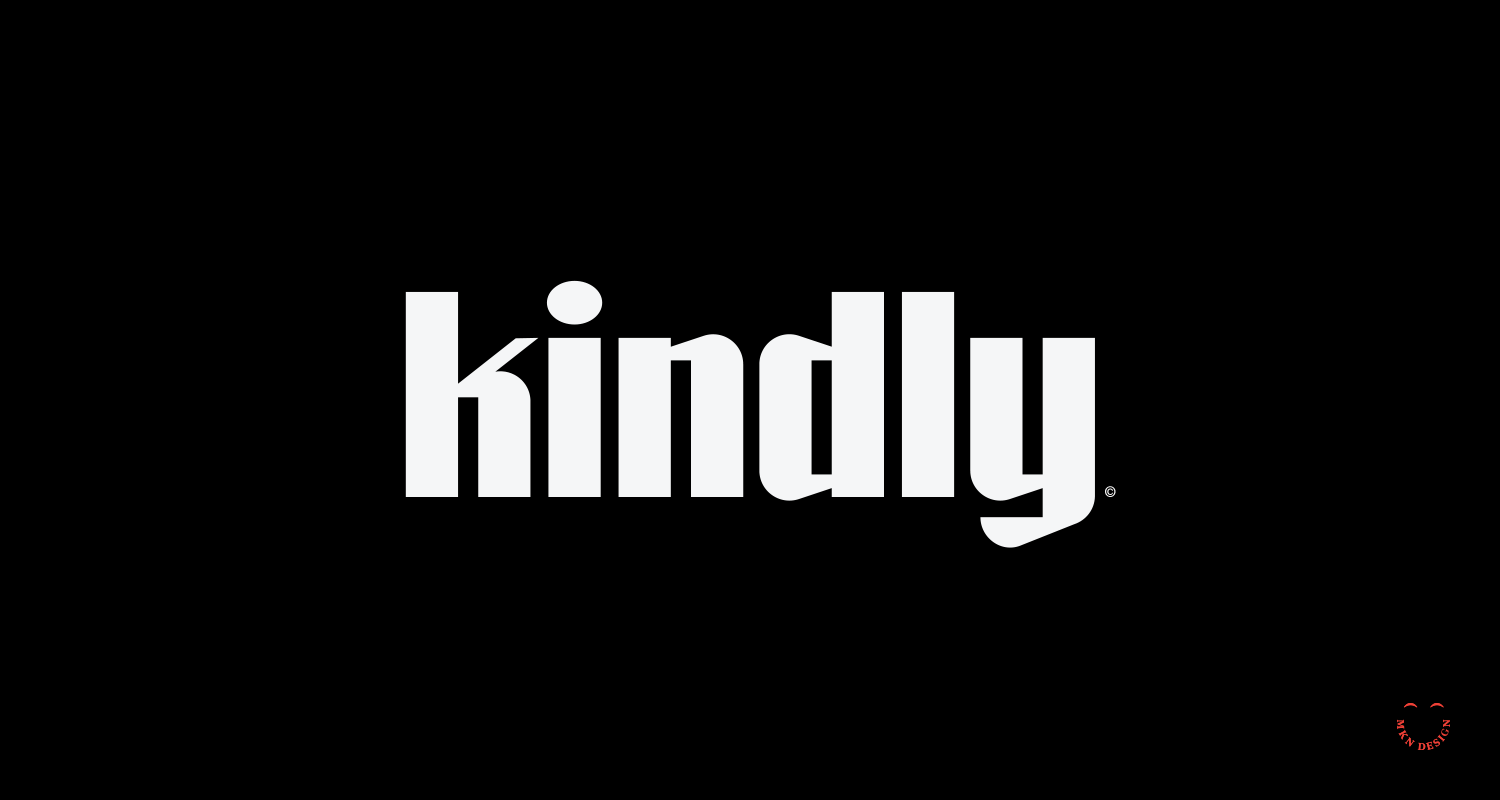
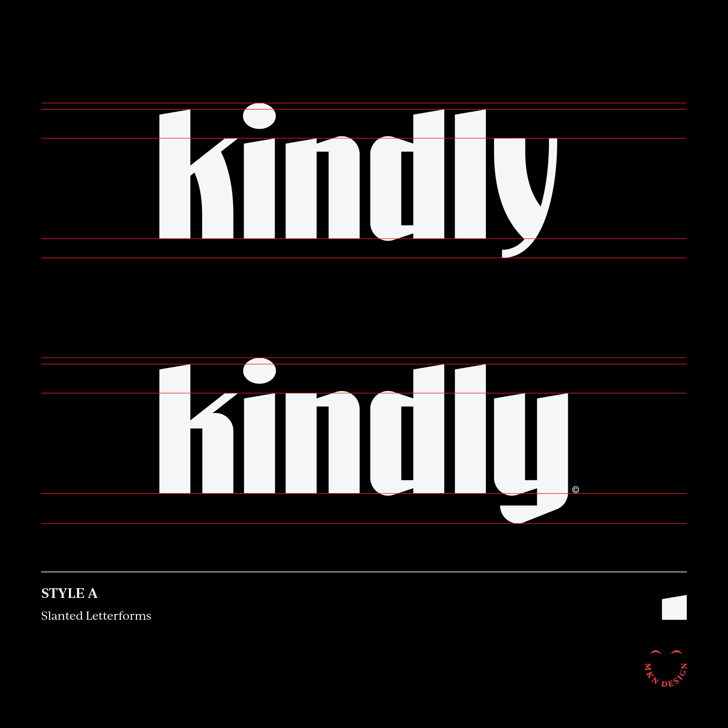
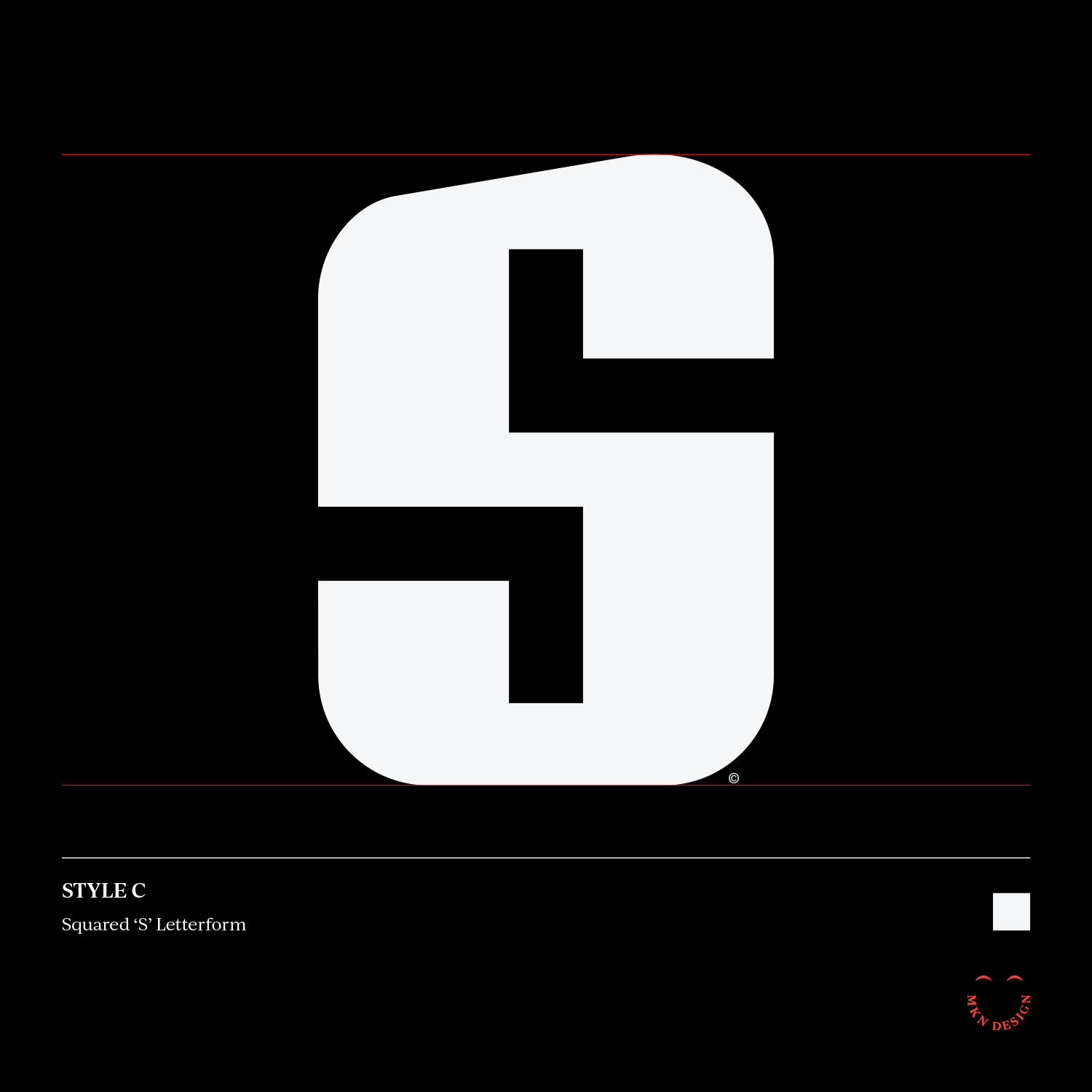
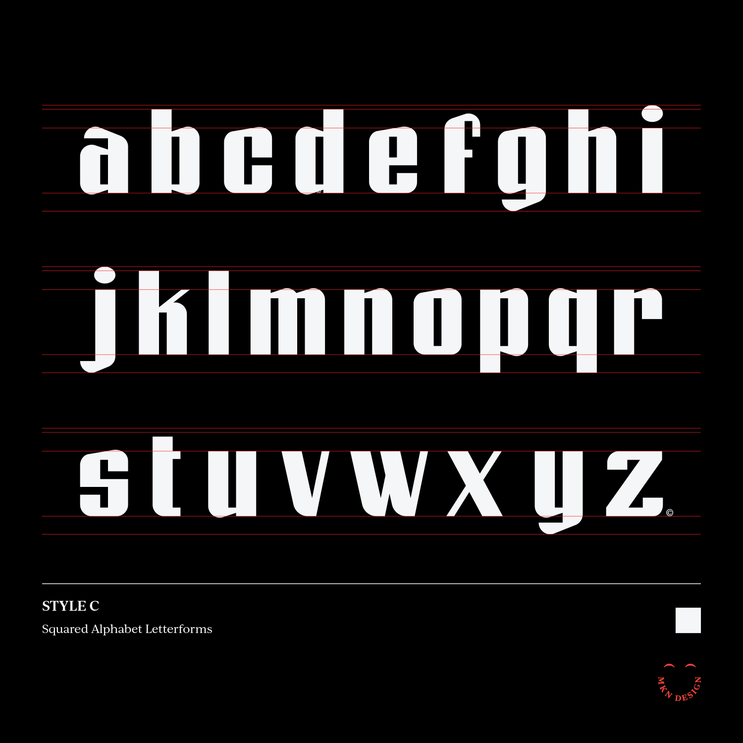
Kindly
Independent Work