
Article
August 2017
__
AIGA Detroit, Member Spotlight
Big thank you to AIGA Detroit for featuring me and my work on their website and future e-newsletter. I hope to make it down soon.
David's Eye
Creative Musing
August 2017
__
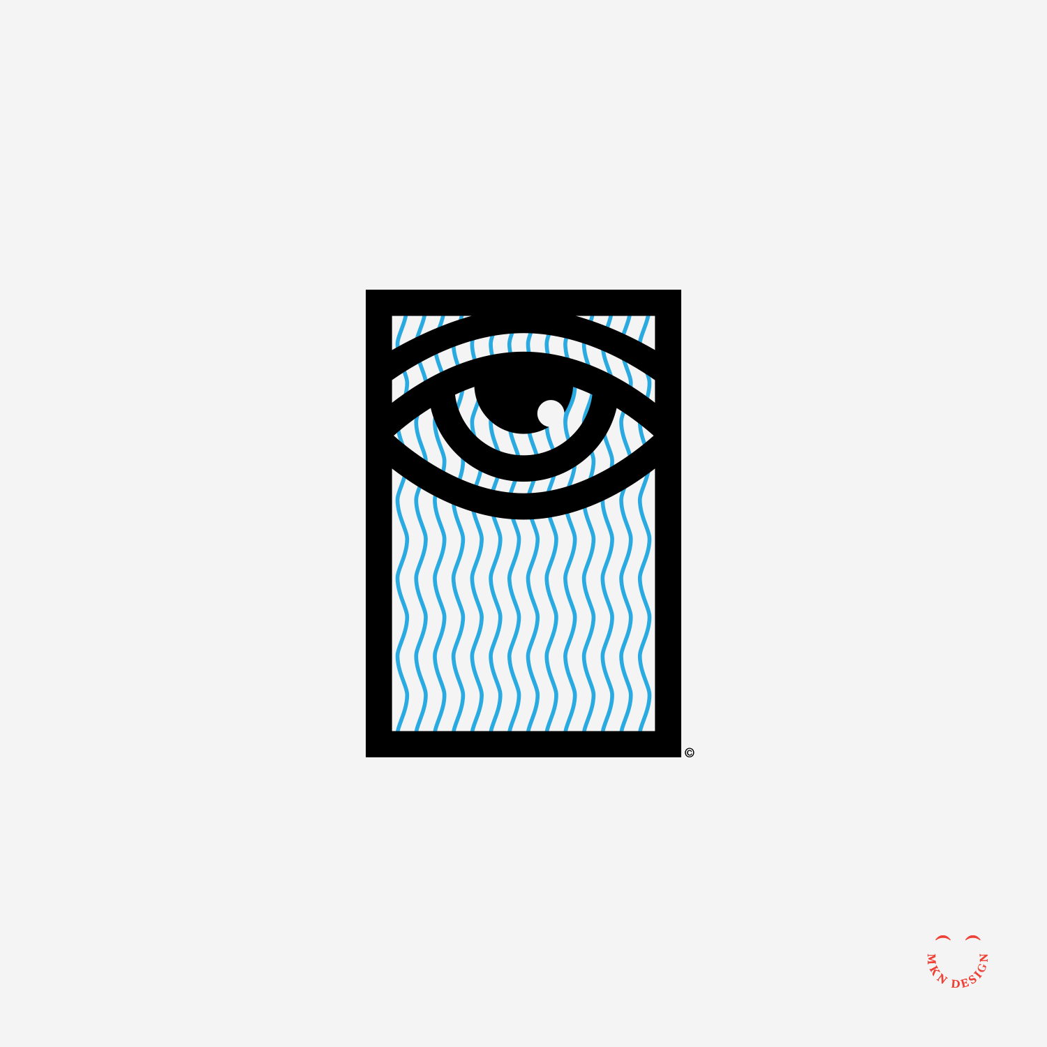
David's Eye
Illustration inspired by the quote from Thomas Carlyle, "The depth of our despair measures what capability and height of claim we have to hope."
Community of Illustrators
Article
August 2017
__
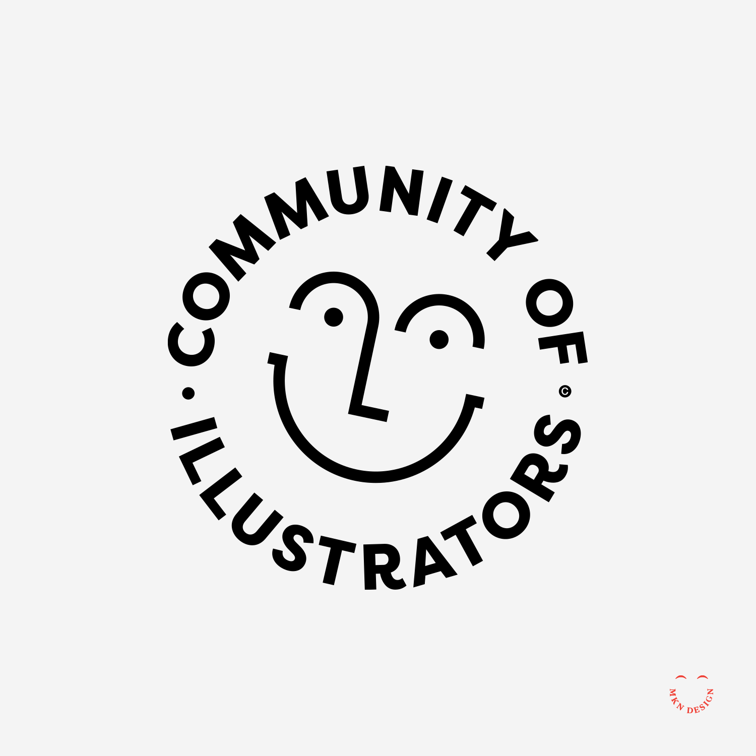
Community of Illustrators
Illustration is a vital part of graphic design. As a person who is a graphic designer and illustrator I’ve found there is a lack of understanding about illustration, licensing, how illustrators work, best practices, and ethics. Because of this, Lucy Engelman and I started The Illustration League. The mark is paired with the typeface Filson Pro designed by Olivier Gourvat from Mostardesign.
Further Reading
Learn more about the Illustration League by reading the Rapid Growth Media article titled “Building An Illustration Community” Additionally, delve deeper into the world of The Illustration League by visiting their website.
Note
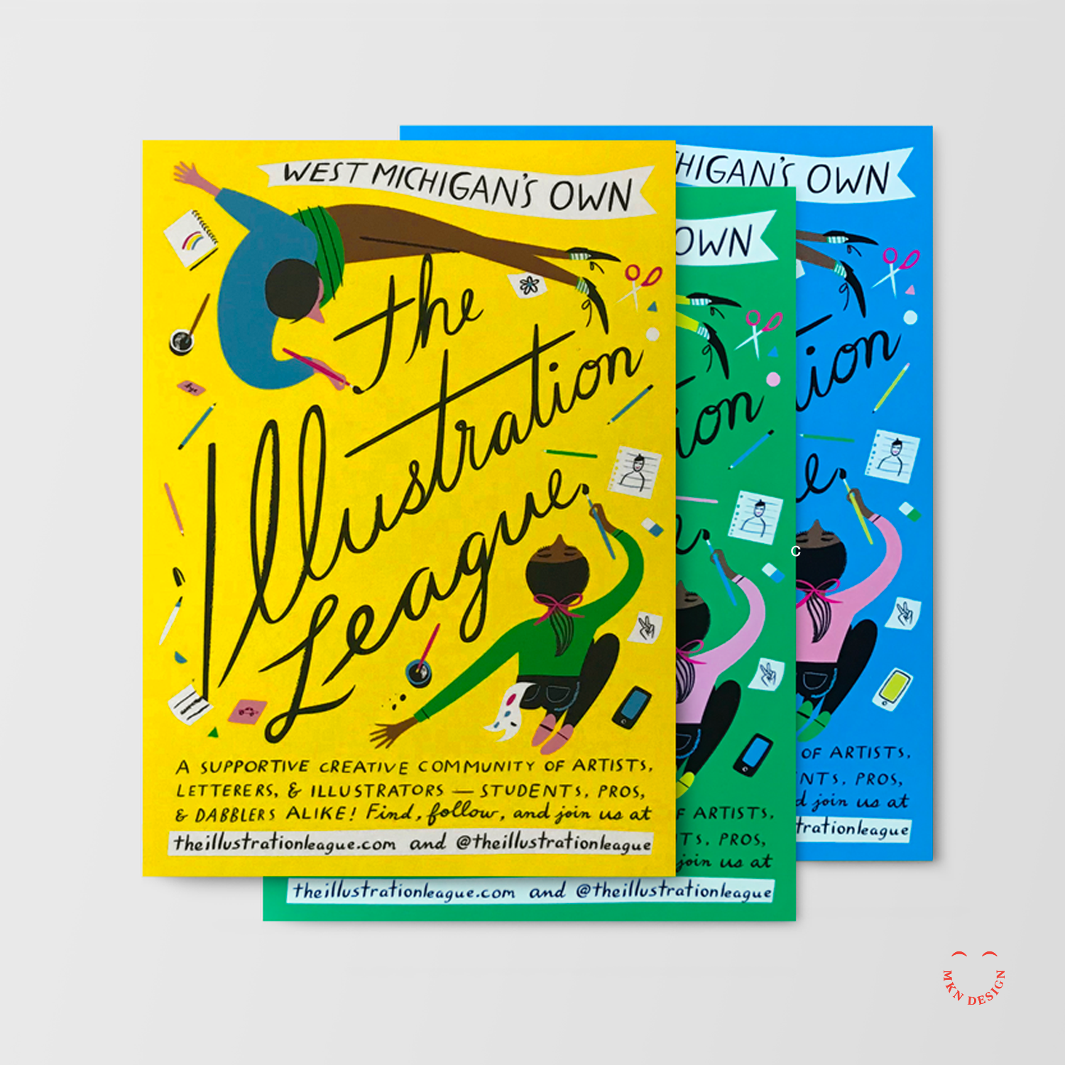
Postcards designed and illustrated by Libby VanderPloeg.
John Lennon

Creative Musing
July 2017
__
John Lennon
Simplified portrait of John Lennon.
Canada 150
Creative Musing
July 2017
__
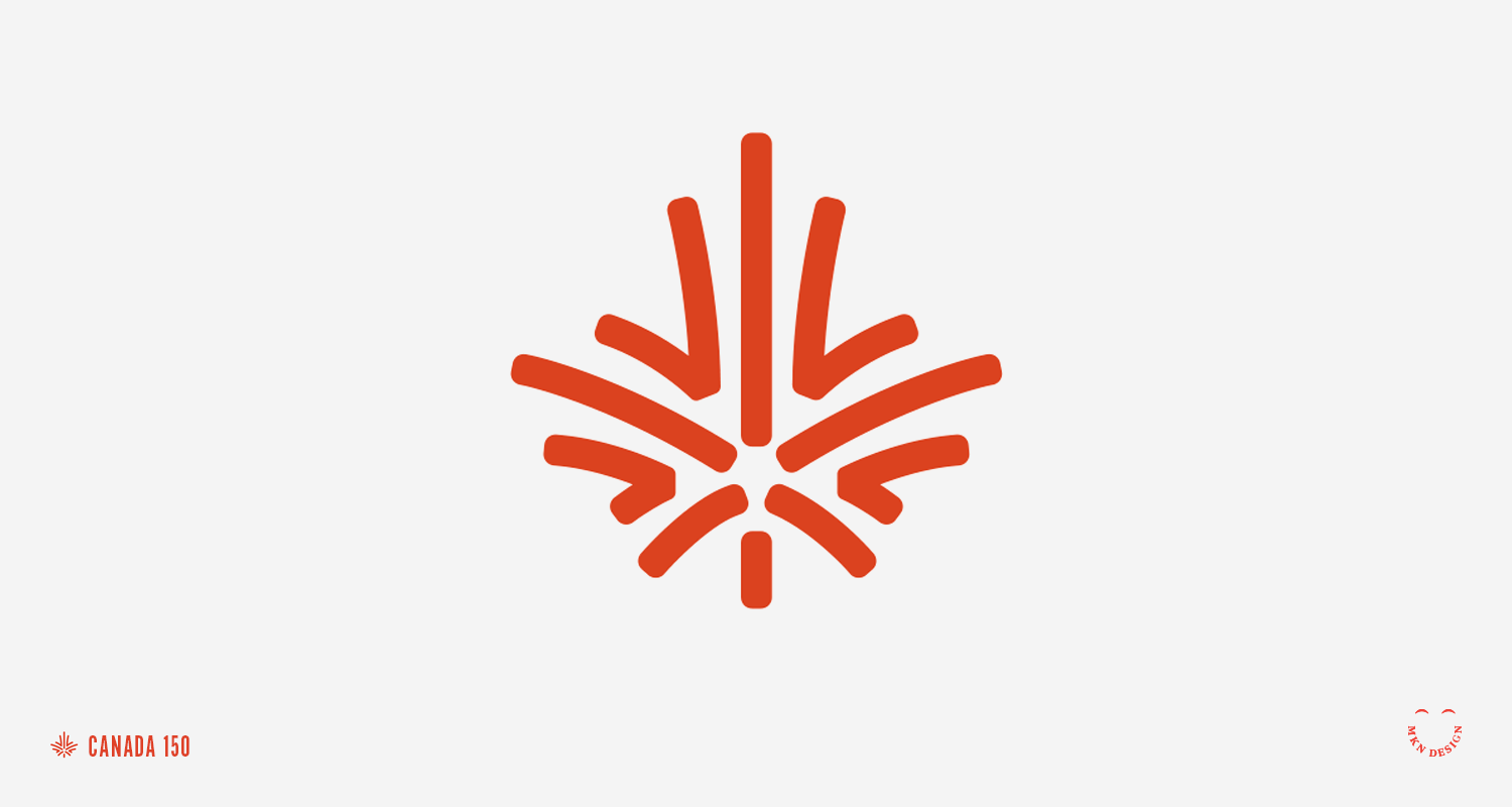
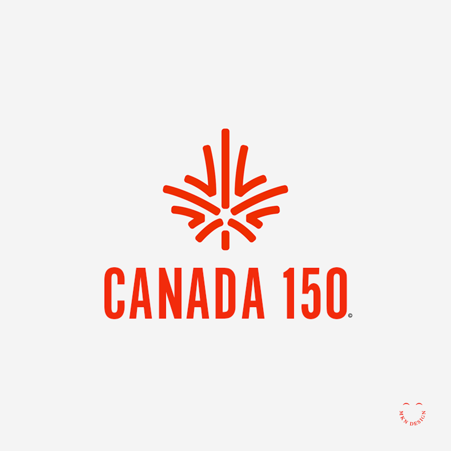
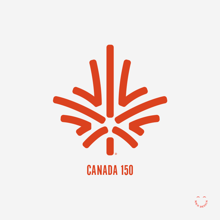
Canada 150
I designed this anniversary mark for Canada’s 150th celebration. The mark features a maple leaf bursting like fireworks, embodying Canada's iconic Maple Leaf while also representing the unity of its citizens. The mark is paired with the typeface ATF Alternate Gothic designed by American Type Founders Collection.
Birth Of Peace
Creative Musing
June 2017
__
Birth Of Peace
An illustration inspired by the words of Sri Chinmoy, “War forgets peace. Peace forgives war.” From the poem, War & Peace.
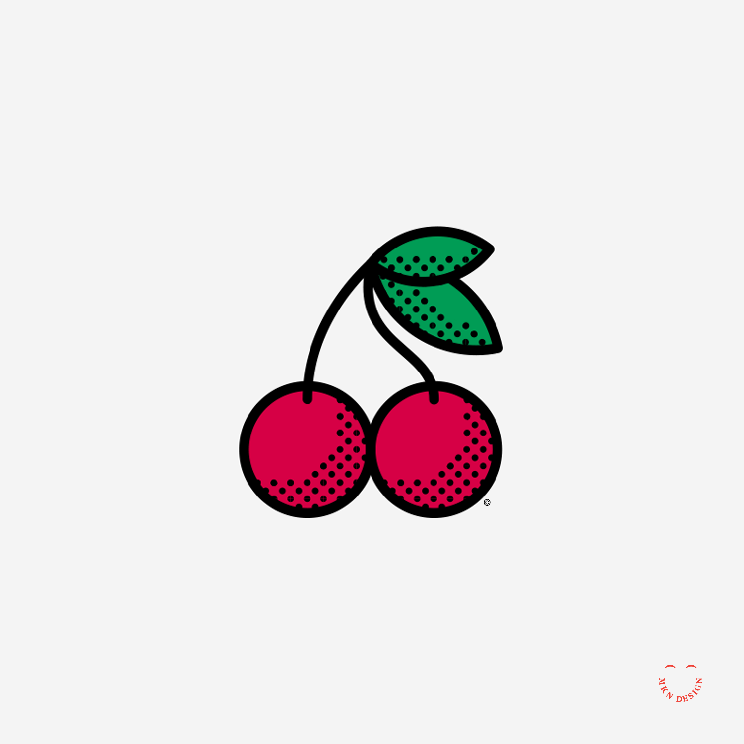
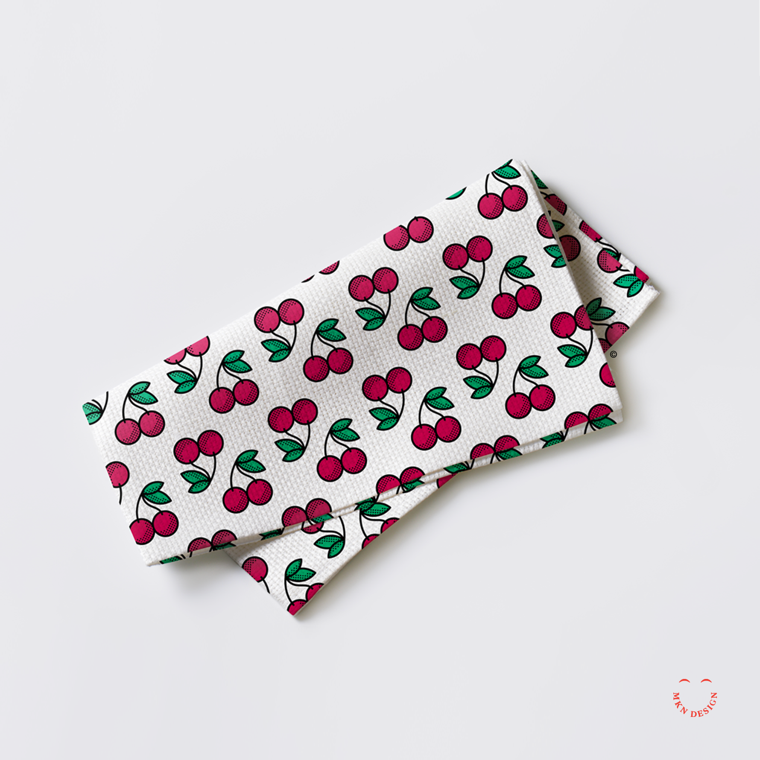
Dueling Cherries
Creative Musing
June 2017
__
Dueling Cherries
Pattern exercise with one illustrated cherry cluster. From illustration to the pattern, to product application.
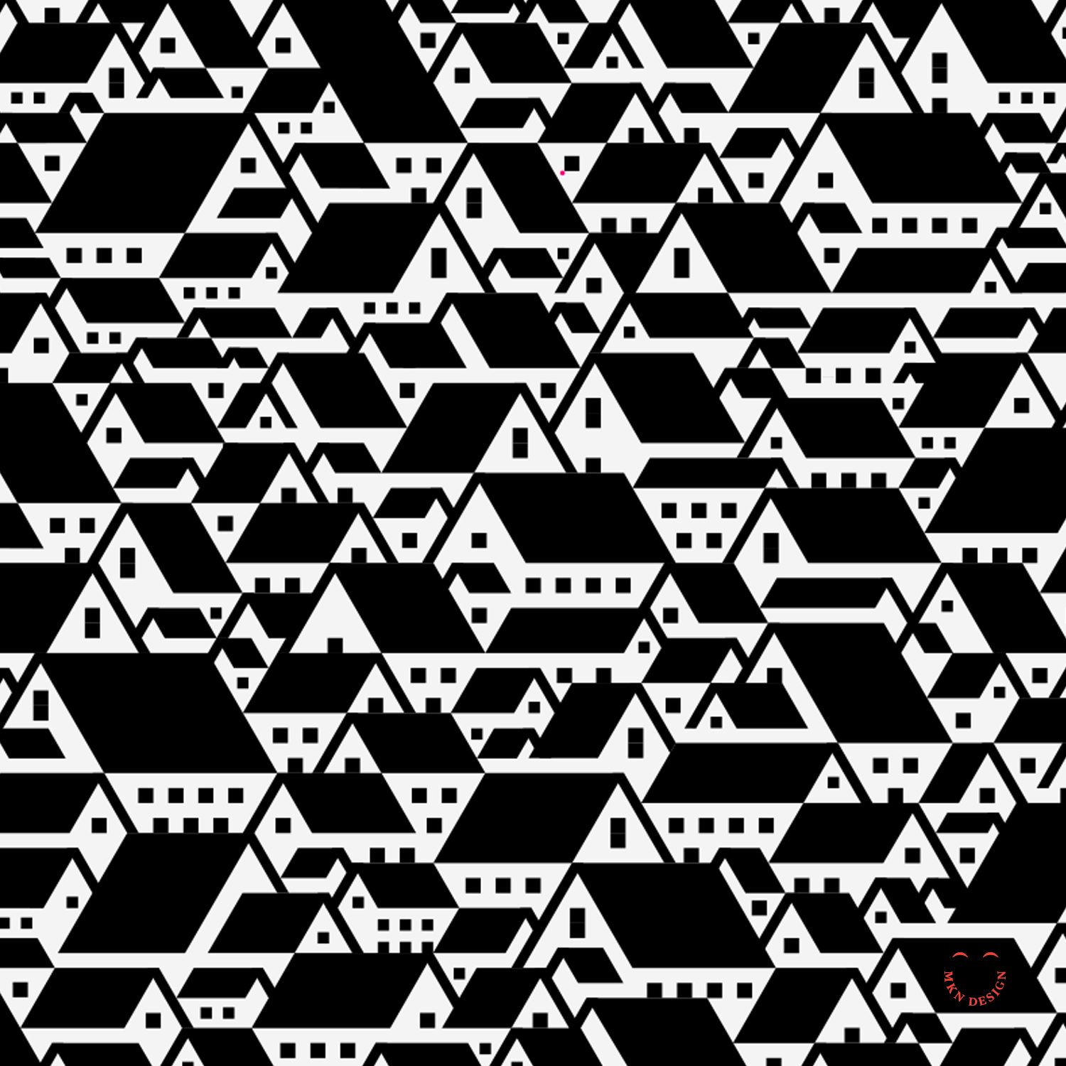
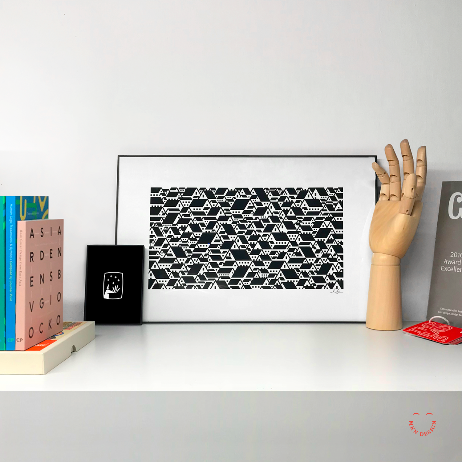
Suburbia
Creative Musing + Product
June 2017
__
Suburbia
A dizzying illustrative representation of endless suburban rooftops.
Buy this Poster
This poster is available for purchase in my shop.
Pollution's Monster
Creative Musing
May 2017
__
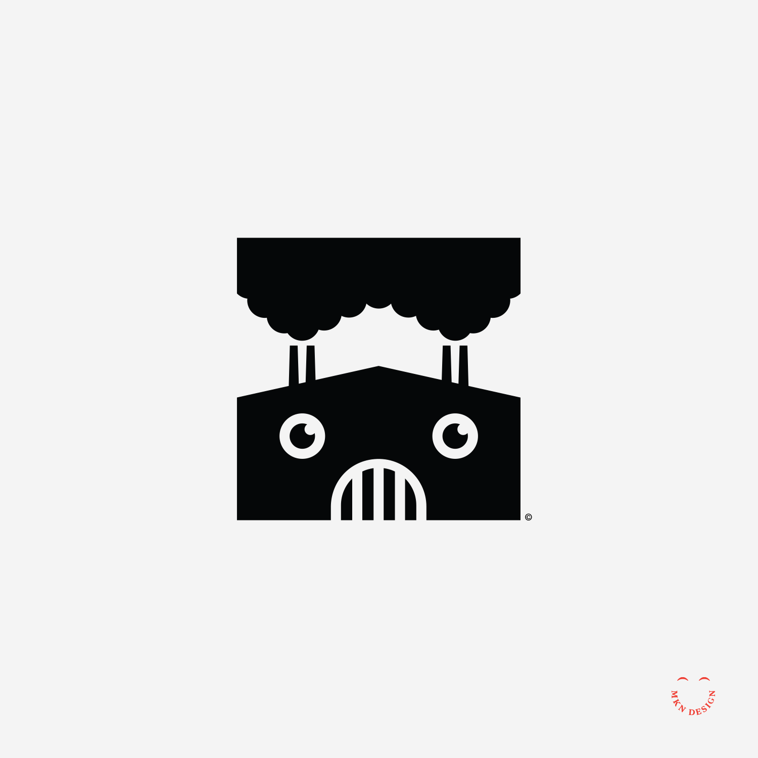
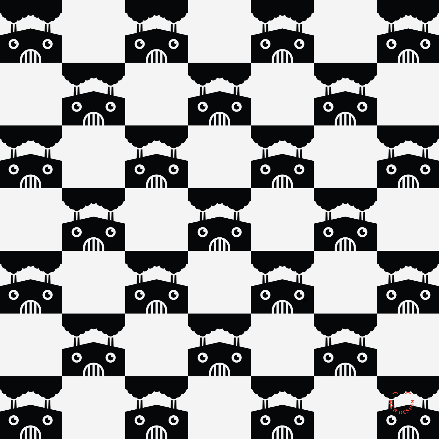
Pollution's Monster
Illustration inspired by the quote from Al Gore, “Pollution should never be the price of prosperity”
The Guardian

Creative Musing
May 2017
__
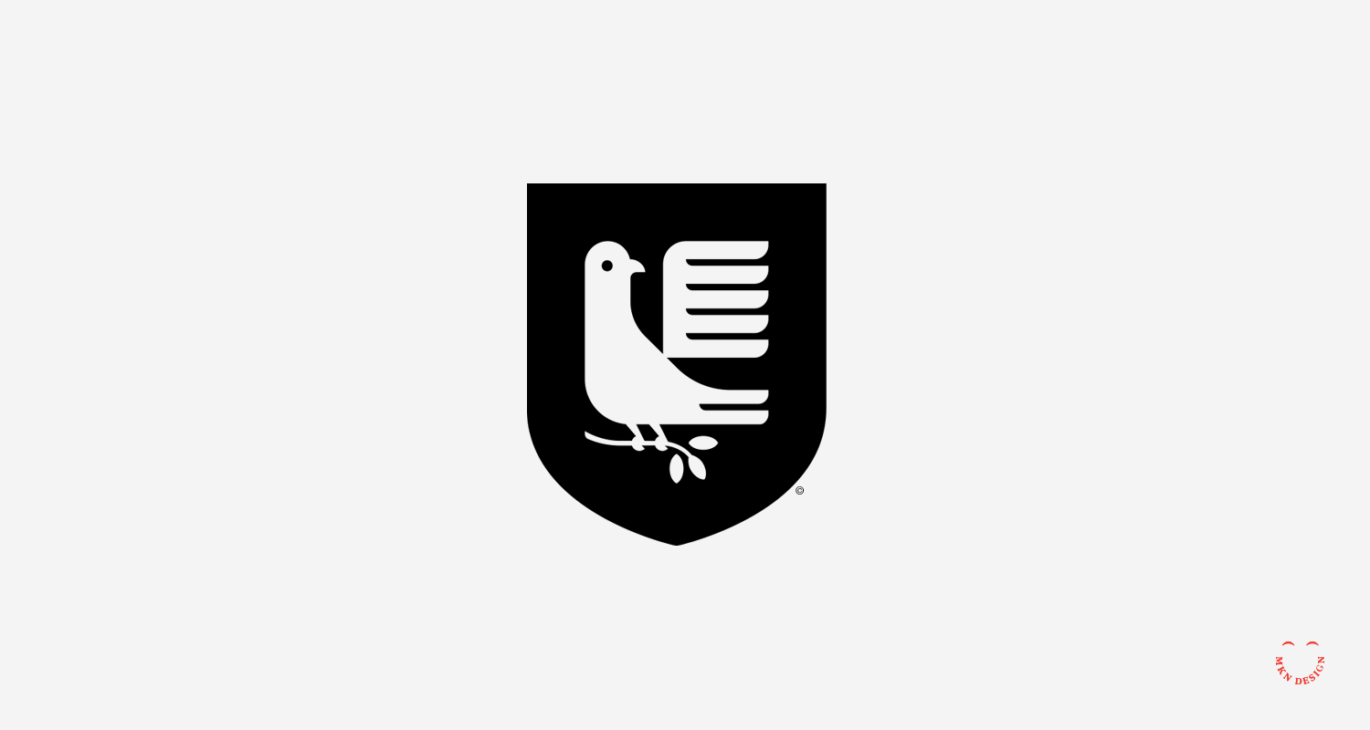
The Guardian
A simplified and modernized interpretation of a Lion Passant was used as a heraldic symbol in the early 14th century. The logo's mark is paired with the typeface Rama Slab designed by Ryoichi Tsunekawa from Dharma Type.
Bluejay & Cardinal
Creative Musing
April 2017
__
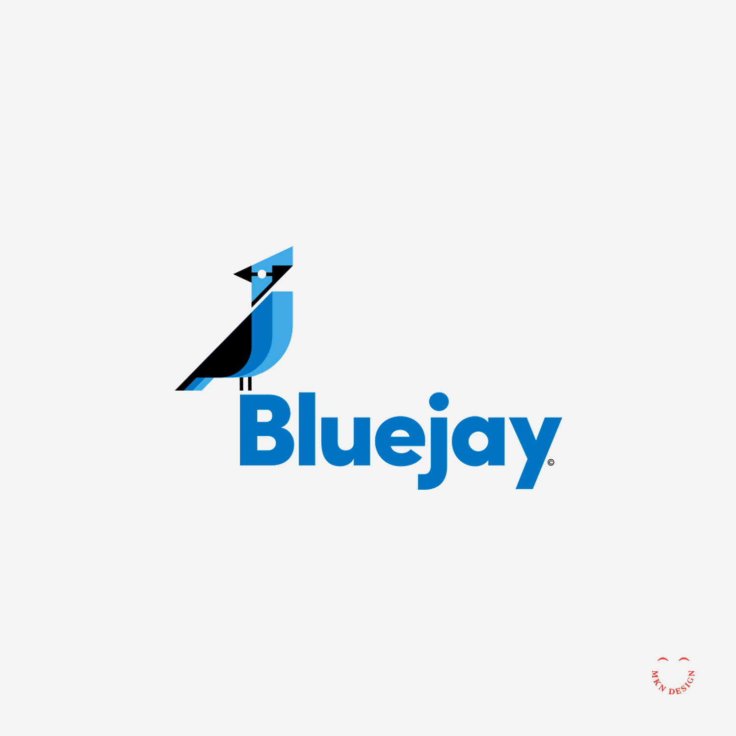
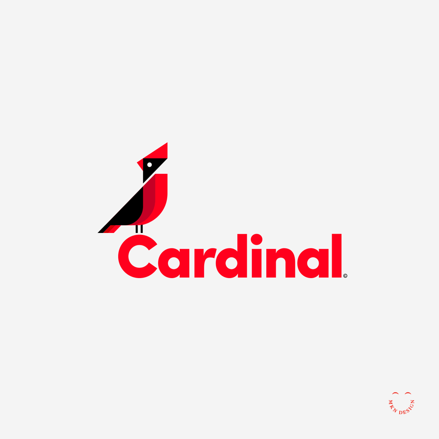
Bluejay & Cardinal
Illustration and type exploration from this past weekend. Simplified Bluejay and Cardinal illustration paired with the typeface, Sofia Pro designed by Olivier Gourvat from Mostardesign. C'est fantastique!
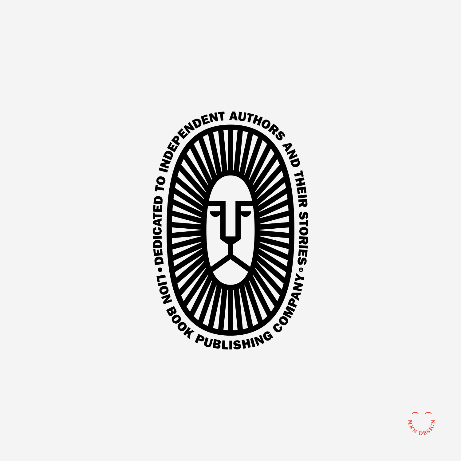
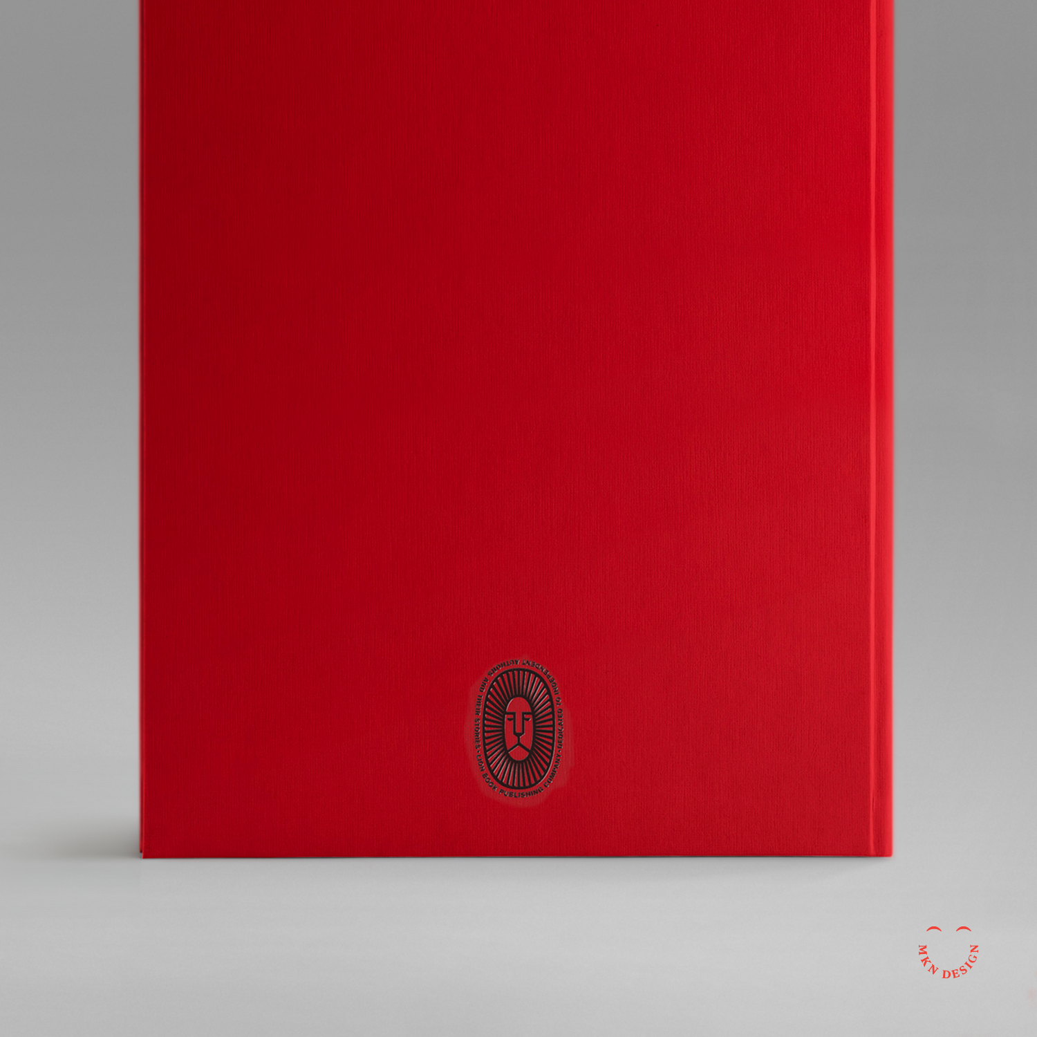
Lion Book Publishing Co.
Creative Musing
March 2017
__
Lion Book Publishing Co.
Dedicated to independent authors and their stories. The typeface utilized around the mark is ATF Franklin Gothic by American Type Founders Collection.
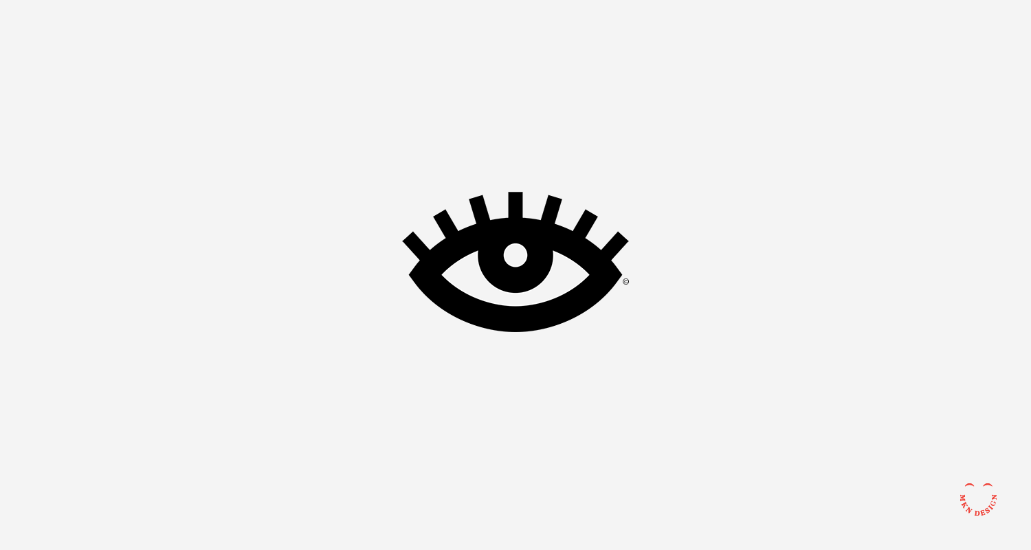
Uneasy Eye
Creative Musing
March 2017
__
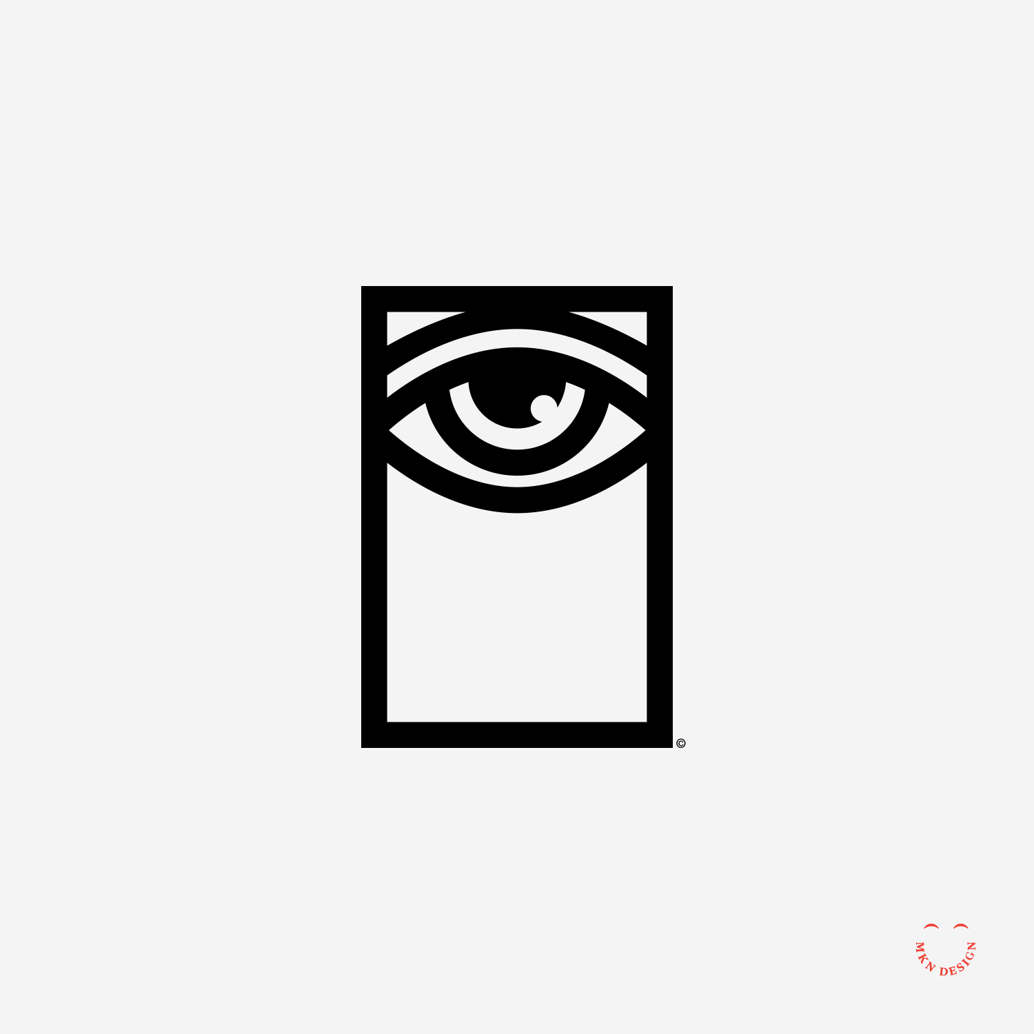
Uneasy Eye
Simple little illustration and animated gif to give it life.
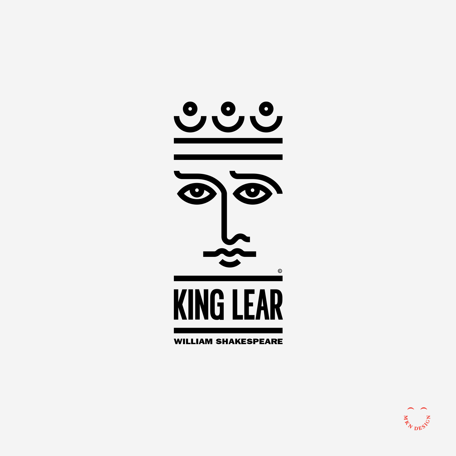
King Lear
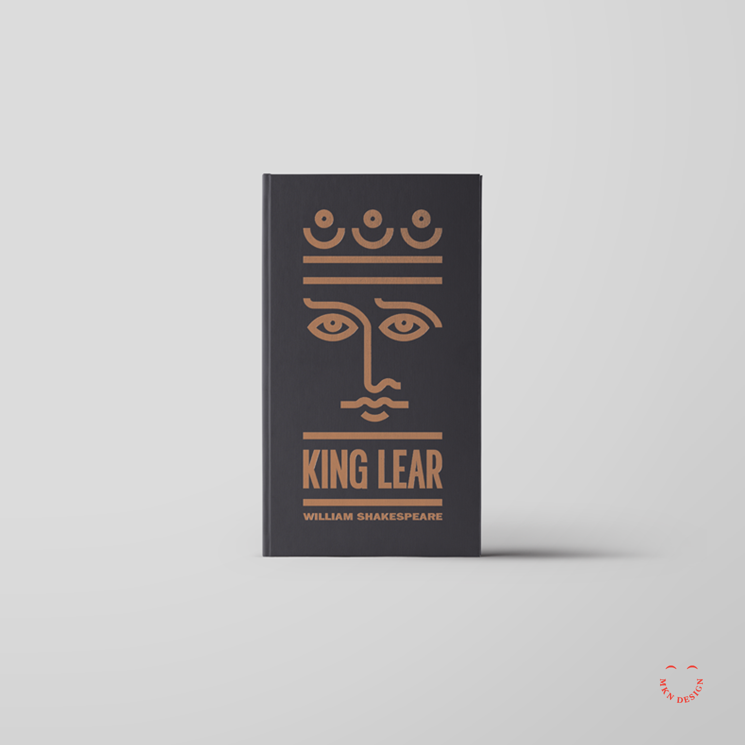
Creative Musing
March 2017
__
King Lear
Simple lines to create this portrait of King Lear for a book jacket. The typeface used on this book jacket is ITC Franklin Gothic LT Pro designed by URW Type Foundry.
Panel Discussion & Portfolio Review


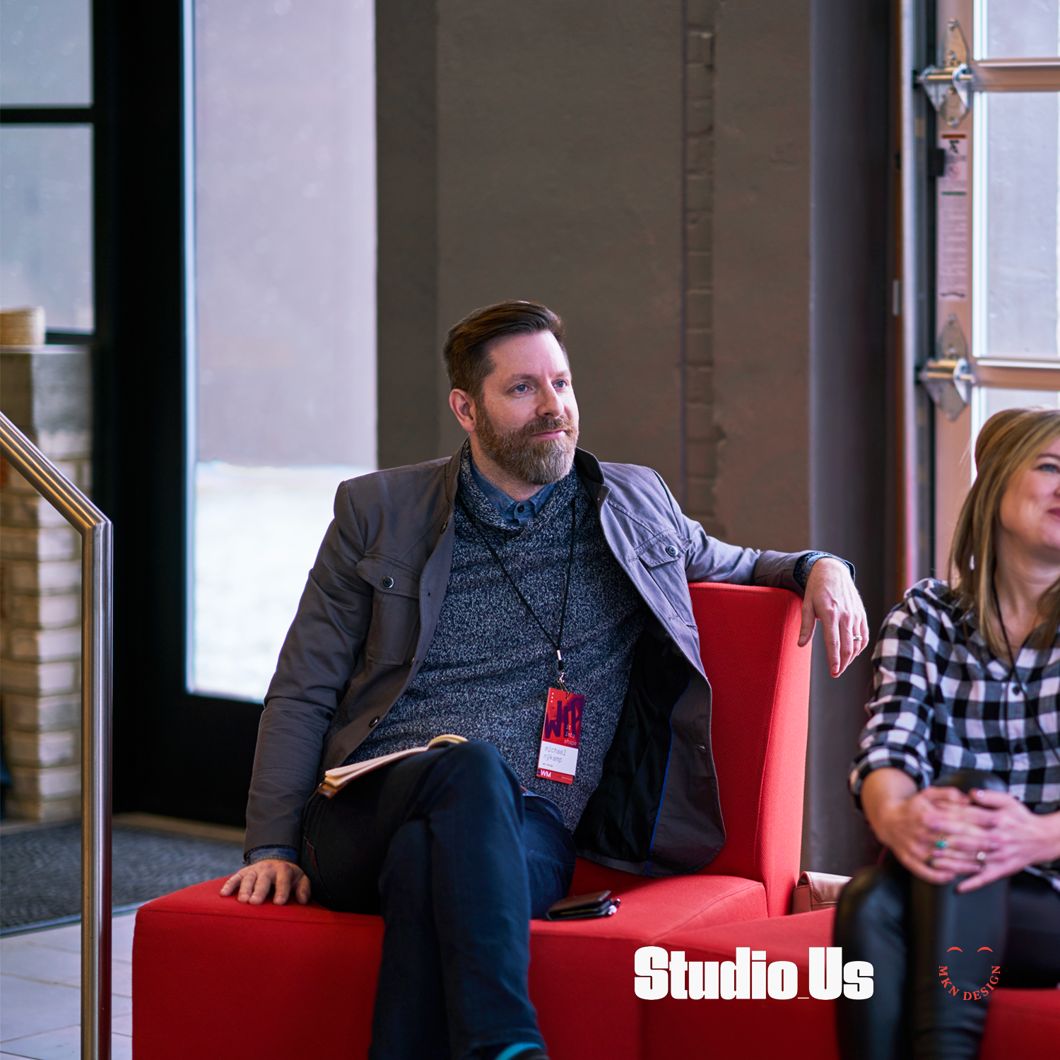


Article
February 2017
__
Panel Discussion & Portfolio Review
Over the weekend, I dedicated my morning to attending "WIP it into Shape," a panel discussion and portfolio review tailored for design students in West Michigan. The event provided an invaluable platform for emerging talents in the design field. Panelists included: Emily Boyd, Sarah Brockett, and Carlos Estrada. This day was organized by AIGA West Michigan, curated by Studio_Us, and graciously hosted and sponsored by Atomic Object.
Note
Program design and photography by two kind and talented humans, Bree and Ross Tanner from Studio_Us.
Camp Pine
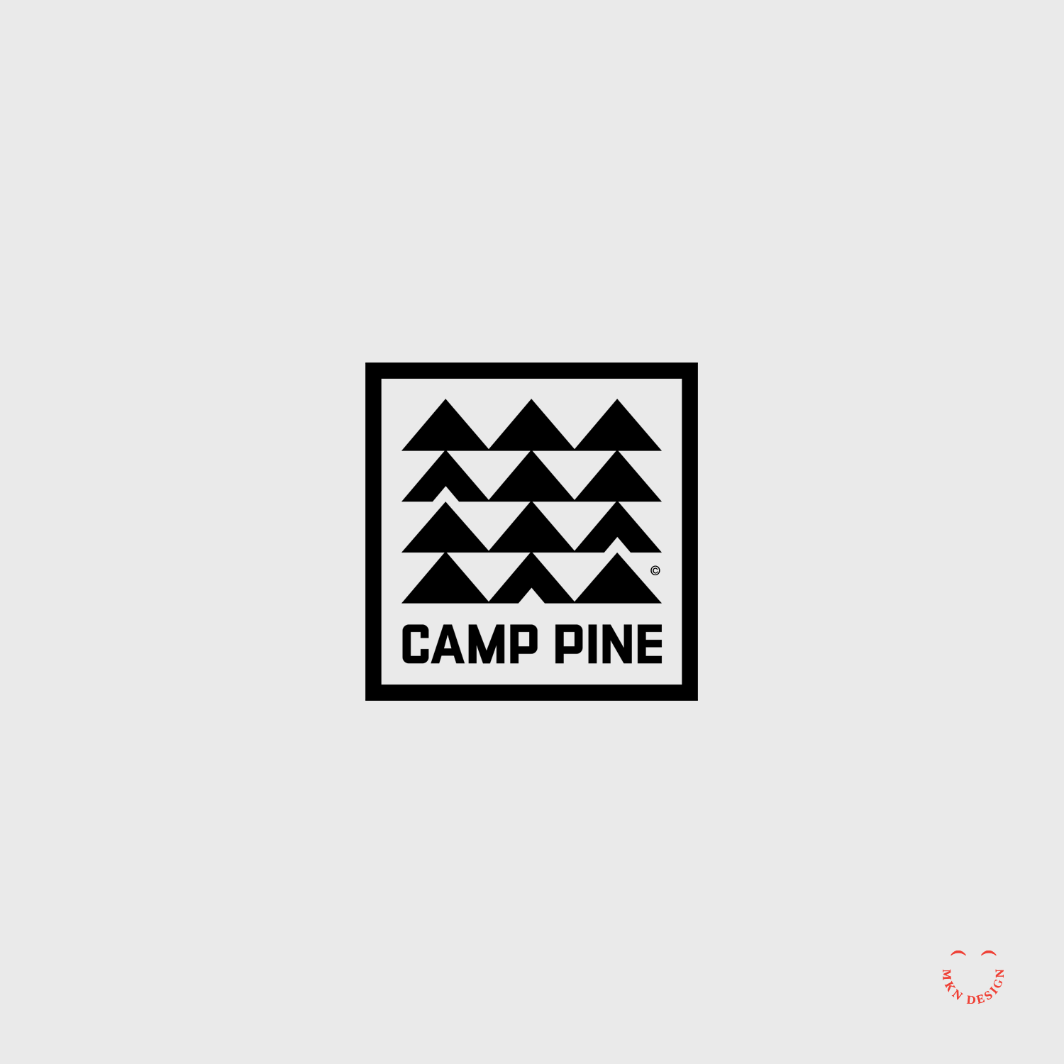
Creative Musing
February 2017
__
Camp Pine
A square, retro mid-century logo with repetitive modern aesthetics. The typeface was custom designed to fit a campy feel.
House Books

Client Project
February 2017
__
House Books
The utilization of a simple line of a roof serves to exemplify the name for House Books. The incorporation of a angled line above the House Books typeface serves as a distinctive marker for the brand's name. The chosen typeface is a customized slab serif that was widened to enhance its presence. I paired the mark with the typeface URW Bodoni Wide designed by Giambattista Bodoni from URW Type Foundry.
-
Brand Identity
-
+ Creative Direction
+ Qualitative Research
+ Concept Development
+ Sketching & Ideation
+ Illustration
Nook Real Estate
Client Project
January 2017
__
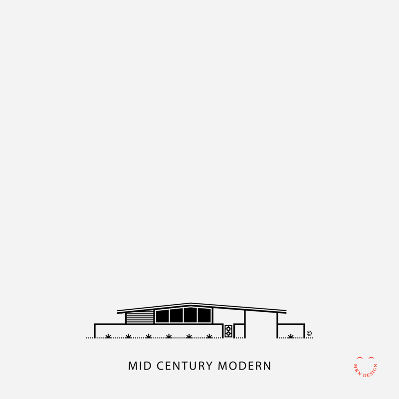
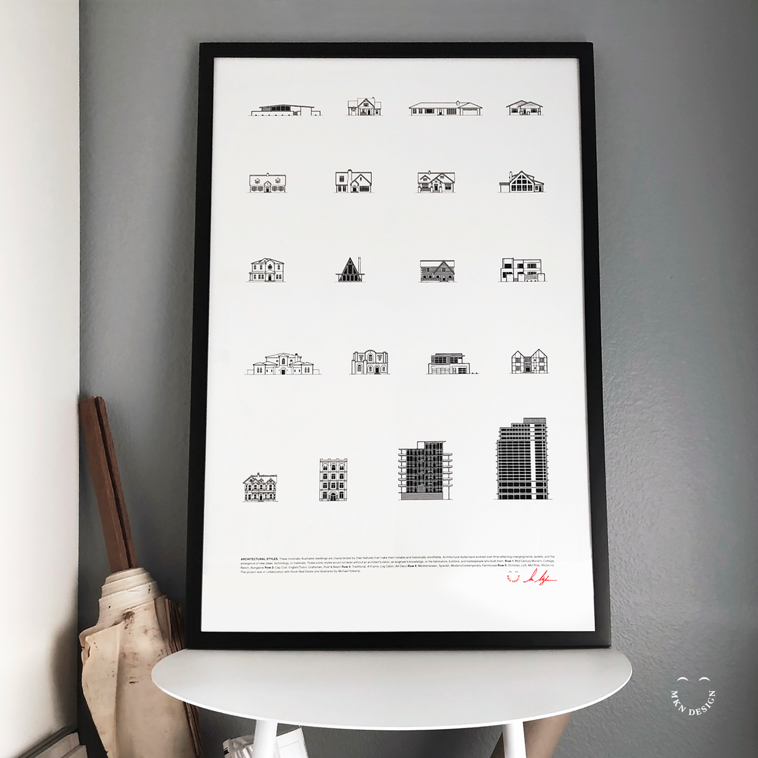
Nook Real Estate
Nook Real Estate, nestled in the heart of Newport Beach, California, epitomizes modernity in the realm of real estate. With a team of astute industry leaders, they specialize in handpicking lifestyle properties that captivate discerning buyers. I've was hired by Nook to craft simple illustrations showcasing the diverse architectural styles of California, enriching their marketing arsenal with visual allure.
Employing my minimalist illustrative approach, I visually captured 20 distinct architectural styles. These illustrations were subsequently compiled into a poster, presenting a comprehensive showcase of the diverse spectrum of architectural designs found in Newport Beach, California.
-
Illustration & Graphic Design
-
+ Creative Direction
+ Research
+ Sketching & Ideation
+ Graphic Design
+ Iconography -
This poster is available for purchase in my shop.
Skate, Surf, & Art


Article + Product
January 2017
__
Skate, Surf, & Art
Monsa Publications requested permission to feature my illustrated skateboard deck graphic, "Urban Totem," in their book titled "Skate, Surf, and Art." This graphic, originally created for a fundraiser aimed at constructing a new skatepark.
Buy this Book
Skate, Surf, & Art is available for purchase on Monsa Publications website.
America's National Parks


Creative Musing
January 2017
__
America's National Parks
Utilizing the emblem shape of the National Park Service and drawing inspiration from the natural elements of our parks—land, water, and sky. Above are two illustrative styles, left badge features gradient colors and right badge feature flat colors. The emblems typeface is Rockwell Nova Condensed designed by Monotype.