Canadian Chronicles is my personal initiative, showcasing brands designed in Canada. These brands captured my attention—from growing up on my family's farm to attending Sheridan college and launching my career as a graphic designer in Toronto. These brands ignited my devotion for brand communication design and continue to influence my work.


Note:
Every month (or two) I will be highlighting brands designed by Canadians, for Canadians through the lens of my experiences and others who are willing to share their stories.

Select images of logos and photos are the copyright and trademark works of their respective holders.


Citytv

Citytv
__
Designer: Unknown
Studio: Unknown
Origin: 1973, Canada
Status: Active (brand updated)

__
www.citytv.com


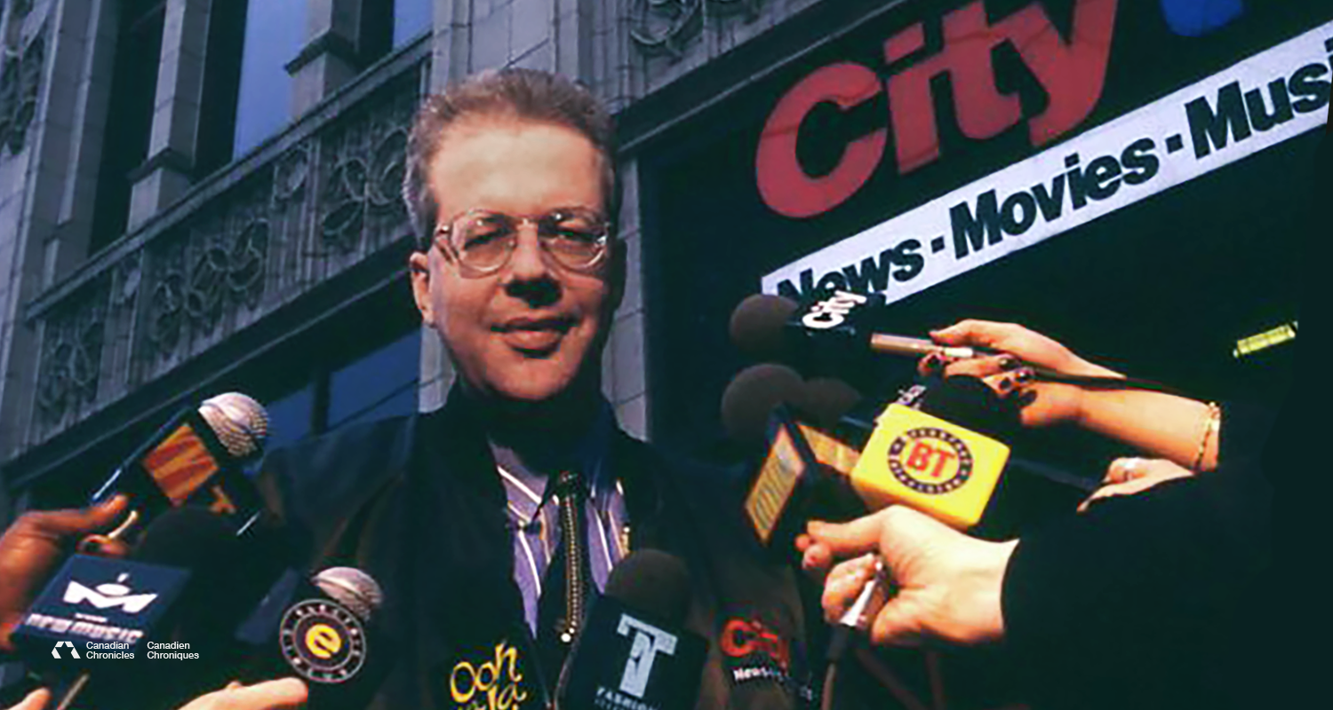
I know, I know—it’s just a news logo (eye roll). But this news station was different. That’s why I love their brand. Citytv wasn’t your typical news station—it took an innovative approach to delivering the news, and that boldness came through in its identity and how they presented themselves to Torontonians. It practically shouted, “We’re different—look at us, hear us, see us—we’re everywhere.”

Growing up in the ’70s and ’80s, the format of most news broadcasts followed a predictable, controlled style. Music played, the station logo faded in—usually an acronym paired with the channel number—and the anchor appeared behind a desk, starting the program with, “Welcome, you’re watching [Such-and-Such] News. We’re starting off this program with…” Then they’d proceed to read the news from a teleprompter. It wasn’t bad—it was just expected and unremarkable.

Citytv used a similar format in the late ’70s and ’80s, but in the early ’90s, the station began to shift as seen on this footage of Citytv New Openers.¹ The driving force behind this change was Moses Znaimer, “He gradually began to pioneer a distinctive style of broadcasting, inspired in part by Marshall McLuhan, which emphasized a strongly local, hip, and casual format aimed at young audiences.” ² Znaimer himself once said, “The flow, not the show.” ³ Breaking down studio walls and gave the public a view inside—literally and figuratively.

This evolution happened during the mid-’90s, when I was attending Sheridan College—right in their target demographic—and it left a huge impression on me. It wasn’t just their bold, fresh approach to newscasting. Citytv extended that spirit into sister stations and programs like MuchMusic,⁴ Oh La La, Breakfast Television, and Great Movies.

They also created Speakers Corner, a public video booth outside their Toronto headquarters. Anyone could step in to rant, sing, tell jokes, or shout out a message—and the clips aired weekly. It was a direct, unscripted connection between the public and the station.

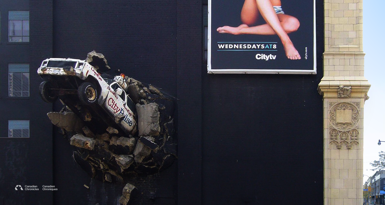
Another standout feature was the CityPulse news truck sculpture bursting through the wall of their headquarters at 299 Queen Street West. Artist Nigel Stanley, who designed the sculpture said, “His vision was for the truck to look like it was busting out of the building, off to the latest news story.”

As I look back, it wasn’t just the logo that made Citytv stand out (although the logo certainly helped). It was the brand as a whole—the bold messaging, the inventive programming, the cultural relevance, and the iconic broadcasting vans—that made Citytv unforgettable.


10-03_20_Canadian_Chronicles_A.png
 

Dairy Farmers of Ontario, Milk


Dairy Farmers of Ontario
__
Designer: Unknown
Studio: Marshall Fenn Communications
Origin: 1972, Canada
Status: Active (brand updated)

__
www.milk.org


As I’ve shared in a previous Canadian Chronicles story, I grew up on my parents’ family farm in Southern Ontario, where I helped with daily farm chores throughout my younger years. Milk was a staple at our family table. Each week, we’d drive over to our neighbor’s dairy farm to pick up a couple of containers of milk. Looking back, I’m pretty sure that wasn’t exactly legal.

On my first visit with my father (pictured in photo 6) to our neighbor’s dairy farm, I was introduced to the milkman—and to the Milk logo, boldly displayed on the side and back of his delivery rig.

That logo by the Dairy Farmers of Ontario wasn’t flashy or over-designed—and that’s exactly what made it stick. The word “Milk,” written in a loose, handwritten script, sat between two shades of blue that instantly suggested something cold, calm, and refreshing. It looked simple, almost modest—but that simplicity carried weight, feeling honest and familiar, as if it had always been part of the backdrop of daily life.

I remember staring at it as a kid, thinking how cold and refreshing it looked—even before the milk hit the glass. It had a no-nonsense, quietly confident vibe, like it was saying: this is the good stuff, straight from the farm. And when you mixed it with a scoop of Nestlé Quik? Pure magic.

What stuck with me wasn’t just how it looked—it was how it made you feel. The mark connected you to the people behind it: the farmers, the routines, the trust. It didn’t need to work hard to get your attention. It just belonged—and that’s what made it powerful.

Looking back, I realize how much that logo shaped the way I think about design. Good branding doesn’t need to shout. It just needs to feel real—and speak with purpose.

When I was in high school, I got a job as a farmhand on a local dairy farm. The family who hired me were Italian Canadians, all living together in a big farmhouse—father, mother, son, aunt, and nonna (grandmother). My days were filled with learning every part of running a farm—milking cows, feeding and caring for cattle, heifers, calves, and chickens, planting and harvesting crops, mowing hay in a sweltering barn, and even getting hands-on with butchering: cutting and curing meat and making Capicola and Salsiccia.

They also introduced me to French press coffee and some seriously amazing Italian home cooking. Nonna was always telling me to eat more, shouting “Mangia! Mangia!” at every meal. They didn’t just hire me—they made me part of the family and I loved it!

I learned more than just how to milk a cow—they taught me about responsibility, hard work, and what it means to show up for others. Lessons I still carry with me today.

  • 1. Milk tanker truck picking up milk
    2. Milk Bone, Billboard Ad by BBDO Canada – c. 2000
    3. Milk. Really keeps kids going, poster Ad by Due North Communications – 2011
    4. Coffee vs. Milk, Magazine Ad by Vickers & Benson – 1976
    5. 50th Anniversary Branding via Recharge with Milk Tankard, Ontario Curling Assoc – 2015
    6. Photo of my father, Dick Nÿkamp milking our family farm cow – c. 1970
    7. Dairy Done Right (The Letter), TV Ad by NFA – 2019


Ontario Hydro


Ontario Hydro
__
Designer: Allan Robb Fleming
Studio: Hathaway-Templeton
Origin: 1962, Canada
Status: Retired

__
www.hydroone.com


I was 6 years of age when my parents built a new finishing barn for their farm. Close to its completion, I recall three white utility trucks slowly traveling down our long lane way. As each truck parked the doors opened, showing off a bright orange emblem. Several men with thick mustaches climbed out and put on their orange safety helmets on which adorned the same emblem.

That bright orange emblem was the Ontario Hydro logo. It’s one of those timeless logos that’s brilliant. For me it was the use of bold colours, the cleverly hidden ‘O’ and ‘H’ and the 45 degree tilt that had caught my eye—it say’s electric, perfect for a power company.

Not only do the colours convey its energy, but the combined logo elements unite it together. As I mentioned, cleverly the letters ‘O’ and ‘H’ (from Ontario Hydro) were combined to create the mark, which also represents the universal symbol for an appliance connector (or plug). The added tilt provides further intensity and strength. Also, subliminally the 'O' and the 'H' remind me of H2O (water’s chemical formula)... interesting.

For people who do not know, hydro is electricity that harnesses the power of water in motion—such as water flowing over a rock face—thank you Niagara Falls : )

The Ontario Hydro logo system was retired in 1999 and was changed to the current nondescript Hydro One logo.


Photo Description & Credit:
1. Ontario Hydro safety helmet (mock-up) - Umit-Yildirim
2. Ontario Hydro logotype and mark.
3. Photo of Allan Robb Fleming, 1959
4. Allan Fleming’s Ontario Hydro logo launch document, 1965 – 
Alliance Graphique Internationale
5. Ontario Hydro printed materials, from left to right: Annual Report front cover: 1973 / Meter Reading Post Card: 1971 / Year Around Comfort Ad Maclean's, May 1971
6. La Centrale nucléaire de Pickering booklet, 1970 (mock-up of original)
7. Ontario Hydro electric utility bucket truck (mock-up) – 
American Public Power Association
8 Sikorsky S-58ET, CF-OIA, Ontario Hydro Helicopter, 1973 – Caz Caswell
9. Zap the Safety Bird for children, by Ontario Hydro, 1982


10-03_20_Canadian_Chronicles_A.png
 

CO-OP


CO-OP
__
Designer:
Unknown
Studio: Unknown
Origin: 1957, Canada
Status: Active (updated)

__
www.fcl.crs


Growing up in a small farming community in Southern Ontario, Co-op was a familiar name which appeared on various products on our farm. I remember my father applying Co-op grease to our old Cockshutt combine—lubricating it’s grease boxes and articulating arm joints. I also recall my father pouring Co-op sacks of winter wheat seed into our International seeder for autumn planting and empty Co-op feed bags laying beside our barn feed spouts.

The logo that represents Co-op was developed in 1957—all-red Co-op letters framed by a green shield. The only change was made in 1974, in which the logo changed to an all-red mark.

Co-op or Federated Co-operatives Limited (FCL), was once a nationwide chain of grocery stores and supermarkets across Canada. Now serving many small rural towns throughout Western Canada. Since it’s beginning, in 1928 the FCL has expanded to wholesaling, manufacturing, marketing and administrative co-operative owned by more than 160 independent local co-operative associations. These local co-ops own and operate agro. centers, food stores, gas bars/convenience stores and home centers.

Co-op Commercials:
1. We Are Co-op
2. Maybe Tomorrow *

* The song in this commercial is “Maybe Tomorrow", sung by Terry Bush. It’s also another childhood memory of my favorite Canadian TV show, The Littlest Hobo.

If you know the designer who created the Co-op logo, email me.


Photo Description & Credit:
1. Grain elevator, Mossleigh Alberta (mock-up) - Bernard Spragg
2. Co-op pole sign, Lafleche, Saskatchewan –
Andrew Filer
3. Co-op full service gas station, circa 1960 -
The History of Fueling Up in Western Canada
4. Co-op Mineral Gear Oil SAE 80, 1 imperial gallon (collage mock-up)
5. Kindersley Co-op oil truck & tanker next to the Federated Co-operatives Limited building, 1957 –
Saskatoon Public Library
6. Old Co-op feed sack (mock-up) –
Diego Catto
7.
Co-op Bulk Plant, Portage, Saskatchewan, circa 1960 – curiosity of Federated Co-op Limited


10-03_20_Canadian_Chronicles_A.png
 

Parks Canada


Parks Canada
__
Designer:
Ken Marsh, Roderick Huggins
Studio: Guillon Design Inc
Origin: 1973, Canada
Status: Retired

__
parkscanada.ca


The only national park I visited in Canada was Gros Morne National Park, Newfoundland—it’s only a 31 hour trip East of Toronto, but worth the visit. The park's main attraction is the Western Brook Pond, a fjord carved out by a glacier that runs through the Long Range Mountains (see the third photo).

While visiting the Gros Morne, I did not see the Parks Canada logo, but did come across a few beavers gnawing on trees. Speaking about beavers, Parks Canada has utilized the beaver as a symbolic representation for it’s national identity for close to 50 years.

The identifiable mark is attributed to the simplified beaver in which it’s encapsulated with a rounded triangle—which signifies a badge (a perfect identifier for park rangers and staff). Significantly, the mark’s unique colours (gold and brown) offset the signage beautifully and bring a natural feel to Canada’s national park's cultural heritage, environment and grand scenery. Sadly, in 2001, Parks Canada replaced it with a new mark.

The beaver has symbolic significance to Native Americans and Canadians. “The beaver helps people understand the dynamics of teamwork and to appreciate each individual’s talents and contributions in order to accomplish anything. He is a builder of the mind, body, and soul and symbolizes creativity, creation, cooperation, persistence and harmony. The Beaver is also a hard worker and will not quit his job until he is done.” (Tatjana and Walter Stolting, Spirits of the West Coast Art Gallery Inc, The Beaver Symbol).

Today, Parks Canada manages 38 National Parks, 3 National Marine Conservation Areas, 171 National Historic Sites, 1 National Urban Park, and 1 National Landmark.

If you have not been to the many national parks in Canada, I suggest you go visit.


Photo Description & Credit:
1. Kluane National Park, Yukon, Canada - unknown photographer
2. Parks Canada passes on Landrover window (mock-up) -
Tim Trad
3. Gros Morne National Park, Newfoundland, Canada - unknown photographer
4. Moraine Lake in Banff National Park, Alberta, Canada - Niv Rozenberg
5. Parks Canada passes on Volkswagen window -
Jaime Verdes
6. Parks Canada park pass design from 1987 (mock-up of original)
7. Parks Canada park pass design evolution between 1979 to 1993 (mock-up of original)


10-03_20_Canadian_Chronicles_A.png
 

Canadian Tire


Canadian Tire
__
Designer:
William Punkett (original design)
Studio: Unknown
Origin: 1940, Canada
Status: Active (updated)

__
canadiantire.ca


Canadian Tire was my favorite store as a kid. Seeing the red triangle paired with Canada’s maple leaf was a beacon of light from the highway. They had everything—automotive parts, camping equipment, housewares, CCM bikes, tools, fishing rods, toys, sportswear—you name it, they had it! On the weekends, I loved to peruse the Canadian Tire flyer and dream of what I could buy with the Canadian Tire Money I saved (I believe my first purchase was a fishing rod).

It has been said that Canadian Tire’s iconic shape, the triangle, was chosen because its founders (John and Alfred Billes) wanted a recognizable symbol on their petroleum products. In 1934, the maple leaf was added to the triangle. Thirty-three years later the logo underwent another design update—it is what we know and love today as the Classic Canadian Tire logo.

“This would be the everlasting symbol for the company that would be emblazoned into the psyche of every Canadian.” (Andrew King, Ottawa Rewind, The Canadian Tire Triangle, 2016).


Photo Description & Credit:
1. Canadian Tire
stacked shipping containers - unknown photographer
2. Canadian Tire store front – unknown photographer
3. Evolution of Canadian Tire logo from 1940 to 2020
4. Canadian Tire sponsored indy car of Jacques Villeneuve, Laguna Seca Raceway, Quebec, 1985 -
Daniel du Plessis


10-03_20_Canadian_Chronicles_A.png
 

GO Transit


GO Transit
__
Designer:
Frank Fox, Gagnon Valkus
Studio: Gagnon/Valkus Inc. in assoc. with Canadian National Railway
Origin: 1967, Canada
Status: Active

__
gotransit.com


I love this mark—most likely because I commuted by train from Oakville to Toronto every day when I was starting my career. I miss that commute. It gave me the opportunity to people-watch, sketch, chat with a friendly passenger nearby, and sometimes drift off to sleep to the rhythmic clickety-clack of the tracks.

Notably, the GO Transit mark has been around for 53 years. While the logo has evolved slightly since the 1960s, it has maintained its original form and integrity. It’s a great example of how thoughtful, well-crafted design can stand the test of time. Its longevity is no accident—it’s a testament to the strength of its design, both in form and in meaning.

It’s memorable and simple, with a few clever visual elements hidden within the design. The letters “G” and “O” not only represent the name GO Transit, but they also form a subtle “T” lying on its side—a nod to the full name. Additionally, the shapes resemble an undercarriage wheelset, reinforcing the connection to rail travel. And finally, “G” and “O” stand for the Government of Ontario, the provincial body that established and oversees the transit system.


Photo Description & Credit:
1. GO Transit cab car #322 -
Youngjin Ko
2. Original 1960 and current 2020 Go Transit logo
3. Commuters at Mount Pleasant GO Transit Station -
Ontario Growth Secretariat, Ministry of Municipal Affairs
4. Find Your Go Time Illustration - MKN Design ©


10-03_20_Canadian_Chronicles_A.png
 

The Beer Store


The Beer Store
__
Designers:
Manfred Gotthans, Chris Yaneff
Studio: Unknown
Origin: 1990, Canada
Status: Retired

__
thebeerstore.com


I remember like it was yesterday—I was 19 and attending college in Oakville, Ontario. It was my first time walking up under the orange glow of The Beer Store sign and opening its revered doors. I strolled back to the walk-in fridge, eyed a two-four of Molson Canadian and placed it on the conveyor. This was the most ingenious innovation that the Beer Store offered, a roller conveyor that easily transported your case of beer from the walk-in fridge to the checkout line. I still remember the whooshing sound the rollers made as the case traveled to the front. I made many trips throughout my time living in Ontario—it’s a true Canadian experience.

Though The Beer Store wordmark was updated, I still love the old school wordmark. Mostly because of the connected serif letters with their soft welcoming corners, paired with the bright orange brand color. It left a distinct impression.


Photo Description & Credit:
1. The Beer Store, storefront - Acadia Broadcasting, staff photo
2. The Beer Store logo on a pole sign – unknown photographer


10-03_20_Canadian_Chronicles_A.png
 

Canadian Chronicles


Canadian Chronicles
__
Michael Nÿkamp

2020, United States (former Canadian, now U.S. citizen)
Forever Canadian at heart ❤

__
mkn-design.com


Project Overview
I started this personal initiative highlighting brands designed by Canadians, for Canadians.

The impetus behind the Canadian Chronicles mark originates from Canada's iconic symbol, the maple leaf while accommodating Canada’s flag colors—red and white. Additionally, I drew inspiration from renowned Canadian designers Allan Flemming, Burton Kramer, Ernst Roch, and specifically Stuart Ash's works from the late '60s (Canadian Centennial symbol, 1965) and early '70s (Metric Commission mark, 1974). I also adopted the naming convention from the Canadian Federal Identity Program presenting the brand's name in both English and French using the system's standardized font, Helvetica. 

The mark is recognizably Canadian and its form evokes a sense of care, movement, and strength.

Project Background
My career interest started as a young kid growing up on a farm in Southern Ontario, Canada. At the time I did not recognize or understand what branding or communication design was. But I admired the various aspects of branding, like Canadian Tire and Parks Canada to catchy TV advertisements, like “Mikey likes it!” (Life Cereal, 1974), or the jingle, "Skippy Peanut Butter, goes on our daily bread..."(Skippy Peanut Butter 1984). As I matured, my interest in communication design continued to develop, although I faced uncertainty about where to begin. Thankfully, I had an art teacher who helped and encourage me on where to start. As I embarked on my journey into art and design at Sheridan College of Art and Design. I was accepted into the Art Foundations program (1 year). This experience propelled me to pursue further education in the field, leading me to complete a four-year Illustration program and a one-year New Media Design program. Fast forward, I currently leverage my skills as an Illustrator, UX Design, and Graphic Design to complement my role as a visual communication designer for my independent business MKN Design. 

I hope to showcase and discuss Canadian brands through the lens of my personal experiences. I invite you to share your own stories and experiences related to the Canadian brands I feature in this blog.


Photo Credit
Allan Fleming, Allan Fleming Papers, York University Clara Thomas Archives, and Special Collections


10-03_20_Canadian_Chronicles_D.png

A shorten ideation process in developing the Canadian Chronicles mark.


Canadian Chronicles combination mark + clear area specifications

 
10-03_20_Canadian_Chronicles_G.png

Primary Brand Application—A

Horizontal / English and French Mark
Clear area combination mark specifications and combination mark + colour usages in: Canada Rouge, Noir and knockouts.


Secondary Brand Application—B

English Mark, Horizontal
Clear area combination mark specifications and combination mark + colour usages in: Canada Rouge, Noir and knockouts.

Tertiary Brand Application—C

English Mark, Stacked
Clear area combination mark specifications and combination mark + colour usages in: Canada Rouge, Noir and knockouts.

Secondary Brand Application—D

French Mark, Horizontal
Clear area combination mark specifications and combination mark + colour usages in: Canada Rouge, Noir and knockouts.

Tertiary Brand Application—E

French Mark, Stacked
Clear area combination mark specifications and combination mark + colour usages in: Canada Rouge, Noir and knockouts.

10-03_20_Canadian_Chronicles_L.png

Typography Usage:
Helvetica Neue, Regular

10-03_20_Canadian_Chronicles_N.png

Primary Colour

Rough Red
CMYK: 0 / 99 / 97 /0
RGB: 237 / 33 / 39
HEX: ED2127

10-03_20_Canadian_Chronicles_O.png

Secondary Colour

Dark Rough Red
CMYK: 5 / 100 / 94 /0
RGB: 225 / 31 / 43
HEX: E11F2B

10-03_20_Canadian_Chronicles_P.png

Secondary Colour

Noir
CMYK: 75 / 68 / 67 / 90
RGB: 0 / 0 / 0
HEX: 00000

10-03_20_Canadian_Chronicles_Q.png

Secondary Colour

Blanc
CMYK: 0 / 0 / 0 / 0
RGB: 255 / 255 / 255
HEX: FFFFFF


10-03_20_Canadian_Chronicles_A.png