
Creative Musing
December 2017
__
Google Doodle Blocks
The Google logo was constructed using blocks and captured using the iPhone 7.
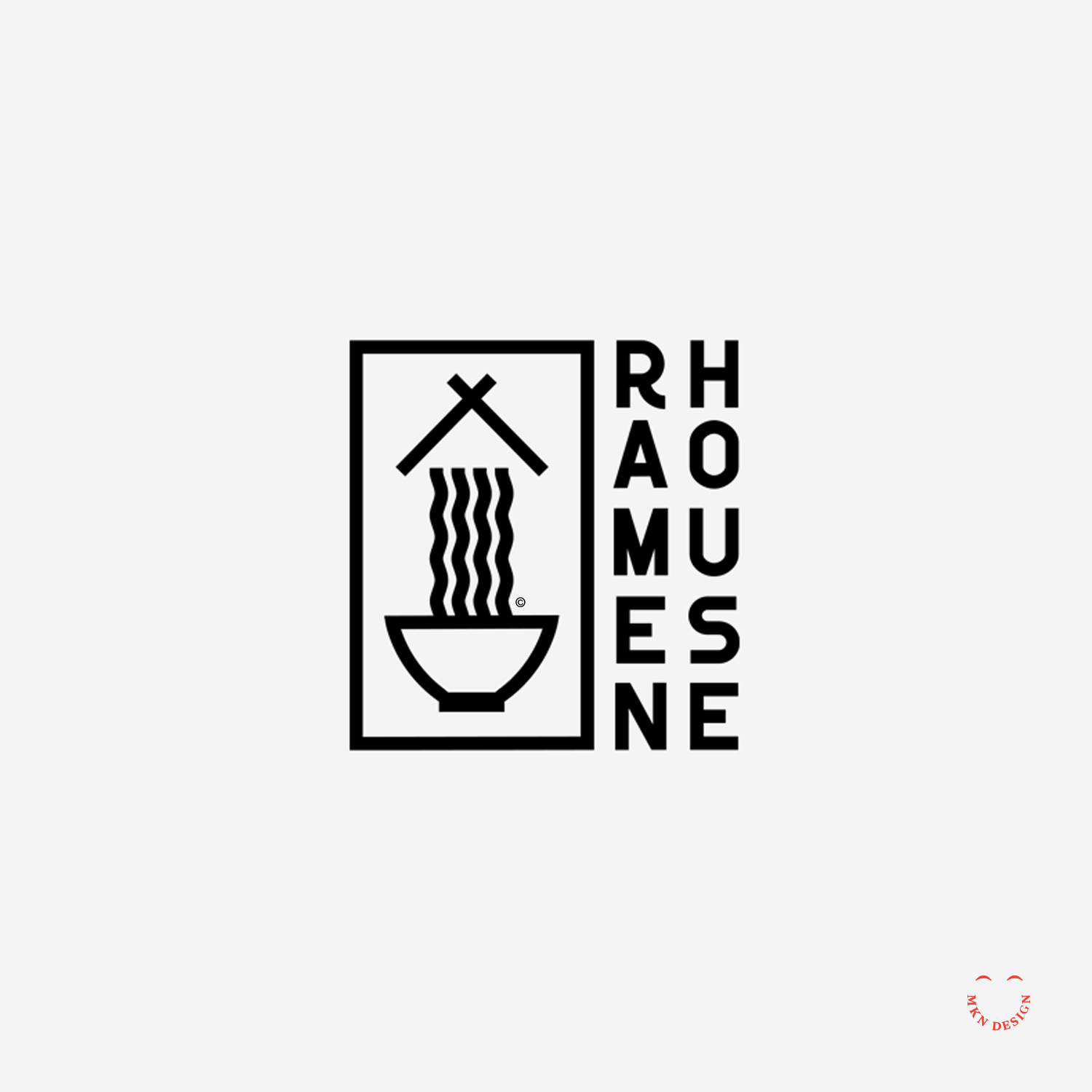
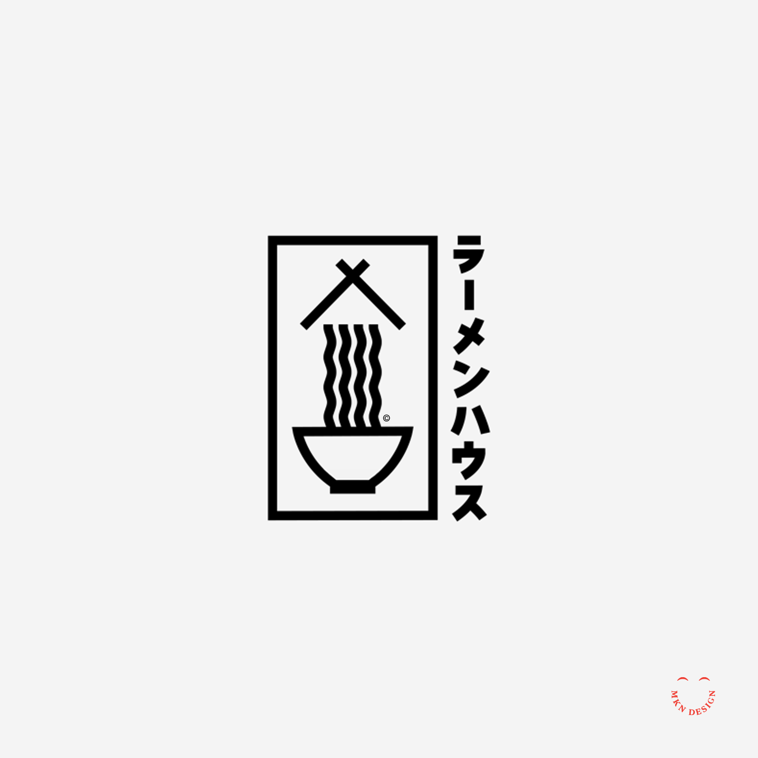
Ramen House
Creative Musing
December 2017
__
Ramen House
Chopsticks, ramen, in a Jukkoku-bachi bowl. The letterforms are a custom typeface designed specifically to for this mark.
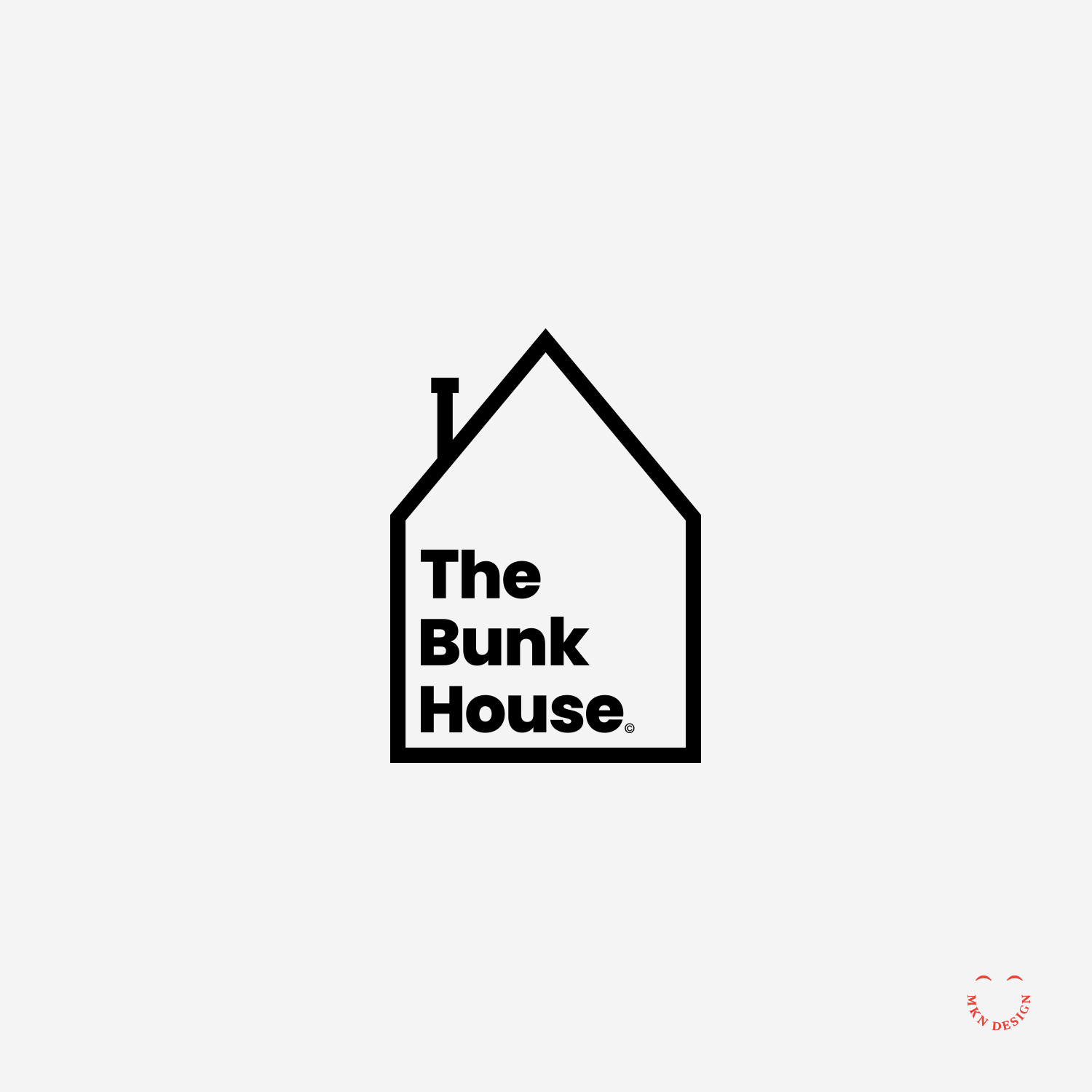
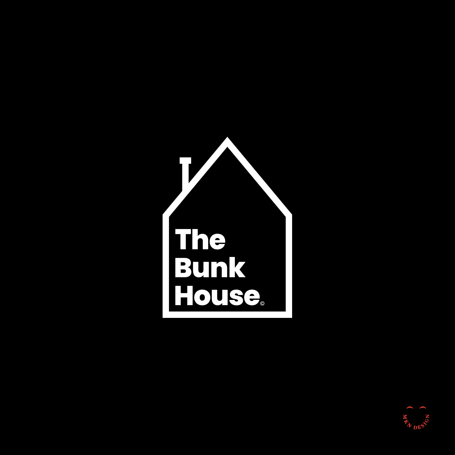
The Bunk House
Creative Musing
December 2017
__
The Bunk House
Simple and literal mark defining its name. The mark is paired with the typeface Poppins designed by Jonny Pinhorn and Ninad Kale from Google.
Spectrum Health

Client Project
December 2017
__
Spectrum Health
A prominent healthcare provider dedicated to delivering exceptional medical services and improving community health, Spectrum Health (now Corwell Health) plays a vital role in enhancing the well-being of individuals across various West Michigan. Working alongside a team of engineers and developers, I helped design and develop functional prototype application named My Chart.
The application catered to both new and returning patients of Spectrum Health facilities, offering features such as iPad-based check-in for hospital and doctor appointments, seamless access to medical records, and entertainment options. This endeavor required a strategic approach, including the use of personas, iterative wire-framing, and meticulous design iterations to craft a compelling and user-centric digital journey for patients.
-
+ Customer Journey Storytelling
+ UX/UI Design -
+ Design Direction
+ Qualitative & Quantitative Research
+ Concept Development
+ Sketching & Ideation
+ Illustrative Storytelling
+ User Experience -
This project was developed in collaboration with Mutually Human.
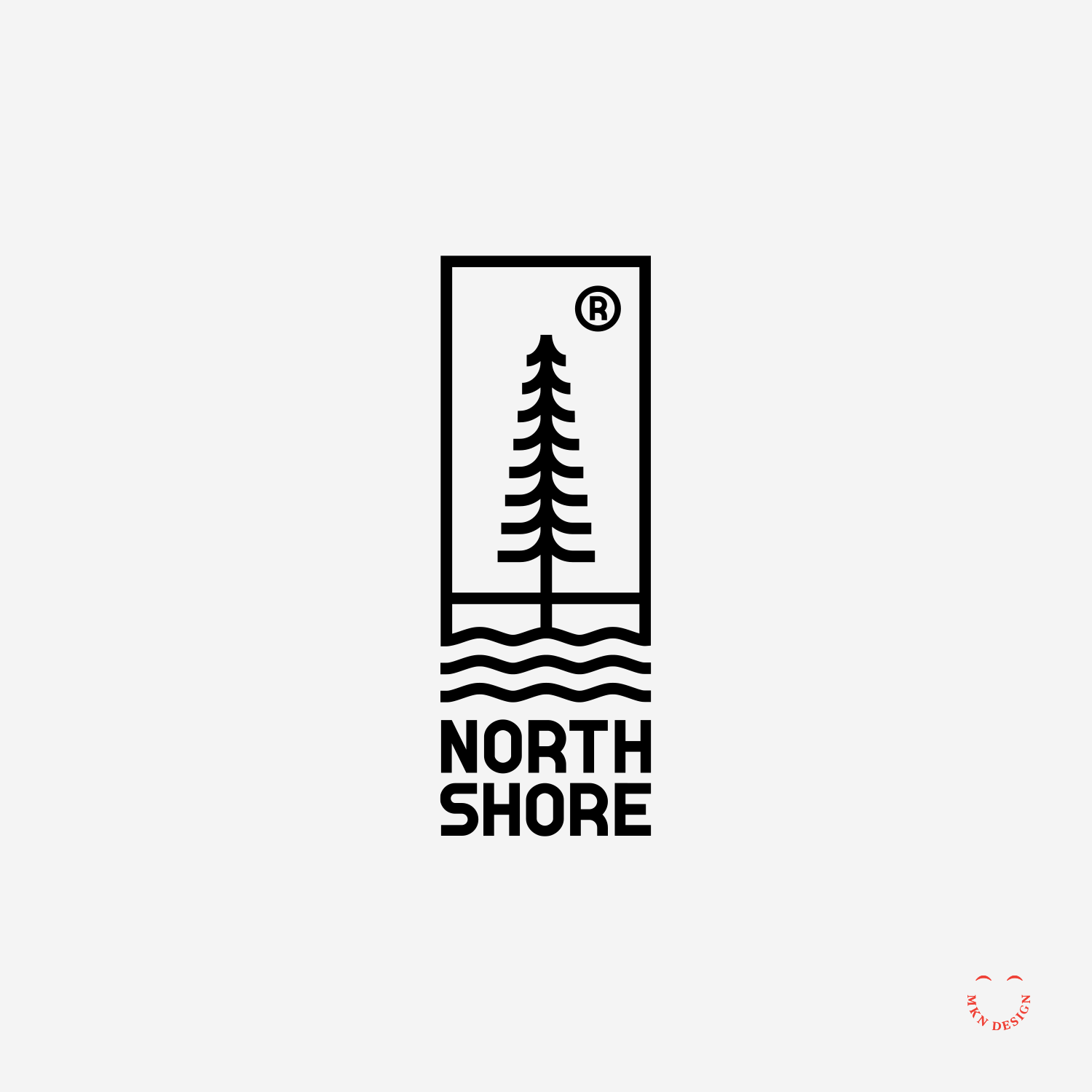
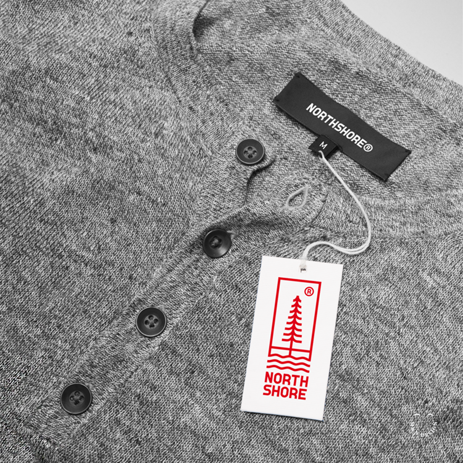
North Shore
Creative Musing
December 2017
__
North Shore
An organic clothing brand logo incorporating earth elements seamlessly paired with a custom typeface I designed specifically to complement the mark.
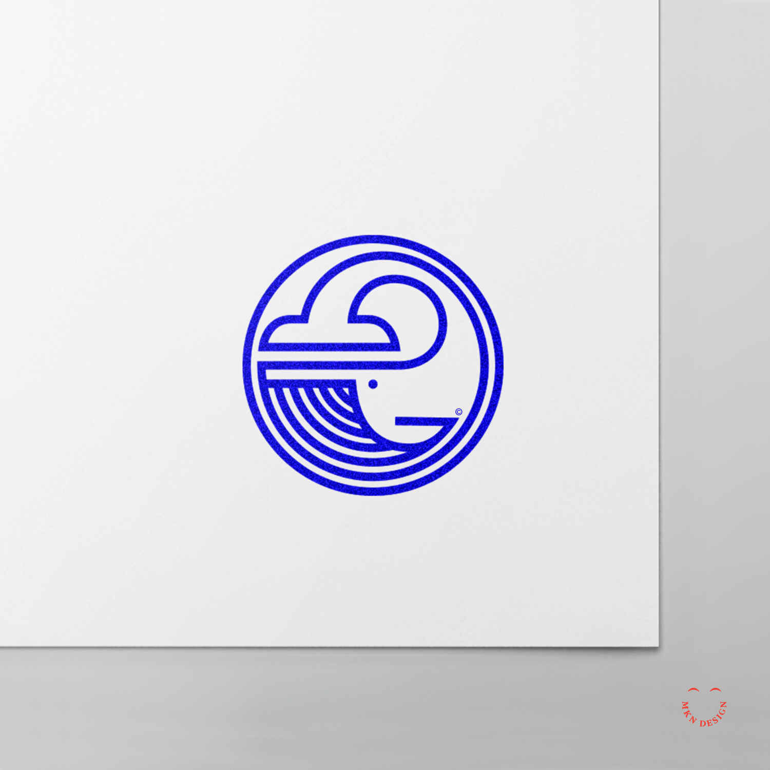
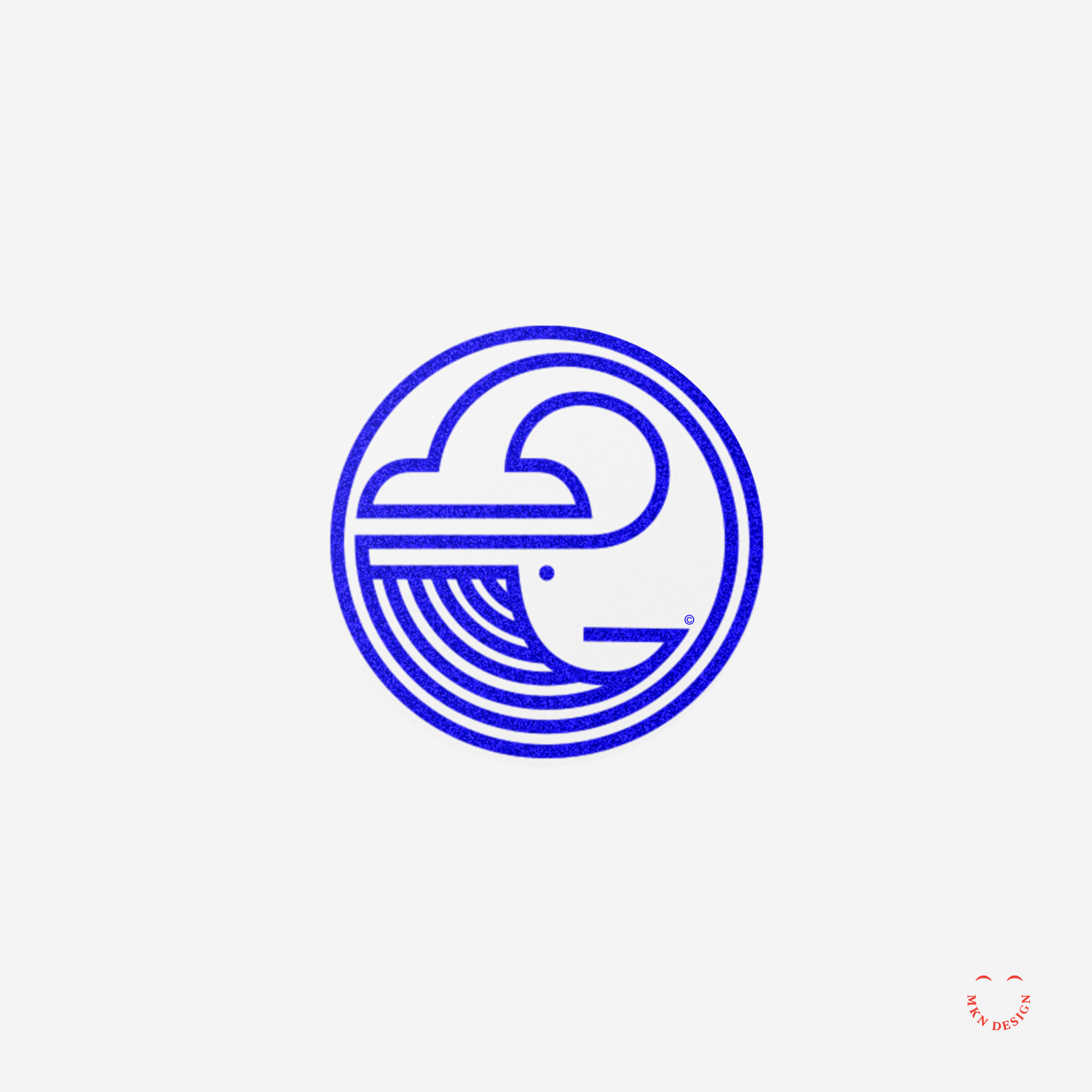
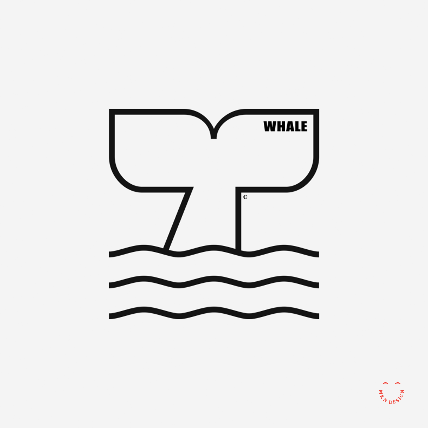
Blue Whale
Creative Musing
November 2017
__
Blue Whale
Detail of simple circular blue whale mark as a signature for letterhead.
Star Wonder

Creative Musing
November 2017
__
Star Wonder
I have loved the stars too fondly to be fearful of the night – Sarah Williams. Star Wonder paired with Suburbia print
Buy this Poster
This poster is available for purchase in my shop.
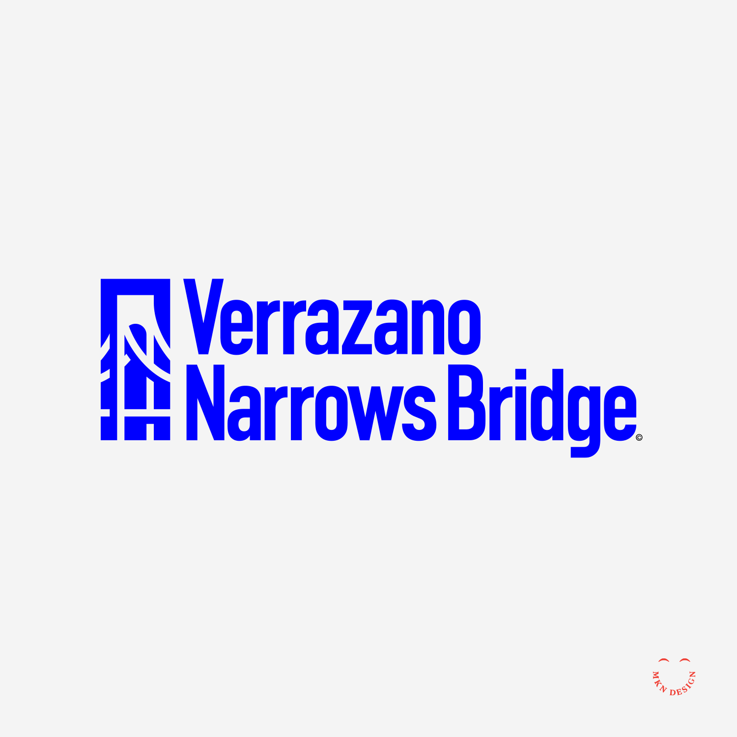
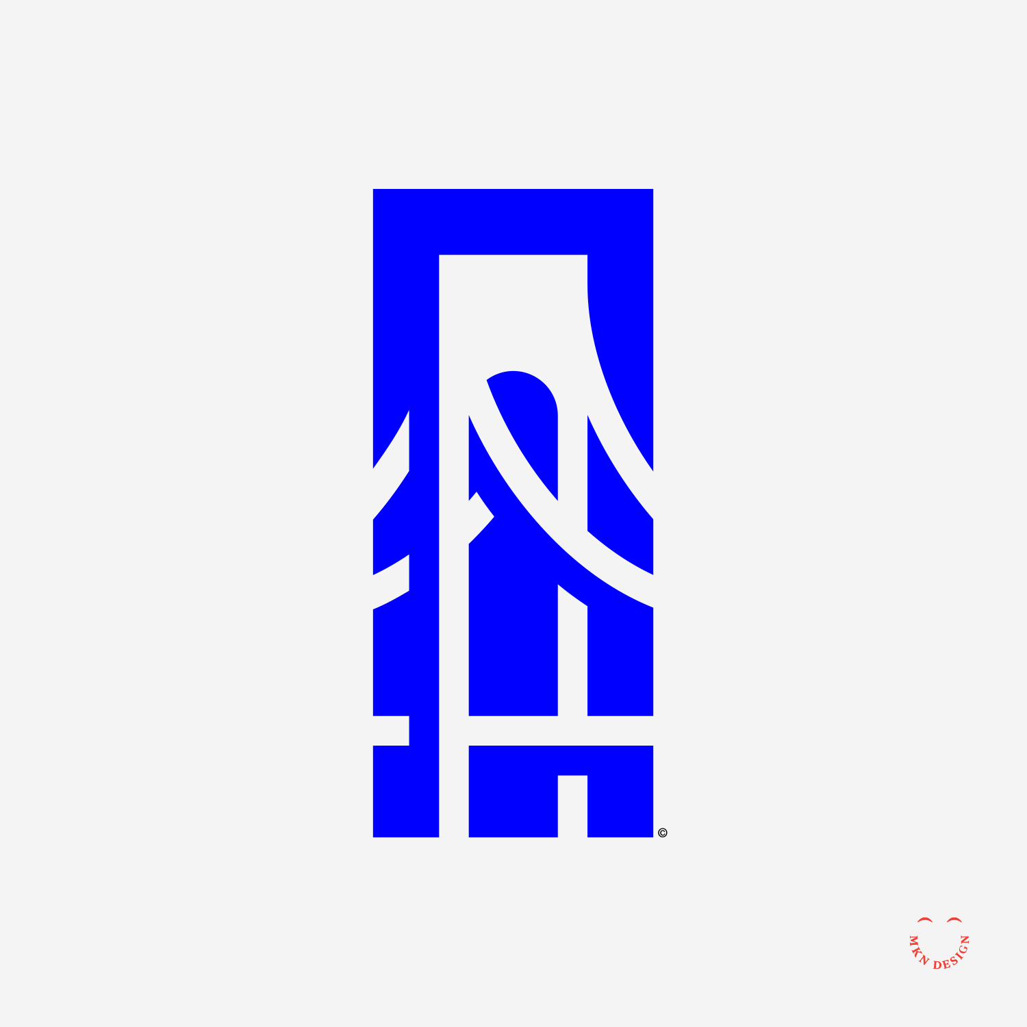
Verrazano Narrows Bridge
Creative Musing
November 2017
__
Verrazano Narrows Bridge
The logo’s mark is paired with the typeface DIN Condensed designed by Isabella Chaeva and Tagir Safayev fom Paratype.
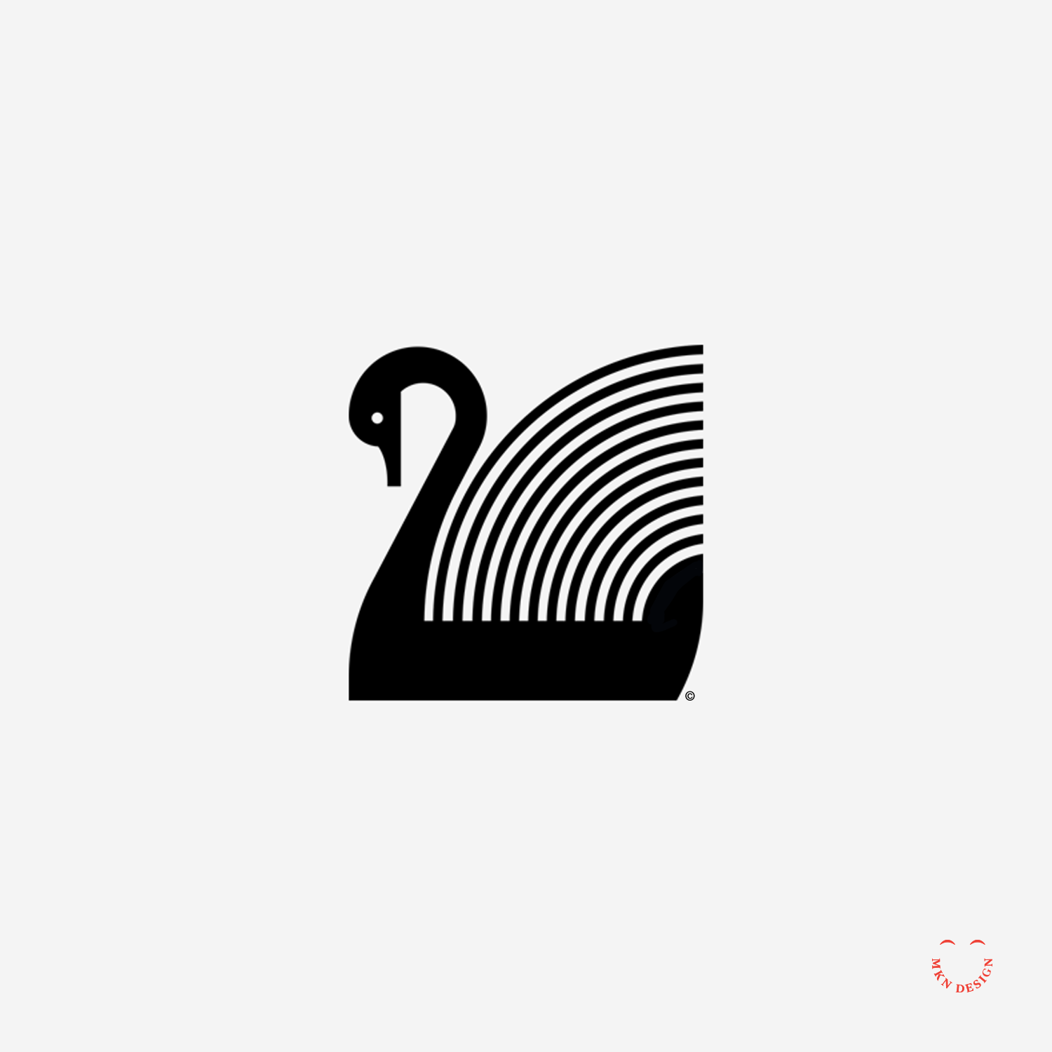
Black Swan Records

Creative Musing
October 2017
__
Black Swan Records
There's nothing more pleasing to a designer when two elements come together magically.
Russian Wolfhound

Creative Musing
October 2017
__
Russian Wolfhound
I created this simple line illustration a few years ago. Found it this morning while searching for another project.
Hopscotch Co.
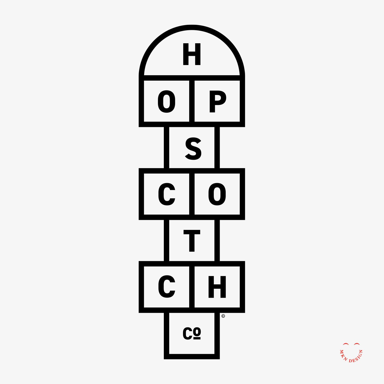
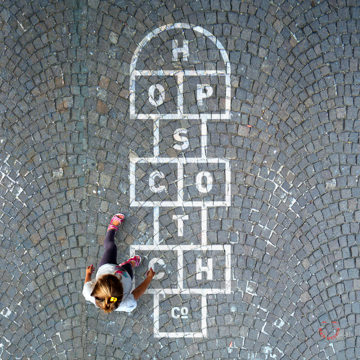
Creative Musing
October 2017
__
Hopscotch Co.
Who would have guessed that the letters in hopscotch perfectly align with the game itself? The mark is paired with the typeface DIN 2014 designed by Vasily Biryukov from Paratype.
ILLOHUS
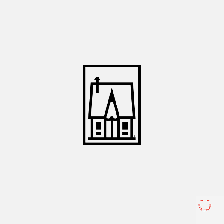
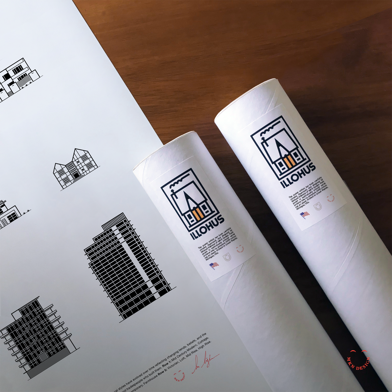
Creative Musing + Product
October 2017
__
ILLOHUS
I designed this logo for my side hustle, selling posters and products in my shop.
Red Headed Finch

Red Headed Finch
September 2017
__
Red Headed Finch
Minimalist study on this Red Headed Finch.
Weekend Exploration

Client Musing
September 2017
__
Weekend Exploration
Fun exploration with typeface and illustration this weekend.
Fultonwood Type Foundry


Client Project + Product
September 2017
__
Fultonwood Type Foundry
A small West Michigan type foundry, founded by Zac Freeland, a young enthusiastic graphic and type designer. He now is works for the Detroit Red Wings & Detroit Tigers as a graphic designer. Dream job!
I collaborated with Fultonwood Type Foundry to create an illustrative story highlighting their design process and homage to traditional typeface tools, echoing the stylistic elements of typefaces they craft.
Pandas & Rainbows
Client Project
September 2017
__
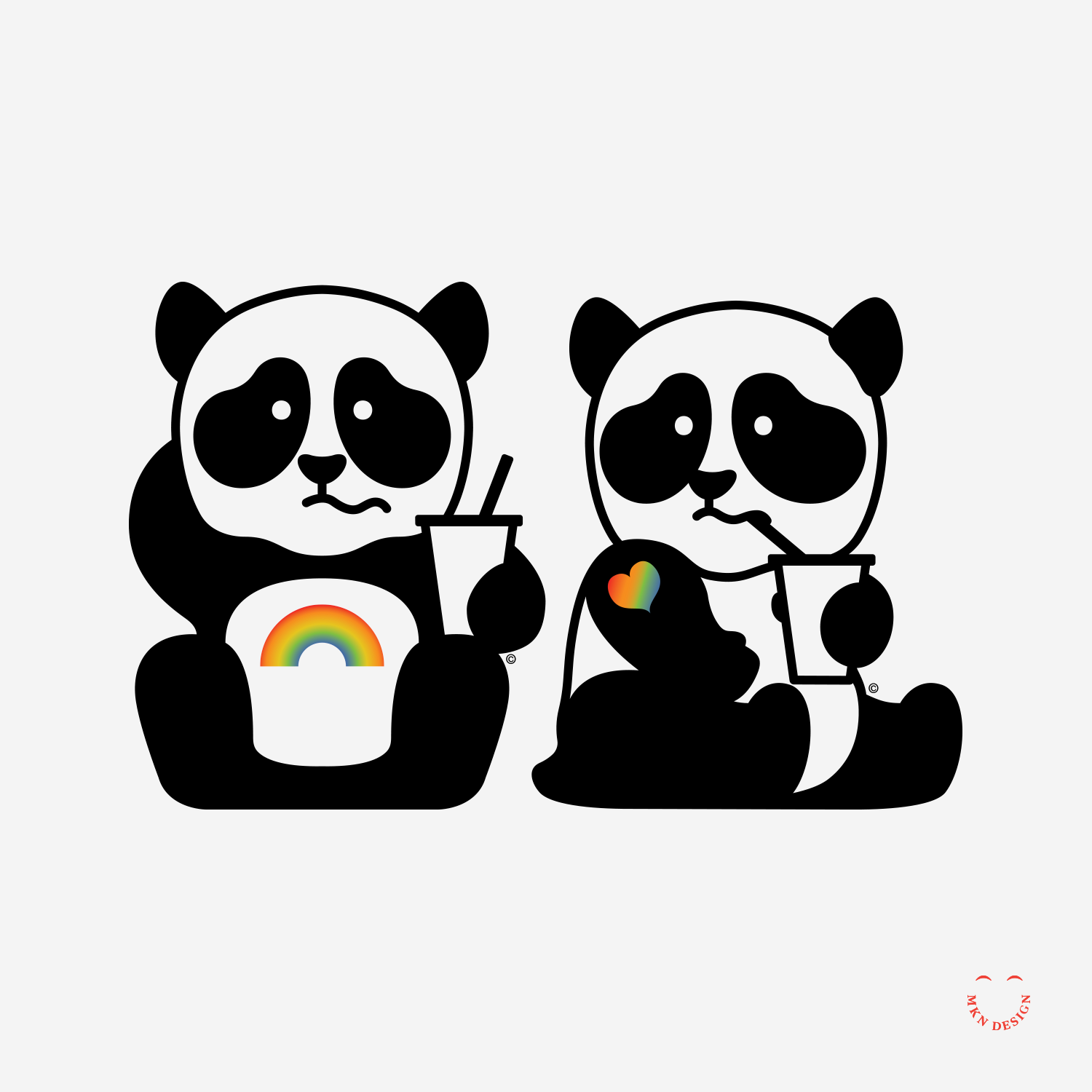
Pandas & Rainbows
A collective of modest independent illustrators, graphic designers, and developers, each with their unique talents, shared a common space and goal: to produce high-quality work for clients while also supporting one another. Like the collective, the mascots are bashful Pandas, which when joining together shoot ray of love, light and magic from their badges.
The mascots are a cross between a Care Bear and Panda. These fun mascots were made several years ago for P&R. These mascots where paired with the typeface SG Europa Grotesk No. 2 designed by Scangraphic.
-
Brand Idientity
-
• Creative Direction
• Concept Development
• Sketching & Ideation
• Illustration -
The five members of this independent group where made up of designers, illustrators, web developers and game developers. The members of this independent group where:
• Kurt Devlaeminck
• Chad Ritsema
• Celeste Pretzel Ritsema
• Chad Ritsema
• Michael Nÿkamp
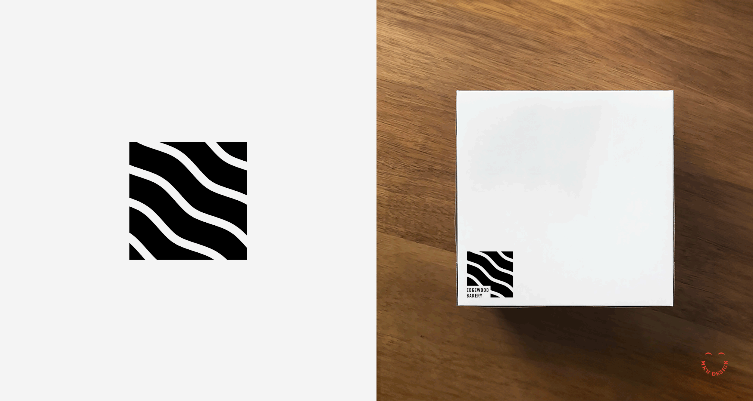
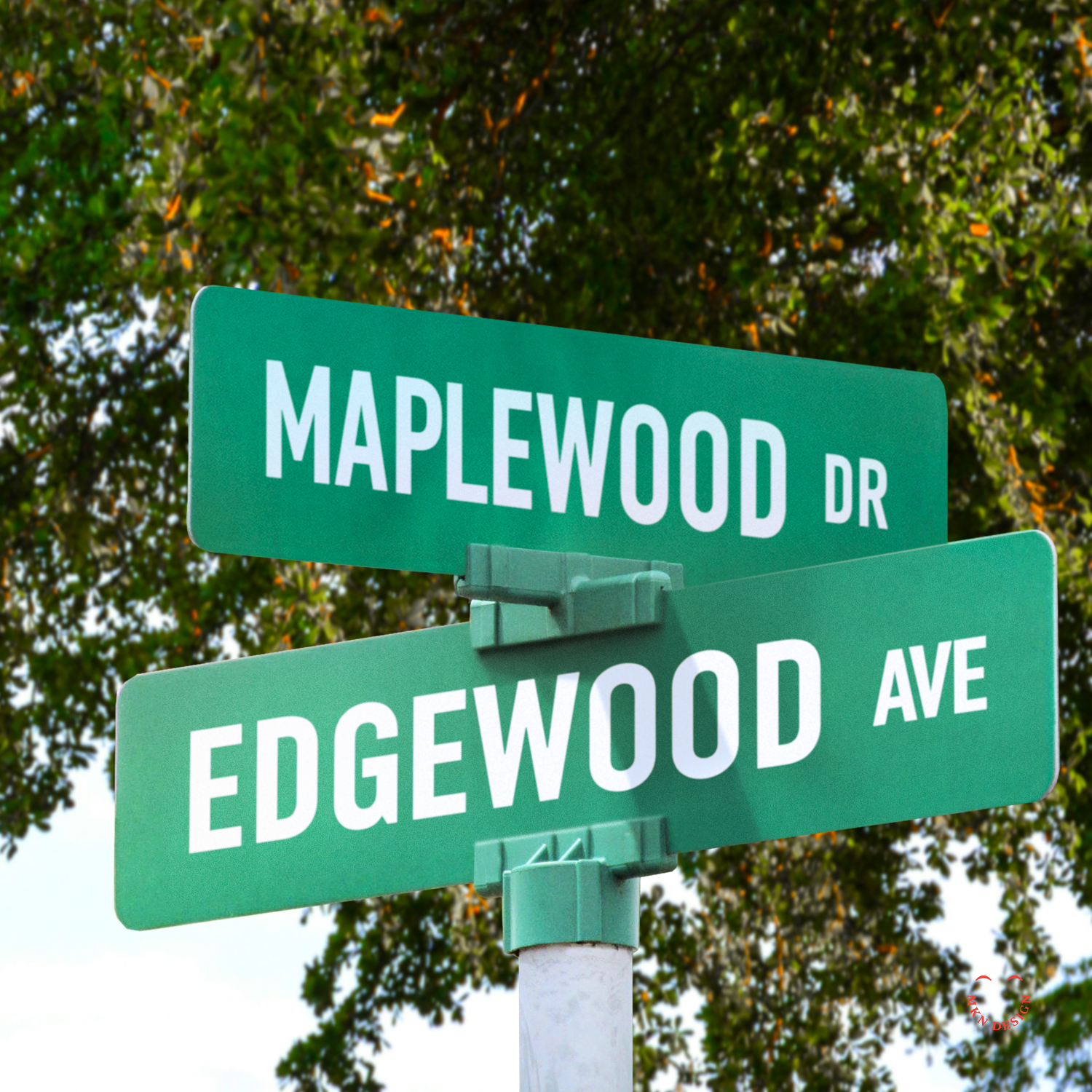
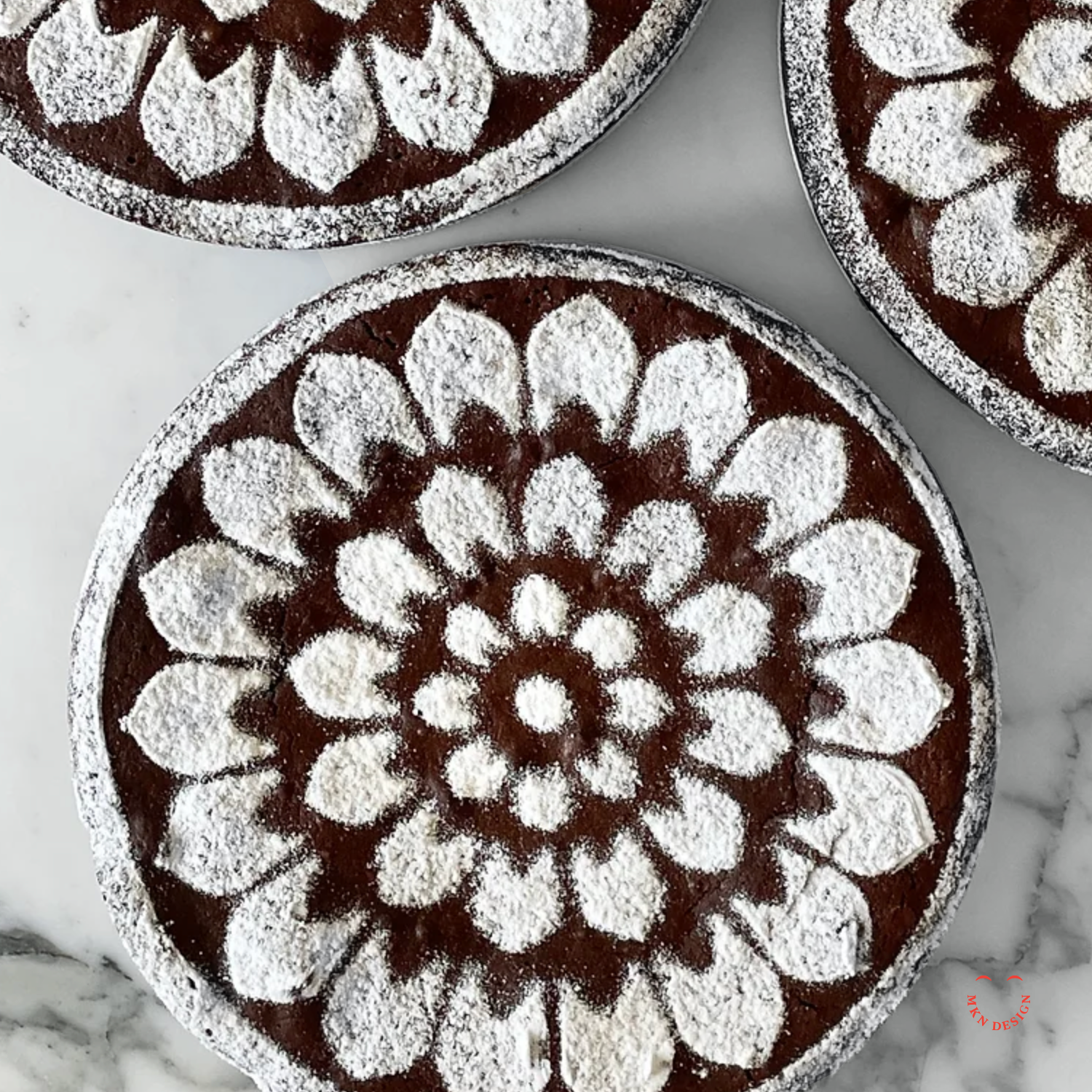
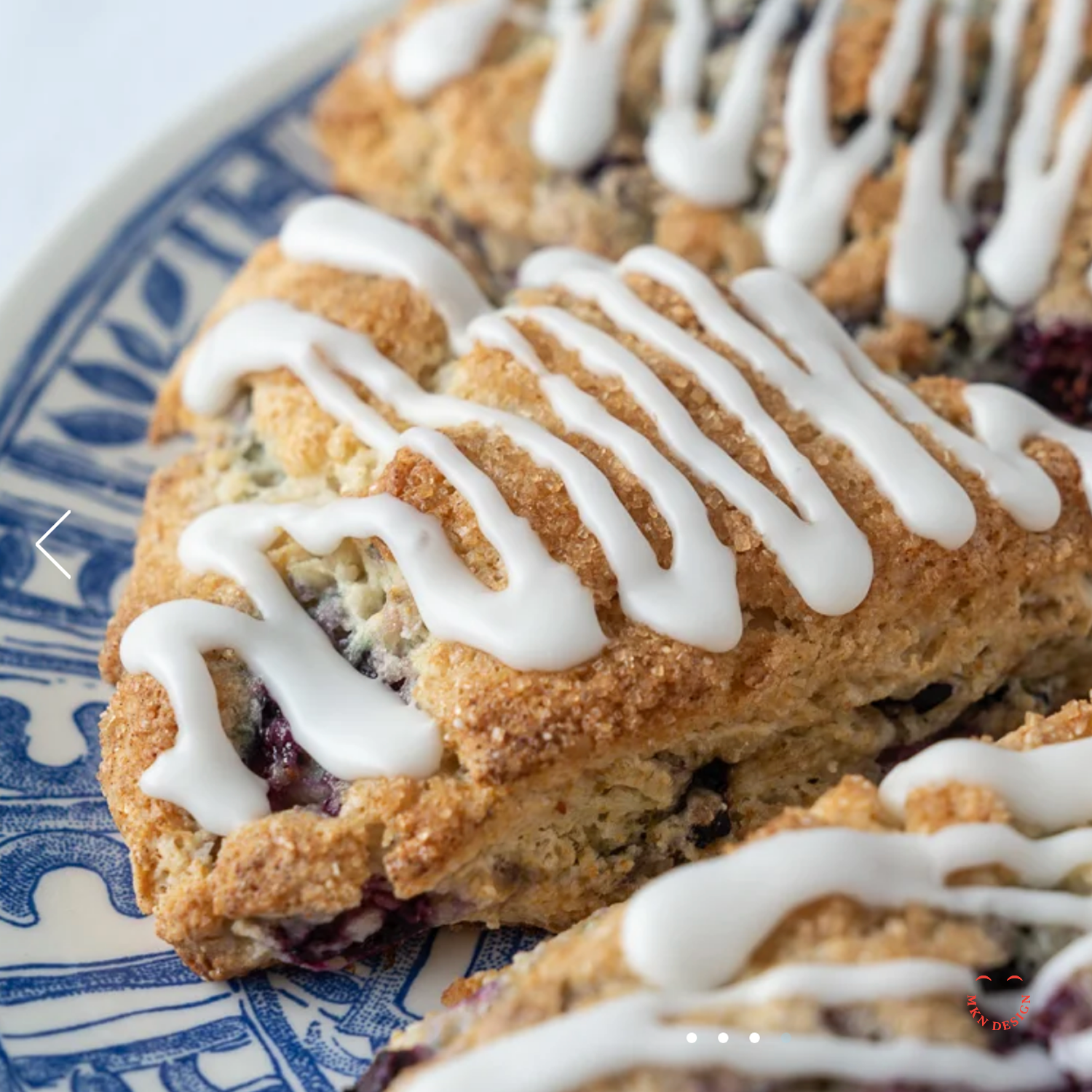
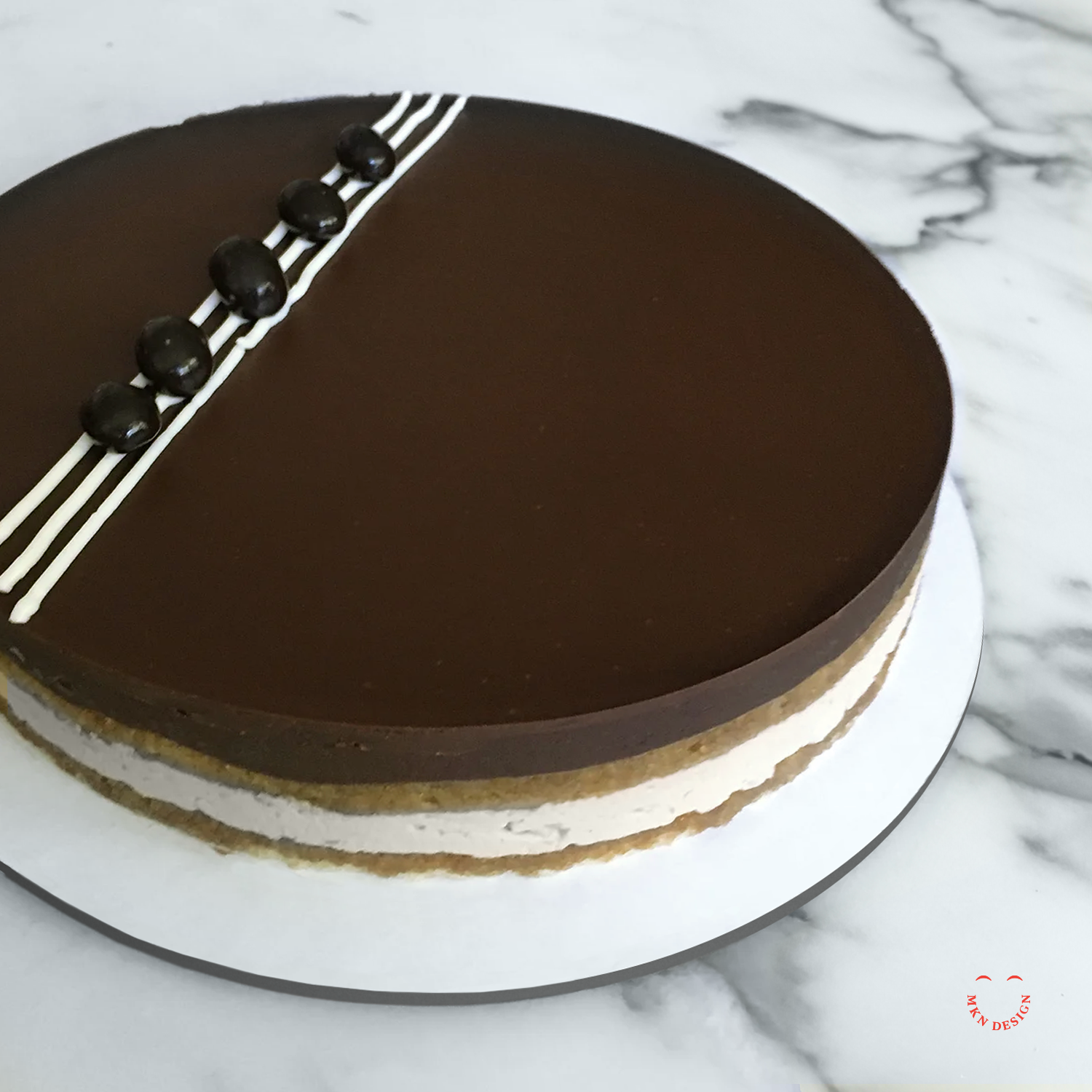
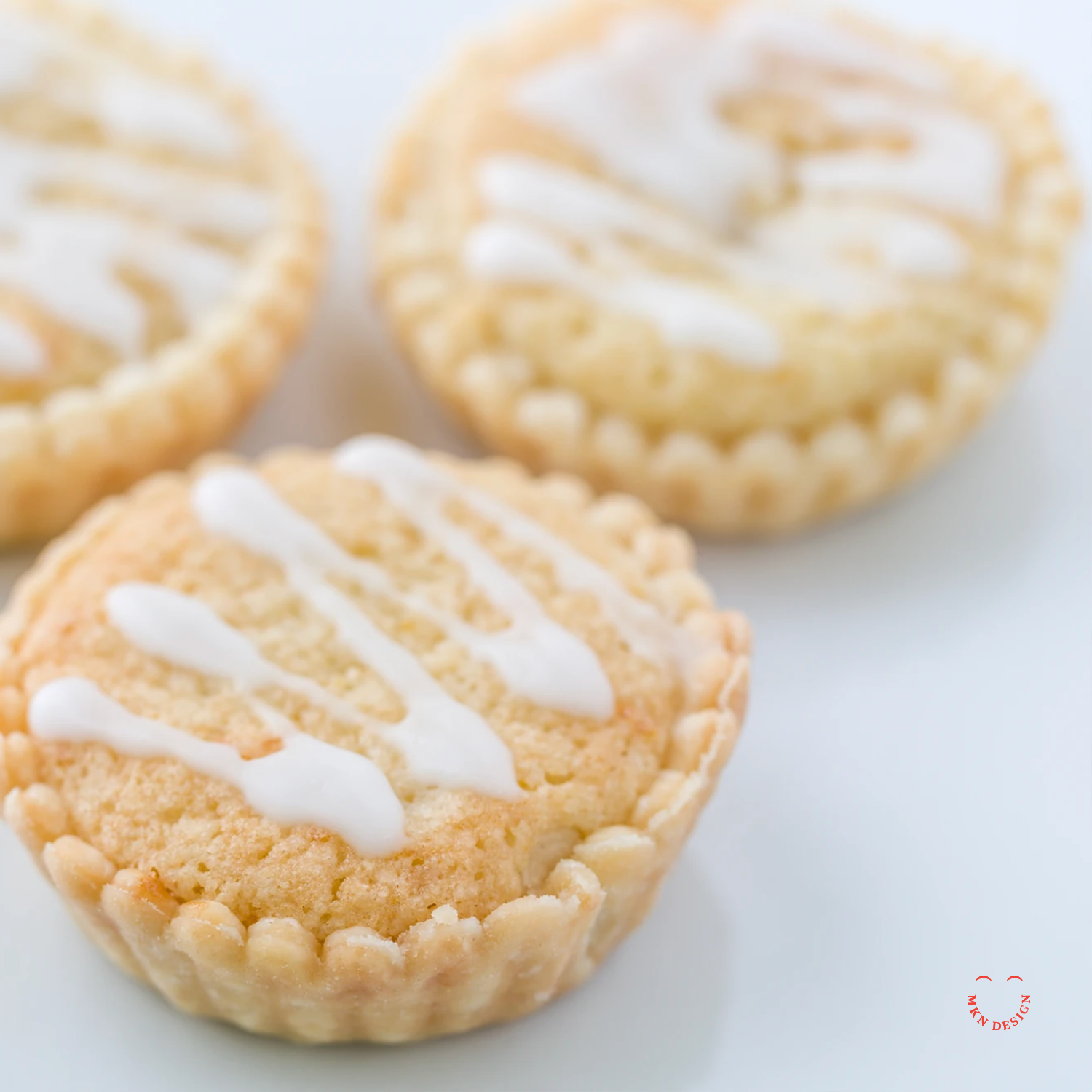
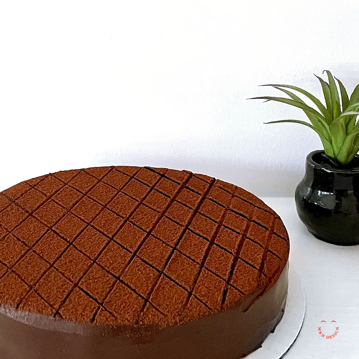
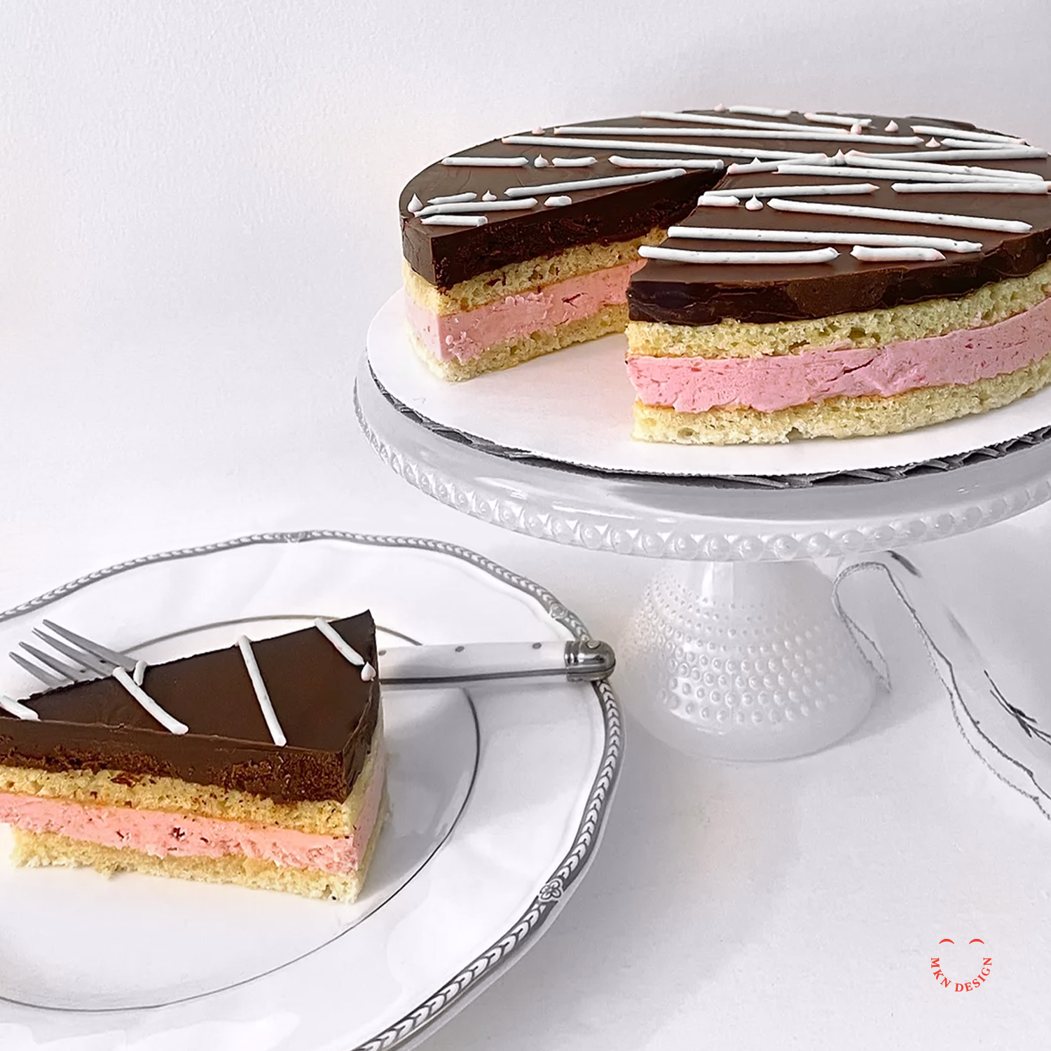
Edgewood Bakery

Client Project
September 2017
__
Edgewood Bakery
A local bakery, owned and operated by Rita Selles. Edgewood Bakery curates a mix a delectable array of American classics and European-inspired desserts. Rita is an experienced baker who was taught baking from her mother’s kitchen, her years spent in France to her home in Grand Rapids, Michigan. She graduated from the Secchia Institute of Culinary Education for Baking and Pastry Arts.
The concept exploration aimed for a simple design that conveyed delectable while evoking a modern European-American vibe. Through careful consideration of color, typography, and minimalist illustration, the final result captured the essence of Edgewood Bakery's unique desserts and evoked the name of her business.
-
+ Brand Identity
-
+ Creative Direction
+ Research
+ Concept Development
+ Sketching & Ideation
+ Graphic Design
+ Illustration -
Photography by Otto Selles.
-
Interested in learning more about Edgewood Bakery’s delectable deserts, visit Edgewood Bakery.
Kindness Is Magic
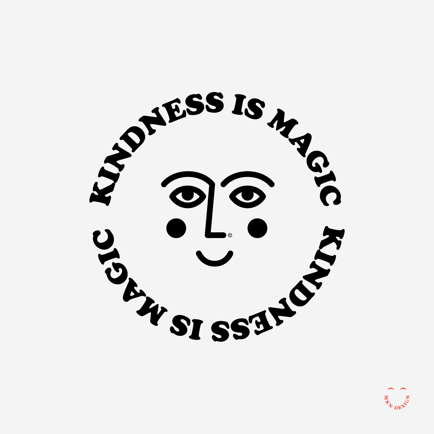
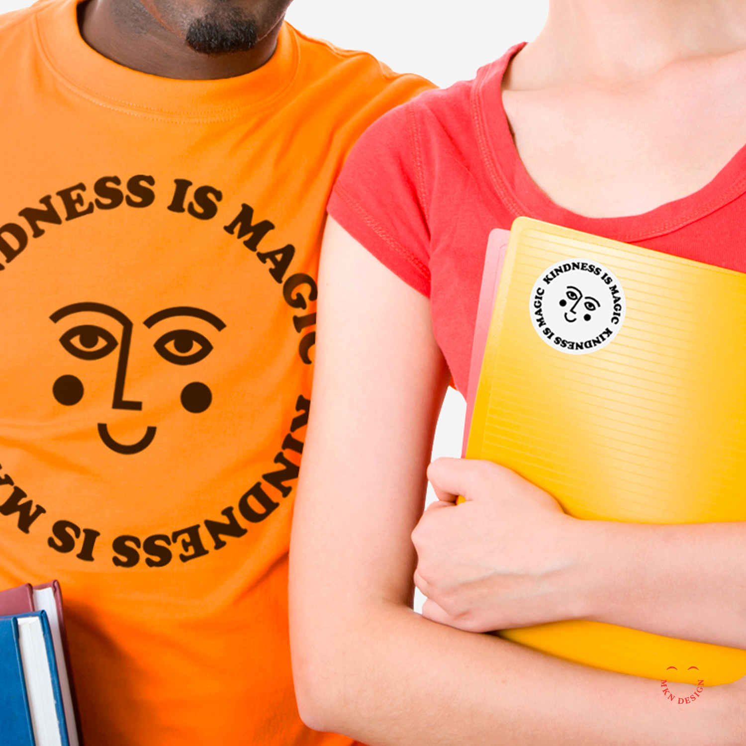
Creative Musing
September 2017
__
Kindness Is Magic
Kindness is magic (it really needs to be mentioned twice). Let’s start each day with this important reminder. Stickers coming soon and maybe some tees. The mark is paired with the typeface Cooper Black designed by Oswald Bruce Cooper from Adobe Originals.
Old City Hall

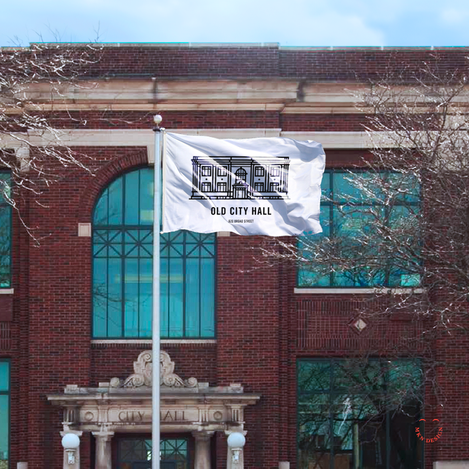
Client Project
August 2017
__
Old City Hall
Thesis is a design agency nestled in St. Joseph, Michigan, their process is embodied in their name and distinctive approach. Collaborating with a diverse clientele spanning from startups to Fortune 100, they craft innovative solutions tailored to each client's needs. Among their clients was Old City Hall, the very building that housed their business. Thesis approached me to lend a hand with their branding endeavor.
I was asked to develop a minimalist illustration of the Old City Hall. The subsequent work was completed by Thesis and integrated into comprehensive branding system and wayfinding signage for the building.
-
+ Brand Identity
-
+ Sketching & Ideation
+ Illustration -
This project was art directed by Thesis.
Postal Mark
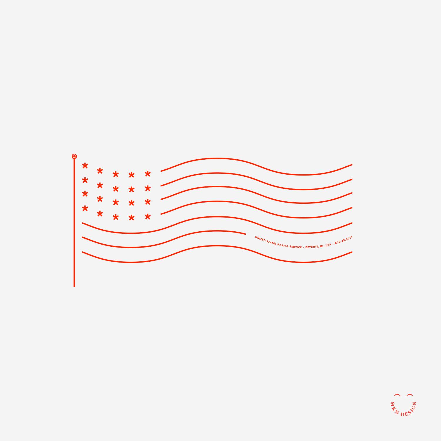
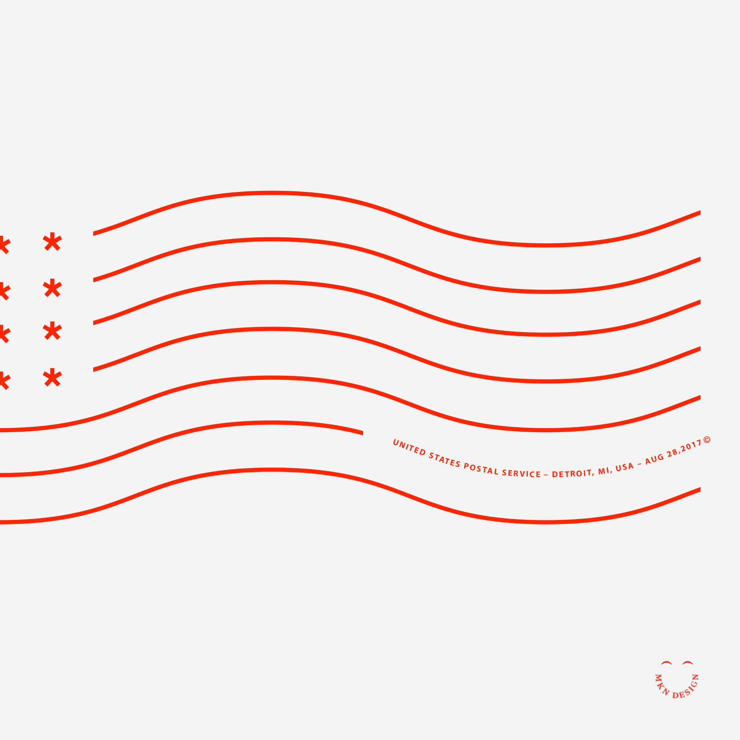
Creative Musing
September 2017
__
Postal Mark
A modern interpretation of an old postal mark.