Creative Musing
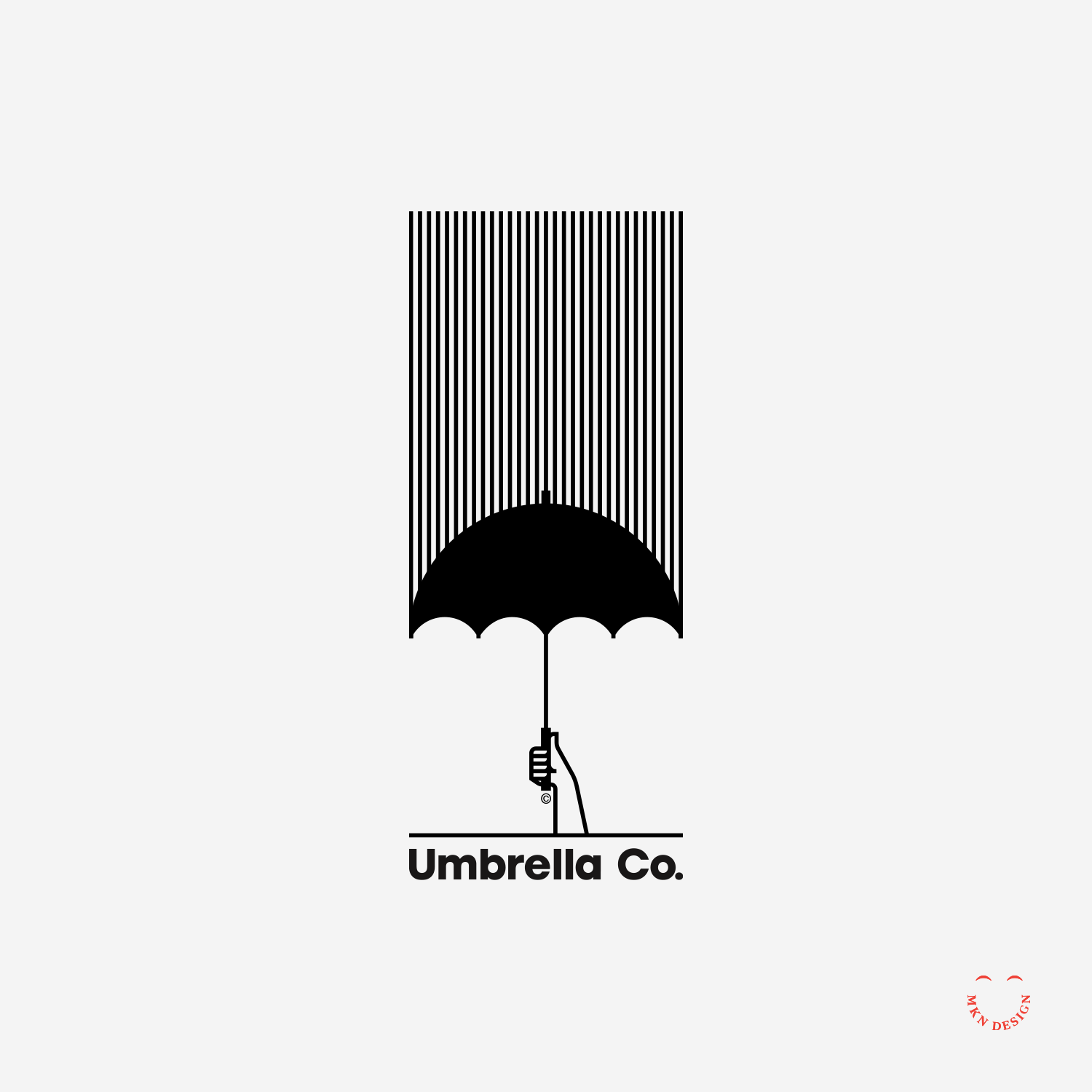
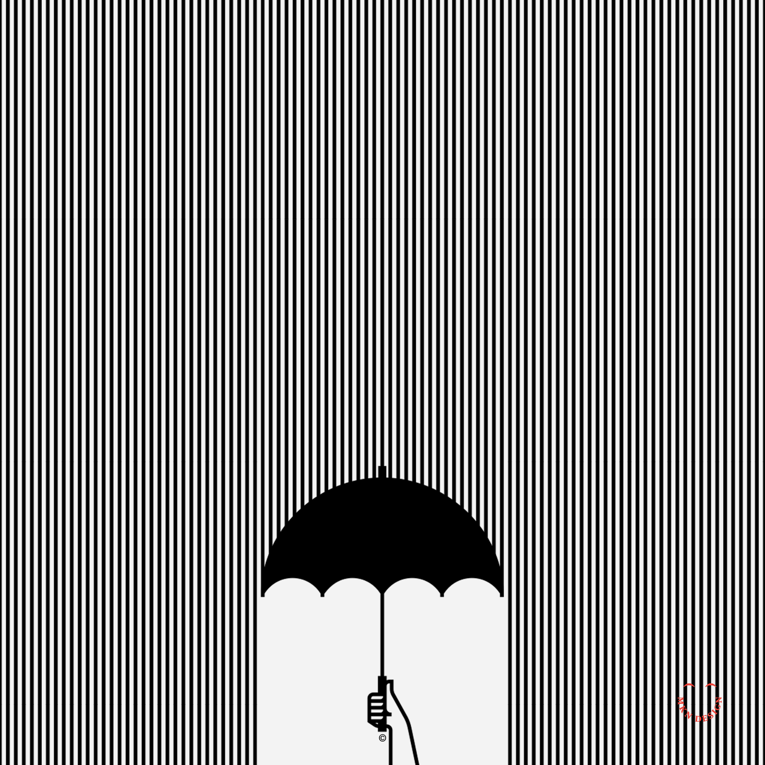
Umbrella Co.
Creative Musing
—
Umbrella Co.
Simple lines and a bold shape. The logo’s mark is paired with the typeface Stolzl designed by Mariya Lish from Inhouse Type Foundry.
Black Cat


Creative Musing
—
Black Cat
Sly cat
Fruit Salad


Creative Musing
—
Fruit Salad
This minimal exploration through fruit illustrations offers a revealing perspective on how circles establish the fundamental framework for crafting their intricate shapes, employing symmetry in the process.
Beacon
Creative Musing
—
Beacon
A simple logo symbolizing guidance. The mark is paired with Proxima Nova, designed by Mark Simonson from Mark Simonson Studio.
Space Invaders

Creative Musing
—
Space Invaders
These illustrations were explorations of hand location/position while holding a phone. It was boring with blank screens so I added the vintage Apple logo and Space Invaders.
Notre Dame De Paris

Creative Musing
—
Notre Dame De Paris
Symmetry with proper spacing.
The Mayflower

Creative Musing
—
The Mayflower
Incorporating strong vertical and horizontal fills with gentle curves.
Bear Love


Creative Musing
—
Bear Love
Bear with a whole lotta love.
Boxed In


Product
—
Boxed In
Following numerous heartfelt conversations with a dear friend regarding her mental health struggles, this artwork encapsulates my visual representation of those dialogues—conveying feelings of being trapped by stress, experiencing loneliness, vulnerability, confusion, anxiety, and depression.
-
This poster is available for purchase in my shop.
American Literacy Council


Creative Musing
—
American Literacy Council
Utilizing the elements of the American flag. The mark is paired with the typeface Utopia designed by Robert Slimbach from Adobe Originals.
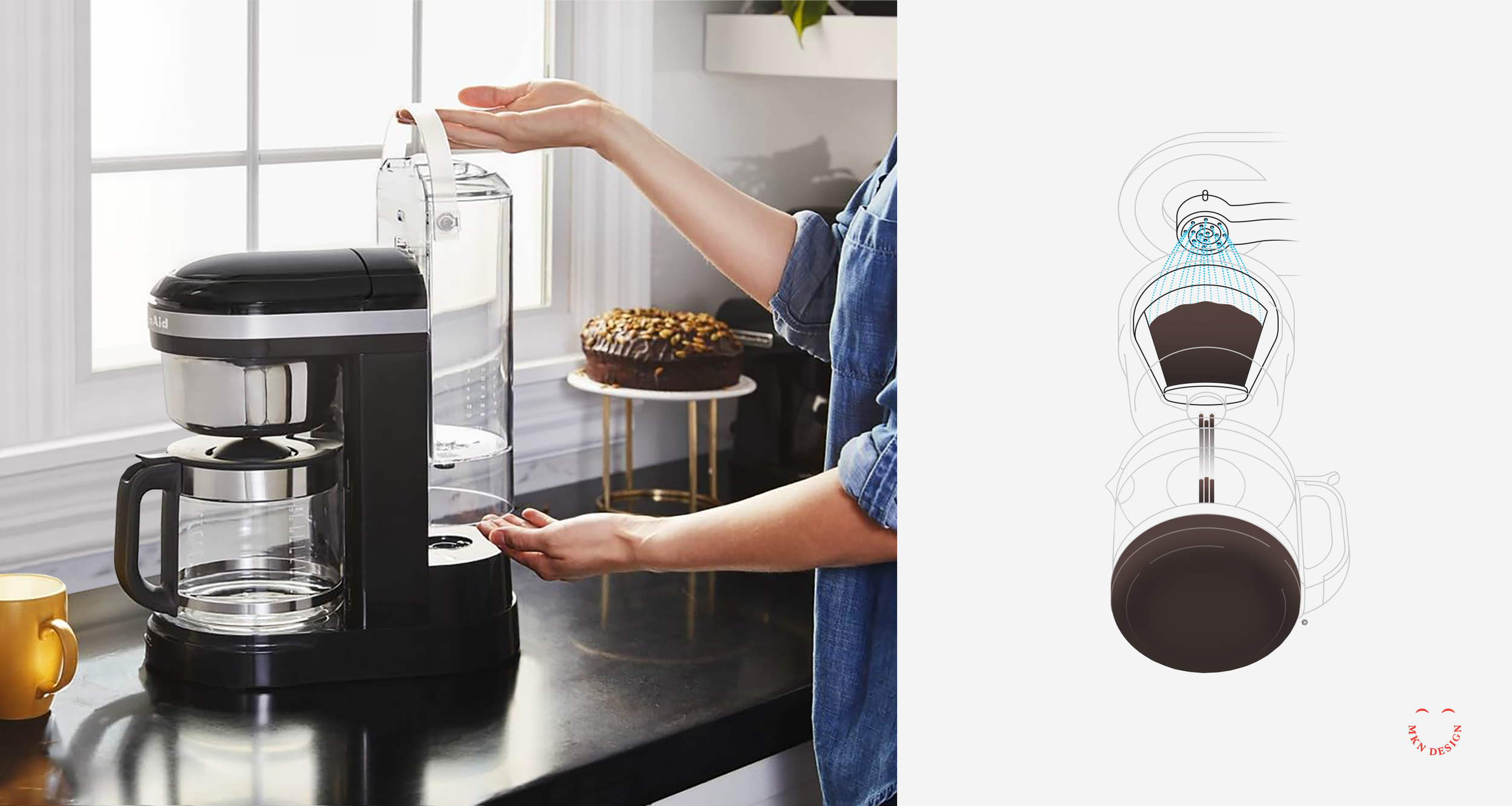
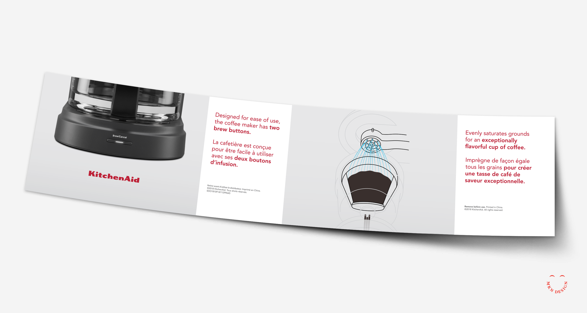
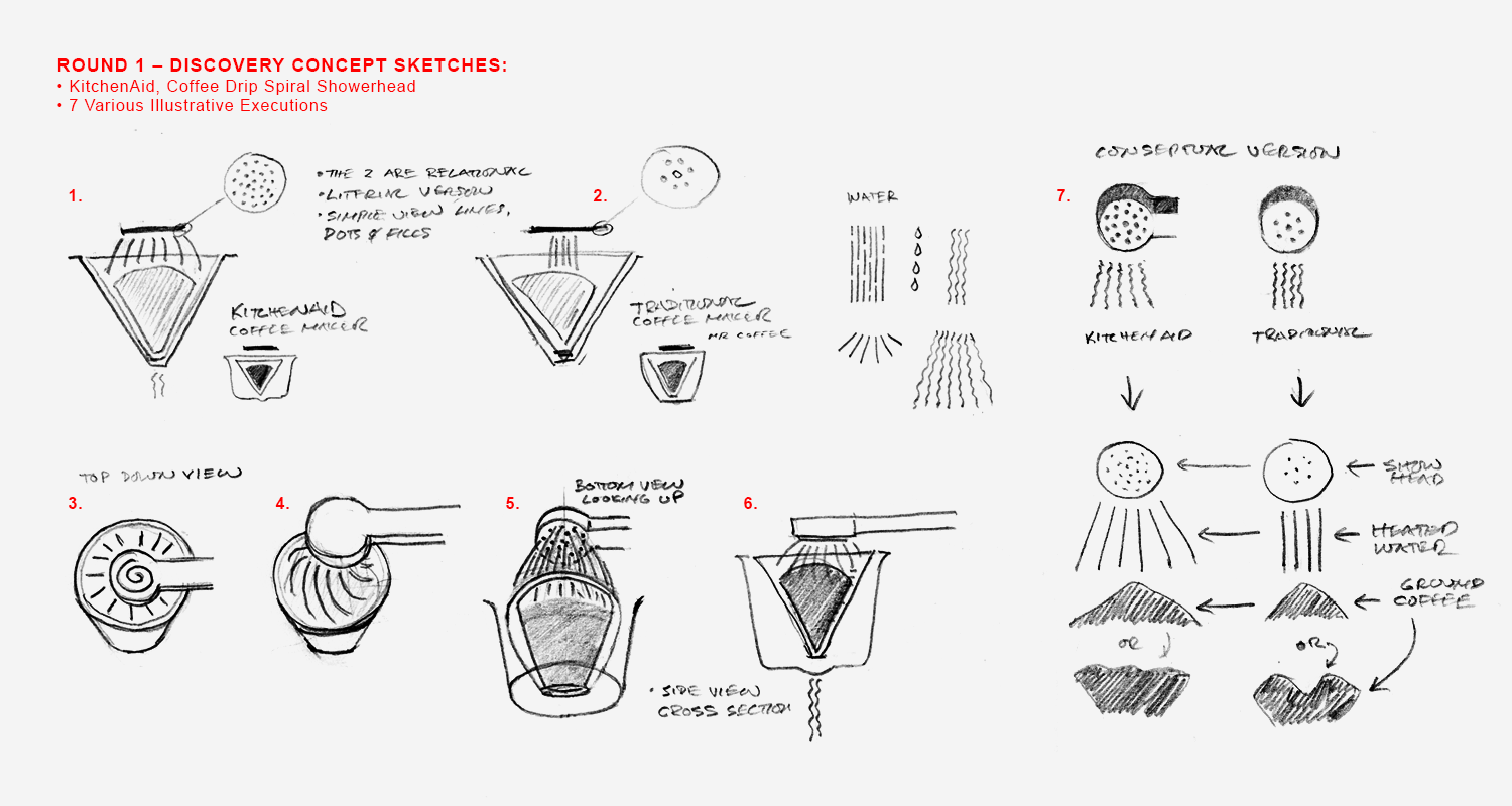
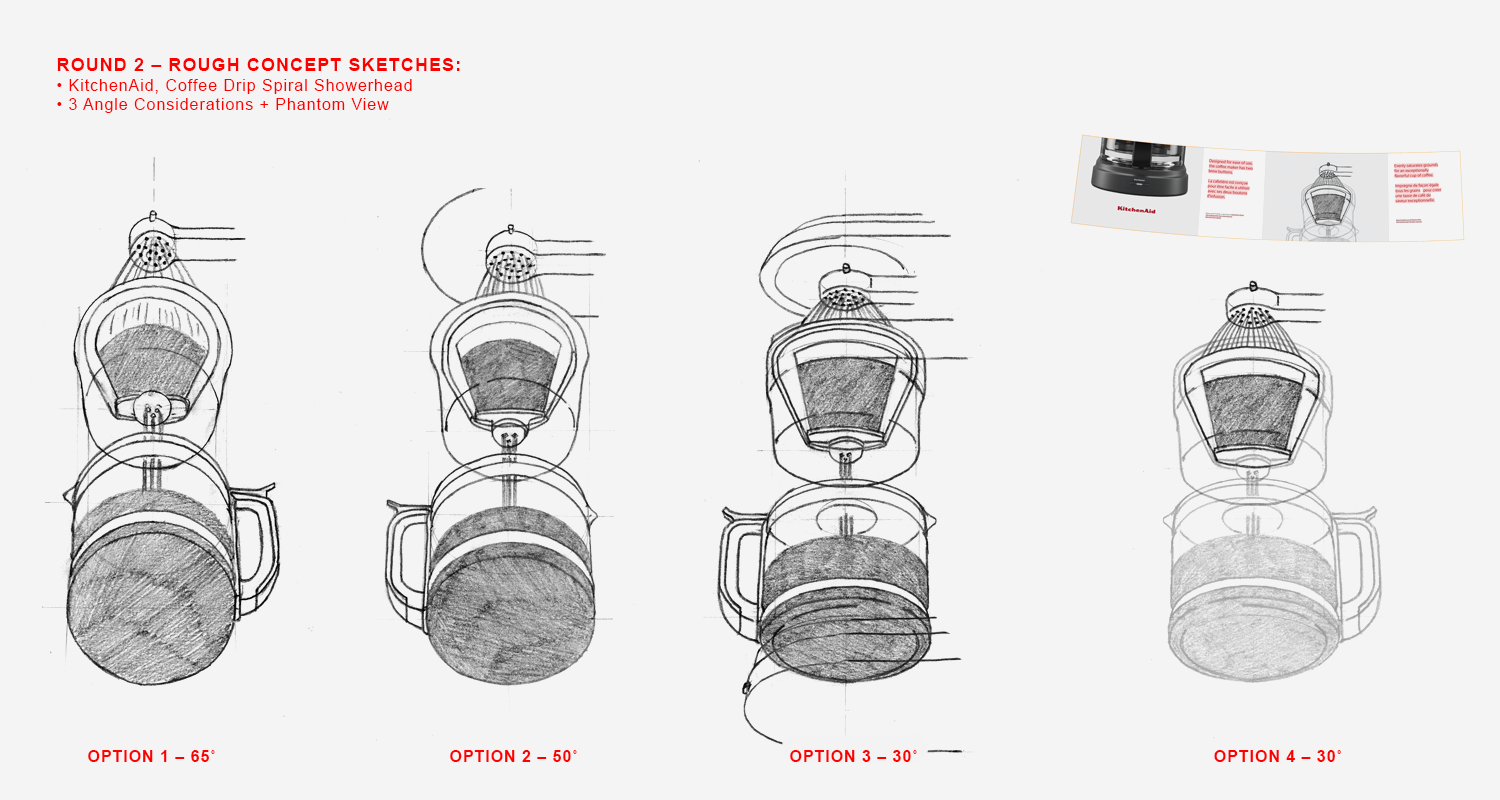
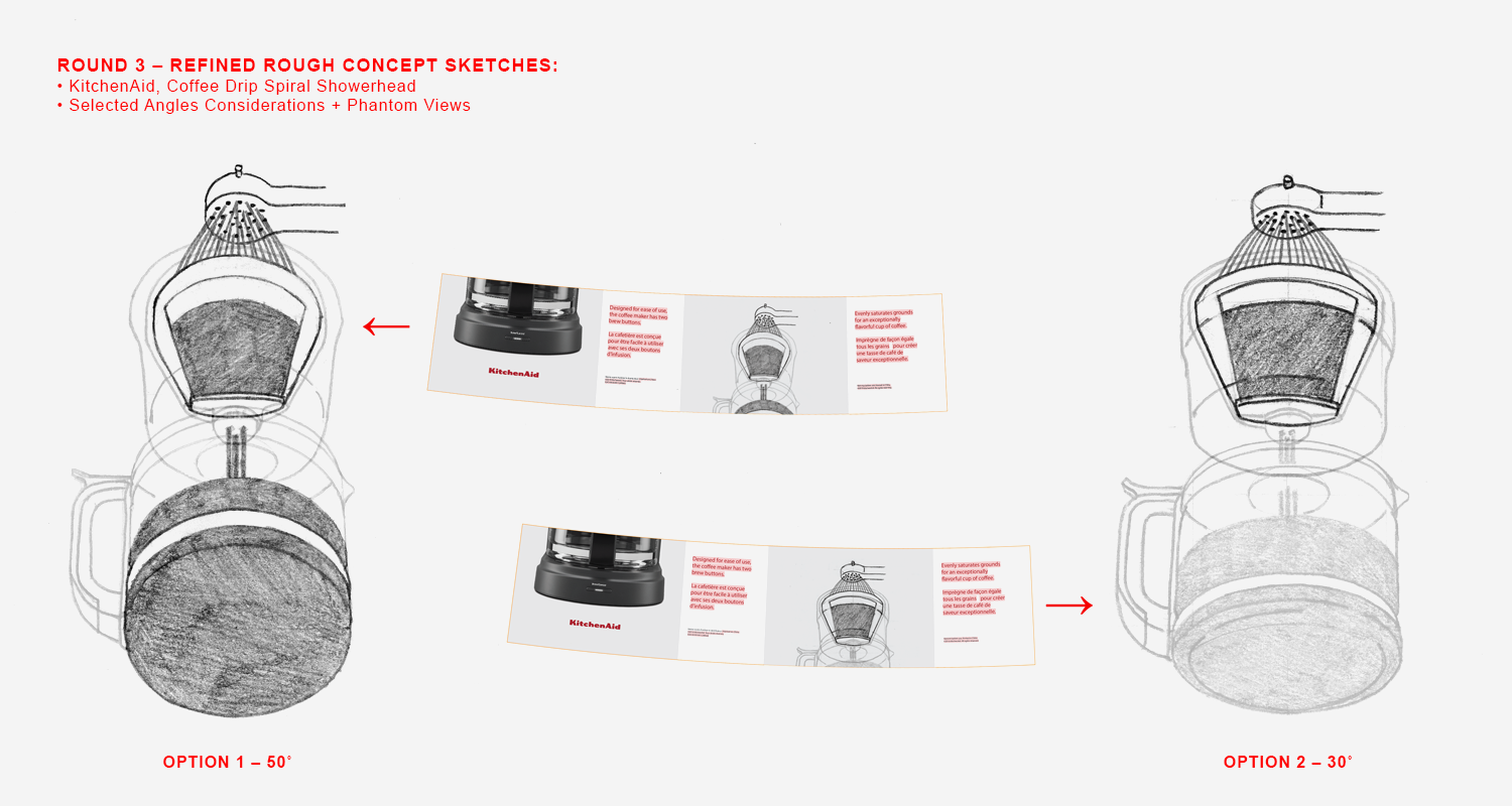
KitchenAid Coffee Drip
Client Project
—
KitchenAid Coffee Drip
Renowned as a leader in kitchen product design and innovation, KitchenAid stands as one of the most recognizable brands in the industry. Within their extensive product catalog, KitchenAid offers coffee makers that seamlessly blend innovative design with precision engineering, ensuring exceptional brewing experiences tailored to both casual coffee drinkers and connoisseurs. KitchenAid enlisted my expertise to visually illustrate their latest drip coffee maker, showcasing its innovative approach to evenly saturating coffee grounds.
Drawing from my comprehension of the innovative Spiral Head feature's functionality, I created a series of sketches to depict its role in ensuring consistent water saturation of coffee grounds for optimal flavor extraction.
The project progressed through various stages, from discovery to concept sketching and ideation. Incorporating diverse perspectives, we determined the most impactful approach to illustrate the idea. This resulted in a straightforward line drawing with nuanced coloring and a phantom-style technical illustration.
-
KitchenAid
Kitchen Appliance Manufacturing -
+ Communication Design
+ Concept Development
+ Instructional Illustration
+ Product Research
+ Qualitative Research -
MKN Design Team:
+ Michael Nÿkamp, IllustratorKitchenAid Stakeholder:
+ Brian Edlefson, Global Creative Manager
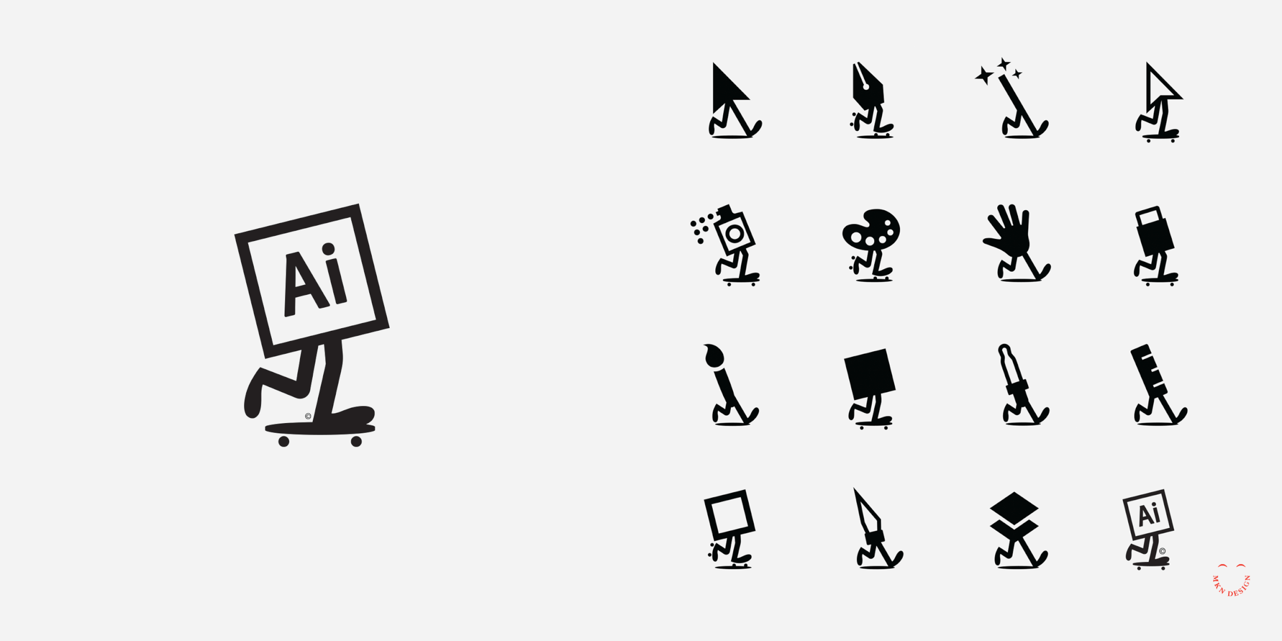
Various Marks & Icons
Creative Musing
—
Various Marks & Icons
A selection of various marks and icons I’ve worked on over the last two years.
Tree Frog

Creative Musing
—
Tree Frog
When building iconography or logo marks, it's essential to ensure that the subject remains recognizable even when scaled down to small sizes. There are no rigid rules regarding icon sizing; it varies based on their usage in digital interfaces and/or printed materials. The graphic above showcases typical icon sizes. It's clear that the smallest icon (16 px) needs adjustments for better recognizability. Depending on application, the smallest size could be increased to 32 px.
Shine Bright


Creative Musing
—
Shine Bright
A happy little illustration for you all today.
Spring Cometh

Creative Musing
—
Spring Cometh
Little singing bird illustration.
Clown Expressions

Creative Musing
—
Clown Expressions
Study on simple 2-color, single-weight clown expressions.
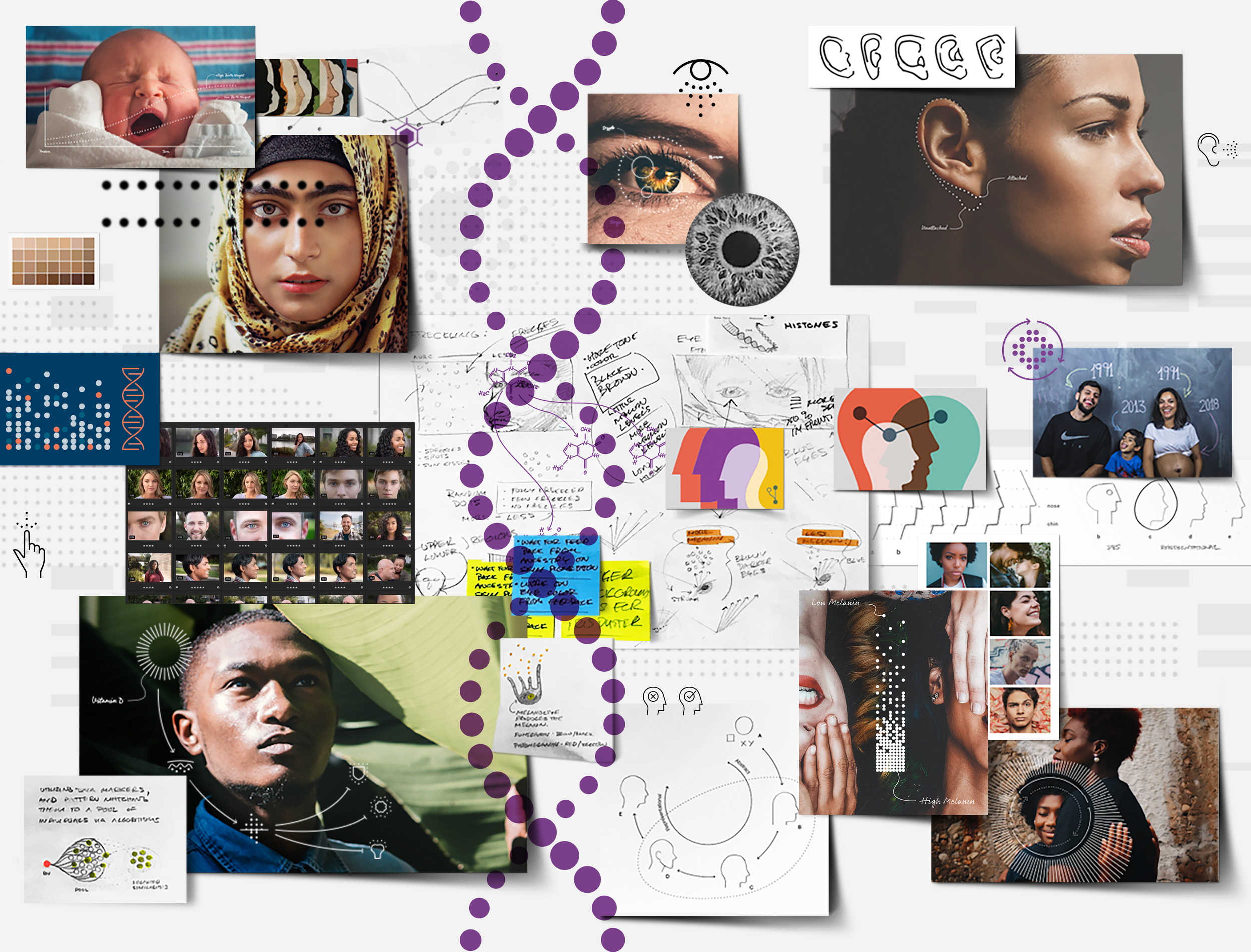
Ancestry DNA – Visual Design System
Client Project
—
Ancestry DNA – Visual Design System
We helped Ancestry DNA, a leader in genealogy and genomics, define and develop a unified visual language system for their trait products using an iterative, user-driven framework.
The initiative focused on two primary objectives: to create a cohesive system of conceptual trait illustrations that helped users explore how their genes influence physical, nutritional, and sensory traits, and to ensure the visuals remained appropriately abstract, avoiding implications of scientific precision or universal accuracy for every individual.
The project followed our user-centered, iterative process—encompassing foundational research and discovery, qualitative research, and conceptual exploration informed by user feedback. This process guided the development of a visual language that brought consistency and clarity across Ancestry’s trait products, while layering illustrations over diverse, human-centered photography to deepen storytelling.
Additionally, the product’s visual system emphasized social engagement, education, and fun—combining scientific insight with approachable design, storytelling, and custom photography to deliver an engaging and memorable user experience. Informed by the completed live visual system and user analytics, the Traits product section achieved a 75% customer satisfaction rate and a 40% take rate among users, while weekly visits across all DNA products increased by 326%.
Note: The graphic above is a coalescence of artifacts—including research, design, illustration, iconography, and photography. Together this board shaped the overall visual language for Ancestry’s digital products.
-
Ancestry DNA
Biotechnology & Information Services -
+ Concept Development
+ Illustrative Storytelling
+ Product Research
+ Qualitative Research
+ Sketching & Ideation
+ Visual Identity System -
MKN Design Team:
+ Michael Nÿkamp, Design DirectorKitchenAid Stakeholders:
+ John Wayne Hill, Senior UX Lead
+ Caroline Vejvoda, UX Designer
Capital

Creative Musing
—
Capital
Thick chunky lines representing the rotunda on Capitol Hill.
Mmm Soup


Creative Musing