
Creative Musing
Creative Musing
Creative Musing
Product
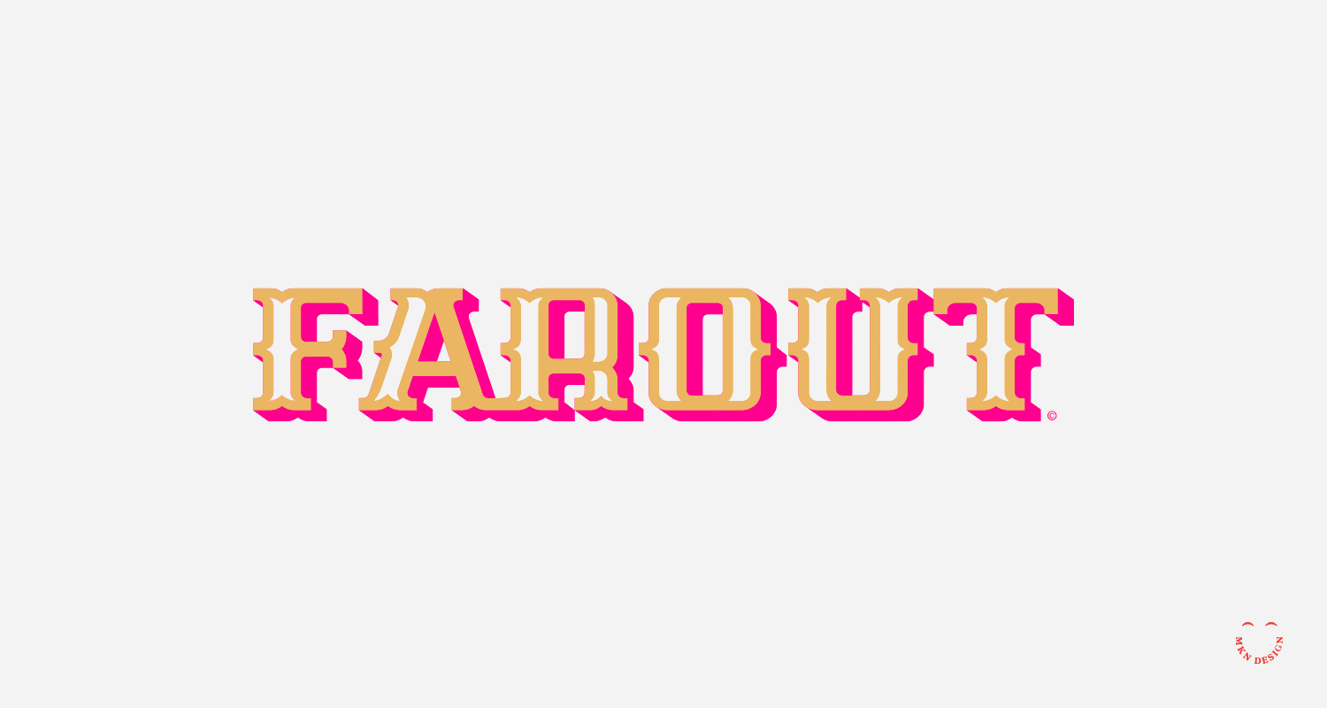
Farout was created using the Flying Dutchman display typeface. If you're interested in purchasing this typeface, please email email me for licensing and cost.

Creative Musing


Article
Creative Musing
Creative Musing
Creative Musing

Creative Musing


Creative Musing
Creative Musing

Creative Musing

Creative Musing

Creative Musing


Creative Musing
Product
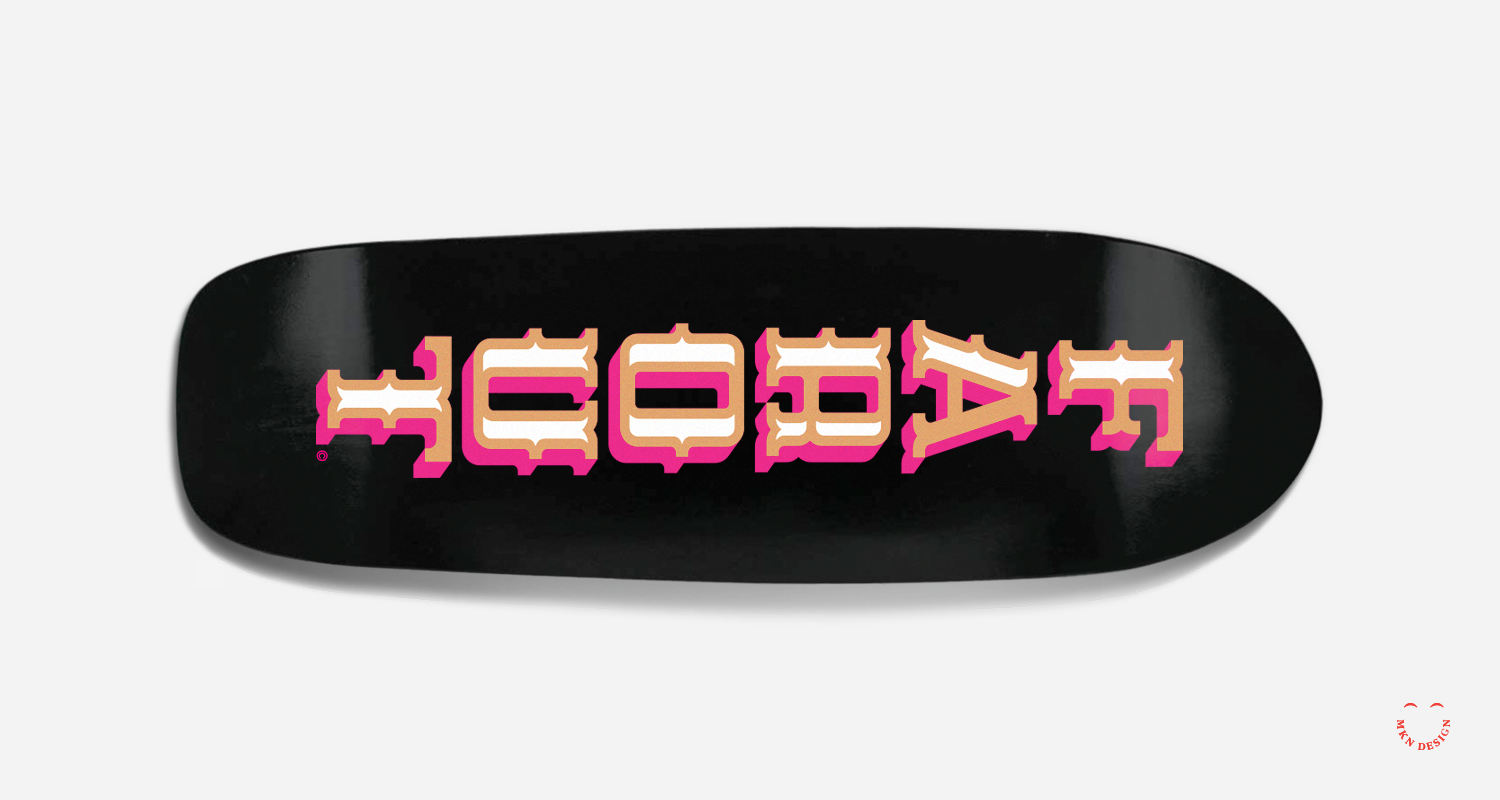
This poster is available for purchase in my shop.
Creative Musing
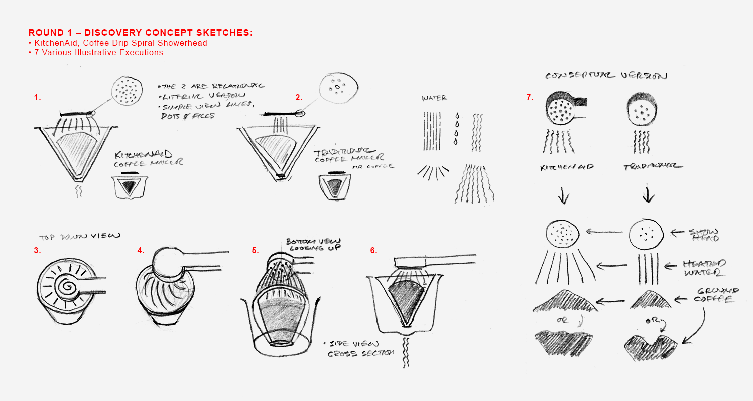
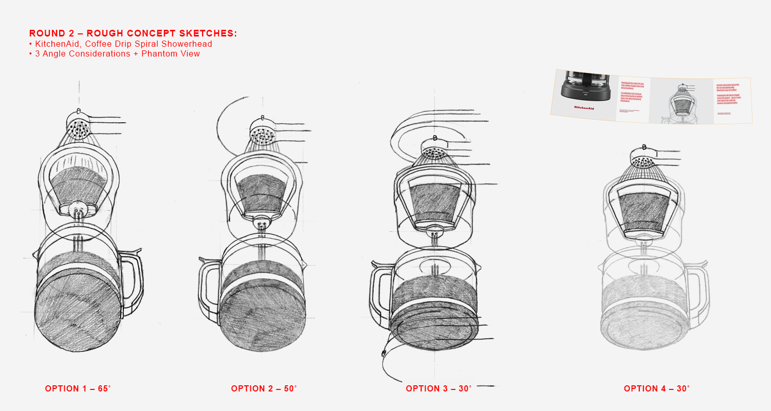
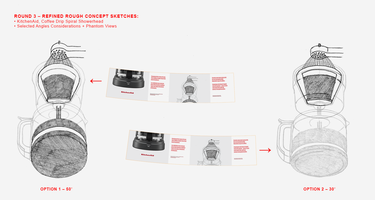
Client Project
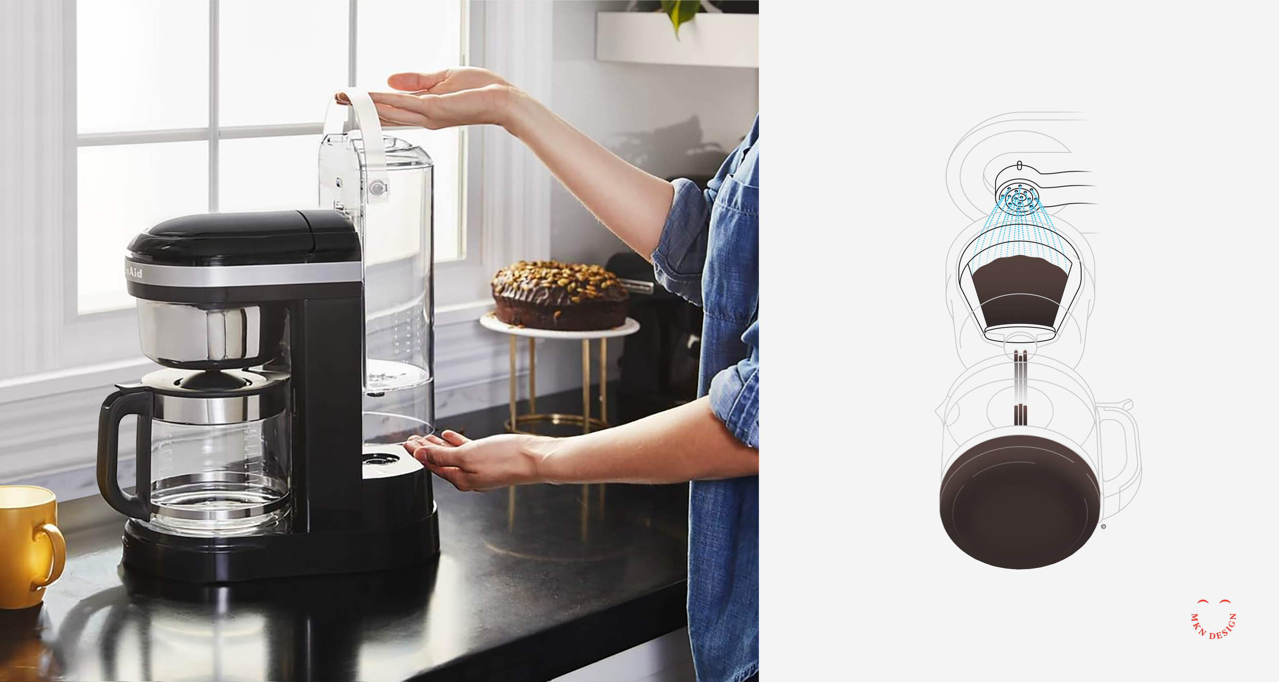
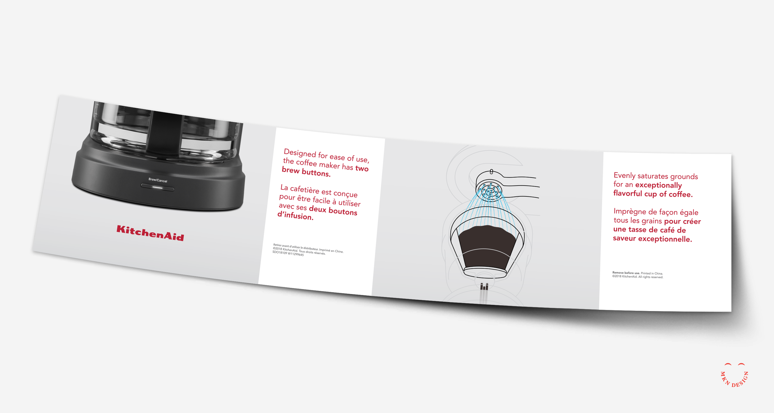
Drawing from my comprehension of the innovative Spiral Head feature's functionality, I created a series of sketches to depict its role in ensuring consistent water saturation of coffee grounds for optimal flavor extraction.
The project progressed through various stages, from discovery to concept sketching and ideation. Incorporating diverse perspectives, we determined the most impactful approach to illustrate the idea. This resulted in a straightforward line drawing with nuanced coloring and a phantom-style technical illustration.
KitchenAid
Kitchen Appliance Manufacturing
+ Communication Design
+ Concept Development
+ Instructional Illustration
+ Product Research
+ Qualitative Research
MKN Design Team:
+ Michael Nÿkamp, Illustrator
KitchenAid Stakeholder:
+ Brian Edlefson, Global Creative Manager
Creative Musing

Creative Musing
MKN Design, LLC
michael@mkn-design.com
1 616 915 1941
Good design is complexity presented simply
MKN Design LLC © 2025
Originally from Ontario, Canada, and currently based in West Michigan, Michael Nÿkamp is dedicated to helping businesses develop and refine creative strategies into clear, impactful solutions that captivate and engage.