Nonprofit Client Project
—
The Illustration League – Brand Identity
TIL is a group of illustrators, artists, and letterers. Lucy Engelman and I founded The Illustration League with the aim of educating members on best practices in client relations, licensing contracts, pricing, and fostering community through illustration talks.
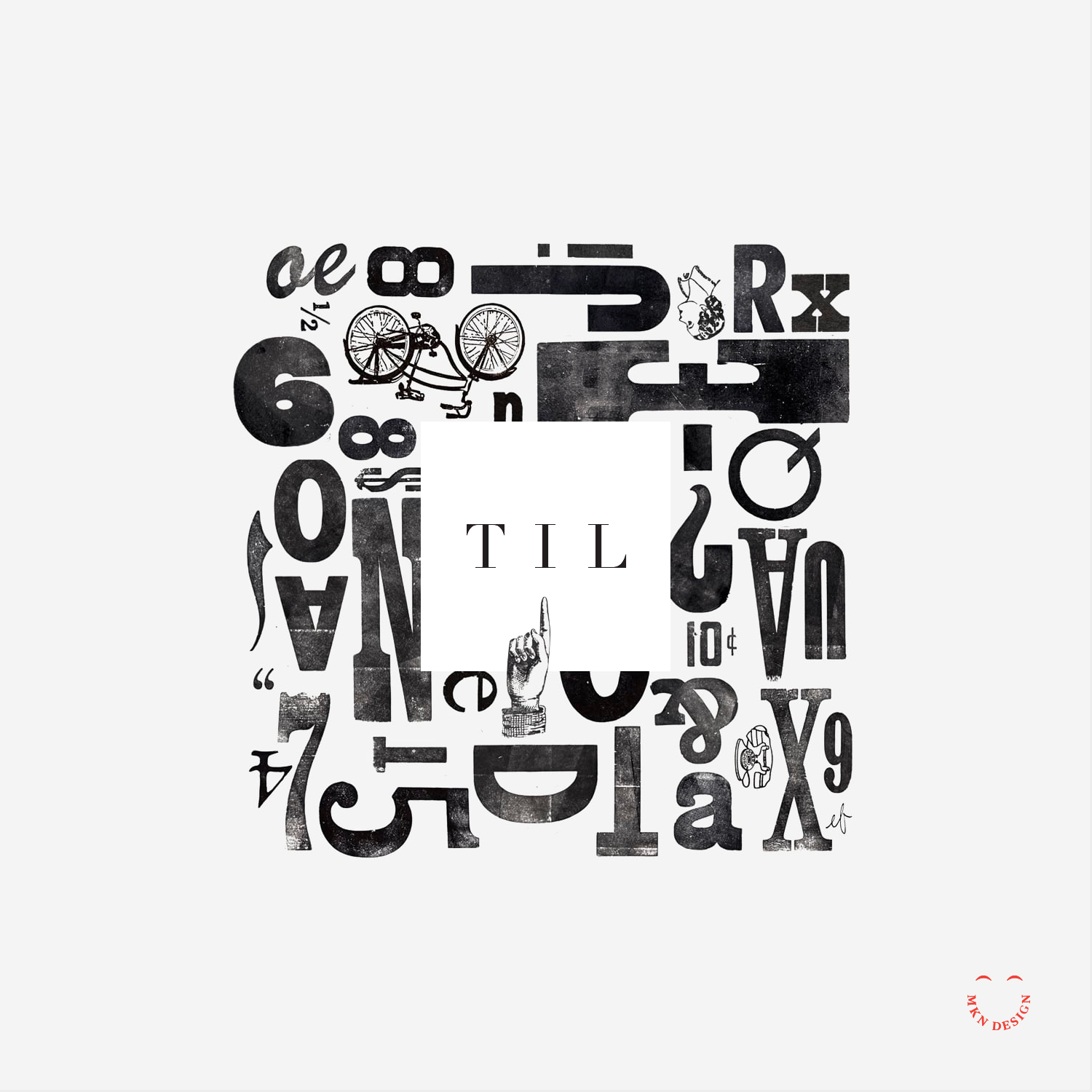
Once we understood our group's objective, we chose to abbreviate The Illustration League to TIL, also a nod to 'Today I Learned,' aligning with our mission. We selected a simple yet impactful square design featuring kerned-out TIL letters. The square logo symbolizes a canvas or digital artboard and is paired with the typeface Linotype Didot designed by Adrian Frutige from Monotype.
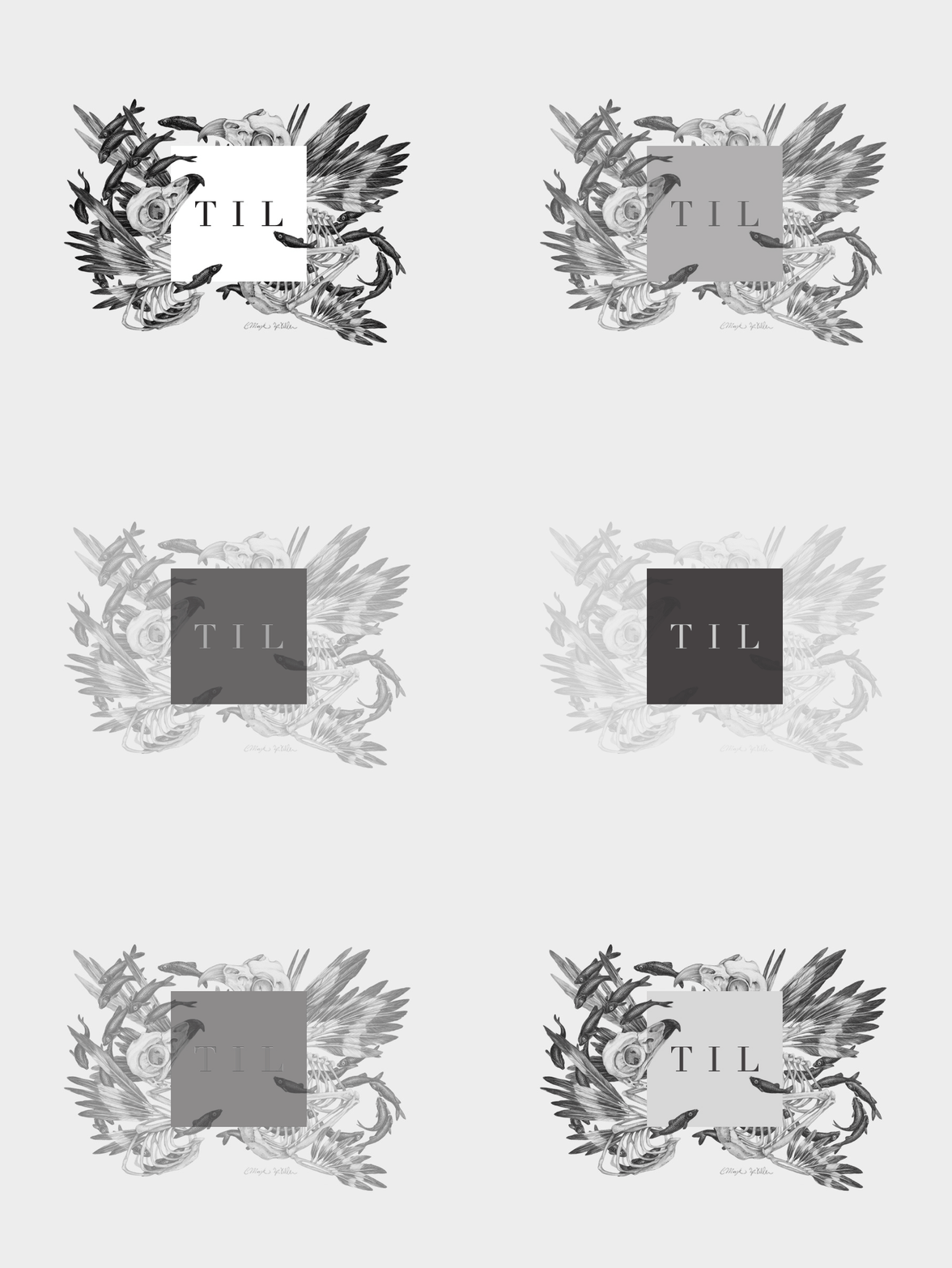
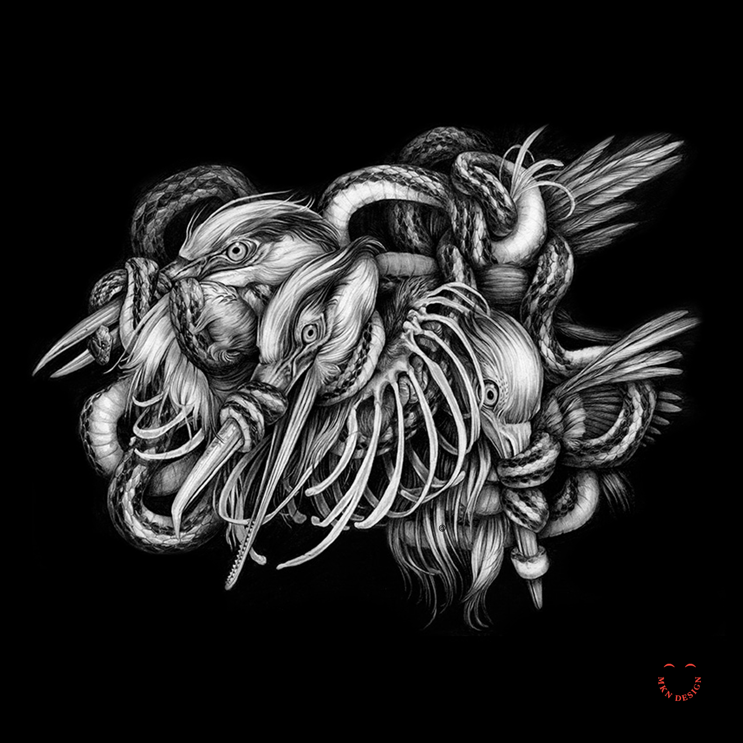
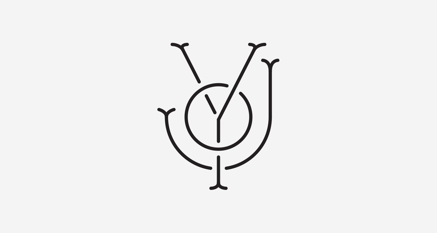
Given that TIL represents a community of diverse individuals with exceptional talents, it was crucial for the logo to embody our collective spirit. With this in mind, we engaged our members to contribute personal illustrations that would envelope, complement and embrace the boxy logo. This collaborative initiative resulted in a vibrant gallery showcasing the diverse talents within our community. Not only did this collection of artwork enhance the TIL brand, but it also exemplified the richness of the illustration community as a whole.
Logo Artwork Attribution:
The branding project was a collaborative effort by various artists, illustrators and designers wrapping there unique artwork around the TIL’s box’y logo.
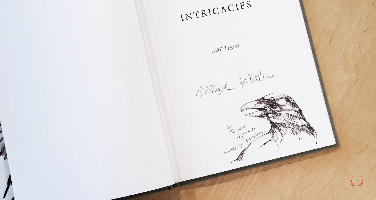
1. Christina Mrozik & Zoe Keller
2. Jody Williams
3. Jonathon Wolfer
4. Michael Nÿkamp
5. Elyse Flynn
6. Neil Hubert
7. Chas Appleby
8. Yolanda Gonzalez
9. Mike Williams
TIL Postcard – Libby VanderPloeg
-
The Illustration League
Nonprofit Professional Illustration Community -
+ Brand Advisor
+ Concept Development
+ Creative Strategy
+ Design Direction
+ Qualitative Research
+ Visual Identity -
+ Building An Illustration Community – Rapid Growth Article
+ Community of Illustrators
+ Woosah & The Illustration League Workshop
