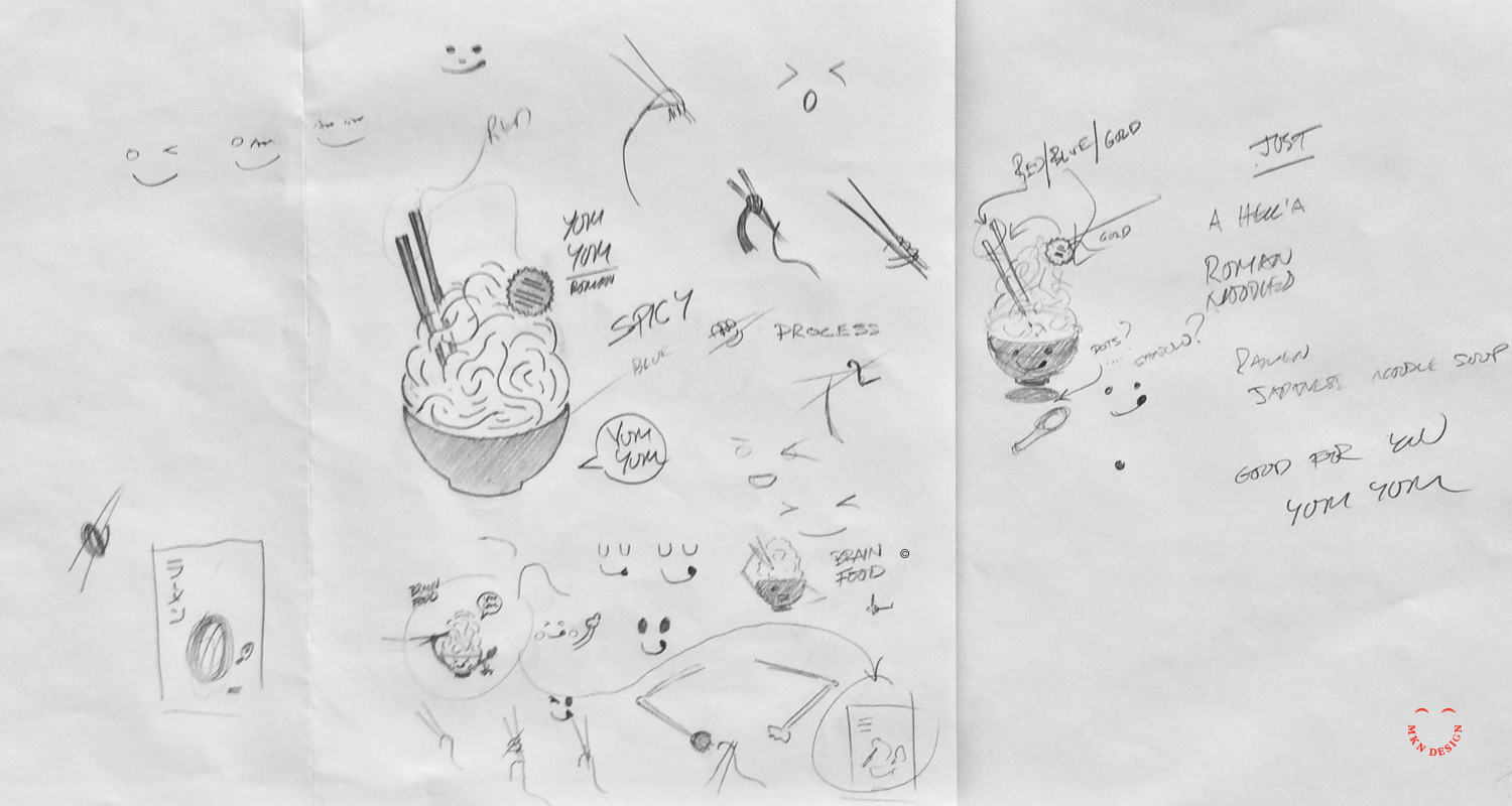
Creative Musing
Creative Musing

Creative Musing

Creative Musing

Creative Musing
Article + Client Project
Project Background:
When Michigan Wheel Marine sought my services to develop a new brand identity for their company, I was initially unaware of the internal conflict and power dynamics at play within the organization. So like any beginning of a project, I dove in and began to work closely with the internal team and their global partners. It soon became evident that there was internal and partner conflict regarding how they defined their brand and how customers perceived them. Unfortunately, their ongoing disagreements only complicated my efforts to provide them with sound advice and develop a meaningful brand identity.
Instead of wanting to gain an understanding of their market and customers, they created internal alignments that swayed what they felt was their brand. Never considering my advice for thoughtful research and interviewing to understand their business, market, and customer perceptions.
Reflecting back on this situation, I wish I had been more direct with them, though I'm uncertain if that would have helped. It's unfortunate that they relied on internal alignments to assert what they believed was right, overlooking the importance of thorough qualitative and quantitative research. Missing this important step, they overlooked valuable insights that would have helped me shape their brand more effectively. Research should always play a crucial role in uncovering customer needs, preferences, and perceptions, ultimately guiding an effective brand strategy.
Logo Direction:
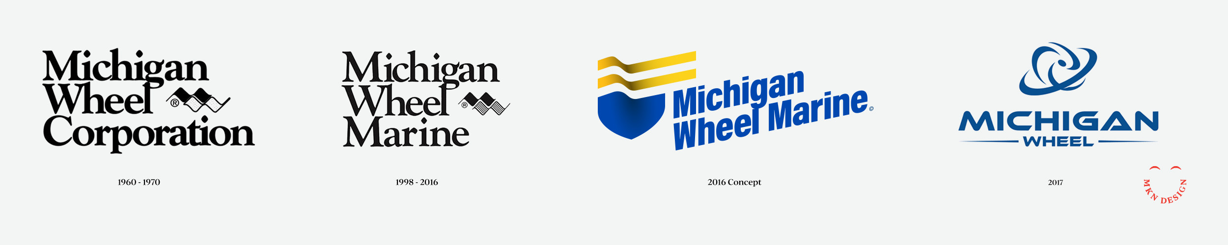
The logo direction was shaped by restricted research, as the client was unwilling to invest in what they perceived as unnecessary expenses. I hate to say, “I told you so.” Some companies do not like spending money on important research. Since this was the reality of this project, I spent time on preparing a basic questionnaire to understand the company, its market segments and competitor analysis. This limited research revealed a desire to differentiate from competitors and avoid the common propeller motif. I felt my approach was unique, drawing from their company's rich history, engineering expertise, and providing precision handcrafted propellors.
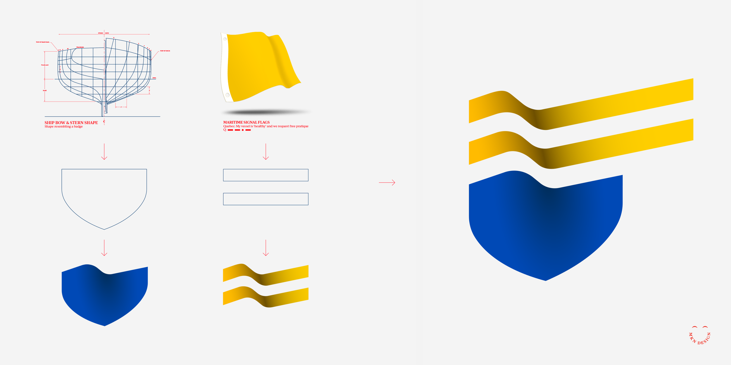
↑ Combined elements of inspiration
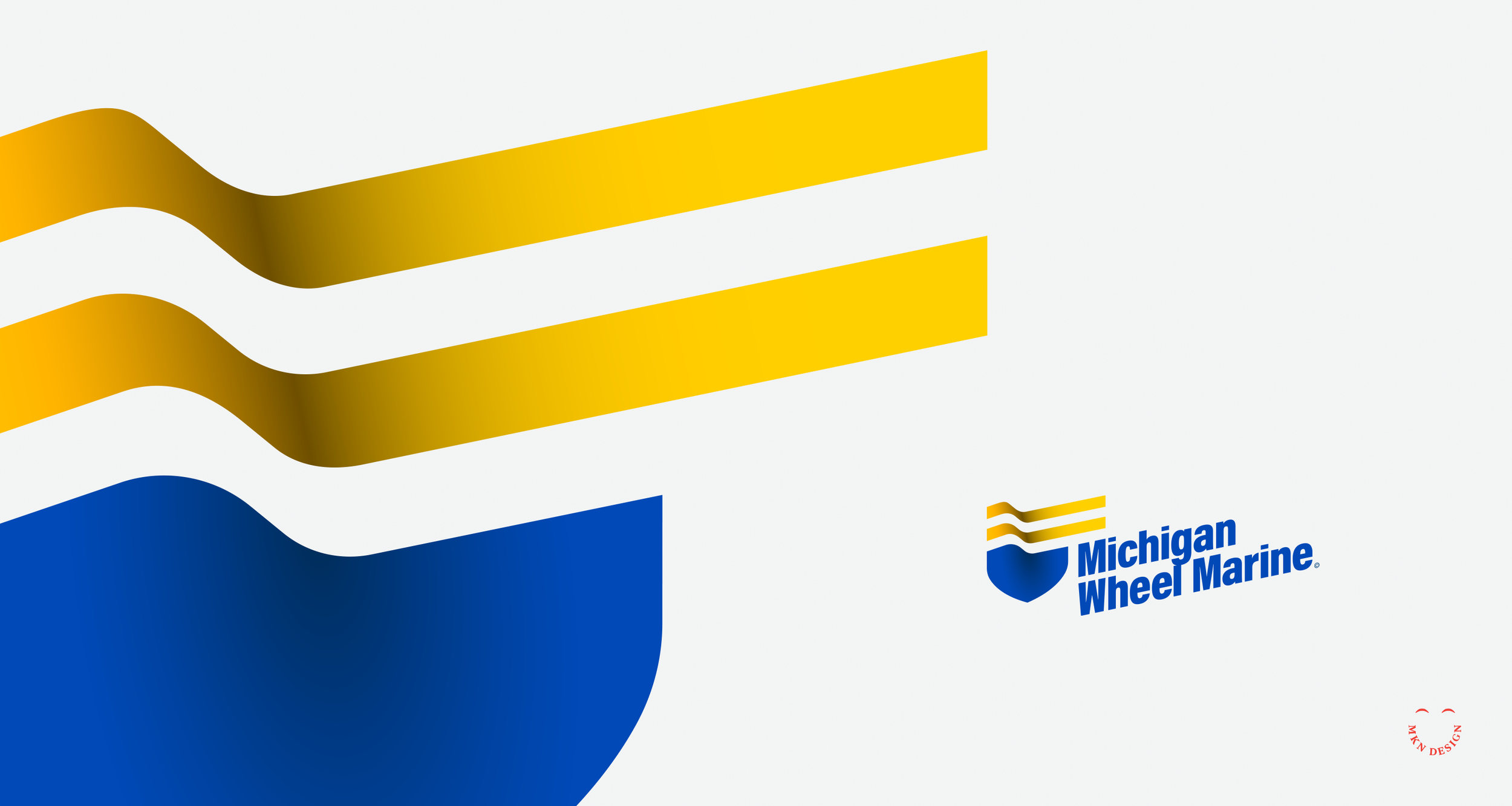
During my exploration phase, I focused on incorporating marine motifs. I used a boat bow with the addition of two flowing lines (acting as a flag), these two combined elements created a badge. I chose a bold typeface, Acumin Variable designed by Robert Slimbach from Adobe Originals to commitment the logomark. With the additional of color, reflecting a nautical theme I added depth to the mark to give it presence. Also, by angling the logo I created a sense of movement, making it feel more modern and energetic. The final execution integrates the logomark (badge) and logotype (company name) to reflect the company's experience, excellence and superior products.
Even though the stakeholders didn't see this as the right direction, it was just one of my approaches that I believed aligned with their needs based on the research conducted.
Michigan Wheel Marine
Industrial Marine Manufacturing
+ Brand Advisor
+ Concept Development
+ Creative Assets
+ Design Direction
+ Qualitative Research
+ Visual Identity
MKN Design Team:
+ Michael Nÿkamp, Design Director
Michigan Wheel Marine Stakeholders:
+ Kevin Mitchell, VP Inboard Sales & Marketing
+ Kyle Trapp, Sales Associate
+ John Kingma, Sales Associate

Client Project
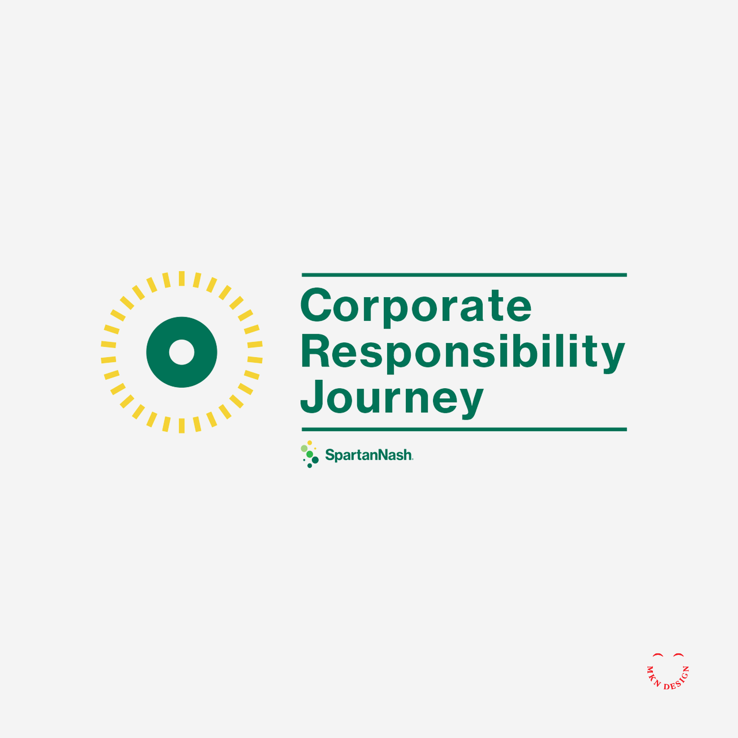
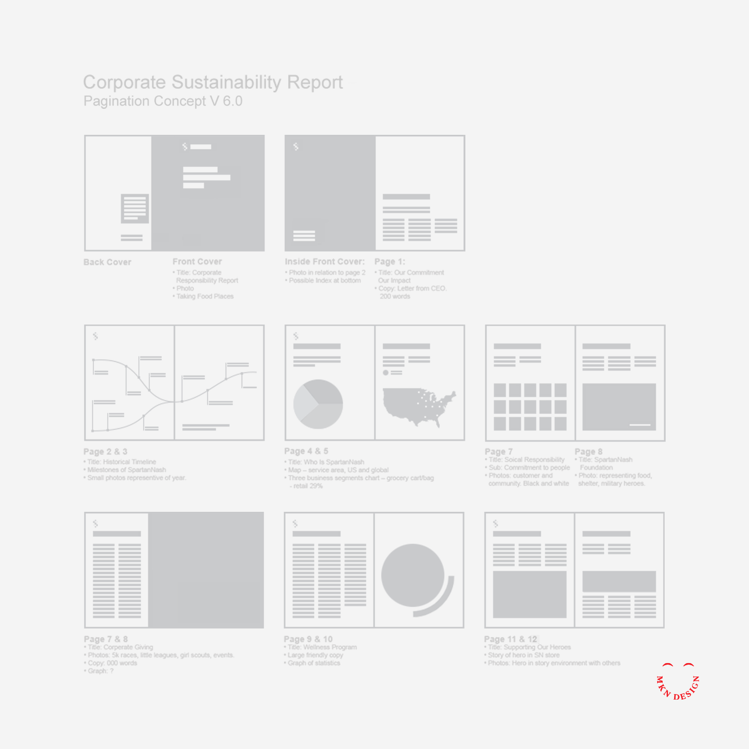
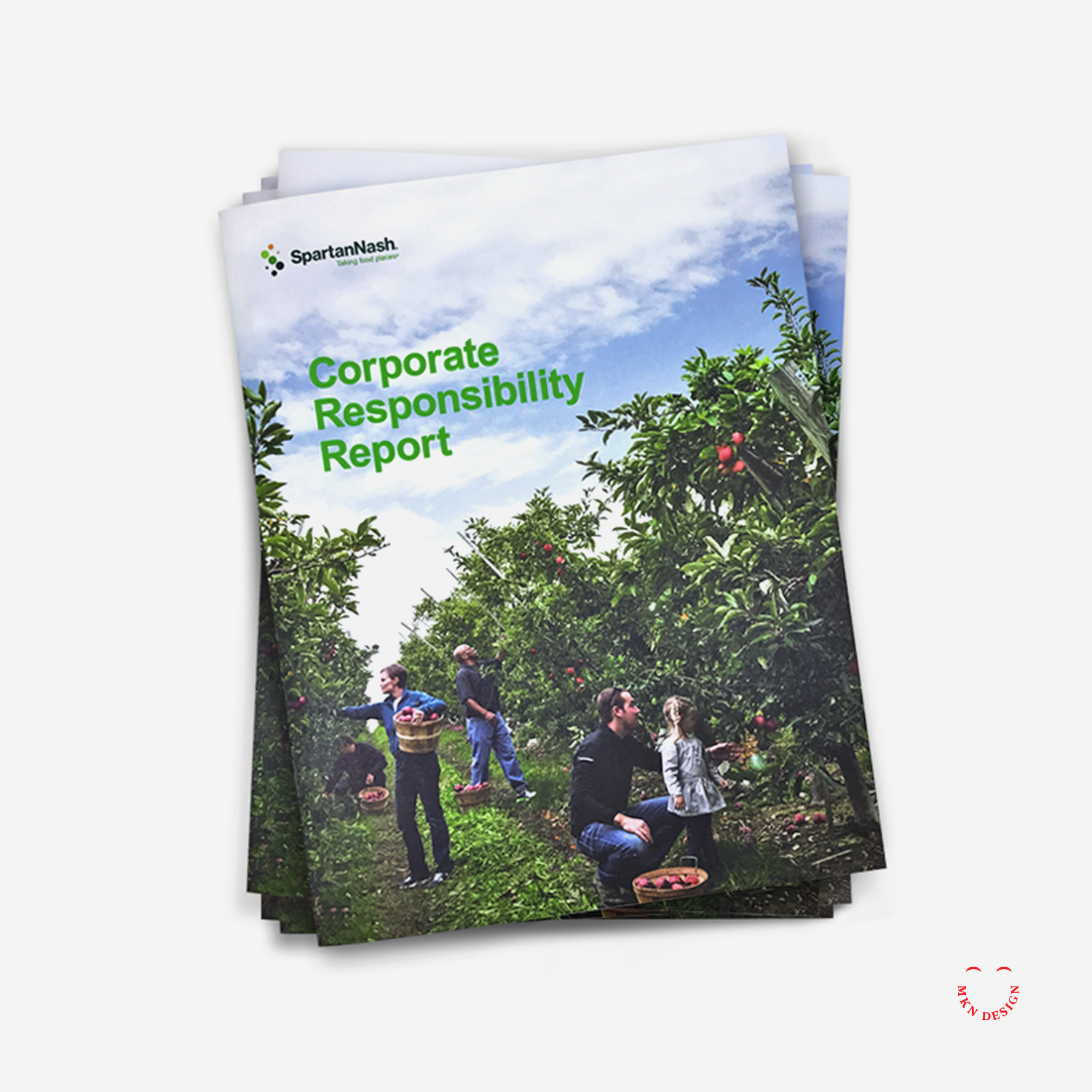
Serving as design director, I led the process to the development and design of the report, highlighting SpartanNash’s core values, diverse capabilities, community engagement, and commitment to environmental responsibility through a strategic combination of copy, visuals, design, and infographics.
Following a guided design process, I reviewed and analyzed SpartanNash’s areas of social and environmental responsibility, shaping each section to tell the story of their sustainable journey. By integrating storytelling with design, we connected their core values, capabilities, and community efforts into a cohesive narrative.
The final brochure brought SpartanNash’s story to life, combining compelling visuals, informative infographics, and clear, engaging design to communicate their achievements and initiatives. Serving as both a visually engaging and practical reference, it reinforced the company’s commitment to sustainability, community, and corporate responsibility, resulting in a comprehensive and impactful sustainability report.
SpartanNash
Food Wholesale & Retail Grocer
+ Communication Design
+ Concept Development
+ Illustrative Storytelling
+ Product Research
+ Pagination Desgin
+ Qualitative Research
+ Sketching & Ideation
+ Visual Identity System
MKN Design Team
+ Michael Nÿkamp, Design Director
SpartanNash Stakeholders:
+ Meredith Gremel, VP, Corporate Affairs & Communications
+ Alison Sutter, Manager, Corporate Responsibility
+ Jena Nooney, Manager, Organizational Communications
+ Lauren DeVol, Corporate Affairs Writer

Article
View my work on my Dwell profile page.

Nonprofit Client Project
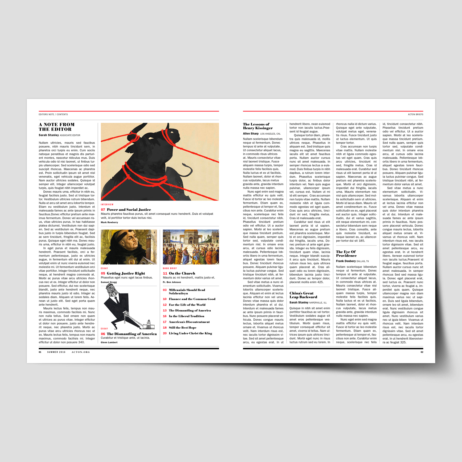
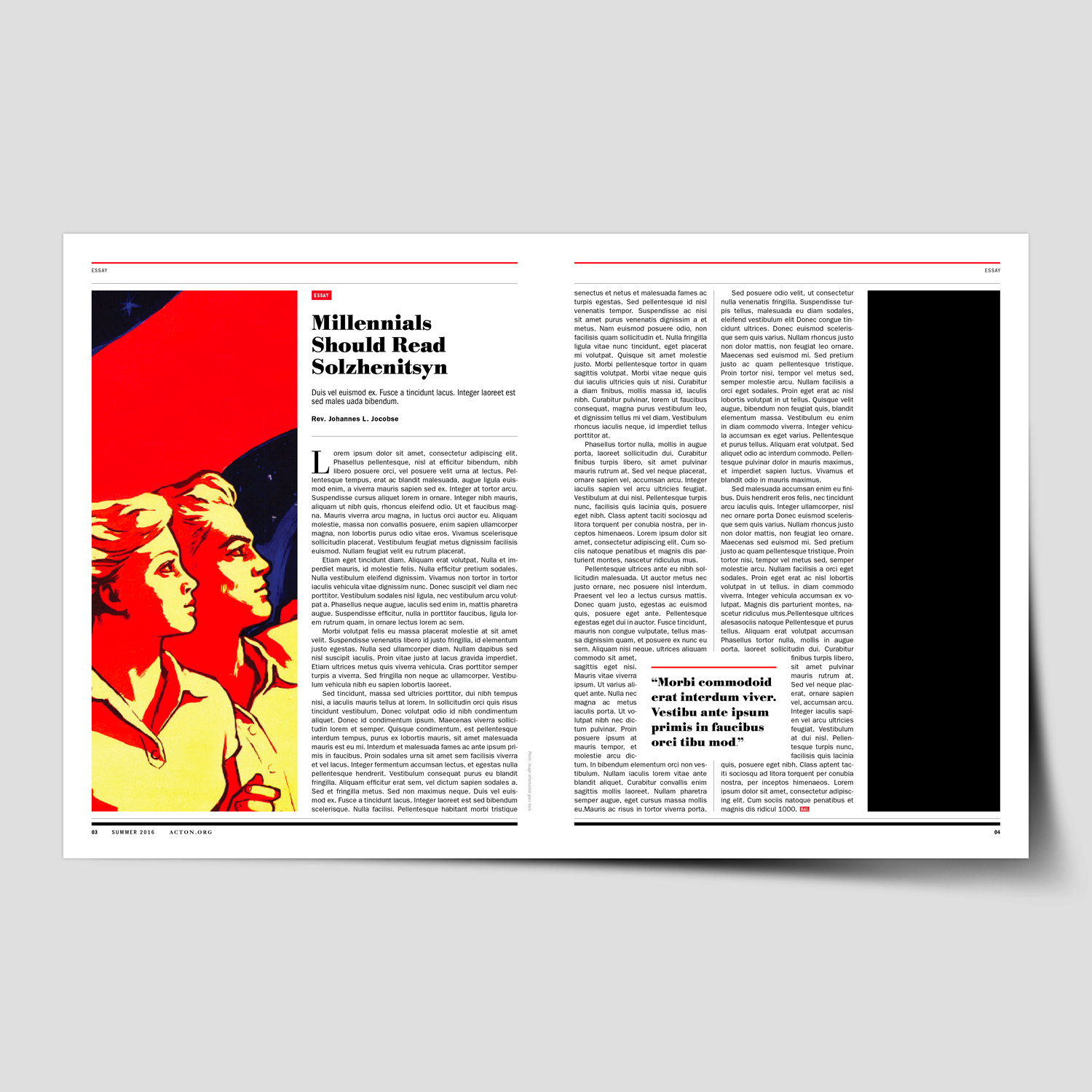
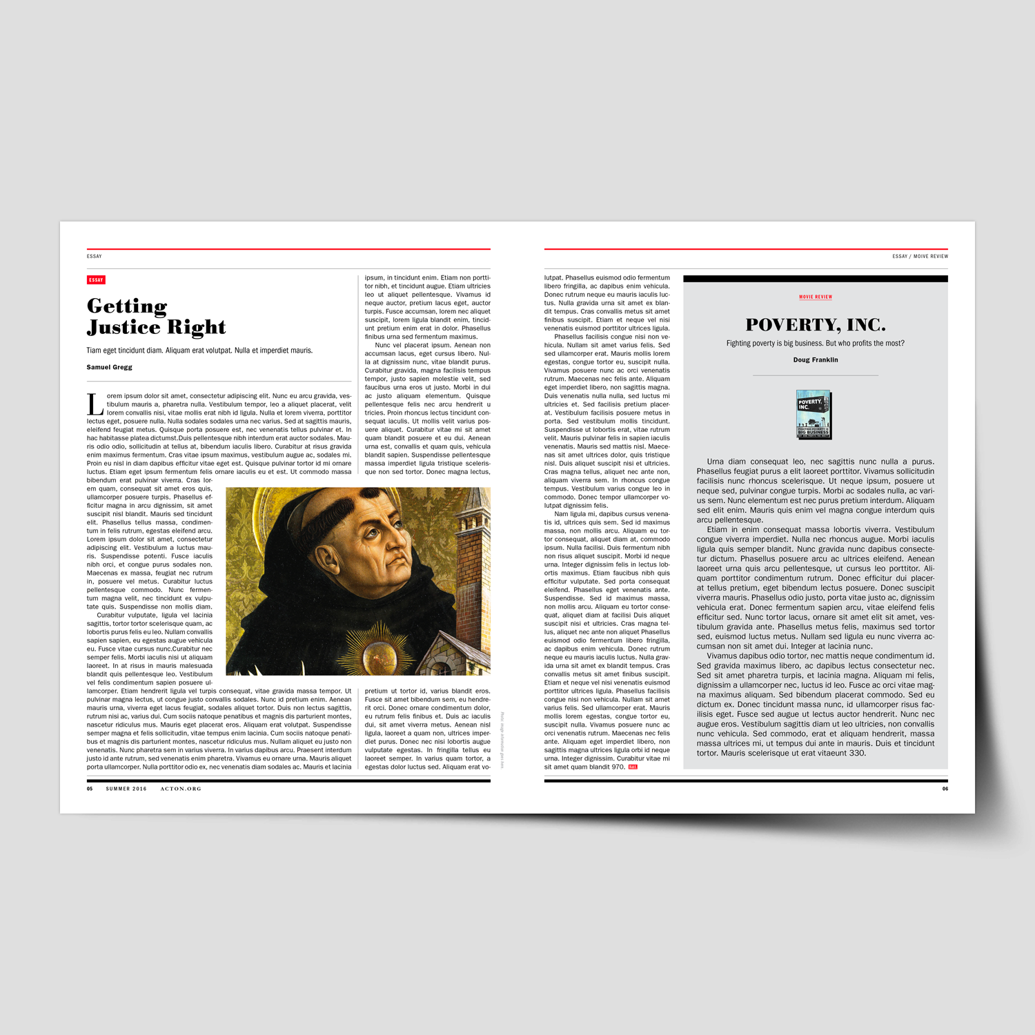
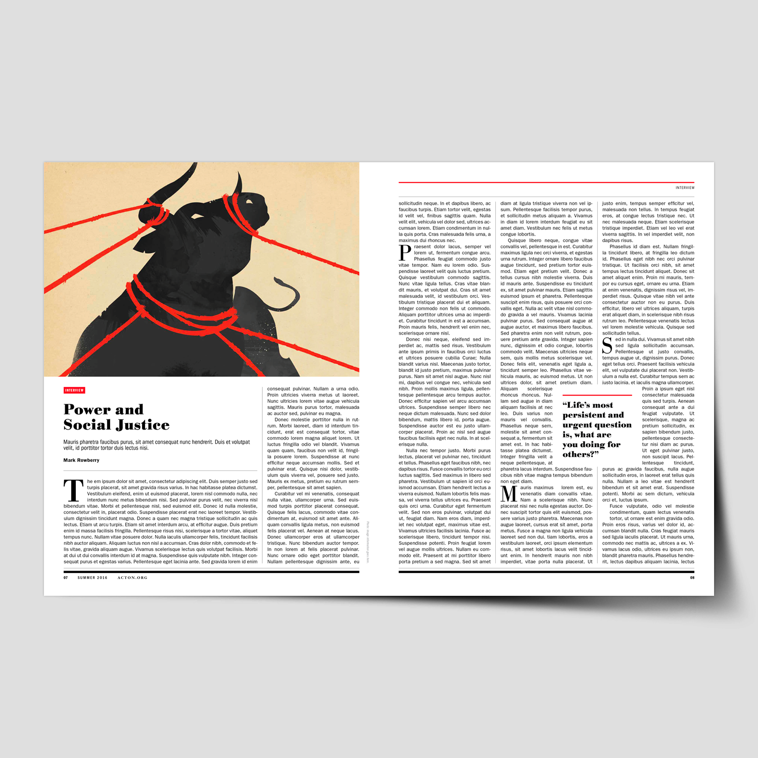
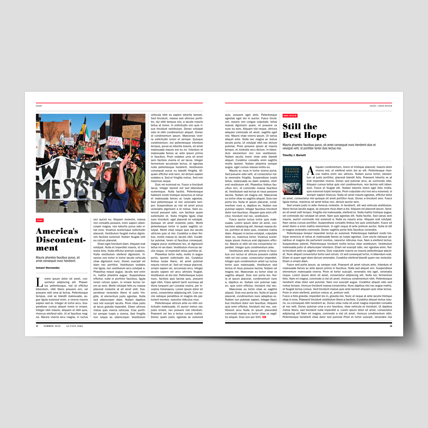
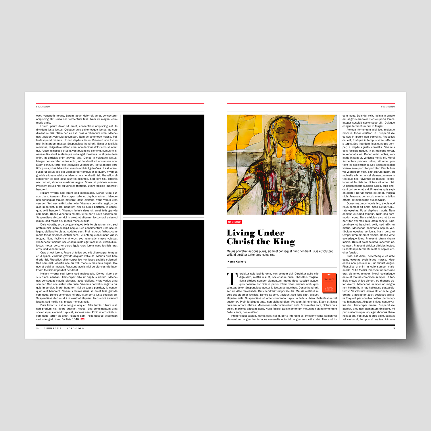
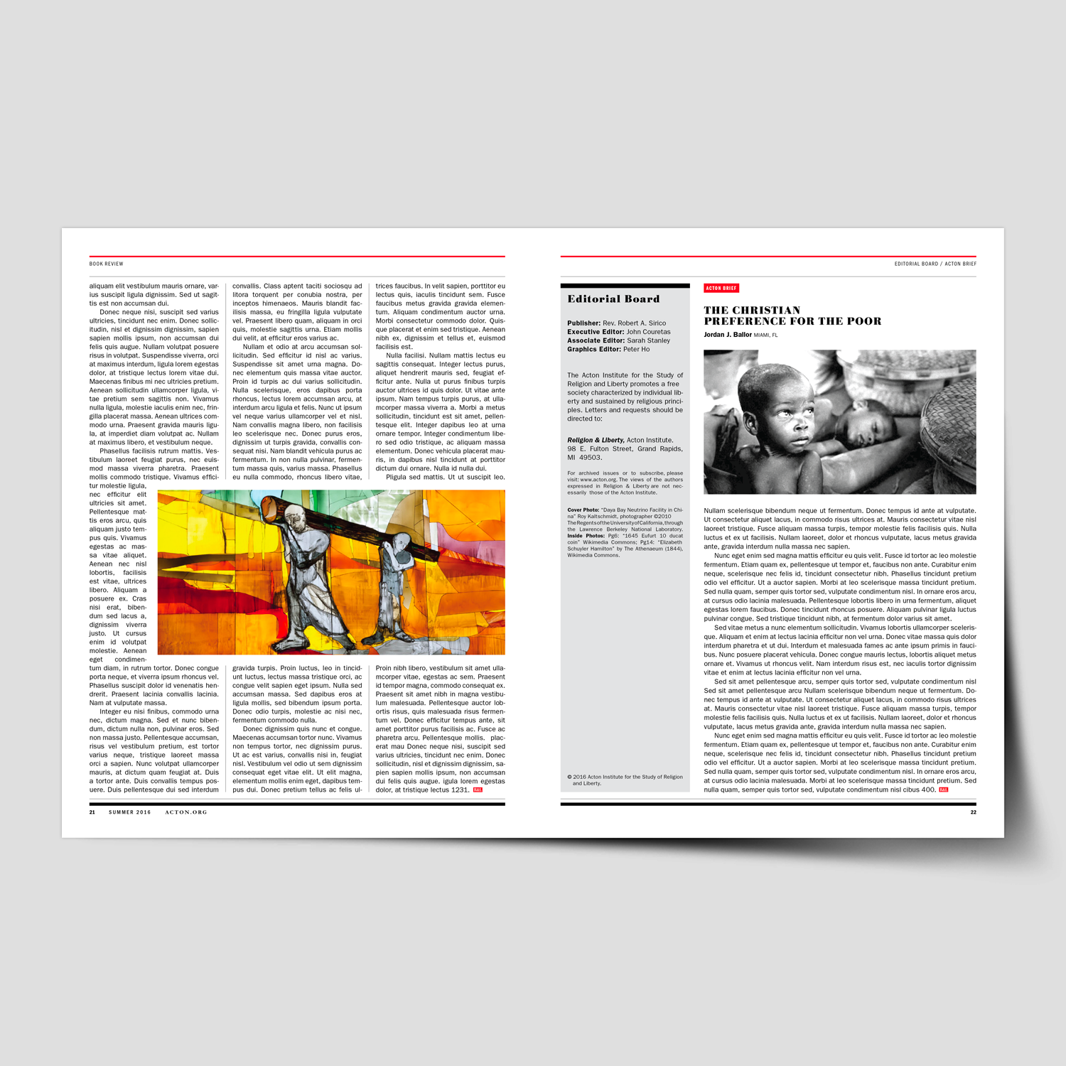
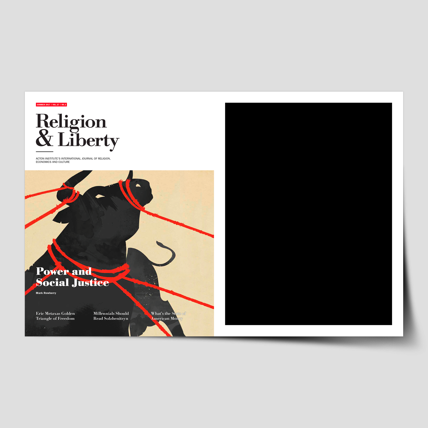
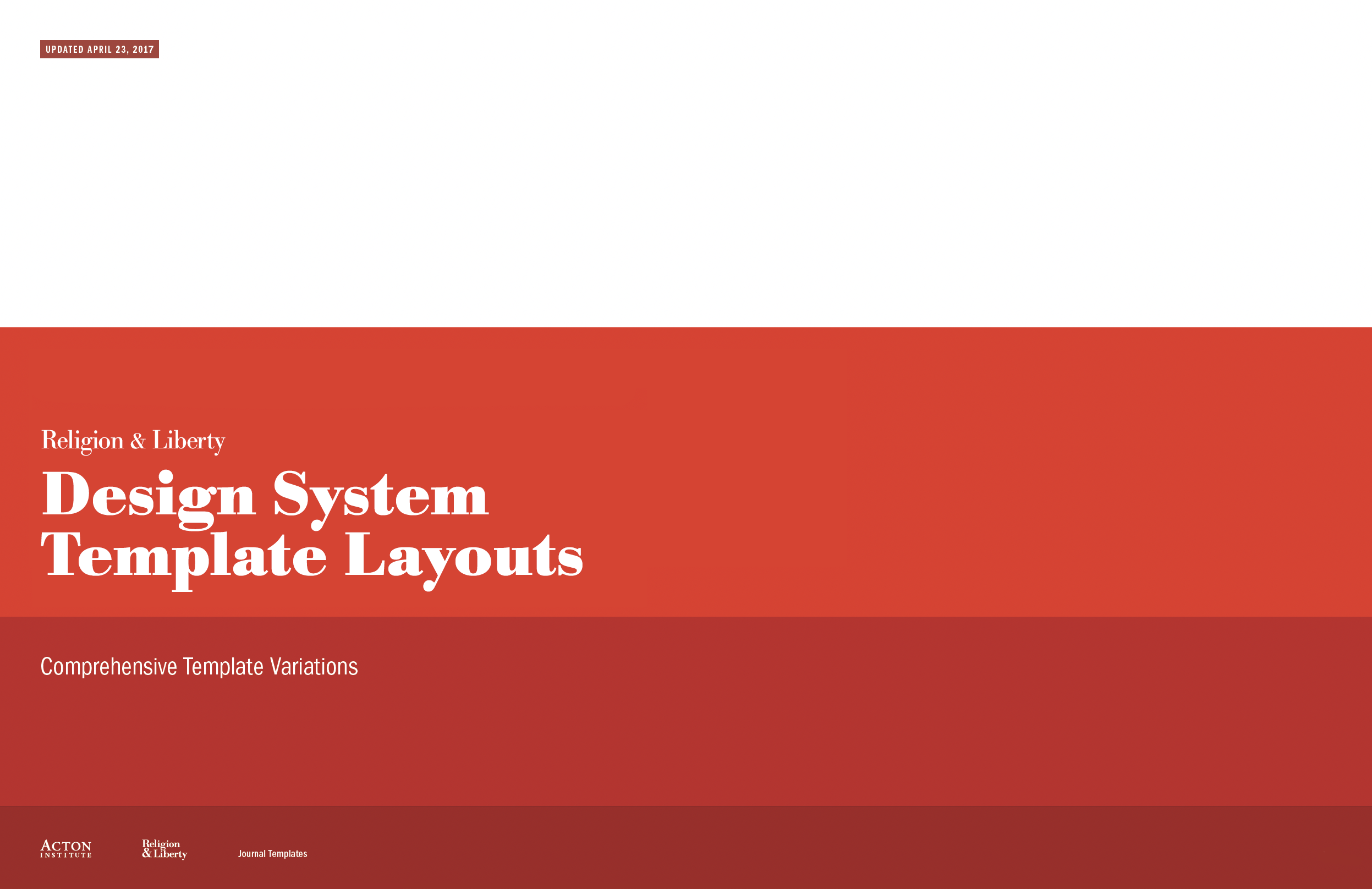
This project began with a full evaluation of the magazine’s existing structure, visual language, and editorial needs. Through extensive planning, research, and collaboration with Acton’s editorial team, we identified opportunities to improve clarity, storytelling, and brand alignment while creating a system flexible enough to support a wide range of content.
The redesign process included an audit of past issues, editorial content analysis, typographic and grid exploration, and the development of a refreshed visual tone—spanning layout structure, photography and illustration direction, color refinement, and cover design. The result was a comprehensive editorial system built around forty distinct layout templates.
To support long-term consistency, a detailed design and layout toolkit was created, equipping the internal team with clear guidelines for typography, spacing, imagery, recurring features, and decision-making. The outcome delivered a magazine that feels contemporary, readable, and distinctly aligned with the Religion & Liberty vision—while significantly improving workflow efficiency for their editorial staff.
←
View the Design System Templates, created to streamline layouts and ensure a consistent visual narrative for future issues.
“It’s rare to come across someone as talented and easy to work with as Michael. We hired Michael to redesign one of our most important publications, Religion & Liberty. The project was incredibly difficult from the start as we didn’t have a clear picture of what we were looking for. Michael was extremely patient and methodical, working closely with us, so we could come up with a concrete plan of execution together. He took special care to understand the needs of the organization as well as the readers, so the final product would be ideal for all audiences. He created a polished publication that holds its own against mainstream magazines.”
Sarah Stanley
Managing Editor, Acton Institute
Religion & Liberty (Acton Institute)
Nonprofit Think Tank
+ Brand Advisor
+ Brand Identity
+ Communication Design
+ Concept Development
+ Design Direction
+ Editorial Publication Design
+ Illustration & Photo Art Direction
+ Qualitative Research
MKN Design Team:
+ Michael Nÿkamp, Design Director
Acton Institue Stakeholders:
+ John Couretas, Director of Communications
+ Sarah Stanley, Managing Editor
Creative Musing

Creative Musing

Creative Musing
Creative Musing

Creative Musing

Creative Musing

↓ Truman Cage alternate logo concept directions
Client Project
I was surprised to get a call from John, who shared that he’d been following my branding and illustration and wanted me to develope a logo for his electronic persona—something distinctive that he’d genuinely connect with. His brief was simple: incorporate the letters “T” and “C,” enclosed within a box. The final logo direction (shown at the top), with a handful of additional concepts below that he loved but ultimately didn’t make the cut.
His notable contributions include crafting the score for the iconic movie Napoleon Dynamite which won Golden Satellite Award for best Original Score. He also produced the music for How I Met Your Mother, alongside various other impressive works.
John Swihart
Musician & Composer
+ Brand Advisor
+ Concept Development
+ Creative Strategy
+ Design Direction
+ Qualitative Research
+ Visual Identity
MKN Design Team:
+ Michael Nÿkamp, Design Director
Truman Cage Stakeholder:
+ John Swihart, Musician & Composer

Creative Musing

Creative Musing

Creative Musing

Creative Musing
MKN Design, LLC
michael@mkn-design.com
1 616 915 1941
Good design is complexity presented simply
MKN Design LLC © 2025
Originally from Ontario, Canada, and currently based in West Michigan, Michael Nÿkamp is dedicated to helping businesses develop and refine creative strategies into clear, impactful solutions that captivate and engage.