Creative Musing
April 2017
Creative Musing
April 2017
Creative Musing
March 2017
Creative Musing
March 2017
Creative Musing
March 2017
Article
February 2017
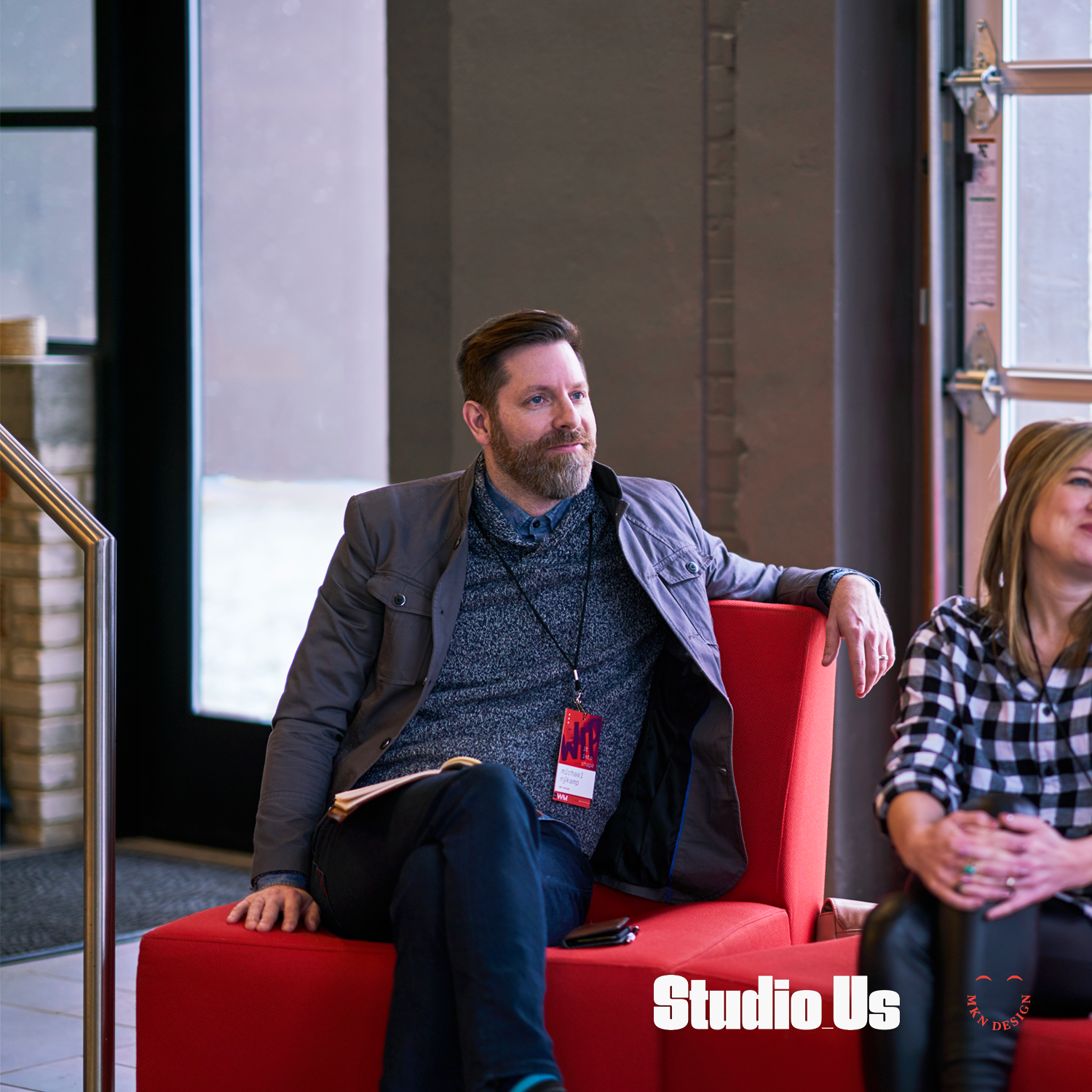
Program design and photography by two kind and talented humans, Bree and Ross Tanner from Studio_Us.
Creative Musing
February 2017

Client Project
February 2017
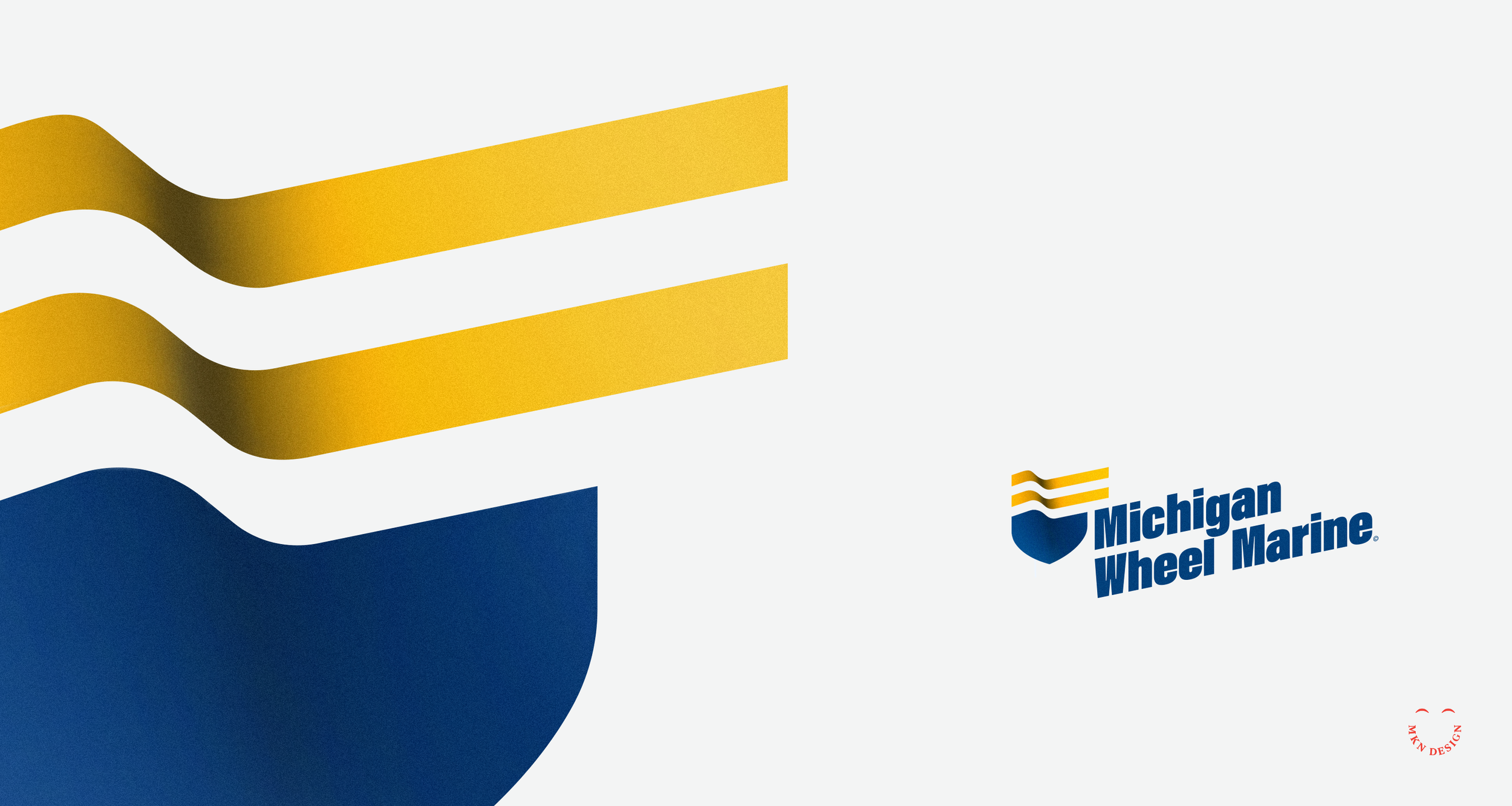
Brand Identity
+ Creative Direction
+ Qualitative Research
+ Concept Development
+ Sketching & Ideation
+ Illustration
Client Project
January 2017
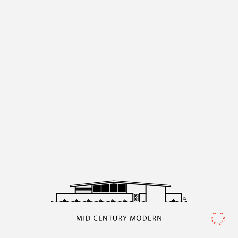
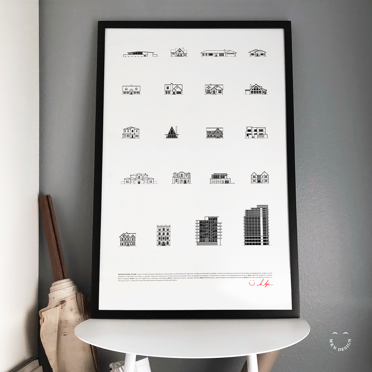
Employing my minimalist illustrative approach, I visually captured 20 distinct architectural styles. These illustrations were subsequently compiled into a poster, presenting a comprehensive showcase of the diverse spectrum of architectural designs found in Newport Beach, California.
+ Illustration & Graphic Design
+ Creative Direction
+ Research
+ Sketching & Ideation
+ Graphic Design
+ Iconography
This poster is available for purchase in my shop.


Article + Product
January 2017
Skate, Surf, & Art is available for purchase on Monsa Publications website.


Creative Musing
January 2017

Creative Musing
January 2017

Creative Musing + Article
December 2016

Creative Musing
December 2016

Article + Client Project
December 2016
+ Brand Identity
+ Creative Direction
+ Project Management
+ Qualitative Research
+ Concept Development
+ Sketching & Ideation
+ Illustration
Client Project
December 2016
+ Brand Identity
+ Creative Direction
+ Project Management
+ Qualitative Research
+ Concept Development
+ Sketching & Ideation
+ Illustration

Client Project
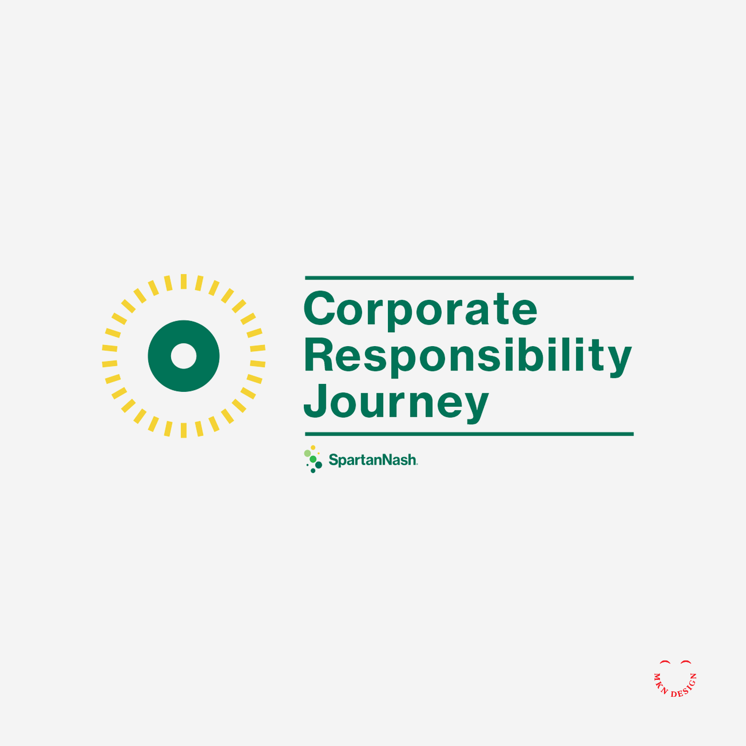
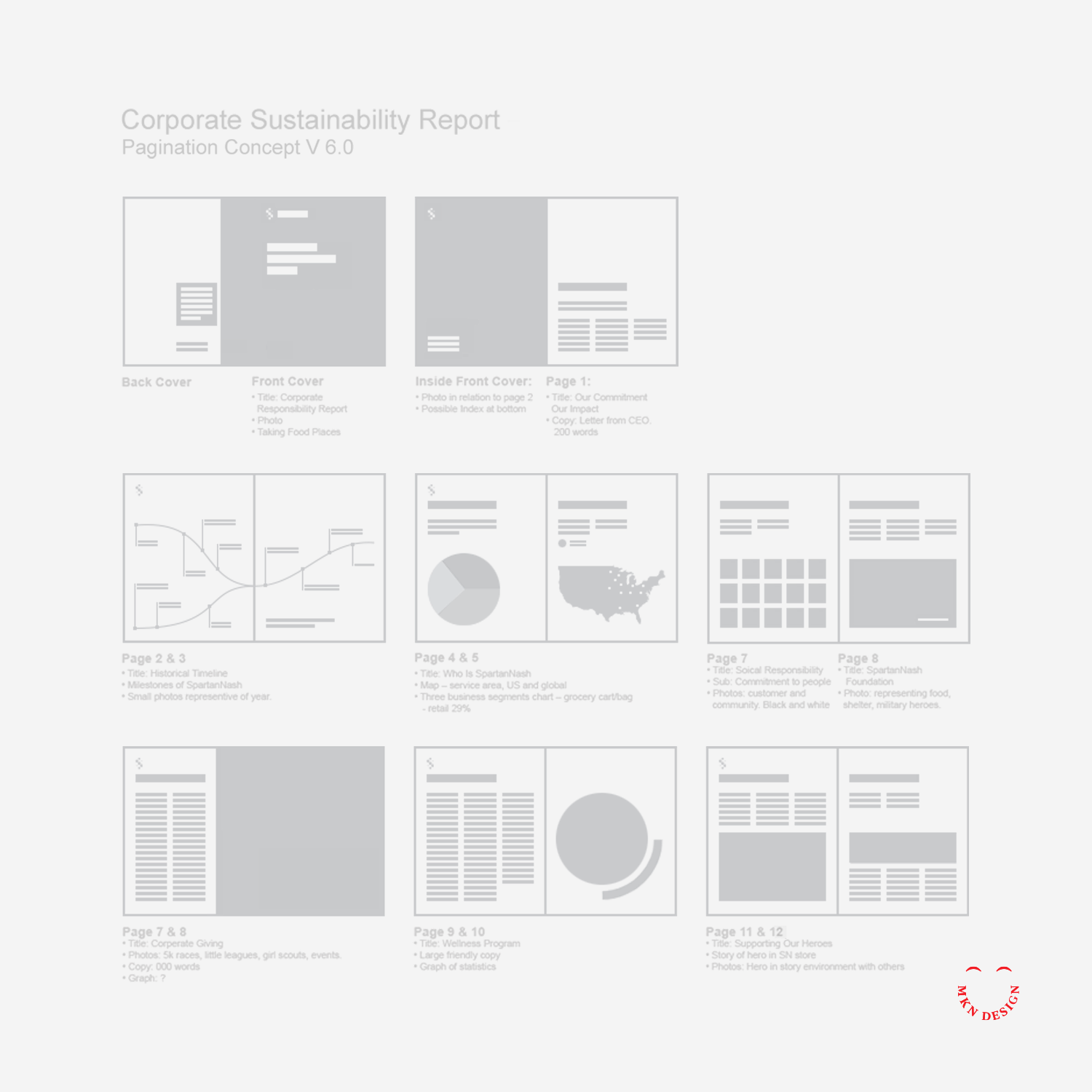
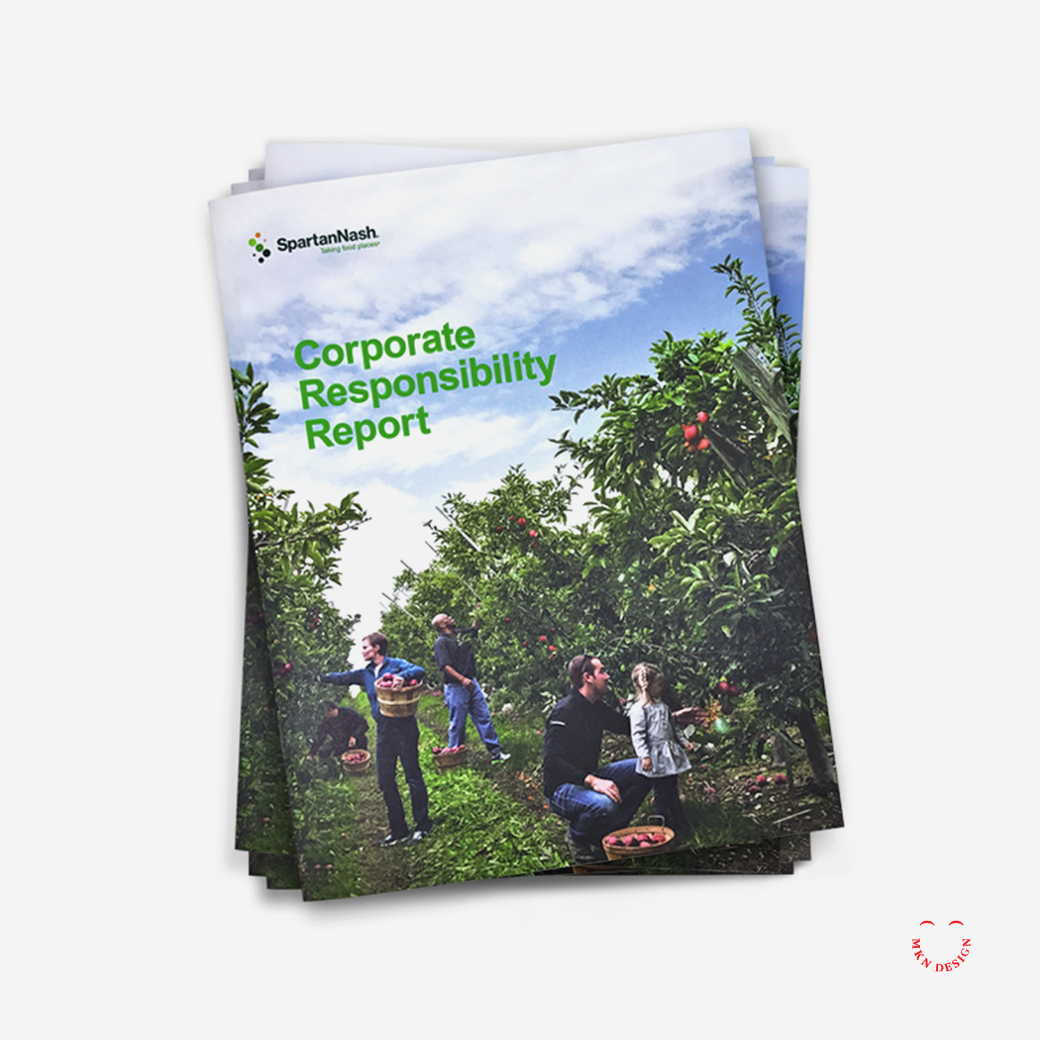
Serving as design director, I led the process to the development and design of the report, highlighting SpartanNash’s core values, diverse capabilities, community engagement, and commitment to environmental responsibility through a strategic combination of copy, visuals, design, and infographics.
Following a guided design process, I reviewed and analyzed SpartanNash’s areas of social and environmental responsibility, shaping each section to tell the story of their sustainable journey. By integrating storytelling with design, we connected their core values, capabilities, and community efforts into a cohesive narrative.
The final brochure brought SpartanNash’s story to life, combining compelling visuals, informative infographics, and clear, engaging design to communicate their achievements and initiatives. Serving as both a visually engaging and practical reference, it reinforced the company’s commitment to sustainability, community, and corporate responsibility, resulting in a comprehensive and impactful sustainability report.
SpartanNash
Food Wholesale & Retail Grocer
+ Communication Design
+ Concept Development
+ Illustrative Storytelling
+ Product Research
+ Pagination Desgin
+ Qualitative Research
+ Sketching & Ideation
+ Visual Identity System
MKN Design Team
+ Michael Nÿkamp, Design Director
SpartanNash Stakeholders:
+ Meredith Gremel, VP, Corporate Affairs & Communications
+ Alison Sutter, Manager, Corporate Responsibility
+ Jena Nooney, Manager, Organizational Communications
+ Lauren DeVol, Corporate Affairs Writer

Article + Product
December 2016
View my work on my Dwell profile page.

Nonprofit Client Project
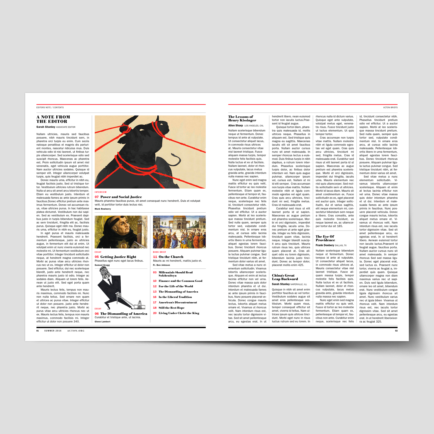
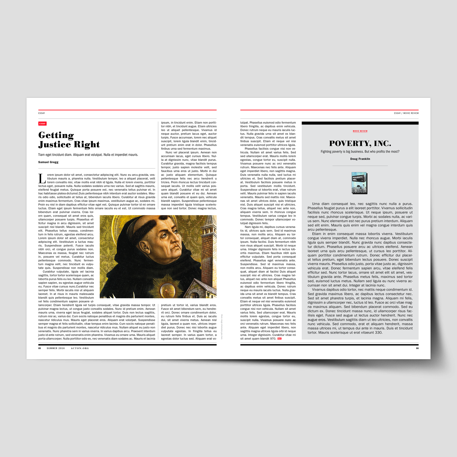
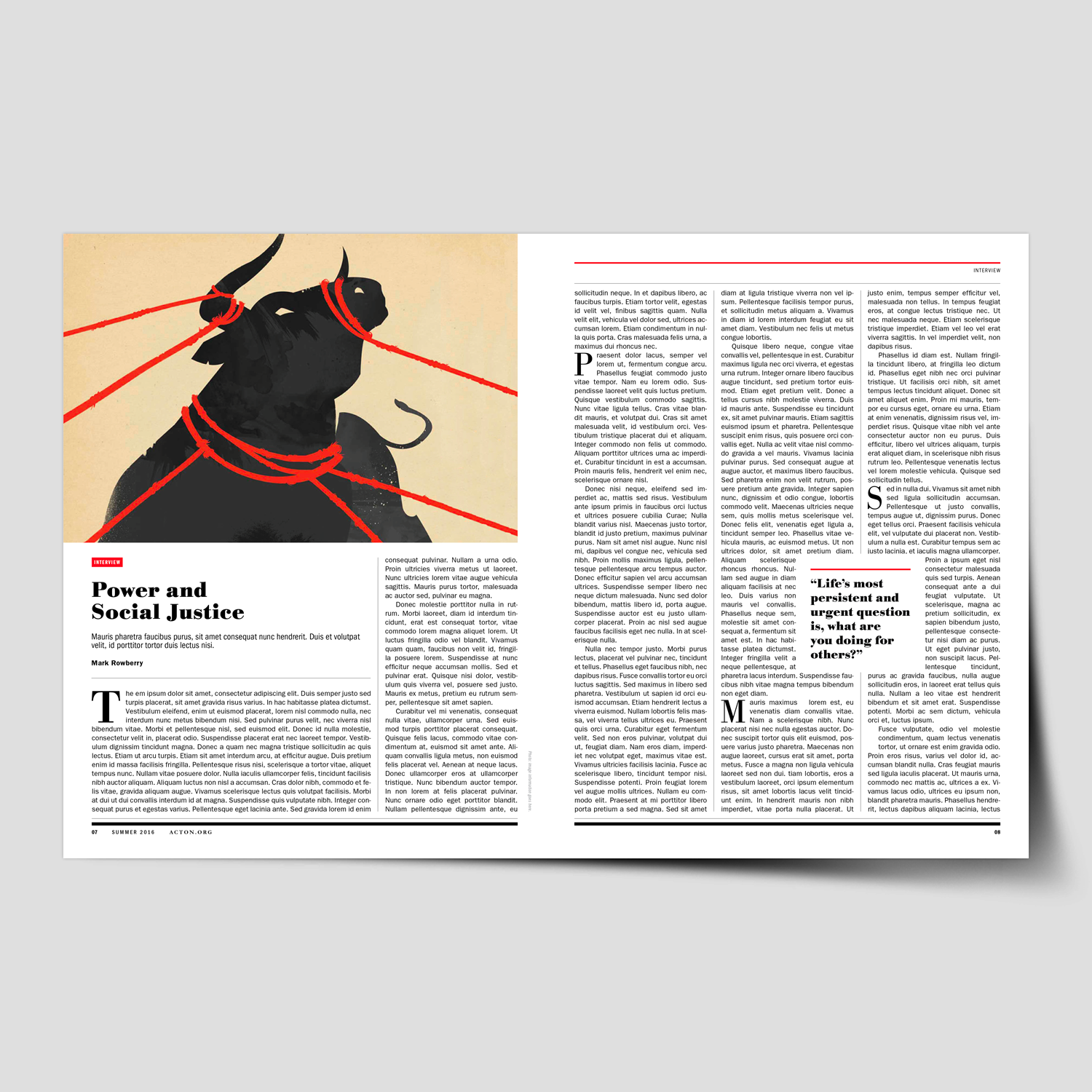
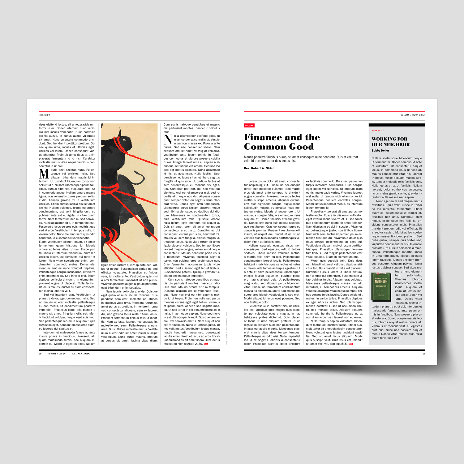
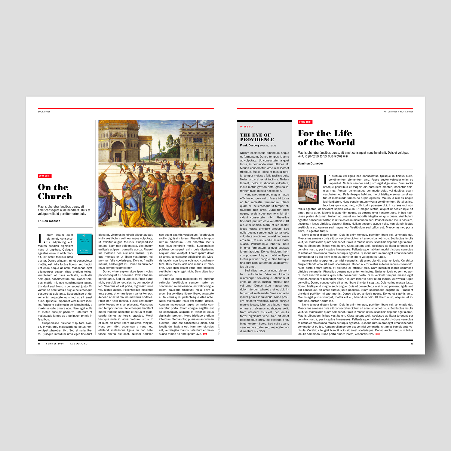
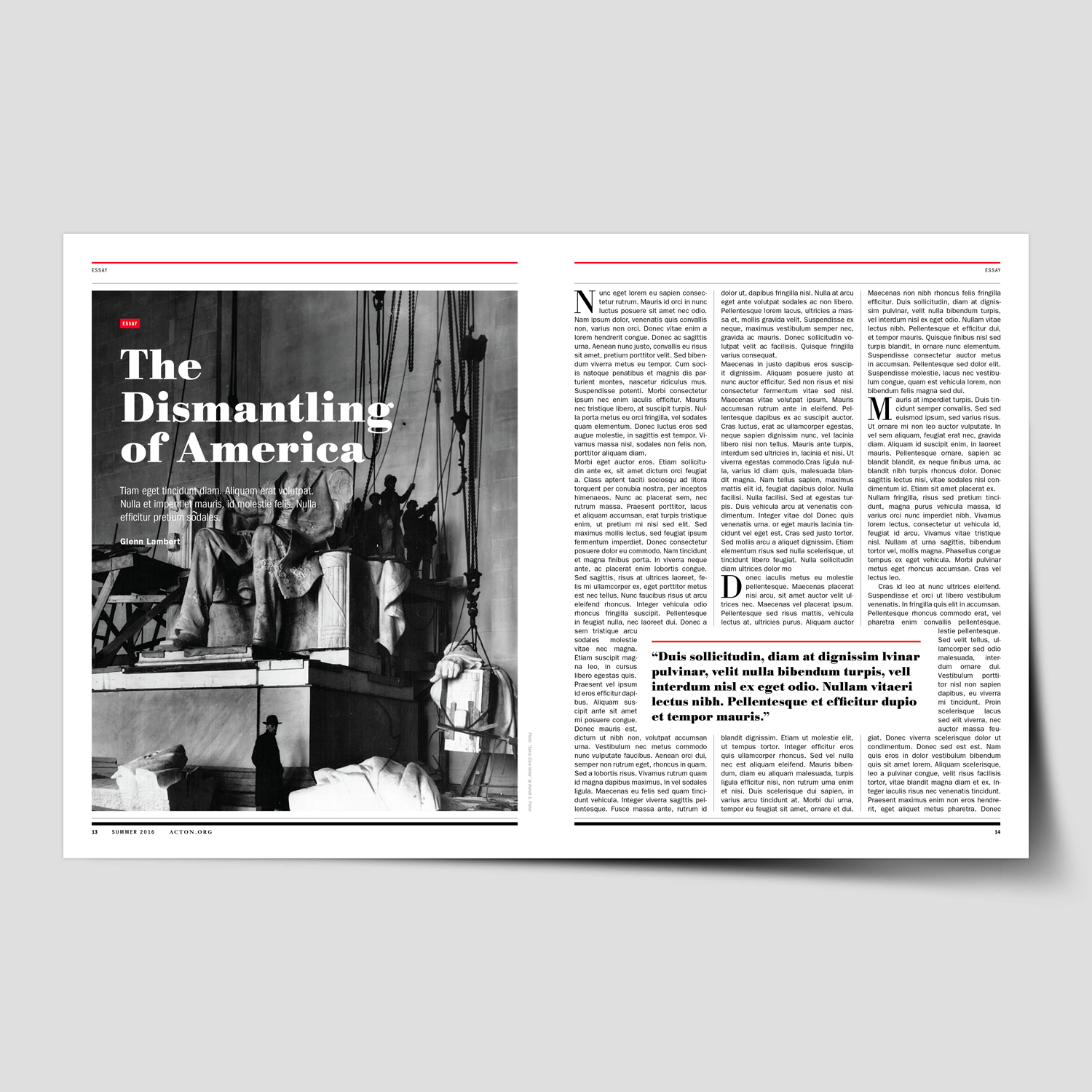
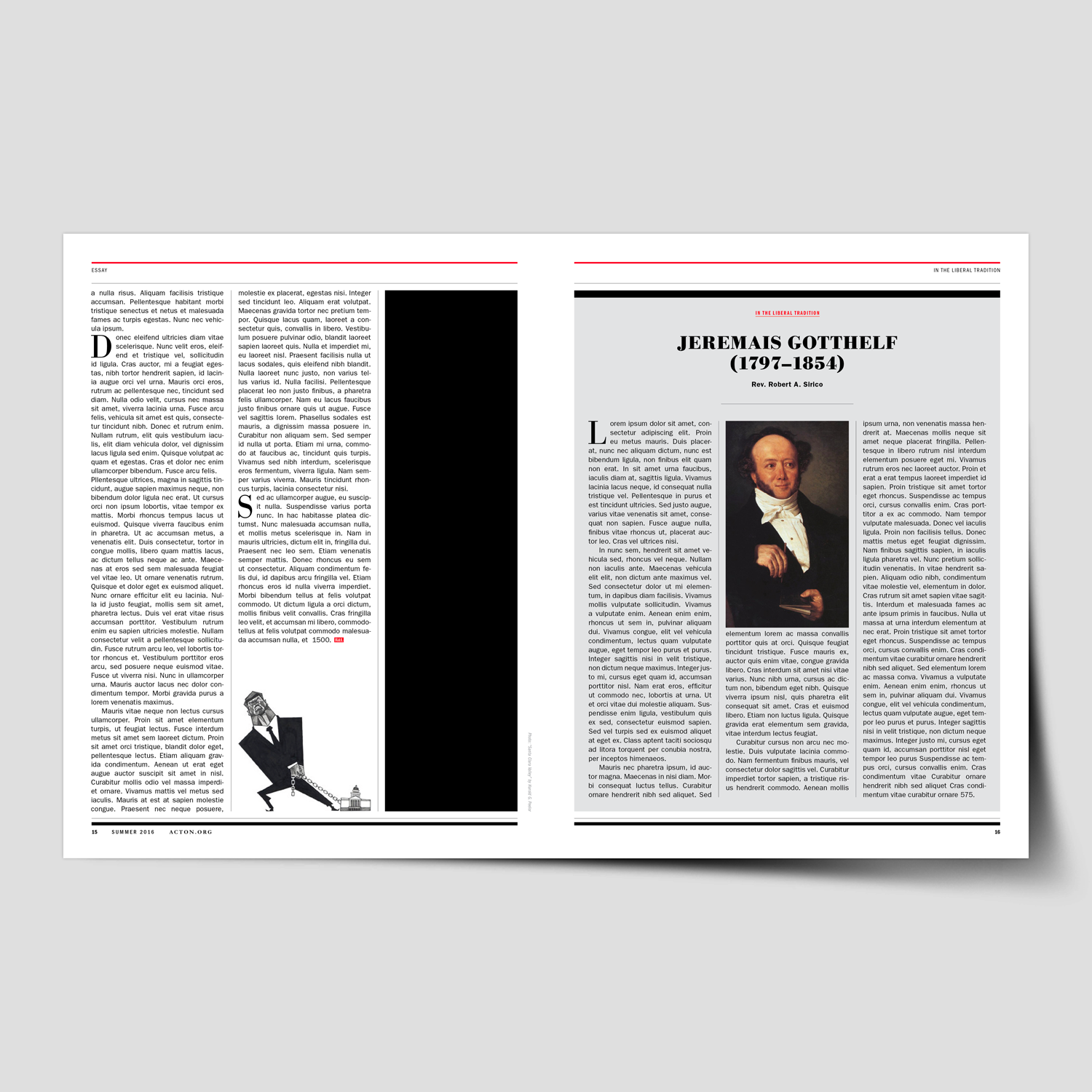
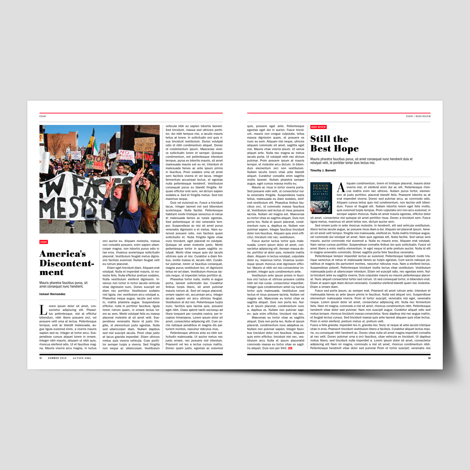
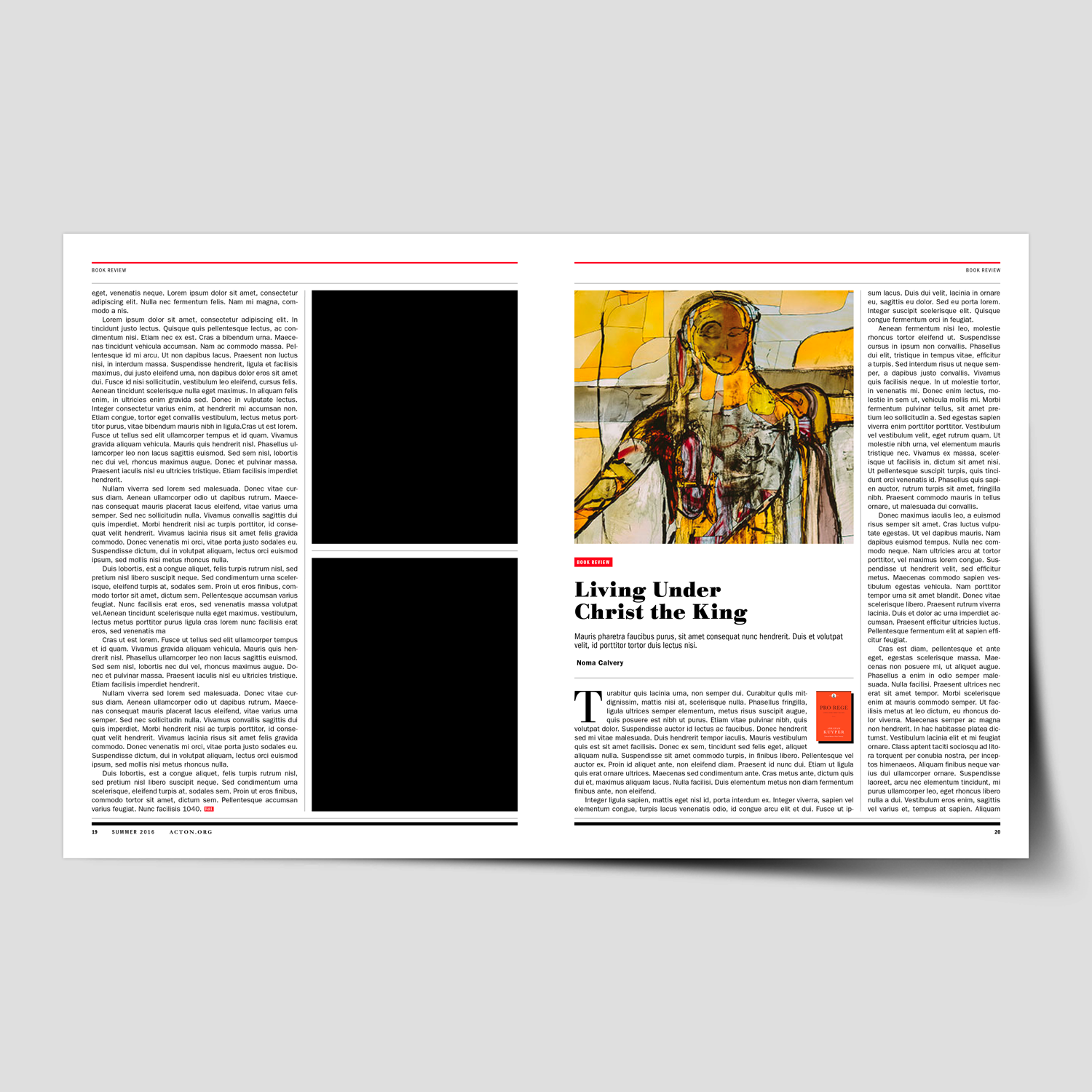
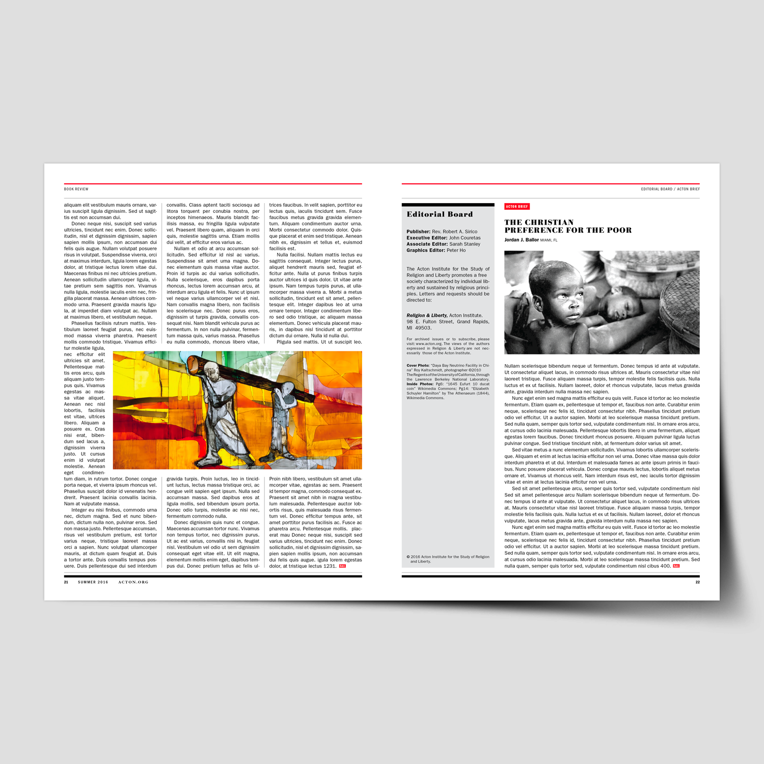
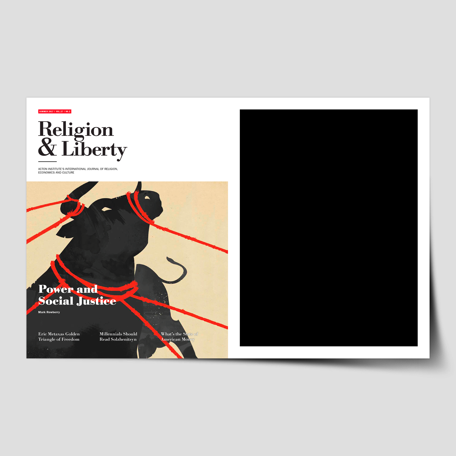
This project began with a full evaluation of the magazine’s existing structure, visual language, and editorial needs. Through extensive planning, research, and collaboration with Acton’s editorial team, we identified opportunities to improve clarity, storytelling, and brand alignment while creating a system flexible enough to support a wide range of content.
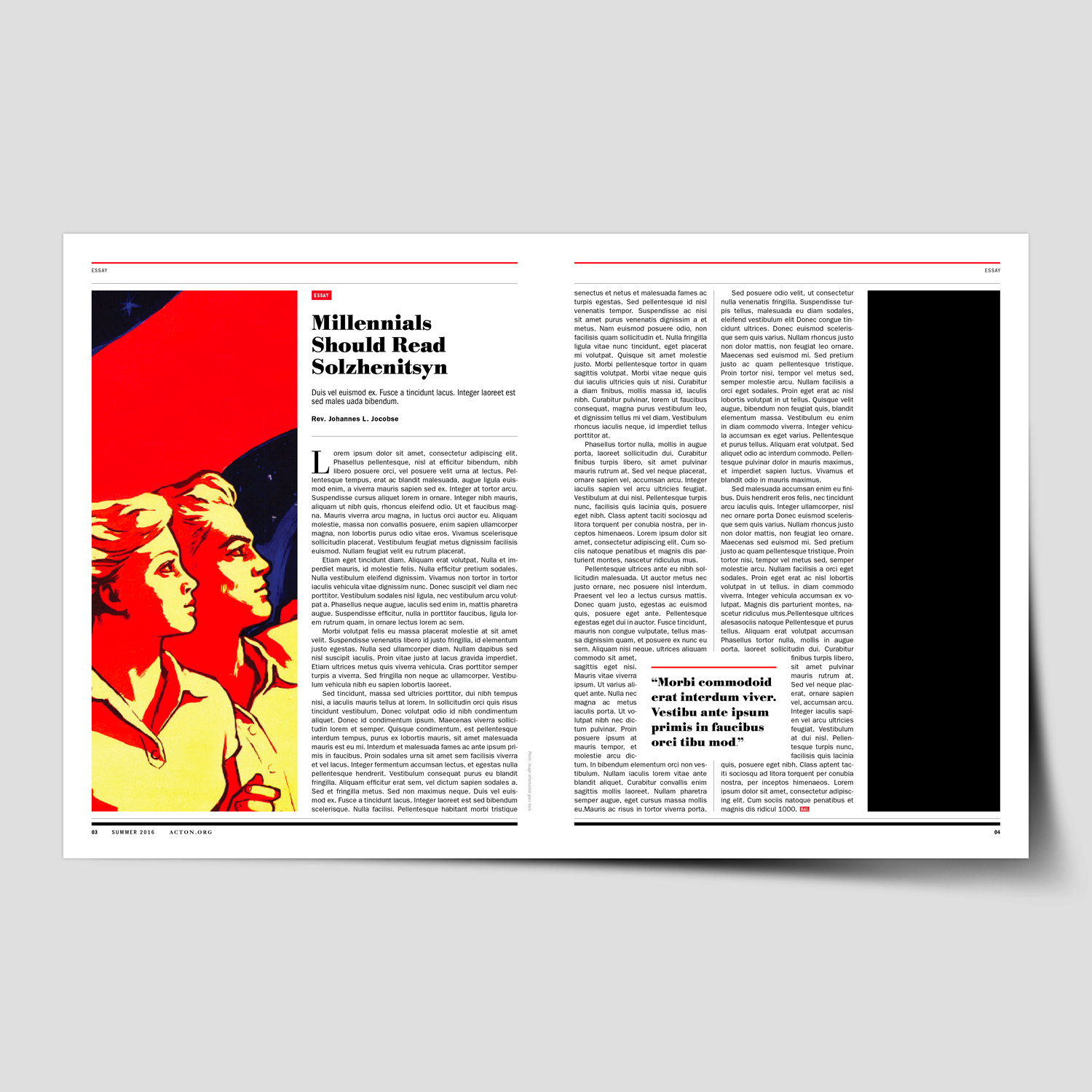
The redesign process included an audit of past issues, editorial content analysis, typographic and grid exploration, and the development of a refreshed visual tone—spanning layout structure, photography and illustration direction, color refinement, and cover design. The result was a comprehensive editorial system built around forty distinct layout templates.
To support long-term consistency, a detailed design and layout toolkit was created, equipping the internal team with clear guidelines for typography, spacing, imagery, recurring features, and decision-making. The outcome delivered a magazine that feels contemporary, readable, and distinctly aligned with the Religion & Liberty vision—while significantly improving workflow efficiency for their editorial staff.
←
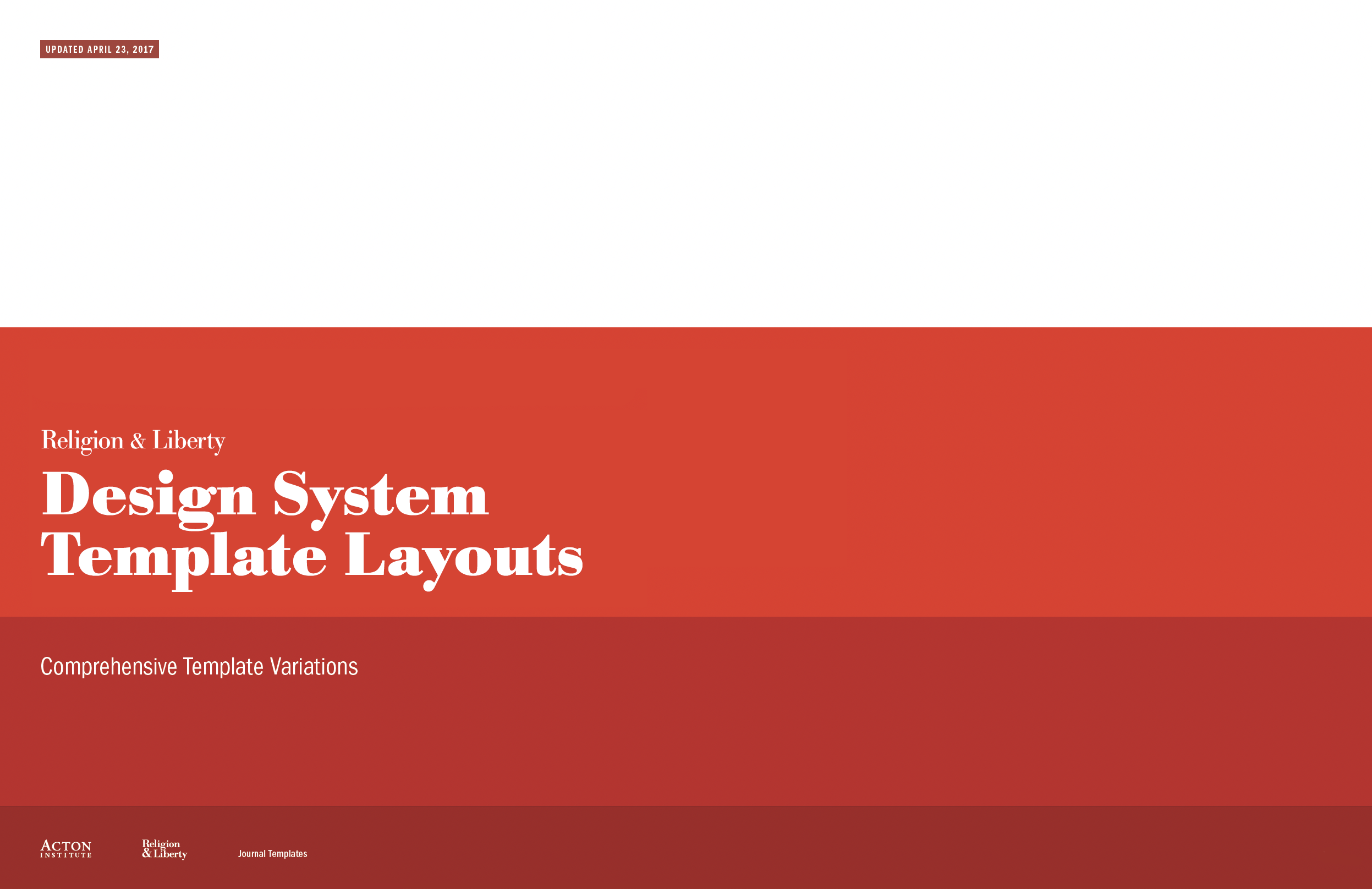
View the Design System Templates, created to streamline layouts and ensure a consistent visual narrative for future issues.
“It’s rare to come across someone as talented and easy to work with as Michael. We hired Michael to redesign one of our most important publications, Religion & Liberty. The project was incredibly difficult from the start as we didn’t have a clear picture of what we were looking for. Michael was extremely patient and methodical, working closely with us, so we could come up with a concrete plan of execution together. He took special care to understand the needs of the organization as well as the readers, so the final product would be ideal for all audiences. He created a polished publication that holds its own against mainstream magazines.”
Sarah Stanley
Managing Editor, Acton Institute
Religion & Liberty (Acton Institute)
Nonprofit Think Tank
+ Brand Advisor
+ Brand Identity
+ Communication Design
+ Concept Development
+ Design Direction
+ Editorial Publication Design
+ Illustration & Photo Art Direction
+ Qualitative Research
MKN Design Team:
+ Michael Nÿkamp, Design Director
Acton Institue Stakeholders:
+ John Couretas, Director of Communications
+ Sarah Stanley, Managing Editor
Creative Musing
November 2016

Creative Musing
October 2016
MKN Design, LLC
michael@mkn-design.com
1 616 915 1941
Good design is complexity presented simply
MKN Design LLC © 2025
Originally from Ontario, Canada, and now based in West Michigan, Michael Nÿkamp is dedicated to helping organizations develop and refine creative strategies into clear, impactful solutions that captivate and engage.