Exhibit A – Brand Identity


Client Project


Exhibit A – Brand Identity
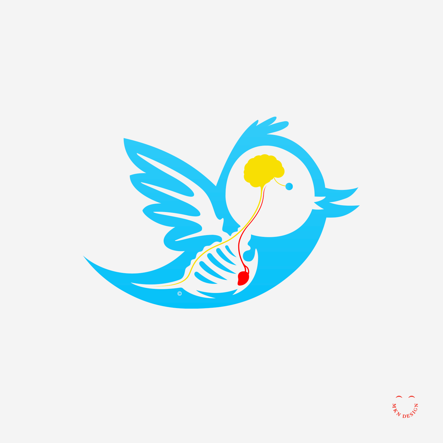
I worked with Adrian Butler [AB] to create this Pegasus for the Exhibit A brand.

Exhibit A” is an annual creative event in Grand Rapids that brings together fashion, music, and local culture in a high-energy showcase—with runway shows, DJs, designers, and other creatives collaborating on a one-night experience celebrating the city’s style and community. It’s produced by Adrian “AB” Butler, a DJ, designer, and producer, and was making a notable comeback in 2024 after not being staged since 2019.

 
  • Adrian Butler [AB]
    DJ, Designer and Musician

  • + Concept Development 
    + Sketching and Ideation
    + Illustration

  • MKN Design Team:
    + Michael Nÿkamp, Design Director

    AB Stakeholder:
    + Adrian Butler, DJ, Designer and Musician


KitchenAid – Branded Environment Graphics


Final Environment Design Concept

↓ Final Environmental Design Environment

Video: KitchenAid Environment Walkthrough

Details: KitchenAid Brand Illustrative & Product Narratives

Client Project


KitchenAid – Branded Environment Graphics

For the second consecutive year, we partnered with KitchenAid, a leader in the consumer kitchen countertop appliance sector, to translate and design their updated brand story with supporting environmental visuals and products for their annual directors’ meeting.

At this year’s meeting, KitchenAid was showcased, and we developed visuals for their updated brand messaging into an illustrative, product-focused walkthrough leading into a beautifully designed kitchen environment, highlighting their most innovative products to investors.

After meetings and a review of their brand messaging and requirements, we deconstructed each brand pillar and translated them into five distinct narratives to bring the “Do It With Me” ethos to life. Each story highlighted households preparing meals, showcasing the interaction of illustrated people with KitchenAid’s countertop appliances, cookware, and utensils in action. These narratives were then seamlessly integrated into a sixth narrative, creating a cohesive story that illustrates how KitchenAid plays a central role in bringing people together, supporting families in food preparation, and fostering meaningful experiences in the kitchen.

The final installation was a seamless blend of clean, minimalist line illustrations paired with physical KitchenAid products, effectively demonstrating how the brand serves as an ‘aid’ in everyday cooking routines. The result was a visually captivating environment that embodied KitchenAid’s brand principles and brought their message to life. This project was a collaborative effort, with the KitchenAid product and CMF teams. Concept sketches where done by Jody Williams.

 
  • KitchenAid
    Consumer Countertop Appliances

  • + Concept Development
    + Design/Art Direction
    + Illustration 
    + Narrative Storytelling
    + Print Management
    + Qualitative Research

  • MKN Design Team:
    + Michael Nÿkamp, Design Director
    + Jody Williams, Illustrator

    KitchenAid Stakeholders:
    + John McConnell, Director of Global Design
    +
    Chadwick Ries, Global Brand Director
    + Brittni Pertijs, CMF Design Manager
    + Brandon Mock, Design Manager


Tulip Festival


Creative Musing


Tulip Festival
I submitted these minimalist tulip illustrations to the Tulip Time poster competition, but they didn’t place. So, I repurposed them into mockups for the Tulip Festival at Keukenhof Gardens in Lisse, Netherlands.

Artwork Statement: Inspired by the tulip’s form, this series of minimalistic illustrations captures its beauty through three life stages: Emerge, Unveil, and Reveal. Each phase captures the tulip’s transformation using the simplicity of negative space to frame its contours. The reduction of detail allows the viewer to focus on the essence of the tulip’s appearance, revealing how it unfolds over time. Through this work, I seek to emphasize the tulip’s beauty and timeless form. The three posters can be evaluated as a series or individually considered.


Yes She Can!


Creative Musing


Yes She Can!
For Freedom.


Pixel Playoffs


Article


Pixel Playoffs
I had a fantastic time at Atomic Object for Tech Week GR last night! Comfort & Adam (comfortandadam.com) and I took part in a live head-to-head art competition, based on word prompts from the audience. The prompt we were given was: “The future is a tentacled optimistic Cheez-it.” From there we each created separate illustrations, working independently without seeing the other team’s artwork, all within three half-hour rounds.

Huge thanks to Kimberly Crawford and Brittany Hunter from Atomic Object for organizing such an awesome event for the community!


No King


Creative Musing


No King
Earthly power, at last, doth yield to death.


Multiplayer Tetris & Game Over


Product


Multiplayer Tetris & Game Over
Created these for the love of 1980’s arcade graphics. Tetris was created by Soviet software engineer Alexey Pajitnov in 1984 and was released in the United States by Atari Games in 1988.

 
  • Multiplayer Tetris & Game Over graphic tees are available for purchase on Cotton Bureau. Check out more graphic tees on my Cotton Bureau profile page. All Cotton Bureau apparel comes in a variety of clothing types, styles, fits, sizes, materials, and colors.


Strategy Requires Creativity


Article


Strategy Requires Creativity
I remember when all creative concepts were hand-drawn. I honed this skill during my college years studying illustration and design, and continue to use it to this day. Nowadays, most clients don't see my sketches, as presenting 'polished' work has become the norm. Nevertheless, my sketches are what made the project.

For me, sketching is essential for visual problem solving and connecting ideas. It continues to help me to create strong visual concepts not only requiring a skilled hand and a good eye, but also empathetic, critical, and conceptual thinking.

If you're seeking human insight, creativity, and thoughtfulness, I can help your brand craft strategic, compelling and unique solutions based on your business objectives, your brand, and your consumers.


Orb


Product


Orb
Creating a celestial feeling through experimentation with shapes, blurs, and textures.

 
  • Orb graphic tee is available for purchase on Cotton Bureau. Check out more graphic tees on my Cotton Bureau profile page. All Cotton Bureau apparel comes in a variety of clothing types, styles, fits, sizes, materials, and colors.


Anatomy of Twitter


Product


Anatomy of Twitter
I pulled this illustration from my archives (originally created in 2010). When Twitter existed before becoming 'X', the internet dubbed my illustration "The Anatomy of a Tweet." My original aim was to depict the thinking (brain) and feeling (heart) of users, highlighting the struggle to balance logic and emotion tweets.

 
  • Anatomy of Twitter graphic tee is available for purchase on Cotton Bureau. Check out more graphic tees on my Cotton Bureau profile page. All Cotton Bureau apparel comes in a variety of clothing types, styles, fits, sizes, materials, and colors.


Zero/One & Ninety-Nine


Creative Musing + Product


Zero/One & Ninety-Nine
These numbers were my favorites growing up. Zero/One (or 10) is from the Dodge Charger that Bo and Luke drove on, Dukes of Hazzard. Ninety-nine of course came from my favorite hockey player, Wayne Gretzky who played for the Edmonton Oilers from 1979–1988.

 
  • Zero/One & Ninety-Nine graphic tees shown in this post are available for purchase on Cotton Bureau. Check out more graphic tees on my Cotton Bureau profile page. All Cotton Bureau apparel comes in a variety of clothing types, styles, fits, sizes, materials, and colors.

  • The numbers featured on these tee graphics come from a display typeface I designed. It’s available for purchase, view Sum here.


Super Phat


Product


Super Phat
A design exploration to find a typeface that embodies “Super Phat”. I believe I choose right. The typeface I used is Sutturah designed by Octavio Pardo from Rosetta Type Foundry.


Hen & Egg


Creative Musing


Hen & Egg
Plutarch posed the question as a philosophical matter in his essay "The Symposiacs", written in the 1st century, "Which came first: the hen (chicken) or the egg?"


Mellow Yellow


Product


Mellow Yellow
Inspiration for this type treatment from the song Mellow Yellow by Donovan. The typeface is Lust Script designed by Neil Summerour from Positype.


Earth Killer


Product


Earth Killer
The oil and manufacturing industries are significant contributors to environmental pollution, earning them the label "Earth Killer." These industries release vast amounts of greenhouse gases, toxic chemicals, and particulate matter into the atmosphere, leading to severe air and water pollution.


Out of Order


Product


Out of Order
This country, known to the world as a shining light of democracy, is quickly becoming very polarized in every aspect of our lives, from divisions in politics, policies and greed.

 
  • Out of Order graphic tee is available for purchase. Check out more graphic tees on my Cotton Bureau profile page. All Cotton Bureau apparel comes in a variety of clothing types, styles, fits, sizes, materials, and colors.


America’s Obsession


Article


America’s Obsession
I often explore national and political perspectives through iconic symbolism. The diptych, titled "America's Obsession," delves into the complex and often contentious relationship between firearms and the American flag.

This diptych highlights the historical ties and ongoing debates surrounding firearms in the U.S., emphasizing how deeply entrenched this issue is in the nation's identity. The title hints at a critical viewpoint, suggesting that the country's focus on guns has surpassed mere heritage or rights, evolving into an obsession. Though the two panels are physically separated, the symbolic reach of the bullet extends to the flag, that have replaced the stars with bullet holes.

The artwork invites viewers to contemplate the implications of this obsession and its effect on the nation's identity.


Visser Automotive – Brand Identity


Client Project


Visser Automotive – Brand Identity
Visser Automotive is a well-established auto repair shop in Waterford, Ontario, Canada, recognized for delivering reliable service with speed, fairness, and consistency. The brand identity was designed to reflect trust, craftsmanship, and approachability—core values of the business. The mark is paired with Sneaker, designed by Neil Summerour of Positype., chosen for its sturdy letterforms and friendly tone, which complement the shop’s hands-on expertise and customer-focused reputation.

 
  • Visser Automotive
    Vehicle Repair Auto Shop

  • + Brand Advisor
    + Concept Development
    + Creative Strategy
    + Design Direction
    + Qualitative Research
    + Visual Identity

  • MKN Design Team:
    + Michael Nÿkamp, Design Director

    Visser Automotive Stakeholder:
    + Randy & Grace Visser Family, Owners


January Series – Brand Strategy Messaging


Client Project


January Series – Brand Strategy Messaging
For nearly 40 years, the January Series has inspired and informed audiences from diverse backgrounds. This free, 10-day event features a lineup of brilliant speakers, captivating topics, and thought-provoking discussions. Prominent academics, educators, artists, activists, and other experts deliver engaging lectures on a range of timely issues. Attendees can participate in person at Calvin University in Grand Rapids, Michigan, or access the series online from anywhere in the world, both live and on-demand throughout the year.

Together with freelance copywriter Adam Barr, I guided the January Series in aligning their vision with cohesive brand messaging. Through in-depth stakeholder interviews, we distilled key insights to establish a solid foundation, shaping the brand’s tone and defining its voice. As we progressed, we posed additional thoughtful questions and refined messaging through an iterative approach, resulting in comprehensive guidelines. These guidelines will support the brand in navigating, cultivating, and communicating a unified voice across all touchpoints, fostering a coherent connection with audiences, communities, and potential attendees.

 
  • The January Series

  • + Brand Advisor
    + Brand Messaging
    + Copywriting
    + Design Direction
    + Qualitative Research
    + User Interviews

  • MKN Design Team:
    + Michael Nÿkamp, Design Director
    + Adam Barr, Copywriter

    January Series Stakeholders:
    + Michael Wwildschut, Director
    + Emily Dock, Assistant Director