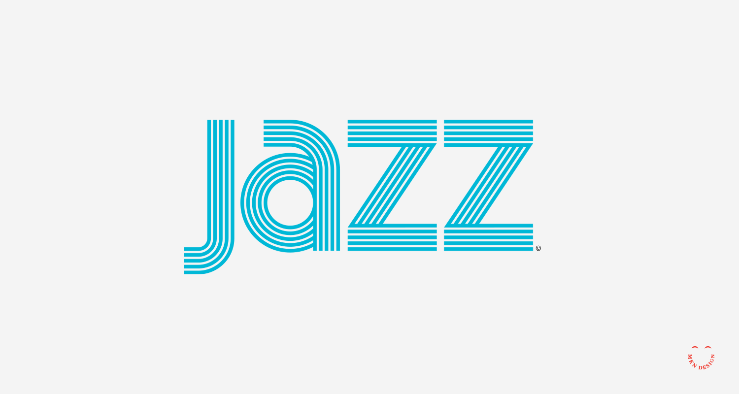
Creative Musing
Creative Musing


Product
Holiday Stroll is currently unavailable for purchase. Please check back after Thanksgiving 2024. Check out more graphic tees on my Cotton Bureau profile page. All Cotton Bureau apparel comes in a variety of clothing types, styles, fits, sizes, materials, and colors.

Article + Creative Musing
Product
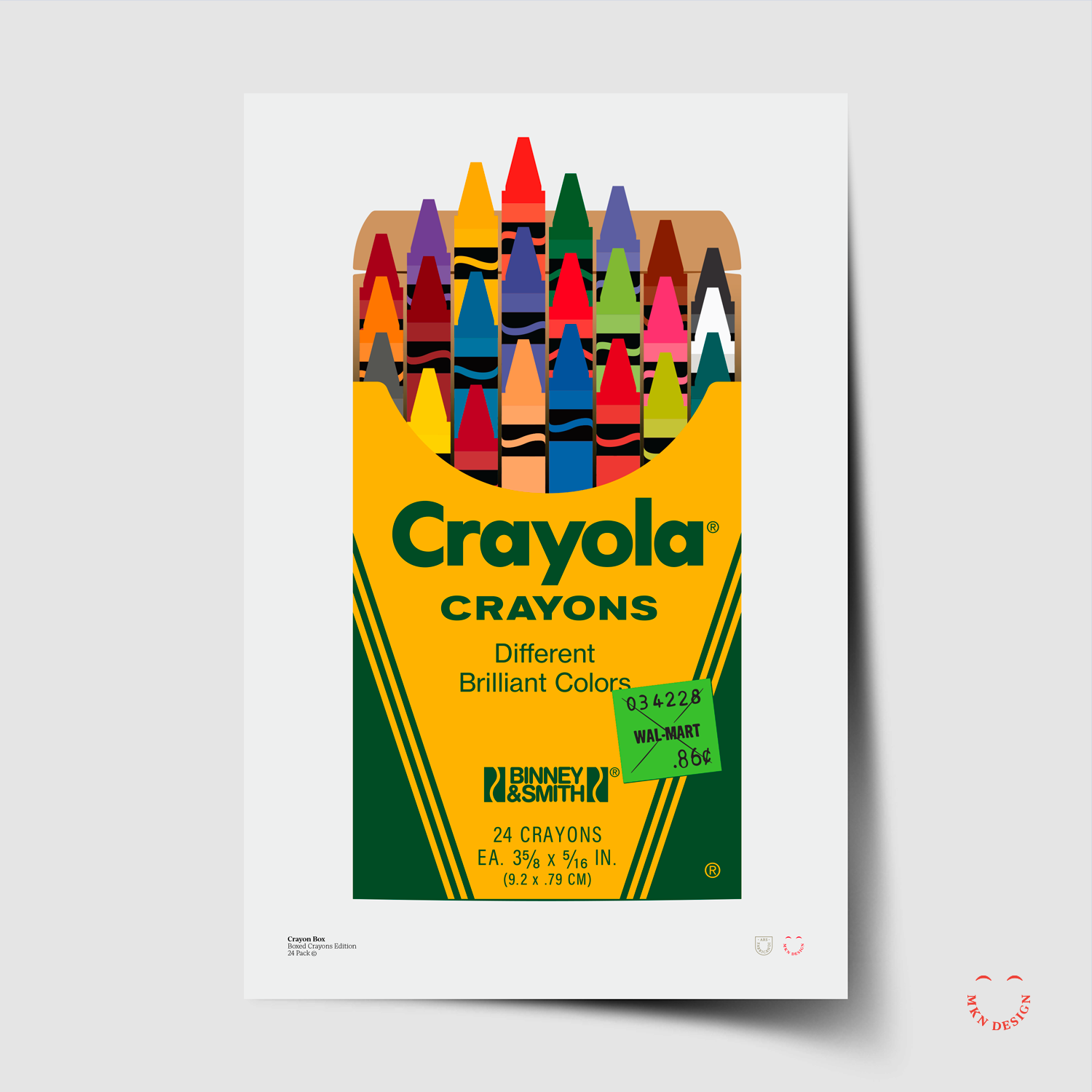
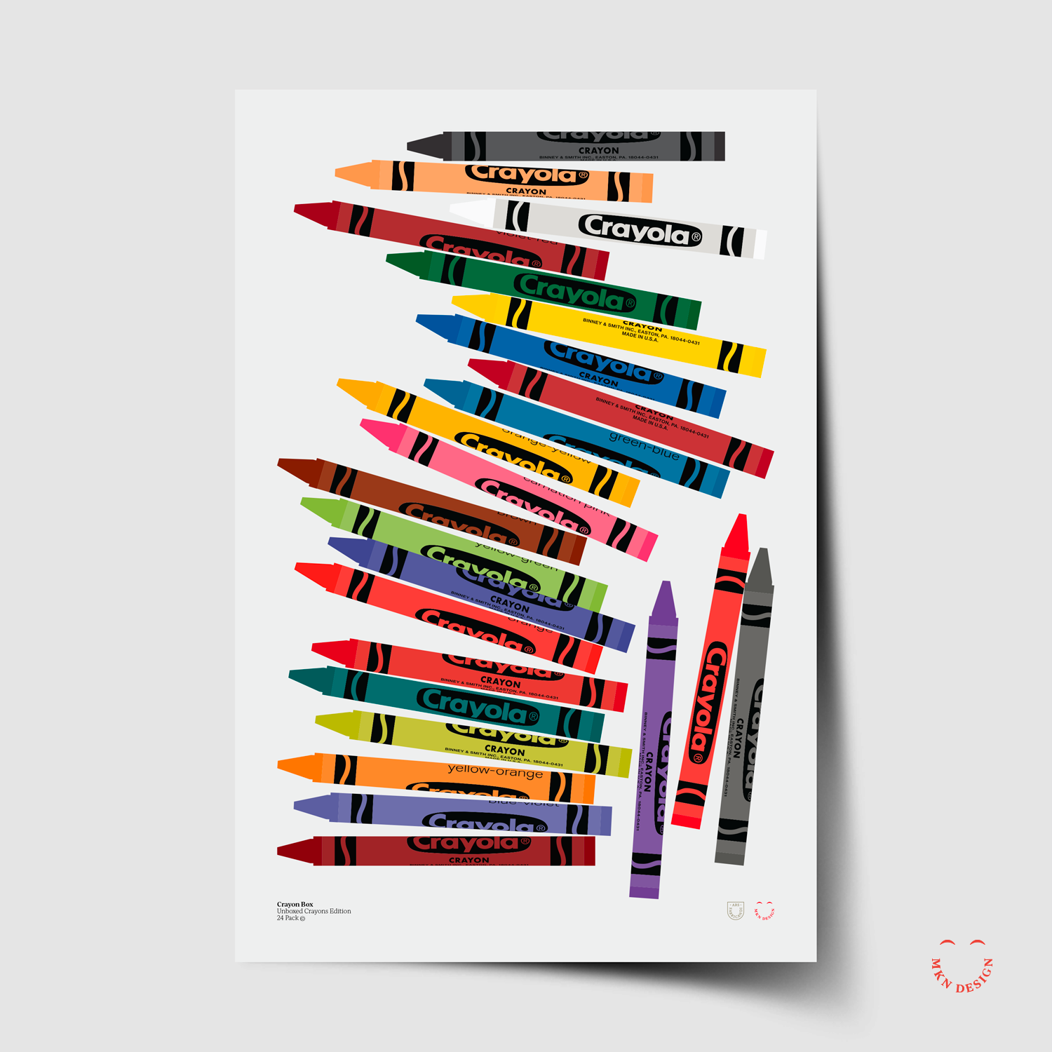
Unfortunately, I was unable to obtain a license from Crayola to sell these vibrant illustrative posters.
Product
Skull & Bones (top right tee) is the only available tee in this series to purchase (check back in early October 2024 to purchase the others). Peruse more graphic tees on my Cotton Bureau profile page. All Cotton Bureau apparel comes in a variety of clothing types, styles, fits, sizes, materials, and colors.

Product
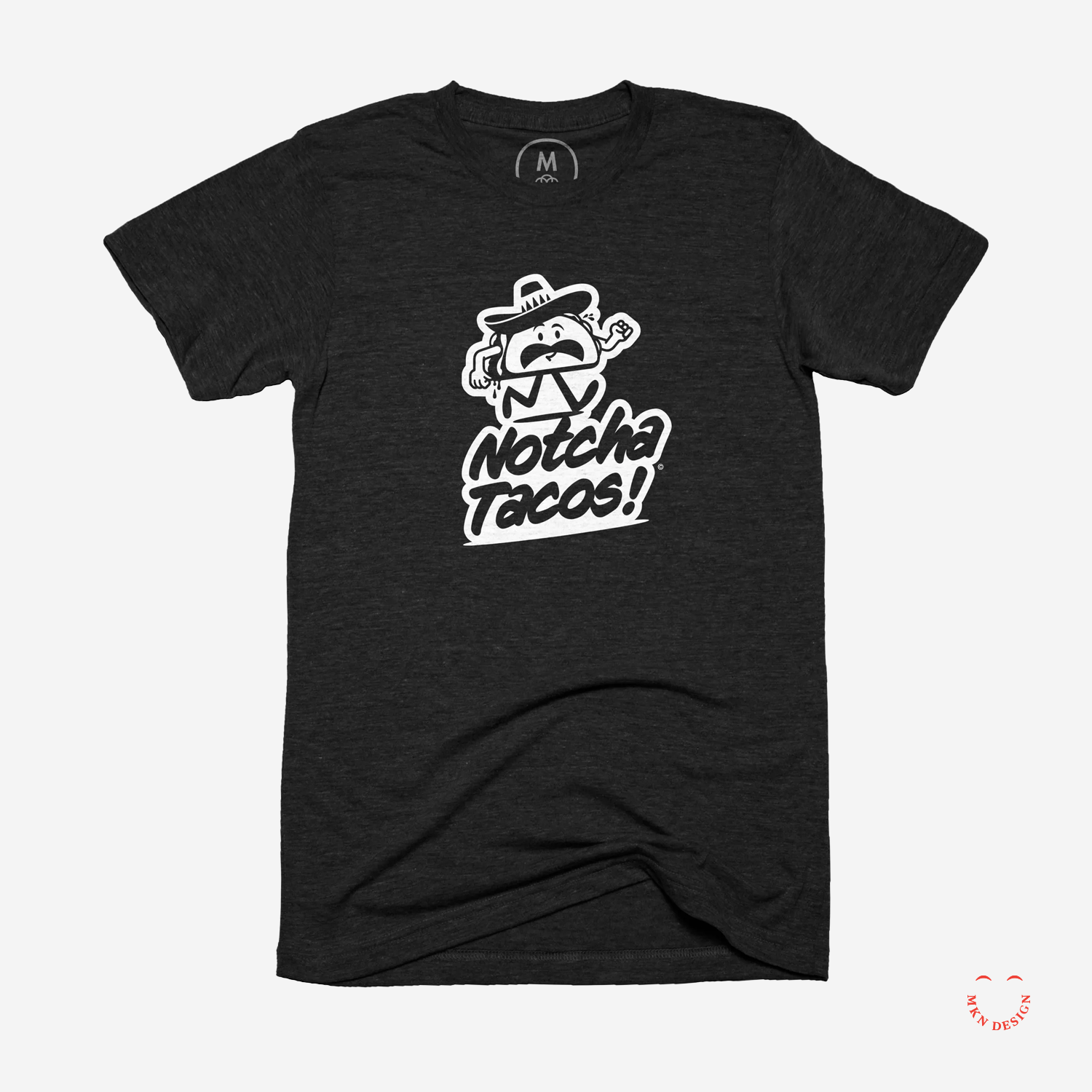
Notcha Tacos graphic tee is available for purchase. Check out more graphic tees on my Cotton Bureau profile page. All Cotton Bureau apparel comes in a variety of clothing types, styles, fits, sizes, materials, and colors.
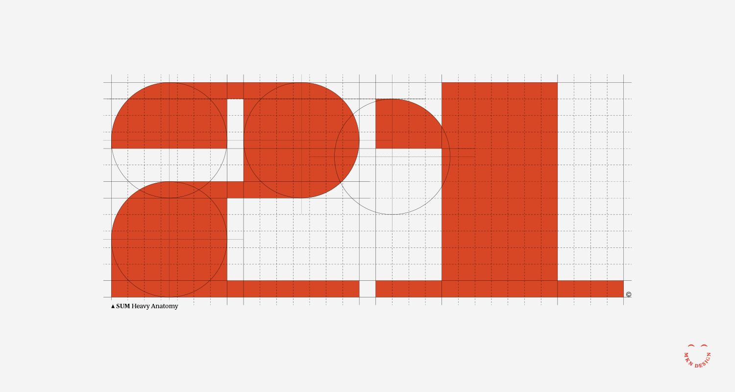
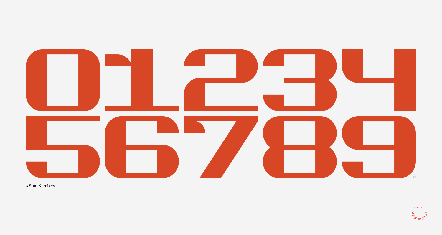
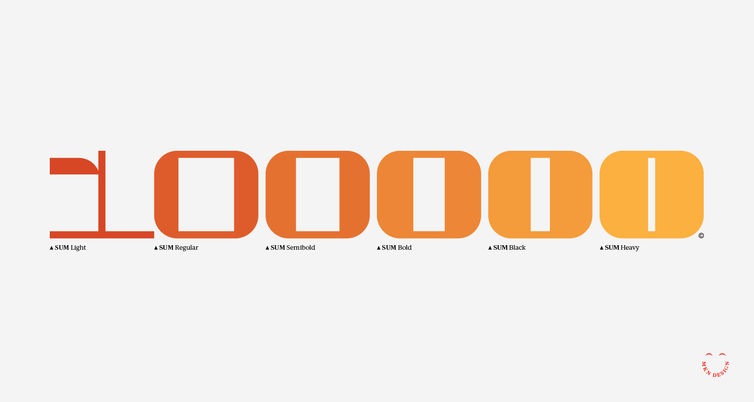
Product
Sum is available for purchase. Email me for licensing and cost.
Article + Client Project
The design and illustrative projects within this reel are a combination of strategic branding, environmental design, iconography, illustration, graphic design, and packaging.

Creative Musing

Client Project
Peopledesign
Branding Agency
+ Concept Development
+ Design & Layout
+ Illustration
+ Sketching & Ideation
+ Qualitative Research
MKN Design Team:
+ Michael Nÿkamp, Graphic Designer & Illustrator
Peopledesign Stakeholder:
+ Yang Kim, Principal and Executive Creative Director

Creative Musing


Client Project
Navigator had a few distinctive design challenges that required resolution:
1. Develop a logo that intuitively feels like a driving academy without feeling or stating it's a driving academy.
2. Logo to be perceived as trustworthy, safe, and exceptional to parents (core audience), but also conveys a cool factor for teen student drivers (secondary audience).
3. By law, driving academy vehicles are legally required to have ‘student driver’ signage on their vehicles. This is typically resolved with magnetic ‘student driver’ signs prone to slipping or peeling. A solution was needed to seamlessly integrate Navigator's logo with the required signage—ensuring a purposeful design rather than an afterthought, enhancing both safety and branding.
The final combined logo for Navigator successfully tackled every design challenge with a bold, attention-grabbing appearance. It seamlessly integrated the student driver sign by utilizing a vehicle wrap, ensuring a cohesive and visually striking solution.
Navigator Driving Academy
Education & Vocational Training
+ Brand Advisor
+ Concept Development
+ Creative Assets
+ Design Direction
+ Qualitative Research
+ Visual Identity
+ Vehicle Wrap
MKN Design Team:
+ Michael Nÿkamp, Design Director
Navigator Stakeholder:
+ Musil Family, Owners & Operators
Creative Musing
Photo of Louis Armstrong, 1953. Library of Congress Prints and Photographs Division Washington, D.C.
Creative Musing
Client Project
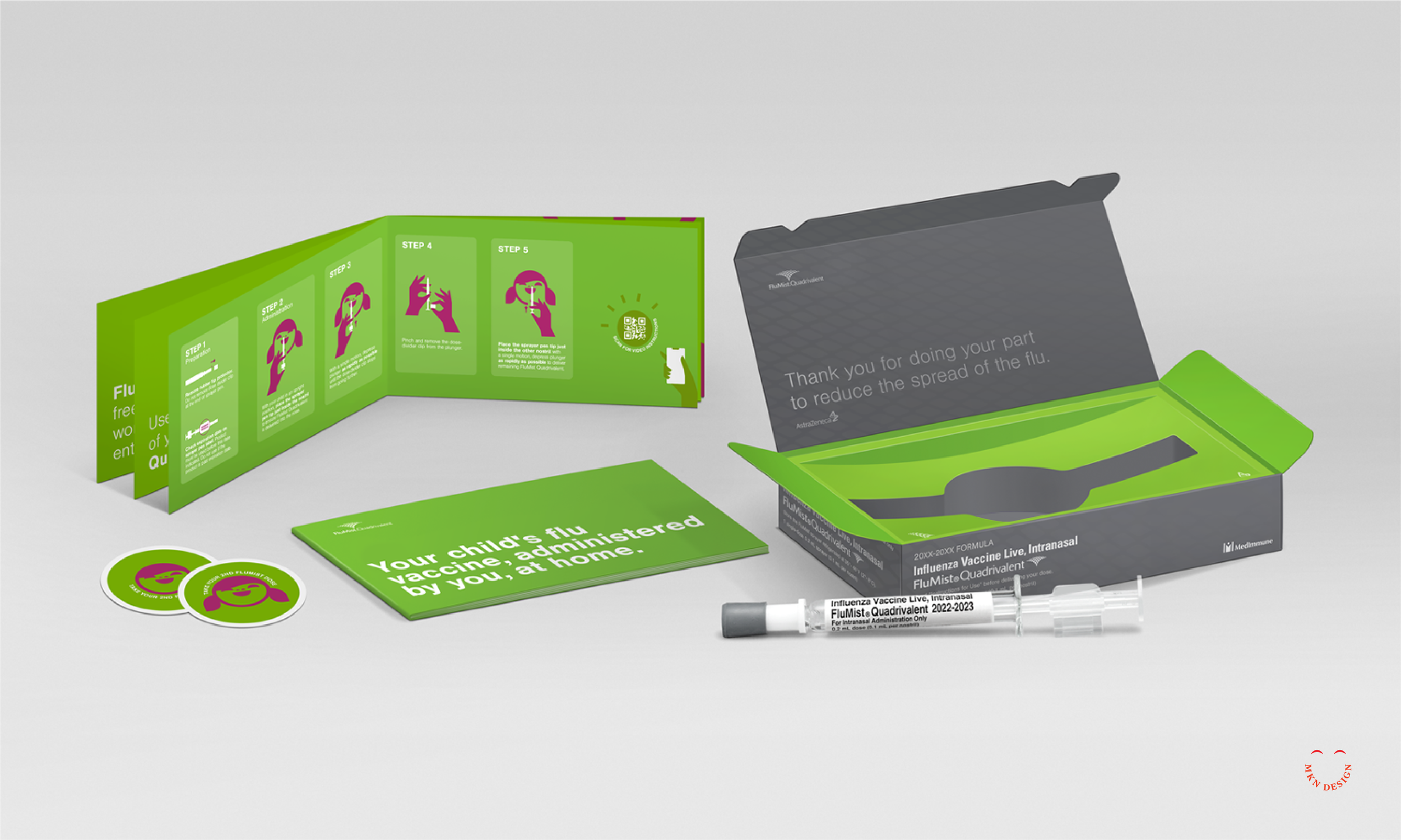
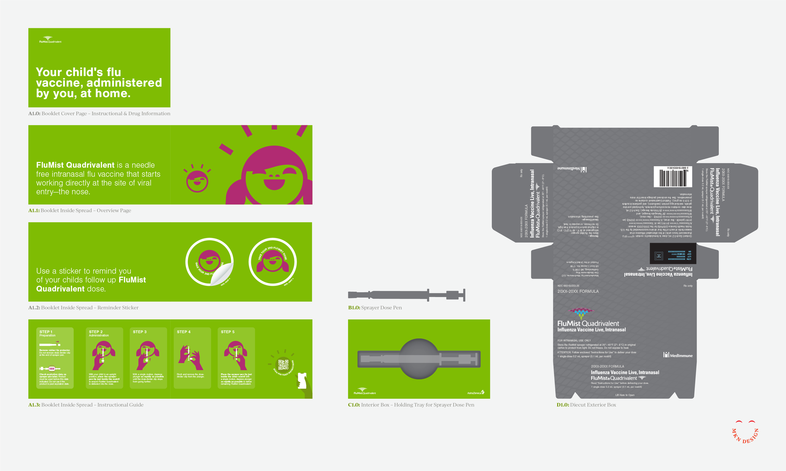
Given the innovative delivery method—a single-dose nasal spray rather than a traditional needle—this project also demanded a creative approach to the visual design and unboxing experience. Our design approach was dual- focused, targeting both parents and children and included exterior and interior design considerations.
The system included a clear visual guide for administering the dose, reminder stickers, and the physical dose mechanism, all designed to work cohesively within the overall experience.
To achieve an approachable, refined, and safe feel for the design and unboxing experience, we incorporated the brand’s vibrant color palette, friendly typography, and playful illustrations. Our goal was to instill a sense of trustworthiness, friendliness, and clarity in both the exterior and interior packaging while ensuring all strict FDA packaging regulations were prominently displayed. This approach created an unboxing experience that was engaging, clear, and professional, balancing approachability and safety.
Successful packaging begins with a deep understanding of who it’s being designed for, guiding both the visual direction and overall strategy. Equally important is having the expertise to design and develop physical mock-ups, which help identify structural requirements and limitations before applying the visual design. Creating these mock-ups further strengthens the process by providing real-world insight into how the structure, materials, and design elements work together. This ensures that the visual and structural components align seamlessly with the overall design goals, especially within strict pharmaceutical guidelines.
AstraZeneca
Pharmaceuticals & Biotechnology
+ Communication Design
+ Concept Development
+ Creative Assets
+ Instructional Illustration
+ Physical Prototyping
+ Photoshop & Physical Mockups
+ Qualitative Research
+ Unboxing Experience
MKN Design Team:
+ Michael Nÿkamp, Graphic Designer and Illustrator
VML Stakeholder:
+ David Swearingen, Group Design Director
+ AstraZeneca, FluMist Marketing Department
Creative Musing
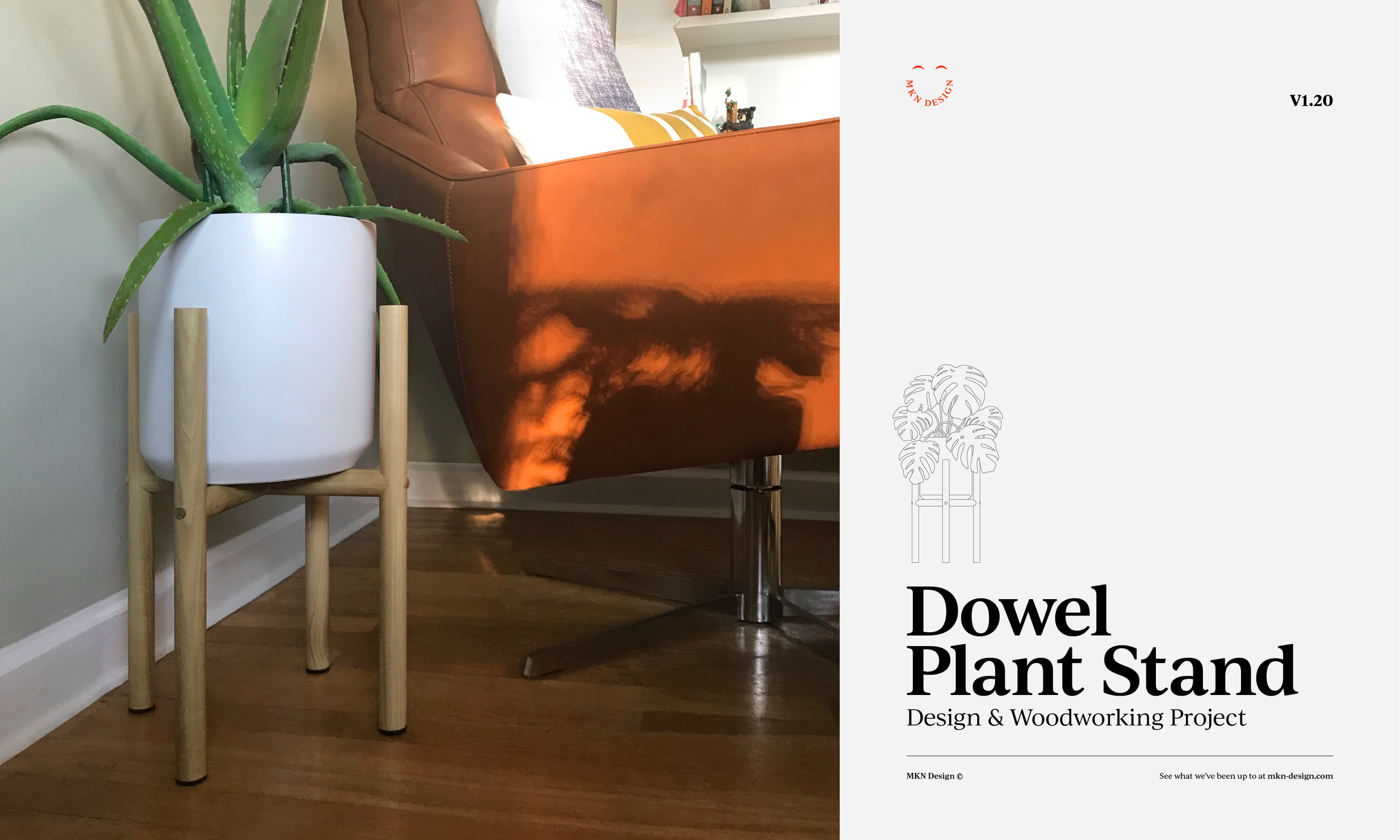
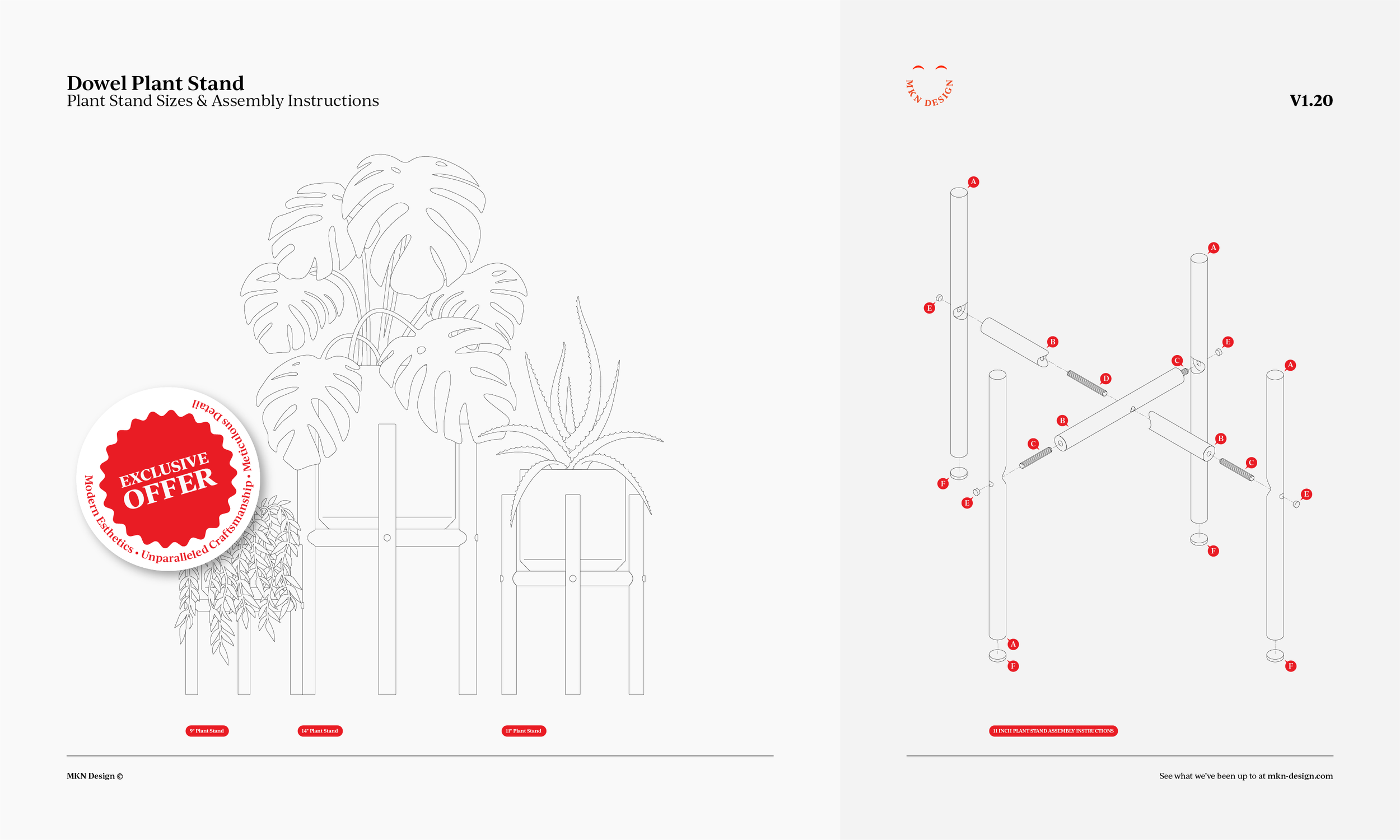
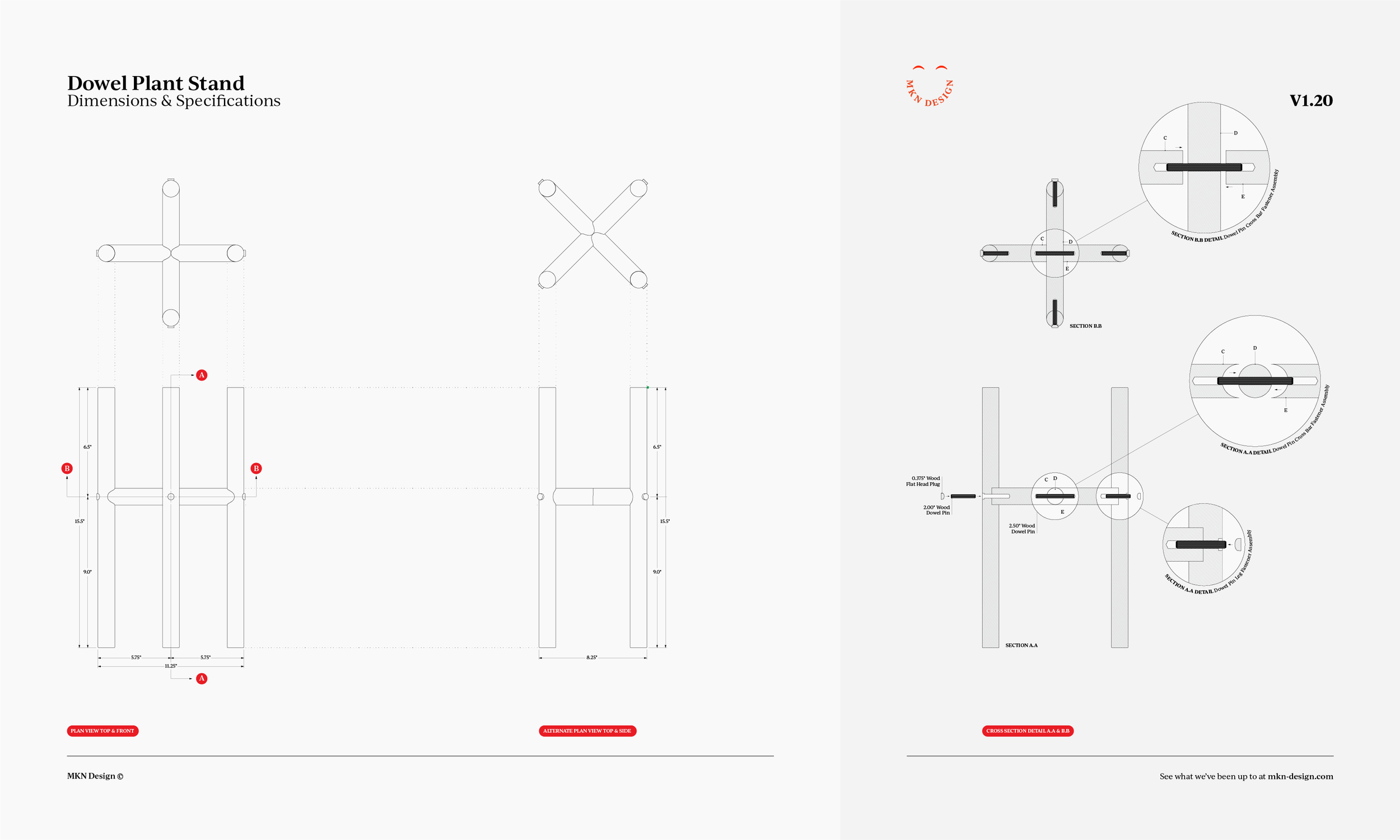
These plans are available to purchase, email me for cost.

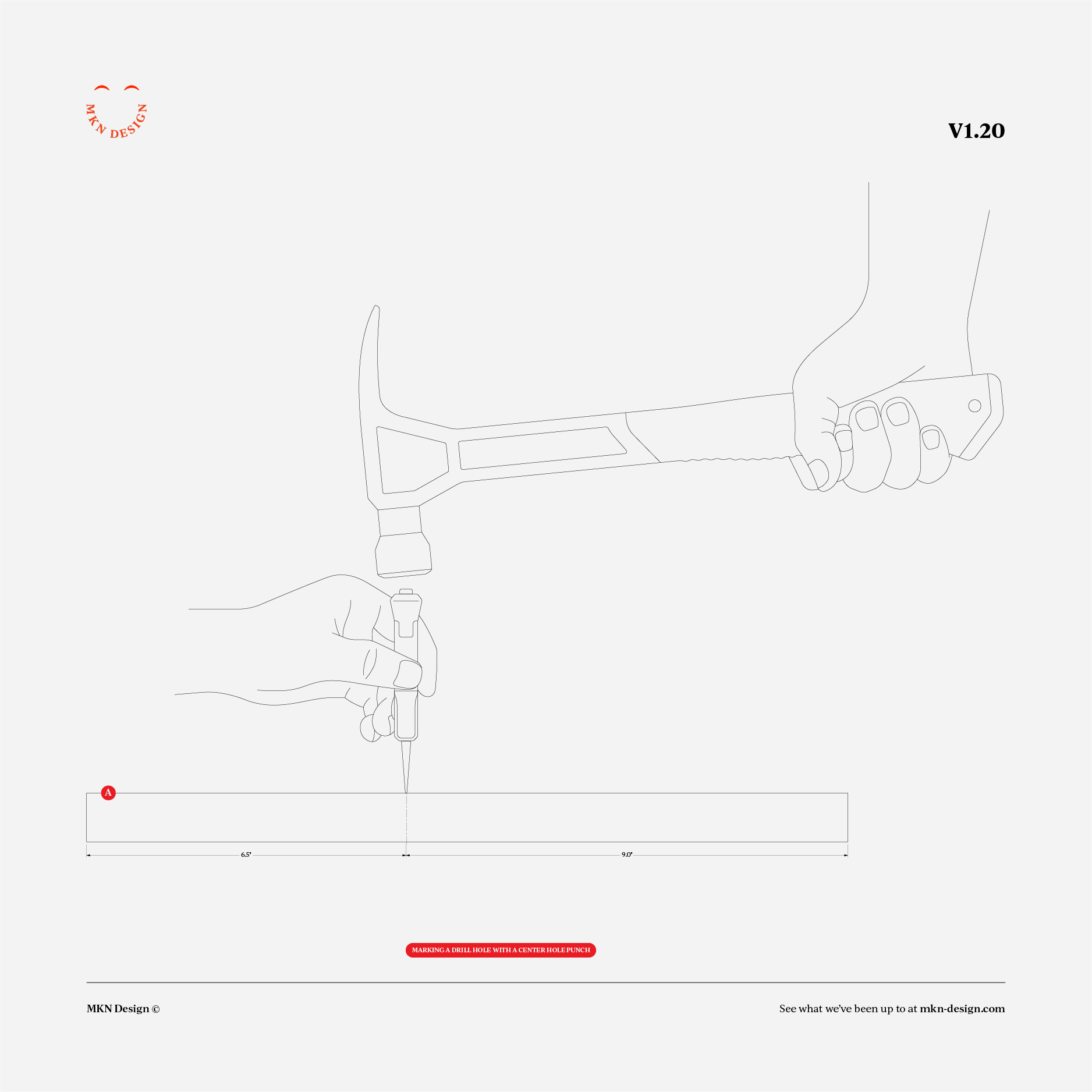
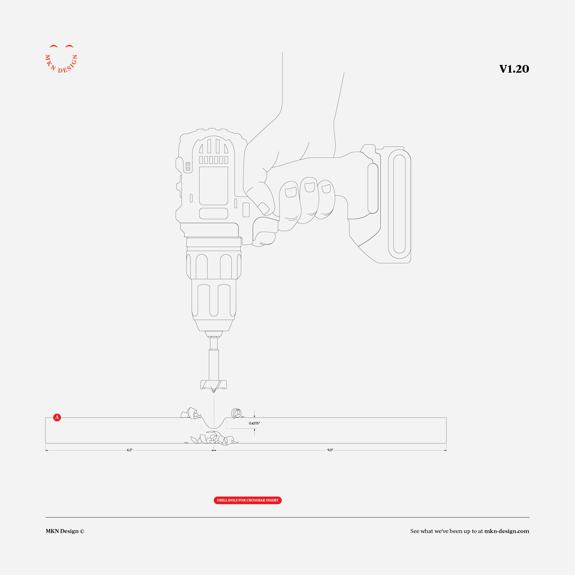
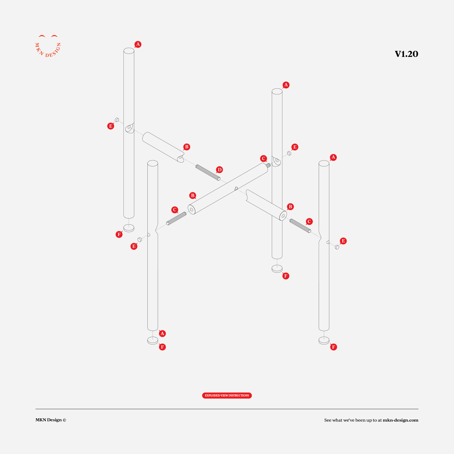
Creative Musing
Creative Musing
Client Project
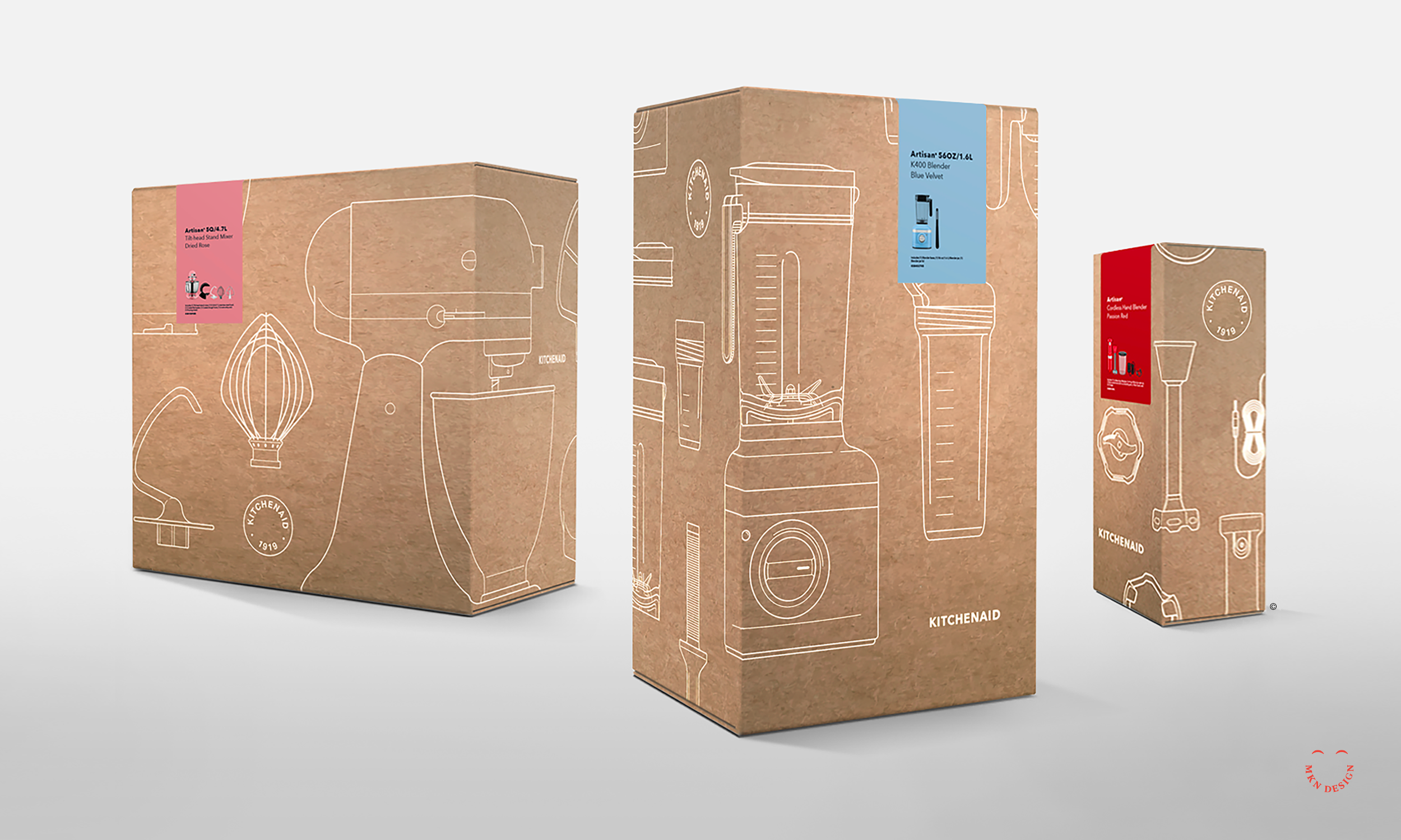
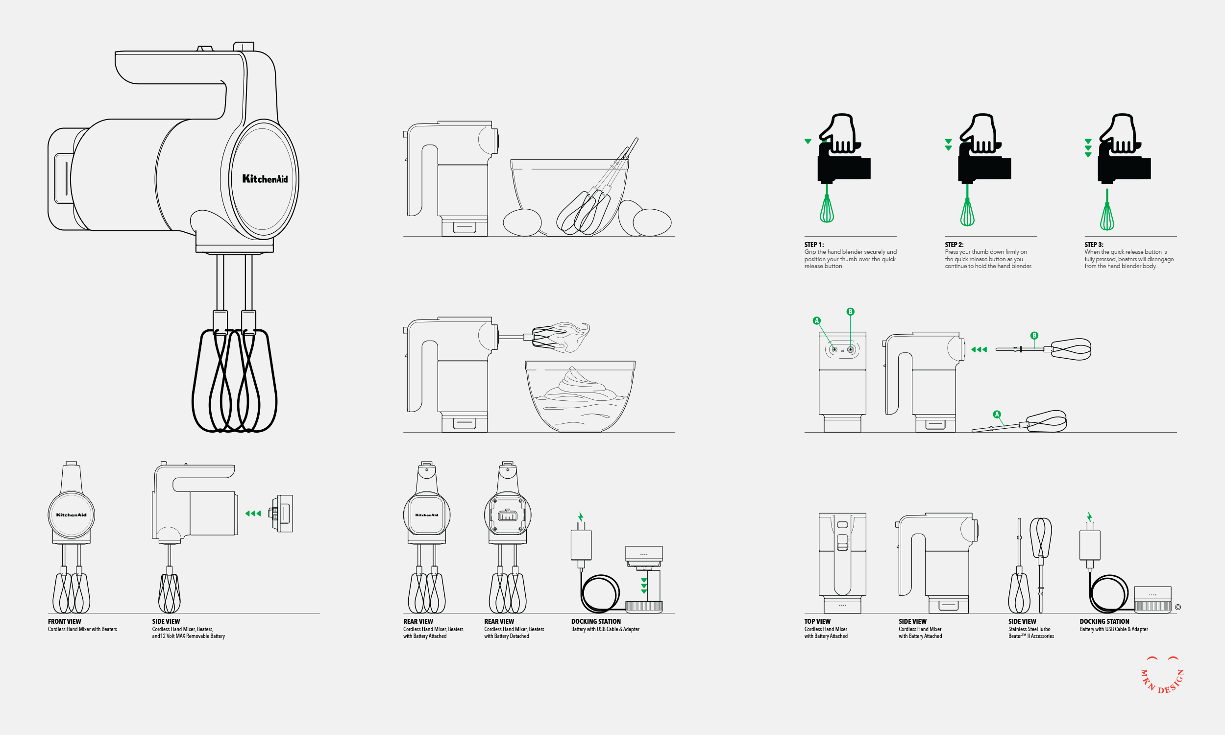
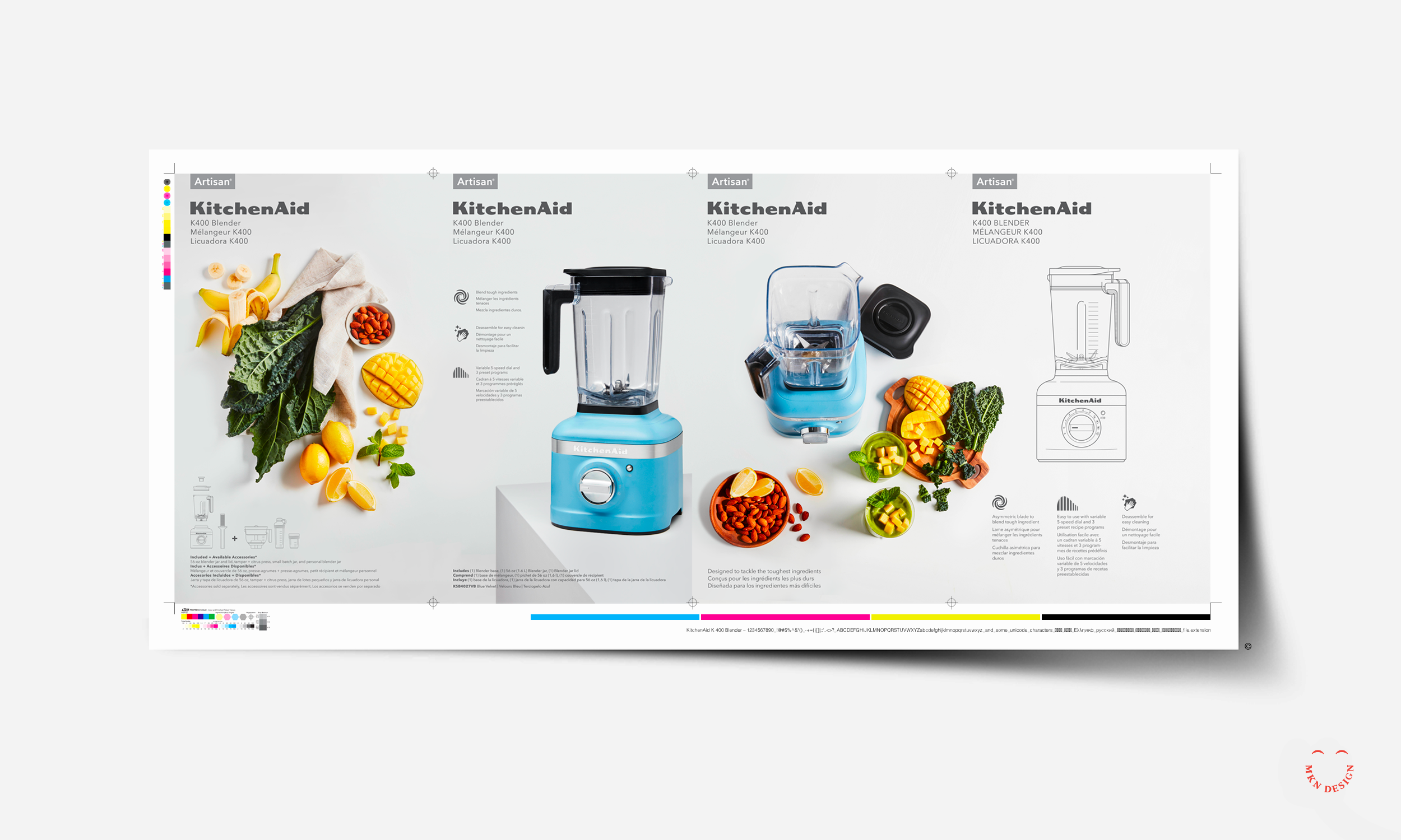
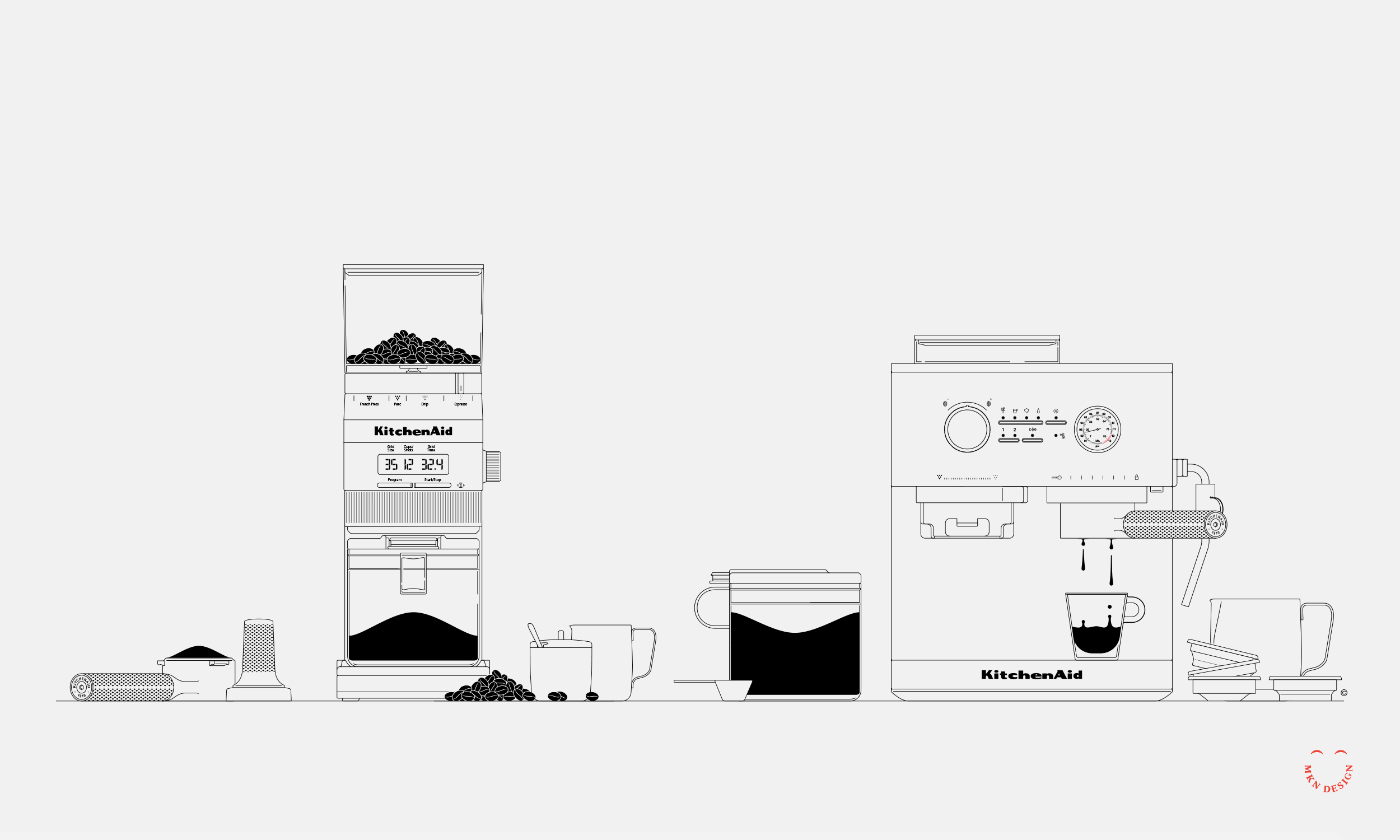
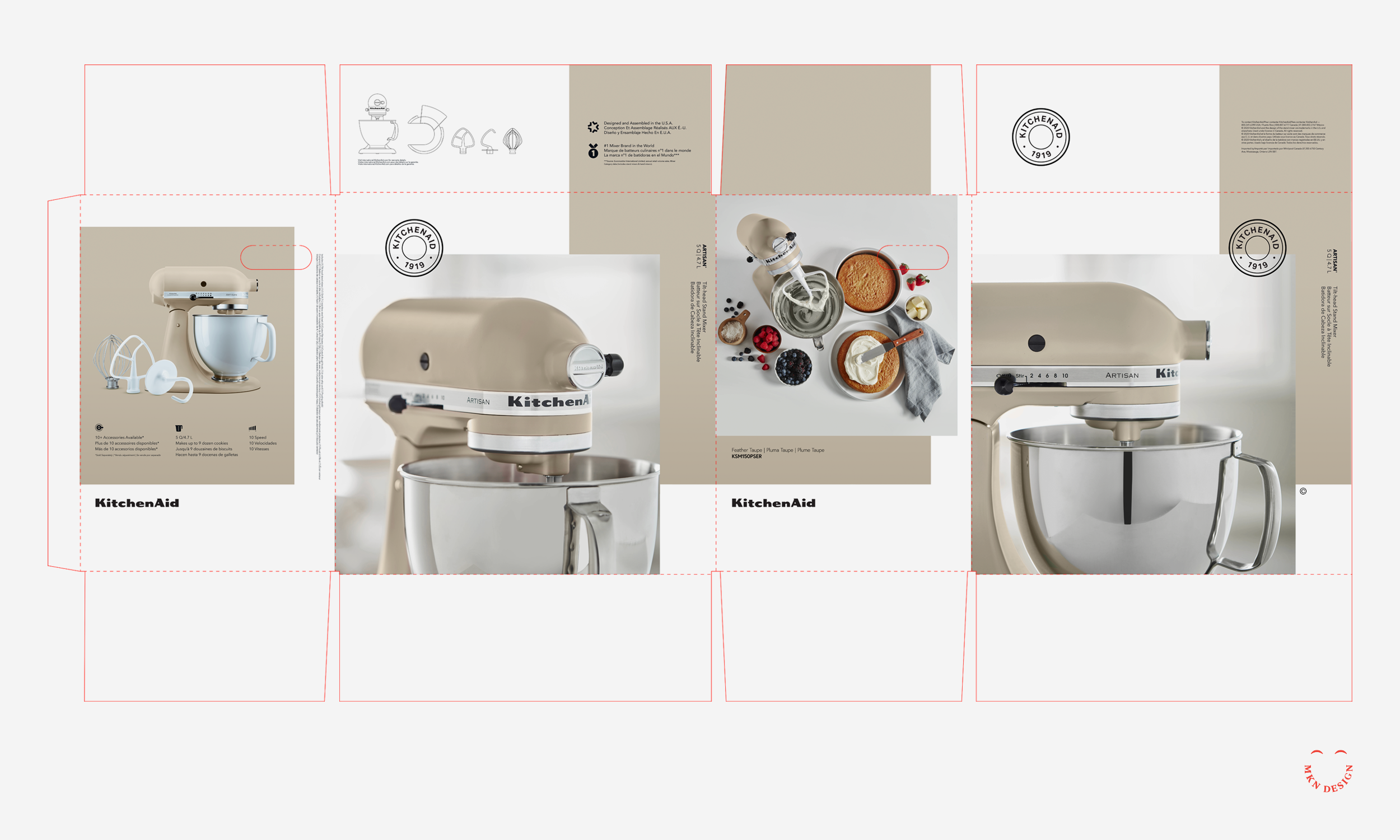
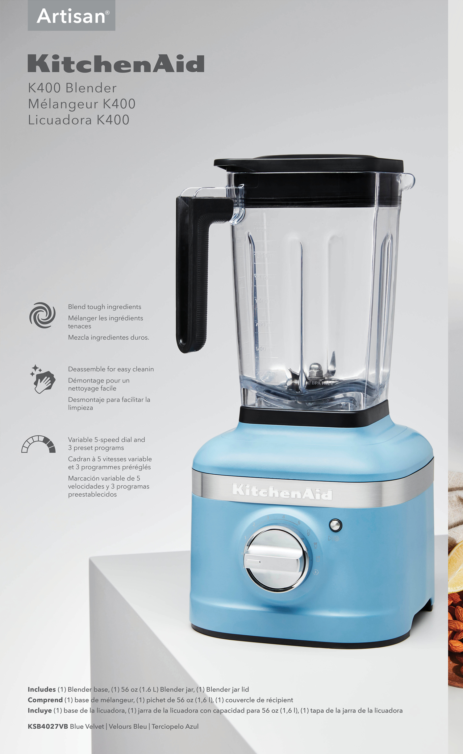
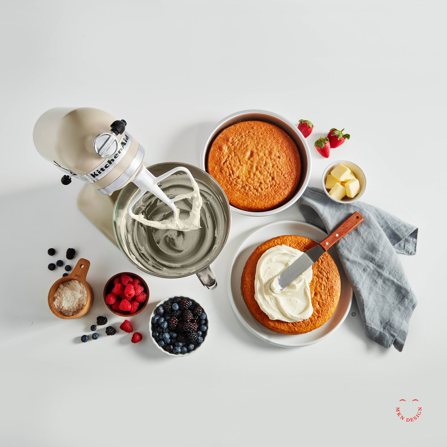
Building on research and consumer insights from the first phase, we developed a clear design strategy to guide multiple packaging concepts—showcasing KitchenAid’s products as innovative, high-quality, and reinforcing the brand’s position as a leader in kitchen appliances.
When we audited the existing packaging, it became evident that it no longer reflected the expectations of today’s consumers or the evolution of KitchenAid’s products. In a market moving toward bold simplicity, clean visual storytelling, and modern minimalism, the packaging appeared dark, cluttered, and outdated.
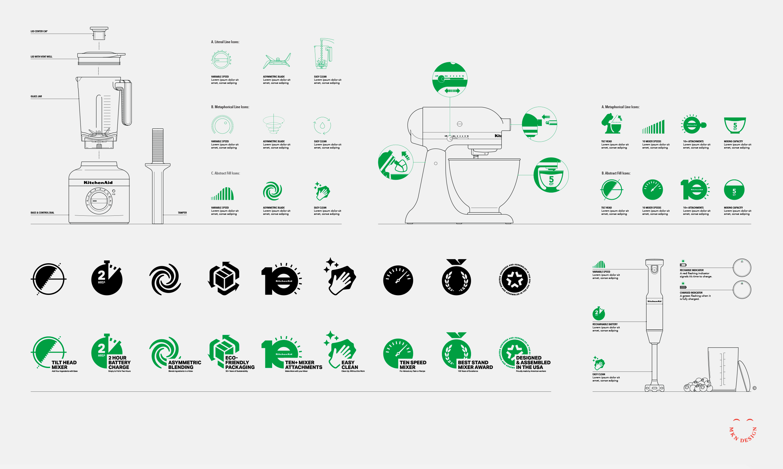
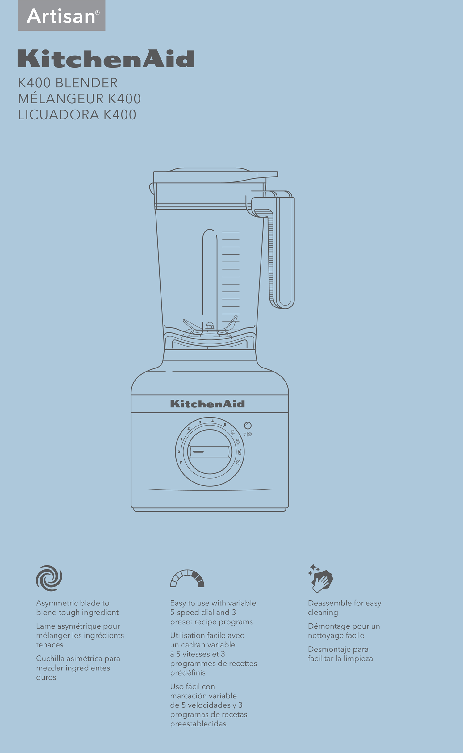
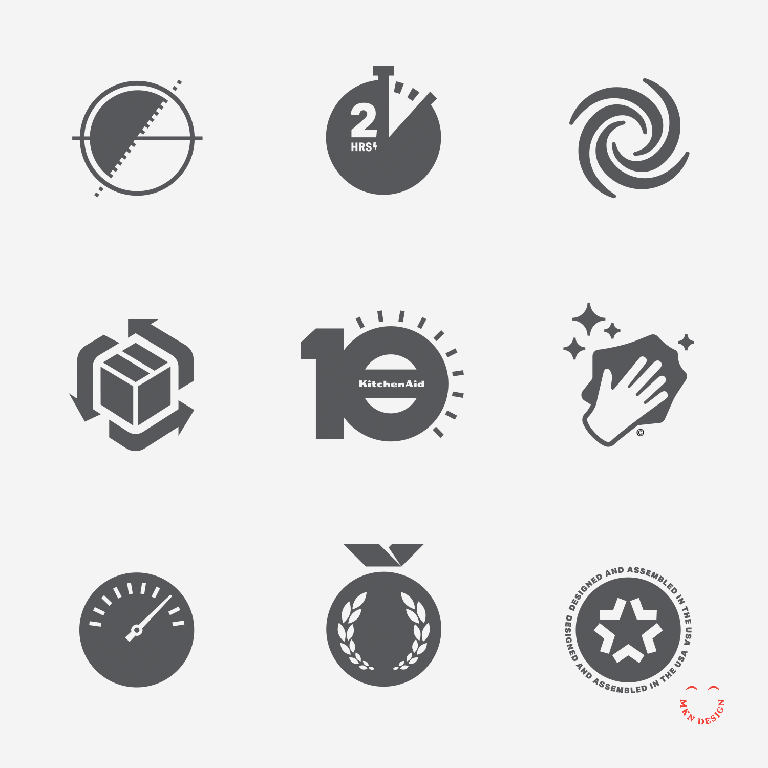
The design challenge was clear—reimagine the packaging in a way that honored KitchenAid’s heritage, spoke directly to today’s consumers, and embraced a modern visual language. To support this evolution, we also conceptualized a modern iconography language and illustrative system that could seamlessly integrate across the new packaging.
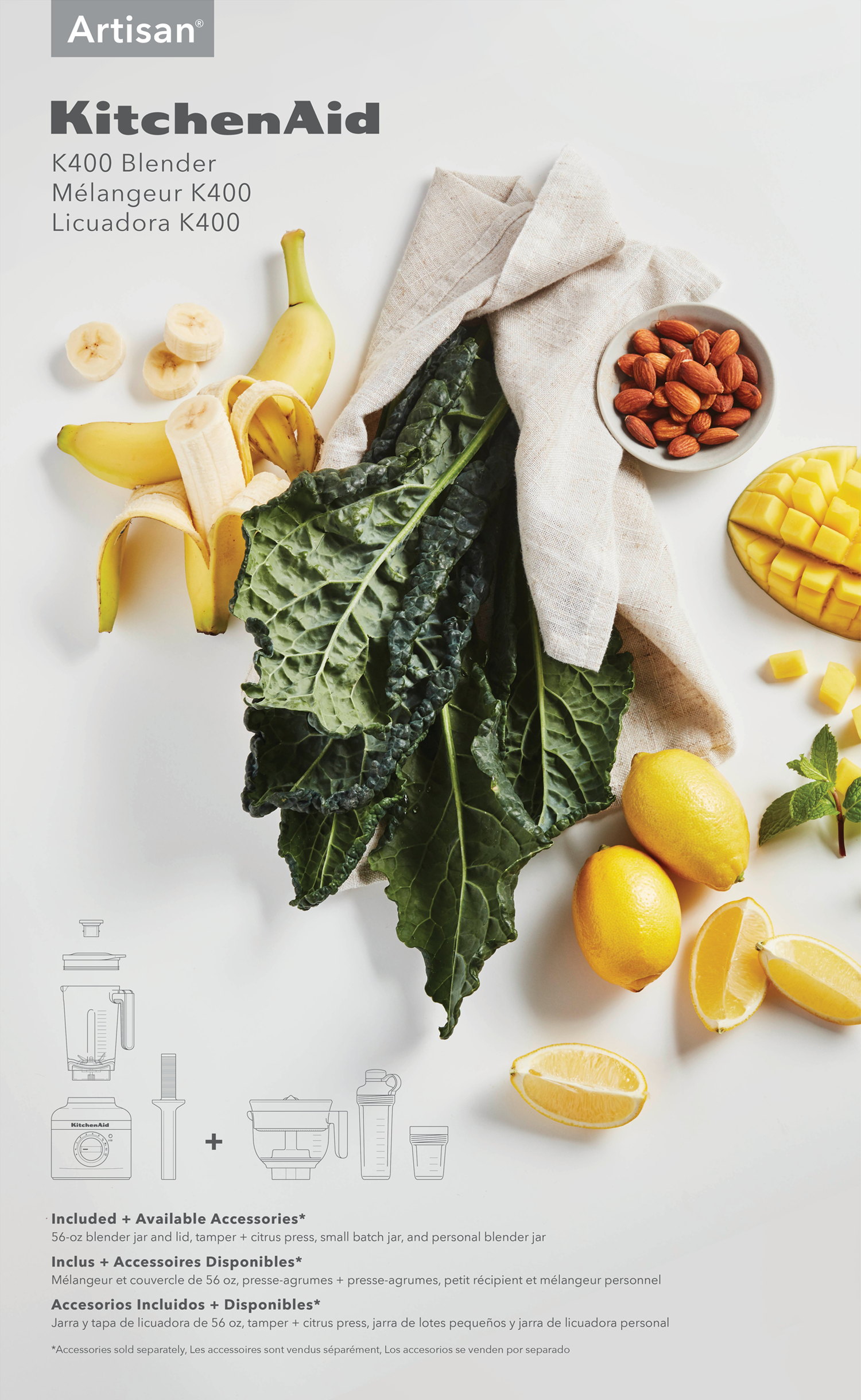
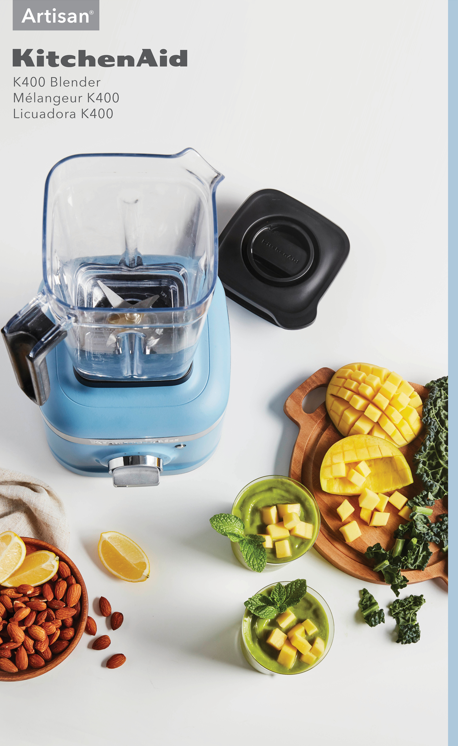
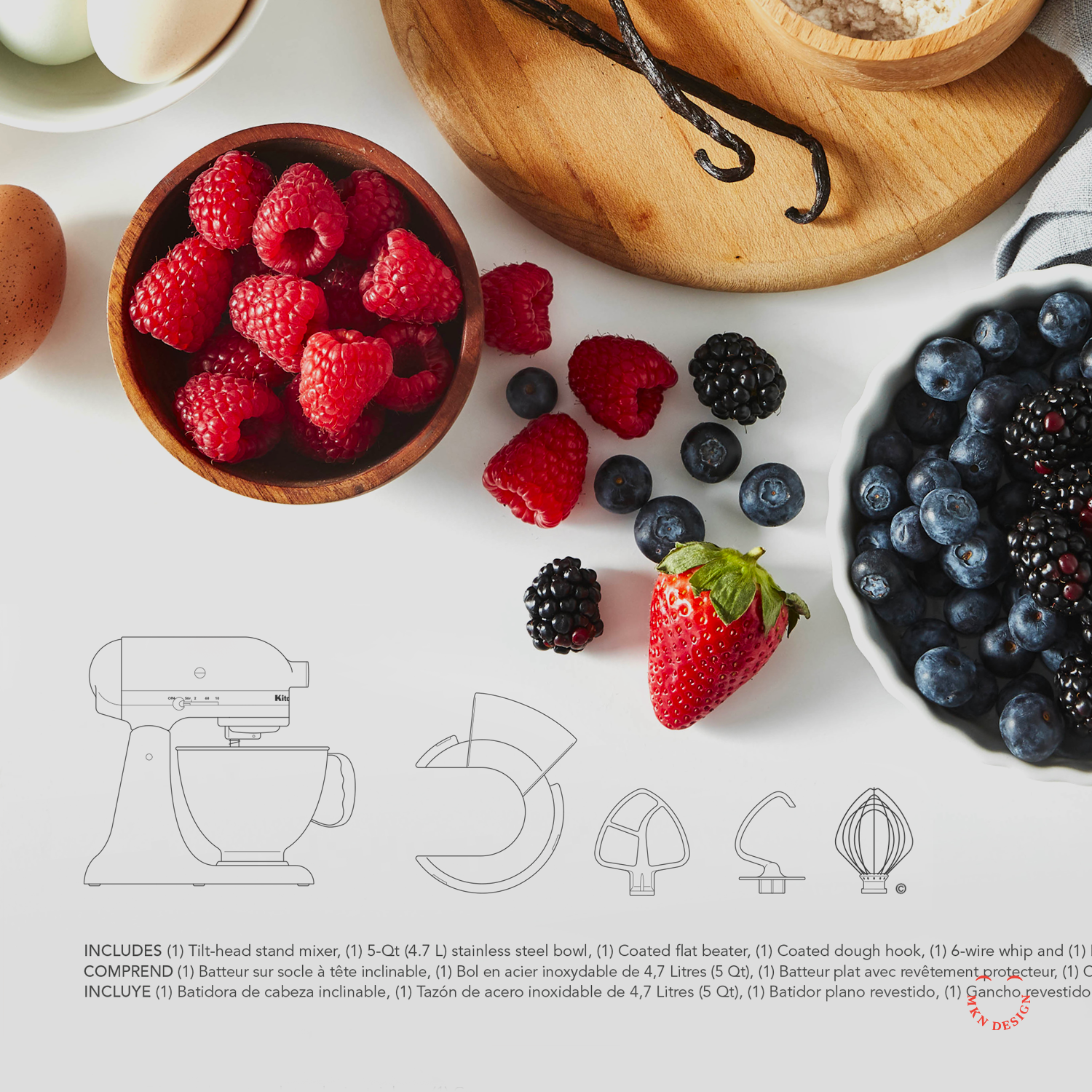
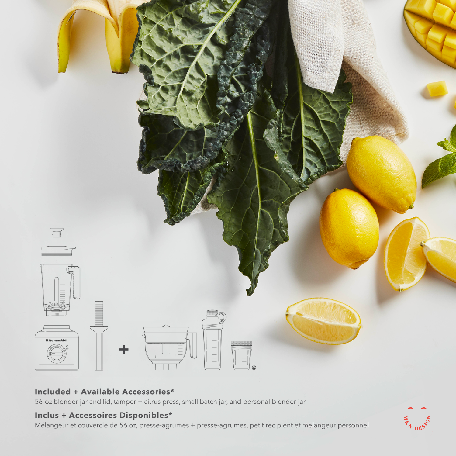
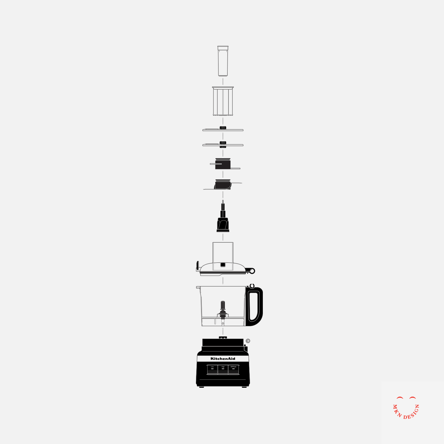
Working closely with the internal KitchenAid team, we began by diving into consumer insights, packaging trends, and design systems across related industries while also bringing our own creative perspective to the process. From this research, we developed a series of concepts built on a refined visual language that combined bespoke product illustrations with photography to drive storytelling, supported by iconography, color, and typography. All of this was organized within a thoughtful packaging system that could extend across product lines and packaging sizes, reinforcing the brand while prioritizing clarity and consumer engagement.
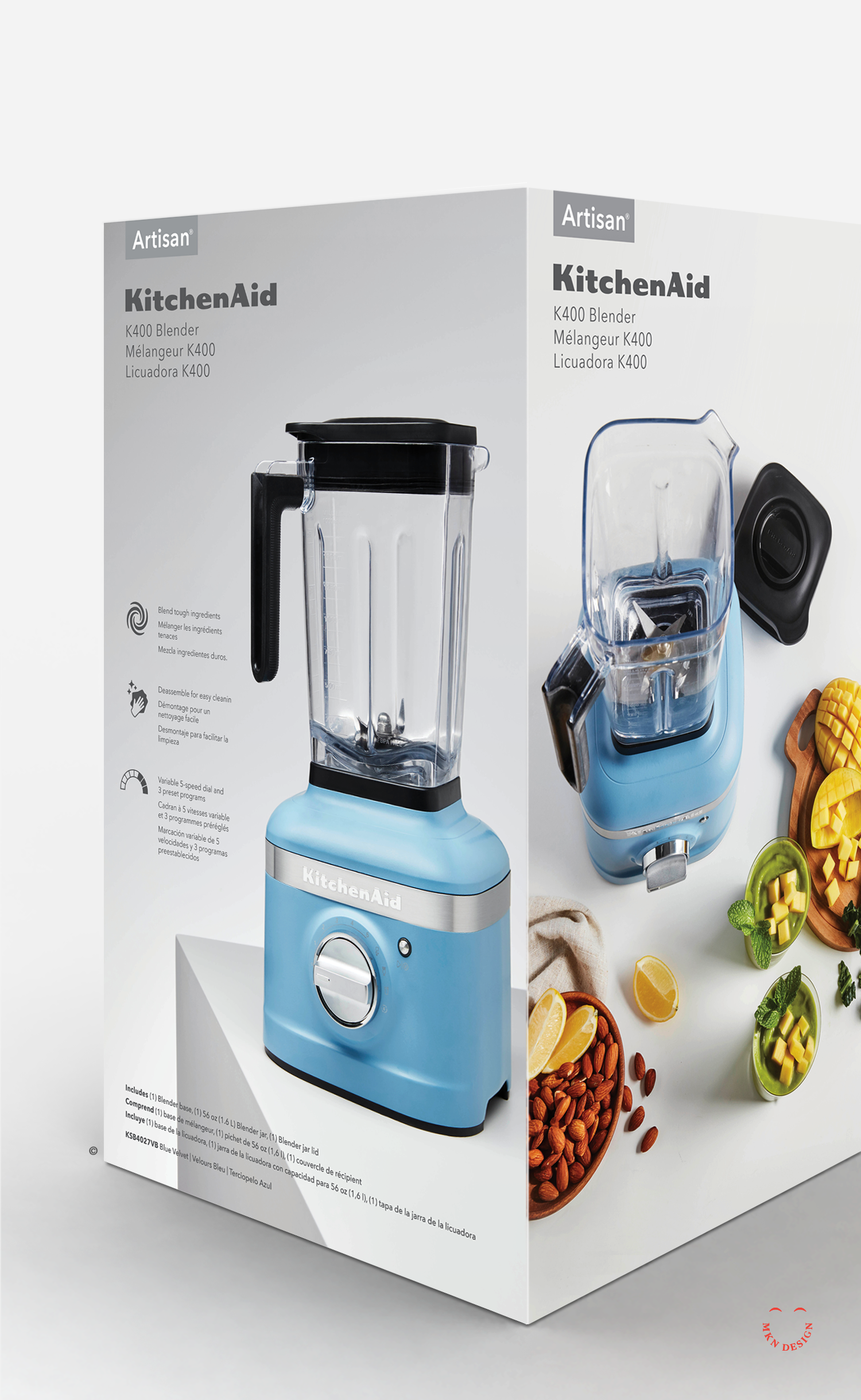
The final result was a flexible, strategic packaging system that scaled across all products—unmistakably KitchenAid, while reinforcing the brand and putting clarity and consumer engagement at the forefront.
This project came to life through a true cross-disciplinary partnership. Designers, packaging engineers, photographers, and CMF teams each brought their own craft, perspective, and problem-solving to the table—layering ideas, refining details, and ultimately shaping the final packaging concepts together.
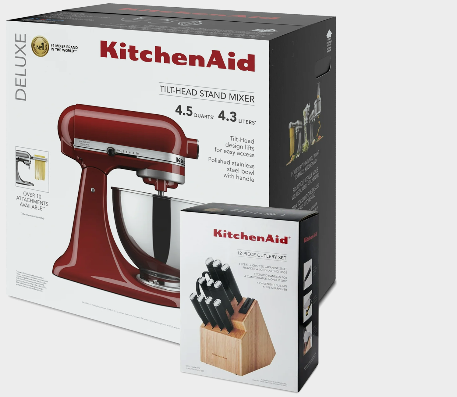
↑ Original KitchenAid Packaging
KitchenAid
Kitchen Appliance Manufacturing
+ Branded Iconography
+ Communication Design
+ Concept Development
+ Consumer & Trend Research
+ Iconography System Design
+ Instructional Illustration
+ Photoshop & Physical Mock-ups
+ Product Research
+ Qualitative Research
MKN Design Team:
+ Michael Nÿkamp, Graphic Designer and Illustrator
KitchenAid Team/Stakeholders:
+ Brian Edlefson, Global Creative Manager
+ Heather Tucker, Contract Art Director
+ Katie Mubita, Senior CMF Designer
+ Calvin Beisiege, Graphics Strategy, Brand & Trends
+ Ashley Klee, Global Graphic Designer
+ Steven Tillstrom, Global Graphic Designer
Product
The Midwest Coast is currently not available. Check back in early June 2024. View additional graphic tee’s on my Cotton Bureau profile page. All Cotton Bureau apparel comes in a variety of clothing types, styles, fits, sizes, materials, and colors.
MKN Design, LLC
michael@mkn-design.com
1 616 915 1941
Good design is complexity presented simply
MKN Design LLC © 2025
Originally from Ontario, Canada, and currently based in West Michigan, Michael Nÿkamp is dedicated to helping businesses develop and refine creative strategies into clear, impactful solutions that captivate and engage.