
Client Project + Product
March 2021
__
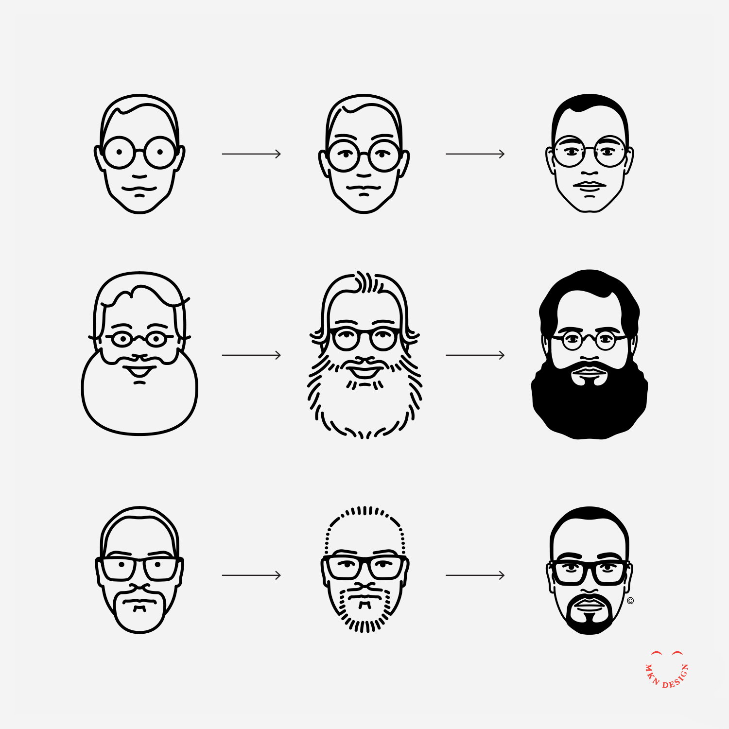
Portrait Style Evolution
These portraits illustrations started as a self-initiated project in 2013 as a stratagem, but also to expanded my skill as an illustrator.
The project began with drawing a few of my Facebook friends and turned into a series of paid client projects for the CanUX Conference, Herman Miller, Fast Company, and IxDA. This personal initiative were simple portrait line studies and evolved to a refined style without compromising its minimalist feel. Portraits from top to bottom: Sam Bleckley, Steve Frykholm, and Hamad Al Zemami.
-
Looking for a custom illustrated portrait of yourself or a group? Reach out via email for further information and details.