
Client Project
—
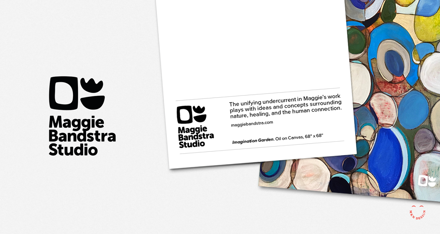
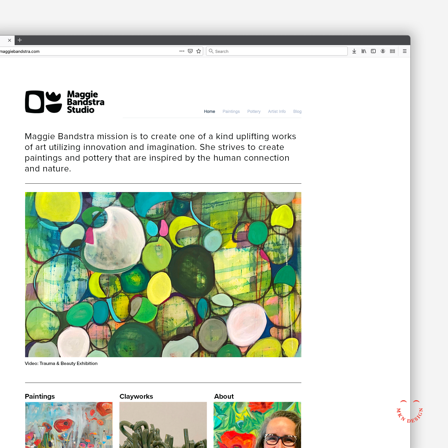
Maggie Bandstra Studio – Brand Identity
Maggie is a versatile artist and educator who seamlessly transitions between painting and crafting clay sculptures and pottery. Her creative endeavors are unified by a captivating exploration of themes such as nature, healing, and human connection.
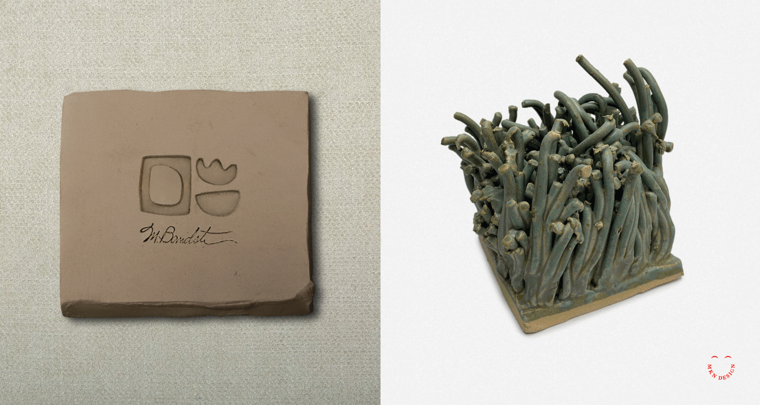
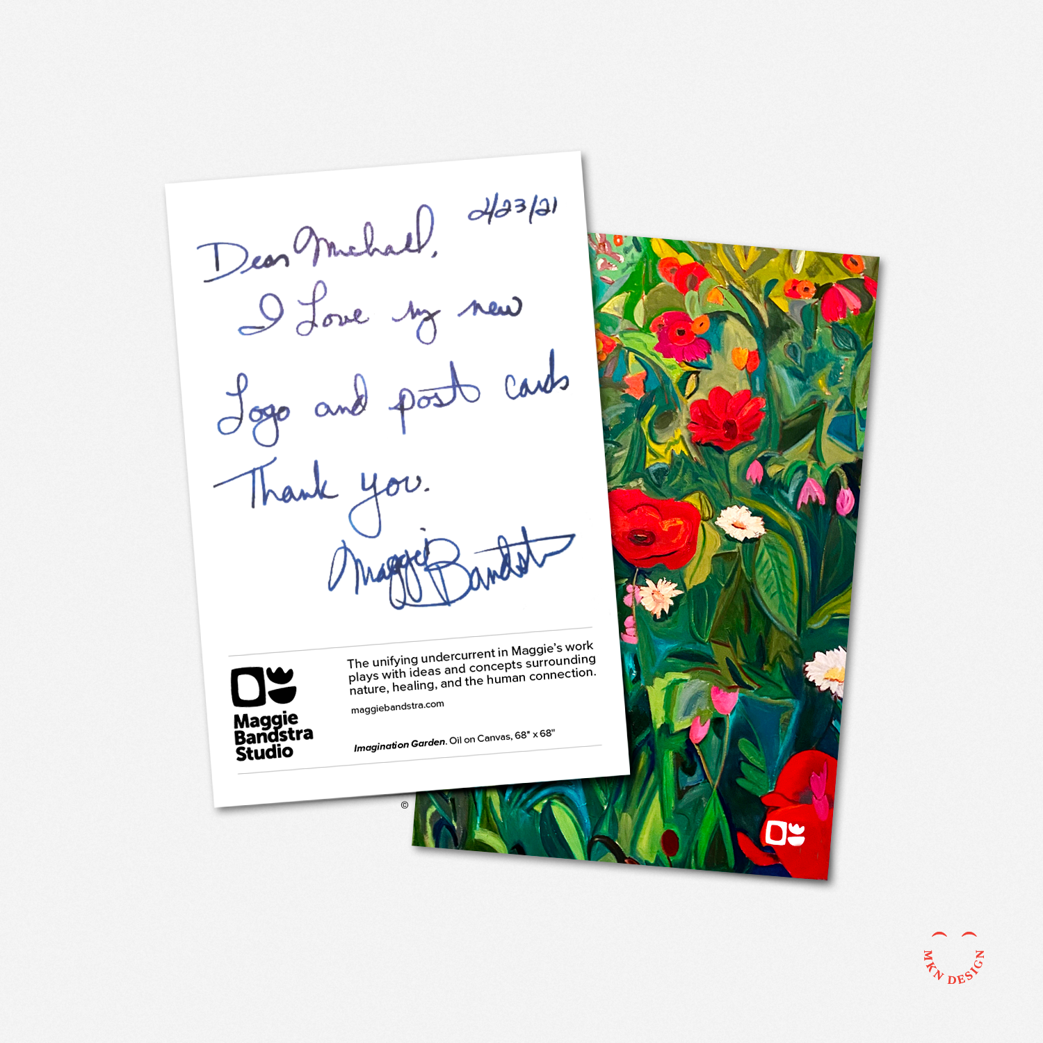
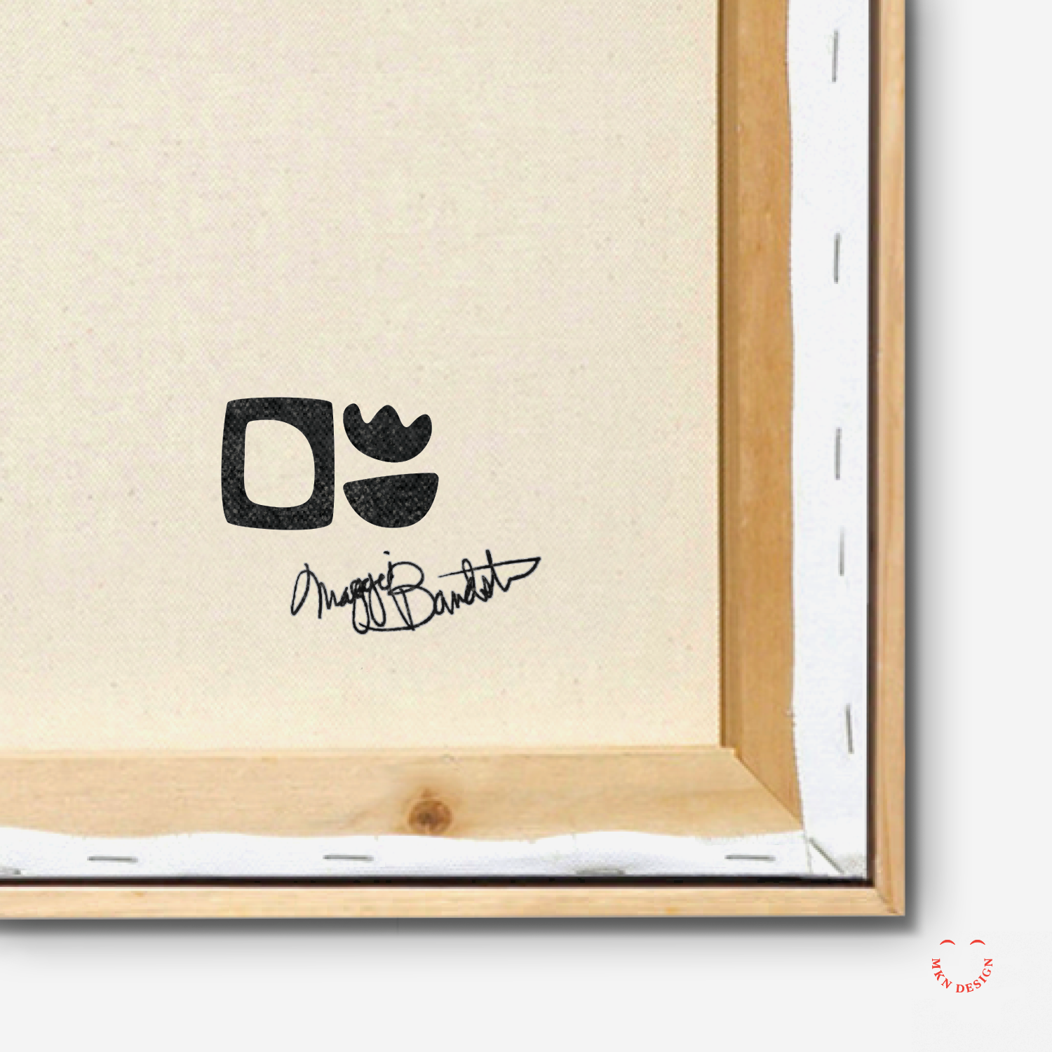
The organic shapes within her logo are reflective of the forms recurrent in both her paintings and pottery creations. While her identity remains neutral, Maggie's vibrant personality permeates her work, ensuring that her art takes center stage. During the exploration phase, it became evident that Maggie required multiple logo marks to accommodate diverse applications across her artwork and to maintain a professional presence across various stamped, printed and digital platforms.
-
Maggie Bandstra Stuido
Independent Artist & Educator -
+ Brand Advisor
+ Concept Development
+ Creative Strategy
+ Design Direction
+ Qualitative Research
+ Visual Identity -
MKN Design Team:
+ Michael Nÿkamp, Design DirectorMaggie Bandstra Studio Stakeholder:
+ Maggie Bandstra, Owner, Artist & Educator